

Progress Alert
Original · freeAn alert with a countdown progress bar.
Copy prompt gives Claude Code, Cursor or v0 a ready-to-paste prompt that recreates this exact component.
npx shadcn@latest add https://webinnoventix.com/r/alert-progress.json"use client";
import { useCallback, useEffect, useRef, useState, type ReactNode } from "react";
import { AnimatePresence, motion, useReducedMotion } from "motion/react";
type AlertTone = "success" | "info" | "warning" | "error";
interface AlertItem {
id: number;
tone: AlertTone;
title: string;
message: string;
action: string;
duration: number;
}
interface ToneStyle {
ring: string;
accent: string;
bar: string;
iconWrap: string;
actionBtn: string;
live: "assertive" | "polite";
role: "alert" | "status";
icon: ReactNode;
}
const TONES: Record<AlertTone, ToneStyle> = {
success: {
ring: "border-emerald-200 dark:border-emerald-500/25",
accent: "text-emerald-700 dark:text-emerald-300",
bar: "bg-emerald-500 dark:bg-emerald-400",
iconWrap:
"bg-emerald-100 text-emerald-700 dark:bg-emerald-500/15 dark:text-emerald-300",
actionBtn:
"text-emerald-700 hover:bg-emerald-100 focus-visible:ring-emerald-500 dark:text-emerald-300 dark:hover:bg-emerald-500/15",
live: "polite",
role: "status",
icon: (
<svg viewBox="0 0 24 24" fill="none" className="h-5 w-5" aria-hidden="true">
<path
d="m5 13 4 4L19 7"
stroke="currentColor"
strokeWidth="2.2"
strokeLinecap="round"
strokeLinejoin="round"
/>
</svg>
),
},
info: {
ring: "border-sky-200 dark:border-sky-500/25",
accent: "text-sky-700 dark:text-sky-300",
bar: "bg-sky-500 dark:bg-sky-400",
iconWrap: "bg-sky-100 text-sky-700 dark:bg-sky-500/15 dark:text-sky-300",
actionBtn:
"text-sky-700 hover:bg-sky-100 focus-visible:ring-sky-500 dark:text-sky-300 dark:hover:bg-sky-500/15",
live: "polite",
role: "status",
icon: (
<svg viewBox="0 0 24 24" fill="none" className="h-5 w-5" aria-hidden="true">
<circle cx="12" cy="12" r="9" stroke="currentColor" strokeWidth="2" />
<path
d="M12 11v5"
stroke="currentColor"
strokeWidth="2.2"
strokeLinecap="round"
/>
<circle cx="12" cy="7.5" r="1.3" fill="currentColor" />
</svg>
),
},
warning: {
ring: "border-amber-200 dark:border-amber-500/25",
accent: "text-amber-700 dark:text-amber-300",
bar: "bg-amber-500 dark:bg-amber-400",
iconWrap: "bg-amber-100 text-amber-700 dark:bg-amber-500/15 dark:text-amber-300",
actionBtn:
"text-amber-700 hover:bg-amber-100 focus-visible:ring-amber-500 dark:text-amber-300 dark:hover:bg-amber-500/15",
live: "assertive",
role: "alert",
icon: (
<svg viewBox="0 0 24 24" fill="none" className="h-5 w-5" aria-hidden="true">
<path
d="M12 4.5 21 19H3L12 4.5Z"
stroke="currentColor"
strokeWidth="2"
strokeLinejoin="round"
/>
<path
d="M12 10v4"
stroke="currentColor"
strokeWidth="2.2"
strokeLinecap="round"
/>
<circle cx="12" cy="16.6" r="1.2" fill="currentColor" />
</svg>
),
},
error: {
ring: "border-rose-200 dark:border-rose-500/25",
accent: "text-rose-700 dark:text-rose-300",
bar: "bg-rose-500 dark:bg-rose-400",
iconWrap: "bg-rose-100 text-rose-700 dark:bg-rose-500/15 dark:text-rose-300",
actionBtn:
"text-rose-700 hover:bg-rose-100 focus-visible:ring-rose-500 dark:text-rose-300 dark:hover:bg-rose-500/15",
live: "assertive",
role: "alert",
icon: (
<svg viewBox="0 0 24 24" fill="none" className="h-5 w-5" aria-hidden="true">
<circle cx="12" cy="12" r="9" stroke="currentColor" strokeWidth="2" />
<path
d="m9 9 6 6M15 9l-6 6"
stroke="currentColor"
strokeWidth="2.2"
strokeLinecap="round"
/>
</svg>
),
},
};
const PRESETS: Omit<AlertItem, "id">[] = [
{
tone: "success",
title: "Payment received",
message:
"Invoice #INV-2043 has been paid in full. A receipt is on its way to your inbox.",
action: "View receipt",
duration: 7000,
},
{
tone: "info",
title: "New version available",
message:
"v2.4 ships faster builds and a fix for dark-mode contrast. Reload to update.",
action: "Reload now",
duration: 8000,
},
{
tone: "warning",
title: "Session expiring soon",
message:
"You'll be signed out shortly for security. Save your work to avoid losing changes.",
action: "Stay signed in",
duration: 9000,
},
{
tone: "error",
title: "Upload failed",
message:
"photo-shoot-final.zip couldn't be uploaded. Check your connection and try again.",
action: "Retry upload",
duration: 9000,
},
];
function ProgressAlert({
item,
onClose,
}: {
item: AlertItem;
onClose: (id: number) => void;
}) {
const tone = TONES[item.tone];
const [remaining, setRemaining] = useState(item.duration);
const [paused, setPaused] = useState(false);
const remainingRef = useRef(item.duration);
const pausedRef = useRef(false);
const closeRef = useRef(onClose);
closeRef.current = onClose;
useEffect(() => {
pausedRef.current = paused;
}, [paused]);
useEffect(() => {
let raf = 0;
let last = performance.now();
const tick = (now: number) => {
const dt = now - last;
last = now;
if (!pausedRef.current) {
remainingRef.current = Math.max(0, remainingRef.current - dt);
setRemaining(remainingRef.current);
if (remainingRef.current <= 0) {
closeRef.current(item.id);
return;
}
}
raf = requestAnimationFrame(tick);
};
raf = requestAnimationFrame(tick);
return () => cancelAnimationFrame(raf);
}, [item.id]);
const pct = Math.max(0, Math.min(100, (remaining / item.duration) * 100));
const secs = Math.ceil(remaining / 1000);
const pause = useCallback(() => setPaused(true), []);
const resume = useCallback(() => setPaused(false), []);
return (
<div
role={tone.role}
aria-live={tone.live}
onMouseEnter={pause}
onMouseLeave={resume}
onFocusCapture={pause}
onBlurCapture={resume}
className={`group relative overflow-hidden rounded-xl border bg-white shadow-lg shadow-slate-900/5 dark:bg-slate-900 dark:shadow-black/40 ${tone.ring}`}
>
<div className="flex items-start gap-3 p-4 pr-3">
<span
className={`mt-0.5 grid h-9 w-9 shrink-0 place-items-center rounded-lg ${tone.iconWrap}`}
>
{tone.icon}
</span>
<div className="min-w-0 flex-1">
<div className="flex items-start justify-between gap-2">
<p className="text-sm font-semibold text-slate-900 dark:text-slate-50">
{item.title}
</p>
<span
className={`shrink-0 tabular-nums text-[11px] font-medium ${
paused ? "text-slate-400 dark:text-slate-500" : tone.accent
}`}
aria-hidden="true"
>
{paused ? "paused" : `${secs}s`}
</span>
</div>
<p className="mt-1 text-sm leading-relaxed text-slate-600 dark:text-slate-300">
{item.message}
</p>
<div className="mt-3 flex items-center gap-1">
<button
type="button"
onClick={() => onClose(item.id)}
className={`rounded-md px-2.5 py-1.5 text-xs font-semibold outline-none transition focus-visible:ring-2 focus-visible:ring-offset-2 focus-visible:ring-offset-white dark:focus-visible:ring-offset-slate-900 ${tone.actionBtn}`}
>
{item.action}
</button>
<button
type="button"
onClick={() => onClose(item.id)}
className="rounded-md px-2.5 py-1.5 text-xs font-medium text-slate-500 outline-none transition hover:bg-slate-100 hover:text-slate-700 focus-visible:ring-2 focus-visible:ring-slate-400 focus-visible:ring-offset-2 focus-visible:ring-offset-white dark:text-slate-400 dark:hover:bg-slate-800 dark:hover:text-slate-200 dark:focus-visible:ring-offset-slate-900"
>
Dismiss
</button>
</div>
</div>
<button
type="button"
onClick={() => onClose(item.id)}
aria-label={`Close: ${item.title}`}
className="-mr-1 grid h-7 w-7 shrink-0 place-items-center rounded-md text-slate-400 outline-none transition hover:bg-slate-100 hover:text-slate-600 focus-visible:ring-2 focus-visible:ring-slate-400 dark:hover:bg-slate-800 dark:hover:text-slate-200"
>
<svg viewBox="0 0 24 24" fill="none" className="h-4 w-4" aria-hidden="true">
<path
d="M6 6l12 12M18 6 6 18"
stroke="currentColor"
strokeWidth="2"
strokeLinecap="round"
/>
</svg>
</button>
</div>
<div
className="absolute inset-x-0 bottom-0 h-1 bg-slate-100 dark:bg-slate-800"
role="progressbar"
aria-label="Time remaining before this alert dismisses"
aria-valuemin={0}
aria-valuemax={100}
aria-valuenow={Math.round(pct)}
>
<div
className={`apbar-fill h-full ${tone.bar}`}
style={{ width: `${pct}%`, opacity: paused ? 0.55 : 1 }}
/>
</div>
</div>
);
}
export default function AlertProgress() {
const reduced = useReducedMotion();
const [items, setItems] = useState<AlertItem[]>([]);
const nextId = useRef(1);
const push = useCallback((preset: Omit<AlertItem, "id">) => {
setItems((prev) => {
const id = nextId.current++;
const next = [{ ...preset, id }, ...prev];
return next.slice(0, 4);
});
}, []);
const close = useCallback((id: number) => {
setItems((prev) => prev.filter((a) => a.id !== id));
}, []);
useEffect(() => {
const id = nextId.current++;
setItems([{ ...PRESETS[0], id }]);
}, []);
const motionProps = reduced
? {}
: {
initial: { opacity: 0, y: 14, scale: 0.97 },
animate: { opacity: 1, y: 0, scale: 1 },
exit: { opacity: 0, x: 32, scale: 0.97 },
transition: { type: "spring" as const, stiffness: 420, damping: 34 },
layout: true,
};
return (
<section className="relative w-full bg-slate-50 px-6 py-20 dark:bg-slate-950 sm:py-24">
<style>{`
@keyframes apbar-sheen {
0% { transform: translateX(-100%); }
100% { transform: translateX(320%); }
}
.apbar-fill { position: relative; overflow: hidden; }
.apbar-fill::after {
content: "";
position: absolute;
inset: 0;
width: 40%;
background: linear-gradient(90deg, transparent, rgba(255,255,255,0.55), transparent);
animation: apbar-sheen 2.2s linear infinite;
}
@media (prefers-reduced-motion: reduce) {
.apbar-fill::after { animation: none; display: none; }
}
`}</style>
<div className="mx-auto max-w-xl">
<div className="mb-8 text-center">
<span className="inline-flex items-center gap-1.5 rounded-full border border-slate-200 bg-white px-3 py-1 text-xs font-medium text-slate-600 dark:border-slate-800 dark:bg-slate-900 dark:text-slate-300">
<span className="h-1.5 w-1.5 rounded-full bg-indigo-500" />
Auto-dismiss alerts
</span>
<h2 className="mt-4 text-2xl font-bold tracking-tight text-slate-900 dark:text-white sm:text-3xl">
Toasts with a countdown
</h2>
<p className="mt-2 text-sm text-slate-600 dark:text-slate-400">
Each alert clears itself when the bar runs out. Hover or focus to pause
the timer.
</p>
</div>
<div className="mb-6 flex flex-wrap justify-center gap-2">
{PRESETS.map((p) => (
<button
key={p.tone}
type="button"
onClick={() => push(p)}
className="rounded-lg border border-slate-200 bg-white px-3 py-1.5 text-xs font-semibold capitalize text-slate-700 outline-none transition hover:border-slate-300 hover:bg-slate-100 focus-visible:ring-2 focus-visible:ring-indigo-500 focus-visible:ring-offset-2 focus-visible:ring-offset-slate-50 dark:border-slate-800 dark:bg-slate-900 dark:text-slate-200 dark:hover:bg-slate-800 dark:focus-visible:ring-offset-slate-950"
>
{p.tone}
</button>
))}
</div>
<ul className="flex flex-col gap-3" aria-label="Notifications">
<AnimatePresence initial={false}>
{items.map((item) => (
<motion.li key={item.id} {...motionProps} className="list-none">
<ProgressAlert item={item} onClose={close} />
</motion.li>
))}
</AnimatePresence>
</ul>
{items.length === 0 && (
<p className="rounded-xl border border-dashed border-slate-300 py-8 text-center text-sm text-slate-500 dark:border-slate-700 dark:text-slate-400">
All caught up. Trigger an alert above.
</p>
)}
</div>
</section>
);
}Dependencies
Licence
Built by Web Innoventix. Free for personal and commercial use, no attribution required.
Built by Web Innoventix
Need a custom interface, a full website, or SEO that gets you cited by AI? We design, build and rank it end to end.
Get a free quoteSimilar components
Browse all →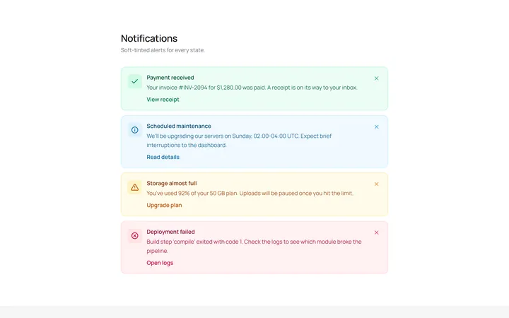
Soft Variants Alert
OriginalSoft-tinted alerts: success, info, warning and error, each with an icon.
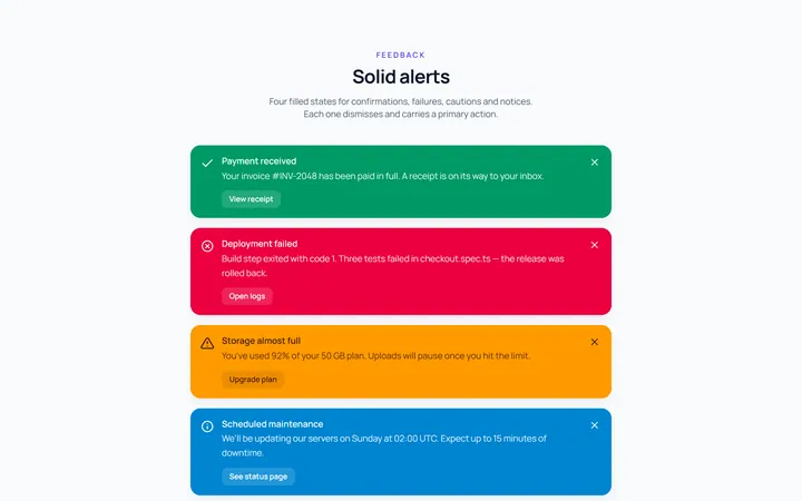
Solid Variants Alert
OriginalSolid-colour alerts across the four states.
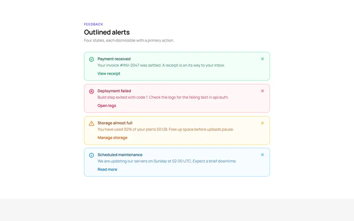
Outline Variants Alert
OriginalOutlined alerts across the four states.
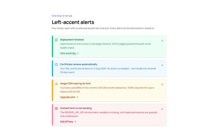
Left Accent Alert
OriginalAlerts with a coloured left accent bar and icon.
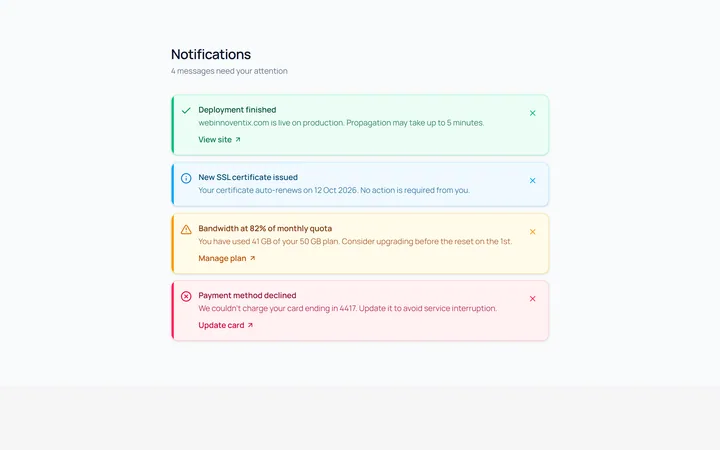
Dismissible Alert
OriginalDismissible alerts with a working close button.
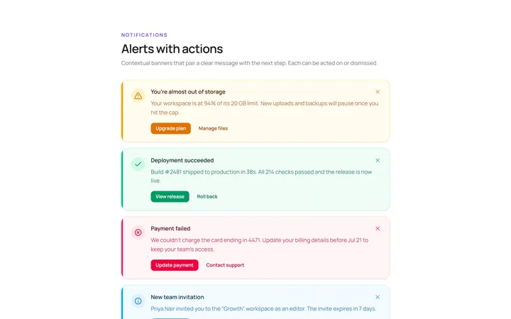
With Action Alert
OriginalAn alert with title, body and action buttons.
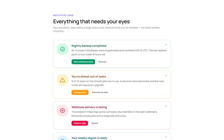
Icon Large Alert
OriginalAn alert led by a large circular icon.
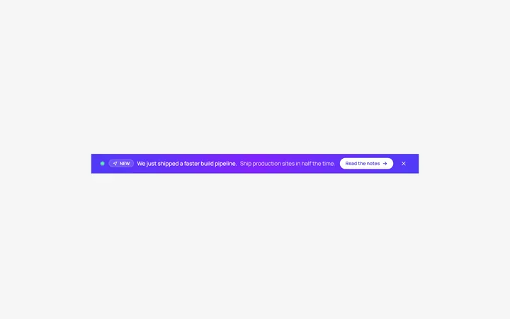
Banner Top Alert
OriginalA full-width top announcement banner, dismissible.
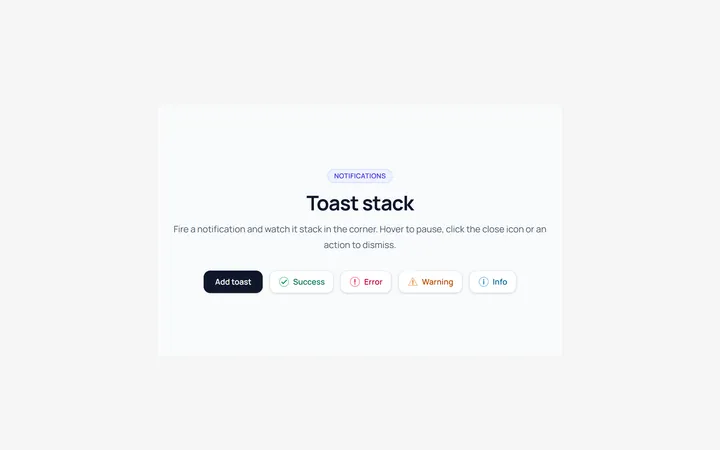
Toast Stack Alert
OriginalA stack of dismissible toasts in a corner.
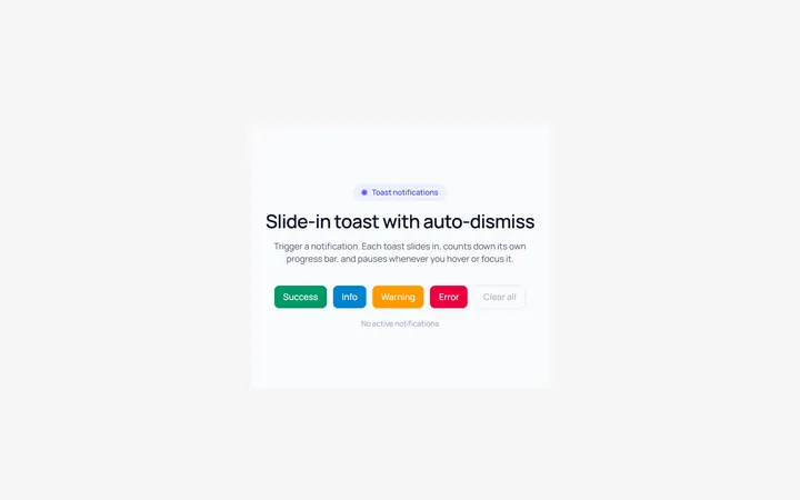
Toast Slide Alert
OriginalA toast that slides in with an icon and auto-dismiss progress.
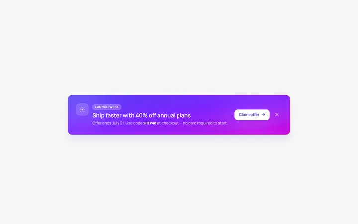
Gradient Alert
OriginalA gradient promo banner alert with a call to action.
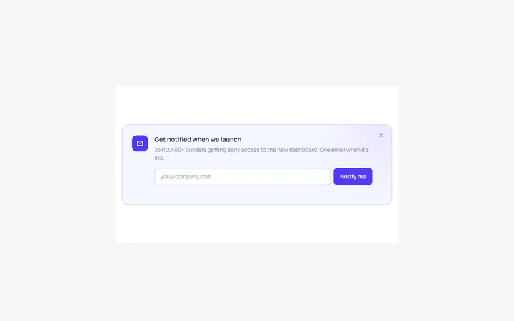
Inline Form Alert
OriginalAn alert containing an inline email input and button.