

Solid Variants Alert
Original · freeSolid-colour alerts across the four states.
Copy prompt gives Claude Code, Cursor or v0 a ready-to-paste prompt that recreates this exact component.
npx shadcn@latest add https://webinnoventix.com/r/alert-solid-variants.json"use client";
import { useState } from "react";
import { AnimatePresence, motion, useReducedMotion } from "motion/react";
type Variant = "success" | "error" | "warning" | "info";
type AlertData = {
id: Variant;
title: string;
message: string;
action: string;
};
const ALERTS: AlertData[] = [
{
id: "success",
title: "Payment received",
message: "Your invoice #INV-2048 has been paid in full. A receipt is on its way to your inbox.",
action: "View receipt",
},
{
id: "error",
title: "Deployment failed",
message: "Build step exited with code 1. Three tests failed in checkout.spec.ts — the release was rolled back.",
action: "Open logs",
},
{
id: "warning",
title: "Storage almost full",
message: "You've used 92% of your 50 GB plan. Uploads will pause once you hit the limit.",
action: "Upgrade plan",
},
{
id: "info",
title: "Scheduled maintenance",
message: "We'll be updating our servers on Sunday at 02:00 UTC. Expect up to 15 minutes of downtime.",
action: "See status page",
},
];
const STYLES: Record<
Variant,
{ surface: string; action: string; close: string; ring: string }
> = {
success: {
surface: "bg-emerald-600 text-emerald-50 dark:bg-emerald-500 dark:text-emerald-950",
action:
"bg-emerald-50/15 text-white hover:bg-emerald-50/25 dark:bg-emerald-950/25 dark:text-emerald-950 dark:hover:bg-emerald-950/40",
close: "hover:bg-emerald-50/20 dark:hover:bg-emerald-950/25",
ring: "focus-visible:ring-emerald-200 dark:focus-visible:ring-emerald-900",
},
error: {
surface: "bg-rose-600 text-rose-50 dark:bg-rose-500 dark:text-rose-950",
action:
"bg-rose-50/15 text-white hover:bg-rose-50/25 dark:bg-rose-950/25 dark:text-rose-950 dark:hover:bg-rose-950/40",
close: "hover:bg-rose-50/20 dark:hover:bg-rose-950/25",
ring: "focus-visible:ring-rose-200 dark:focus-visible:ring-rose-900",
},
warning: {
surface: "bg-amber-500 text-amber-950 dark:bg-amber-400 dark:text-amber-950",
action:
"bg-amber-950/10 text-amber-950 hover:bg-amber-950/20 dark:bg-amber-950/15 dark:hover:bg-amber-950/25",
close: "hover:bg-amber-950/15",
ring: "focus-visible:ring-amber-800 dark:focus-visible:ring-amber-900",
},
info: {
surface: "bg-sky-600 text-sky-50 dark:bg-sky-500 dark:text-sky-950",
action:
"bg-sky-50/15 text-white hover:bg-sky-50/25 dark:bg-sky-950/25 dark:text-sky-950 dark:hover:bg-sky-950/40",
close: "hover:bg-sky-50/20 dark:hover:bg-sky-950/25",
ring: "focus-visible:ring-sky-200 dark:focus-visible:ring-sky-900",
},
};
function Icon({ variant }: { variant: Variant }) {
const common = {
width: 22,
height: 22,
viewBox: "0 0 24 24",
fill: "none",
stroke: "currentColor",
strokeWidth: 2,
strokeLinecap: "round" as const,
strokeLinejoin: "round" as const,
"aria-hidden": true,
};
switch (variant) {
case "success":
return (
<svg {...common}>
<path d="M20 6 9 17l-5-5" />
</svg>
);
case "error":
return (
<svg {...common}>
<circle cx="12" cy="12" r="9" />
<path d="m15 9-6 6M9 9l6 6" />
</svg>
);
case "warning":
return (
<svg {...common}>
<path d="M10.3 3.9 1.8 18a2 2 0 0 0 1.7 3h17a2 2 0 0 0 1.7-3L13.7 3.9a2 2 0 0 0-3.4 0Z" />
<path d="M12 9v4M12 17h.01" />
</svg>
);
case "info":
return (
<svg {...common}>
<circle cx="12" cy="12" r="9" />
<path d="M12 16v-4M12 8h.01" />
</svg>
);
}
}
const LABELS: Record<Variant, string> = {
success: "Success",
error: "Error",
warning: "Warning",
info: "Information",
};
export default function AlertSolidVariants() {
const reduce = useReducedMotion();
const [open, setOpen] = useState<Record<Variant, boolean>>({
success: true,
error: true,
warning: true,
info: true,
});
const [note, setNote] = useState<string>("");
const dismiss = (id: Variant) =>
setOpen((prev) => ({ ...prev, [id]: false }));
const allClosed = ALERTS.every((a) => !open[a.id]);
return (
<section className="relative w-full bg-slate-50 px-4 py-20 sm:px-6 dark:bg-slate-950">
<style>{`
@keyframes asv-pop {
0% { transform: scale(.96); opacity: 0; }
100% { transform: scale(1); opacity: 1; }
}
@media (prefers-reduced-motion: reduce) {
.asv-pop { animation: none !important; }
}
`}</style>
<div className="mx-auto max-w-2xl">
<header className="mb-10 text-center">
<p className="text-xs font-semibold uppercase tracking-[0.2em] text-indigo-600 dark:text-indigo-400">
Feedback
</p>
<h2 className="mt-2 text-3xl font-bold tracking-tight text-slate-900 dark:text-slate-50">
Solid alerts
</h2>
<p className="mx-auto mt-3 max-w-md text-sm text-slate-600 dark:text-slate-400">
Four filled states for confirmations, failures, cautions and notices. Each one dismisses and carries a primary action.
</p>
</header>
<div
className="flex flex-col gap-4"
role="region"
aria-label="Alert examples"
>
<AnimatePresence mode="popLayout">
{ALERTS.filter((a) => open[a.id]).map((alert) => {
const s = STYLES[alert.id];
return (
<motion.div
key={alert.id}
layout={!reduce}
role="alert"
initial={reduce ? false : { opacity: 0, y: -8, scale: 0.98 }}
animate={{ opacity: 1, y: 0, scale: 1 }}
exit={
reduce
? { opacity: 0 }
: { opacity: 0, x: 24, scale: 0.96, transition: { duration: 0.2 } }
}
transition={{ type: "spring", stiffness: 460, damping: 34 }}
className={`asv-pop flex items-start gap-3 rounded-2xl p-4 shadow-lg shadow-slate-900/5 ${s.surface}`}
>
<span className="mt-0.5 shrink-0" aria-hidden>
<Icon variant={alert.id} />
</span>
<div className="min-w-0 flex-1">
<p className="text-sm font-semibold leading-tight">
<span className="sr-only">{LABELS[alert.id]}: </span>
{alert.title}
</p>
<p className="mt-1 text-sm leading-relaxed opacity-90">
{alert.message}
</p>
<div className="mt-3">
<button
type="button"
onClick={() =>
setNote(`${alert.action} — ${LABELS[alert.id]}`)
}
className={`inline-flex items-center rounded-lg px-3 py-1.5 text-xs font-semibold outline-none transition-colors focus-visible:ring-2 focus-visible:ring-offset-2 focus-visible:ring-offset-transparent ${s.action} ${s.ring}`}
>
{alert.action}
</button>
</div>
</div>
<button
type="button"
onClick={() => dismiss(alert.id)}
aria-label={`Dismiss ${LABELS[alert.id]} alert`}
className={`-mr-1 -mt-1 shrink-0 rounded-lg p-1.5 outline-none transition-colors focus-visible:ring-2 focus-visible:ring-offset-2 focus-visible:ring-offset-transparent ${s.close} ${s.ring}`}
>
<svg
width={18}
height={18}
viewBox="0 0 24 24"
fill="none"
stroke="currentColor"
strokeWidth={2}
strokeLinecap="round"
strokeLinejoin="round"
aria-hidden
>
<path d="M18 6 6 18M6 6l12 12" />
</svg>
</button>
</motion.div>
);
})}
</AnimatePresence>
{allClosed && (
<div className="rounded-2xl border border-dashed border-slate-300 p-6 text-center text-sm text-slate-500 dark:border-slate-700 dark:text-slate-400">
All alerts dismissed.
<button
type="button"
onClick={() =>
setOpen({ success: true, error: true, warning: true, info: true })
}
className="ml-1 rounded font-semibold text-indigo-600 underline underline-offset-2 outline-none focus-visible:ring-2 focus-visible:ring-indigo-400 dark:text-indigo-400"
>
Reset
</button>
</div>
)}
</div>
<p
aria-live="polite"
className="mt-6 h-5 text-center text-xs font-medium text-slate-500 dark:text-slate-400"
>
{note ? `Action triggered: ${note}` : ""}
</p>
</div>
</section>
);
}Dependencies
Licence
Built by Web Innoventix. Free for personal and commercial use, no attribution required.
Built by Web Innoventix
Need a custom interface, a full website, or SEO that gets you cited by AI? We design, build and rank it end to end.
Get a free quoteSimilar components
Browse all →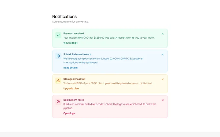
Soft Variants Alert
OriginalSoft-tinted alerts: success, info, warning and error, each with an icon.
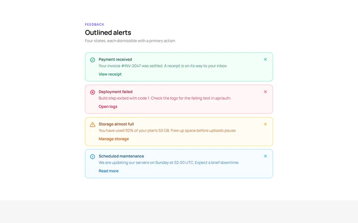
Outline Variants Alert
OriginalOutlined alerts across the four states.
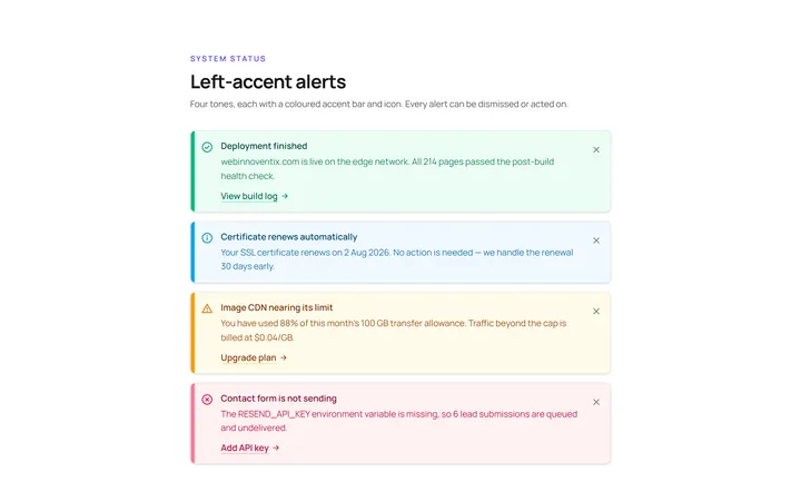
Left Accent Alert
OriginalAlerts with a coloured left accent bar and icon.
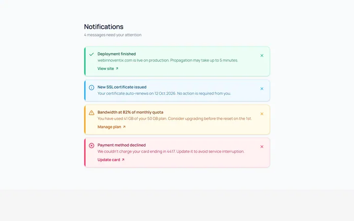
Dismissible Alert
OriginalDismissible alerts with a working close button.
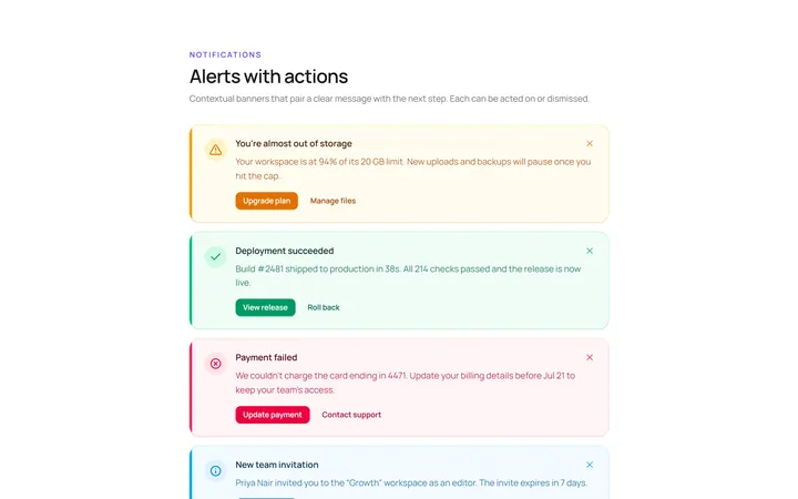
With Action Alert
OriginalAn alert with title, body and action buttons.
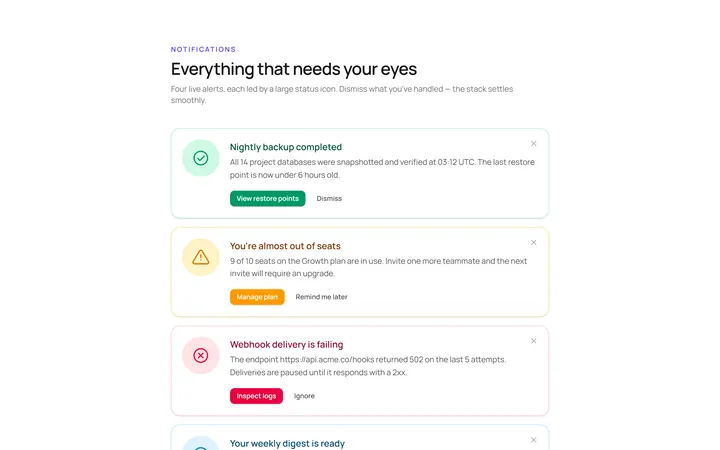
Icon Large Alert
OriginalAn alert led by a large circular icon.
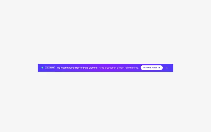
Banner Top Alert
OriginalA full-width top announcement banner, dismissible.
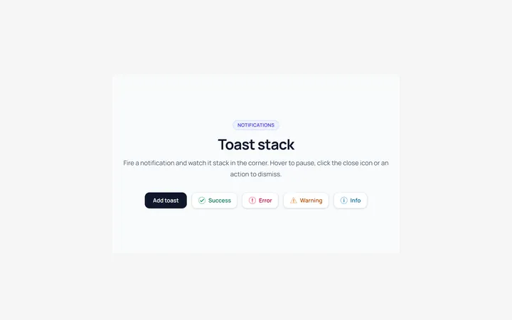
Toast Stack Alert
OriginalA stack of dismissible toasts in a corner.
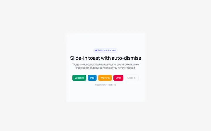
Toast Slide Alert
OriginalA toast that slides in with an icon and auto-dismiss progress.
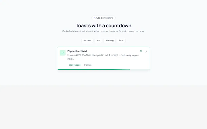
Progress Alert
OriginalAn alert with a countdown progress bar.
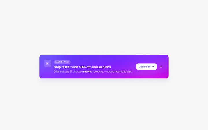
Gradient Alert
OriginalA gradient promo banner alert with a call to action.
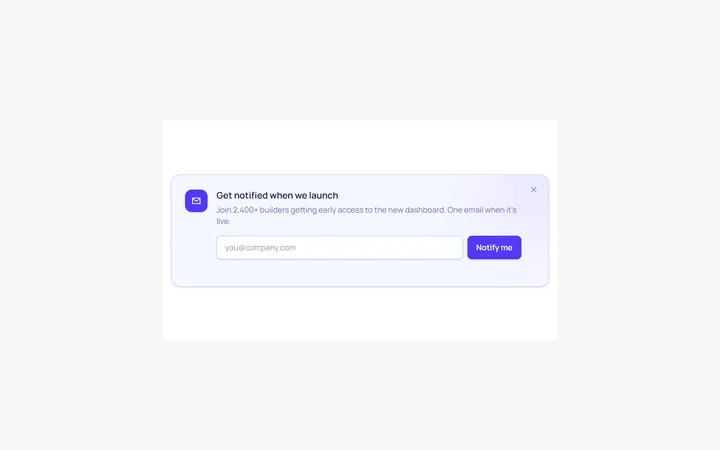
Inline Form Alert
OriginalAn alert containing an inline email input and button.