

Basic Avatar
Original · freeavatars in sizes with fallback
Copy prompt gives Claude Code, Cursor or v0 a ready-to-paste prompt that recreates this exact component.
npx shadcn@latest add https://webinnoventix.com/r/av-basic.json"use client";
import {
useEffect,
useRef,
useState,
type KeyboardEvent as ReactKeyboardEvent,
} from "react";
import { motion, useReducedMotion } from "motion/react";
type AvatarSize = "xs" | "sm" | "md" | "lg" | "xl";
type PresenceStatus = "online" | "away" | "busy" | "offline";
interface Person {
id: string;
name: string;
role: string;
src: string;
status: PresenceStatus;
}
const PEOPLE: Person[] = [
{ id: "amara", name: "Amara Okafor", role: "Principal Designer", src: "/img/gallery/g01.webp", status: "online" },
{ id: "devon", name: "Devon Reyes", role: "Staff Engineer", src: "/img/gallery/g02.webp", status: "busy" },
{ id: "priya", name: "Priya Nair", role: "Product Manager", src: "/img/gallery/g03.webp", status: "away" },
{ id: "lucas", name: "Lucas Brandt", role: "Design Engineer", src: "/img/gallery/g04.webp", status: "online" },
{ id: "meilin", name: "Mei-Lin Chow", role: "UX Researcher", src: "/img/gallery/g05.webp", status: "offline" },
{ id: "sofia", name: "Sofia Almeida", role: "Content Strategist", src: "/img/gallery/g06.webp", status: "online" },
{ id: "idris", name: "Idris Haddad", role: "Frontend Lead", src: "/img/gallery/g07.webp", status: "busy" },
{ id: "nadia", name: "Nadia Volkov", role: "Motion Designer", src: "/img/gallery/g08.webp", status: "away" },
];
const SIZE_ORDER: AvatarSize[] = ["xs", "sm", "md", "lg", "xl"];
const SIZE_MAP: Record<
AvatarSize,
{ name: string; px: number; box: string; text: string; dot: string; glyph: string }
> = {
xs: { name: "Extra small", px: 24, box: "h-6 w-6", text: "text-[0.6rem]", dot: "h-2 w-2", glyph: "h-3.5 w-3.5" },
sm: { name: "Small", px: 32, box: "h-8 w-8", text: "text-[0.7rem]", dot: "h-2.5 w-2.5", glyph: "h-4 w-4" },
md: { name: "Medium", px: 40, box: "h-10 w-10", text: "text-sm", dot: "h-3 w-3", glyph: "h-5 w-5" },
lg: { name: "Large", px: 56, box: "h-14 w-14", text: "text-lg", dot: "h-3.5 w-3.5", glyph: "h-6 w-6" },
xl: { name: "Extra large", px: 80, box: "h-20 w-20", text: "text-2xl", dot: "h-4 w-4", glyph: "h-9 w-9" },
};
const STATUS_MAP: Record<PresenceStatus, { label: string; dotBg: string }> = {
online: { label: "Online", dotBg: "bg-emerald-500" },
away: { label: "Away", dotBg: "bg-amber-500" },
busy: { label: "Busy", dotBg: "bg-rose-500" },
offline: { label: "Offline", dotBg: "bg-zinc-400 dark:bg-zinc-600" },
};
const FALLBACK_TONES = [
"bg-indigo-100 text-indigo-700 dark:bg-indigo-500/20 dark:text-indigo-300",
"bg-violet-100 text-violet-700 dark:bg-violet-500/20 dark:text-violet-300",
"bg-emerald-100 text-emerald-700 dark:bg-emerald-500/20 dark:text-emerald-300",
"bg-rose-100 text-rose-700 dark:bg-rose-500/20 dark:text-rose-300",
"bg-amber-100 text-amber-700 dark:bg-amber-500/20 dark:text-amber-300",
"bg-sky-100 text-sky-700 dark:bg-sky-500/20 dark:text-sky-300",
];
const BROKEN_SRC = "/img/gallery/g99-missing.webp";
const EASE: [number, number, number, number] = [0.22, 1, 0.36, 1];
function getInitials(name: string): string {
const parts = name.trim().split(/\s+/).filter(Boolean);
if (parts.length === 0) return "";
if (parts.length === 1) return parts[0].slice(0, 2).toUpperCase();
return (parts[0][0] + parts[parts.length - 1][0]).toUpperCase();
}
function toneFor(name: string): string {
let hash = 0;
for (let i = 0; i < name.length; i += 1) {
hash = (hash * 31 + name.charCodeAt(i)) >>> 0;
}
return FALLBACK_TONES[hash % FALLBACK_TONES.length];
}
function UserGlyph({ className }: { className?: string }) {
return (
<svg
viewBox="0 0 24 24"
fill="none"
stroke="currentColor"
strokeWidth={1.7}
strokeLinecap="round"
strokeLinejoin="round"
aria-hidden="true"
className={className}
>
<circle cx="12" cy="8.5" r="3.6" />
<path d="M4.5 20a7.5 7.5 0 0 1 15 0" />
</svg>
);
}
function StatusDot({ status, sizeClass }: { status: PresenceStatus; sizeClass: string }) {
const cfg = STATUS_MAP[status];
const isOnline = status === "online";
return (
<span
className={`absolute bottom-0 right-0 rounded-full ring-2 ring-white dark:ring-zinc-900 ${sizeClass} ${cfg.dotBg} ${
isOnline ? "avbasic-ping text-emerald-500" : ""
}`}
/>
);
}
interface AvatarProps {
person: Person;
size: AvatarSize;
showStatus: boolean;
broken: boolean;
}
function Avatar({ person, size, showStatus, broken }: AvatarProps) {
const [errored, setErrored] = useState(false);
const src = broken ? BROKEN_SRC : person.src;
useEffect(() => {
setErrored(false);
}, [src]);
const dims = SIZE_MAP[size];
const useImage = src.length > 0 && !errored;
const initials = getInitials(person.name);
const baseName = person.name.trim().length > 0 ? person.name : "Unknown member";
const label = showStatus ? `${baseName}, ${STATUS_MAP[person.status].label}` : baseName;
return (
<span
role="img"
aria-label={label}
className={`relative inline-flex shrink-0 select-none ${dims.box}`}
>
<span
className={`flex h-full w-full items-center justify-center overflow-hidden rounded-full font-semibold ring-1 ring-inset ring-zinc-950/10 transition-[width,height] duration-300 ease-out dark:ring-white/10 ${
useImage ? "bg-zinc-100 dark:bg-zinc-800" : toneFor(person.name)
}`}
>
{useImage ? (
<>
{/* eslint-disable-next-line @next/next/no-img-element */}
<img
src={src}
alt=""
loading="lazy"
draggable={false}
onError={() => setErrored(true)}
className="h-full w-full object-cover"
/>
</>
) : (
<span aria-hidden="true" className={`flex items-center justify-center ${dims.text}`}>
{initials.length > 0 ? initials : <UserGlyph className={dims.glyph} />}
</span>
)}
</span>
{showStatus && <StatusDot status={person.status} sizeClass={dims.dot} />}
</span>
);
}
function SizePicker({ value, onChange }: { value: AvatarSize; onChange: (next: AvatarSize) => void }) {
const refs = useRef<Array<HTMLButtonElement | null>>([]);
const handleKey = (event: ReactKeyboardEvent<HTMLButtonElement>, index: number) => {
let next = index;
if (event.key === "ArrowRight" || event.key === "ArrowDown") next = (index + 1) % SIZE_ORDER.length;
else if (event.key === "ArrowLeft" || event.key === "ArrowUp") next = (index - 1 + SIZE_ORDER.length) % SIZE_ORDER.length;
else if (event.key === "Home") next = 0;
else if (event.key === "End") next = SIZE_ORDER.length - 1;
else return;
event.preventDefault();
onChange(SIZE_ORDER[next]);
refs.current[next]?.focus();
};
return (
<div
role="radiogroup"
aria-label="Avatar size"
className="inline-flex rounded-xl border border-zinc-200 bg-zinc-50 p-1 dark:border-zinc-800 dark:bg-zinc-900"
>
{SIZE_ORDER.map((size, index) => {
const selected = size === value;
const meta = SIZE_MAP[size];
return (
<button
key={size}
ref={(node) => {
refs.current[index] = node;
}}
type="button"
role="radio"
aria-checked={selected}
aria-label={`${meta.name}, ${meta.px} pixels`}
tabIndex={selected ? 0 : -1}
onClick={() => onChange(size)}
onKeyDown={(event) => handleKey(event, index)}
className={`rounded-lg px-3 py-1.5 text-sm font-medium uppercase tracking-wide transition-colors focus-visible:outline-none focus-visible:ring-2 focus-visible:ring-indigo-500 focus-visible:ring-offset-2 focus-visible:ring-offset-zinc-50 dark:focus-visible:ring-offset-zinc-900 ${
selected
? "bg-zinc-900 text-white shadow-sm dark:bg-zinc-100 dark:text-zinc-900"
: "text-zinc-500 hover:bg-zinc-200/60 hover:text-zinc-800 dark:text-zinc-400 dark:hover:bg-zinc-800 dark:hover:text-zinc-100"
}`}
>
{size}
</button>
);
})}
</div>
);
}
function Switch({
checked,
onChange,
label,
hint,
}: {
checked: boolean;
onChange: (next: boolean) => void;
label: string;
hint: string;
}) {
return (
<button
type="button"
role="switch"
aria-checked={checked}
onClick={() => onChange(!checked)}
className="group flex w-full items-center justify-between gap-4 rounded-xl border border-zinc-200 bg-white px-4 py-3 text-left transition-colors hover:border-zinc-300 focus-visible:outline-none focus-visible:ring-2 focus-visible:ring-indigo-500 focus-visible:ring-offset-2 focus-visible:ring-offset-white dark:border-zinc-800 dark:bg-zinc-900 dark:hover:border-zinc-700 dark:focus-visible:ring-offset-zinc-950"
>
<span className="min-w-0">
<span className="block text-sm font-medium text-zinc-800 dark:text-zinc-100">{label}</span>
<span className="block text-xs text-zinc-500 dark:text-zinc-400">{hint}</span>
</span>
<span
className={`relative inline-flex h-6 w-11 shrink-0 items-center rounded-full transition-colors ${
checked ? "bg-indigo-600 dark:bg-indigo-500" : "bg-zinc-300 dark:bg-zinc-700"
}`}
>
<span
className={`inline-block h-5 w-5 transform rounded-full bg-white shadow-sm transition-transform duration-200 ${
checked ? "translate-x-5" : "translate-x-0.5"
}`}
/>
</span>
</button>
);
}
export default function AvBasic() {
const reduce = useReducedMotion();
const [size, setSize] = useState<AvatarSize>("md");
const [showStatus, setShowStatus] = useState(true);
const [broken, setBroken] = useState(false);
const [expanded, setExpanded] = useState(false);
const maxVisible = 5;
const shown = expanded ? PEOPLE : PEOPLE.slice(0, maxVisible);
const overflow = PEOPLE.length - maxVisible;
const lift = reduce ? undefined : { y: -8, scale: 1.1 };
const fallbackTrio: Array<{ person: Person; broken: boolean; caption: string }> = [
{ person: PEOPLE[0], broken: false, caption: "Photo loads" },
{ person: PEOPLE[1], broken: true, caption: "Initials fallback" },
{
person: { id: "guest", name: "", role: "Invited guest", src: "", status: "offline" },
broken: true,
caption: "Glyph fallback",
},
];
const reveal = (delay: number) =>
reduce
? {}
: {
initial: { opacity: 0, y: 18 },
whileInView: { opacity: 1, y: 0 },
viewport: { once: true, amount: 0.25 },
transition: { duration: 0.5, delay, ease: EASE },
};
return (
<section className="relative w-full overflow-hidden bg-gradient-to-b from-zinc-50 to-white px-6 py-20 text-zinc-900 sm:py-24 dark:from-zinc-950 dark:to-zinc-900 dark:text-zinc-100">
<style>{`
@keyframes avbasic-ping {
0% { transform: scale(1); opacity: 0.5; }
70%, 100% { transform: scale(2.4); opacity: 0; }
}
.avbasic-ping::after {
content: "";
position: absolute;
inset: 0;
border-radius: 9999px;
background: currentColor;
animation: avbasic-ping 2.6s cubic-bezier(0, 0, 0.2, 1) infinite;
}
@media (prefers-reduced-motion: reduce) {
.avbasic-ping::after { animation: none; }
}
`}</style>
<div
aria-hidden="true"
className="pointer-events-none absolute -top-24 left-1/2 h-72 w-72 -translate-x-1/2 rounded-full bg-indigo-400/20 blur-3xl dark:bg-indigo-500/10"
/>
<div className="relative mx-auto max-w-5xl">
<motion.header {...reveal(0)} className="mx-auto max-w-2xl text-center">
<p className="text-xs font-semibold uppercase tracking-[0.2em] text-indigo-600 dark:text-indigo-400">
Component · Avatars
</p>
<h2 className="mt-3 text-3xl font-bold tracking-tight sm:text-4xl">
Avatars that never break the layout
</h2>
<p className="mt-4 text-base leading-relaxed text-zinc-600 dark:text-zinc-400">
Five fixed sizes, live presence indicators, and a graceful fallback to colored initials
or a neutral glyph when an image fails to load. Use the controls to see every state.
</p>
</motion.header>
<motion.div
{...reveal(0.05)}
className="mt-10 rounded-2xl border border-zinc-200 bg-white/70 p-5 backdrop-blur-sm sm:p-6 dark:border-zinc-800 dark:bg-zinc-900/50"
>
<div className="flex flex-col gap-5">
<div className="flex flex-col gap-2">
<span className="text-xs font-semibold uppercase tracking-wider text-zinc-500 dark:text-zinc-400">
Size
</span>
<SizePicker value={size} onChange={setSize} />
</div>
<div className="grid gap-3 sm:grid-cols-2">
<Switch
checked={showStatus}
onChange={setShowStatus}
label="Presence status"
hint="Show the live availability dot"
/>
<Switch
checked={broken}
onChange={setBroken}
label="Simulate broken images"
hint="Point every source at a 404 to test fallback"
/>
</div>
</div>
</motion.div>
<motion.div {...reveal(0.1)} className="mt-10">
<h3 className="text-sm font-semibold uppercase tracking-wider text-zinc-500 dark:text-zinc-400">
Team roster
</h3>
<ul className="mt-4 grid grid-cols-1 gap-3 sm:grid-cols-2 lg:grid-cols-4">
{PEOPLE.map((person) => (
<li
key={person.id}
className="flex items-center gap-3 rounded-xl border border-zinc-200 bg-white p-3 dark:border-zinc-800 dark:bg-zinc-900"
>
<Avatar person={person} size={size} showStatus={showStatus} broken={broken} />
<div className="min-w-0">
<p className="truncate text-sm font-semibold text-zinc-900 dark:text-zinc-100">
{person.name}
</p>
<p className="truncate text-xs text-zinc-500 dark:text-zinc-400">{person.role}</p>
<span className="mt-1 inline-flex items-center gap-1.5 text-[0.7rem] font-medium text-zinc-500 dark:text-zinc-400">
<span className={`h-1.5 w-1.5 rounded-full ${STATUS_MAP[person.status].dotBg}`} />
{STATUS_MAP[person.status].label}
</span>
</div>
</li>
))}
</ul>
</motion.div>
<div className="mt-10 grid gap-6 lg:grid-cols-2">
<motion.div
{...reveal(0.12)}
className="rounded-2xl border border-zinc-200 bg-white p-6 dark:border-zinc-800 dark:bg-zinc-900"
>
<h3 className="text-sm font-semibold uppercase tracking-wider text-zinc-500 dark:text-zinc-400">
Stacked group
</h3>
<p className="mt-1 text-sm text-zinc-600 dark:text-zinc-400">
8 people in the Aurora design system core team.
</p>
<div className="mt-5 flex items-center">
{shown.map((person) => (
<span key={person.id} className="group relative">
<motion.button
type="button"
whileHover={lift}
whileFocus={lift}
aria-label={`${person.name}, ${person.role}`}
className="relative -ml-3 block rounded-full ring-2 ring-white first:ml-0 hover:z-20 focus-visible:z-20 focus-visible:outline-none focus-visible:ring-indigo-500 dark:ring-zinc-900"
>
<Avatar person={person} size="md" showStatus={false} broken={broken} />
</motion.button>
<span className="pointer-events-none absolute -top-9 left-1/2 z-30 -translate-x-1/2 whitespace-nowrap rounded-md bg-zinc-900 px-2 py-1 text-xs font-medium text-white opacity-0 shadow-md transition-opacity duration-150 group-hover:opacity-100 group-focus-within:opacity-100 dark:bg-zinc-100 dark:text-zinc-900">
{person.name}
</span>
</span>
))}
{overflow > 0 && (
<button
type="button"
aria-expanded={expanded}
aria-label={expanded ? "Collapse the group" : `Show ${overflow} more collaborators`}
onClick={() => setExpanded((value) => !value)}
className="relative -ml-3 flex h-10 w-10 items-center justify-center rounded-full bg-zinc-200 text-xs font-semibold text-zinc-700 ring-2 ring-white transition-colors hover:bg-zinc-300 hover:z-20 focus-visible:z-20 focus-visible:outline-none focus-visible:ring-indigo-500 dark:bg-zinc-800 dark:text-zinc-200 dark:ring-zinc-900 dark:hover:bg-zinc-700"
>
{expanded ? "−" : `+${overflow}`}
</button>
)}
</div>
</motion.div>
<motion.div
{...reveal(0.16)}
className="rounded-2xl border border-zinc-200 bg-white p-6 dark:border-zinc-800 dark:bg-zinc-900"
>
<h3 className="text-sm font-semibold uppercase tracking-wider text-zinc-500 dark:text-zinc-400">
Fallback ladder
</h3>
<p className="mt-1 text-sm text-zinc-600 dark:text-zinc-400">
Missing images degrade to initials, then to a neutral glyph.
</p>
<div className="mt-5 flex items-end justify-around gap-3">
{fallbackTrio.map((item) => (
<div key={item.person.id} className="flex flex-col items-center gap-2 text-center">
<Avatar person={item.person} size="lg" showStatus={false} broken={item.broken} />
<span className="text-xs text-zinc-500 dark:text-zinc-400">{item.caption}</span>
</div>
))}
</div>
</motion.div>
</div>
<motion.div
{...reveal(0.2)}
className="mt-10 rounded-2xl border border-zinc-200 bg-white p-6 dark:border-zinc-800 dark:bg-zinc-900"
>
<h3 className="text-sm font-semibold uppercase tracking-wider text-zinc-500 dark:text-zinc-400">
Size scale
</h3>
<div className="mt-6 flex flex-wrap items-end justify-center gap-8 sm:justify-between">
{SIZE_ORDER.map((key, index) => {
const meta = SIZE_MAP[key];
const person = PEOPLE[index % PEOPLE.length];
return (
<div key={key} className="flex flex-col items-center gap-3 text-center">
<Avatar person={person} size={key} showStatus={showStatus} broken={broken} />
<div>
<p className="text-xs font-semibold uppercase tracking-wide text-zinc-700 dark:text-zinc-200">
{key}
</p>
<p className="text-[0.7rem] text-zinc-400 dark:text-zinc-500">{meta.px}px</p>
</div>
</div>
);
})}
</div>
</motion.div>
</div>
</section>
);
}Dependencies
Licence
Built by Web Innoventix. Free for personal and commercial use, no attribution required.
Built by Web Innoventix
Need a custom interface, a full website, or SEO that gets you cited by AI? We design, build and rank it end to end.
Get a free quoteSimilar components
Browse all →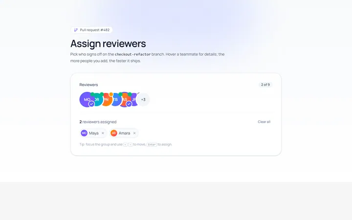
Group Avatar
Originaloverlapping avatar group
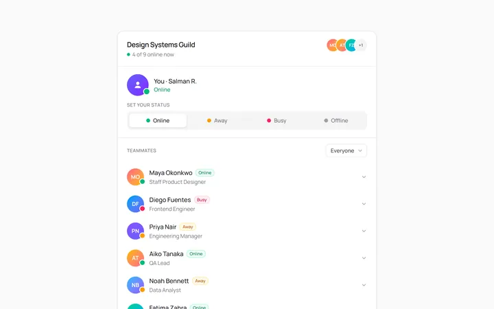
Status Avatar
Originalavatars with online status dot
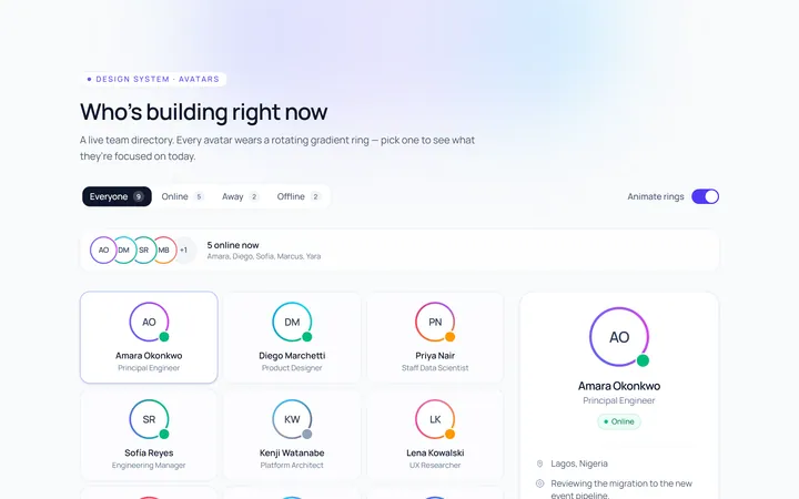
Ring Avatar
Originalavatars with gradient ring
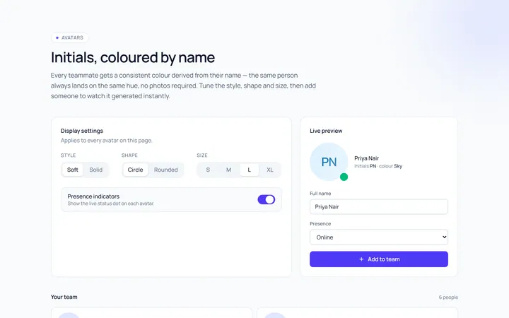
Initials Avatar
Originalinitials avatars with colours
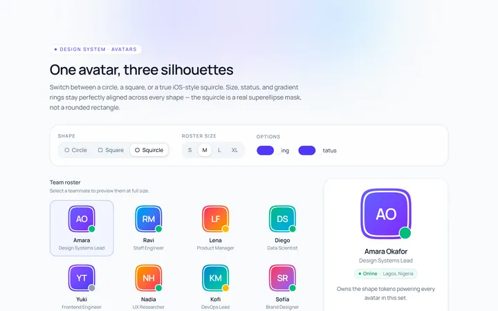
Shapes Avatar
Originalavatars in circle/square/squircle
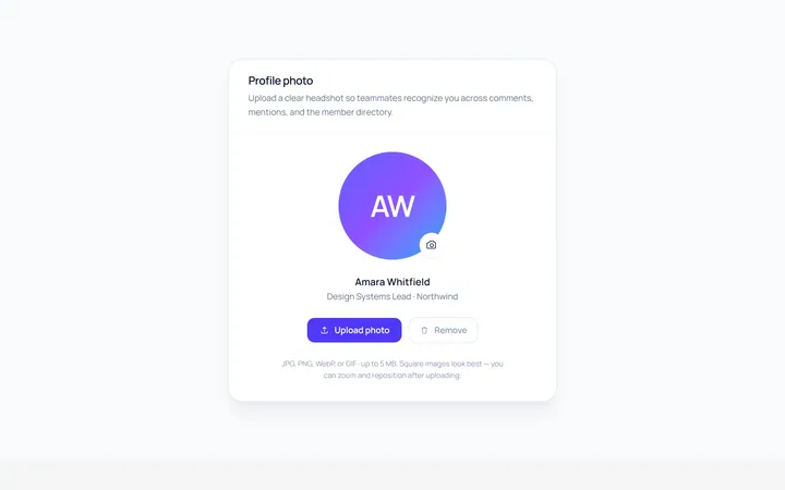
Upload Avatar
Originalavatar with upload/edit overlay
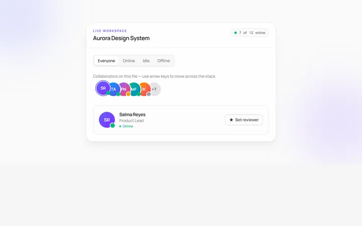
Stacked Count Avatar
Originalavatar stack with +N count
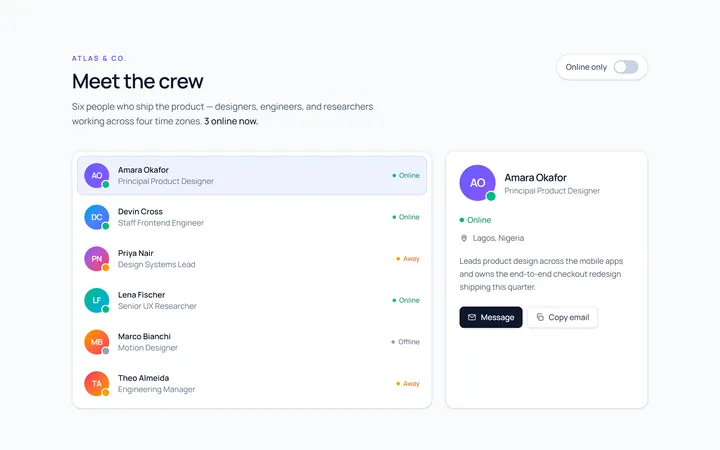
With Name Avatar
Originalavatar with name and role
Squircle Avatar
Originalsquircle avatars with badge

Spotlight Hero
OriginalA centred hero with a soft radial spotlight, badge and dual call-to-action.

Split Hero
OriginalA two-column hero pairing a headline and CTAs with a product mock and social proof.

Gradient Spotlight Hero
OriginalA minimal centred hero with a soft gradient-mesh backdrop, announcement pill and dual call-to-action buttons.