

Status Avatar
Original · freeavatars with online status dot
Copy prompt gives Claude Code, Cursor or v0 a ready-to-paste prompt that recreates this exact component.
npx shadcn@latest add https://webinnoventix.com/r/av-status.json"use client";
import { useId, useRef, useState } from "react";
import type { KeyboardEvent, ReactNode } from "react";
import { AnimatePresence, motion, useReducedMotion } from "motion/react";
type Status = "online" | "away" | "busy" | "offline";
type Filter = Status | "all";
type StatusMeta = {
label: string;
dot: string;
text: string;
chip: string;
};
const STATUS: Record<Status, StatusMeta> = {
online: {
label: "Online",
dot: "bg-emerald-500",
text: "text-emerald-600 dark:text-emerald-400",
chip: "bg-emerald-50 text-emerald-700 ring-emerald-200 dark:bg-emerald-500/10 dark:text-emerald-300 dark:ring-emerald-500/30",
},
away: {
label: "Away",
dot: "bg-amber-500",
text: "text-amber-600 dark:text-amber-400",
chip: "bg-amber-50 text-amber-700 ring-amber-200 dark:bg-amber-500/10 dark:text-amber-300 dark:ring-amber-500/30",
},
busy: {
label: "Busy",
dot: "bg-rose-500",
text: "text-rose-600 dark:text-rose-400",
chip: "bg-rose-50 text-rose-700 ring-rose-200 dark:bg-rose-500/10 dark:text-rose-300 dark:ring-rose-500/30",
},
offline: {
label: "Offline",
dot: "bg-zinc-400 dark:bg-zinc-500",
text: "text-zinc-500 dark:text-zinc-400",
chip: "bg-zinc-100 text-zinc-600 ring-zinc-200 dark:bg-zinc-800 dark:text-zinc-400 dark:ring-zinc-700",
},
};
const STATUS_ORDER: Status[] = ["online", "away", "busy", "offline"];
type Teammate = {
id: string;
name: string;
role: string;
initials: string;
gradient: string;
status: Status;
note: string;
localTime: string;
};
const TEAM: Teammate[] = [
{
id: "maya",
name: "Maya Okonkwo",
role: "Staff Product Designer",
initials: "MO",
gradient: "from-rose-400 to-amber-400",
status: "online",
note: "Active now — reviewing the checkout redesign.",
localTime: "9:42 AM · Lagos",
},
{
id: "diego",
name: "Diego Fuentes",
role: "Frontend Engineer",
initials: "DF",
gradient: "from-sky-500 to-indigo-500",
status: "busy",
note: "In a call until 3:30 PM. Ping for anything urgent.",
localTime: "1:42 PM · Madrid",
},
{
id: "priya",
name: "Priya Nair",
role: "Engineering Manager",
initials: "PN",
gradient: "from-violet-500 to-indigo-500",
status: "away",
note: "Back in about 20 minutes.",
localTime: "6:12 PM · Bengaluru",
},
{
id: "aiko",
name: "Aiko Tanaka",
role: "QA Lead",
initials: "AT",
gradient: "from-amber-400 to-rose-400",
status: "online",
note: "Active now — running the release regression suite.",
localTime: "9:42 PM · Tokyo",
},
{
id: "noah",
name: "Noah Bennett",
role: "Data Analyst",
initials: "NB",
gradient: "from-sky-400 to-violet-500",
status: "away",
note: "Out for lunch, replies after 1.",
localTime: "11:42 AM · Austin",
},
{
id: "fatima",
name: "Fatima Zahra",
role: "Product Manager",
initials: "FZ",
gradient: "from-emerald-400 to-sky-500",
status: "online",
note: "Active now — drafting the Q3 roadmap.",
localTime: "1:42 PM · Casablanca",
},
{
id: "tomas",
name: "Tomas Berg",
role: "Backend Engineer",
initials: "TB",
gradient: "from-emerald-500 to-sky-500",
status: "offline",
note: "Last seen 2 hours ago.",
localTime: "1:42 PM · Stockholm",
},
{
id: "liam",
name: "Liam Walsh",
role: "DevOps Engineer",
initials: "LW",
gradient: "from-slate-500 to-zinc-600",
status: "offline",
note: "Last seen yesterday at 6:14 PM.",
localTime: "12:42 PM · Dublin",
},
];
const FILTERS: { value: Filter; label: string }[] = [
{ value: "all", label: "Everyone" },
{ value: "online", label: "Online" },
{ value: "away", label: "Away" },
{ value: "busy", label: "Busy" },
{ value: "offline", label: "Offline" },
];
function UserGlyph() {
return (
<svg viewBox="0 0 24 24" className="h-6 w-6" fill="currentColor" aria-hidden="true">
<path d="M12 12a4.25 4.25 0 1 0 0-8.5 4.25 4.25 0 0 0 0 8.5Z" />
<path d="M4.5 19.2c0-3.14 3.36-5.2 7.5-5.2s7.5 2.06 7.5 5.2a1 1 0 0 1-1 .95H5.5a1 1 0 0 1-1-.95Z" />
</svg>
);
}
function ChevronGlyph({ open }: { open: boolean }) {
return (
<svg
viewBox="0 0 24 24"
className={`h-4 w-4 transition-transform duration-200 motion-reduce:transition-none ${open ? "rotate-180" : ""}`}
fill="none"
stroke="currentColor"
strokeWidth={2}
strokeLinecap="round"
strokeLinejoin="round"
aria-hidden="true"
>
<path d="m6 9 6 6 6-6" />
</svg>
);
}
function StatusDot({
status,
reduce,
size = "sm",
}: {
status: Status;
reduce: boolean;
size?: "sm" | "md";
}) {
const dim = size === "md" ? "h-3.5 w-3.5" : "h-3 w-3";
const bg = STATUS[status].dot;
return (
<span className={`relative inline-flex ${dim}`}>
{status === "online" && !reduce ? (
<span
className={`avst-anim absolute inset-0 rounded-full ${bg} opacity-60 animate-[avst-ping_1.9s_cubic-bezier(0,0,0.2,1)_infinite]`}
/>
) : null}
<span
className={`relative inline-flex ${dim} rounded-full ${bg} ring-2 ring-white dark:ring-zinc-900`}
/>
</span>
);
}
function StatusAvatar({
gradient,
status,
reduce,
size = "md",
children,
}: {
gradient: string;
status: Status;
reduce: boolean;
size?: "md" | "lg";
children: ReactNode;
}) {
const box = size === "lg" ? "h-14 w-14 text-lg" : "h-11 w-11 text-sm";
return (
<span className="relative inline-flex shrink-0">
<span
className={`inline-flex ${box} select-none items-center justify-center rounded-full bg-gradient-to-br ${gradient} font-semibold tracking-wide text-white shadow-sm`}
>
{children}
</span>
<span className="absolute -bottom-0.5 -right-0.5">
<StatusDot status={status} reduce={reduce} size={size === "lg" ? "md" : "sm"} />
</span>
</span>
);
}
export default function AvStatus() {
const reduce = useReducedMotion() ?? false;
const uid = useId();
const [myStatus, setMyStatus] = useState<Status>("online");
const [filter, setFilter] = useState<Filter>("all");
const [openId, setOpenId] = useState<string | null>(null);
const radioRefs = useRef<Record<Status, HTMLButtonElement | null>>({
online: null,
away: null,
busy: null,
offline: null,
});
const onlineCount =
TEAM.filter((m) => m.status === "online").length + (myStatus === "online" ? 1 : 0);
const visible = filter === "all" ? TEAM : TEAM.filter((m) => m.status === filter);
const stack = TEAM.filter((m) => m.status === "online").slice(0, 4);
const stackExtra = Math.max(0, onlineCount - stack.length);
function handleRadioKey(e: KeyboardEvent<HTMLButtonElement>, current: Status) {
const i = STATUS_ORDER.indexOf(current);
let ni = i;
if (e.key === "ArrowRight" || e.key === "ArrowDown") ni = (i + 1) % STATUS_ORDER.length;
else if (e.key === "ArrowLeft" || e.key === "ArrowUp")
ni = (i - 1 + STATUS_ORDER.length) % STATUS_ORDER.length;
else if (e.key === "Home") ni = 0;
else if (e.key === "End") ni = STATUS_ORDER.length - 1;
else return;
e.preventDefault();
const next = STATUS_ORDER[ni];
setMyStatus(next);
radioRefs.current[next]?.focus();
}
const focusRing =
"focus-visible:outline-none focus-visible:ring-2 focus-visible:ring-indigo-500 focus-visible:ring-offset-2 focus-visible:ring-offset-white dark:focus-visible:ring-offset-zinc-900";
return (
<section
aria-label="Team presence"
className="relative w-full bg-zinc-50 px-4 py-16 text-zinc-900 sm:py-20 dark:bg-zinc-950 dark:text-zinc-100"
>
<style>{`
@keyframes avst-ping {
0% { transform: scale(1); opacity: 0.55; }
70%, 100% { transform: scale(2.3); opacity: 0; }
}
@media (prefers-reduced-motion: reduce) {
.avst-anim { animation: none !important; }
}
`}</style>
<motion.div
initial={reduce ? false : { opacity: 0, y: 14 }}
whileInView={{ opacity: 1, y: 0 }}
viewport={{ once: true, amount: 0.3 }}
transition={{ duration: reduce ? 0 : 0.45, ease: [0.22, 1, 0.36, 1] }}
className="mx-auto w-full max-w-2xl overflow-hidden rounded-2xl border border-zinc-200 bg-white shadow-sm dark:border-zinc-800 dark:bg-zinc-900"
>
{/* Header */}
<div className="flex flex-wrap items-start justify-between gap-4 border-b border-zinc-200 px-6 py-5 dark:border-zinc-800">
<div>
<h2 className="text-lg font-semibold tracking-tight">Design Systems Guild</h2>
<p className="mt-0.5 flex items-center gap-1.5 text-sm text-zinc-500 dark:text-zinc-400">
<span className="inline-flex h-2 w-2 rounded-full bg-emerald-500" aria-hidden="true" />
<span aria-live="polite">
{onlineCount} of {TEAM.length + 1} online now
</span>
</p>
</div>
<div className="flex items-center -space-x-2" aria-hidden="true">
{stack.map((m) => (
<span
key={m.id}
className={`inline-flex h-8 w-8 items-center justify-center rounded-full bg-gradient-to-br ${m.gradient} text-[11px] font-semibold text-white ring-2 ring-white dark:ring-zinc-900`}
>
{m.initials}
</span>
))}
{stackExtra > 0 ? (
<span className="inline-flex h-8 w-8 items-center justify-center rounded-full bg-zinc-100 text-[11px] font-semibold text-zinc-600 ring-2 ring-white dark:bg-zinc-800 dark:text-zinc-300 dark:ring-zinc-900">
+{stackExtra}
</span>
) : null}
</div>
</div>
{/* Your status */}
<div className="border-b border-zinc-200 px-6 py-5 dark:border-zinc-800">
<div className="flex items-center gap-3.5">
<StatusAvatar gradient="from-indigo-500 to-violet-600" status={myStatus} reduce={reduce} size="lg">
<UserGlyph />
</StatusAvatar>
<div className="min-w-0">
<p className="truncate font-medium">You · Salman R.</p>
<p className={`text-sm font-medium ${STATUS[myStatus].text}`}>
{STATUS[myStatus].label}
</p>
</div>
</div>
<p className="sr-only" aria-live="polite">
Your status is set to {STATUS[myStatus].label}.
</p>
<div className="mt-4">
<p className="mb-2 text-xs font-medium uppercase tracking-wider text-zinc-500 dark:text-zinc-400">
Set your status
</p>
<div
role="radiogroup"
aria-label="Set your status"
className="grid grid-cols-2 gap-1.5 rounded-xl bg-zinc-100 p-1.5 sm:grid-cols-4 dark:bg-zinc-800/70"
>
{STATUS_ORDER.map((s) => {
const active = myStatus === s;
return (
<button
key={s}
ref={(el) => {
radioRefs.current[s] = el;
}}
type="button"
role="radio"
aria-checked={active}
tabIndex={active ? 0 : -1}
onClick={() => setMyStatus(s)}
onKeyDown={(e) => handleRadioKey(e, s)}
className={`flex items-center justify-center gap-2 rounded-lg px-3 py-2 text-sm font-medium transition-colors motion-reduce:transition-none ${focusRing} ${
active
? "bg-white text-zinc-900 shadow-sm dark:bg-zinc-950 dark:text-zinc-100"
: "text-zinc-500 hover:text-zinc-800 dark:text-zinc-400 dark:hover:text-zinc-200"
}`}
>
<span
className={`inline-flex h-2.5 w-2.5 rounded-full ${STATUS[s].dot}`}
aria-hidden="true"
/>
{STATUS[s].label}
</button>
);
})}
</div>
</div>
</div>
{/* Filter */}
<div className="flex flex-wrap items-center justify-between gap-3 px-6 py-4">
<p className="text-xs font-medium uppercase tracking-wider text-zinc-500 dark:text-zinc-400">
Teammates
</p>
<div className="flex items-center gap-2">
<label htmlFor={`${uid}-filter`} className="sr-only">
Filter teammates by status
</label>
<div className="relative">
<select
id={`${uid}-filter`}
value={filter}
onChange={(e) => setFilter(e.target.value as Filter)}
className={`appearance-none rounded-lg border border-zinc-200 bg-white py-1.5 pl-3 pr-8 text-sm font-medium text-zinc-700 hover:border-zinc-300 dark:border-zinc-700 dark:bg-zinc-800 dark:text-zinc-200 dark:hover:border-zinc-600 ${focusRing}`}
>
{FILTERS.map((f) => (
<option key={f.value} value={f.value}>
{f.label}
</option>
))}
</select>
<svg
viewBox="0 0 24 24"
className="pointer-events-none absolute right-2.5 top-1/2 h-4 w-4 -translate-y-1/2 text-zinc-400"
fill="none"
stroke="currentColor"
strokeWidth={2}
strokeLinecap="round"
strokeLinejoin="round"
aria-hidden="true"
>
<path d="m6 9 6 6 6-6" />
</svg>
</div>
</div>
</div>
{/* Roster */}
<ul className="px-2 pb-3">
{visible.map((m) => {
const open = openId === m.id;
const panelId = `${uid}-panel-${m.id}`;
return (
<li key={m.id}>
<button
type="button"
aria-expanded={open}
aria-controls={panelId}
onClick={() => setOpenId(open ? null : m.id)}
className={`flex w-full items-center gap-3.5 rounded-xl px-4 py-3 text-left transition-colors hover:bg-zinc-50 motion-reduce:transition-none dark:hover:bg-zinc-800/60 ${focusRing}`}
>
<StatusAvatar gradient={m.gradient} status={m.status} reduce={reduce}>
{m.initials}
</StatusAvatar>
<span className="min-w-0 flex-1">
<span className="flex items-center gap-2">
<span className="truncate font-medium text-zinc-900 dark:text-zinc-100">
{m.name}
</span>
<span
className={`hidden shrink-0 rounded-full px-2 py-0.5 text-[11px] font-medium ring-1 ring-inset sm:inline ${STATUS[m.status].chip}`}
>
{STATUS[m.status].label}
</span>
</span>
<span className="mt-0.5 block truncate text-sm text-zinc-500 dark:text-zinc-400">
{m.role}
</span>
</span>
<span className="shrink-0 text-zinc-400 dark:text-zinc-500">
<ChevronGlyph open={open} />
</span>
</button>
<AnimatePresence initial={false}>
{open ? (
<motion.div
id={panelId}
role="region"
aria-label={`${m.name} details`}
initial={reduce ? { opacity: 1 } : { height: 0, opacity: 0 }}
animate={reduce ? { opacity: 1 } : { height: "auto", opacity: 1 }}
exit={reduce ? { opacity: 0 } : { height: 0, opacity: 0 }}
transition={{ duration: reduce ? 0 : 0.25, ease: [0.22, 1, 0.36, 1] }}
className="overflow-hidden"
>
<div className="mx-4 mb-2 rounded-xl border border-zinc-200 bg-zinc-50 px-4 py-3.5 dark:border-zinc-800 dark:bg-zinc-800/40">
<p className={`text-sm font-medium ${STATUS[m.status].text}`}>{m.note}</p>
<p className="mt-1 flex items-center gap-1.5 text-xs text-zinc-500 dark:text-zinc-400">
<svg
viewBox="0 0 24 24"
className="h-3.5 w-3.5"
fill="none"
stroke="currentColor"
strokeWidth={2}
strokeLinecap="round"
strokeLinejoin="round"
aria-hidden="true"
>
<circle cx="12" cy="12" r="9" />
<path d="M12 7v5l3 2" />
</svg>
{m.localTime}
</p>
<div className="mt-3 flex flex-wrap gap-2">
<button
type="button"
className={`inline-flex items-center gap-1.5 rounded-lg bg-indigo-600 px-3 py-1.5 text-sm font-medium text-white hover:bg-indigo-500 dark:bg-indigo-500 dark:hover:bg-indigo-400 ${focusRing}`}
>
<svg
viewBox="0 0 24 24"
className="h-4 w-4"
fill="none"
stroke="currentColor"
strokeWidth={2}
strokeLinecap="round"
strokeLinejoin="round"
aria-hidden="true"
>
<path d="M21 15a2 2 0 0 1-2 2H8l-4 4V5a2 2 0 0 1 2-2h13a2 2 0 0 1 2 2Z" />
</svg>
Message
</button>
<button
type="button"
className={`inline-flex items-center gap-1.5 rounded-lg border border-zinc-300 bg-white px-3 py-1.5 text-sm font-medium text-zinc-700 hover:bg-zinc-100 dark:border-zinc-700 dark:bg-zinc-900 dark:text-zinc-200 dark:hover:bg-zinc-800 ${focusRing}`}
>
View profile
</button>
</div>
</div>
</motion.div>
) : null}
</AnimatePresence>
</li>
);
})}
{visible.length === 0 ? (
<li className="px-4 py-10 text-center text-sm text-zinc-500 dark:text-zinc-400">
No teammates are currently {filter === "all" ? "listed" : STATUS[filter as Status].label.toLowerCase()}.
</li>
) : null}
</ul>
</motion.div>
</section>
);
}Dependencies
Licence
Built by Web Innoventix. Free for personal and commercial use, no attribution required.
Built by Web Innoventix
Need a custom interface, a full website, or SEO that gets you cited by AI? We design, build and rank it end to end.
Get a free quoteSimilar components
Browse all →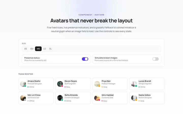
Basic Avatar
Originalavatars in sizes with fallback
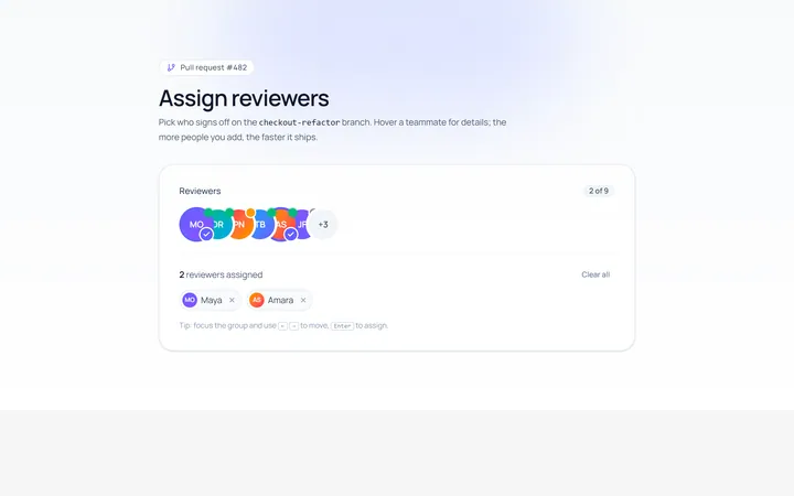
Group Avatar
Originaloverlapping avatar group
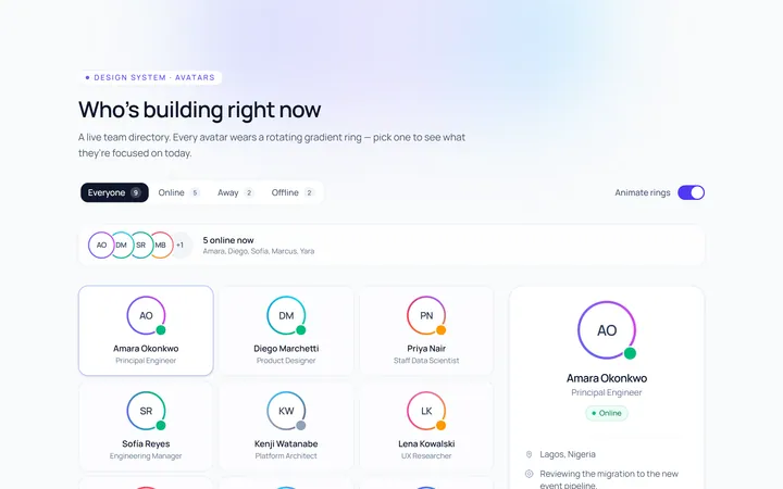
Ring Avatar
Originalavatars with gradient ring
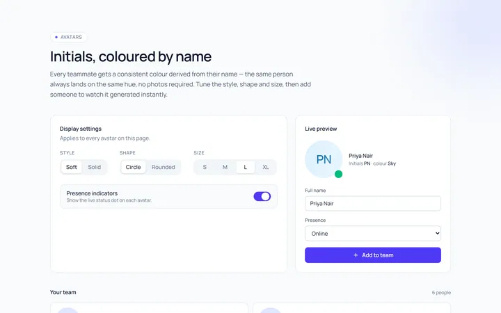
Initials Avatar
Originalinitials avatars with colours
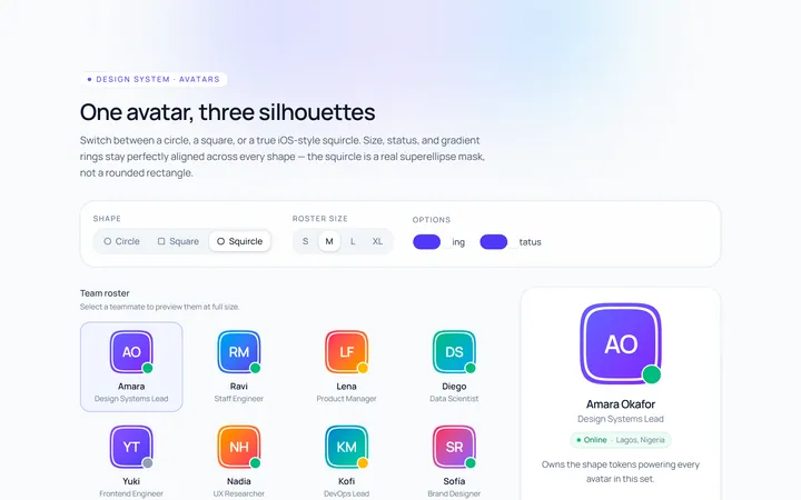
Shapes Avatar
Originalavatars in circle/square/squircle
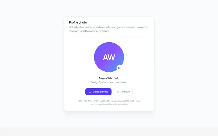
Upload Avatar
Originalavatar with upload/edit overlay
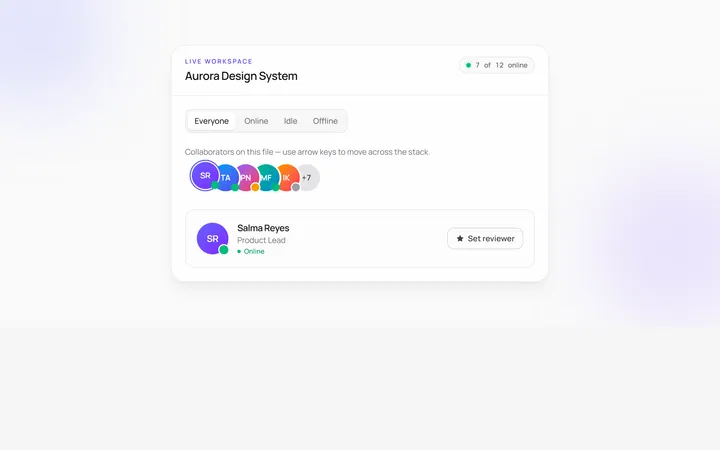
Stacked Count Avatar
Originalavatar stack with +N count
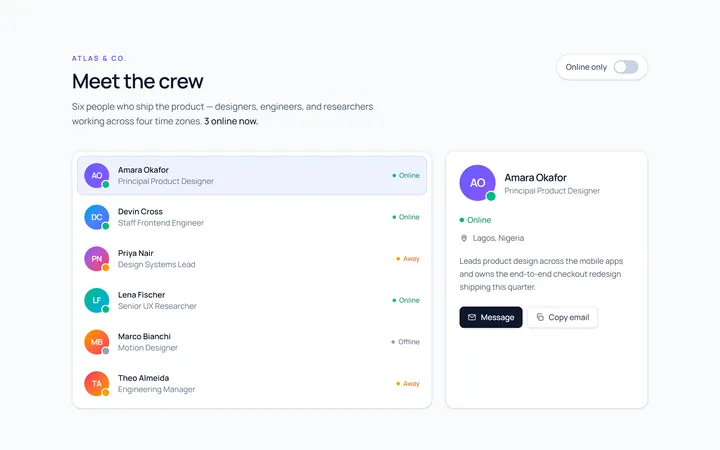
With Name Avatar
Originalavatar with name and role
Squircle Avatar
Originalsquircle avatars with badge

Spotlight Hero
OriginalA centred hero with a soft radial spotlight, badge and dual call-to-action.

Split Hero
OriginalA two-column hero pairing a headline and CTAs with a product mock and social proof.

Gradient Spotlight Hero
OriginalA minimal centred hero with a soft gradient-mesh backdrop, announcement pill and dual call-to-action buttons.