

Shapes Avatar
Original · freeavatars in circle/square/squircle
Copy prompt gives Claude Code, Cursor or v0 a ready-to-paste prompt that recreates this exact component.
npx shadcn@latest add https://webinnoventix.com/r/av-shapes.json"use client";
import { useId, useRef, useState } from "react";
import type { CSSProperties, KeyboardEvent, ReactNode } from "react";
import { motion, useReducedMotion } from "motion/react";
type Shape = "circle" | "square" | "squircle";
type Size = "sm" | "md" | "lg" | "xl";
type Status = "online" | "away" | "offline";
type Member = {
id: string;
name: string;
role: string;
status: Status;
location: string;
blurb: string;
gradient: string;
};
const MEMBERS: Member[] = [
{
id: "amara",
name: "Amara Okafor",
role: "Design Systems Lead",
status: "online",
location: "Lagos, Nigeria",
blurb: "Owns the shape tokens powering every avatar in this set.",
gradient: "from-indigo-500 to-violet-600",
},
{
id: "ravi",
name: "Ravi Menon",
role: "Staff Engineer",
status: "online",
location: "Bengaluru, India",
blurb: "Ships the superellipse mask so squircles render pixel-crisp.",
gradient: "from-sky-500 to-indigo-600",
},
{
id: "lena",
name: "Lena Fischer",
role: "Product Manager",
status: "away",
location: "Berlin, Germany",
blurb: "Back from a design review around half past two.",
gradient: "from-rose-500 to-amber-500",
},
{
id: "diego",
name: "Diego Salvatierra",
role: "Data Scientist",
status: "online",
location: "Mexico City, Mexico",
blurb: "Measuring how shape choice nudges profile click-through.",
gradient: "from-emerald-500 to-sky-500",
},
{
id: "yuki",
name: "Yuki Tanaka",
role: "Frontend Engineer",
status: "offline",
location: "Osaka, Japan",
blurb: "Offline until Monday — cutting the next component release.",
gradient: "from-violet-500 to-indigo-600",
},
{
id: "nadia",
name: "Nadia Haddad",
role: "UX Researcher",
status: "online",
location: "Amman, Jordan",
blurb: "Running the study on square versus round recognition.",
gradient: "from-amber-500 to-rose-500",
},
{
id: "kofi",
name: "Kofi Mensah",
role: "DevOps Lead",
status: "away",
location: "Accra, Ghana",
blurb: "Heads-down on the zero-downtime deploy pipeline.",
gradient: "from-sky-600 to-emerald-400",
},
{
id: "sofia",
name: "Sofía Rossi",
role: "Brand Designer",
status: "online",
location: "Milan, Italy",
blurb: "Tuning the gradient ramps across the whole avatar palette.",
gradient: "from-rose-500 to-violet-500",
},
];
const STATUS_META: Record<
Status,
{ label: string; dot: string; chip: string }
> = {
online: {
label: "Online",
dot: "bg-emerald-500",
chip: "bg-emerald-50 text-emerald-700 ring-emerald-600/20 dark:bg-emerald-500/10 dark:text-emerald-300 dark:ring-emerald-400/20",
},
away: {
label: "Away",
dot: "bg-amber-400",
chip: "bg-amber-50 text-amber-700 ring-amber-600/20 dark:bg-amber-500/10 dark:text-amber-300 dark:ring-amber-400/20",
},
offline: {
label: "Offline",
dot: "bg-slate-400 dark:bg-slate-500",
chip: "bg-slate-100 text-slate-600 ring-slate-500/20 dark:bg-slate-500/10 dark:text-slate-400 dark:ring-slate-400/20",
},
};
const SIZE_PX: Record<Size, number> = { sm: 44, md: 60, lg: 76, xl: 96 };
// True superellipse (iOS-style squircle) rendered once as an SVG mask data URI.
const SQUIRCLE_MASK_URL = (() => {
const n = 4.4;
const steps = 80;
const pts: string[] = [];
for (let i = 0; i <= steps; i++) {
const t = (i / steps) * Math.PI * 2;
const c = Math.cos(t);
const s = Math.sin(t);
const x = 50 + 49.5 * Math.sign(c) * Math.pow(Math.abs(c), 2 / n);
const y = 50 + 49.5 * Math.sign(s) * Math.pow(Math.abs(s), 2 / n);
pts.push(`${x.toFixed(2)},${y.toFixed(2)}`);
}
const svg = `<svg xmlns='http://www.w3.org/2000/svg' viewBox='0 0 100 100' preserveAspectRatio='none'><polygon points='${pts.join(
" ",
)}' fill='#000'/></svg>`;
return `url("data:image/svg+xml,${encodeURIComponent(svg)}")`;
})();
function shapeProps(shape: Shape): { className: string; style: CSSProperties } {
if (shape === "circle") return { className: "rounded-full", style: {} };
if (shape === "square") return { className: "rounded-[18%]", style: {} };
return {
className: "rounded-none",
style: {
WebkitMaskImage: SQUIRCLE_MASK_URL,
maskImage: SQUIRCLE_MASK_URL,
WebkitMaskSize: "100% 100%",
maskSize: "100% 100%",
},
};
}
function initialsOf(name: string): string {
const parts = name.trim().split(/\s+/);
const first = parts[0]?.[0] ?? "";
const last = parts.length > 1 ? parts[parts.length - 1][0] : "";
return (first + last).toUpperCase();
}
type RingMode = "none" | "gradient" | "separator";
function StatusDot({
status,
shape,
size,
}: {
status: Status;
shape: Shape;
size: number;
}) {
const d = Math.max(10, Math.round(size * 0.26));
const inset = Math.round((shape === "circle" ? 0.07 : 0.015) * size);
return (
<span
className="absolute z-20"
style={{ right: inset, bottom: inset, width: d, height: d }}
>
{status === "online" && (
<span
aria-hidden="true"
className="avsh-ping absolute inset-0 rounded-full bg-emerald-500/70"
/>
)}
<span
aria-hidden="true"
className={`absolute inset-0 rounded-full ring-2 ring-white dark:ring-slate-950 ${STATUS_META[status].dot}`}
/>
</span>
);
}
function Avatar({
member,
shape,
size,
ring,
showStatus,
}: {
member: Member;
shape: Shape;
size: number;
ring: RingMode;
showStatus: boolean;
}) {
const { className: sc, style: ss } = shapeProps(shape);
const face: ReactNode = (
<span
className={`inline-grid place-items-center bg-gradient-to-br ${member.gradient} font-semibold tracking-tight text-white ${sc}`}
style={{ width: size, height: size, fontSize: Math.round(size * 0.36), ...ss }}
>
<span aria-hidden="true">{initialsOf(member.name)}</span>
</span>
);
let body: ReactNode = face;
if (ring === "separator") {
const pad = Math.max(2, Math.round(size * 0.05));
body = (
<span
className={`inline-flex bg-white dark:bg-slate-950 ${sc}`}
style={{ padding: pad, ...ss }}
>
{face}
</span>
);
} else if (ring === "gradient") {
const outer = Math.max(2, Math.round(size * 0.05));
const gap = Math.max(2, Math.round(size * 0.04));
body = (
<span
className={`inline-flex bg-gradient-to-br ${member.gradient} ${sc}`}
style={{ padding: outer, ...ss }}
>
<span
className={`inline-flex bg-white dark:bg-slate-950 ${sc}`}
style={{ padding: gap, ...ss }}
>
{face}
</span>
</span>
);
}
return (
<span className="relative inline-flex">
{body}
{showStatus && (
<StatusDot status={member.status} shape={shape} size={size} />
)}
</span>
);
}
type Opt<T extends string> = { value: T; label: string; icon?: ReactNode };
function Segmented<T extends string>({
label,
value,
options,
onChange,
}: {
label: string;
value: T;
options: Opt<T>[];
onChange: (v: T) => void;
}) {
const labelId = useId();
const pillId = useId();
const reduce = useReducedMotion();
const refs = useRef<Array<HTMLButtonElement | null>>([]);
const idx = options.findIndex((o) => o.value === value);
function onKeyDown(e: KeyboardEvent<HTMLDivElement>) {
let next = -1;
if (e.key === "ArrowRight" || e.key === "ArrowDown")
next = (idx + 1) % options.length;
else if (e.key === "ArrowLeft" || e.key === "ArrowUp")
next = (idx - 1 + options.length) % options.length;
else if (e.key === "Home") next = 0;
else if (e.key === "End") next = options.length - 1;
if (next < 0) return;
e.preventDefault();
onChange(options[next].value);
refs.current[next]?.focus();
}
return (
<div className="flex flex-col gap-2">
<span
id={labelId}
className="text-xs font-medium uppercase tracking-[0.12em] text-slate-500 dark:text-slate-400"
>
{label}
</span>
<div
role="radiogroup"
aria-labelledby={labelId}
onKeyDown={onKeyDown}
className="inline-flex items-center gap-1 rounded-2xl bg-slate-100 p-1 ring-1 ring-slate-900/5 dark:bg-slate-800/70 dark:ring-white/10"
>
{options.map((o, i) => {
const active = o.value === value;
return (
<button
key={o.value}
ref={(el) => {
refs.current[i] = el;
}}
type="button"
role="radio"
aria-checked={active}
tabIndex={active ? 0 : -1}
onClick={() => onChange(o.value)}
className={`relative inline-flex items-center gap-1.5 rounded-xl px-3 py-1.5 text-sm font-medium transition-colors focus:outline-none focus-visible:ring-2 focus-visible:ring-indigo-500 focus-visible:ring-offset-2 focus-visible:ring-offset-slate-100 dark:focus-visible:ring-offset-slate-800 ${
active
? "text-slate-900 dark:text-white"
: "text-slate-500 hover:text-slate-800 dark:text-slate-400 dark:hover:text-slate-100"
}`}
>
{active && (
<motion.span
layoutId={pillId}
className="absolute inset-0 rounded-xl bg-white shadow-sm ring-1 ring-slate-900/5 dark:bg-slate-950 dark:ring-white/10"
transition={
reduce
? { duration: 0 }
: { type: "spring", stiffness: 420, damping: 34 }
}
/>
)}
<span className="relative z-10 inline-flex items-center gap-1.5">
{o.icon}
{o.label}
</span>
</button>
);
})}
</div>
</div>
);
}
function Toggle({
label,
checked,
onChange,
}: {
label: string;
checked: boolean;
onChange: (v: boolean) => void;
}) {
return (
<button
type="button"
role="switch"
aria-checked={checked}
onClick={() => onChange(!checked)}
className="group inline-flex items-center gap-2.5 focus:outline-none"
>
<span
className={`relative h-6 w-11 shrink-0 rounded-full transition-colors group-focus-visible:ring-2 group-focus-visible:ring-indigo-500 group-focus-visible:ring-offset-2 group-focus-visible:ring-offset-white dark:group-focus-visible:ring-offset-slate-900 ${
checked
? "bg-indigo-600 dark:bg-indigo-500"
: "bg-slate-300 dark:bg-slate-700"
}`}
>
<span
className={`absolute top-0.5 h-5 w-5 rounded-full bg-white shadow-sm transition-transform motion-reduce:transition-none ${
checked ? "translate-x-[22px]" : "translate-x-0.5"
}`}
/>
</span>
<span className="text-sm font-medium text-slate-700 dark:text-slate-200">
{label}
</span>
</button>
);
}
function CircleIcon() {
return (
<svg viewBox="0 0 24 24" className="h-3.5 w-3.5" aria-hidden="true">
<circle
cx="12"
cy="12"
r="8.5"
fill="none"
stroke="currentColor"
strokeWidth="2"
/>
</svg>
);
}
function SquareIcon() {
return (
<svg viewBox="0 0 24 24" className="h-3.5 w-3.5" aria-hidden="true">
<rect
x="4"
y="4"
width="16"
height="16"
rx="2.5"
fill="none"
stroke="currentColor"
strokeWidth="2"
/>
</svg>
);
}
function SquircleIcon() {
return (
<svg viewBox="0 0 24 24" className="h-3.5 w-3.5" aria-hidden="true">
<path
d="M12 3.5c5.6 0 8.5 2.9 8.5 8.5s-2.9 8.5-8.5 8.5S3.5 17.6 3.5 12 6.4 3.5 12 3.5Z"
fill="none"
stroke="currentColor"
strokeWidth="2"
strokeLinejoin="round"
/>
</svg>
);
}
function MessageIcon() {
return (
<svg
viewBox="0 0 24 24"
fill="none"
stroke="currentColor"
strokeWidth={1.7}
strokeLinecap="round"
strokeLinejoin="round"
className="h-4 w-4"
aria-hidden="true"
>
<path d="M21 11.5a7.5 7.5 0 0 1-10.7 6.8L4 20l1.7-5.3A7.5 7.5 0 1 1 21 11.5Z" />
</svg>
);
}
function ProfileIcon() {
return (
<svg
viewBox="0 0 24 24"
fill="none"
stroke="currentColor"
strokeWidth={1.7}
strokeLinecap="round"
strokeLinejoin="round"
className="h-4 w-4"
aria-hidden="true"
>
<circle cx="12" cy="8" r="3.6" />
<path d="M4.5 20a7.5 7.5 0 0 1 15 0" />
</svg>
);
}
export default function AvShapes() {
const reduce = useReducedMotion();
const [shape, setShape] = useState<Shape>("squircle");
const [size, setSize] = useState<Size>("md");
const [showRing, setShowRing] = useState(true);
const [showStatus, setShowStatus] = useState(true);
const [selectedId, setSelectedId] = useState<string>(MEMBERS[0].id);
const selected = MEMBERS.find((m) => m.id === selectedId) ?? MEMBERS[0];
const rosterPx = SIZE_PX[size];
const shapeOptions: Opt<Shape>[] = [
{ value: "circle", label: "Circle", icon: <CircleIcon /> },
{ value: "square", label: "Square", icon: <SquareIcon /> },
{ value: "squircle", label: "Squircle", icon: <SquircleIcon /> },
];
const sizeOptions: Opt<Size>[] = [
{ value: "sm", label: "S" },
{ value: "md", label: "M" },
{ value: "lg", label: "L" },
{ value: "xl", label: "XL" },
];
const stackVisible = MEMBERS.slice(0, 5);
const stackOverflow = MEMBERS.length - stackVisible.length;
const stackShape = shapeProps(shape);
return (
<section className="relative w-full overflow-hidden bg-slate-50 px-5 py-20 text-slate-900 sm:px-8 sm:py-28 dark:bg-slate-950 dark:text-slate-100">
<style>{`
@keyframes avsh-ping {
0% { transform: scale(1); opacity: .7; }
75%, 100% { transform: scale(2); opacity: 0; }
}
@keyframes avsh-pop {
0% { transform: scale(.9); opacity: 0; }
100% { transform: scale(1); opacity: 1; }
}
.avsh-ping { animation: avsh-ping 1.9s cubic-bezier(0,0,.2,1) infinite; }
@media (prefers-reduced-motion: reduce) {
.avsh-ping { animation: none; }
}
`}</style>
<div
aria-hidden="true"
className="pointer-events-none absolute -top-28 left-1/2 h-72 w-[42rem] max-w-[90%] -translate-x-1/2 rounded-full bg-gradient-to-r from-indigo-300/40 via-violet-300/30 to-sky-300/40 blur-3xl dark:from-indigo-600/20 dark:via-violet-600/15 dark:to-sky-600/20"
/>
<div className="relative mx-auto max-w-5xl">
<div className="max-w-2xl">
<span className="inline-flex items-center gap-2 rounded-full bg-white px-3 py-1 text-xs font-medium uppercase tracking-[0.18em] text-indigo-600 ring-1 ring-slate-900/5 dark:bg-slate-900 dark:text-indigo-300 dark:ring-white/10">
<span className="h-1.5 w-1.5 rounded-full bg-indigo-500" />
Design system · Avatars
</span>
<h2 className="mt-5 text-3xl font-semibold tracking-tight sm:text-4xl">
One avatar, three silhouettes
</h2>
<p className="mt-3 text-base leading-relaxed text-slate-600 dark:text-slate-400">
Switch between a circle, a square, or a true iOS-style squircle. Size,
status, and gradient rings stay perfectly aligned across every shape —
the squircle is a real superellipse mask, not a rounded rectangle.
</p>
</div>
{/* controls */}
<div className="mt-8 rounded-3xl border border-slate-200/70 bg-white/80 p-4 ring-1 ring-slate-900/5 backdrop-blur sm:p-5 dark:border-white/10 dark:bg-white/5 dark:ring-white/5">
<div className="flex flex-wrap items-end gap-x-8 gap-y-5">
<Segmented
label="Shape"
value={shape}
options={shapeOptions}
onChange={setShape}
/>
<Segmented
label="Roster size"
value={size}
options={sizeOptions}
onChange={setSize}
/>
<div className="flex flex-col gap-2">
<span className="text-xs font-medium uppercase tracking-[0.12em] text-slate-500 dark:text-slate-400">
Options
</span>
<div className="flex h-[38px] items-center gap-6">
<Toggle
label="Ring"
checked={showRing}
onChange={setShowRing}
/>
<Toggle
label="Status"
checked={showStatus}
onChange={setShowStatus}
/>
</div>
</div>
</div>
</div>
{/* main */}
<div className="mt-8 grid gap-6 lg:grid-cols-[1fr_20rem]">
{/* roster */}
<div>
<h3 className="text-sm font-semibold text-slate-700 dark:text-slate-200">
Team roster
</h3>
<p className="mt-1 text-xs text-slate-500 dark:text-slate-400">
Select a teammate to preview them at full size.
</p>
<div className="mt-4 grid grid-cols-3 gap-2 sm:grid-cols-4">
{MEMBERS.map((m) => {
const isSelected = m.id === selectedId;
return (
<button
key={m.id}
type="button"
aria-pressed={isSelected}
aria-label={`Select ${m.name}, ${m.role}, ${STATUS_META[m.status].label}`}
onClick={() => setSelectedId(m.id)}
className={`group flex flex-col items-center gap-2.5 rounded-2xl border p-3 text-center transition-colors focus:outline-none focus-visible:ring-2 focus-visible:ring-indigo-500 focus-visible:ring-offset-2 focus-visible:ring-offset-slate-50 dark:focus-visible:ring-offset-slate-950 ${
isSelected
? "border-indigo-300 bg-indigo-50/60 dark:border-indigo-500/40 dark:bg-indigo-500/10"
: "border-transparent hover:border-slate-200 hover:bg-white dark:hover:border-white/10 dark:hover:bg-white/5"
}`}
>
<span className="transition-transform duration-300 group-hover:-translate-y-0.5 motion-reduce:transition-none">
<Avatar
member={m}
shape={shape}
size={rosterPx}
ring={showRing ? "gradient" : "none"}
showStatus={showStatus}
/>
</span>
<span className="min-w-0">
<span className="block truncate text-sm font-semibold">
{m.name.split(" ")[0]}
</span>
<span className="mt-0.5 block truncate text-xs text-slate-500 dark:text-slate-400">
{m.role}
</span>
</span>
</button>
);
})}
</div>
</div>
{/* detail */}
<aside
aria-live="polite"
className="flex flex-col items-center rounded-3xl border border-slate-200/70 bg-white p-6 text-center shadow-sm lg:sticky lg:top-6 dark:border-white/10 dark:bg-slate-900"
>
<motion.div
key={`${selected.id}-${shape}-${showRing}-${showStatus}`}
initial={reduce ? false : { scale: 0.9, opacity: 0 }}
animate={{ scale: 1, opacity: 1 }}
transition={{ duration: 0.32, ease: [0.22, 1, 0.36, 1] }}
>
<Avatar
member={selected}
shape={shape}
size={112}
ring={showRing ? "gradient" : "none"}
showStatus={showStatus}
/>
</motion.div>
<h3 className="mt-4 text-lg font-semibold tracking-tight">
{selected.name}
</h3>
<p className="text-sm text-slate-500 dark:text-slate-400">
{selected.role}
</p>
<span
className={`mt-3 inline-flex items-center gap-1.5 rounded-full px-2.5 py-1 text-xs font-medium ring-1 ${STATUS_META[selected.status].chip}`}
>
<span
className={`h-1.5 w-1.5 rounded-full ${STATUS_META[selected.status].dot}`}
/>
{STATUS_META[selected.status].label}
<span className="text-slate-400 dark:text-slate-500">·</span>
<span className="font-normal text-slate-500 dark:text-slate-400">
{selected.location}
</span>
</span>
<p className="mt-4 text-sm leading-relaxed text-slate-600 dark:text-slate-300">
{selected.blurb}
</p>
<div className="mt-6 flex w-full items-center gap-2 border-t border-slate-100 pt-5 dark:border-white/5">
<button
type="button"
className="inline-flex flex-1 items-center justify-center gap-2 rounded-xl bg-slate-900 px-3 py-2 text-sm font-medium text-white transition-colors hover:bg-slate-700 focus:outline-none focus-visible:ring-2 focus-visible:ring-indigo-500 focus-visible:ring-offset-2 focus-visible:ring-offset-white dark:bg-white dark:text-slate-900 dark:hover:bg-slate-200 dark:focus-visible:ring-offset-slate-900"
>
<MessageIcon />
Message
</button>
<button
type="button"
aria-label={`View ${selected.name}'s profile`}
className="inline-flex items-center justify-center gap-2 rounded-xl border border-slate-200 px-3 py-2 text-sm font-medium text-slate-700 transition-colors hover:bg-slate-100 focus:outline-none focus-visible:ring-2 focus-visible:ring-indigo-500 focus-visible:ring-offset-2 focus-visible:ring-offset-white dark:border-white/15 dark:text-slate-200 dark:hover:bg-white/5 dark:focus-visible:ring-offset-slate-900"
>
<ProfileIcon />
Profile
</button>
</div>
</aside>
</div>
{/* stack */}
<div className="mt-6 flex flex-wrap items-center gap-x-5 gap-y-3 rounded-3xl border border-slate-200/70 bg-white/70 px-5 py-4 ring-1 ring-slate-900/5 backdrop-blur dark:border-white/10 dark:bg-white/5 dark:ring-white/5">
<div className="flex items-center">
{stackVisible.map((m, i) => (
<span
key={m.id}
style={{ marginLeft: i === 0 ? 0 : -18, zIndex: stackVisible.length - i }}
className="relative transition-transform duration-200 hover:z-40 hover:-translate-y-1 motion-reduce:transition-none"
>
<Avatar
member={m}
shape={shape}
size={52}
ring="separator"
showStatus={false}
/>
</span>
))}
{stackOverflow > 0 && (
<span
style={{ marginLeft: -18, zIndex: 0 }}
className="relative inline-flex"
>
<span
className={`inline-flex bg-white dark:bg-slate-950 ${stackShape.className}`}
style={{ padding: 3, ...stackShape.style }}
>
<span
className={`inline-grid place-items-center bg-slate-200 text-sm font-semibold text-slate-600 dark:bg-slate-800 dark:text-slate-300 ${stackShape.className}`}
style={{ width: 52, height: 52, ...stackShape.style }}
>
+{stackOverflow}
</span>
</span>
</span>
)}
</div>
<div className="min-w-0">
<p className="text-sm font-semibold">Overlapping stack</p>
<p className="text-xs text-slate-500 dark:text-slate-400">
The same shape token drives grouped avatars, separator rings, and the
overflow chip.
</p>
</div>
</div>
</div>
</section>
);
}Dependencies
Licence
Built by Web Innoventix. Free for personal and commercial use, no attribution required.
Built by Web Innoventix
Need a custom interface, a full website, or SEO that gets you cited by AI? We design, build and rank it end to end.
Get a free quoteSimilar components
Browse all →
Basic Avatar
Originalavatars in sizes with fallback
Group Avatar
Originaloverlapping avatar group
Status Avatar
Originalavatars with online status dot
Ring Avatar
Originalavatars with gradient ring
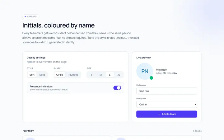
Initials Avatar
Originalinitials avatars with colours
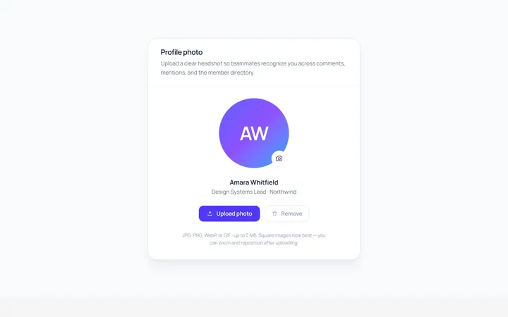
Upload Avatar
Originalavatar with upload/edit overlay
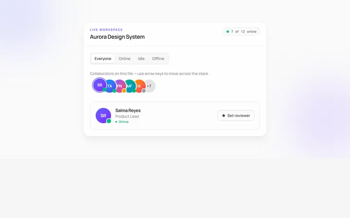
Stacked Count Avatar
Originalavatar stack with +N count
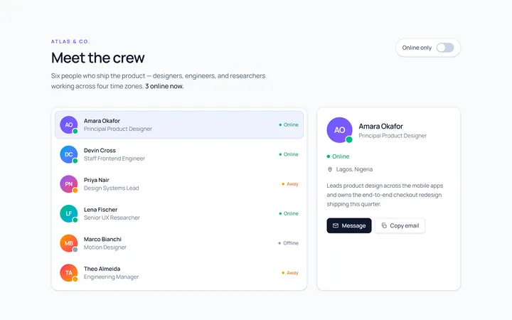
With Name Avatar
Originalavatar with name and role
Squircle Avatar
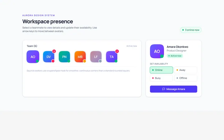
Originalsquircle avatars with badge

Spotlight Hero
OriginalA centred hero with a soft radial spotlight, badge and dual call-to-action.

Split Hero
OriginalA two-column hero pairing a headline and CTAs with a product mock and social proof.

Gradient Spotlight Hero
OriginalA minimal centred hero with a soft gradient-mesh backdrop, announcement pill and dual call-to-action buttons.