

Conic Gradient Flow
Original · freeA frosted hero backed by twin counter-rotating conic gradients, with flowing gradient text and an animated gradient-border stat card.
Copy prompt gives Claude Code, Cursor or v0 a ready-to-paste prompt that recreates this exact component.
npx shadcn@latest add https://webinnoventix.com/r/bg-conic-flow.json"use client";
import { motion, useReducedMotion, type Variants } from "motion/react";
const container: Variants = {
hidden: {},
show: { transition: { staggerChildren: 0.12, delayChildren: 0.1 } },
};
const item: Variants = {
hidden: { opacity: 0, y: 22 },
show: {
opacity: 1,
y: 0,
transition: { duration: 0.65, ease: [0.16, 1, 0.3, 1] },
},
};
export default function BgConicFlow() {
const reduce = useReducedMotion();
const flow = reduce ? undefined : "bcf-flow 8s linear infinite";
return (
<section className="relative isolate flex min-h-[640px] w-full items-center justify-center overflow-hidden bg-white px-6 py-24 dark:bg-slate-950">
<style>{`
@keyframes bcf-flow { to { background-position: 200% center; } }
@media (prefers-reduced-motion: reduce) { .bcf-anim { animation: none !important; } }
`}</style>
{/* rotating conic mesh */}
<div
aria-hidden="true"
className="pointer-events-none absolute inset-0 -z-10 overflow-hidden"
>
<motion.div
animate={reduce ? undefined : { rotate: 360 }}
transition={{ duration: 26, repeat: Infinity, ease: "linear" }}
className="absolute left-1/2 top-1/2 h-[135vmax] w-[135vmax] -translate-x-1/2 -translate-y-1/2 opacity-45 blur-[70px] dark:opacity-40"
style={{
backgroundImage:
"conic-gradient(from 0deg, #6366f1, #ec4899, #f59e0b, #22d3ee, #6366f1)",
}}
/>
<motion.div
animate={reduce ? undefined : { rotate: -360 }}
transition={{ duration: 34, repeat: Infinity, ease: "linear" }}
className="absolute left-1/2 top-1/2 h-[80vmax] w-[80vmax] -translate-x-1/2 -translate-y-1/2 opacity-40 blur-[90px] mix-blend-multiply dark:mix-blend-screen"
style={{
backgroundImage:
"conic-gradient(from 180deg, #22d3ee, #6366f1, #ec4899, #22d3ee)",
}}
/>
{/* frost overlay so foreground stays legible */}
<div className="absolute inset-0 bg-white/60 backdrop-blur-xl dark:bg-slate-950/60" />
</div>
<motion.div
variants={container}
initial="hidden"
whileInView="show"
viewport={{ once: true, amount: 0.35 }}
className="relative mx-auto max-w-2xl text-center"
>
<motion.span
variants={item}
className="inline-flex items-center gap-2 rounded-full border border-slate-200/70 bg-white/70 px-4 py-1.5 text-sm font-medium text-slate-600 shadow-sm backdrop-blur dark:border-white/10 dark:bg-white/5 dark:text-slate-300"
>
<span className="h-2 w-2 rounded-full bg-gradient-to-r from-indigo-500 to-pink-500" />
Colour in motion
</motion.span>
<motion.h1
variants={item}
className="mt-6 text-4xl font-semibold tracking-tight text-slate-900 sm:text-6xl dark:text-white"
>
A backdrop that{" "}
<span
className="bcf-anim bg-clip-text text-transparent"
style={{
backgroundImage:
"linear-gradient(110deg,#6366f1,#ec4899,#f59e0b,#22d3ee,#6366f1)",
backgroundSize: "200% auto",
animation: flow,
}}
>
breathes colour
</span>
</motion.h1>
<motion.p
variants={item}
className="mx-auto mt-5 max-w-xl text-base leading-relaxed text-slate-600 sm:text-lg dark:text-slate-400"
>
Twin conic gradients rotate in opposite directions behind a frosted
pane, so the light shifts forever while your copy stays perfectly
readable.
</motion.p>
{/* animated gradient border card */}
<motion.div
variants={item}
className="relative mx-auto mt-10 w-full max-w-sm overflow-hidden rounded-2xl p-px"
>
<motion.div
aria-hidden="true"
animate={reduce ? undefined : { rotate: 360 }}
transition={{ duration: 6, repeat: Infinity, ease: "linear" }}
className="absolute left-1/2 top-1/2 h-[200%] w-[200%] -translate-x-1/2 -translate-y-1/2"
style={{
backgroundImage:
"conic-gradient(from 0deg, transparent 0 62%, #6366f1 75%, #ec4899 84%, #f59e0b 90%, transparent 100%)",
}}
/>
<div className="relative flex items-center justify-between gap-4 rounded-[15px] bg-white px-6 py-5 text-left dark:bg-slate-900">
<div>
<p className="text-2xl font-semibold text-slate-900 dark:text-white">
99.98%
</p>
<p className="text-sm text-slate-500 dark:text-slate-400">
Uptime this quarter
</p>
</div>
<div className="flex h-11 w-11 items-center justify-center rounded-full bg-gradient-to-br from-indigo-500 to-pink-500 text-white shadow-lg">
<svg
viewBox="0 0 24 24"
fill="none"
stroke="currentColor"
strokeWidth={2}
strokeLinecap="round"
strokeLinejoin="round"
aria-hidden="true"
className="h-5 w-5"
>
<path d="M20 6 9 17l-5-5" />
</svg>
</div>
</div>
</motion.div>
</motion.div>
</section>
);
}Dependencies
Licence
Built by Web Innoventix. Free for personal and commercial use, no attribution required.
Built by Web Innoventix
Need a custom interface, a full website, or SEO that gets you cited by AI? We design, build and rank it end to end.
Get a free quoteSimilar components
Browse all →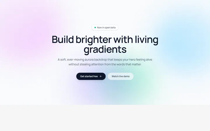
Aurora Blobs Background
OriginalAn animated hero section with soft, ever-drifting aurora gradient blobs floating behind staggered, blur-in content.
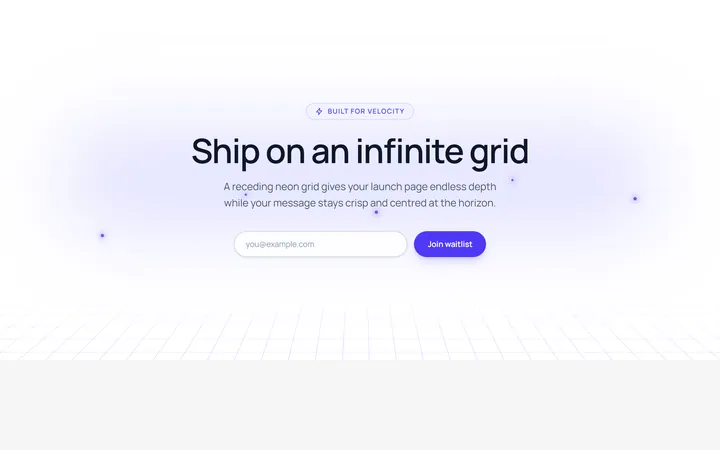
Retro Perspective Grid
OriginalA launch and waitlist section set over an infinite neon grid that scrolls into a glowing horizon with rising particles.
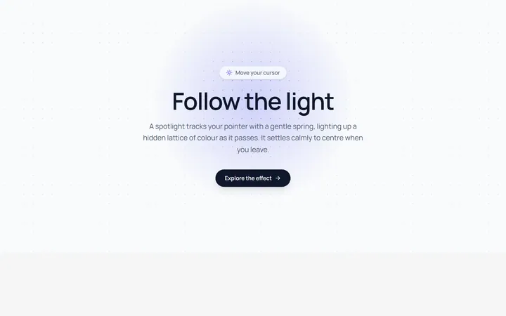
Spotlight Follow Background
OriginalA dot-grid section where a spring-eased spotlight follows the cursor and reveals a hidden lattice of coloured dots.
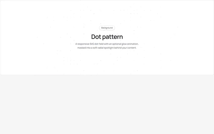
Dot Pattern Background
pattern.tsxA reusable animated background for React and Tailwind: dot pattern background.
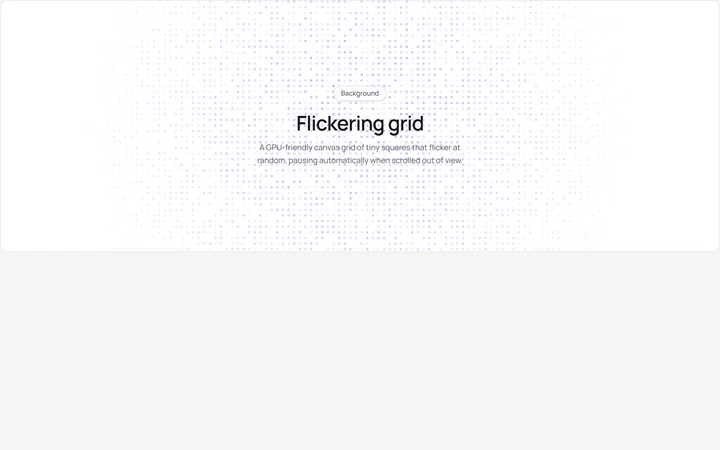
Flickering Grid Background
grid.tsxA reusable animated background for React and Tailwind: flickering grid background.
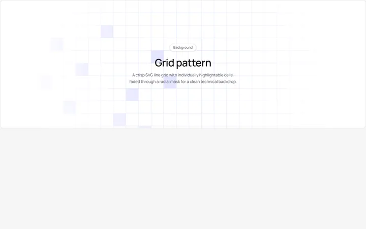
Grid Pattern Background
pattern.tsxA reusable animated background for React and Tailwind: grid pattern background.
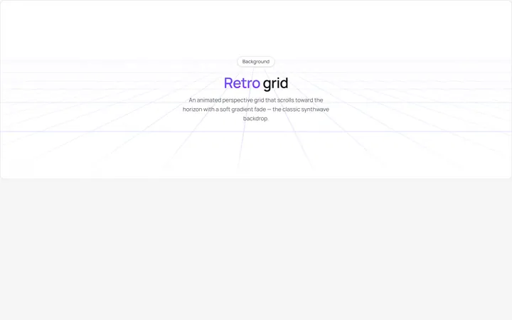
Retro Grid Background
grid.jsonA reusable animated background for React and Tailwind: retro grid background.

Spotlight Hero
OriginalA centred hero with a soft radial spotlight, badge and dual call-to-action.

Split Hero
OriginalA two-column hero pairing a headline and CTAs with a product mock and social proof.

Gradient Spotlight Hero
OriginalA minimal centred hero with a soft gradient-mesh backdrop, announcement pill and dual call-to-action buttons.

App Preview Hero
OriginalA centred hero that pairs headline copy with a realistic product dashboard mock built entirely from markup, complete with browser chrome and a floating notification card.

Waitlist Capture Hero
OriginalA dark, focused hero with an inline email capture form and avatar social proof, ready for pre-launch waitlists.