

Grid Pattern Background
pattern.tsx · attributedA reusable animated background for React and Tailwind: grid pattern background.
Copy prompt gives Claude Code, Cursor or v0 a ready-to-paste prompt that recreates this exact component.
npx shadcn@latest add https://webinnoventix.com/r/src-grid-pattern-background.json/* Source: Magic UI (magicuidesign) — https://github.com/magicuidesign/magicui/blob/main/apps/www/registry/magicui/grid-pattern.tsx — MIT. Included under its original licence. */
/* Copyright (c) Magic UI */
import React, { useId } from "react";
function cn(...classes: Array<string | false | null | undefined>) {
return classes.filter(Boolean).join(" ");
}
interface GridPatternProps extends React.SVGProps<SVGSVGElement> {
width?: number;
height?: number;
x?: number;
y?: number;
squares?: Array<[x: number, y: number]>;
strokeDasharray?: string;
className?: string;
}
export function GridPattern({
width = 40,
height = 40,
x = -1,
y = -1,
strokeDasharray = "0",
squares,
className,
...props
}: GridPatternProps) {
const id = useId();
return (
<svg
aria-hidden="true"
className={cn(
"pointer-events-none absolute inset-0 h-full w-full fill-gray-400/30 stroke-gray-400/30",
className,
)}
{...props}
>
<defs>
<pattern
id={id}
width={width}
height={height}
patternUnits="userSpaceOnUse"
x={x}
y={y}
>
<path
d={`M.5 ${height}V.5H${width}`}
fill="none"
strokeDasharray={strokeDasharray}
/>
</pattern>
</defs>
<rect width="100%" height="100%" strokeWidth={0} fill={`url(#${id})`} />
{squares && (
<svg x={x} y={y} className="overflow-visible">
{squares.map(([squareX, squareY]) => (
<rect
strokeWidth="0"
key={`${squareX}-${squareY}`}
width={width - 1}
height={height - 1}
x={squareX * width + 1}
y={squareY * height + 1}
/>
))}
</svg>
)}
</svg>
);
}
export default function SrcGridPatternBackground() {
return (
<div className="relative flex h-[28rem] w-full items-center justify-center overflow-hidden rounded-xl border border-zinc-200 bg-white dark:border-zinc-800 dark:bg-zinc-950">
<GridPattern
width={44}
height={44}
squares={[
[4, 3],
[6, 5],
[8, 2],
[10, 7],
[12, 4],
[5, 8],
[9, 9],
[13, 6],
[3, 6],
[11, 10],
]}
className="fill-indigo-500/20! stroke-indigo-500/25! [mask-image:radial-gradient(560px_circle_at_center,white,transparent)] dark:fill-indigo-400/15! dark:stroke-indigo-400/20!"
/>
<div className="relative z-10 max-w-md px-6 text-center">
<span className="inline-flex items-center rounded-full border border-zinc-200 bg-white/70 px-3 py-1 text-xs font-medium text-zinc-600 shadow-sm backdrop-blur dark:border-zinc-800 dark:bg-zinc-900/70 dark:text-zinc-300">
Background
</span>
<h2 className="mt-5 text-3xl font-semibold tracking-tight text-zinc-900 dark:text-white sm:text-4xl">
Grid pattern
</h2>
<p className="mx-auto mt-3 max-w-sm text-sm leading-relaxed text-zinc-600 dark:text-zinc-400">
A crisp SVG line grid with individually highlightable cells, faded through a radial mask for a clean technical backdrop.
</p>
</div>
</div>
);
}Dependencies
Licence
Magic UI (magicuidesign) (original) · Licensed under pattern.tsx.
Built by Web Innoventix
Need a custom interface, a full website, or SEO that gets you cited by AI? We design, build and rank it end to end.
Get a free quoteSimilar components
Browse all →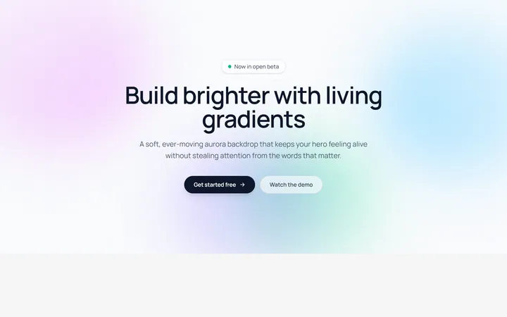
Aurora Blobs Background
OriginalAn animated hero section with soft, ever-drifting aurora gradient blobs floating behind staggered, blur-in content.

Retro Perspective Grid
OriginalA launch and waitlist section set over an infinite neon grid that scrolls into a glowing horizon with rising particles.
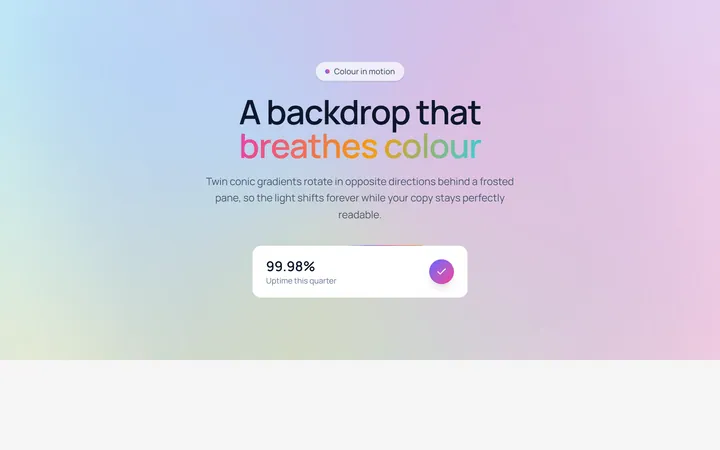
Conic Gradient Flow
OriginalA frosted hero backed by twin counter-rotating conic gradients, with flowing gradient text and an animated gradient-border stat card.
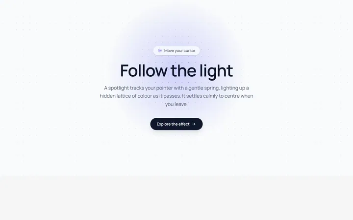
Spotlight Follow Background
OriginalA dot-grid section where a spring-eased spotlight follows the cursor and reveals a hidden lattice of coloured dots.
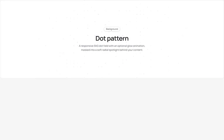
Dot Pattern Background
pattern.tsxA reusable animated background for React and Tailwind: dot pattern background.
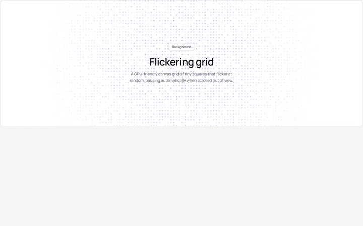
Flickering Grid Background
grid.tsxA reusable animated background for React and Tailwind: flickering grid background.
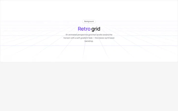
Retro Grid Background
grid.jsonA reusable animated background for React and Tailwind: retro grid background.

Spotlight Hero
OriginalA centred hero with a soft radial spotlight, badge and dual call-to-action.

Split Hero
OriginalA two-column hero pairing a headline and CTAs with a product mock and social proof.

Gradient Spotlight Hero
OriginalA minimal centred hero with a soft gradient-mesh backdrop, announcement pill and dual call-to-action buttons.

App Preview Hero
OriginalA centred hero that pairs headline copy with a realistic product dashboard mock built entirely from markup, complete with browser chrome and a floating notification card.

Waitlist Capture Hero
OriginalA dark, focused hero with an inline email capture form and avatar social proof, ready for pre-launch waitlists.