

Blend Cursor
Original · freemix-blend cursor
Copy prompt gives Claude Code, Cursor or v0 a ready-to-paste prompt that recreates this exact component.
npx shadcn@latest add https://webinnoventix.com/r/cur-blend.json"use client";
import { useId, useRef, useState } from "react";
import {
motion,
useMotionValue,
useMotionValueEvent,
useReducedMotion,
useSpring,
} from "motion/react";
const BLENDS = [
{ value: "difference", label: "Difference" },
{ value: "exclusion", label: "Exclusion" },
{ value: "overlay", label: "Overlay" },
{ value: "hue", label: "Hue" },
] as const;
type Blend = (typeof BLENDS)[number]["value"];
const SHAPES = [
{ value: "filled", label: "Filled" },
{ value: "ring", label: "Ring" },
] as const;
type Shape = (typeof SHAPES)[number]["value"];
const WORD_TONE = ["text-white", "text-amber-200", "text-sky-200", "text-emerald-200"];
const BLEND_NOTE: Record<Blend, string> = {
difference: "Subtracts colours — white flips whatever it crosses to its exact inverse.",
exclusion: "Softer than difference; mid-greys mute rather than fully invert.",
overlay: "Multiplies shadows and screens highlights for a stained-glass wash.",
hue: "Keeps luminance, repaints the underlying colour with the disc's hue.",
};
export default function CurBlend() {
const reduce = useReducedMotion();
const stageRef = useRef<HTMLDivElement>(null);
const xReadout = useRef<HTMLSpanElement>(null);
const yReadout = useRef<HTMLSpanElement>(null);
const blendName = useId();
const shapeName = useId();
const sizeId = useId();
const trailId = useId();
const switchLabelId = useId();
const [enabled, setEnabled] = useState(true);
const [blend, setBlend] = useState<Blend>("difference");
const [shape, setShape] = useState<Shape>("filled");
const [size, setSize] = useState(60);
const [trail, setTrail] = useState(48);
const [inside, setInside] = useState(false);
const stiffness = Math.round(720 - trail * 6.2);
const x = useMotionValue(0);
const y = useMotionValue(0);
const sx = useSpring(x, { stiffness, damping: 32, mass: 0.6 });
const sy = useSpring(y, { stiffness, damping: 32, mass: 0.6 });
const tx = useSpring(x, { stiffness: Math.round(stiffness * 0.45), damping: 26, mass: 1.2 });
const ty = useSpring(y, { stiffness: Math.round(stiffness * 0.45), damping: 26, mass: 1.2 });
const scaleTarget = useMotionValue(1);
const scaleSpring = useSpring(scaleTarget, { stiffness: 260, damping: 18, mass: 0.5 });
const dx = reduce ? x : sx;
const dy = reduce ? y : sy;
const dtx = reduce ? x : tx;
const dty = reduce ? y : ty;
const dScale = reduce ? scaleTarget : scaleSpring;
useMotionValueEvent(x, "change", (v) => {
if (xReadout.current) xReadout.current.textContent = String(Math.round(v));
});
useMotionValueEvent(y, "change", (v) => {
if (yReadout.current) yReadout.current.textContent = String(Math.round(v));
});
const track = (clientX: number, clientY: number) => {
const rect = stageRef.current?.getBoundingClientRect();
if (!rect) return;
x.set(clientX - rect.left);
y.set(clientY - rect.top);
};
const pillBase =
"inline-flex cursor-pointer items-center rounded-full border px-4 py-2 text-sm font-medium transition select-none " +
"border-neutral-300 text-neutral-700 hover:border-neutral-400 " +
"dark:border-neutral-700 dark:text-neutral-200 dark:hover:border-neutral-500 " +
"peer-checked:border-transparent peer-checked:bg-indigo-600 peer-checked:text-white " +
"peer-focus-visible:outline-none peer-focus-visible:ring-2 peer-focus-visible:ring-indigo-500 " +
"peer-focus-visible:ring-offset-2 peer-focus-visible:ring-offset-neutral-50 " +
"dark:peer-focus-visible:ring-offset-neutral-900";
const sliderClass =
"h-2 w-full cursor-pointer appearance-none rounded-full bg-neutral-200 accent-indigo-600 " +
"focus-visible:outline-none focus-visible:ring-2 focus-visible:ring-indigo-500 " +
"focus-visible:ring-offset-2 focus-visible:ring-offset-neutral-50 " +
"dark:bg-neutral-700 dark:accent-indigo-400 dark:focus-visible:ring-offset-neutral-900";
const cardClass =
"rounded-2xl border border-neutral-200 bg-neutral-50/80 p-5 " +
"dark:border-neutral-800 dark:bg-neutral-900/60";
return (
<section className="relative w-full bg-white px-4 py-16 text-neutral-900 sm:px-6 sm:py-24 dark:bg-neutral-950 dark:text-neutral-50">
<style>{`
@keyframes curblend-pulse { 0%,100%{opacity:.35;transform:scale(1);} 50%{opacity:1;transform:scale(1.7);} }
@keyframes curblend-drift { 0%{transform:translate3d(0,0,0);} 50%{transform:translate3d(0,-18px,0);} 100%{transform:translate3d(0,0,0);} }
.curblend-pulse{animation:curblend-pulse 1.8s ease-in-out infinite;}
.curblend-drift-a{animation:curblend-drift 9s ease-in-out infinite;}
.curblend-drift-b{animation:curblend-drift 12s ease-in-out infinite reverse;}
@media (prefers-reduced-motion: reduce){
.curblend-pulse,.curblend-drift-a,.curblend-drift-b{animation:none !important;}
}
`}</style>
<div className="mx-auto max-w-5xl">
<header className="max-w-2xl">
<p className="text-xs font-semibold uppercase tracking-[0.22em] text-indigo-600 dark:text-indigo-400">
Cursors / mix-blend
</p>
<h2 className="mt-3 text-3xl font-semibold tracking-tight sm:text-4xl">
Paint the screen with a blend cursor
</h2>
<p className="mt-4 text-base leading-relaxed text-neutral-600 dark:text-neutral-400">
A pointer-driven disc that mixes with everything beneath it. Drag across the field
below — the disc inverts, recolours, or washes each patch it touches, and grows when
it meets a live target. Tune the blend, shape, size, and trail with real controls.
</p>
</header>
<div
ref={stageRef}
role="group"
aria-label="Blend cursor demonstration field"
onPointerMove={(e) => {
setInside(true);
track(e.clientX, e.clientY);
}}
onPointerEnter={() => setInside(true)}
onPointerLeave={() => setInside(false)}
style={{ cursor: enabled ? "none" : "auto" }}
className="relative mt-10 min-h-[360px] overflow-hidden rounded-3xl border border-black/10 bg-gradient-to-br from-indigo-600 via-violet-600 to-rose-600 p-6 shadow-2xl sm:min-h-[440px] sm:p-10 dark:border-white/10 dark:from-indigo-800 dark:via-violet-900 dark:to-rose-900"
>
<div
aria-hidden
className="curblend-drift-a pointer-events-none absolute -left-16 -top-10 h-64 w-64 rounded-full bg-amber-400/70 blur-3xl"
/>
<div
aria-hidden
className="curblend-drift-b pointer-events-none absolute -bottom-20 right-4 h-72 w-72 rounded-full bg-emerald-400/60 blur-3xl"
/>
<div
aria-hidden
className="curblend-drift-a pointer-events-none absolute right-1/3 top-1/2 h-48 w-48 rounded-full bg-sky-400/60 blur-3xl"
/>
<div className="pointer-events-none absolute right-4 top-4 rounded-full bg-black/25 px-3 py-1 font-mono text-[11px] text-white/90 backdrop-blur-sm">
x <span ref={xReadout}>0</span> · y <span ref={yReadout}>0</span>
</div>
<div className="relative z-10 flex h-full min-h-[300px] flex-col justify-between gap-8 sm:min-h-[360px]">
<p className="max-w-md text-sm font-medium leading-relaxed text-white/90">
Each word is a live target — hover to swell the disc, click to switch the blend mode.
</p>
<div className="flex flex-wrap items-baseline gap-x-6 gap-y-3">
{BLENDS.map((b, i) => {
const active = blend === b.value;
return (
<button
key={b.value}
type="button"
aria-pressed={active}
onClick={() => setBlend(b.value)}
onPointerEnter={() => scaleTarget.set(2.4)}
onPointerLeave={() => scaleTarget.set(1)}
onFocus={() => scaleTarget.set(2.4)}
onBlur={() => scaleTarget.set(1)}
className={`rounded-lg px-1 text-4xl font-black leading-none tracking-tight transition-all sm:text-6xl ${
WORD_TONE[i]
} ${
active
? "underline decoration-white/85 decoration-4 underline-offset-8"
: "opacity-90 hover:opacity-100"
} focus-visible:outline-none focus-visible:ring-2 focus-visible:ring-white focus-visible:ring-offset-2 focus-visible:ring-offset-transparent`}
>
{b.label}
</button>
);
})}
</div>
<div
className={`flex items-center gap-2 self-start rounded-full bg-black/25 px-3 py-1.5 text-xs font-medium text-white/90 backdrop-blur-sm transition-opacity duration-300 ${
inside && enabled ? "opacity-0" : "opacity-100"
}`}
>
<span className="curblend-pulse inline-block h-2 w-2 rounded-full bg-white" />
{enabled ? "Move your pointer across the field" : "Blend cursor is off"}
</div>
</div>
{enabled && (
<div
aria-hidden
className={`pointer-events-none absolute inset-0 z-20 transition-opacity duration-200 ${
inside ? "opacity-100" : "opacity-0"
}`}
>
<motion.div style={{ x: dtx, y: dty }} className="absolute left-0 top-0 will-change-transform">
<div className="-translate-x-1/2 -translate-y-1/2">
<motion.div
style={{ width: size * 1.9, height: size * 1.9, mixBlendMode: blend }}
className="rounded-full border border-white/70"
/>
</div>
</motion.div>
<motion.div style={{ x: dx, y: dy }} className="absolute left-0 top-0 will-change-transform">
<div className="-translate-x-1/2 -translate-y-1/2">
<motion.div
style={{ width: size, height: size, scale: dScale, mixBlendMode: blend }}
className={`rounded-full ${
shape === "ring" ? "border-[3px] border-white bg-transparent" : "bg-white"
}`}
/>
</div>
</motion.div>
</div>
)}
</div>
<div className="mt-6 grid gap-4 md:grid-cols-2">
<fieldset className={`${cardClass} md:col-span-2`}>
<legend className="px-1 text-xs font-semibold uppercase tracking-[0.16em] text-neutral-500 dark:text-neutral-400">
Blend mode
</legend>
<div className="mt-3 flex flex-wrap gap-2">
{BLENDS.map((b) => (
<label key={b.value}>
<input
type="radio"
name={blendName}
value={b.value}
checked={blend === b.value}
onChange={() => setBlend(b.value)}
className="peer sr-only"
/>
<span className={pillBase}>{b.label}</span>
</label>
))}
</div>
<p className="mt-3 text-sm leading-relaxed text-neutral-500 dark:text-neutral-400">
{BLEND_NOTE[blend]}
</p>
</fieldset>
<div className={cardClass}>
<p className="text-xs font-semibold uppercase tracking-[0.16em] text-neutral-500 dark:text-neutral-400">
Disc
</p>
<div className="mt-3 flex flex-wrap gap-2" role="radiogroup" aria-label="Disc shape">
{SHAPES.map((s) => (
<label key={s.value}>
<input
type="radio"
name={shapeName}
value={s.value}
checked={shape === s.value}
onChange={() => setShape(s.value)}
className="peer sr-only"
/>
<span className={pillBase}>{s.label}</span>
</label>
))}
</div>
<div className="mt-5">
<label htmlFor={sizeId} className="flex items-center justify-between text-sm font-medium text-neutral-700 dark:text-neutral-200">
<span>Diameter</span>
<span className="font-mono text-xs text-neutral-500 dark:text-neutral-400">{size}px</span>
</label>
<input
id={sizeId}
type="range"
min={16}
max={120}
step={2}
value={size}
onChange={(e) => setSize(Number(e.target.value))}
aria-valuetext={`${size} pixels`}
className={`mt-2 ${sliderClass}`}
/>
</div>
</div>
<div className={cardClass}>
<div className="flex items-center justify-between gap-4">
<span id={switchLabelId} className="text-sm font-medium text-neutral-700 dark:text-neutral-200">
Blend cursor
</span>
<button
type="button"
role="switch"
aria-checked={enabled}
aria-labelledby={switchLabelId}
onClick={() => setEnabled((v) => !v)}
className={`relative inline-flex h-7 w-12 shrink-0 items-center rounded-full transition-colors focus-visible:outline-none focus-visible:ring-2 focus-visible:ring-indigo-500 focus-visible:ring-offset-2 focus-visible:ring-offset-neutral-50 dark:focus-visible:ring-offset-neutral-900 ${
enabled ? "bg-indigo-600" : "bg-neutral-300 dark:bg-neutral-700"
}`}
>
<span
className={`inline-block h-5 w-5 transform rounded-full bg-white shadow transition-transform ${
enabled ? "translate-x-6" : "translate-x-1"
}`}
/>
</button>
</div>
<div className="mt-5">
<label htmlFor={trailId} className="flex items-center justify-between text-sm font-medium text-neutral-700 dark:text-neutral-200">
<span>Trail</span>
<span className="font-mono text-xs text-neutral-500 dark:text-neutral-400">{trail}%</span>
</label>
<input
id={trailId}
type="range"
min={0}
max={100}
step={1}
value={trail}
onChange={(e) => setTrail(Number(e.target.value))}
aria-valuetext={`${trail} percent lag`}
className={`mt-2 ${sliderClass}`}
/>
<p className="mt-2 text-xs text-neutral-500 dark:text-neutral-400">
Higher values loosen the spring so the disc drifts behind the pointer.
</p>
</div>
</div>
</div>
</div>
</section>
);
}Dependencies
Licence
Built by Web Innoventix. Free for personal and commercial use, no attribution required.
Built by Web Innoventix
Need a custom interface, a full website, or SEO that gets you cited by AI? We design, build and rank it end to end.
Get a free quoteSimilar components
Browse all →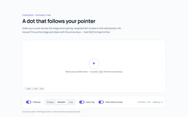
Dot Follow Cursor
Originaldot cursor follower
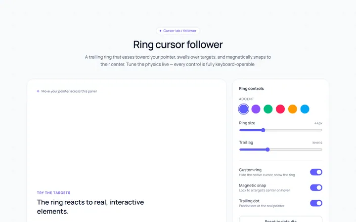
Ring Cursor
Originalring cursor follower
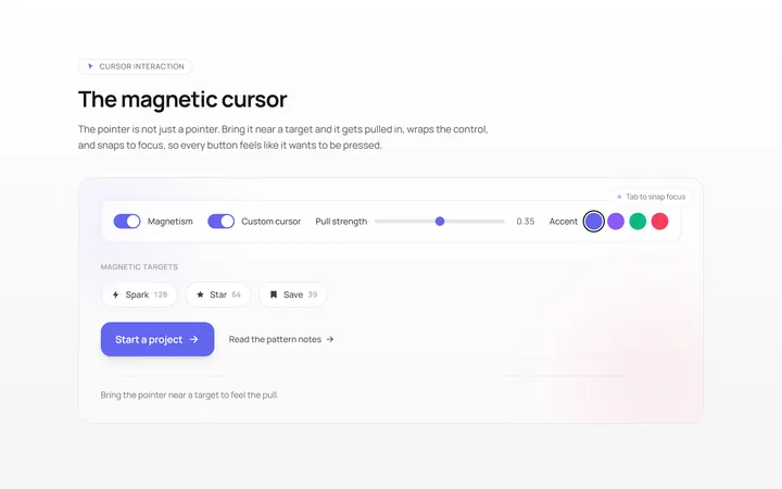
Magnetic Cursor
Originalmagnetic cursor on targets
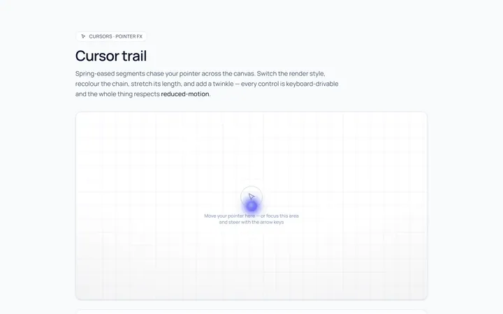
Trail Cursor
Originalcursor trail effect
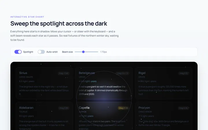
Spotlight Cursor
Originalcursor spotlight mask

Spotlight Hero
OriginalA centred hero with a soft radial spotlight, badge and dual call-to-action.

Split Hero
OriginalA two-column hero pairing a headline and CTAs with a product mock and social proof.

Gradient Spotlight Hero
OriginalA minimal centred hero with a soft gradient-mesh backdrop, announcement pill and dual call-to-action buttons.

App Preview Hero
OriginalA centred hero that pairs headline copy with a realistic product dashboard mock built entirely from markup, complete with browser chrome and a floating notification card.

Waitlist Capture Hero
OriginalA dark, focused hero with an inline email capture form and avatar social proof, ready for pre-launch waitlists.

Image Backdrop Hero
OriginalA cinematic full-bleed hero with a layered image-style backdrop, overlaid left-aligned copy and a trusted-by logos strip.
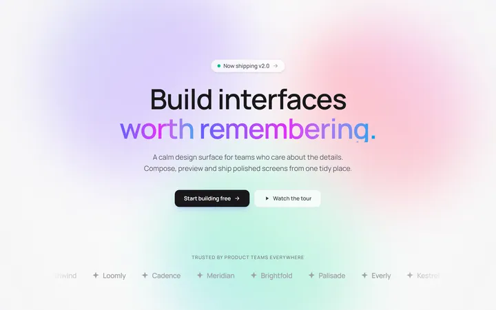
Gradient Mesh Hero with Staggered Text Reveal
OriginalA full-screen hero pairing a drifting animated gradient-mesh backdrop with a word-by-word staggered blur-in headline and a logo marquee under the fold.