

Ring Cursor
Original · freering cursor follower
Copy prompt gives Claude Code, Cursor or v0 a ready-to-paste prompt that recreates this exact component.
npx shadcn@latest add https://webinnoventix.com/r/cur-ring.json"use client";
import {
useEffect,
useRef,
useState,
type PointerEvent as ReactPointerEvent,
} from "react";
import { motion, useMotionValue, useReducedMotion } from "motion/react";
type AccentKey = "indigo" | "violet" | "emerald" | "rose" | "amber" | "sky";
type Accent = {
name: string;
swatch: string;
border: string;
dot: string;
fill: string;
sel: string;
on: string;
range: string;
text: string;
};
const ACCENTS: Record<AccentKey, Accent> = {
indigo: {
name: "Indigo",
swatch: "bg-indigo-500",
border: "border-indigo-500",
dot: "bg-indigo-500",
fill: "bg-indigo-400/20",
sel: "peer-checked:ring-indigo-500 peer-focus-visible:ring-indigo-500",
on: "bg-indigo-500",
range: "accent-indigo-500",
text: "text-indigo-600 dark:text-indigo-400",
},
violet: {
name: "Violet",
swatch: "bg-violet-500",
border: "border-violet-500",
dot: "bg-violet-500",
fill: "bg-violet-400/20",
sel: "peer-checked:ring-violet-500 peer-focus-visible:ring-violet-500",
on: "bg-violet-500",
range: "accent-violet-500",
text: "text-violet-600 dark:text-violet-400",
},
emerald: {
name: "Emerald",
swatch: "bg-emerald-500",
border: "border-emerald-500",
dot: "bg-emerald-500",
fill: "bg-emerald-400/20",
sel: "peer-checked:ring-emerald-500 peer-focus-visible:ring-emerald-500",
on: "bg-emerald-500",
range: "accent-emerald-500",
text: "text-emerald-600 dark:text-emerald-400",
},
rose: {
name: "Rose",
swatch: "bg-rose-500",
border: "border-rose-500",
dot: "bg-rose-500",
fill: "bg-rose-400/20",
sel: "peer-checked:ring-rose-500 peer-focus-visible:ring-rose-500",
on: "bg-rose-500",
range: "accent-rose-500",
text: "text-rose-600 dark:text-rose-400",
},
amber: {
name: "Amber",
swatch: "bg-amber-500",
border: "border-amber-500",
dot: "bg-amber-500",
fill: "bg-amber-400/20",
sel: "peer-checked:ring-amber-500 peer-focus-visible:ring-amber-500",
on: "bg-amber-500",
range: "accent-amber-500",
text: "text-amber-600 dark:text-amber-400",
},
sky: {
name: "Sky",
swatch: "bg-sky-500",
border: "border-sky-500",
dot: "bg-sky-500",
fill: "bg-sky-400/20",
sel: "peer-checked:ring-sky-500 peer-focus-visible:ring-sky-500",
on: "bg-sky-500",
range: "accent-sky-500",
text: "text-sky-600 dark:text-sky-400",
},
};
const ACCENT_ORDER: AccentKey[] = [
"indigo",
"violet",
"emerald",
"rose",
"amber",
"sky",
];
const DEFAULTS = {
accent: "indigo" as AccentKey,
ringSize: 44,
trail: 4,
showDot: true,
magnetic: true,
enabled: true,
};
const lerp = (a: number, b: number, t: number): number => a + (b - a) * t;
const FOCUS =
"focus-visible:outline-none focus-visible:ring-2 focus-visible:ring-offset-2 focus-visible:ring-slate-500 focus-visible:ring-offset-white dark:focus-visible:ring-slate-400 dark:focus-visible:ring-offset-slate-950";
export default function CurRing() {
const prefersReduced = useReducedMotion() ?? false;
const [accent, setAccent] = useState<AccentKey>(DEFAULTS.accent);
const [ringSize, setRingSize] = useState<number>(DEFAULTS.ringSize);
const [trail, setTrail] = useState<number>(DEFAULTS.trail);
const [showDot, setShowDot] = useState<boolean>(DEFAULTS.showDot);
const [magnetic, setMagnetic] = useState<boolean>(DEFAULTS.magnetic);
const [enabled, setEnabled] = useState<boolean>(DEFAULTS.enabled);
const [inside, setInside] = useState<boolean>(false);
const [hover, setHover] = useState<boolean>(false);
const [pressing, setPressing] = useState<boolean>(false);
const [targetSize, setTargetSize] = useState<number>(0);
const [hasFine, setHasFine] = useState<boolean>(true);
const [stars, setStars] = useState<number>(128);
const [status, setStatus] = useState<string>("Hover a control to feel the ring lock on.");
const canvasRef = useRef<HTMLDivElement | null>(null);
const pointerRef = useRef<{ x: number; y: number }>({ x: 0, y: 0 });
const targetRef = useRef<{ cx: number; cy: number } | null>(null);
const hoverRef = useRef<boolean>(false);
const settingsRef = useRef<{ lag: number; magnetic: boolean }>({
lag: 0.25,
magnetic: true,
});
const ringX = useMotionValue(0);
const ringY = useMotionValue(0);
const dotX = useMotionValue(0);
const dotY = useMotionValue(0);
const lag = 0.35 - ((trail - 1) / 9) * 0.3;
settingsRef.current = { lag, magnetic };
const a = ACCENTS[accent];
let ringDim = ringSize;
if (hover) ringDim = magnetic && targetSize ? targetSize : ringSize * 1.5;
if (pressing) ringDim = ringDim * 0.82;
useEffect(() => {
const mq = window.matchMedia("(pointer: fine)");
const sync = () => setHasFine(mq.matches);
sync();
mq.addEventListener("change", sync);
return () => mq.removeEventListener("change", sync);
}, []);
useEffect(() => {
const el = canvasRef.current;
if (!el) return;
const r = el.getBoundingClientRect();
ringX.set(r.width / 2);
ringY.set(r.height / 2);
dotX.set(r.width / 2);
dotY.set(r.height / 2);
pointerRef.current = { x: r.width / 2, y: r.height / 2 };
}, [ringX, ringY, dotX, dotY]);
useEffect(() => {
if (!enabled || !hasFine) return;
let raf = 0;
const step = () => {
const s = settingsRef.current;
const l = prefersReduced ? 1 : s.lag;
let tx = pointerRef.current.x;
let ty = pointerRef.current.y;
if (s.magnetic && hoverRef.current && targetRef.current) {
tx = targetRef.current.cx;
ty = targetRef.current.cy;
}
ringX.set(lerp(ringX.get(), tx, l));
ringY.set(lerp(ringY.get(), ty, l));
raf = requestAnimationFrame(step);
};
raf = requestAnimationFrame(step);
return () => cancelAnimationFrame(raf);
}, [enabled, hasFine, prefersReduced, ringX, ringY]);
const onMove = (e: ReactPointerEvent<HTMLDivElement>) => {
const el = canvasRef.current;
if (!el) return;
const r = el.getBoundingClientRect();
const x = e.clientX - r.left;
const y = e.clientY - r.top;
pointerRef.current = { x, y };
dotX.set(x);
dotY.set(y);
if (!inside) setInside(true);
};
const onLeave = () => {
setInside(false);
setHover(false);
setPressing(false);
setTargetSize(0);
hoverRef.current = false;
targetRef.current = null;
};
const enterTarget = (e: ReactPointerEvent<HTMLElement>) => {
hoverRef.current = true;
setHover(true);
const el = canvasRef.current;
if (!el) return;
const cr = el.getBoundingClientRect();
const tr = e.currentTarget.getBoundingClientRect();
targetRef.current = {
cx: tr.left - cr.left + tr.width / 2,
cy: tr.top - cr.top + tr.height / 2,
};
setTargetSize(Math.max(tr.width, tr.height) + 18);
};
const leaveTarget = () => {
hoverRef.current = false;
targetRef.current = null;
setHover(false);
setTargetSize(0);
};
const reset = () => {
setAccent(DEFAULTS.accent);
setRingSize(DEFAULTS.ringSize);
setTrail(DEFAULTS.trail);
setShowDot(DEFAULTS.showDot);
setMagnetic(DEFAULTS.magnetic);
setEnabled(DEFAULTS.enabled);
setStatus("Settings restored to defaults.");
};
const copyLink = () => {
if (typeof navigator !== "undefined" && navigator.clipboard) {
void navigator.clipboard.writeText("https://ring.cursor/invite/9f3a-2c").catch(() => {});
}
setStatus("Invite link copied — ring pulsed on click.");
};
const showRing = enabled && hasFine;
return (
<section className="relative w-full overflow-hidden bg-slate-50 py-16 sm:py-24 dark:bg-slate-950">
<style>{`
@keyframes curring-pulse {
0%, 100% { opacity: 0.35; transform: scale(1); }
50% { opacity: 1; transform: scale(1.4); }
}
@keyframes curring-rise {
from { opacity: 0; transform: translateY(14px); }
to { opacity: 1; transform: translateY(0); }
}
.curring-pulse { animation: curring-pulse 1.8s ease-in-out infinite; }
.curring-rise { animation: curring-rise 0.6s cubic-bezier(0.22, 1, 0.36, 1) both; }
@media (prefers-reduced-motion: reduce) {
.curring-pulse, .curring-rise { animation: none !important; }
}
`}</style>
<div
aria-hidden="true"
className="pointer-events-none absolute inset-0 opacity-[0.35] [background-image:linear-gradient(to_right,rgb(148_163_184/0.12)_1px,transparent_1px),linear-gradient(to_bottom,rgb(148_163_184/0.12)_1px,transparent_1px)] [background-size:44px_44px]"
/>
<div className="relative mx-auto w-full max-w-6xl px-4 sm:px-6 lg:px-8">
<header className="curring-rise mx-auto max-w-2xl text-center">
<span className={`inline-flex items-center gap-2 rounded-full border border-slate-200 bg-white px-3 py-1 text-xs font-medium tracking-wide ${a.text} dark:border-slate-800 dark:bg-slate-900`}>
<span className={`h-1.5 w-1.5 rounded-full ${a.swatch}`} />
Cursor lab / follower
</span>
<h2 className="mt-4 text-3xl font-semibold tracking-tight text-slate-900 sm:text-4xl dark:text-white">
Ring cursor follower
</h2>
<p className="mt-3 text-base leading-relaxed text-slate-600 dark:text-slate-400">
A trailing ring that eases toward your pointer, swells over targets, and
magnetically snaps to their center. Tune the physics live — every control is
fully keyboard-operable.
</p>
</header>
<div className="mt-10 grid gap-5 lg:grid-cols-3">
{/* Interactive canvas */}
<div
ref={canvasRef}
onPointerMove={showRing ? onMove : undefined}
onPointerLeave={onLeave}
onPointerDown={() => setPressing(true)}
onPointerUp={() => setPressing(false)}
className={`relative flex min-h-[440px] flex-col overflow-hidden rounded-3xl border border-slate-200 bg-white p-7 sm:p-9 lg:col-span-2 lg:min-h-[520px] dark:border-slate-800 dark:bg-slate-900 ${
showRing ? "cursor-none" : ""
}`}
>
{/* Ring overlay */}
{showRing && (
<div aria-hidden="true" className="pointer-events-none absolute inset-0 z-20">
<motion.div style={{ x: ringX, y: ringY }} className="absolute left-0 top-0">
<div
style={{ width: ringDim, height: ringDim }}
className={`-translate-x-1/2 -translate-y-1/2 rounded-full border-2 ring-1 ring-inset ring-white/50 dark:ring-slate-950/50 ${a.border} ${
hover ? a.fill : "bg-transparent"
} ${
prefersReduced
? ""
: "transition-[width,height,background-color,opacity] duration-200 ease-out"
} ${inside ? "opacity-100" : "opacity-0"}`}
/>
</motion.div>
{showDot && (
<motion.div style={{ x: dotX, y: dotY }} className="absolute left-0 top-0">
<div
className={`h-2 w-2 -translate-x-1/2 -translate-y-1/2 rounded-full ${a.dot} ${
prefersReduced ? "" : "transition-opacity duration-150"
} ${inside ? "opacity-100" : "opacity-0"}`}
/>
</motion.div>
)}
</div>
)}
{/* Canvas content */}
<div className="relative z-10 flex h-full flex-col">
<div className="flex items-center gap-2 text-xs font-medium text-slate-500 dark:text-slate-400">
<span className={`curring-pulse h-2 w-2 rounded-full ${a.swatch}`} />
{hasFine
? "Move your pointer across this panel"
: "Touch device detected — ring preview is pointer-only"}
</div>
<div className="mt-auto">
<p className={`text-xs font-semibold uppercase tracking-widest ${a.text}`}>
Try the targets
</p>
<h3 className="mt-2 max-w-md text-2xl font-semibold leading-snug text-slate-900 dark:text-white">
The ring reacts to real, interactive elements.
</h3>
<div className="mt-6 flex flex-wrap items-center gap-3">
<button
type="button"
onPointerEnter={enterTarget}
onPointerLeave={leaveTarget}
onClick={copyLink}
className={`rounded-xl px-4 py-2.5 text-sm font-semibold text-white shadow-sm transition-transform duration-150 hover:-translate-y-0.5 active:translate-y-0 ${a.on} ${FOCUS}`}
>
Copy invite link
</button>
<button
type="button"
onPointerEnter={enterTarget}
onPointerLeave={leaveTarget}
onClick={() => {
setStars((n) => n + 1);
setStatus("Starred — magnetic snap engaged on the target.");
}}
className={`inline-flex items-center gap-2 rounded-xl border border-slate-300 bg-white px-4 py-2.5 text-sm font-semibold text-slate-800 transition-transform duration-150 hover:-translate-y-0.5 active:translate-y-0 dark:border-slate-700 dark:bg-slate-800 dark:text-slate-100 ${FOCUS}`}
>
<svg viewBox="0 0 20 20" className="h-4 w-4" fill="currentColor" aria-hidden="true">
<path d="M10 1.6l2.47 5.01 5.53.8-4 3.9.94 5.5L10 14.2l-4.94 2.6.94-5.5-4-3.9 5.53-.8L10 1.6z" />
</svg>
Star repo
<span className="tabular-nums text-slate-500 dark:text-slate-400">{stars}</span>
</button>
<a
href="https://developer.mozilla.org/docs/Web/API/Pointer_events"
target="_blank"
rel="noopener"
onPointerEnter={enterTarget}
onPointerLeave={leaveTarget}
className={`inline-flex items-center gap-1.5 rounded-xl px-4 py-2.5 text-sm font-semibold ${a.text} underline-offset-4 hover:underline ${FOCUS}`}
>
Read the docs
<svg viewBox="0 0 20 20" className="h-4 w-4" fill="none" stroke="currentColor" strokeWidth="1.75" aria-hidden="true">
<path d="M7 5h8v8M15 5l-9 9" strokeLinecap="round" strokeLinejoin="round" />
</svg>
</a>
</div>
<p
role="status"
aria-live="polite"
className="mt-5 text-sm text-slate-500 dark:text-slate-400"
>
{status}
</p>
</div>
</div>
</div>
{/* Controls */}
<div className="rounded-3xl border border-slate-200 bg-white p-6 lg:col-span-1 dark:border-slate-800 dark:bg-slate-900">
<h3 className="text-sm font-semibold text-slate-900 dark:text-white">Ring controls</h3>
{/* Accent radios */}
<fieldset className="mt-5">
<legend className="text-xs font-medium uppercase tracking-widest text-slate-500 dark:text-slate-400">
Accent
</legend>
<div className="mt-3 flex flex-wrap gap-3">
{ACCENT_ORDER.map((key) => {
const acc = ACCENTS[key];
return (
<label key={key} className="relative cursor-pointer" title={acc.name}>
<input
type="radio"
name="curring-accent"
value={key}
checked={accent === key}
onChange={() => setAccent(key)}
className="peer sr-only"
/>
<span
className={`block h-8 w-8 rounded-full ${acc.swatch} ring-offset-2 ring-offset-white peer-checked:ring-2 peer-focus-visible:ring-2 dark:ring-offset-slate-900 ${acc.sel}`}
/>
<span className="sr-only">{acc.name}</span>
</label>
);
})}
</div>
</fieldset>
{/* Ring size */}
<div className="mt-6">
<div className="flex items-baseline justify-between">
<label htmlFor="curring-size" className="text-sm font-medium text-slate-700 dark:text-slate-300">
Ring size
</label>
<span className="text-xs tabular-nums text-slate-500 dark:text-slate-400">{ringSize}px</span>
</div>
<input
id="curring-size"
type="range"
min={24}
max={96}
step={2}
value={ringSize}
onChange={(e) => setRingSize(Number(e.target.value))}
className={`mt-2 w-full ${a.range} ${FOCUS}`}
/>
</div>
{/* Trail */}
<div className="mt-5">
<div className="flex items-baseline justify-between">
<label htmlFor="curring-trail" className="text-sm font-medium text-slate-700 dark:text-slate-300">
Trail lag
</label>
<span className="text-xs tabular-nums text-slate-500 dark:text-slate-400">
{trail === 1 ? "snappy" : trail >= 8 ? "floaty" : `level ${trail}`}
</span>
</div>
<input
id="curring-trail"
type="range"
min={1}
max={10}
step={1}
value={trail}
onChange={(e) => setTrail(Number(e.target.value))}
className={`mt-2 w-full ${a.range} ${FOCUS}`}
/>
</div>
{/* Toggles */}
<div className="mt-6 space-y-1 border-t border-slate-200 pt-4 dark:border-slate-800">
<Toggle
label="Custom ring"
description="Hide the native cursor, show the ring"
checked={enabled}
onChange={() => setEnabled((v) => !v)}
onColor={a.on}
/>
<Toggle
label="Magnetic snap"
description="Lock to a target's center on hover"
checked={magnetic}
onChange={() => setMagnetic((v) => !v)}
onColor={a.on}
/>
<Toggle
label="Trailing dot"
description="Precise dot at the real pointer"
checked={showDot}
onChange={() => setShowDot((v) => !v)}
onColor={a.on}
/>
</div>
<button
type="button"
onClick={reset}
className={`mt-5 w-full rounded-xl border border-slate-300 bg-white px-4 py-2.5 text-sm font-semibold text-slate-700 transition-colors hover:bg-slate-50 dark:border-slate-700 dark:bg-slate-800 dark:text-slate-200 dark:hover:bg-slate-700 ${FOCUS}`}
>
Reset to defaults
</button>
<p className="mt-4 text-xs leading-relaxed text-slate-400 dark:text-slate-500">
The ring is a decorative pointer enhancement. It respects reduced-motion and only
replaces the cursor on fine-pointer devices.
</p>
</div>
</div>
</div>
</section>
);
}
function Toggle({
label,
description,
checked,
onChange,
onColor,
}: {
label: string;
description: string;
checked: boolean;
onChange: () => void;
onColor: string;
}) {
return (
<div className="flex items-center justify-between gap-4 py-2">
<span className="min-w-0">
<span className="block text-sm font-medium text-slate-700 dark:text-slate-300">{label}</span>
<span className="block text-xs text-slate-500 dark:text-slate-400">{description}</span>
</span>
<button
type="button"
role="switch"
aria-checked={checked}
aria-label={label}
onClick={onChange}
className={`relative inline-flex h-6 w-11 shrink-0 items-center rounded-full transition-colors ${
checked ? onColor : "bg-slate-300 dark:bg-slate-700"
} ${FOCUS}`}
>
<span
className={`inline-block h-4 w-4 transform rounded-full bg-white shadow-sm transition-transform ${
checked ? "translate-x-6" : "translate-x-1"
}`}
/>
</button>
</div>
);
}Dependencies
Licence
Built by Web Innoventix. Free for personal and commercial use, no attribution required.
Built by Web Innoventix
Need a custom interface, a full website, or SEO that gets you cited by AI? We design, build and rank it end to end.
Get a free quoteSimilar components
Browse all →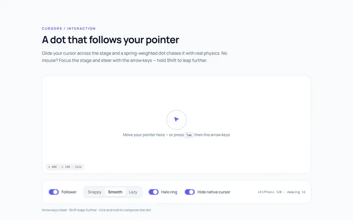
Dot Follow Cursor
Originaldot cursor follower
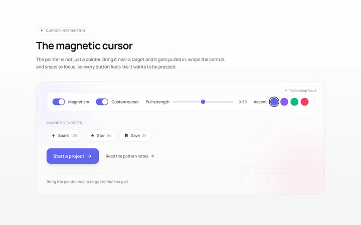
Magnetic Cursor
Originalmagnetic cursor on targets
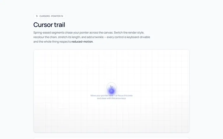
Trail Cursor
Originalcursor trail effect
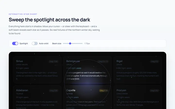
Spotlight Cursor
Originalcursor spotlight mask
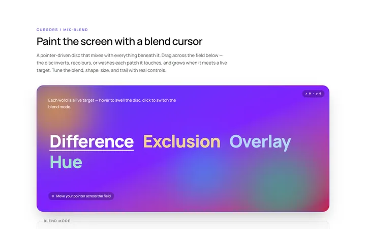
Blend Cursor
Originalmix-blend cursor

Spotlight Hero
OriginalA centred hero with a soft radial spotlight, badge and dual call-to-action.

Split Hero
OriginalA two-column hero pairing a headline and CTAs with a product mock and social proof.

Gradient Spotlight Hero
OriginalA minimal centred hero with a soft gradient-mesh backdrop, announcement pill and dual call-to-action buttons.

App Preview Hero
OriginalA centred hero that pairs headline copy with a realistic product dashboard mock built entirely from markup, complete with browser chrome and a floating notification card.

Waitlist Capture Hero
OriginalA dark, focused hero with an inline email capture form and avatar social proof, ready for pre-launch waitlists.

Image Backdrop Hero
OriginalA cinematic full-bleed hero with a layered image-style backdrop, overlaid left-aligned copy and a trusted-by logos strip.
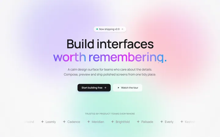
Gradient Mesh Hero with Staggered Text Reveal
OriginalA full-screen hero pairing a drifting animated gradient-mesh backdrop with a word-by-word staggered blur-in headline and a logo marquee under the fold.