

Duotone Hover Gallery
Original · freeA grid where images sit under a coloured duotone wash that clears to full colour on hover.
Copy prompt gives Claude Code, Cursor or v0 a ready-to-paste prompt that recreates this exact component.
npx shadcn@latest add https://webinnoventix.com/r/gallery-duotone-hover.json"use client";
import { useRef } from "react";
import { motion, useInView } from "motion/react";
type Tone = {
wash: string;
glow: string;
chip: string;
};
type Shot = {
src: string;
alt: string;
title: string;
category: string;
span: string;
tone: Tone;
};
const TONES: Record<string, Tone> = {
indigo: {
wash: "from-indigo-700 via-indigo-500 to-sky-400",
glow: "shadow-indigo-500/30",
chip: "text-indigo-100 ring-indigo-300/40 bg-indigo-950/40",
},
emerald: {
wash: "from-emerald-700 via-teal-500 to-cyan-400",
glow: "shadow-emerald-500/30",
chip: "text-emerald-100 ring-emerald-300/40 bg-emerald-950/40",
},
violet: {
wash: "from-violet-700 via-fuchsia-500 to-rose-400",
glow: "shadow-violet-500/30",
chip: "text-violet-100 ring-violet-300/40 bg-violet-950/40",
},
amber: {
wash: "from-orange-600 via-amber-500 to-rose-500",
glow: "shadow-amber-500/30",
chip: "text-amber-100 ring-amber-300/40 bg-amber-950/40",
},
cyan: {
wash: "from-cyan-600 via-sky-500 to-indigo-500",
glow: "shadow-cyan-500/30",
chip: "text-cyan-100 ring-cyan-300/40 bg-cyan-950/40",
},
rose: {
wash: "from-rose-700 via-pink-500 to-orange-400",
glow: "shadow-rose-500/30",
chip: "text-rose-100 ring-rose-300/40 bg-rose-950/40",
},
};
const SHOTS: Shot[] = [
{
src: "/img/gallery/g03.webp",
alt: "Fog rolling over a pine ridge at first light",
title: "Coastal light",
category: "Landscape",
span: "sm:col-span-2 sm:row-span-2",
tone: TONES.cyan,
},
{
src: "/img/gallery/g11.webp",
alt: "Portrait of a ceramicist beside a wheel",
title: "Studio 04",
category: "Portrait",
span: "sm:row-span-2",
tone: TONES.violet,
},
{
src: "/img/gallery/g18.webp",
alt: "Close crop of dew on a fern frond",
title: "Undergrowth",
category: "Nature",
span: "",
tone: TONES.emerald,
},
{
src: "/img/gallery/g07.webp",
alt: "Empty concrete stairwell washed in afternoon sun",
title: "Brutalist stair",
category: "Architecture",
span: "",
tone: TONES.amber,
},
{
src: "/img/gallery/g24.webp",
alt: "Long exposure of tail lights on a coastal highway",
title: "Night drift",
category: "Motion",
span: "sm:col-span-2",
tone: TONES.indigo,
},
{
src: "/img/gallery/g15.webp",
alt: "Hands arranging dried flowers on linen",
title: "Still life No. 9",
category: "Editorial",
span: "sm:row-span-2",
tone: TONES.rose,
},
{
src: "/img/gallery/g29.webp",
alt: "Windblown dunes under a pale overcast sky",
title: "Salt flats",
category: "Landscape",
span: "",
tone: TONES.emerald,
},
{
src: "/img/gallery/g33.webp",
alt: "Neon signage reflected in a rain puddle",
title: "After hours",
category: "Street",
span: "",
tone: TONES.violet,
},
{
src: "/img/gallery/g21.webp",
alt: "Overhead view of a marble tabletop and coffee",
title: "Flat white",
category: "Detail",
span: "sm:col-span-2",
tone: TONES.cyan,
},
];
function Tile({ shot, index }: { shot: Shot; index: number }) {
const ref = useRef<HTMLElement | null>(null);
const inView = useInView(ref, { once: true, margin: "-40px" });
return (
<motion.figure
ref={ref}
initial={{ opacity: 0, y: 28 }}
animate={inView ? { opacity: 1, y: 0 } : undefined}
transition={{
duration: 0.6,
delay: (index % 4) * 0.08,
ease: [0.22, 1, 0.36, 1],
}}
tabIndex={0}
aria-label={`${shot.title} — ${shot.category}`}
className={[
"group relative overflow-hidden rounded-2xl",
"bg-slate-200 dark:bg-slate-800",
"ring-1 ring-slate-900/5 dark:ring-white/10",
"shadow-lg shadow-slate-900/5 dark:shadow-black/40",
"outline-none transition-shadow duration-500",
"focus-visible:ring-2 focus-visible:ring-offset-2",
"focus-visible:ring-slate-900 dark:focus-visible:ring-white",
"focus-visible:ring-offset-slate-50 dark:focus-visible:ring-offset-slate-950",
"hover:shadow-2xl focus-visible:shadow-2xl",
shot.tone.glow,
shot.span,
].join(" ")}
>
{/* eslint-disable-next-line @next/next/no-img-element */}
<img
src={shot.src}
alt={shot.alt}
loading="lazy"
draggable={false}
className={[
"h-full w-full object-cover",
"min-h-[220px]",
"[filter:grayscale(1)_contrast(1.05)]",
"scale-[1.03] transition-[filter,transform] duration-[700ms] ease-out",
"group-hover:[filter:grayscale(0)_contrast(1)] group-hover:scale-100",
"group-focus-visible:[filter:grayscale(0)_contrast(1)] group-focus-visible:scale-100",
].join(" ")}
/>
{/* Duotone colour wash — clears on hover/focus */}
<div
aria-hidden="true"
className={[
"pointer-events-none absolute inset-0 bg-gradient-to-br mix-blend-color",
"opacity-100 transition-opacity duration-[700ms] ease-out",
"group-hover:opacity-0 group-focus-visible:opacity-0",
shot.tone.wash,
].join(" ")}
/>
{/* Depth multiply to deepen the duotone shadows */}
<div
aria-hidden="true"
className={[
"pointer-events-none absolute inset-0 bg-gradient-to-t mix-blend-multiply",
"from-slate-950 via-slate-900/20 to-transparent",
"opacity-70 transition-opacity duration-[700ms] ease-out",
"group-hover:opacity-0 group-focus-visible:opacity-0",
].join(" ")}
/>
{/* Permanent legibility scrim for the caption */}
<div
aria-hidden="true"
className="pointer-events-none absolute inset-x-0 bottom-0 h-2/5 bg-gradient-to-t from-slate-950/85 via-slate-950/25 to-transparent"
/>
<figcaption className="absolute inset-x-0 bottom-0 flex items-end justify-between gap-3 p-4 sm:p-5">
<div className="min-w-0 translate-y-1 opacity-95 transition-transform duration-500 ease-out group-hover:translate-y-0">
<span
className={[
"inline-flex items-center rounded-full px-2.5 py-0.5",
"text-[11px] font-semibold uppercase tracking-[0.14em]",
"ring-1 backdrop-blur-sm",
shot.tone.chip,
].join(" ")}
>
{shot.category}
</span>
<h3 className="mt-2 truncate text-lg font-semibold tracking-tight text-white drop-shadow-sm">
{shot.title}
</h3>
</div>
<span
aria-hidden="true"
className="mb-1 shrink-0 rounded-full bg-white/15 p-2 text-white opacity-0 backdrop-blur-md transition-all duration-500 ease-out group-hover:translate-x-0 group-hover:opacity-100 translate-x-2"
>
<svg viewBox="0 0 24 24" fill="none" className="h-4 w-4" strokeWidth={2}>
<path
d="M7 17 17 7M9 7h8v8"
stroke="currentColor"
strokeLinecap="round"
strokeLinejoin="round"
/>
</svg>
</span>
</figcaption>
</motion.figure>
);
}
export default function GalleryDuotoneHover() {
return (
<section className="relative w-full overflow-hidden bg-slate-50 px-4 py-20 sm:px-6 lg:px-8 lg:py-28 dark:bg-slate-950">
<style>{`
@keyframes gdh-drift {
0%, 100% { transform: translate3d(0,0,0) scale(1); }
50% { transform: translate3d(0,-24px,0) scale(1.08); }
}
.gdh-blob { animation: gdh-drift 16s ease-in-out infinite; }
.gdh-blob-2 { animation-duration: 22s; animation-delay: -6s; }
@media (prefers-reduced-motion: reduce) {
.gdh-blob { animation: none !important; }
}
`}</style>
{/* Atmosphere */}
<div
aria-hidden="true"
className="gdh-blob pointer-events-none absolute -left-24 top-8 h-72 w-72 rounded-full bg-indigo-400/20 blur-3xl dark:bg-indigo-500/15"
/>
<div
aria-hidden="true"
className="gdh-blob gdh-blob-2 pointer-events-none absolute -right-20 bottom-0 h-80 w-80 rounded-full bg-emerald-400/20 blur-3xl dark:bg-emerald-500/10"
/>
<div className="relative mx-auto max-w-6xl">
<header className="mb-12 flex flex-col gap-6 sm:mb-16 sm:flex-row sm:items-end sm:justify-between">
<div className="max-w-xl">
<span className="inline-flex items-center gap-2 text-xs font-semibold uppercase tracking-[0.24em] text-indigo-600 dark:text-indigo-400">
<span className="h-px w-8 bg-indigo-500/60" />
Selected work
</span>
<h2 className="mt-4 text-4xl font-semibold tracking-tight text-slate-900 sm:text-5xl dark:text-white">
The Duotone Series
</h2>
<p className="mt-4 text-base leading-relaxed text-slate-600 dark:text-slate-400">
Each frame rests beneath a coloured wash. Hover — or focus with the
keyboard — to let the true colour bloom back through.
</p>
</div>
<p className="shrink-0 text-sm font-medium text-slate-500 dark:text-slate-500">
{SHOTS.length} frames · 2025—2026
</p>
</header>
<div className="grid auto-rows-[minmax(160px,auto)] grid-cols-1 gap-4 sm:grid-cols-2 lg:grid-cols-4 lg:gap-5">
{SHOTS.map((shot, i) => (
<Tile key={shot.src} shot={shot} index={i} />
))}
</div>
</div>
</section>
);
}Dependencies
Licence
Built by Web Innoventix. Free for personal and commercial use, no attribution required.
Built by Web Innoventix
Need a custom interface, a full website, or SEO that gets you cited by AI? We design, build and rank it end to end.
Get a free quoteSimilar components
Browse all →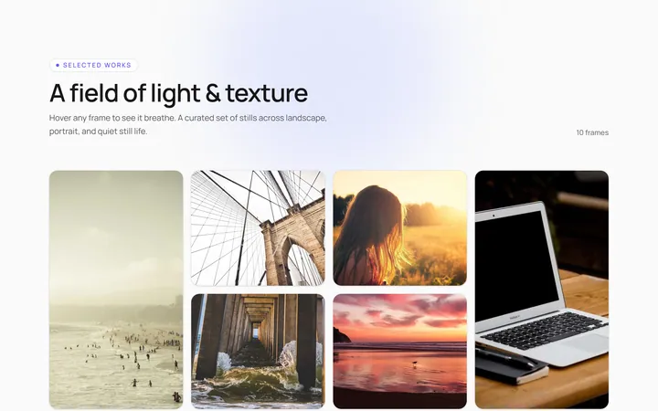
Hover Caption Gallery
OriginalA responsive image grid where each tile subtly zooms and reveals a caption bar on hover.
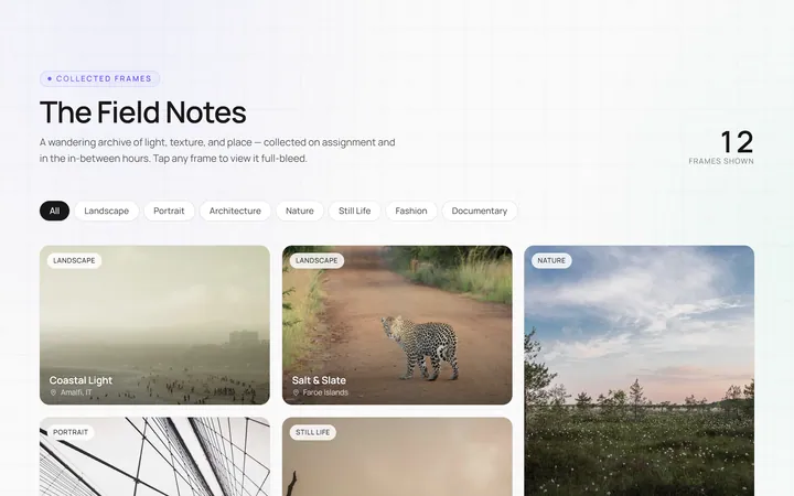
Masonry Gallery
OriginalA Pinterest-style masonry gallery using CSS columns with varied-height images; tiles lift and brighten on hover.
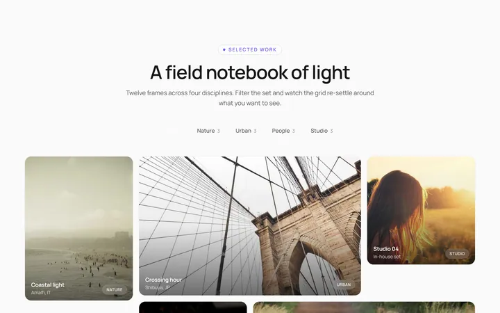
Filterable Gallery
OriginalA filterable gallery with category tabs; clicking a tab animates the grid to show only that category.
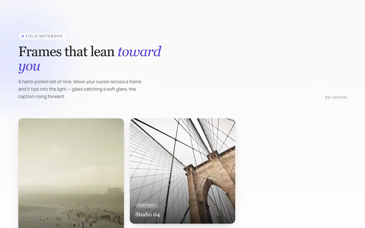
Tilt Cards Gallery
OriginalA grid of image cards that tilt in 3D toward the cursor on hover, with a soft glare.
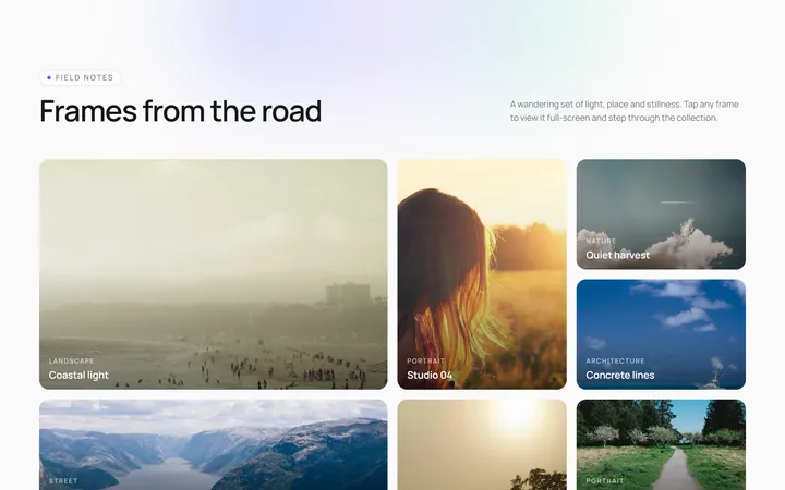
Lightbox Gallery
OriginalA thumbnail grid where clicking a thumb opens a full-screen lightbox with prev/next arrows and keyboard support.
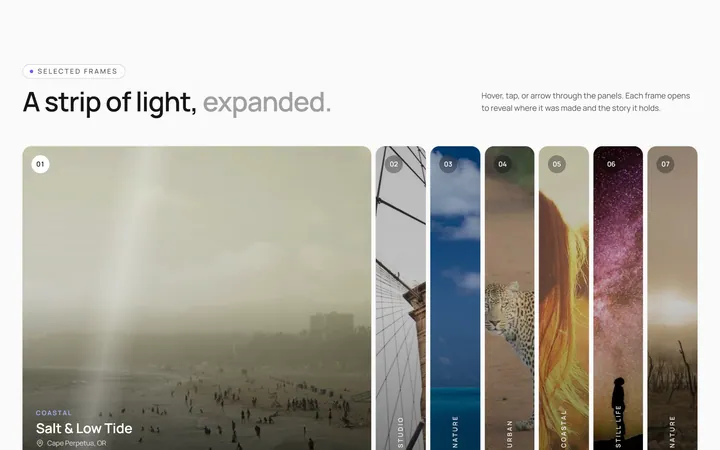
Expanding Strip Gallery
OriginalA horizontal strip of image panels; hovering a panel expands it and shrinks the others to reveal its caption.
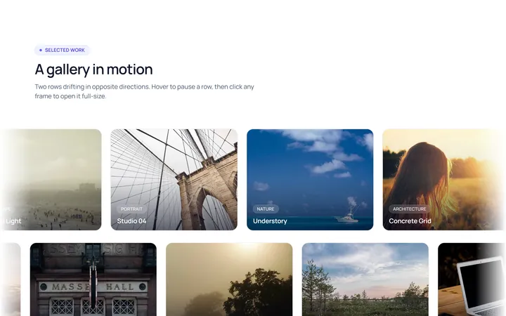
Marquee Gallery
OriginalTwo rows of images auto-scrolling in opposite directions, pausing on hover, with edge fade masks.
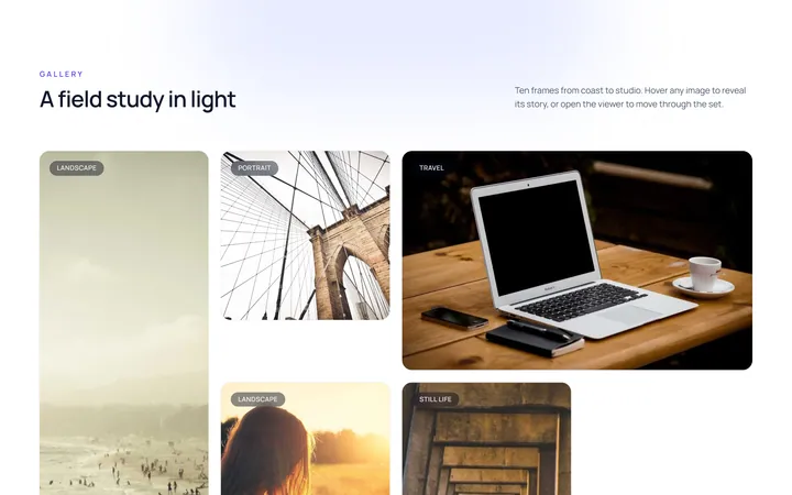
Hover Zoom Overlay Gallery
OriginalA grid where each image scales up under a dark gradient overlay revealing a title and a view button on hover.
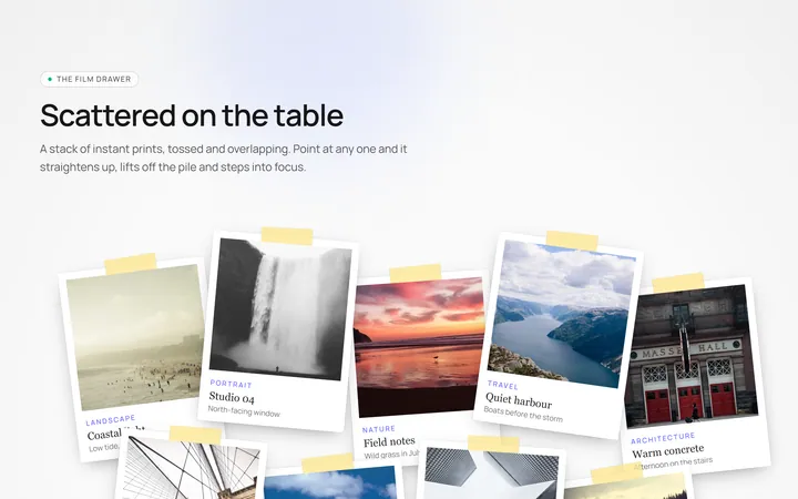
Polaroid Stack Gallery
OriginalA scattered stack of slightly-rotated polaroid photos that straighten and lift on hover.
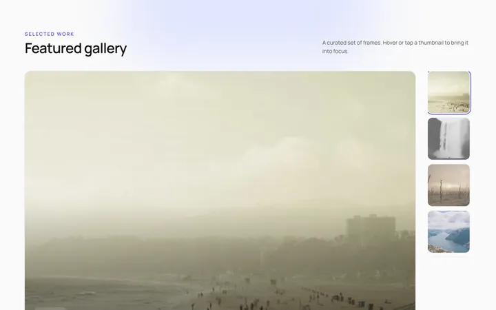
Featured Thumbs Gallery
OriginalA large featured image with a thumbnail row; selecting a thumbnail swaps the featured image with a crossfade.
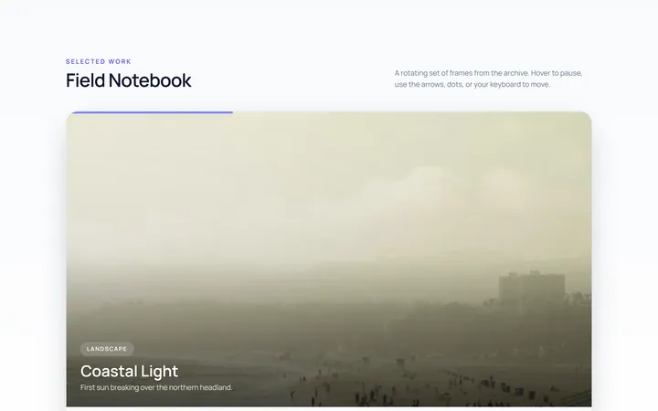
Carousel Gallery
OriginalAn image carousel with arrows and dots, smooth slide transitions and autoplay that pauses on hover.
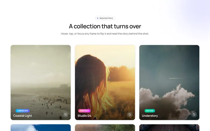
Flip Cards Gallery
OriginalA grid of cards that flip in 3D on hover to reveal a caption and details on the back.