

Featured Thumbs Gallery
Original · freeA large featured image with a thumbnail row; selecting a thumbnail swaps the featured image with a crossfade.
Copy prompt gives Claude Code, Cursor or v0 a ready-to-paste prompt that recreates this exact component.
npx shadcn@latest add https://webinnoventix.com/r/gallery-featured-thumbs.json"use client";
import { useState, useRef, useEffect, useCallback } from "react";
import { AnimatePresence, motion } from "motion/react";
type Shot = {
src: string;
title: string;
category: string;
alt: string;
};
const SHOTS: Shot[] = [
{
src: "/img/gallery/g03.webp",
title: "Coastal light",
category: "Landscape",
alt: "Morning sun breaking over a quiet stretch of coastline",
},
{
src: "/img/gallery/g08.webp",
title: "Studio 04",
category: "Portrait",
alt: "Soft-lit studio portrait against a warm neutral backdrop",
},
{
src: "/img/gallery/g14.webp",
title: "Understory",
category: "Nature",
alt: "Dense green ferns caught in dappled forest light",
},
{
src: "/img/gallery/g21.webp",
title: "Concrete grid",
category: "Architecture",
alt: "Repeating geometry of a brutalist concrete facade",
},
{
src: "/img/gallery/g27.webp",
title: "Golden hour",
category: "Landscape",
alt: "Rolling hills washed in low golden evening light",
},
{
src: "/img/gallery/g11.webp",
title: "Still life 09",
category: "Objects",
alt: "Minimal still life arrangement on a textured surface",
},
{
src: "/img/gallery/g19.webp",
title: "City after rain",
category: "Street",
alt: "Reflections on a wet city street at dusk",
},
{
src: "/img/gallery/g33.webp",
title: "Quiet room",
category: "Interior",
alt: "Sunlit interior with clean lines and soft shadows",
},
];
export default function GalleryFeaturedThumbs() {
const [active, setActive] = useState(0);
const thumbRefs = useRef<(HTMLButtonElement | null)[]>([]);
const select = useCallback((i: number) => {
setActive(((i % SHOTS.length) + SHOTS.length) % SHOTS.length);
}, []);
const onKey = useCallback(
(e: React.KeyboardEvent, i: number) => {
let next = i;
if (e.key === "ArrowRight" || e.key === "ArrowDown") next = i + 1;
else if (e.key === "ArrowLeft" || e.key === "ArrowUp") next = i - 1;
else if (e.key === "Home") next = 0;
else if (e.key === "End") next = SHOTS.length - 1;
else return;
e.preventDefault();
const clamped = ((next % SHOTS.length) + SHOTS.length) % SHOTS.length;
select(clamped);
thumbRefs.current[clamped]?.focus();
},
[select]
);
useEffect(() => {
thumbRefs.current[active]?.scrollIntoView({
behavior: "smooth",
block: "nearest",
inline: "center",
});
}, [active]);
const current = SHOTS[active];
return (
<section
className="relative w-full overflow-hidden bg-neutral-50 px-4 py-16 text-neutral-900 sm:px-6 sm:py-20 lg:px-8 dark:bg-neutral-950 dark:text-neutral-50"
aria-label="Featured gallery"
>
<style>{`
@keyframes gft-shimmer {
0% { transform: translateX(-100%); }
100% { transform: translateX(100%); }
}
.gft-shimmer::after {
content: "";
position: absolute;
inset: 0;
background: linear-gradient(110deg, transparent 30%, rgba(255,255,255,0.14) 50%, transparent 70%);
animation: gft-shimmer 2.6s ease-in-out infinite;
}
@media (prefers-reduced-motion: reduce) {
.gft-shimmer::after { animation: none; }
}
`}</style>
{/* ambient glow */}
<div
aria-hidden="true"
className="pointer-events-none absolute -top-32 left-1/2 h-72 w-[42rem] -translate-x-1/2 rounded-full bg-indigo-300/30 blur-3xl dark:bg-indigo-600/15"
/>
<div className="relative mx-auto max-w-6xl">
<header className="mb-8 flex flex-col gap-3 sm:mb-10 sm:flex-row sm:items-end sm:justify-between">
<div>
<p className="text-xs font-semibold uppercase tracking-[0.2em] text-indigo-600 dark:text-indigo-400">
Selected work
</p>
<h2 className="mt-2 text-2xl font-semibold tracking-tight sm:text-3xl lg:text-4xl">
Featured gallery
</h2>
</div>
<p className="max-w-sm text-sm leading-relaxed text-neutral-600 dark:text-neutral-400">
A curated set of frames. Hover or tap a thumbnail to bring it into
focus.
</p>
</header>
<div className="grid gap-6 lg:grid-cols-[minmax(0,1fr)_7rem] lg:gap-8">
{/* Featured stage */}
<div className="relative">
<div className="group relative aspect-[16/11] w-full overflow-hidden rounded-2xl bg-neutral-200 ring-1 ring-neutral-900/10 dark:bg-neutral-900 dark:ring-white/10">
<AnimatePresence mode="popLayout" initial={false}>
<motion.div
key={current.src}
initial={{ opacity: 0, scale: 1.04 }}
animate={{ opacity: 1, scale: 1 }}
exit={{ opacity: 0, scale: 0.99 }}
transition={{ duration: 0.55, ease: [0.22, 1, 0.36, 1] }}
className="absolute inset-0"
>
{/* eslint-disable-next-line @next/next/no-img-element */}
<img
src={current.src}
alt={current.alt}
loading="lazy"
draggable={false}
className="h-full w-full object-cover"
/>
</motion.div>
</AnimatePresence>
<div
aria-hidden="true"
className="pointer-events-none absolute inset-0 bg-gradient-to-t from-black/60 via-black/5 to-transparent"
/>
<AnimatePresence mode="wait">
<motion.figcaption
key={current.title}
initial={{ opacity: 0, y: 12 }}
animate={{ opacity: 1, y: 0 }}
exit={{ opacity: 0, y: -8 }}
transition={{ duration: 0.4, ease: "easeOut" }}
className="absolute bottom-0 left-0 right-0 flex items-end justify-between gap-4 p-5 sm:p-6"
>
<div>
<span className="inline-block rounded-full bg-white/15 px-2.5 py-1 text-[0.65rem] font-semibold uppercase tracking-wider text-white backdrop-blur">
{current.category}
</span>
<h3 className="mt-2 text-lg font-semibold text-white sm:text-xl">
{current.title}
</h3>
</div>
<span className="shrink-0 text-sm font-medium tabular-nums text-white/80">
{String(active + 1).padStart(2, "0")}
<span className="text-white/40"> / {String(SHOTS.length).padStart(2, "0")}</span>
</span>
</motion.figcaption>
</AnimatePresence>
</div>
{/* Prev / Next controls */}
<div className="mt-4 flex items-center gap-2">
<button
type="button"
onClick={() => select(active - 1)}
aria-label="Previous image"
className="inline-flex h-10 w-10 items-center justify-center rounded-full bg-white text-neutral-700 shadow-sm ring-1 ring-neutral-900/10 transition hover:bg-neutral-100 focus-visible:outline-none focus-visible:ring-2 focus-visible:ring-indigo-500 dark:bg-neutral-900 dark:text-neutral-200 dark:ring-white/10 dark:hover:bg-neutral-800"
>
<svg viewBox="0 0 24 24" className="h-5 w-5" fill="none" stroke="currentColor" strokeWidth={2} aria-hidden="true">
<path d="M15 18l-6-6 6-6" strokeLinecap="round" strokeLinejoin="round" />
</svg>
</button>
<button
type="button"
onClick={() => select(active + 1)}
aria-label="Next image"
className="inline-flex h-10 w-10 items-center justify-center rounded-full bg-white text-neutral-700 shadow-sm ring-1 ring-neutral-900/10 transition hover:bg-neutral-100 focus-visible:outline-none focus-visible:ring-2 focus-visible:ring-indigo-500 dark:bg-neutral-900 dark:text-neutral-200 dark:ring-white/10 dark:hover:bg-neutral-800"
>
<svg viewBox="0 0 24 24" className="h-5 w-5" fill="none" stroke="currentColor" strokeWidth={2} aria-hidden="true">
<path d="M9 18l6-6-6-6" strokeLinecap="round" strokeLinejoin="round" />
</svg>
</button>
<div className="ml-1 h-1.5 flex-1 overflow-hidden rounded-full bg-neutral-200 dark:bg-neutral-800">
<motion.div
className="h-full rounded-full bg-indigo-500"
animate={{ width: `${((active + 1) / SHOTS.length) * 100}%` }}
transition={{ duration: 0.5, ease: [0.22, 1, 0.36, 1] }}
/>
</div>
</div>
</div>
{/* Thumbnail rail */}
<div
role="listbox"
aria-label="Choose a photo"
aria-orientation="vertical"
className="flex gap-3 overflow-x-auto pb-2 lg:max-h-[30rem] lg:flex-col lg:overflow-y-auto lg:overflow-x-visible lg:pb-0 lg:pr-1 [scrollbar-width:thin]"
>
{SHOTS.map((shot, i) => {
const selected = i === active;
return (
<button
key={shot.src}
ref={(el) => {
thumbRefs.current[i] = el;
}}
type="button"
role="option"
aria-selected={selected}
aria-label={`${shot.title}, ${shot.category}`}
tabIndex={selected ? 0 : -1}
onClick={() => select(i)}
onMouseEnter={() => select(i)}
onFocus={() => select(i)}
onKeyDown={(e) => onKey(e, i)}
className={`relative aspect-square w-20 shrink-0 overflow-hidden rounded-xl outline-none transition duration-300 lg:w-full ${
selected
? "ring-2 ring-indigo-500 ring-offset-2 ring-offset-neutral-50 dark:ring-offset-neutral-950"
: "opacity-70 ring-1 ring-neutral-900/10 hover:opacity-100 focus-visible:opacity-100 focus-visible:ring-2 focus-visible:ring-indigo-400 dark:ring-white/10"
}`}
>
{/* eslint-disable-next-line @next/next/no-img-element */}
<img
src={shot.src}
alt={shot.alt}
loading="lazy"
draggable={false}
className={`h-full w-full object-cover transition duration-500 ${
selected ? "scale-105" : "scale-100"
}`}
/>
{!selected && (
<span
aria-hidden="true"
className="absolute inset-0 bg-neutral-950/10 dark:bg-neutral-950/30"
/>
)}
</button>
);
})}
</div>
</div>
</div>
</section>
);
}Dependencies
Licence
Built by Web Innoventix. Free for personal and commercial use, no attribution required.
Built by Web Innoventix
Need a custom interface, a full website, or SEO that gets you cited by AI? We design, build and rank it end to end.
Get a free quoteSimilar components
Browse all →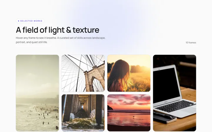
Hover Caption Gallery
OriginalA responsive image grid where each tile subtly zooms and reveals a caption bar on hover.
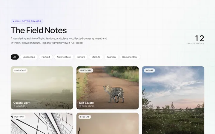
Masonry Gallery
OriginalA Pinterest-style masonry gallery using CSS columns with varied-height images; tiles lift and brighten on hover.
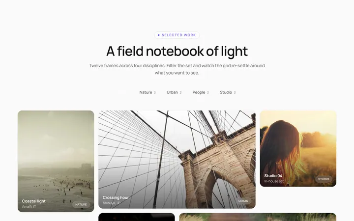
Filterable Gallery
OriginalA filterable gallery with category tabs; clicking a tab animates the grid to show only that category.
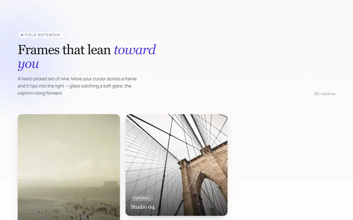
Tilt Cards Gallery
OriginalA grid of image cards that tilt in 3D toward the cursor on hover, with a soft glare.
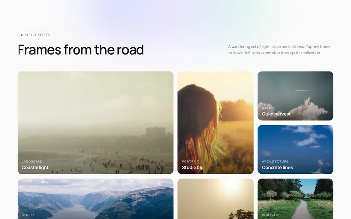
Lightbox Gallery
OriginalA thumbnail grid where clicking a thumb opens a full-screen lightbox with prev/next arrows and keyboard support.
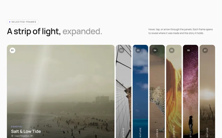
Expanding Strip Gallery
OriginalA horizontal strip of image panels; hovering a panel expands it and shrinks the others to reveal its caption.
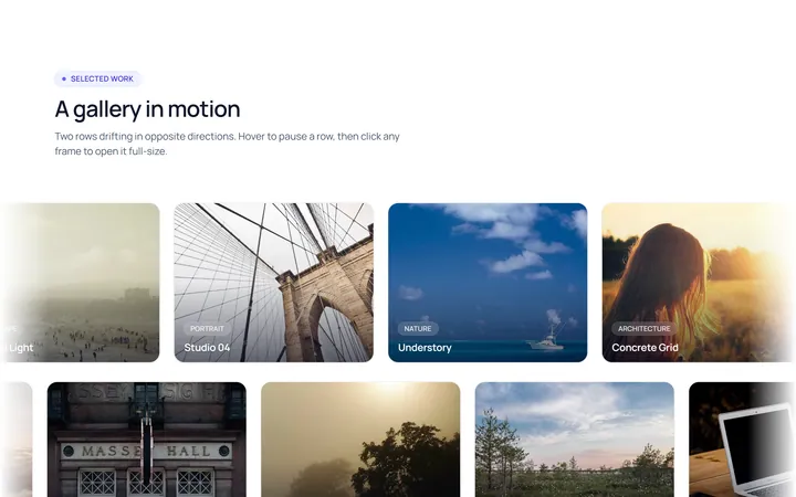
Marquee Gallery
OriginalTwo rows of images auto-scrolling in opposite directions, pausing on hover, with edge fade masks.
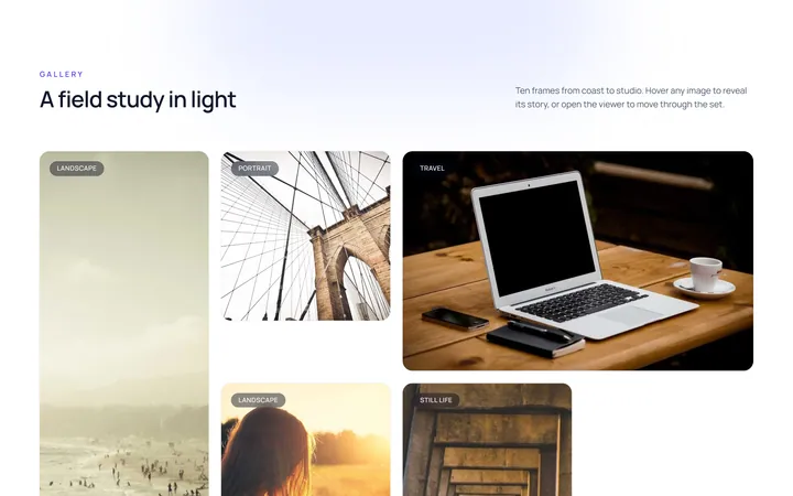
Hover Zoom Overlay Gallery
OriginalA grid where each image scales up under a dark gradient overlay revealing a title and a view button on hover.
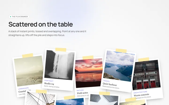
Polaroid Stack Gallery
OriginalA scattered stack of slightly-rotated polaroid photos that straighten and lift on hover.
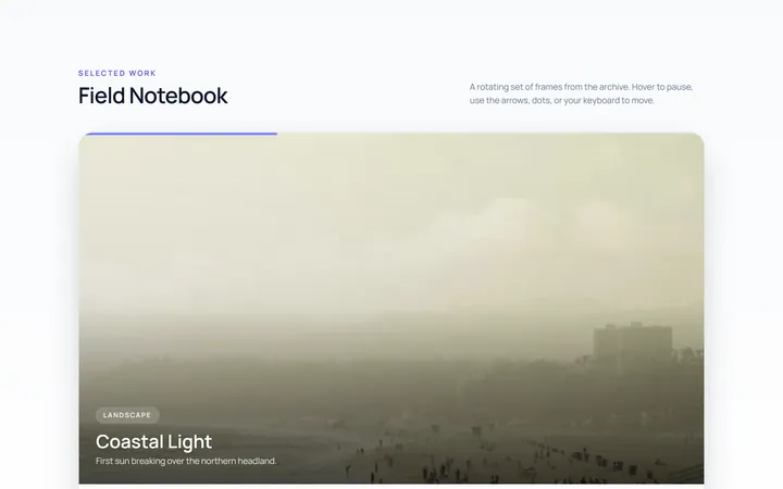
Carousel Gallery
OriginalAn image carousel with arrows and dots, smooth slide transitions and autoplay that pauses on hover.
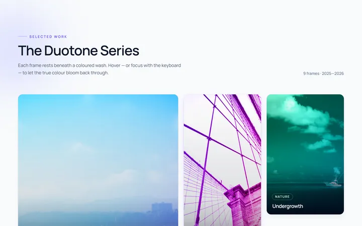
Duotone Hover Gallery
OriginalA grid where images sit under a coloured duotone wash that clears to full colour on hover.
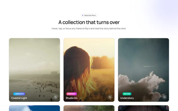
Flip Cards Gallery
OriginalA grid of cards that flip in 3D on hover to reveal a caption and details on the back.