

Polaroid Stack Gallery
Original · freeA scattered stack of slightly-rotated polaroid photos that straighten and lift on hover.
Copy prompt gives Claude Code, Cursor or v0 a ready-to-paste prompt that recreates this exact component.
npx shadcn@latest add https://webinnoventix.com/r/gallery-polaroid-stack.json"use client";
import { useRef, useState } from "react";
import {
motion,
useInView,
useReducedMotion,
type Variants,
} from "motion/react";
type Polaroid = {
src: string;
title: string;
caption: string;
category: string;
rotate: number;
// position as a percentage of the board, tuned for a hand-scattered look
left: string;
top: string;
z: number;
};
const PHOTOS: Polaroid[] = [
{
src: "/img/gallery/g03.webp",
title: "Coastal light",
caption: "Low tide, 6:42am",
category: "Landscape",
rotate: -7,
left: "4%",
top: "8%",
z: 2,
},
{
src: "/img/gallery/g08.webp",
title: "Studio 04",
caption: "North-facing window",
category: "Portrait",
rotate: 5,
left: "23%",
top: "2%",
z: 4,
},
{
src: "/img/gallery/g15.webp",
title: "Field notes",
caption: "Wild grass in July",
category: "Nature",
rotate: -4,
left: "43%",
top: "10%",
z: 3,
},
{
src: "/img/gallery/g21.webp",
title: "Quiet harbour",
caption: "Boats before the storm",
category: "Travel",
rotate: 8,
left: "62%",
top: "3%",
z: 5,
},
{
src: "/img/gallery/g27.webp",
title: "Warm concrete",
caption: "Afternoon on the stairs",
category: "Architecture",
rotate: -6,
left: "80%",
top: "12%",
z: 2,
},
{
src: "/img/gallery/g11.webp",
title: "First frost",
caption: "The garden turns silver",
category: "Nature",
rotate: 6,
left: "10%",
top: "44%",
z: 6,
},
{
src: "/img/gallery/g18.webp",
title: "Golden hour",
caption: "Rooftops going amber",
category: "Cityscape",
rotate: -5,
left: "31%",
top: "50%",
z: 3,
},
{
src: "/img/gallery/g30.webp",
title: "Still life",
caption: "Fruit and morning shadow",
category: "Studio",
rotate: 4,
left: "52%",
top: "46%",
z: 5,
},
{
src: "/img/gallery/g34.webp",
title: "Open road",
caption: "Somewhere past the ridge",
category: "Travel",
rotate: -8,
left: "72%",
top: "52%",
z: 4,
},
];
export default function GalleryPolaroidStack() {
const sectionRef = useRef<HTMLElement | null>(null);
const boardRef = useRef<HTMLDivElement | null>(null);
const inView = useInView(boardRef, { once: true, margin: "-80px" });
const reduceMotion = useReducedMotion();
const [active, setActive] = useState<number | null>(null);
const cardVariants: Variants = {
hidden: (rotate: number) => ({
opacity: 0,
y: reduceMotion ? 0 : 40,
rotate: reduceMotion ? rotate : rotate * 2.2,
scale: reduceMotion ? 1 : 0.9,
}),
show: (rotate: number) => ({
opacity: 1,
y: 0,
rotate,
scale: 1,
transition: {
type: "spring",
stiffness: 120,
damping: 16,
mass: 0.7,
},
}),
};
return (
<section
ref={sectionRef}
aria-labelledby="polaroid-stack-heading"
className="relative w-full overflow-hidden bg-neutral-50 px-5 py-20 sm:px-8 sm:py-28 dark:bg-neutral-950"
>
<style>{`
@keyframes gps-tape-sheen {
0% { transform: translateX(-120%) skewX(-18deg); opacity: 0; }
40% { opacity: 0.7; }
100% { transform: translateX(320%) skewX(-18deg); opacity: 0; }
}
@media (min-width: 1024px) {
.gps-card {
position: absolute;
left: var(--gps-l);
top: var(--gps-t);
margin: 0;
}
}
@media (prefers-reduced-motion: reduce) {
.gps-tape-sheen { animation: none !important; }
}
`}</style>
{/* soft ambient backdrop */}
<div
aria-hidden="true"
className="pointer-events-none absolute inset-0"
>
<div className="absolute -top-32 left-1/4 h-96 w-96 rounded-full bg-indigo-200/40 blur-3xl dark:bg-indigo-500/10" />
<div className="absolute -bottom-24 right-1/5 h-80 w-80 rounded-full bg-violet-200/40 blur-3xl dark:bg-violet-500/10" />
<div className="absolute inset-0 bg-[radial-gradient(circle_at_center,transparent_55%,rgba(0,0,0,0.04))] dark:bg-[radial-gradient(circle_at_center,transparent_55%,rgba(0,0,0,0.35))]" />
</div>
<div className="relative mx-auto max-w-6xl">
<div className="mb-14 max-w-2xl sm:mb-20">
<span className="inline-flex items-center gap-2 rounded-full border border-neutral-300 bg-white/70 px-3 py-1 text-xs font-medium uppercase tracking-widest text-neutral-600 backdrop-blur dark:border-neutral-700 dark:bg-neutral-900/70 dark:text-neutral-400">
<span className="h-1.5 w-1.5 rounded-full bg-emerald-500" />
The film drawer
</span>
<h2
id="polaroid-stack-heading"
className="mt-5 text-3xl font-semibold tracking-tight text-neutral-900 sm:text-4xl md:text-5xl dark:text-neutral-50"
>
Scattered on the table
</h2>
<p className="mt-4 text-base leading-relaxed text-neutral-600 sm:text-lg dark:text-neutral-400">
A stack of instant prints, tossed and overlapping. Point at any one
and it straightens up, lifts off the pile and steps into focus.
</p>
</div>
{/* Scatter board — absolute layout on lg, honest stacked grid below */}
<div
ref={boardRef}
className="relative mx-auto grid grid-cols-2 gap-5 sm:grid-cols-3 lg:block lg:h-[760px] lg:gap-0"
>
{PHOTOS.map((photo, i) => {
const isActive = active === i;
const style: React.CSSProperties = {
zIndex: isActive ? 50 : photo.z,
["--gps-l" as string]: photo.left,
["--gps-t" as string]: photo.top,
};
return (
<motion.figure
key={photo.src}
custom={photo.rotate}
variants={cardVariants}
initial="hidden"
animate={inView ? "show" : "hidden"}
onHoverStart={() => setActive(i)}
onHoverEnd={() => setActive((c) => (c === i ? null : c))}
onFocus={() => setActive(i)}
onBlur={() => setActive((c) => (c === i ? null : c))}
tabIndex={0}
aria-label={`${photo.title} — ${photo.caption}, ${photo.category}`}
whileHover={
reduceMotion ? undefined : { rotate: 0, y: -16, scale: 1.05 }
}
whileFocus={
reduceMotion ? undefined : { rotate: 0, y: -16, scale: 1.05 }
}
transition={{ type: "spring", stiffness: 260, damping: 20 }}
style={style}
className="gps-card group relative mx-auto w-full max-w-[240px] cursor-pointer rounded-[3px] outline-none lg:w-[236px] lg:max-w-none"
>
<PolaroidCard photo={photo} active={isActive} />
</motion.figure>
);
})}
</div>
<p className="mt-14 text-center text-sm text-neutral-500 sm:mt-20 dark:text-neutral-500">
Nine of thirty-six frames. Tab through them with the keyboard, too.
</p>
</div>
</section>
);
}
function PolaroidCard({
photo,
active,
}: {
photo: Polaroid;
active: boolean;
}) {
return (
<div
className={`relative rounded-[3px] bg-white p-3 pb-0 shadow-[0_10px_30px_-12px_rgba(0,0,0,0.45)] ring-1 ring-black/5 transition-shadow duration-300 dark:bg-neutral-100 ${
active
? "shadow-[0_28px_60px_-18px_rgba(0,0,0,0.6)]"
: "group-hover:shadow-[0_28px_60px_-18px_rgba(0,0,0,0.6)]"
}`}
>
{/* strip of tape */}
<span
aria-hidden="true"
className="absolute -top-3 left-1/2 h-6 w-20 -translate-x-1/2 -rotate-2 overflow-hidden bg-amber-200/70 shadow-sm ring-1 ring-amber-300/40 dark:bg-amber-300/50"
>
<span
className={`gps-tape-sheen absolute inset-y-0 left-0 w-8 bg-white/70 ${
active ? "" : "opacity-0"
}`}
style={{ animation: active ? "gps-tape-sheen 0.9s ease-out" : "none" }}
/>
</span>
<div className="relative overflow-hidden bg-neutral-200 dark:bg-neutral-300">
{/* eslint-disable-next-line @next/next/no-img-element */}
<img
src={photo.src}
alt={`${photo.title} — ${photo.caption}`}
loading="lazy"
draggable={false}
className="block aspect-square w-full object-cover"
/>
{/* film gradient */}
<span
aria-hidden="true"
className="pointer-events-none absolute inset-0 bg-gradient-to-t from-black/15 via-transparent to-white/10"
/>
</div>
<figcaption className="px-1 py-3">
<span className="block text-[11px] font-medium uppercase tracking-[0.18em] text-indigo-500 dark:text-indigo-600">
{photo.category}
</span>
<span
className="mt-0.5 block text-[17px] leading-tight text-neutral-800 dark:text-neutral-900"
style={{ fontFamily: "ui-serif, Georgia, 'Times New Roman', serif" }}
>
{photo.title}
</span>
<span className="mt-0.5 block text-xs text-neutral-500 dark:text-neutral-600">
{photo.caption}
</span>
</figcaption>
</div>
);
}Dependencies
Licence
Built by Web Innoventix. Free for personal and commercial use, no attribution required.
Built by Web Innoventix
Need a custom interface, a full website, or SEO that gets you cited by AI? We design, build and rank it end to end.
Get a free quoteSimilar components
Browse all →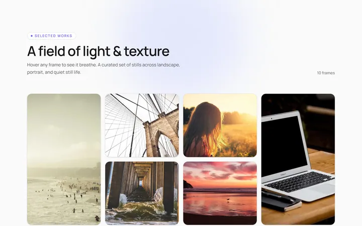
Hover Caption Gallery
OriginalA responsive image grid where each tile subtly zooms and reveals a caption bar on hover.
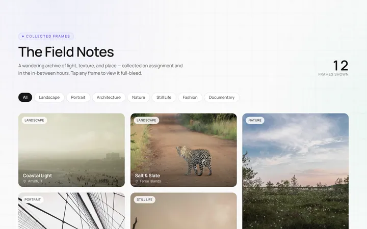
Masonry Gallery
OriginalA Pinterest-style masonry gallery using CSS columns with varied-height images; tiles lift and brighten on hover.
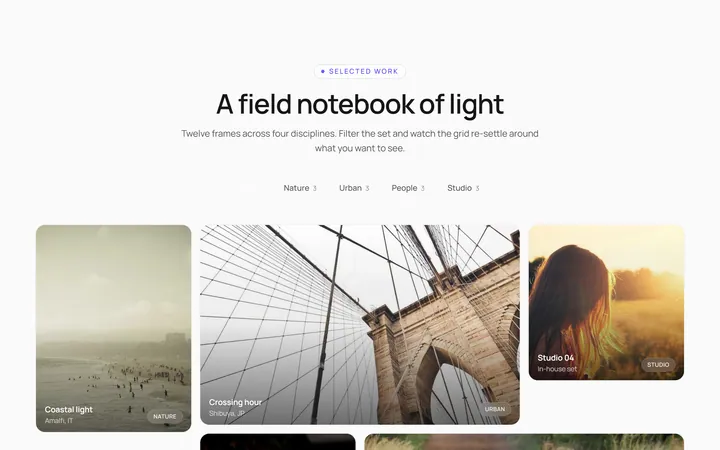
Filterable Gallery
OriginalA filterable gallery with category tabs; clicking a tab animates the grid to show only that category.
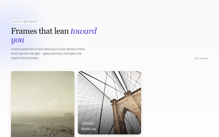
Tilt Cards Gallery
OriginalA grid of image cards that tilt in 3D toward the cursor on hover, with a soft glare.
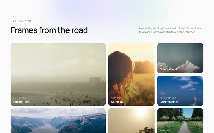
Lightbox Gallery
OriginalA thumbnail grid where clicking a thumb opens a full-screen lightbox with prev/next arrows and keyboard support.
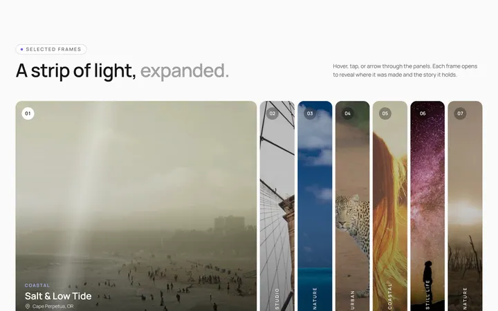
Expanding Strip Gallery
OriginalA horizontal strip of image panels; hovering a panel expands it and shrinks the others to reveal its caption.
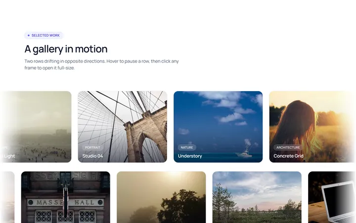
Marquee Gallery
OriginalTwo rows of images auto-scrolling in opposite directions, pausing on hover, with edge fade masks.
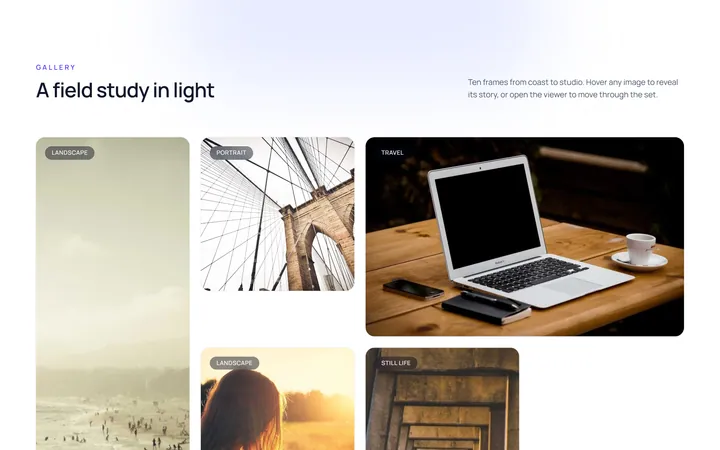
Hover Zoom Overlay Gallery
OriginalA grid where each image scales up under a dark gradient overlay revealing a title and a view button on hover.
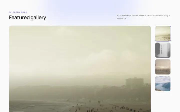
Featured Thumbs Gallery
OriginalA large featured image with a thumbnail row; selecting a thumbnail swaps the featured image with a crossfade.
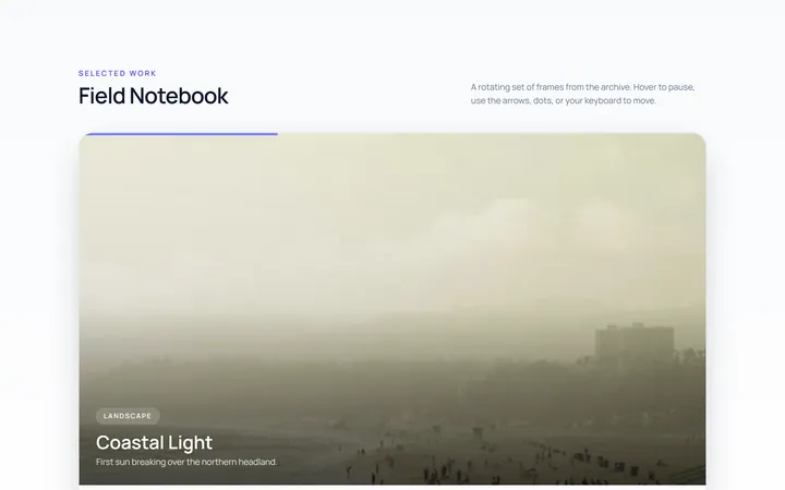
Carousel Gallery
OriginalAn image carousel with arrows and dots, smooth slide transitions and autoplay that pauses on hover.
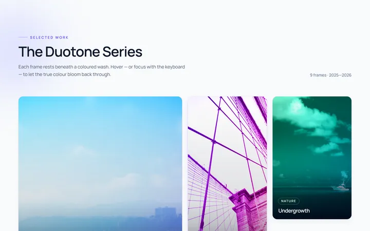
Duotone Hover Gallery
OriginalA grid where images sit under a coloured duotone wash that clears to full colour on hover.
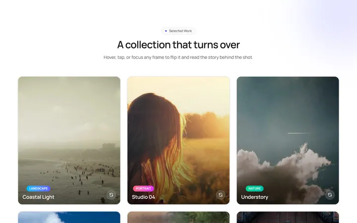
Flip Cards Gallery
OriginalA grid of cards that flip in 3D on hover to reveal a caption and details on the back.