

Centered Gradient Hero
Original · freecentred hero on a gradient
Copy prompt gives Claude Code, Cursor or v0 a ready-to-paste prompt that recreates this exact component.
npx shadcn@latest add https://webinnoventix.com/r/herox-centered-gradient.json"use client";
import { useState, type ChangeEvent, type FormEvent } from "react";
import { motion, useReducedMotion, type Variants } from "motion/react";
type AudienceId = "startups" | "enterprise" | "agencies";
type FormStatus = "idle" | "error" | "success";
interface Audience {
id: AudienceId;
label: string;
blurb: string;
}
const AUDIENCES: Audience[] = [
{
id: "startups",
label: "Startups",
blurb: "Built for lean teams shipping fast on a short runway.",
},
{
id: "enterprise",
label: "Enterprise",
blurb: "SSO, granular roles, and audit logs your security team will actually sign off on.",
},
{
id: "agencies",
label: "Agencies",
blurb: "Run every client workspace from one dashboard — no more account switching.",
},
];
const HXCG_CSS = `
@keyframes hxcg-float-a {
0%, 100% { transform: translate3d(0, 0, 0) scale(1); }
50% { transform: translate3d(0, -34px, 0) scale(1.07); }
}
@keyframes hxcg-float-b {
0%, 100% { transform: translate3d(0, 0, 0) scale(1); }
50% { transform: translate3d(26px, 22px, 0) scale(1.09); }
}
@keyframes hxcg-pulse {
0%, 100% { opacity: 1; transform: scale(1); }
50% { opacity: 0.35; transform: scale(0.7); }
}
@keyframes hxcg-spin {
to { transform: translateX(-50%) rotate(360deg); }
}
.hxcg-grid {
background-image:
linear-gradient(to right, rgba(100, 116, 139, 0.14) 1px, transparent 1px),
linear-gradient(to bottom, rgba(100, 116, 139, 0.14) 1px, transparent 1px);
background-size: 56px 56px;
-webkit-mask-image: radial-gradient(ellipse 72% 62% at 50% 0%, #000 38%, transparent 80%);
mask-image: radial-gradient(ellipse 72% 62% at 50% 0%, #000 38%, transparent 80%);
}
.hxcg-halo {
background: conic-gradient(
from 0deg,
rgba(99, 102, 241, 0),
rgba(99, 102, 241, 0.38),
rgba(168, 85, 247, 0.38),
rgba(56, 189, 248, 0.38),
rgba(99, 102, 241, 0)
);
animation: hxcg-spin 28s linear infinite;
}
.hxcg-orb-a { animation: hxcg-float-a 15s ease-in-out infinite; }
.hxcg-orb-b { animation: hxcg-float-b 19s ease-in-out infinite; }
.hxcg-orb-c { animation: hxcg-float-a 23s ease-in-out infinite reverse; }
.hxcg-dot { animation: hxcg-pulse 2.4s ease-in-out infinite; }
@media (prefers-reduced-motion: reduce) {
.hxcg-halo, .hxcg-orb-a, .hxcg-orb-b, .hxcg-orb-c, .hxcg-dot {
animation: none !important;
}
}
`;
const container: Variants = {
hidden: {},
show: { transition: { staggerChildren: 0.08, delayChildren: 0.05 } },
};
const item: Variants = {
hidden: { opacity: 0, y: 18 },
show: { opacity: 1, y: 0, transition: { duration: 0.5, ease: "easeOut" } },
};
const EMAIL_RE = /^[^\s@]+@[^\s@]+\.[^\s@]+$/;
export default function HeroxCenteredGradient() {
const prefersReducedMotion = useReducedMotion();
const [audience, setAudience] = useState<AudienceId>("startups");
const [email, setEmail] = useState<string>("");
const [status, setStatus] = useState<FormStatus>("idle");
const active = AUDIENCES.find((a) => a.id === audience) ?? AUDIENCES[0];
const handleChange = (event: ChangeEvent<HTMLInputElement>) => {
setEmail(event.target.value);
if (status === "error") setStatus("idle");
};
const handleSubmit = (event: FormEvent<HTMLFormElement>) => {
event.preventDefault();
if (!EMAIL_RE.test(email.trim())) {
setStatus("error");
return;
}
setStatus("success");
};
const resetForm = () => {
setStatus("idle");
setEmail("");
};
return (
<section className="relative w-full overflow-hidden bg-gradient-to-b from-white via-indigo-50/60 to-white px-6 py-24 sm:py-32 dark:from-slate-950 dark:via-indigo-950/40 dark:to-slate-950">
<style>{HXCG_CSS}</style>
<div aria-hidden="true" className="pointer-events-none absolute inset-0">
<div className="hxcg-grid absolute inset-0" />
<div className="hxcg-halo absolute left-1/2 top-[-20%] h-[44rem] w-[44rem] rounded-full opacity-50 blur-2xl dark:opacity-40" />
<div className="hxcg-orb-a absolute -left-16 top-24 h-72 w-72 rounded-full bg-gradient-to-br from-indigo-400/40 to-sky-400/30 blur-3xl dark:from-indigo-500/30 dark:to-sky-500/20" />
<div className="hxcg-orb-b absolute -right-12 top-40 h-80 w-80 rounded-full bg-gradient-to-br from-violet-400/40 to-rose-400/25 blur-3xl dark:from-violet-500/30 dark:to-rose-500/20" />
<div className="hxcg-orb-c absolute -bottom-24 left-1/3 h-72 w-72 rounded-full bg-gradient-to-br from-emerald-300/30 to-sky-400/25 blur-3xl dark:from-emerald-500/20 dark:to-sky-500/20" />
</div>
<motion.div
variants={container}
initial={prefersReducedMotion ? false : "hidden"}
animate="show"
className="relative mx-auto flex max-w-3xl flex-col items-center text-center"
>
<motion.a
variants={item}
href="#changelog"
className="group inline-flex items-center gap-2 rounded-full border border-slate-200/80 bg-white/70 px-3 py-1 text-sm font-medium text-slate-700 shadow-sm backdrop-blur transition hover:border-indigo-300 hover:text-slate-900 focus-visible:outline-none focus-visible:ring-2 focus-visible:ring-indigo-500 focus-visible:ring-offset-2 focus-visible:ring-offset-white dark:border-white/10 dark:bg-white/5 dark:text-slate-300 dark:hover:text-white dark:focus-visible:ring-offset-slate-950"
>
<span className="relative flex h-2 w-2">
<span className="hxcg-dot absolute inline-flex h-full w-full rounded-full bg-emerald-400" />
<span className="relative inline-flex h-2 w-2 rounded-full bg-emerald-500" />
</span>
Northwind Automations 2.0 is live
<svg
viewBox="0 0 16 16"
aria-hidden="true"
className="h-3.5 w-3.5 transition-transform group-hover:translate-x-0.5"
fill="none"
stroke="currentColor"
strokeWidth="1.6"
strokeLinecap="round"
strokeLinejoin="round"
>
<path d="M4 8h8" />
<path d="M8.5 4.5 12 8l-3.5 3.5" />
</svg>
</motion.a>
<motion.h1
variants={item}
className="mt-6 text-4xl font-semibold tracking-tight text-slate-900 sm:text-6xl dark:text-white"
>
Ship the work that used to take weeks{" "}
<span className="bg-gradient-to-r from-indigo-600 via-violet-600 to-sky-600 bg-clip-text text-transparent dark:from-indigo-300 dark:via-violet-300 dark:to-sky-300">
in a single afternoon
</span>
</motion.h1>
<motion.p
variants={item}
className="mt-6 max-w-2xl text-lg leading-relaxed text-slate-600 dark:text-slate-300"
>
Northwind connects the tools you already use, automates the busywork, and
gives every team one calm place to move projects forward — no more status
meetings or scattered spreadsheets.
</motion.p>
<motion.div variants={item} className="mt-8 flex flex-col items-center gap-3">
<div
role="group"
aria-label="Choose your team type"
className="inline-flex items-center gap-1 rounded-full border border-slate-200 bg-white/70 p-1 backdrop-blur dark:border-white/10 dark:bg-white/5"
>
{AUDIENCES.map((option) => {
const selected = option.id === audience;
return (
<button
key={option.id}
type="button"
onClick={() => setAudience(option.id)}
aria-pressed={selected}
className={`relative rounded-full px-4 py-1.5 text-sm font-medium transition focus-visible:outline-none focus-visible:ring-2 focus-visible:ring-indigo-500 ${
selected
? "text-slate-900 dark:text-white"
: "text-slate-500 hover:text-slate-700 dark:text-slate-400 dark:hover:text-slate-200"
}`}
>
{selected && (
<motion.span
layoutId="hxcg-seg"
transition={{
duration: prefersReducedMotion ? 0 : 0.3,
ease: "easeOut",
}}
className="absolute inset-0 rounded-full bg-white shadow-sm dark:bg-slate-800"
/>
)}
<span className="relative z-10">{option.label}</span>
</button>
);
})}
</div>
<p
aria-live="polite"
className="min-h-[1.5rem] max-w-md text-sm text-slate-500 dark:text-slate-400"
>
{active.blurb}
</p>
</motion.div>
<motion.div variants={item} className="mt-10 w-full max-w-md">
{status === "success" ? (
<div
role="status"
className="flex items-center gap-3 rounded-2xl border border-emerald-200 bg-emerald-50 px-5 py-4 text-left dark:border-emerald-500/30 dark:bg-emerald-500/10"
>
<svg
viewBox="0 0 24 24"
aria-hidden="true"
className="h-6 w-6 shrink-0 text-emerald-600 dark:text-emerald-400"
fill="none"
stroke="currentColor"
strokeWidth="2"
strokeLinecap="round"
strokeLinejoin="round"
>
<circle cx="12" cy="12" r="9" />
<path d="m8.5 12 2.5 2.5 4.5-5" />
</svg>
<div className="flex-1">
<p className="text-sm font-semibold text-emerald-800 dark:text-emerald-200">
You're on the list.
</p>
<p className="text-sm text-emerald-700/80 dark:text-emerald-300/70">
A workspace invite is on its way to {email}.
</p>
</div>
<button
type="button"
onClick={resetForm}
className="shrink-0 rounded-md text-sm font-medium text-emerald-700 underline underline-offset-2 transition hover:text-emerald-900 focus-visible:outline-none focus-visible:ring-2 focus-visible:ring-emerald-500 dark:text-emerald-300 dark:hover:text-emerald-100"
>
Undo
</button>
</div>
) : (
<form noValidate onSubmit={handleSubmit} className="flex flex-col gap-3 sm:flex-row">
<div className="flex-1 text-left">
<label htmlFor="hxcg-email" className="sr-only">
Work email
</label>
<input
id="hxcg-email"
name="email"
type="email"
autoComplete="email"
inputMode="email"
value={email}
onChange={handleChange}
placeholder="you@company.com"
aria-invalid={status === "error"}
aria-describedby={status === "error" ? "hxcg-email-error" : undefined}
className={`w-full rounded-xl border bg-white/80 px-4 py-3 text-sm text-slate-900 shadow-sm outline-none transition placeholder:text-slate-400 focus:ring-2 focus:ring-indigo-500/40 dark:bg-white/5 dark:text-white dark:placeholder:text-slate-500 ${
status === "error"
? "border-rose-400 focus:border-rose-500 dark:border-rose-500/60"
: "border-slate-300 focus:border-indigo-500 dark:border-white/10"
}`}
/>
{status === "error" && (
<p
id="hxcg-email-error"
role="alert"
className="mt-1.5 px-1 text-left text-sm text-rose-600 dark:text-rose-400"
>
Please enter a valid work email.
</p>
)}
</div>
<button
type="submit"
className="inline-flex shrink-0 items-center justify-center gap-2 rounded-xl bg-gradient-to-r from-indigo-600 to-violet-600 px-5 py-3 text-sm font-semibold text-white shadow-sm transition hover:from-indigo-500 hover:to-violet-500 focus-visible:outline-none focus-visible:ring-2 focus-visible:ring-indigo-500 focus-visible:ring-offset-2 focus-visible:ring-offset-white dark:focus-visible:ring-offset-slate-950"
>
Start free
<svg
viewBox="0 0 16 16"
aria-hidden="true"
className="h-4 w-4"
fill="none"
stroke="currentColor"
strokeWidth="1.8"
strokeLinecap="round"
strokeLinejoin="round"
>
<path d="M3 8h10" />
<path d="M9 4l4 4-4 4" />
</svg>
</button>
</form>
)}
<p className="mt-3 text-xs text-slate-500 dark:text-slate-400">
Free 14-day trial · No credit card required
</p>
</motion.div>
<motion.ul
variants={item}
className="mt-12 flex flex-wrap items-center justify-center gap-x-8 gap-y-3 text-sm text-slate-500 dark:text-slate-400"
>
<li className="inline-flex items-center gap-2">
<svg
viewBox="0 0 24 24"
aria-hidden="true"
className="h-4 w-4 text-indigo-500 dark:text-indigo-400"
fill="none"
stroke="currentColor"
strokeWidth="1.8"
strokeLinecap="round"
strokeLinejoin="round"
>
<path d="M16 20v-2a4 4 0 0 0-4-4H6a4 4 0 0 0-4 4v2" />
<circle cx="9" cy="7" r="3.2" />
<path d="M22 20v-2a4 4 0 0 0-3-3.87" />
<path d="M16 3.5a4 4 0 0 1 0 7" />
</svg>
Trusted by 4,200+ teams
</li>
<li className="inline-flex items-center gap-2">
<svg
viewBox="0 0 24 24"
aria-hidden="true"
className="h-4 w-4 text-emerald-500 dark:text-emerald-400"
fill="none"
stroke="currentColor"
strokeWidth="1.8"
strokeLinecap="round"
strokeLinejoin="round"
>
<path d="M12 3 5 6v5c0 4.5 3 7.7 7 9 4-1.3 7-4.5 7-9V6l-7-3Z" />
<path d="m9 12 2 2 4-4" />
</svg>
SOC 2 Type II
</li>
<li className="inline-flex items-center gap-2">
<svg
viewBox="0 0 24 24"
aria-hidden="true"
className="h-4 w-4 text-amber-500 dark:text-amber-400"
fill="none"
stroke="currentColor"
strokeWidth="1.8"
strokeLinecap="round"
strokeLinejoin="round"
>
<path d="M13 2 4 14h6l-1 8 9-12h-6l1-8Z" />
</svg>
99.99% uptime
</li>
</motion.ul>
</motion.div>
</section>
);
}Dependencies
Licence
Built by Web Innoventix. Free for personal and commercial use, no attribution required.
Built by Web Innoventix
Need a custom interface, a full website, or SEO that gets you cited by AI? We design, build and rank it end to end.
Get a free quoteSimilar components
Browse all →
Spotlight Hero
OriginalA centred hero with a soft radial spotlight, badge and dual call-to-action.

Split Hero
OriginalA two-column hero pairing a headline and CTAs with a product mock and social proof.

Gradient Spotlight Hero
OriginalA minimal centred hero with a soft gradient-mesh backdrop, announcement pill and dual call-to-action buttons.

App Preview Hero
OriginalA centred hero that pairs headline copy with a realistic product dashboard mock built entirely from markup, complete with browser chrome and a floating notification card.

Waitlist Capture Hero
OriginalA dark, focused hero with an inline email capture form and avatar social proof, ready for pre-launch waitlists.

Image Backdrop Hero
OriginalA cinematic full-bleed hero with a layered image-style backdrop, overlaid left-aligned copy and a trusted-by logos strip.
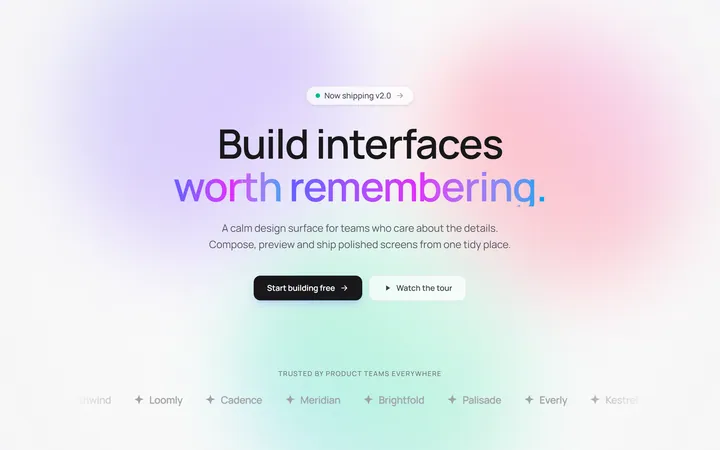
Gradient Mesh Hero with Staggered Text Reveal
OriginalA full-screen hero pairing a drifting animated gradient-mesh backdrop with a word-by-word staggered blur-in headline and a logo marquee under the fold.
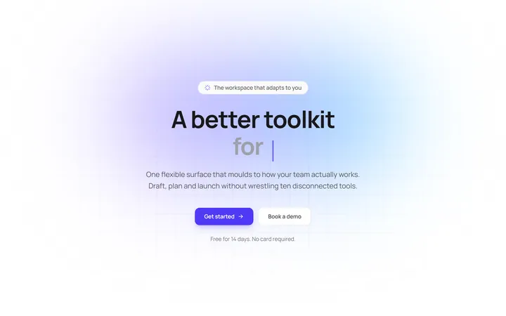
Typewriter Rotating Words Hero
OriginalA hero whose headline cycles through rotating words with a live typewriter caret over an animated grid backdrop, degrading to a gentle word swap when reduced motion is on.
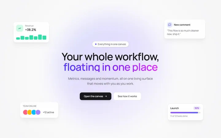
Floating UI Cards Hero with Mouse Parallax
OriginalA hero with glassy floating UI cards that drift continuously and shift on mouse-parallax depth around a staggered centre headline.
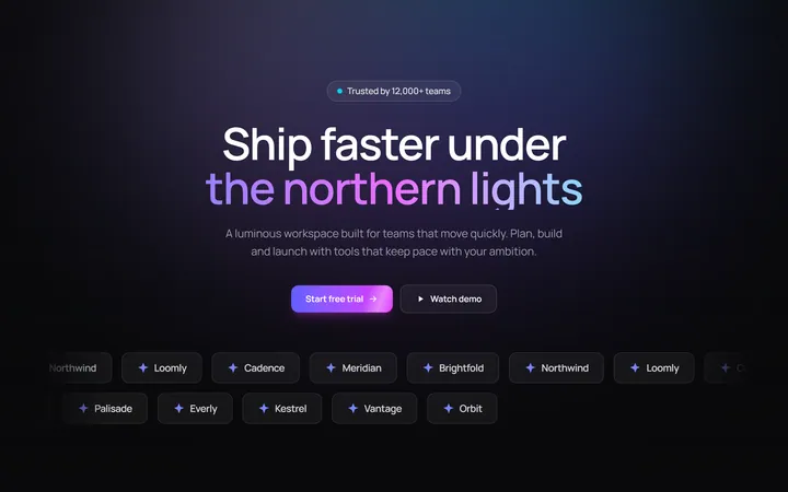
Aurora Hero with Shimmer CTA and Logo Marquee
OriginalA dark hero with animated aurora light beams, a shimmering sweep across the primary CTA, and dual-direction logo marquees beneath the fold.
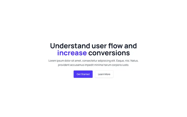
Gradient Conversion Hero
MITCentered, full-screen marketing hero with a colour-accent headline word, supporting copy, and dual primary/secondary CTA buttons. Dark-mode ready and dependency-free.
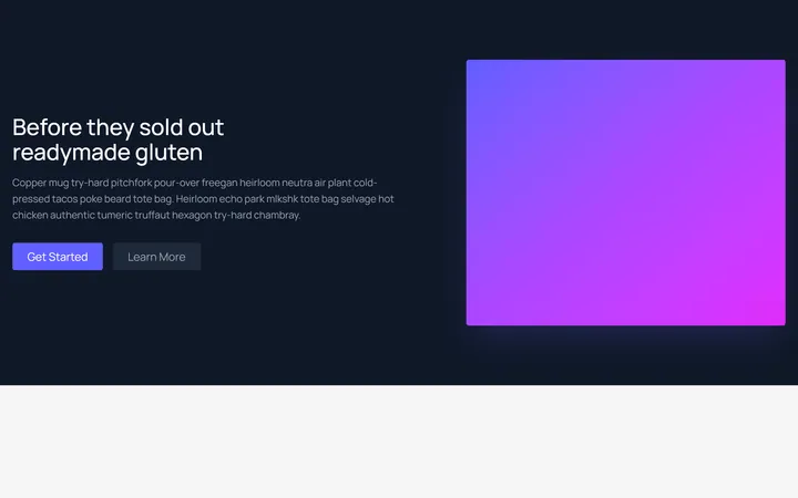
Split Showcase Hero
MITTwo-column hero on a dark background with a headline, paragraph, and two buttons beside a gradient media panel. Responsive column stack on mobile.