

Gradient Mesh Hero
Original · freehero on an animated mesh gradient
Copy prompt gives Claude Code, Cursor or v0 a ready-to-paste prompt that recreates this exact component.
npx shadcn@latest add https://webinnoventix.com/r/herox-gradient-mesh.json"use client";
import {
useState,
useRef,
useId,
type KeyboardEvent,
type FormEvent,
type ChangeEvent,
} from "react";
import { motion, AnimatePresence, useReducedMotion } from "motion/react";
type FeatureTab = {
id: string;
label: string;
headline: string;
metric: string;
metricLabel: string;
points: string[];
bars: number[];
};
const TABS: FeatureTab[] = [
{
id: "automate",
label: "Automate",
headline: "Automate the busywork",
metric: "8.5 hrs",
metricLabel: "saved per teammate every week",
points: [
"Turn repeatable steps into workflows that run on their own",
"Trigger on any event across the tools you already use",
"Approvals, retries and rollbacks handled for you",
],
bars: [42, 58, 51, 73, 66, 88, 79],
},
{
id: "analyze",
label: "Analyze",
headline: "See every workflow live",
metric: "312 ms",
metricLabel: "median run time across pipelines",
points: [
"A real-time map of every run, queue and dependency",
"Alerts the moment a workflow slows or drifts off target",
"Drill from a single failed step to its exact input",
],
bars: [30, 44, 40, 55, 62, 58, 71],
},
{
id: "scale",
label: "Scale",
headline: "Scale without new headcount",
metric: "6×",
metricLabel: "throughput per engineer, on average",
points: [
"Run thousands of concurrent workflows on shared infra",
"Cost controls and budgets enforced before anything ships",
"Grow from one team to the whole org on the same setup",
],
bars: [48, 52, 64, 60, 78, 84, 95],
},
];
const STATS: { value: string; label: string }[] = [
{ value: "12k+", label: "teams onboard" },
{ value: "40M", label: "workflows / month" },
{ value: "99.99%", label: "uptime SLA" },
];
const BLOBS: {
className: string;
anim: string;
duration: string;
delay: string;
}[] = [
{
className:
"left-[-12%] top-[-14%] h-[46rem] w-[46rem] bg-indigo-400/60 dark:bg-indigo-500/40",
anim: "heroxmesh-drift-1",
duration: "22s",
delay: "0s",
},
{
className:
"right-[-14%] top-[-8%] h-[40rem] w-[40rem] bg-violet-400/55 dark:bg-violet-600/40",
anim: "heroxmesh-drift-2",
duration: "26s",
delay: "-6s",
},
{
className:
"left-[22%] bottom-[-24%] h-[44rem] w-[44rem] bg-sky-400/55 dark:bg-sky-500/35",
anim: "heroxmesh-drift-3",
duration: "30s",
delay: "-3s",
},
{
className:
"right-[6%] bottom-[-18%] h-[34rem] w-[34rem] bg-emerald-300/55 dark:bg-emerald-500/30",
anim: "heroxmesh-drift-1",
duration: "28s",
delay: "-11s",
},
{
className:
"left-[40%] top-[8%] h-[30rem] w-[30rem] bg-rose-300/50 dark:bg-rose-500/25",
anim: "heroxmesh-drift-2",
duration: "24s",
delay: "-14s",
},
];
function isValidEmail(value: string): boolean {
return /^[^\s@]+@[^\s@]+\.[^\s@]+$/.test(value.trim());
}
export default function HeroxGradientMesh() {
const reduce = useReducedMotion();
const uid = useId();
const [active, setActive] = useState<number>(0);
const [email, setEmail] = useState<string>("");
const [status, setStatus] = useState<"idle" | "error" | "done">("idle");
const tabRefs = useRef<(HTMLButtonElement | null)[]>([]);
const activeTab = TABS[active];
function focusTab(index: number) {
const next = (index + TABS.length) % TABS.length;
setActive(next);
tabRefs.current[next]?.focus();
}
function onTabKeyDown(event: KeyboardEvent<HTMLButtonElement>, index: number) {
if (event.key === "ArrowRight" || event.key === "ArrowDown") {
event.preventDefault();
focusTab(index + 1);
} else if (event.key === "ArrowLeft" || event.key === "ArrowUp") {
event.preventDefault();
focusTab(index - 1);
} else if (event.key === "Home") {
event.preventDefault();
focusTab(0);
} else if (event.key === "End") {
event.preventDefault();
focusTab(TABS.length - 1);
}
}
function onEmailChange(event: ChangeEvent<HTMLInputElement>) {
setEmail(event.target.value);
if (status !== "idle") setStatus("idle");
}
function onSubmit(event: FormEvent<HTMLFormElement>) {
event.preventDefault();
if (!isValidEmail(email)) {
setStatus("error");
return;
}
setStatus("done");
}
const ease = [0.22, 1, 0.36, 1] as const;
return (
<section className="relative w-full overflow-hidden bg-white px-5 py-24 text-slate-900 sm:px-8 sm:py-28 lg:py-36 dark:bg-slate-950 dark:text-slate-100">
<style>{`
@keyframes heroxmesh-drift-1 {
0%, 100% { transform: translate3d(0, 0, 0) scale(1); }
33% { transform: translate3d(7%, -9%, 0) scale(1.16); }
66% { transform: translate3d(-6%, 7%, 0) scale(0.9); }
}
@keyframes heroxmesh-drift-2 {
0%, 100% { transform: translate3d(0, 0, 0) scale(1.05); }
40% { transform: translate3d(-9%, 8%, 0) scale(0.88); }
75% { transform: translate3d(6%, -5%, 0) scale(1.2); }
}
@keyframes heroxmesh-drift-3 {
0%, 100% { transform: translate3d(0, 0, 0) scale(0.95); }
50% { transform: translate3d(9%, -7%, 0) scale(1.18); }
}
@keyframes heroxmesh-float {
0%, 100% { transform: translateY(0); }
50% { transform: translateY(-10px); }
}
@keyframes heroxmesh-rise {
from { transform: scaleY(0.35); opacity: 0.35; }
to { transform: scaleY(1); opacity: 1; }
}
@keyframes heroxmesh-shimmer {
from { background-position: 200% 0; }
to { background-position: -200% 0; }
}
.heroxmesh-blob { animation: var(--heroxmesh-anim) var(--heroxmesh-dur) ease-in-out infinite; animation-delay: var(--heroxmesh-delay); will-change: transform; }
.heroxmesh-card { animation: heroxmesh-float 7s ease-in-out infinite; }
.heroxmesh-bar { transform-origin: bottom; animation: heroxmesh-rise 0.7s cubic-bezier(0.22,1,0.36,1) both; }
@media (prefers-reduced-motion: reduce) {
.heroxmesh-blob, .heroxmesh-card, .heroxmesh-bar { animation: none !important; }
}
`}</style>
{/* Animated mesh gradient */}
<div aria-hidden="true" className="pointer-events-none absolute inset-0 -z-10">
{BLOBS.map((blob, i) => (
<div
key={i}
className={`heroxmesh-blob absolute rounded-full blur-3xl mix-blend-multiply dark:mix-blend-screen ${blob.className}`}
style={
{
"--heroxmesh-anim": blob.anim,
"--heroxmesh-dur": blob.duration,
"--heroxmesh-delay": blob.delay,
} as Record<string, string>
}
/>
))}
{/* Fine grid overlay */}
<div
className="absolute inset-0 opacity-[0.05] dark:opacity-[0.08]"
style={{
backgroundImage:
"linear-gradient(to right, currentColor 1px, transparent 1px), linear-gradient(to bottom, currentColor 1px, transparent 1px)",
backgroundSize: "44px 44px",
}}
/>
{/* Readability wash */}
<div className="absolute inset-0 bg-gradient-to-b from-white/40 via-transparent to-white/70 dark:from-slate-950/50 dark:via-transparent dark:to-slate-950/80" />
</div>
<div className="mx-auto grid max-w-7xl items-center gap-14 lg:grid-cols-[1.05fr_0.95fr] lg:gap-16">
{/* Left: copy + CTA */}
<motion.div
initial={reduce ? false : { opacity: 0, y: 24 }}
animate={{ opacity: 1, y: 0 }}
transition={{ duration: 0.7, ease }}
>
<a
href="#changelog"
className="group inline-flex items-center gap-2 rounded-full border border-slate-200 bg-white/70 px-3.5 py-1.5 text-xs font-medium text-slate-700 shadow-sm backdrop-blur transition-colors hover:border-indigo-300 hover:text-indigo-700 dark:border-white/10 dark:bg-white/5 dark:text-slate-200 dark:hover:border-indigo-400/50 dark:hover:text-indigo-300"
>
<span className="inline-flex h-4 items-center rounded-full bg-indigo-600 px-1.5 text-[10px] font-semibold uppercase tracking-wide text-white dark:bg-indigo-500">
New
</span>
Nimbus Agents are now generally available
<svg
viewBox="0 0 24 24"
className="h-3.5 w-3.5 transition-transform group-hover:translate-x-0.5"
fill="none"
stroke="currentColor"
strokeWidth={2}
strokeLinecap="round"
strokeLinejoin="round"
aria-hidden="true"
>
<path d="M5 12h14M13 6l6 6-6 6" />
</svg>
</a>
<h1 className="mt-6 text-4xl font-semibold tracking-tight text-slate-900 sm:text-5xl lg:text-6xl dark:text-white">
Ship operations that
<span className="relative whitespace-nowrap">
{" "}
<span className="bg-gradient-to-r from-indigo-600 via-violet-600 to-sky-500 bg-clip-text text-transparent dark:from-indigo-400 dark:via-violet-400 dark:to-sky-400">
run themselves
</span>
</span>
.
</h1>
<p className="mt-6 max-w-xl text-lg leading-relaxed text-slate-600 dark:text-slate-300">
Nimbus connects your stack, watches every workflow, and clears the
busywork before it ever reaches a person. Set it up once and let the
platform handle the rest.
</p>
{/* Email capture */}
<form onSubmit={onSubmit} noValidate className="mt-8 max-w-md">
<label htmlFor={`${uid}-email`} className="sr-only">
Work email
</label>
<div className="flex flex-col gap-3 sm:flex-row">
<div className="relative flex-1">
<span className="pointer-events-none absolute inset-y-0 left-3.5 flex items-center text-slate-400 dark:text-slate-500">
<svg
viewBox="0 0 24 24"
className="h-4.5 w-4.5"
fill="none"
stroke="currentColor"
strokeWidth={2}
strokeLinecap="round"
strokeLinejoin="round"
aria-hidden="true"
>
<rect x="3" y="5" width="18" height="14" rx="2" />
<path d="m3 7 9 6 9-6" />
</svg>
</span>
<input
id={`${uid}-email`}
type="email"
inputMode="email"
autoComplete="email"
value={email}
onChange={onEmailChange}
placeholder="you@company.com"
aria-invalid={status === "error"}
aria-describedby={`${uid}-status`}
className="w-full rounded-xl border border-slate-300 bg-white/80 py-3 pl-10 pr-3.5 text-sm text-slate-900 shadow-sm outline-none backdrop-blur transition focus:border-indigo-500 focus:ring-2 focus:ring-indigo-500/40 dark:border-white/10 dark:bg-white/5 dark:text-white dark:placeholder:text-slate-500 dark:focus:border-indigo-400"
/>
</div>
<button
type="submit"
className="inline-flex items-center justify-center gap-2 rounded-xl bg-slate-900 px-5 py-3 text-sm font-semibold text-white shadow-sm transition hover:bg-slate-800 focus-visible:outline focus-visible:outline-2 focus-visible:outline-offset-2 focus-visible:outline-indigo-500 active:scale-[0.98] dark:bg-white dark:text-slate-900 dark:hover:bg-slate-200"
>
Start free
<svg
viewBox="0 0 24 24"
className="h-4 w-4"
fill="none"
stroke="currentColor"
strokeWidth={2}
strokeLinecap="round"
strokeLinejoin="round"
aria-hidden="true"
>
<path d="M5 12h14M13 6l6 6-6 6" />
</svg>
</button>
</div>
<p
id={`${uid}-status`}
aria-live="polite"
className={`mt-2.5 min-h-[1.25rem] text-sm ${
status === "error"
? "text-rose-600 dark:text-rose-400"
: status === "done"
? "text-emerald-600 dark:text-emerald-400"
: "text-slate-500 dark:text-slate-400"
}`}
>
{status === "error"
? "Enter a valid work email to continue."
: status === "done"
? "You're on the list — check your inbox to activate."
: "No credit card · SOC 2 Type II · 14-day trial"}
</p>
</form>
{/* Stats */}
<dl className="mt-10 flex flex-wrap gap-x-10 gap-y-5">
{STATS.map((stat) => (
<div key={stat.label} className="flex flex-col">
<dt className="order-2 text-sm text-slate-500 dark:text-slate-400">
{stat.label}
</dt>
<dd className="order-1 text-2xl font-semibold tracking-tight text-slate-900 dark:text-white">
{stat.value}
</dd>
</div>
))}
</dl>
</motion.div>
{/* Right: interactive preview card */}
<motion.div
initial={reduce ? false : { opacity: 0, y: 28, scale: 0.98 }}
animate={{ opacity: 1, y: 0, scale: 1 }}
transition={{ duration: 0.8, ease, delay: 0.1 }}
className="relative"
>
<div className="heroxmesh-card rounded-3xl border border-slate-200/80 bg-white/70 p-5 shadow-xl shadow-slate-900/5 backdrop-blur-xl sm:p-6 dark:border-white/10 dark:bg-slate-900/60 dark:shadow-black/30">
{/* Window chrome */}
<div className="mb-5 flex items-center gap-2">
<span className="h-3 w-3 rounded-full bg-rose-400" />
<span className="h-3 w-3 rounded-full bg-amber-400" />
<span className="h-3 w-3 rounded-full bg-emerald-400" />
<span className="ml-3 text-xs font-medium text-slate-400 dark:text-slate-500">
nimbus · live workspace
</span>
</div>
{/* Tabs */}
<div
role="tablist"
aria-label="Product capabilities"
className="flex gap-1 rounded-xl bg-slate-100 p-1 dark:bg-white/5"
>
{TABS.map((tab, i) => {
const selected = i === active;
return (
<button
key={tab.id}
ref={(el) => {
tabRefs.current[i] = el;
}}
role="tab"
id={`${uid}-tab-${tab.id}`}
aria-selected={selected}
aria-controls={`${uid}-panel-${tab.id}`}
tabIndex={selected ? 0 : -1}
onClick={() => setActive(i)}
onKeyDown={(e) => onTabKeyDown(e, i)}
className={`relative flex-1 rounded-lg px-3 py-2 text-sm font-medium transition focus-visible:outline focus-visible:outline-2 focus-visible:outline-offset-2 focus-visible:outline-indigo-500 ${
selected
? "text-slate-900 dark:text-white"
: "text-slate-500 hover:text-slate-700 dark:text-slate-400 dark:hover:text-slate-200"
}`}
>
{selected && (
<motion.span
layoutId={`${uid}-tabpill`}
className="absolute inset-0 rounded-lg bg-white shadow-sm dark:bg-slate-800"
transition={{ duration: reduce ? 0 : 0.3, ease }}
/>
)}
<span className="relative">{tab.label}</span>
</button>
);
})}
</div>
{/* Panel */}
<div
role="tabpanel"
id={`${uid}-panel-${activeTab.id}`}
aria-labelledby={`${uid}-tab-${activeTab.id}`}
className="mt-5"
>
<AnimatePresence mode="wait">
<motion.div
key={activeTab.id}
initial={reduce ? false : { opacity: 0, y: 10 }}
animate={{ opacity: 1, y: 0 }}
exit={reduce ? { opacity: 0 } : { opacity: 0, y: -10 }}
transition={{ duration: 0.35, ease }}
>
<div className="flex items-end justify-between gap-4">
<div>
<h2 className="text-base font-semibold text-slate-900 dark:text-white">
{activeTab.headline}
</h2>
<div className="mt-3 flex items-baseline gap-2">
<span className="bg-gradient-to-r from-indigo-600 to-violet-600 bg-clip-text text-4xl font-bold tracking-tight text-transparent dark:from-indigo-400 dark:to-violet-400">
{activeTab.metric}
</span>
</div>
<p className="mt-1 text-sm text-slate-500 dark:text-slate-400">
{activeTab.metricLabel}
</p>
</div>
{/* Mini bar chart */}
<div
className="flex h-24 items-end gap-1.5"
aria-hidden="true"
>
{activeTab.bars.map((h, bi) => (
<div
key={bi}
className="heroxmesh-bar w-3 rounded-t bg-gradient-to-t from-indigo-500/70 to-violet-400 dark:from-indigo-500/60 dark:to-violet-300"
style={{
height: `${h}%`,
animationDelay: reduce ? "0s" : `${bi * 60}ms`,
}}
/>
))}
</div>
</div>
<ul className="mt-5 space-y-2.5">
{activeTab.points.map((point) => (
<li
key={point}
className="flex items-start gap-2.5 text-sm text-slate-600 dark:text-slate-300"
>
<svg
viewBox="0 0 24 24"
className="mt-0.5 h-4 w-4 shrink-0 text-emerald-500 dark:text-emerald-400"
fill="none"
stroke="currentColor"
strokeWidth={2.4}
strokeLinecap="round"
strokeLinejoin="round"
aria-hidden="true"
>
<path d="M20 6 9 17l-5-5" />
</svg>
{point}
</li>
))}
</ul>
</motion.div>
</AnimatePresence>
</div>
{/* Footer action */}
<div className="mt-6 flex items-center justify-between border-t border-slate-200 pt-4 dark:border-white/10">
<span className="text-xs text-slate-400 dark:text-slate-500">
Updated moments ago
</span>
<a
href="#demo"
className="inline-flex items-center gap-1.5 text-sm font-semibold text-indigo-600 transition hover:text-indigo-700 dark:text-indigo-400 dark:hover:text-indigo-300"
>
Book a demo
<svg
viewBox="0 0 24 24"
className="h-4 w-4"
fill="none"
stroke="currentColor"
strokeWidth={2}
strokeLinecap="round"
strokeLinejoin="round"
aria-hidden="true"
>
<path d="M5 12h14M13 6l6 6-6 6" />
</svg>
</a>
</div>
</div>
{/* Floating badge */}
<div className="absolute -bottom-4 -left-4 hidden rounded-2xl border border-slate-200/80 bg-white/80 px-4 py-3 shadow-lg backdrop-blur-xl sm:block dark:border-white/10 dark:bg-slate-900/70">
<div className="flex items-center gap-2.5">
<span className="relative flex h-2.5 w-2.5">
<span className="absolute inline-flex h-full w-full rounded-full bg-emerald-400 opacity-75" />
<span className="relative inline-flex h-2.5 w-2.5 rounded-full bg-emerald-500" />
</span>
<div>
<p className="text-sm font-semibold text-slate-900 dark:text-white">
All systems operational
</p>
<p className="text-xs text-slate-500 dark:text-slate-400">
1,284 workflows running now
</p>
</div>
</div>
</div>
</motion.div>
</div>
</section>
);
}Dependencies
Licence
Built by Web Innoventix. Free for personal and commercial use, no attribution required.
Built by Web Innoventix
Need a custom interface, a full website, or SEO that gets you cited by AI? We design, build and rank it end to end.
Get a free quoteSimilar components
Browse all →
Spotlight Hero
OriginalA centred hero with a soft radial spotlight, badge and dual call-to-action.

Split Hero
OriginalA two-column hero pairing a headline and CTAs with a product mock and social proof.

Gradient Spotlight Hero
OriginalA minimal centred hero with a soft gradient-mesh backdrop, announcement pill and dual call-to-action buttons.

App Preview Hero
OriginalA centred hero that pairs headline copy with a realistic product dashboard mock built entirely from markup, complete with browser chrome and a floating notification card.

Waitlist Capture Hero
OriginalA dark, focused hero with an inline email capture form and avatar social proof, ready for pre-launch waitlists.

Image Backdrop Hero
OriginalA cinematic full-bleed hero with a layered image-style backdrop, overlaid left-aligned copy and a trusted-by logos strip.
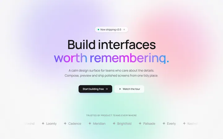
Gradient Mesh Hero with Staggered Text Reveal
OriginalA full-screen hero pairing a drifting animated gradient-mesh backdrop with a word-by-word staggered blur-in headline and a logo marquee under the fold.

Typewriter Rotating Words Hero
OriginalA hero whose headline cycles through rotating words with a live typewriter caret over an animated grid backdrop, degrading to a gentle word swap when reduced motion is on.
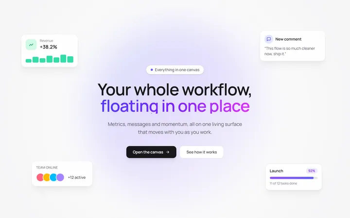
Floating UI Cards Hero with Mouse Parallax
OriginalA hero with glassy floating UI cards that drift continuously and shift on mouse-parallax depth around a staggered centre headline.
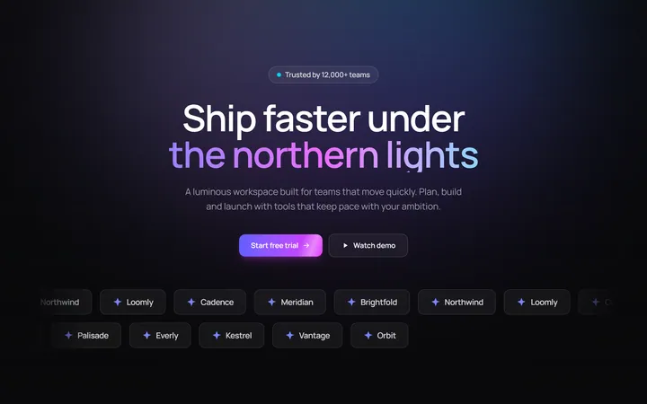
Aurora Hero with Shimmer CTA and Logo Marquee
OriginalA dark hero with animated aurora light beams, a shimmering sweep across the primary CTA, and dual-direction logo marquees beneath the fold.

Gradient Conversion Hero
MITCentered, full-screen marketing hero with a colour-accent headline word, supporting copy, and dual primary/secondary CTA buttons. Dark-mode ready and dependency-free.
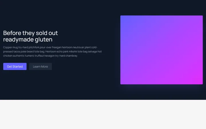
Split Showcase Hero
MITTwo-column hero on a dark background with a headline, paragraph, and two buttons beside a gradient media panel. Responsive column stack on mobile.