

Stats Hero
Original · freehero with a stats strip
Copy prompt gives Claude Code, Cursor or v0 a ready-to-paste prompt that recreates this exact component.
npx shadcn@latest add https://webinnoventix.com/r/herox-stats.json"use client";
import { useEffect, useId, useRef, useState, type KeyboardEvent } from "react";
import { motion, useReducedMotion, type Variants } from "motion/react";
type Arrow = "up" | "down" | "none";
type Tone = "pos" | "neg" | "neutral";
type StatItem = {
label: string;
value: number;
decimals: number;
prefix: string;
suffix: string;
delta: string;
arrow: Arrow;
tone: Tone;
};
type StatGroup = {
id: string;
label: string;
stats: StatItem[];
};
const GROUPS: StatGroup[] = [
{
id: "overview",
label: "Overview",
stats: [
{
label: "Teams onboarded",
value: 4200,
decimals: 0,
prefix: "",
suffix: "+",
delta: "+18% this quarter",
arrow: "up",
tone: "pos",
},
{
label: "Uptime, last 12 months",
value: 99.98,
decimals: 2,
prefix: "",
suffix: "%",
delta: "SLA-backed",
arrow: "none",
tone: "neutral",
},
{
label: "Revenue tracked",
value: 2.4,
decimals: 1,
prefix: "$",
suffix: "B",
delta: "+31% year over year",
arrow: "up",
tone: "pos",
},
{
label: "Avg. time to first insight",
value: 38,
decimals: 0,
prefix: "",
suffix: " min",
delta: "-52% vs 2024",
arrow: "down",
tone: "pos",
},
],
},
{
id: "growth",
label: "Growth",
stats: [
{
label: "Pipeline velocity",
value: 3.1,
decimals: 1,
prefix: "",
suffix: "x",
delta: "+0.6x this quarter",
arrow: "up",
tone: "pos",
},
{
label: "Activation rate",
value: 42,
decimals: 0,
prefix: "+",
suffix: "%",
delta: "+9 points",
arrow: "up",
tone: "pos",
},
{
label: "Workflows automated",
value: 12800,
decimals: 0,
prefix: "",
suffix: "",
delta: "+2,100 this quarter",
arrow: "up",
tone: "pos",
},
{
label: "Native integrations",
value: 27,
decimals: 0,
prefix: "",
suffix: "",
delta: "6 added in 2025",
arrow: "up",
tone: "neutral",
},
],
},
{
id: "reliability",
label: "Reliability",
stats: [
{
label: "Uptime SLA",
value: 99.98,
decimals: 2,
prefix: "",
suffix: "%",
delta: "Guaranteed",
arrow: "none",
tone: "neutral",
},
{
label: "Median query time",
value: 118,
decimals: 0,
prefix: "",
suffix: " ms",
delta: "-24 ms this quarter",
arrow: "down",
tone: "pos",
},
{
label: "Support coverage",
value: 24,
decimals: 0,
prefix: "",
suffix: "/7",
delta: "3 min median reply",
arrow: "none",
tone: "neutral",
},
{
label: "Data incidents, 2025",
value: 0,
decimals: 0,
prefix: "",
suffix: "",
delta: "3 years clean",
arrow: "none",
tone: "pos",
},
],
},
];
function formatNumber(n: number, decimals: number): string {
return n.toLocaleString("en-US", {
minimumFractionDigits: decimals,
maximumFractionDigits: decimals,
});
}
function useCountUp(value: number, enabled: boolean, duration = 1200): number {
const [display, setDisplay] = useState<number>(enabled ? 0 : value);
useEffect(() => {
if (!enabled) {
setDisplay(value);
return;
}
let raf = 0;
let start = 0;
const step = (t: number) => {
if (start === 0) start = t;
const progress = Math.min((t - start) / duration, 1);
const eased = 1 - Math.pow(1 - progress, 3);
setDisplay(value * eased);
if (progress < 1) raf = requestAnimationFrame(step);
else setDisplay(value);
};
raf = requestAnimationFrame(step);
return () => cancelAnimationFrame(raf);
}, [value, enabled, duration]);
return display;
}
function TrendIcon({ arrow }: { arrow: Arrow }) {
if (arrow === "none") {
return (
<svg viewBox="0 0 16 16" aria-hidden="true" className="h-3 w-3">
<path
d="M3 8h10"
fill="none"
stroke="currentColor"
strokeWidth="2"
strokeLinecap="round"
/>
</svg>
);
}
const isUp = arrow === "up";
return (
<svg viewBox="0 0 16 16" aria-hidden="true" className="h-3 w-3">
<path
d={isUp ? "M8 13V3M8 3l-4 4M8 3l4 4" : "M8 3v10M8 13l-4-4M8 13l4-4"}
fill="none"
stroke="currentColor"
strokeWidth="2"
strokeLinecap="round"
strokeLinejoin="round"
/>
</svg>
);
}
function StatCard({
stat,
animate,
index,
}: {
stat: StatItem;
animate: boolean;
index: number;
}) {
const display = useCountUp(stat.value, animate);
const shown = animate ? display : stat.value;
const toneText =
stat.tone === "pos"
? "text-emerald-600 dark:text-emerald-400"
: stat.tone === "neg"
? "text-rose-600 dark:text-rose-400"
: "text-slate-500 dark:text-slate-400";
const tonePill =
stat.tone === "pos"
? "bg-emerald-500/10 text-emerald-700 ring-emerald-500/20 dark:text-emerald-300"
: stat.tone === "neg"
? "bg-rose-500/10 text-rose-700 ring-rose-500/20 dark:text-rose-300"
: "bg-slate-500/10 text-slate-600 ring-slate-500/20 dark:text-slate-300";
return (
<div
className="hxs-fade group relative flex flex-col gap-3 rounded-2xl border border-slate-200/70 bg-white/60 p-5 backdrop-blur-sm transition-colors hover:border-indigo-300 dark:border-white/10 dark:bg-white/[0.03] dark:hover:border-indigo-400/40"
style={{ animationDelay: `${index * 70}ms` }}
>
<div className="flex items-baseline gap-1 font-semibold tracking-tight text-slate-900 tabular-nums dark:text-white">
<span className="text-3xl sm:text-4xl">
{stat.prefix}
{formatNumber(shown, stat.decimals)}
{stat.suffix}
</span>
</div>
<p className="text-sm font-medium text-slate-600 dark:text-slate-300">
{stat.label}
</p>
<span
className={`inline-flex w-fit items-center gap-1 rounded-full px-2 py-0.5 text-xs font-semibold ring-1 ${tonePill}`}
>
<span className={toneText}>
<TrendIcon arrow={stat.arrow} />
</span>
{stat.delta}
</span>
</div>
);
}
export default function HeroxStats() {
const reduce = useReducedMotion();
const uid = useId();
const [activeId, setActiveId] = useState<string>(GROUPS[0].id);
const [inView, setInView] = useState<boolean>(false);
const tabRefs = useRef<Array<HTMLButtonElement | null>>([]);
const activeIndex = GROUPS.findIndex((g) => g.id === activeId);
const activeGroup = GROUPS[activeIndex] ?? GROUPS[0];
const animateCount = inView && !reduce;
const onTabKeyDown = (event: KeyboardEvent<HTMLButtonElement>) => {
if (event.key !== "ArrowRight" && event.key !== "ArrowLeft") return;
event.preventDefault();
const dir = event.key === "ArrowRight" ? 1 : -1;
const next = (activeIndex + dir + GROUPS.length) % GROUPS.length;
setActiveId(GROUPS[next].id);
tabRefs.current[next]?.focus();
};
const container: Variants = {
hidden: {},
show: {
transition: { staggerChildren: 0.09, delayChildren: 0.05 },
},
};
const item: Variants = reduce
? { hidden: { opacity: 1, y: 0 }, show: { opacity: 1, y: 0 } }
: {
hidden: { opacity: 0, y: 20 },
show: {
opacity: 1,
y: 0,
transition: { duration: 0.6, ease: "easeOut" },
},
};
return (
<section className="relative w-full overflow-hidden bg-gradient-to-b from-slate-50 via-white to-slate-100 px-6 py-24 sm:py-28 lg:py-32 dark:from-slate-950 dark:via-slate-950 dark:to-slate-900">
<style>{`
@keyframes hxs-floaty {
0%, 100% { transform: translate3d(0, 0, 0) scale(1); }
50% { transform: translate3d(0, -18px, 0) scale(1.05); }
}
@keyframes hxs-drift {
0%, 100% { transform: translate3d(0, 0, 0) scale(1); }
50% { transform: translate3d(14px, 12px, 0) scale(1.08); }
}
@keyframes hxs-pulse {
0%, 100% { opacity: 1; transform: scale(1); }
50% { opacity: 0.35; transform: scale(0.6); }
}
@keyframes hxs-dash {
to { stroke-dashoffset: 0; }
}
@keyframes hxs-rise {
from { opacity: 0; transform: translateY(14px); }
to { opacity: 1; transform: translateY(0); }
}
.hxs-fade { animation: hxs-rise 0.6s cubic-bezier(0.16,1,0.3,1) both; }
@media (prefers-reduced-motion: reduce) {
.hxs-blob-a, .hxs-blob-b, .hxs-live-dot, .hxs-spark, .hxs-fade {
animation: none !important;
}
.hxs-spark { stroke-dashoffset: 0 !important; }
}
`}</style>
{/* Decorative background */}
<div aria-hidden="true" className="pointer-events-none absolute inset-0">
<div
className="hxs-blob-a absolute -left-24 top-8 h-72 w-72 rounded-full bg-indigo-400/25 blur-3xl dark:bg-indigo-500/20"
style={{ animation: "hxs-floaty 11s ease-in-out infinite" }}
/>
<div
className="hxs-blob-b absolute -right-16 top-32 h-80 w-80 rounded-full bg-violet-400/20 blur-3xl dark:bg-violet-500/20"
style={{ animation: "hxs-drift 13s ease-in-out infinite" }}
/>
<div
className="absolute inset-0 opacity-[0.4] dark:opacity-[0.25]"
style={{
backgroundImage:
"linear-gradient(to right, rgb(100 116 139 / 0.12) 1px, transparent 1px), linear-gradient(to bottom, rgb(100 116 139 / 0.12) 1px, transparent 1px)",
backgroundSize: "56px 56px",
maskImage:
"radial-gradient(ellipse 70% 60% at 50% 0%, black 40%, transparent 100%)",
WebkitMaskImage:
"radial-gradient(ellipse 70% 60% at 50% 0%, black 40%, transparent 100%)",
}}
/>
</div>
<div className="relative mx-auto max-w-6xl">
{/* Hero copy */}
<motion.div
variants={container}
initial="hidden"
whileInView="show"
viewport={{ once: true, margin: "-80px" }}
className="mx-auto max-w-3xl text-center"
>
<motion.span
variants={item}
className="inline-flex items-center gap-2 rounded-full border border-indigo-200 bg-indigo-50/80 px-3.5 py-1.5 text-xs font-semibold uppercase tracking-wider text-indigo-700 dark:border-indigo-400/20 dark:bg-indigo-400/10 dark:text-indigo-300"
>
<span className="relative flex h-1.5 w-1.5">
<span
className="hxs-live-dot absolute inline-flex h-full w-full rounded-full bg-indigo-500"
style={{ animation: "hxs-pulse 2s ease-in-out infinite" }}
/>
<span className="relative inline-flex h-1.5 w-1.5 rounded-full bg-indigo-500" />
</span>
Revenue intelligence, unified
</motion.span>
<motion.h1
variants={item}
className="mt-6 text-balance text-4xl font-semibold tracking-tight text-slate-900 sm:text-5xl lg:text-6xl dark:text-white"
>
Turn scattered signals into decisions your team{" "}
<span className="bg-gradient-to-r from-indigo-600 via-violet-600 to-sky-600 bg-clip-text text-transparent dark:from-indigo-400 dark:via-violet-400 dark:to-sky-400">
actually ships
</span>
.
</motion.h1>
<motion.p
variants={item}
className="mx-auto mt-6 max-w-2xl text-pretty text-lg leading-relaxed text-slate-600 dark:text-slate-300"
>
Cadence unifies your product, billing, and support data into one
live workspace, so every team moves on the same numbers in real
time. No exports, no stale dashboards, no arguing about whose spreadsheet is right.
</motion.p>
<motion.div
variants={item}
className="mt-9 flex flex-col items-center justify-center gap-3 sm:flex-row"
>
<button
type="button"
className="group inline-flex w-full items-center justify-center gap-2 rounded-xl bg-slate-900 px-6 py-3 text-sm font-semibold text-white shadow-lg shadow-slate-900/10 transition-all hover:-translate-y-0.5 hover:bg-indigo-600 focus-visible:outline focus-visible:outline-2 focus-visible:outline-offset-2 focus-visible:outline-indigo-500 sm:w-auto dark:bg-white dark:text-slate-900 dark:hover:bg-indigo-400 dark:hover:text-white"
>
Start free, no card
<svg
viewBox="0 0 20 20"
aria-hidden="true"
className="h-4 w-4 transition-transform group-hover:translate-x-0.5"
>
<path
d="M4 10h11M11 5l5 5-5 5"
fill="none"
stroke="currentColor"
strokeWidth="2"
strokeLinecap="round"
strokeLinejoin="round"
/>
</svg>
</button>
<a
href="#demo"
className="inline-flex w-full items-center justify-center gap-2 rounded-xl border border-slate-300 bg-white/70 px-6 py-3 text-sm font-semibold text-slate-800 backdrop-blur transition-all hover:-translate-y-0.5 hover:border-slate-400 focus-visible:outline focus-visible:outline-2 focus-visible:outline-offset-2 focus-visible:outline-indigo-500 sm:w-auto dark:border-white/15 dark:bg-white/5 dark:text-slate-100 dark:hover:border-white/30"
>
<svg viewBox="0 0 20 20" aria-hidden="true" className="h-4 w-4">
<path
d="M7 5.5v9l7-4.5-7-4.5Z"
fill="currentColor"
/>
</svg>
Book a 20-min demo
</a>
</motion.div>
<motion.div
variants={item}
className="mt-8 flex flex-col items-center justify-center gap-3 text-sm text-slate-500 sm:flex-row dark:text-slate-400"
>
<div className="flex -space-x-2">
{["from-indigo-400 to-violet-500", "from-sky-400 to-indigo-500", "from-emerald-400 to-sky-500", "from-rose-400 to-violet-500", "from-amber-400 to-rose-500"].map(
(g, i) => (
<span
key={i}
className={`inline-block h-7 w-7 rounded-full bg-gradient-to-br ${g} ring-2 ring-white dark:ring-slate-950`}
/>
),
)}
</div>
<span>
Trusted by{" "}
<span className="font-semibold text-slate-700 dark:text-slate-200">
4,200+ operators
</span>{" "}
<span className="mx-1 text-slate-300 dark:text-slate-600">|</span>{" "}
SOC 2 Type II
</span>
</motion.div>
</motion.div>
{/* Stats strip */}
<motion.div
initial={reduce ? undefined : { opacity: 0, y: 28 }}
whileInView={reduce ? undefined : { opacity: 1, y: 0 }}
viewport={{ once: true, margin: "-60px" }}
transition={{ duration: 0.7, ease: "easeOut", delay: 0.1 }}
onViewportEnter={() => setInView(true)}
className="relative mx-auto mt-16 max-w-5xl overflow-hidden rounded-3xl border border-slate-200/80 bg-white/70 p-4 shadow-xl shadow-slate-900/5 backdrop-blur-md sm:p-6 dark:border-white/10 dark:bg-slate-900/50 dark:shadow-black/20"
>
{/* Card sparkline decoration */}
<svg
aria-hidden="true"
viewBox="0 0 600 120"
preserveAspectRatio="none"
className="pointer-events-none absolute inset-x-0 bottom-0 h-24 w-full opacity-40 dark:opacity-30"
>
<defs>
<linearGradient id={`${uid}-spark`} x1="0" y1="0" x2="1" y2="0">
<stop offset="0%" stopColor="rgb(99 102 241)" stopOpacity="0.1" />
<stop offset="50%" stopColor="rgb(139 92 246)" stopOpacity="0.7" />
<stop offset="100%" stopColor="rgb(56 189 248)" stopOpacity="0.1" />
</linearGradient>
</defs>
<path
className="hxs-spark"
d="M0 90 C60 90 90 40 150 50 C210 60 240 20 300 30 C360 40 390 80 450 70 C510 60 540 30 600 45"
fill="none"
stroke={`url(#${uid}-spark)`}
strokeWidth="2.5"
strokeLinecap="round"
strokeDasharray="900"
strokeDashoffset="900"
style={{
animation: "hxs-dash 2.2s ease-out 0.4s forwards",
}}
/>
</svg>
{/* Header: tabs + live badge */}
<div className="relative mb-5 flex flex-col items-start justify-between gap-3 sm:flex-row sm:items-center">
<div
role="tablist"
aria-label="Metric groups"
className="inline-flex rounded-xl bg-slate-100 p-1 dark:bg-white/5"
>
{GROUPS.map((group, i) => {
const selected = group.id === activeId;
return (
<button
key={group.id}
ref={(el) => {
tabRefs.current[i] = el;
}}
role="tab"
id={`${uid}-tab-${group.id}`}
aria-selected={selected}
aria-controls={`${uid}-panel`}
tabIndex={selected ? 0 : -1}
onClick={() => setActiveId(group.id)}
onKeyDown={onTabKeyDown}
className={`relative rounded-lg px-3.5 py-1.5 text-sm font-semibold transition-colors focus-visible:outline focus-visible:outline-2 focus-visible:outline-offset-2 focus-visible:outline-indigo-500 sm:px-4 ${
selected
? "bg-white text-slate-900 shadow-sm dark:bg-slate-800 dark:text-white"
: "text-slate-500 hover:text-slate-800 dark:text-slate-400 dark:hover:text-slate-200"
}`}
>
{group.label}
</button>
);
})}
</div>
<span className="inline-flex items-center gap-2 text-xs font-medium text-slate-500 dark:text-slate-400">
<span className="relative flex h-2 w-2">
<span
className="hxs-live-dot absolute inline-flex h-full w-full rounded-full bg-emerald-500"
style={{ animation: "hxs-pulse 1.8s ease-in-out infinite" }}
/>
<span className="relative inline-flex h-2 w-2 rounded-full bg-emerald-500" />
</span>
Live, updated every 60s
</span>
</div>
{/* Stats grid */}
<div
key={reduce ? "static" : activeId}
role="tabpanel"
id={`${uid}-panel`}
aria-labelledby={`${uid}-tab-${activeGroup.id}`}
className="relative grid grid-cols-2 gap-3 sm:gap-4 lg:grid-cols-4"
>
{activeGroup.stats.map((stat, i) => (
<StatCard
key={`${activeGroup.id}-${stat.label}`}
stat={stat}
animate={animateCount}
index={i}
/>
))}
</div>
</motion.div>
</div>
</section>
);
}Dependencies
Licence
Built by Web Innoventix. Free for personal and commercial use, no attribution required.
Built by Web Innoventix
Need a custom interface, a full website, or SEO that gets you cited by AI? We design, build and rank it end to end.
Get a free quoteSimilar components
Browse all →
Spotlight Hero
OriginalA centred hero with a soft radial spotlight, badge and dual call-to-action.

Split Hero
OriginalA two-column hero pairing a headline and CTAs with a product mock and social proof.

Gradient Spotlight Hero
OriginalA minimal centred hero with a soft gradient-mesh backdrop, announcement pill and dual call-to-action buttons.

App Preview Hero
OriginalA centred hero that pairs headline copy with a realistic product dashboard mock built entirely from markup, complete with browser chrome and a floating notification card.

Waitlist Capture Hero
OriginalA dark, focused hero with an inline email capture form and avatar social proof, ready for pre-launch waitlists.

Image Backdrop Hero
OriginalA cinematic full-bleed hero with a layered image-style backdrop, overlaid left-aligned copy and a trusted-by logos strip.
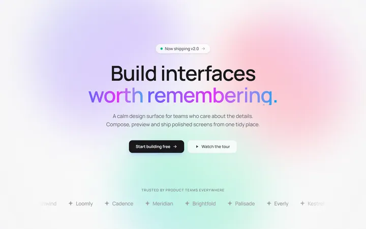
Gradient Mesh Hero with Staggered Text Reveal
OriginalA full-screen hero pairing a drifting animated gradient-mesh backdrop with a word-by-word staggered blur-in headline and a logo marquee under the fold.
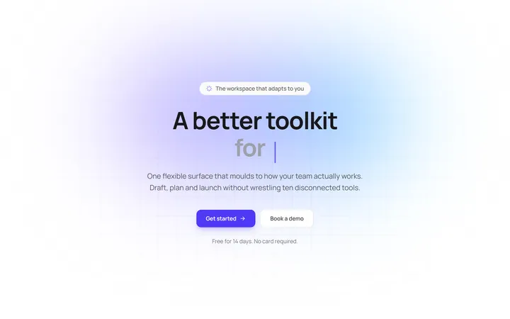
Typewriter Rotating Words Hero
OriginalA hero whose headline cycles through rotating words with a live typewriter caret over an animated grid backdrop, degrading to a gentle word swap when reduced motion is on.
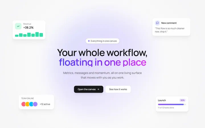
Floating UI Cards Hero with Mouse Parallax
OriginalA hero with glassy floating UI cards that drift continuously and shift on mouse-parallax depth around a staggered centre headline.
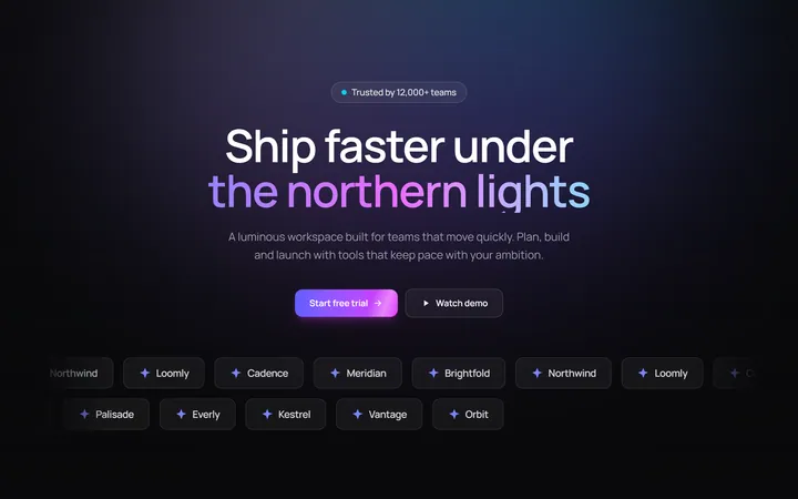
Aurora Hero with Shimmer CTA and Logo Marquee
OriginalA dark hero with animated aurora light beams, a shimmering sweep across the primary CTA, and dual-direction logo marquees beneath the fold.

Gradient Conversion Hero
MITCentered, full-screen marketing hero with a colour-accent headline word, supporting copy, and dual primary/secondary CTA buttons. Dark-mode ready and dependency-free.
Split Showcase Hero
MITTwo-column hero on a dark background with a headline, paragraph, and two buttons beside a gradient media panel. Responsive column stack on mobile.