

Avatar Ring Hover Effect
Original · freeAvatars that gain an animated gradient ring on hover.
Copy prompt gives Claude Code, Cursor or v0 a ready-to-paste prompt that recreates this exact component.
npx shadcn@latest add https://webinnoventix.com/r/hover-avatar-ring.json"use client";
import { useState } from "react";
type Person = {
id: string;
name: string;
role: string;
img: string;
initials: string;
from: string;
via: string;
to: string;
};
const PEOPLE: Person[] = [
{
id: "amara",
name: "Amara Okafor",
role: "Principal Design Engineer",
img: "/img/gallery/g07.webp",
initials: "AO",
from: "#6366f1",
via: "#a855f7",
to: "#ec4899",
},
{
id: "leo",
name: "Leo Marchetti",
role: "Staff Frontend Developer",
img: "/img/gallery/g12.webp",
initials: "LM",
from: "#10b981",
via: "#06b6d4",
to: "#6366f1",
},
{
id: "priya",
name: "Priya Raghavan",
role: "Product Strategy Lead",
img: "/img/gallery/g21.webp",
initials: "PR",
from: "#f43f5e",
via: "#f59e0b",
to: "#ec4899",
},
{
id: "noah",
name: "Noah Bergström",
role: "Motion & Interaction Designer",
img: "/img/gallery/g28.webp",
initials: "NB",
from: "#8b5cf6",
via: "#6366f1",
to: "#0ea5e9",
},
{
id: "yuki",
name: "Yuki Tanaka",
role: "Design Systems Architect",
img: "/img/gallery/g33.webp",
initials: "YT",
from: "#f59e0b",
via: "#f43f5e",
to: "#a855f7",
},
];
export default function HoverAvatarRing() {
const [active, setActive] = useState<string | null>(null);
return (
<section className="relative w-full overflow-hidden bg-slate-50 px-6 py-20 dark:bg-slate-950 sm:py-28">
<style>{`
@keyframes har-spin {
to { transform: rotate(360deg); }
}
@keyframes har-pulse-ring {
0%, 100% { opacity: 0.55; }
50% { opacity: 1; }
}
@media (prefers-reduced-motion: reduce) {
.har-ring-spin { animation: none !important; }
.har-pulse { animation: none !important; }
}
`}</style>
<div className="relative mx-auto max-w-4xl">
<div className="mx-auto max-w-xl text-center">
<span className="inline-flex items-center gap-2 rounded-full border border-slate-200 bg-white px-3 py-1 text-xs font-medium text-slate-600 shadow-sm dark:border-slate-800 dark:bg-slate-900 dark:text-slate-300">
<span className="h-1.5 w-1.5 rounded-full bg-indigo-500" />
The team
</span>
<h2 className="mt-5 text-balance text-3xl font-semibold tracking-tight text-slate-900 dark:text-white sm:text-4xl">
The people behind the pixels
</h2>
<p className="mt-3 text-pretty text-base leading-relaxed text-slate-600 dark:text-slate-400">
Hover or focus any avatar to bring their gradient ring to life.
</p>
</div>
<ul className="mt-14 flex flex-wrap items-start justify-center gap-x-8 gap-y-10 sm:gap-x-12">
{PEOPLE.map((person) => {
const isActive = active === person.id;
return (
<li key={person.id} className="w-28 sm:w-32">
<button
type="button"
aria-pressed={isActive}
aria-label={`${person.name}, ${person.role}`}
onMouseEnter={() => setActive(person.id)}
onMouseLeave={() =>
setActive((cur) => (cur === person.id ? null : cur))
}
onFocus={() => setActive(person.id)}
onBlur={() =>
setActive((cur) => (cur === person.id ? null : cur))
}
className="group flex w-full flex-col items-center rounded-2xl p-2 outline-none transition focus-visible:ring-2 focus-visible:ring-indigo-500 focus-visible:ring-offset-2 focus-visible:ring-offset-slate-50 dark:focus-visible:ring-offset-slate-950"
>
<span className="relative grid h-24 w-24 place-items-center sm:h-28 sm:w-28">
{/* Rotating gradient ring */}
<span
aria-hidden="true"
className="har-ring-spin absolute inset-0 rounded-full opacity-0 transition-opacity duration-300 group-hover:opacity-100 group-focus-visible:opacity-100"
style={{
background: `conic-gradient(from 0deg, ${person.from}, ${person.via}, ${person.to}, ${person.from})`,
animation: isActive
? "har-spin 4s linear infinite"
: undefined,
}}
/>
{/* Soft glow */}
<span
aria-hidden="true"
className="har-pulse absolute -inset-1 rounded-full opacity-0 blur-md transition-opacity duration-300 group-hover:opacity-70 group-focus-visible:opacity-70"
style={{
background: `conic-gradient(from 90deg, ${person.from}, ${person.via}, ${person.to}, ${person.from})`,
animation: isActive
? "har-pulse-ring 2.4s ease-in-out infinite"
: undefined,
}}
/>
{/* Ring gap (background-colored spacer) */}
<span className="absolute inset-[3px] rounded-full bg-slate-50 transition-all duration-300 group-hover:inset-[4px] dark:bg-slate-950" />
{/* Avatar image */}
<span className="relative h-[84px] w-[84px] overflow-hidden rounded-full ring-1 ring-slate-900/5 sm:h-[100px] sm:w-[100px] dark:ring-white/10">
{/* eslint-disable-next-line @next/next/no-img-element */}
<img
src={person.img}
alt={person.name}
loading="lazy"
draggable={false}
className="h-full w-full object-cover transition-transform duration-500 group-hover:scale-105 group-focus-visible:scale-105"
/>
{/* Initials fallback overlay for text contrast on load */}
<span
aria-hidden="true"
className="pointer-events-none absolute inset-0 grid place-items-center bg-gradient-to-br from-slate-200 to-slate-300 text-lg font-semibold text-slate-500 opacity-0 dark:from-slate-800 dark:to-slate-700 dark:text-slate-400"
>
{person.initials}
</span>
</span>
</span>
<span className="mt-4 block text-sm font-semibold text-slate-900 dark:text-white">
{person.name}
</span>
<span className="mt-0.5 block text-pretty text-center text-xs leading-snug text-slate-500 dark:text-slate-400">
{person.role}
</span>
</button>
</li>
);
})}
</ul>
</div>
</section>
);
}Dependencies
Licence
Built by Web Innoventix. Free for personal and commercial use, no attribution required.
Built by Web Innoventix
Need a custom interface, a full website, or SEO that gets you cited by AI? We design, build and rank it end to end.
Get a free quoteSimilar components
Browse all →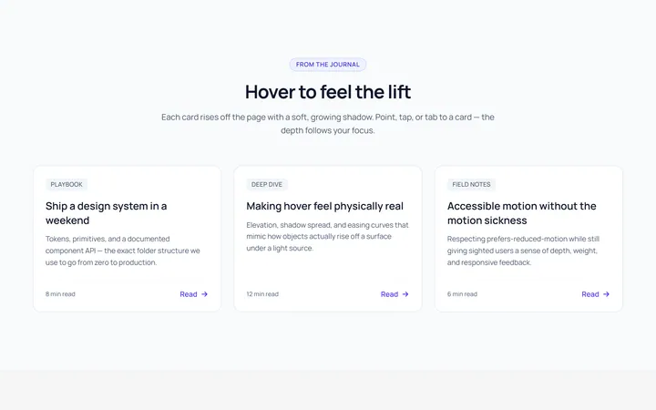
Card Lift Hover Effect
OriginalA card that lifts with a growing shadow on hover.
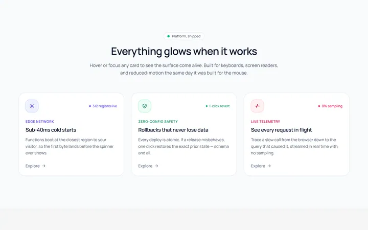
Card Glow Hover Effect
OriginalA card with a coloured glow that blooms on hover.
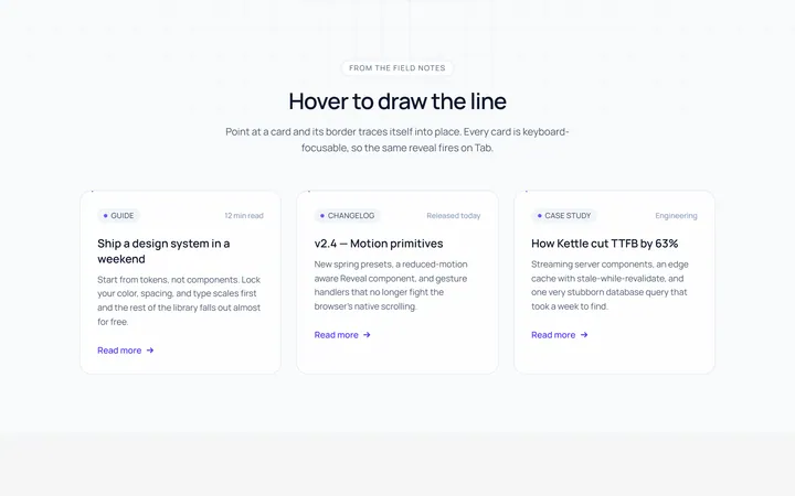
Card Border Draw Hover Effect
OriginalA card whose border draws itself in on hover.
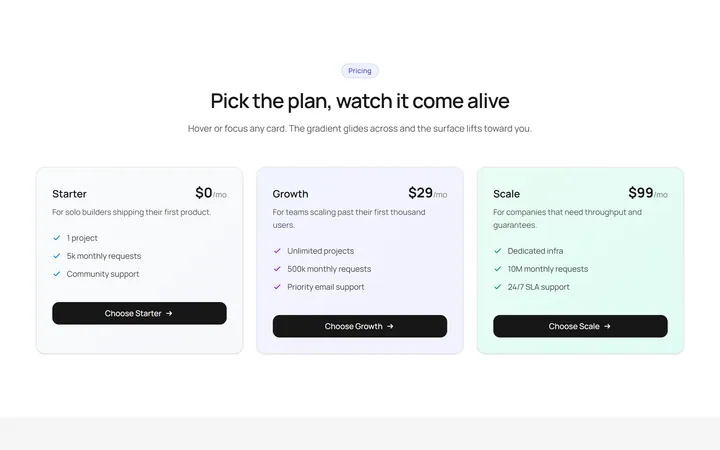
Card Gradient Shift Hover Effect
OriginalA card whose gradient background shifts on hover.
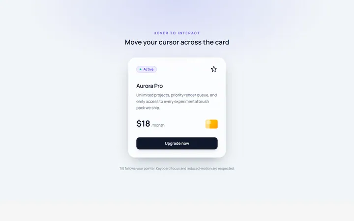
Card Tilt Hover Effect
OriginalA card that tilts in 3D toward the cursor on hover.
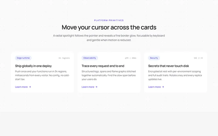
Card Spotlight Hover Effect
OriginalA card with a cursor-following radial spotlight.
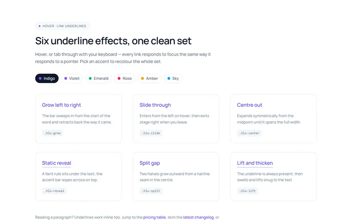
Link Underline Hover Effect
OriginalAnimated link underline effects: grow, slide and centre-out.
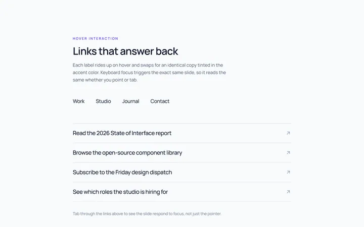
Link Slide Hover Effect
OriginalLinks whose label slides up to a duplicate on hover.
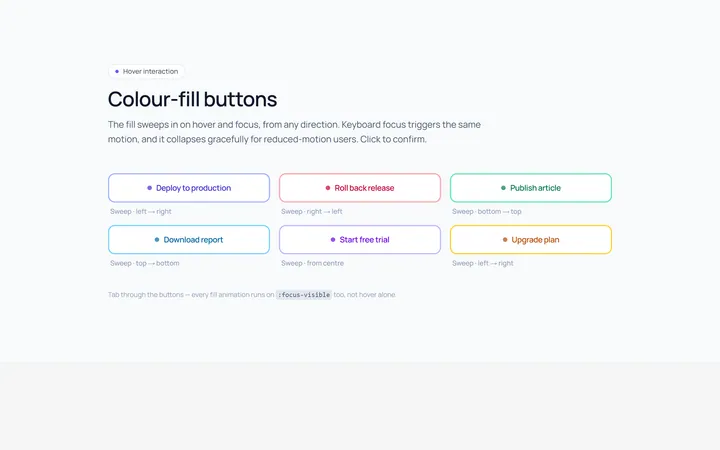
Button Fill Hover Effect
OriginalButtons with a colour fill that sweeps across on hover.
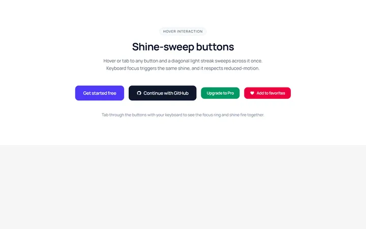
Button Shine Hover Effect
OriginalButtons with a diagonal shine sweep on hover.
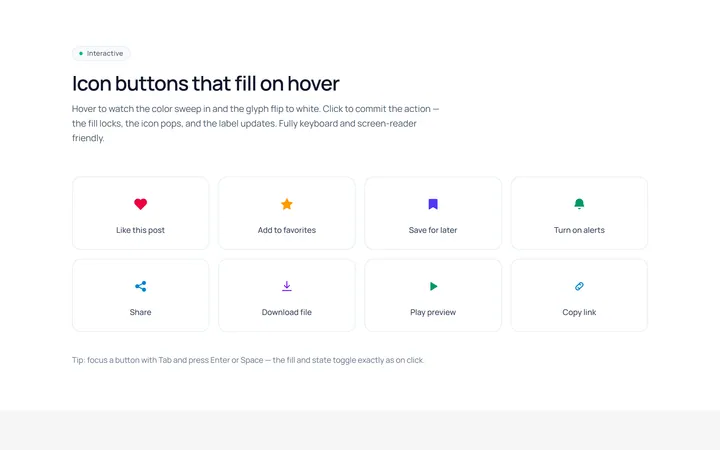
Icon Fill Hover Effect
OriginalIcon buttons whose icon and background fill on hover.
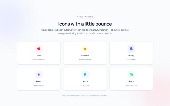
Icon Bounce Hover Effect
OriginalIcons that bounce or spin playfully on hover.