

Social Icons Hover Effect
Original · freeA row of social icon buttons with distinct hover animations.
Copy prompt gives Claude Code, Cursor or v0 a ready-to-paste prompt that recreates this exact component.
npx shadcn@latest add https://webinnoventix.com/r/hover-social-icons.json"use client";
import { useState, type ReactNode } from "react";
type Social = {
key: string;
label: string;
handle: string;
href: string;
motion: "spin" | "lift" | "fill" | "sweep" | "pulse" | "shake" | "flip";
accent: string;
ring: string;
fill: string;
icon: ReactNode;
};
const SOCIALS: Social[] = [
{
key: "x",
label: "X",
handle: "@webinnoventix",
href: "https://x.com/webinnoventix",
motion: "flip",
accent:
"text-zinc-700 group-hover:text-zinc-900 dark:text-zinc-300 dark:group-hover:text-white",
ring: "group-hover:ring-zinc-400 dark:group-hover:ring-zinc-500",
fill: "bg-zinc-900/5 dark:bg-white/10",
icon: (
<svg viewBox="0 0 24 24" fill="currentColor" aria-hidden="true" className="h-5 w-5">
<path d="M18.244 2.25h3.308l-7.227 8.26 8.502 11.24h-6.66l-5.214-6.817L4.99 21.75H1.68l7.73-8.835L1.254 2.25H8.08l4.713 6.231 5.45-6.231Zm-1.161 17.52h1.833L7.084 4.126H5.117L17.083 19.77Z" />
</svg>
),
},
{
key: "github",
label: "GitHub",
handle: "webinnoventix",
href: "https://github.com/webinnoventix",
motion: "lift",
accent:
"text-zinc-700 group-hover:text-zinc-900 dark:text-zinc-300 dark:group-hover:text-white",
ring: "group-hover:ring-zinc-400 dark:group-hover:ring-zinc-500",
fill: "bg-zinc-900/5 dark:bg-white/10",
icon: (
<svg viewBox="0 0 24 24" fill="currentColor" aria-hidden="true" className="h-5 w-5">
<path d="M12 .5C5.73.5.5 5.74.5 12.02c0 5.1 3.29 9.42 7.86 10.95.58.11.79-.25.79-.56 0-.28-.01-1.02-.02-2-3.2.7-3.88-1.54-3.88-1.54-.53-1.34-1.29-1.7-1.29-1.7-1.05-.72.08-.7.08-.7 1.16.08 1.77 1.2 1.77 1.2 1.03 1.77 2.7 1.26 3.36.96.1-.75.4-1.26.73-1.55-2.55-.29-5.24-1.28-5.24-5.69 0-1.26.45-2.28 1.19-3.09-.12-.29-.52-1.46.11-3.05 0 0 .97-.31 3.18 1.18a11 11 0 0 1 2.9-.39c.98 0 1.97.13 2.9.39 2.2-1.49 3.17-1.18 3.17-1.18.63 1.59.24 2.76.12 3.05.74.81 1.18 1.83 1.18 3.09 0 4.42-2.69 5.39-5.25 5.68.41.36.78 1.06.78 2.14 0 1.55-.02 2.79-.02 3.17 0 .31.21.68.8.56A11.53 11.53 0 0 0 23.5 12.02C23.5 5.74 18.27.5 12 .5Z" />
</svg>
),
},
{
key: "linkedin",
label: "LinkedIn",
handle: "webinnoventix",
href: "https://www.linkedin.com/company/webinnoventix",
motion: "fill",
accent:
"text-sky-600 group-hover:text-white dark:text-sky-400 dark:group-hover:text-white",
ring: "group-hover:ring-sky-500",
fill: "bg-sky-600 dark:bg-sky-500",
icon: (
<svg viewBox="0 0 24 24" fill="currentColor" aria-hidden="true" className="h-5 w-5">
<path d="M20.45 20.45h-3.56v-5.57c0-1.33-.02-3.04-1.85-3.04-1.85 0-2.14 1.45-2.14 2.94v5.67H9.34V9h3.42v1.56h.05c.48-.9 1.64-1.85 3.37-1.85 3.6 0 4.27 2.37 4.27 5.46v6.28ZM5.34 7.43a2.06 2.06 0 1 1 0-4.13 2.06 2.06 0 0 1 0 4.13ZM7.12 20.45H3.55V9h3.57v11.45ZM22.22 0H1.77C.79 0 0 .77 0 1.73v20.54C0 23.23.79 24 1.77 24h20.45c.98 0 1.78-.77 1.78-1.73V1.73C24 .77 23.2 0 22.22 0Z" />
</svg>
),
},
{
key: "instagram",
label: "Instagram",
handle: "@webinnoventix",
href: "https://www.instagram.com/webinnoventix",
motion: "sweep",
accent: "text-rose-500 group-hover:text-white",
ring: "group-hover:ring-rose-400",
fill: "bg-gradient-to-tr from-amber-500 via-rose-500 to-violet-600",
icon: (
<svg viewBox="0 0 24 24" fill="currentColor" aria-hidden="true" className="h-5 w-5">
<path d="M12 2.16c3.2 0 3.58.01 4.85.07 1.17.05 1.8.25 2.23.41.56.22.96.48 1.38.9.42.42.68.82.9 1.38.16.42.36 1.06.41 2.23.06 1.27.07 1.65.07 4.85s-.01 3.58-.07 4.85c-.05 1.17-.25 1.8-.41 2.23-.22.56-.48.96-.9 1.38-.42.42-.82.68-1.38.9-.42.16-1.06.36-2.23.41-1.27.06-1.65.07-4.85.07s-3.58-.01-4.85-.07c-1.17-.05-1.8-.25-2.23-.41a3.7 3.7 0 0 1-1.38-.9 3.7 3.7 0 0 1-.9-1.38c-.16-.42-.36-1.06-.41-2.23C2.17 15.58 2.16 15.2 2.16 12s.01-3.58.07-4.85c.05-1.17.25-1.8.41-2.23.22-.56.48-.96.9-1.38.42-.42.82-.68 1.38-.9.42-.16 1.06-.36 2.23-.41C8.42 2.17 8.8 2.16 12 2.16ZM12 0C8.74 0 8.33.01 7.05.07 5.78.13 4.9.33 4.14.63c-.79.3-1.46.72-2.12 1.38A5.86 5.86 0 0 0 .63 4.14c-.3.76-.5 1.64-.56 2.91C.01 8.33 0 8.74 0 12s.01 3.67.07 4.95c.06 1.27.26 2.15.56 2.91.3.79.72 1.46 1.38 2.12.66.66 1.33 1.08 2.12 1.38.76.3 1.64.5 2.91.56C8.33 23.99 8.74 24 12 24s3.67-.01 4.95-.07c1.27-.06 2.15-.26 2.91-.56a5.86 5.86 0 0 0 2.12-1.38 5.86 5.86 0 0 0 1.38-2.12c.3-.76.5-1.64.56-2.91.06-1.28.07-1.69.07-4.95s-.01-3.67-.07-4.95c-.06-1.27-.26-2.15-.56-2.91a5.86 5.86 0 0 0-1.38-2.12A5.86 5.86 0 0 0 19.86.63c-.76-.3-1.64-.5-2.91-.56C15.67.01 15.26 0 12 0Zm0 5.84a6.16 6.16 0 1 0 0 12.32 6.16 6.16 0 0 0 0-12.32Zm0 10.16a4 4 0 1 1 0-8 4 4 0 0 1 0 8Zm7.85-10.4a1.44 1.44 0 1 1-2.88 0 1.44 1.44 0 0 1 2.88 0Z" />
</svg>
),
},
{
key: "youtube",
label: "YouTube",
handle: "Web Innoventix",
href: "https://www.youtube.com/@webinnoventix",
motion: "pulse",
accent: "text-rose-600 group-hover:text-white dark:text-rose-500",
ring: "group-hover:ring-rose-500",
fill: "bg-rose-600",
icon: (
<svg viewBox="0 0 24 24" fill="currentColor" aria-hidden="true" className="h-5 w-5">
<path d="M23.5 6.19a3.02 3.02 0 0 0-2.12-2.14C19.5 3.55 12 3.55 12 3.55s-7.5 0-9.38.5A3.02 3.02 0 0 0 .5 6.19C0 8.08 0 12 0 12s0 3.92.5 5.81a3.02 3.02 0 0 0 2.12 2.14c1.88.5 9.38.5 9.38.5s7.5 0 9.38-.5a3.02 3.02 0 0 0 2.12-2.14C24 15.92 24 12 24 12s0-3.92-.5-5.81ZM9.6 15.6V8.4l6.24 3.6L9.6 15.6Z" />
</svg>
),
},
{
key: "dribbble",
label: "Dribbble",
handle: "webinnoventix",
href: "https://dribbble.com/webinnoventix",
motion: "spin",
accent:
"text-pink-500 group-hover:text-white dark:text-pink-400 dark:group-hover:text-white",
ring: "group-hover:ring-pink-400",
fill: "bg-pink-500",
icon: (
<svg viewBox="0 0 24 24" fill="currentColor" aria-hidden="true" className="h-5 w-5">
<path d="M12 0C5.37 0 0 5.37 0 12s5.37 12 12 12 12-5.37 12-12S18.63 0 12 0Zm7.93 5.53a10.2 10.2 0 0 1 2.31 6.4c-.34-.07-3.72-.76-7.12-.33-.07-.17-.14-.35-.22-.53-.21-.5-.44-1-.68-1.49 3.77-1.54 5.48-3.75 5.71-4.05ZM12 1.78c2.6 0 4.98.98 6.78 2.58-.2.28-1.74 2.35-5.38 3.72A48.8 48.8 0 0 0 9.9 2.13c.68-.16 1.38-.35 2.1-.35Zm-3.9.98a55 55 0 0 1 3.53 5.86c-4.45 1.18-8.38 1.16-8.8 1.16A10.26 10.26 0 0 1 8.1 2.76ZM1.77 12.02v-.31c.41.01 5.03.07 9.78-1.36.28.53.53 1.07.77 1.62l-.37.11c-4.92 1.59-7.53 5.92-7.75 6.29a10.2 10.2 0 0 1-2.43-6.35Zm10.23 10.2c-2.3 0-4.42-.77-6.11-2.07.17-.35 2.09-4.05 7.47-5.93l.06-.02c1.34 3.48 1.89 6.4 2.03 7.24a10.15 10.15 0 0 1-3.45.78Zm5.19-1.73c-.1-.57-.6-3.36-1.85-6.79 3.2-.51 6 .33 6.35.44a10.23 10.23 0 0 1-4.5 6.35Z" />
</svg>
),
},
{
key: "email",
label: "Email",
handle: "hello@webinnoventix.com",
href: "mailto:hello@webinnoventix.com",
motion: "shake",
accent:
"text-emerald-600 group-hover:text-white dark:text-emerald-400 dark:group-hover:text-white",
ring: "group-hover:ring-emerald-500",
fill: "bg-emerald-600 dark:bg-emerald-500",
icon: (
<svg viewBox="0 0 24 24" fill="none" stroke="currentColor" strokeWidth={2} strokeLinecap="round" strokeLinejoin="round" aria-hidden="true" className="h-5 w-5">
<rect x="2" y="4" width="20" height="16" rx="2" />
<path d="m3 6 9 6 9-6" />
</svg>
),
},
];
const MOTION_CLASS: Record<Social["motion"], string> = {
flip: "hsi-flip",
lift: "hsi-lift",
fill: "hsi-fill",
sweep: "hsi-sweep",
pulse: "hsi-pulse",
spin: "hsi-spin",
shake: "hsi-shake",
};
export default function HoverSocialIcons() {
const [active, setActive] = useState<string | null>(null);
return (
<section className="relative w-full bg-white px-6 py-20 dark:bg-zinc-950 sm:py-28">
<style>{`
@keyframes hsi-icon-pulse {
0%, 100% { transform: scale(1); }
50% { transform: scale(1.18); }
}
@keyframes hsi-icon-shake {
0%, 100% { transform: translateX(0) rotate(0deg); }
20% { transform: translateX(-2px) rotate(-6deg); }
40% { transform: translateX(2px) rotate(6deg); }
60% { transform: translateX(-1.5px) rotate(-4deg); }
80% { transform: translateX(1.5px) rotate(4deg); }
}
.hsi-btn { transition: transform .28s cubic-bezier(.34,1.56,.64,1), box-shadow .28s ease, background-color .28s ease; }
.hsi-fillbg { transition: transform .35s cubic-bezier(.34,1.56,.64,1), opacity .3s ease; }
.hsi-ico { transition: transform .3s cubic-bezier(.34,1.56,.64,1), color .25s ease; }
/* Distinct hover motions per icon */
.hsi-lift:hover .hsi-btn { transform: translateY(-6px); }
.hsi-flip:hover .hsi-ico { transform: rotateY(180deg); }
.hsi-spin:hover .hsi-ico { transform: rotate(360deg); }
.hsi-pulse:hover .hsi-ico { animation: hsi-icon-pulse .6s ease-in-out infinite; }
.hsi-shake:hover .hsi-ico { animation: hsi-icon-shake .5s ease-in-out; }
.hsi-fill:hover .hsi-fillbg,
.hsi-sweep:hover .hsi-fillbg,
.hsi-pulse:hover .hsi-fillbg,
.hsi-spin:hover .hsi-fillbg,
.hsi-fill:hover .hsi-fillbg,
.hsi-shake:hover .hsi-fillbg,
.hsi-flip:hover .hsi-fillbg,
.hsi-lift:hover .hsi-fillbg { transform: translateY(0); opacity: 1; }
.hsi-group:focus-visible .hsi-btn { transform: translateY(-6px); }
.hsi-flip:focus-visible .hsi-ico { transform: rotateY(180deg); }
.hsi-spin:focus-visible .hsi-ico { transform: rotate(360deg); }
.hsi-group:focus-visible .hsi-fillbg { transform: translateY(0); opacity: 1; }
@media (prefers-reduced-motion: reduce) {
.hsi-btn, .hsi-fillbg, .hsi-ico { transition: none !important; }
.hsi-lift:hover .hsi-btn,
.hsi-flip:hover .hsi-ico,
.hsi-spin:hover .hsi-ico,
.hsi-group:focus-visible .hsi-btn,
.hsi-flip:focus-visible .hsi-ico,
.hsi-spin:focus-visible .hsi-ico { transform: none !important; }
.hsi-pulse:hover .hsi-ico,
.hsi-shake:hover .hsi-ico { animation: none !important; }
}
`}</style>
<div className="mx-auto max-w-3xl text-center">
<p className="text-xs font-semibold uppercase tracking-[0.2em] text-indigo-600 dark:text-indigo-400">
Stay connected
</p>
<h2 className="mt-3 text-3xl font-bold tracking-tight text-zinc-900 dark:text-white sm:text-4xl">
Find us across the web
</h2>
<p className="mx-auto mt-4 max-w-xl text-base text-zinc-600 dark:text-zinc-400">
Follow along for build logs, product drops, and the occasional
behind-the-scenes. Hover any icon — each one moves a little differently.
</p>
<ul className="mt-12 flex flex-wrap items-center justify-center gap-4 sm:gap-6">
{SOCIALS.map((s) => (
<li key={s.key} className="relative">
<a
href={s.href}
target={s.key === "email" ? undefined : "_blank"}
rel={s.key === "email" ? undefined : "noopener noreferrer"}
aria-label={`${s.label} — ${s.handle}`}
onMouseEnter={() => setActive(s.key)}
onMouseLeave={() => setActive((p) => (p === s.key ? null : p))}
onFocus={() => setActive(s.key)}
onBlur={() => setActive((p) => (p === s.key ? null : p))}
className={`hsi-group ${MOTION_CLASS[s.motion]} group relative block rounded-2xl outline-none`}
>
<span
className={`hsi-btn relative flex h-14 w-14 items-center justify-center overflow-hidden rounded-2xl bg-zinc-100 ring-2 ring-transparent group-focus-visible:ring-4 group-focus-visible:ring-indigo-500/60 dark:bg-zinc-900 ${s.ring} sm:h-16 sm:w-16`}
>
<span
aria-hidden="true"
className={`hsi-fillbg absolute inset-0 translate-y-full opacity-0 ${s.fill}`}
/>
<span
className={`hsi-ico relative z-10 ${s.accent}`}
style={{ transformStyle: "preserve-3d" }}
>
{s.icon}
</span>
</span>
<span
role="tooltip"
className={`pointer-events-none absolute left-1/2 top-full z-20 mt-3 -translate-x-1/2 whitespace-nowrap rounded-lg bg-zinc-900 px-2.5 py-1 text-xs font-medium text-white shadow-lg transition-all duration-200 dark:bg-white dark:text-zinc-900 ${
active === s.key
? "translate-y-0 opacity-100"
: "translate-y-1 opacity-0"
}`}
>
{s.handle}
<span className="absolute -top-1 left-1/2 h-2 w-2 -translate-x-1/2 rotate-45 bg-zinc-900 dark:bg-white" />
</span>
</a>
</li>
))}
</ul>
</div>
</section>
);
}Dependencies
Licence
Built by Web Innoventix. Free for personal and commercial use, no attribution required.
Built by Web Innoventix
Need a custom interface, a full website, or SEO that gets you cited by AI? We design, build and rank it end to end.
Get a free quoteSimilar components
Browse all →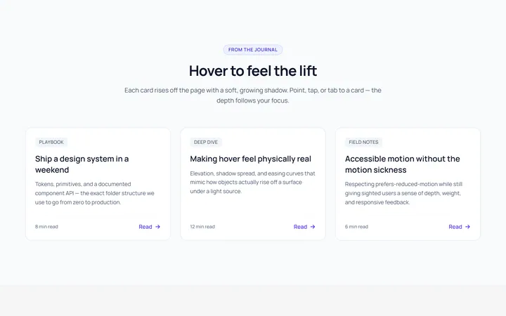
Card Lift Hover Effect
OriginalA card that lifts with a growing shadow on hover.
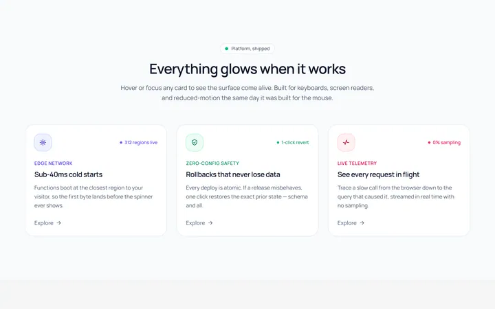
Card Glow Hover Effect
OriginalA card with a coloured glow that blooms on hover.
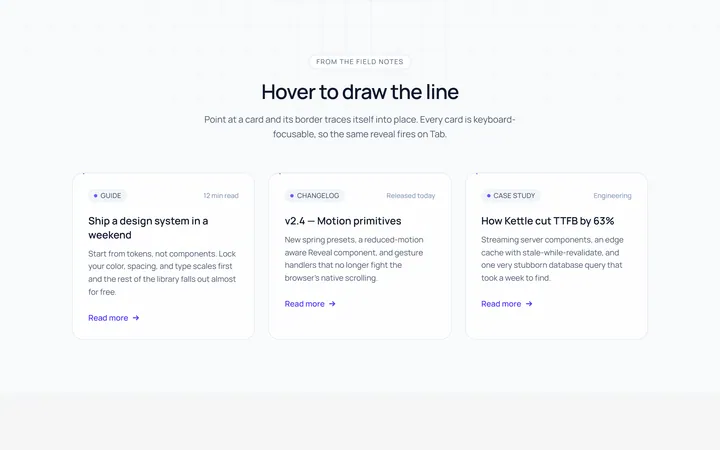
Card Border Draw Hover Effect
OriginalA card whose border draws itself in on hover.
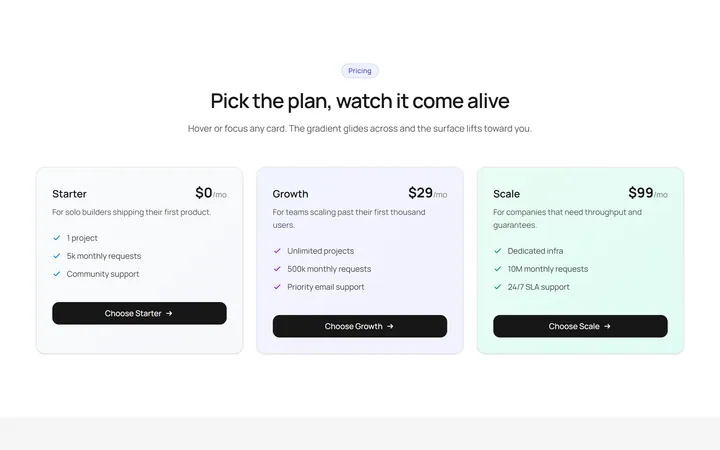
Card Gradient Shift Hover Effect
OriginalA card whose gradient background shifts on hover.
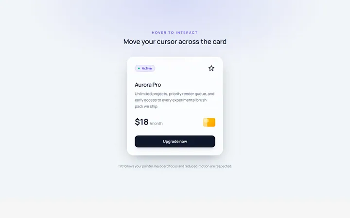
Card Tilt Hover Effect
OriginalA card that tilts in 3D toward the cursor on hover.
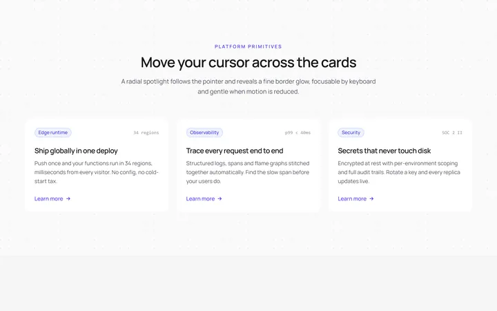
Card Spotlight Hover Effect
OriginalA card with a cursor-following radial spotlight.
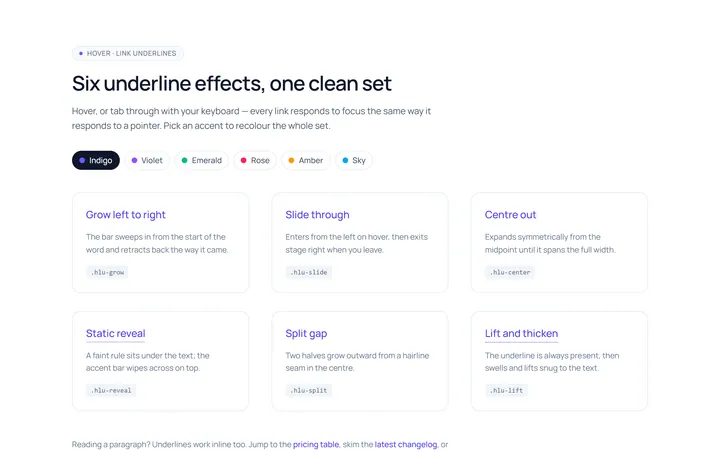
Link Underline Hover Effect
OriginalAnimated link underline effects: grow, slide and centre-out.
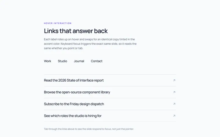
Link Slide Hover Effect
OriginalLinks whose label slides up to a duplicate on hover.
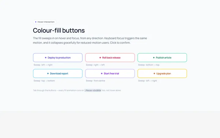
Button Fill Hover Effect
OriginalButtons with a colour fill that sweeps across on hover.
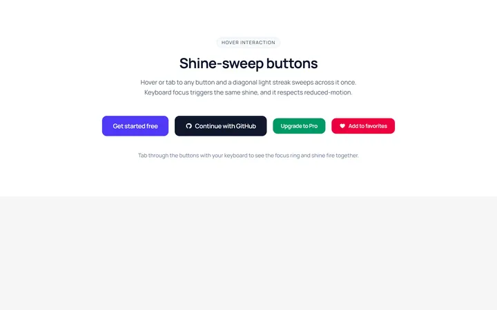
Button Shine Hover Effect
OriginalButtons with a diagonal shine sweep on hover.
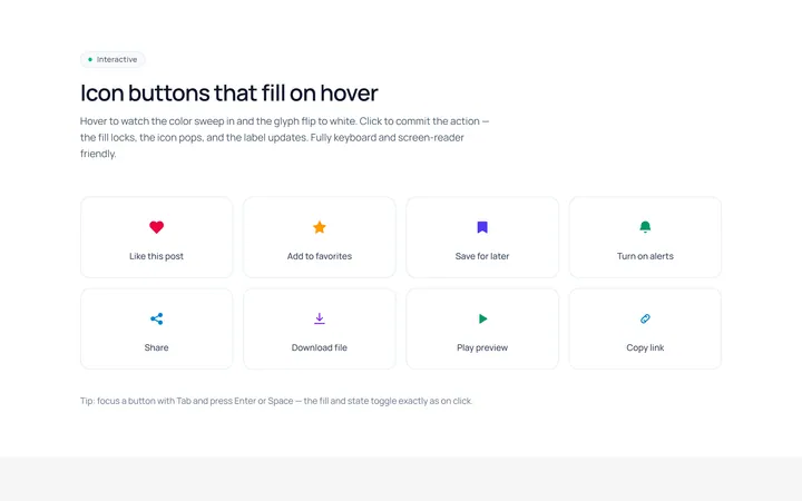
Icon Fill Hover Effect
OriginalIcon buttons whose icon and background fill on hover.
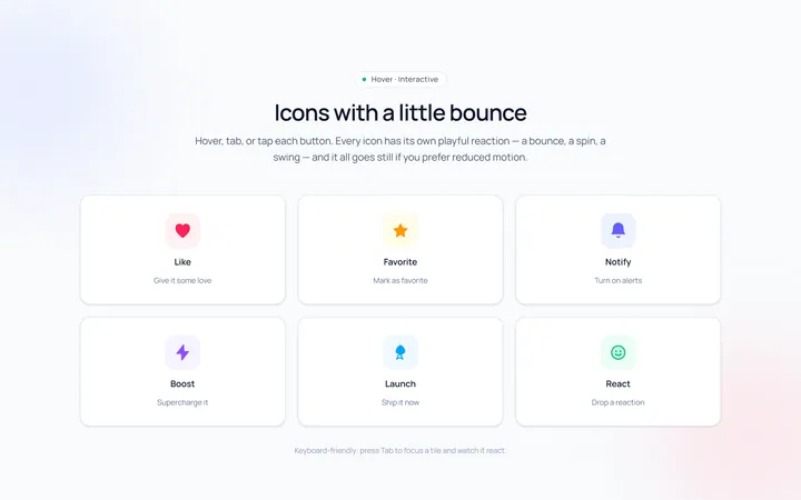
Icon Bounce Hover Effect
OriginalIcons that bounce or spin playfully on hover.