

Basic Set Input
Original · freedefault, hover, focus, disabled, error text inputs
Copy prompt gives Claude Code, Cursor or v0 a ready-to-paste prompt that recreates this exact component.
npx shadcn@latest add https://webinnoventix.com/r/inp-basic-set.json"use client";
import {
type FormEvent,
type ReactNode,
type Ref,
useEffect,
useId,
useRef,
useState,
} from "react";
import { AnimatePresence, motion, useReducedMotion } from "motion/react";
type Status = "default" | "error" | "success";
type StateId = "default" | "hover" | "focus" | "disabled" | "error";
type FieldKey = "name" | "email" | "password";
const cn = (...parts: Array<string | false | null | undefined>) =>
parts.filter(Boolean).join(" ");
/* ---------------- inline SVG icons ---------------- */
function MailIcon({ className }: { className?: string }) {
return (
<svg
viewBox="0 0 24 24"
fill="none"
stroke="currentColor"
strokeWidth={1.75}
strokeLinecap="round"
strokeLinejoin="round"
aria-hidden="true"
className={className}
>
<rect x="3" y="5" width="18" height="14" rx="2" />
<path d="m4 7.5 8 5.5 8-5.5" />
</svg>
);
}
function UserIcon({ className }: { className?: string }) {
return (
<svg
viewBox="0 0 24 24"
fill="none"
stroke="currentColor"
strokeWidth={1.75}
strokeLinecap="round"
strokeLinejoin="round"
aria-hidden="true"
className={className}
>
<circle cx="12" cy="8" r="4" />
<path d="M4 20c0-3.6 3.6-6 8-6s8 2.4 8 6" />
</svg>
);
}
function LockIcon({ className }: { className?: string }) {
return (
<svg
viewBox="0 0 24 24"
fill="none"
stroke="currentColor"
strokeWidth={1.75}
strokeLinecap="round"
strokeLinejoin="round"
aria-hidden="true"
className={className}
>
<rect x="4" y="11" width="16" height="9" rx="2" />
<path d="M8 11V8a4 4 0 0 1 8 0v3" />
</svg>
);
}
function CheckIcon({ className }: { className?: string }) {
return (
<svg
viewBox="0 0 24 24"
fill="none"
stroke="currentColor"
strokeWidth={2.25}
strokeLinecap="round"
strokeLinejoin="round"
aria-hidden="true"
className={className}
>
<path d="m5 13 4 4L19 7" />
</svg>
);
}
function AlertIcon({ className }: { className?: string }) {
return (
<svg
viewBox="0 0 24 24"
fill="none"
stroke="currentColor"
strokeWidth={2}
strokeLinecap="round"
strokeLinejoin="round"
aria-hidden="true"
className={className}
>
<circle cx="12" cy="12" r="9" />
<path d="M12 8v4.5" />
<path d="M12 16h.01" />
</svg>
);
}
function EyeIcon({ className }: { className?: string }) {
return (
<svg
viewBox="0 0 24 24"
fill="none"
stroke="currentColor"
strokeWidth={1.75}
strokeLinecap="round"
strokeLinejoin="round"
aria-hidden="true"
className={className}
>
<path d="M2.5 12S6 5.5 12 5.5 21.5 12 21.5 12 18 18.5 12 18.5 2.5 12 2.5 12Z" />
<circle cx="12" cy="12" r="3" />
</svg>
);
}
function EyeOffIcon({ className }: { className?: string }) {
return (
<svg
viewBox="0 0 24 24"
fill="none"
stroke="currentColor"
strokeWidth={1.75}
strokeLinecap="round"
strokeLinejoin="round"
aria-hidden="true"
className={className}
>
<path d="M10.7 6.2A9.9 9.9 0 0 1 12 6c6 0 9.5 6 9.5 6a17 17 0 0 1-3.2 3.9" />
<path d="M6.3 7.8A16.7 16.7 0 0 0 2.5 12S6 18 12 18a9.7 9.7 0 0 0 3.5-.7" />
<path d="M9.9 9.9a3 3 0 0 0 4.2 4.2" />
<path d="m3 3 18 18" />
</svg>
);
}
function SuccessTick() {
return (
<span className="pointer-events-none grid h-8 w-8 place-items-center">
<CheckIcon className="inpbasic-pop h-4 w-4 text-emerald-500" />
</span>
);
}
/* ---------------- reusable field ---------------- */
interface TextFieldProps {
id: string;
label: string;
value: string;
onChange: (value: string) => void;
type?: string;
placeholder?: string;
autoComplete?: string;
inputMode?: "text" | "email" | "search" | "numeric";
helper?: string;
error?: string;
status?: Status;
disabled?: boolean;
hoverPreview?: boolean;
optional?: boolean;
leadingIcon?: ReactNode;
trailing?: ReactNode;
onBlur?: () => void;
inputRef?: Ref<HTMLInputElement>;
}
function TextField(props: TextFieldProps) {
const {
id,
label,
value,
onChange,
type = "text",
placeholder,
autoComplete,
inputMode,
helper,
error,
disabled = false,
hoverPreview = false,
optional = false,
leadingIcon,
trailing,
onBlur,
inputRef,
} = props;
const prefersReduced = useReducedMotion();
const status: Status = error ? "error" : props.status ?? "default";
const messageId = `${id}-message`;
const showError = status === "error" && !!error;
const message = showError ? error : helper;
return (
<div>
<div className="mb-1.5 flex items-baseline justify-between gap-3">
<label
htmlFor={id}
className="text-sm font-medium text-slate-800 dark:text-slate-200"
>
{label}
</label>
{optional && (
<span className="text-xs font-normal text-slate-400 dark:text-slate-500">
Optional
</span>
)}
</div>
<div className="relative">
{leadingIcon && (
<span
className={cn(
"pointer-events-none absolute left-3 top-1/2 -translate-y-1/2",
disabled
? "text-slate-300 dark:text-slate-600"
: status === "error"
? "text-rose-400 dark:text-rose-400"
: status === "success"
? "text-emerald-500"
: "text-slate-400 dark:text-slate-500",
)}
>
<span className="block h-5 w-5">{leadingIcon}</span>
</span>
)}
<input
ref={inputRef}
id={id}
type={type}
value={value}
disabled={disabled}
placeholder={placeholder}
autoComplete={autoComplete}
inputMode={inputMode}
onChange={(event) => onChange(event.target.value)}
onBlur={onBlur}
aria-invalid={showError || undefined}
aria-describedby={message ? messageId : undefined}
className={cn(
"w-full rounded-xl border bg-white py-2.5 text-sm text-slate-900 shadow-sm outline-none transition-colors placeholder:text-slate-400",
"dark:bg-slate-900 dark:text-slate-100 dark:placeholder:text-slate-500",
leadingIcon ? "pl-10" : "pl-3.5",
trailing ? "pr-11" : "pr-3.5",
disabled &&
"cursor-not-allowed border-slate-200 bg-slate-100 text-slate-400 shadow-none dark:border-slate-800 dark:bg-slate-800/50 dark:text-slate-500",
!disabled &&
status === "default" &&
"border-slate-300 hover:border-slate-400 focus:border-indigo-500 focus-visible:ring-2 focus-visible:ring-indigo-500/40 dark:border-slate-700 dark:hover:border-slate-600 dark:focus:border-indigo-400",
!disabled &&
status === "default" &&
hoverPreview &&
"border-slate-400 dark:border-slate-600",
!disabled &&
status === "error" &&
"border-rose-400 focus:border-rose-500 focus-visible:ring-2 focus-visible:ring-rose-500/40 dark:border-rose-500/70 dark:focus:border-rose-400",
!disabled &&
status === "success" &&
"border-emerald-400 focus:border-emerald-500 focus-visible:ring-2 focus-visible:ring-emerald-500/40 dark:border-emerald-500/70 dark:focus:border-emerald-400",
)}
/>
{trailing && (
<span className="absolute right-1.5 top-1/2 -translate-y-1/2">
{trailing}
</span>
)}
</div>
<div className="mt-1.5 min-h-[1.15rem] text-xs leading-tight">
<AnimatePresence mode="wait" initial={false}>
{message && (
<motion.p
key={message}
id={messageId}
role={showError ? "alert" : undefined}
initial={prefersReduced ? { opacity: 0 } : { opacity: 0, y: -3 }}
animate={{ opacity: 1, y: 0 }}
exit={prefersReduced ? { opacity: 0 } : { opacity: 0, y: -3 }}
transition={{ duration: 0.18, ease: "easeOut" }}
className={cn(
"flex items-center gap-1.5",
showError
? "text-rose-600 dark:text-rose-400"
: status === "success"
? "text-emerald-600 dark:text-emerald-400"
: "text-slate-500 dark:text-slate-400",
)}
>
{showError && (
<AlertIcon className="inpbasic-pop h-3.5 w-3.5 shrink-0" />
)}
{!showError && status === "success" && (
<CheckIcon className="inpbasic-pop h-3.5 w-3.5 shrink-0" />
)}
<span>{message}</span>
</motion.p>
)}
</AnimatePresence>
</div>
</div>
);
}
/* ---------------- showcase ---------------- */
export default function InpBasicSet() {
const prefersReduced = useReducedMotion();
const uid = useId();
// --- state inspector ---
const [inspectState, setInspectState] = useState<StateId>("default");
const [demoValue, setDemoValue] = useState("");
const demoRef = useRef<HTMLInputElement>(null);
useEffect(() => {
if (inspectState === "focus") demoRef.current?.focus();
}, [inspectState]);
const stateOptions: Array<{ id: StateId; label: string }> = [
{ id: "default", label: "Default" },
{ id: "hover", label: "Hover" },
{ id: "focus", label: "Focus" },
{ id: "disabled", label: "Disabled" },
{ id: "error", label: "Error" },
];
const inspectorHelper: Record<StateId, string> = {
default: "Resting state — neutral border, waiting for input.",
hover: "Hover — the border darkens to signal the field is interactive.",
focus: "Focus — an indigo ring and border appear while you type.",
disabled: "Disabled — dimmed and non-interactive; skipped by the keyboard.",
error: "",
};
// --- live validation form ---
const [form, setForm] = useState({ name: "", email: "", password: "" });
const [touched, setTouched] = useState<Record<FieldKey, boolean>>({
name: false,
email: false,
password: false,
});
const [showPassword, setShowPassword] = useState(false);
const [submitted, setSubmitted] = useState(false);
const errors = {
name: form.name.trim().length < 2 ? "Enter your full name." : "",
email: /^[^\s@]+@[^\s@]+\.[^\s@]+$/.test(form.email)
? ""
: "Enter a valid email address.",
password: form.password.length < 8 ? "Use at least 8 characters." : "",
};
const isValid = !errors.name && !errors.email && !errors.password;
const setField = (key: FieldKey, value: string) => {
setForm((prev) => ({ ...prev, [key]: value }));
setSubmitted(false);
};
const markTouched = (key: FieldKey) =>
setTouched((prev) => ({ ...prev, [key]: true }));
const handleSubmit = (event: FormEvent<HTMLFormElement>) => {
event.preventDefault();
setTouched({ name: true, email: true, password: true });
if (isValid) setSubmitted(true);
};
return (
<section className="relative w-full overflow-hidden bg-slate-50 px-4 py-16 dark:bg-slate-950 sm:px-6 sm:py-20 lg:py-24">
<style>{`
@keyframes inpbasic-pop {
0% { transform: scale(.5); opacity: 0; }
60% { transform: scale(1.12); }
100% { transform: scale(1); opacity: 1; }
}
@keyframes inpbasic-pulse {
0%, 100% { opacity: 1; }
50% { opacity: .35; }
}
.inpbasic-pop { animation: inpbasic-pop .28s cubic-bezier(.34,1.56,.64,1) both; }
.inpbasic-pulse { animation: inpbasic-pulse 2s ease-in-out infinite; }
@media (prefers-reduced-motion: reduce) {
.inpbasic-pop, .inpbasic-pulse { animation: none !important; }
}
`}</style>
<div
aria-hidden="true"
className="pointer-events-none absolute -top-24 left-1/2 h-72 w-72 -translate-x-1/2 rounded-full bg-indigo-400/15 blur-3xl dark:bg-indigo-500/10"
/>
<div className="relative mx-auto max-w-4xl">
<header className="mx-auto max-w-2xl text-center">
<span className="inline-flex items-center gap-2 rounded-full border border-slate-200 bg-white px-3 py-1 text-xs font-medium text-slate-600 dark:border-slate-800 dark:bg-slate-900 dark:text-slate-300">
<span className="inpbasic-pulse inline-block h-1.5 w-1.5 rounded-full bg-indigo-500" />
Inputs · Text fields
</span>
<h2 className="mt-4 text-2xl font-semibold tracking-tight text-slate-900 dark:text-white sm:text-3xl">
Text field states, done right
</h2>
<p className="mt-3 text-sm text-slate-600 dark:text-slate-400 sm:text-base">
Default, hover, focus, disabled and error — every state is a real,
accessible control with visible focus rings and inline validation
messaging.
</p>
</header>
<div className="mt-10 grid gap-6 lg:grid-cols-2">
{/* state inspector */}
<div className="rounded-2xl border border-slate-200 bg-white p-6 shadow-sm dark:border-slate-800 dark:bg-slate-900/60 sm:p-8">
<h3 className="text-base font-semibold text-slate-900 dark:text-white">
State inspector
</h3>
<p className="mt-1 text-sm text-slate-500 dark:text-slate-400">
Pick a state to see how the same field responds.
</p>
<div
role="group"
aria-label="Preview input state"
className="mt-5 inline-flex flex-wrap gap-1 rounded-xl border border-slate-200 bg-slate-100 p-1 dark:border-slate-800 dark:bg-slate-900/80"
>
{stateOptions.map((option) => (
<label key={option.id} className="relative cursor-pointer">
<input
type="radio"
name={`${uid}-state`}
value={option.id}
checked={inspectState === option.id}
onChange={() => setInspectState(option.id)}
className="peer sr-only"
/>
<span className="block rounded-lg px-3 py-1.5 text-xs font-medium text-slate-600 transition-colors hover:text-slate-900 peer-checked:bg-white peer-checked:text-slate-900 peer-checked:shadow-sm peer-focus-visible:ring-2 peer-focus-visible:ring-indigo-500 dark:text-slate-400 dark:hover:text-slate-100 dark:peer-checked:bg-slate-700 dark:peer-checked:text-white">
{option.label}
</span>
</label>
))}
</div>
<div className="mt-6">
<TextField
id={`${uid}-demo`}
inputRef={demoRef}
label="Work email"
type="email"
inputMode="email"
autoComplete="email"
placeholder="you@company.com"
leadingIcon={<MailIcon className="h-5 w-5" />}
value={demoValue}
onChange={setDemoValue}
disabled={inspectState === "disabled"}
hoverPreview={inspectState === "hover"}
error={
inspectState === "error"
? "That email is already registered."
: undefined
}
helper={
inspectState !== "error"
? inspectorHelper[inspectState]
: undefined
}
/>
</div>
</div>
{/* live form */}
<div className="rounded-2xl border border-slate-200 bg-white p-6 shadow-sm dark:border-slate-800 dark:bg-slate-900/60 sm:p-8">
<h3 className="text-base font-semibold text-slate-900 dark:text-white">
Create your account
</h3>
<p className="mt-1 text-sm text-slate-500 dark:text-slate-400">
Real-time validation with inline error text on blur.
</p>
<form onSubmit={handleSubmit} noValidate className="mt-5 space-y-4">
<TextField
id={`${uid}-name`}
label="Full name"
autoComplete="name"
placeholder="Salman Farsi"
leadingIcon={<UserIcon className="h-5 w-5" />}
value={form.name}
onChange={(value) => setField("name", value)}
onBlur={() => markTouched("name")}
error={touched.name && errors.name ? errors.name : undefined}
status={
touched.name && !errors.name ? "success" : "default"
}
trailing={
touched.name && !errors.name ? <SuccessTick /> : undefined
}
helper={
touched.name && !errors.name
? "Looks good."
: !touched.name
? "As it should appear on your invoices."
: undefined
}
/>
<TextField
id={`${uid}-email`}
label="Work email"
type="email"
inputMode="email"
autoComplete="email"
placeholder="you@company.com"
leadingIcon={<MailIcon className="h-5 w-5" />}
value={form.email}
onChange={(value) => setField("email", value)}
onBlur={() => markTouched("email")}
error={touched.email && errors.email ? errors.email : undefined}
status={
touched.email && !errors.email ? "success" : "default"
}
trailing={
touched.email && !errors.email ? <SuccessTick /> : undefined
}
helper={
touched.email && !errors.email
? "We'll send a magic link here."
: !touched.email
? "We'll never share your address."
: undefined
}
/>
<TextField
id={`${uid}-password`}
label="Password"
type={showPassword ? "text" : "password"}
autoComplete="new-password"
placeholder="At least 8 characters"
leadingIcon={<LockIcon className="h-5 w-5" />}
value={form.password}
onChange={(value) => setField("password", value)}
onBlur={() => markTouched("password")}
error={
touched.password && errors.password
? errors.password
: undefined
}
status={
touched.password && !errors.password ? "success" : "default"
}
helper={
touched.password && !errors.password
? "Strong enough."
: !touched.password
? "Mix letters, numbers and symbols."
: undefined
}
trailing={
<button
type="button"
onClick={() => setShowPassword((prev) => !prev)}
aria-label={
showPassword ? "Hide password" : "Show password"
}
aria-pressed={showPassword}
className="grid h-8 w-8 place-items-center rounded-lg text-slate-500 transition-colors hover:text-slate-800 focus-visible:outline-none focus-visible:ring-2 focus-visible:ring-indigo-500 dark:text-slate-400 dark:hover:text-slate-100"
>
{showPassword ? (
<EyeOffIcon className="h-5 w-5" />
) : (
<EyeIcon className="h-5 w-5" />
)}
</button>
}
/>
<button
type="submit"
className="inline-flex w-full items-center justify-center gap-2 rounded-xl bg-indigo-600 px-4 py-2.5 text-sm font-semibold text-white shadow-sm transition-colors hover:bg-indigo-500 focus-visible:outline-none focus-visible:ring-2 focus-visible:ring-indigo-500 focus-visible:ring-offset-2 focus-visible:ring-offset-white active:bg-indigo-700 dark:focus-visible:ring-offset-slate-950"
>
Create account
</button>
<AnimatePresence initial={false}>
{submitted && (
<motion.div
role="status"
initial={
prefersReduced ? { opacity: 0 } : { opacity: 0, y: -4 }
}
animate={{ opacity: 1, y: 0 }}
exit={{ opacity: 0 }}
transition={{ duration: 0.2, ease: "easeOut" }}
className="flex items-center gap-2 rounded-xl border border-emerald-200 bg-emerald-50 px-3.5 py-2.5 text-sm font-medium text-emerald-700 dark:border-emerald-500/30 dark:bg-emerald-500/10 dark:text-emerald-300"
>
<CheckIcon className="h-4 w-4 shrink-0" />
Account created — confirm at{" "}
{form.email || "your inbox"}.
</motion.div>
)}
</AnimatePresence>
</form>
</div>
</div>
</div>
</section>
);
}Dependencies
Licence
Built by Web Innoventix. Free for personal and commercial use, no attribution required.
Built by Web Innoventix
Need a custom interface, a full website, or SEO that gets you cited by AI? We design, build and rank it end to end.
Get a free quoteSimilar components
Browse all →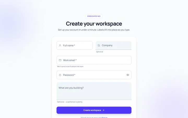
Floating Label Input
Originallabel that floats up on focus/fill
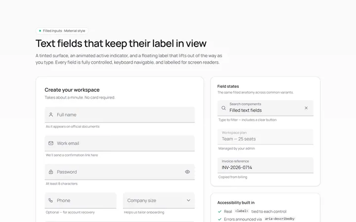
Filled Input
Originalfilled material-style inputs
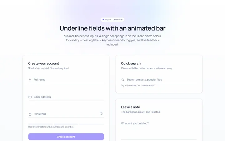
Underline Input
Originalminimal underline inputs with animated bar
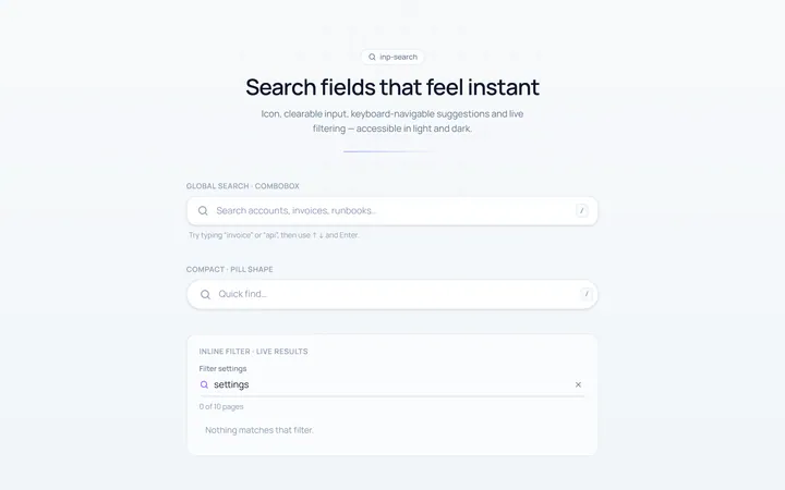
Search Input
Originalsearch box with icon and clear
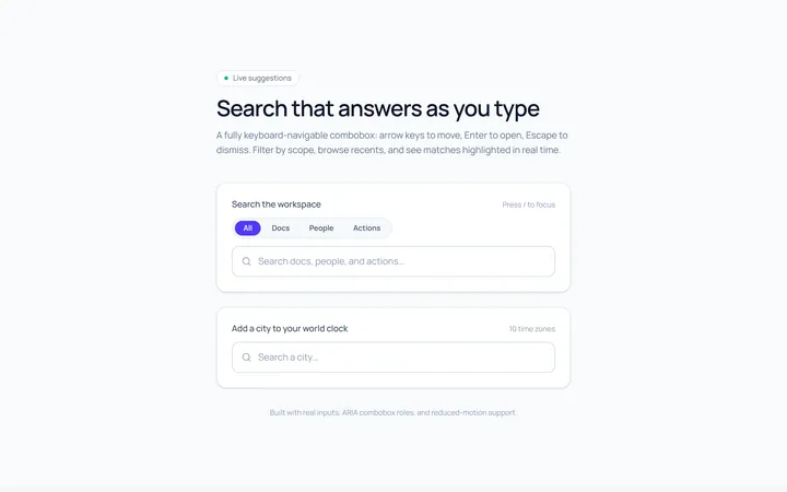
Search Suggest Input
Originalsearch with a live suggestions dropdown
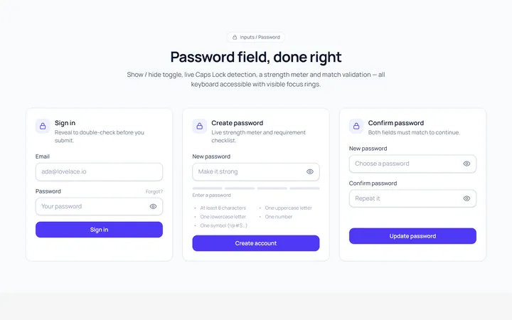
Password Toggle Input
Originalpassword field with show/hide toggle
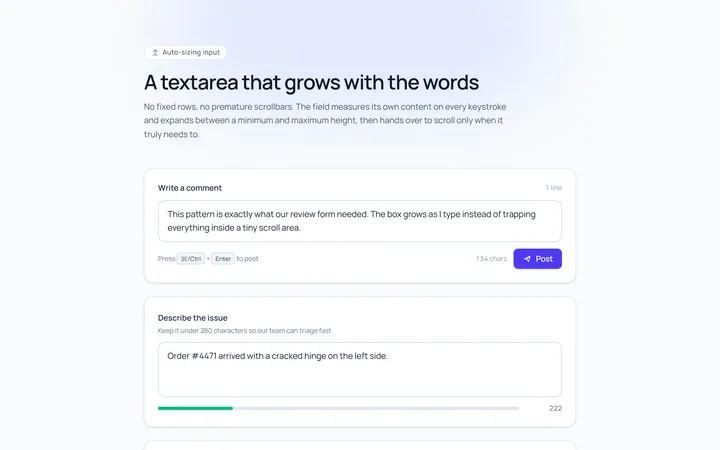
Textarea Autosize Input
Originaltextarea that grows with content
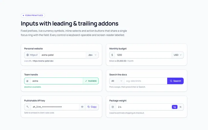
Addon Group Input
Originalinput group with leading/trailing addons
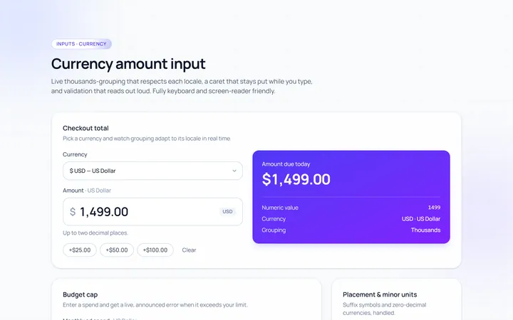
Currency Input
Originalcurrency input with formatting
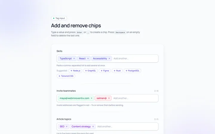
Tags Input
Originaltag input, add and remove chips
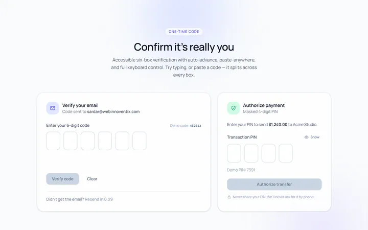
OTP Input
Original6-box one-time-code input with paste
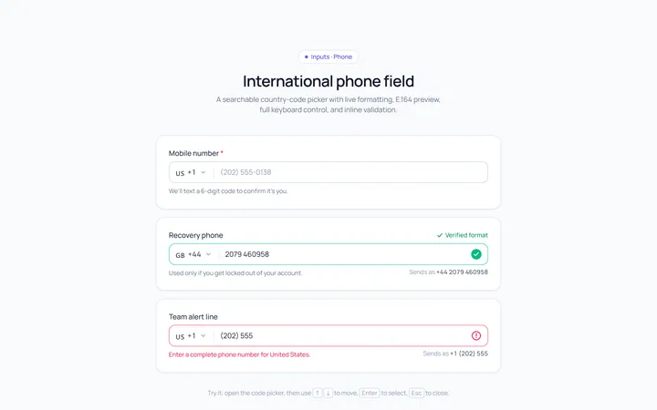
Phone Input
Originalphone input with country prefix select