

Textarea Autosize Input
Original · freetextarea that grows with content
Copy prompt gives Claude Code, Cursor or v0 a ready-to-paste prompt that recreates this exact component.
npx shadcn@latest add https://webinnoventix.com/r/inp-textarea-autosize.json"use client";
import {
useState,
useRef,
useCallback,
useLayoutEffect,
useId,
type KeyboardEvent as ReactKeyboardEvent,
type ChangeEvent,
} from "react";
import { motion, AnimatePresence, useReducedMotion } from "motion/react";
/* ------------------------------------------------------------------ */
/* Core: a genuinely auto-sizing textarea */
/* ------------------------------------------------------------------ */
type AutosizeTextareaProps = {
id?: string;
value: string;
onValueChange: (value: string) => void;
minRows?: number;
maxRows?: number;
placeholder?: string;
maxLength?: number;
disabled?: boolean;
invalid?: boolean;
ariaLabel?: string;
describedBy?: string;
onEnterSubmit?: () => void;
className?: string;
};
function AutosizeTextarea({
id,
value,
onValueChange,
minRows = 2,
maxRows = 8,
placeholder,
maxLength,
disabled = false,
invalid = false,
ariaLabel,
describedBy,
onEnterSubmit,
className = "",
}: AutosizeTextareaProps) {
const ref = useRef<HTMLTextAreaElement | null>(null);
const resize = useCallback(() => {
const el = ref.current;
if (!el) return;
el.style.height = "auto";
const cs = window.getComputedStyle(el);
const lineHeight = parseFloat(cs.lineHeight) || 24;
const padY =
parseFloat(cs.paddingTop || "0") + parseFloat(cs.paddingBottom || "0");
const borderY =
parseFloat(cs.borderTopWidth || "0") +
parseFloat(cs.borderBottomWidth || "0");
const minH = Math.round(minRows * lineHeight + padY + borderY);
const maxH = Math.round(maxRows * lineHeight + padY + borderY);
// scrollHeight includes content + padding (not border) for border-box.
const content = el.scrollHeight + borderY;
const next = Math.max(minH, Math.min(content, maxH));
el.style.height = `${next}px`;
el.style.overflowY = content > maxH ? "auto" : "hidden";
}, [minRows, maxRows]);
// Recompute whenever the value changes and once on mount.
useLayoutEffect(() => {
resize();
}, [value, resize]);
// Keep it correct across viewport/font reflows.
useLayoutEffect(() => {
window.addEventListener("resize", resize);
return () => window.removeEventListener("resize", resize);
}, [resize]);
const handleChange = (e: ChangeEvent<HTMLTextAreaElement>) => {
onValueChange(e.target.value);
};
const handleKeyDown = (e: ReactKeyboardEvent<HTMLTextAreaElement>) => {
if (
onEnterSubmit &&
e.key === "Enter" &&
(e.metaKey || e.ctrlKey) &&
!e.shiftKey
) {
e.preventDefault();
onEnterSubmit();
}
};
return (
<textarea
id={id}
ref={ref}
rows={minRows}
value={value}
onChange={handleChange}
onKeyDown={handleKeyDown}
placeholder={placeholder}
maxLength={maxLength}
disabled={disabled}
aria-label={ariaLabel}
aria-invalid={invalid || undefined}
aria-describedby={describedBy}
spellCheck
className={[
"block w-full resize-none rounded-xl px-4 py-3 text-[15px] leading-6",
"bg-white text-slate-900 placeholder:text-slate-400",
"dark:bg-slate-900 dark:text-slate-100 dark:placeholder:text-slate-500",
"border transition-colors duration-200 ease-out",
"focus-visible:outline-none focus-visible:ring-2 focus-visible:ring-offset-2",
"focus-visible:ring-offset-white dark:focus-visible:ring-offset-slate-950",
"disabled:cursor-not-allowed disabled:opacity-60",
invalid
? "border-rose-400 focus-visible:border-rose-500 focus-visible:ring-rose-500/60 dark:border-rose-500/70"
: "border-slate-300 focus-visible:border-indigo-500 focus-visible:ring-indigo-500/60 dark:border-slate-700 dark:focus-visible:border-indigo-400",
className,
].join(" ")}
/>
);
}
/* ------------------------------------------------------------------ */
/* Small inline icons */
/* ------------------------------------------------------------------ */
function SendIcon({ className = "" }: { className?: string }) {
return (
<svg
viewBox="0 0 24 24"
fill="none"
stroke="currentColor"
strokeWidth={1.8}
strokeLinecap="round"
strokeLinejoin="round"
className={className}
aria-hidden="true"
>
<path d="M4.5 12.5 20 5l-4 15-4.5-6.5L4.5 12.5Z" />
<path d="m11.5 13 8.5-8" />
</svg>
);
}
function CheckIcon({ className = "" }: { className?: string }) {
return (
<svg
viewBox="0 0 24 24"
fill="none"
stroke="currentColor"
strokeWidth={2}
strokeLinecap="round"
strokeLinejoin="round"
className={className}
aria-hidden="true"
>
<path d="m5 12.5 4.5 4.5L19 7" />
</svg>
);
}
function GrowIcon({ className = "" }: { className?: string }) {
return (
<svg
viewBox="0 0 24 24"
fill="none"
stroke="currentColor"
strokeWidth={1.8}
strokeLinecap="round"
strokeLinejoin="round"
className={className}
aria-hidden="true"
>
<path d="M12 20V4" />
<path d="m6 10 6-6 6 6" />
<path d="M5 20h14" />
</svg>
);
}
/* ------------------------------------------------------------------ */
/* Demo */
/* ------------------------------------------------------------------ */
export default function InpTextareaAutosize() {
const reduce = useReducedMotion();
// Variant 1 — comment composer
const commentId = useId();
const commentHelpId = `${commentId}-help`;
const [comment, setComment] = useState(
"This pattern is exactly what our review form needed. The box grows as I type instead of trapping everything inside a tiny scroll area."
);
const [posted, setPosted] = useState(false);
const commentLines = comment.length === 0 ? 0 : comment.split("\n").length;
const postComment = useCallback(() => {
if (comment.trim().length === 0) return;
setPosted(true);
setComment("");
window.setTimeout(() => setPosted(false), 2200);
}, [comment]);
// Variant 2 — support message with a hard limit + progress
const supportId = useId();
const supportCountId = `${supportId}-count`;
const SUPPORT_MAX = 280;
const [support, setSupport] = useState(
"Order #4471 arrived with a cracked hinge on the left side."
);
const used = support.length;
const remaining = SUPPORT_MAX - used;
const pct = Math.min(100, (used / SUPPORT_MAX) * 100);
const over = remaining < 0;
const near = remaining <= 40 && remaining >= 0;
const barColor = over
? "bg-rose-500"
: near
? "bg-amber-500"
: "bg-emerald-500";
const countColor = over
? "text-rose-600 dark:text-rose-400"
: near
? "text-amber-600 dark:text-amber-400"
: "text-slate-500 dark:text-slate-400";
// Variant 3 — compact quick reply
const replyId = useId();
const [reply, setReply] = useState("");
const [sent, setSent] = useState<string | null>(null);
const sendReply = useCallback(() => {
if (reply.trim().length === 0) return;
setSent(reply.trim());
setReply("");
window.setTimeout(() => setSent(null), 2400);
}, [reply]);
const fadeIn = reduce
? {}
: {
initial: { opacity: 0, y: 8 },
animate: { opacity: 1, y: 0 },
exit: { opacity: 0, y: -6 },
transition: { duration: 0.24, ease: [0.22, 1, 0.36, 1] as const },
};
return (
<section className="relative w-full overflow-hidden bg-slate-50 px-5 py-20 text-slate-900 sm:px-8 dark:bg-slate-950 dark:text-slate-100">
<style>{`
@keyframes inpta-rise {
from { opacity: 0; transform: translateY(10px); }
to { opacity: 1; transform: translateY(0); }
}
@keyframes inpta-caret {
0%, 100% { opacity: 1; }
50% { opacity: 0.15; }
}
.inpta-rise { animation: inpta-rise 0.5s cubic-bezier(0.22, 1, 0.36, 1) both; }
.inpta-caret { animation: inpta-caret 1.4s ease-in-out infinite; }
@media (prefers-reduced-motion: reduce) {
.inpta-rise, .inpta-caret { animation: none !important; }
}
`}</style>
{/* atmosphere */}
<div
aria-hidden="true"
className="pointer-events-none absolute -top-24 left-1/2 h-72 w-[42rem] max-w-full -translate-x-1/2 rounded-full bg-indigo-300/25 blur-3xl dark:bg-indigo-500/10"
/>
<div className="relative mx-auto max-w-3xl">
<header className="inpta-rise mb-12 max-w-2xl">
<span className="inline-flex items-center gap-1.5 rounded-full border border-slate-200 bg-white px-3 py-1 text-xs font-medium tracking-wide text-slate-600 dark:border-slate-800 dark:bg-slate-900 dark:text-slate-300">
<GrowIcon className="h-3.5 w-3.5 text-indigo-500 dark:text-indigo-400" />
Auto-sizing input
</span>
<h2 className="mt-5 text-3xl font-semibold tracking-tight text-slate-900 sm:text-4xl dark:text-white">
A textarea that grows with the words
</h2>
<p className="mt-3 text-[15px] leading-relaxed text-slate-600 dark:text-slate-400">
No fixed rows, no premature scrollbars. The field measures its own
content on every keystroke and expands between a minimum and maximum
height, then hands over to scroll only when it truly needs to.
</p>
</header>
<div className="space-y-6">
{/* -------------------------------------------------- */}
{/* Variant 1 — comment composer */}
{/* -------------------------------------------------- */}
<article className="inpta-rise rounded-2xl border border-slate-200 bg-white p-5 shadow-sm sm:p-6 dark:border-slate-800 dark:bg-slate-900/70">
<div className="mb-3 flex items-center justify-between gap-3">
<label
htmlFor={commentId}
className="text-sm font-semibold text-slate-800 dark:text-slate-100"
>
Write a comment
</label>
<span className="text-xs tabular-nums text-slate-400 dark:text-slate-500">
{commentLines} {commentLines === 1 ? "line" : "lines"}
</span>
</div>
<AutosizeTextarea
id={commentId}
value={comment}
onValueChange={setComment}
minRows={2}
maxRows={8}
placeholder="Share your thoughts on this thread…"
describedBy={commentHelpId}
onEnterSubmit={postComment}
/>
<div className="mt-3 flex flex-wrap items-center justify-between gap-3">
<p id={commentHelpId} className="text-xs text-slate-500 dark:text-slate-400">
Press{" "}
<kbd className="rounded border border-slate-300 bg-slate-100 px-1.5 py-0.5 font-sans text-[11px] font-medium text-slate-600 dark:border-slate-700 dark:bg-slate-800 dark:text-slate-300">
⌘/Ctrl
</kbd>{" "}
<span aria-hidden="true">+</span>{" "}
<kbd className="rounded border border-slate-300 bg-slate-100 px-1.5 py-0.5 font-sans text-[11px] font-medium text-slate-600 dark:border-slate-700 dark:bg-slate-800 dark:text-slate-300">
Enter
</kbd>{" "}
to post
</p>
<div className="flex items-center gap-3">
<span className="text-xs tabular-nums text-slate-400 dark:text-slate-500">
{comment.length} chars
</span>
<button
type="button"
onClick={postComment}
disabled={comment.trim().length === 0}
className="inline-flex items-center gap-2 rounded-lg bg-indigo-600 px-4 py-2 text-sm font-medium text-white shadow-sm transition-colors hover:bg-indigo-500 focus-visible:outline-none focus-visible:ring-2 focus-visible:ring-indigo-500 focus-visible:ring-offset-2 focus-visible:ring-offset-white disabled:cursor-not-allowed disabled:bg-slate-300 disabled:text-slate-500 dark:focus-visible:ring-offset-slate-900 dark:disabled:bg-slate-700 dark:disabled:text-slate-400"
>
<SendIcon className="h-4 w-4" />
Post
</button>
</div>
</div>
<div aria-live="polite" className="min-h-0">
<AnimatePresence>
{posted && (
<motion.p
{...fadeIn}
className="mt-3 inline-flex items-center gap-1.5 rounded-lg bg-emerald-50 px-3 py-1.5 text-xs font-medium text-emerald-700 dark:bg-emerald-500/10 dark:text-emerald-300"
>
<CheckIcon className="h-3.5 w-3.5" />
Comment posted
</motion.p>
)}
</AnimatePresence>
</div>
</article>
{/* -------------------------------------------------- */}
{/* Variant 2 — support message with limit + progress */}
{/* -------------------------------------------------- */}
<article className="inpta-rise rounded-2xl border border-slate-200 bg-white p-5 shadow-sm sm:p-6 dark:border-slate-800 dark:bg-slate-900/70">
<label
htmlFor={supportId}
className="text-sm font-semibold text-slate-800 dark:text-slate-100"
>
Describe the issue
</label>
<p className="mb-3 mt-1 text-xs text-slate-500 dark:text-slate-400">
Keep it under {SUPPORT_MAX} characters so our team can triage fast.
</p>
<AutosizeTextarea
id={supportId}
value={support}
onValueChange={setSupport}
minRows={3}
maxRows={7}
invalid={over}
placeholder="What went wrong, and what did you expect to happen?"
describedBy={supportCountId}
/>
<div className="mt-3 flex items-center gap-3">
<div
className="h-1.5 flex-1 overflow-hidden rounded-full bg-slate-200 dark:bg-slate-800"
role="presentation"
>
<div
className={`h-full rounded-full transition-[width,background-color] duration-200 ease-out ${barColor}`}
style={{ width: `${pct}%` }}
/>
</div>
<span
id={supportCountId}
aria-live="polite"
className={`w-16 text-right text-xs font-medium tabular-nums ${countColor}`}
>
{remaining}
</span>
</div>
{over && (
<p className="mt-2 text-xs font-medium text-rose-600 dark:text-rose-400">
You’re {Math.abs(remaining)} characters over the limit.
</p>
)}
</article>
{/* -------------------------------------------------- */}
{/* Variant 3 — compact quick reply */}
{/* -------------------------------------------------- */}
<article className="inpta-rise rounded-2xl border border-slate-200 bg-white p-5 shadow-sm sm:p-6 dark:border-slate-800 dark:bg-slate-900/70">
<div className="mb-3 flex items-center gap-3">
<span
aria-hidden="true"
className="grid h-8 w-8 shrink-0 place-items-center rounded-full bg-gradient-to-br from-violet-500 to-indigo-500 text-xs font-semibold text-white"
>
RA
</span>
<div className="leading-tight">
<p className="text-sm font-semibold text-slate-800 dark:text-slate-100">
Reply to Rina Alvarez
</p>
<p className="text-xs text-slate-500 dark:text-slate-400">
Starts one line tall, grows as you write
</p>
</div>
</div>
<div className="flex items-end gap-2">
<div className="flex-1">
<AutosizeTextarea
id={replyId}
value={reply}
onValueChange={setReply}
minRows={1}
maxRows={5}
placeholder="Write a quick reply…"
ariaLabel="Quick reply to Rina Alvarez"
onEnterSubmit={sendReply}
/>
</div>
<button
type="button"
onClick={sendReply}
disabled={reply.trim().length === 0}
aria-label="Send reply"
className="grid h-11 w-11 shrink-0 place-items-center rounded-xl bg-slate-900 text-white shadow-sm transition-colors hover:bg-slate-700 focus-visible:outline-none focus-visible:ring-2 focus-visible:ring-slate-500 focus-visible:ring-offset-2 focus-visible:ring-offset-white disabled:cursor-not-allowed disabled:bg-slate-300 disabled:text-slate-500 dark:bg-slate-100 dark:text-slate-900 dark:hover:bg-white dark:focus-visible:ring-offset-slate-900 dark:disabled:bg-slate-700 dark:disabled:text-slate-500"
>
<SendIcon className="h-5 w-5" />
</button>
</div>
<div aria-live="polite" className="min-h-0">
<AnimatePresence>
{sent && (
<motion.p
{...fadeIn}
className="mt-3 truncate text-xs text-slate-500 dark:text-slate-400"
>
<span className="font-medium text-emerald-600 dark:text-emerald-400">
Sent:
</span>{" "}
{sent}
</motion.p>
)}
</AnimatePresence>
</div>
</article>
</div>
<p className="mt-8 text-center text-xs text-slate-400 dark:text-slate-600">
Each field measures its own content — try adding several lines to watch it grow.
</p>
</div>
</section>
);
}Dependencies
Licence
Built by Web Innoventix. Free for personal and commercial use, no attribution required.
Built by Web Innoventix
Need a custom interface, a full website, or SEO that gets you cited by AI? We design, build and rank it end to end.
Get a free quoteSimilar components
Browse all →
Basic Set Input
Originaldefault, hover, focus, disabled, error text inputs

Floating Label Input
Originallabel that floats up on focus/fill
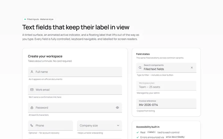
Filled Input
Originalfilled material-style inputs

Underline Input
Originalminimal underline inputs with animated bar

Search Input
Originalsearch box with icon and clear

Search Suggest Input
Originalsearch with a live suggestions dropdown

Password Toggle Input
Originalpassword field with show/hide toggle
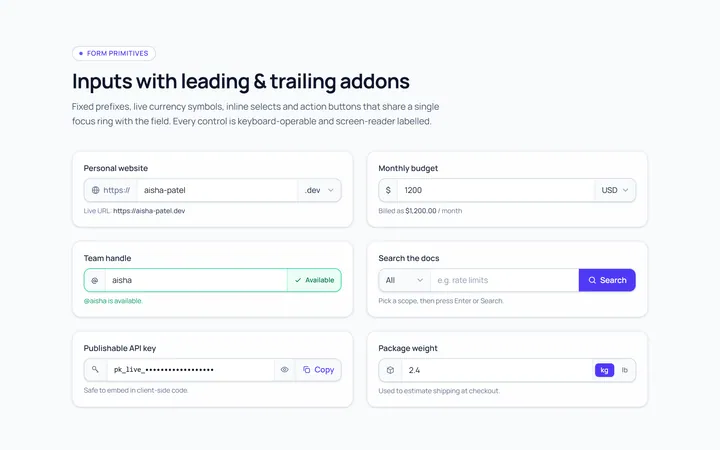
Addon Group Input
Originalinput group with leading/trailing addons

Currency Input
Originalcurrency input with formatting
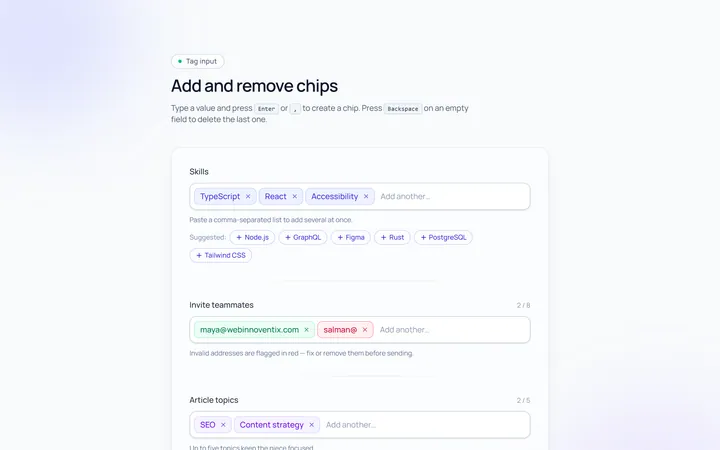
Tags Input
Originaltag input, add and remove chips

OTP Input
Original6-box one-time-code input with paste
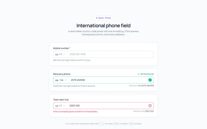
Phone Input
Originalphone input with country prefix select