

Filled Input
Original · freefilled material-style inputs
Copy prompt gives Claude Code, Cursor or v0 a ready-to-paste prompt that recreates this exact component.
npx shadcn@latest add https://webinnoventix.com/r/inp-filled.json"use client";
import { useId, useState } from "react";
import type { ReactNode } from "react";
import { AnimatePresence, motion, useReducedMotion } from "motion/react";
/* ------------------------------------------------------------------ */
/* utils */
/* ------------------------------------------------------------------ */
function cx(...classes: Array<string | false | null | undefined>): string {
return classes.filter(Boolean).join(" ");
}
/* ------------------------------------------------------------------ */
/* inline icons */
/* ------------------------------------------------------------------ */
type IconProps = { className?: string };
function UserIcon({ className }: IconProps) {
return (
<svg viewBox="0 0 24 24" fill="none" stroke="currentColor" strokeWidth={1.8} strokeLinecap="round" strokeLinejoin="round" className={className} aria-hidden="true">
<circle cx="12" cy="8" r="3.6" />
<path d="M4.5 20c.6-3.6 3.7-5.8 7.5-5.8s6.9 2.2 7.5 5.8" />
</svg>
);
}
function MailIcon({ className }: IconProps) {
return (
<svg viewBox="0 0 24 24" fill="none" stroke="currentColor" strokeWidth={1.8} strokeLinecap="round" strokeLinejoin="round" className={className} aria-hidden="true">
<rect x="3" y="5" width="18" height="14" rx="2.5" />
<path d="m3.5 7 8.5 6 8.5-6" />
</svg>
);
}
function LockIcon({ className }: IconProps) {
return (
<svg viewBox="0 0 24 24" fill="none" stroke="currentColor" strokeWidth={1.8} strokeLinecap="round" strokeLinejoin="round" className={className} aria-hidden="true">
<rect x="4.5" y="10.5" width="15" height="9.5" rx="2.2" />
<path d="M8 10.5V8a4 4 0 0 1 8 0v2.5" />
<circle cx="12" cy="15" r="1.2" />
</svg>
);
}
function EyeIcon({ className }: IconProps) {
return (
<svg viewBox="0 0 24 24" fill="none" stroke="currentColor" strokeWidth={1.8} strokeLinecap="round" strokeLinejoin="round" className={className} aria-hidden="true">
<path d="M2.5 12S6 5.5 12 5.5 21.5 12 21.5 12 18 18.5 12 18.5 2.5 12 2.5 12Z" />
<circle cx="12" cy="12" r="3" />
</svg>
);
}
function EyeOffIcon({ className }: IconProps) {
return (
<svg viewBox="0 0 24 24" fill="none" stroke="currentColor" strokeWidth={1.8} strokeLinecap="round" strokeLinejoin="round" className={className} aria-hidden="true">
<path d="M10.3 6.2A9.9 9.9 0 0 1 12 6c6 0 9.5 6 9.5 6a17 17 0 0 1-2.6 3.3M6.1 7.6A17 17 0 0 0 2.5 12S6 18 12 18a9.6 9.6 0 0 0 3.6-.7" />
<path d="M9.9 9.9a3 3 0 0 0 4.2 4.2" />
<path d="m4 4 16 16" />
</svg>
);
}
function PhoneIcon({ className }: IconProps) {
return (
<svg viewBox="0 0 24 24" fill="none" stroke="currentColor" strokeWidth={1.8} strokeLinecap="round" strokeLinejoin="round" className={className} aria-hidden="true">
<path d="M5 4h3.2l1.4 4-2 1.3a11 11 0 0 0 5.1 5.1l1.3-2 4 1.4V18a2 2 0 0 1-2.2 2A15.5 15.5 0 0 1 3 6.2 2 2 0 0 1 5 4Z" />
</svg>
);
}
function ChevronDownIcon({ className }: IconProps) {
return (
<svg viewBox="0 0 24 24" fill="none" stroke="currentColor" strokeWidth={1.9} strokeLinecap="round" strokeLinejoin="round" className={className} aria-hidden="true">
<path d="m6 9 6 6 6-6" />
</svg>
);
}
function SearchIcon({ className }: IconProps) {
return (
<svg viewBox="0 0 24 24" fill="none" stroke="currentColor" strokeWidth={1.8} strokeLinecap="round" strokeLinejoin="round" className={className} aria-hidden="true">
<circle cx="11" cy="11" r="6.5" />
<path d="m20 20-3.6-3.6" />
</svg>
);
}
function CloseIcon({ className }: IconProps) {
return (
<svg viewBox="0 0 24 24" fill="none" stroke="currentColor" strokeWidth={2} strokeLinecap="round" strokeLinejoin="round" className={className} aria-hidden="true">
<path d="m6 6 12 12M18 6 6 18" />
</svg>
);
}
function AlertIcon({ className }: IconProps) {
return (
<svg viewBox="0 0 24 24" fill="none" stroke="currentColor" strokeWidth={1.9} strokeLinecap="round" strokeLinejoin="round" className={className} aria-hidden="true">
<circle cx="12" cy="12" r="9" />
<path d="M12 7.5v5" />
<circle cx="12" cy="16" r="0.6" fill="currentColor" />
</svg>
);
}
function CheckIcon({ className }: IconProps) {
return (
<svg viewBox="0 0 24 24" fill="none" stroke="currentColor" strokeWidth={2.2} strokeLinecap="round" strokeLinejoin="round" className={className} aria-hidden="true">
<path d="m5 12.5 4.5 4.5L19 7.5" />
</svg>
);
}
/* ------------------------------------------------------------------ */
/* shared tone helpers */
/* ------------------------------------------------------------------ */
function toneText(invalid: boolean, focused: boolean): string {
if (invalid) return "text-rose-600 dark:text-rose-400";
if (focused) return "text-indigo-600 dark:text-indigo-400";
return "text-zinc-500 dark:text-zinc-400";
}
function toneBorder(invalid: boolean, focused: boolean): string {
if (invalid) return "border-rose-500 dark:border-rose-400";
if (focused) return "border-indigo-600 dark:border-indigo-400";
return "border-zinc-400 dark:border-zinc-600";
}
const groupBase =
"group relative flex w-full items-center rounded-t-lg border-b bg-zinc-100 transition-colors duration-150 has-[:focus-visible]:ring-2 has-[:focus-visible]:ring-indigo-500/40 dark:bg-zinc-800/60";
/* ------------------------------------------------------------------ */
/* filled text field */
/* ------------------------------------------------------------------ */
type FilledFieldProps = {
label: string;
value: string;
onChange: (value: string) => void;
type?: string;
placeholder?: string;
helper?: string;
error?: string;
leading?: ReactNode;
trailing?: ReactNode;
disabled?: boolean;
readOnly?: boolean;
maxLength?: number;
autoComplete?: string;
inputMode?: "text" | "email" | "tel" | "numeric" | "search" | "url";
name?: string;
};
function FilledField({
label,
value,
onChange,
type = "text",
placeholder,
helper,
error,
leading,
trailing,
disabled = false,
readOnly = false,
maxLength,
autoComplete,
inputMode,
name,
}: FilledFieldProps) {
const reduce = useReducedMotion();
const uid = useId();
const inputId = `${uid}-field`;
const descId = `${uid}-desc`;
const [focused, setFocused] = useState(false);
const invalid = Boolean(error);
const floated = focused || value.length > 0;
const describe = error ?? helper;
const descMotion = reduce
? { initial: { opacity: 0 }, animate: { opacity: 1 }, exit: { opacity: 0 } }
: { initial: { opacity: 0, y: -4 }, animate: { opacity: 1, y: 0 }, exit: { opacity: 0, y: -4 } };
return (
<div className="w-full">
<div className={cx(groupBase, toneBorder(invalid, focused), disabled ? "opacity-60" : "hover:bg-zinc-200/70 dark:hover:bg-zinc-800")}>
{leading ? (
<span className={cx("pointer-events-none absolute left-3 top-1/2 -translate-y-1/2", toneText(invalid, focused))}>{leading}</span>
) : null}
<input
id={inputId}
name={name}
type={type}
value={value}
onChange={(e) => onChange(e.target.value)}
onFocus={() => setFocused(true)}
onBlur={() => setFocused(false)}
placeholder={floated ? placeholder : undefined}
disabled={disabled}
readOnly={readOnly}
maxLength={maxLength}
autoComplete={autoComplete}
inputMode={inputMode}
aria-invalid={invalid ? true : undefined}
aria-describedby={describe ? descId : undefined}
className={cx(
"peer h-14 w-full bg-transparent pb-1 pt-5 text-base text-zinc-900 caret-indigo-600 outline-none placeholder:text-zinc-400 disabled:cursor-not-allowed dark:text-zinc-100 dark:caret-indigo-400 dark:placeholder:text-zinc-500",
leading ? "pl-11" : "pl-4",
trailing ? "pr-12" : "pr-4",
)}
/>
<label
htmlFor={inputId}
className={cx(
"pointer-events-none absolute origin-left transition-all duration-200 ease-out motion-reduce:transition-none",
leading ? "left-11" : "left-4",
floated ? "top-1.5 text-xs font-medium" : "top-1/2 -translate-y-1/2 text-base",
toneText(invalid, focused),
)}
>
{label}
</label>
{trailing ? <span className="absolute right-2 top-1/2 -translate-y-1/2">{trailing}</span> : null}
<span
aria-hidden="true"
className={cx(
"pointer-events-none absolute inset-x-0 bottom-0 h-0.5 origin-center transition-transform duration-200 ease-out motion-reduce:transition-none peer-focus:scale-x-100",
invalid ? "scale-x-100 bg-rose-500 dark:bg-rose-400" : "scale-x-0 bg-indigo-600 dark:bg-indigo-400",
)}
/>
</div>
<div className="mt-1.5 flex items-start justify-between gap-3 px-1">
<div className="min-h-[1rem] text-xs leading-4">
<AnimatePresence mode="wait" initial={false}>
{error ? (
<motion.p key="err" id={descId} className="flex items-center gap-1 text-rose-600 dark:text-rose-400" transition={{ duration: 0.18, ease: "easeOut" }} {...descMotion}>
<AlertIcon className="h-3.5 w-3.5 shrink-0" />
{error}
</motion.p>
) : helper ? (
<motion.p key="help" id={descId} className="text-zinc-500 dark:text-zinc-400" transition={{ duration: 0.18, ease: "easeOut" }} {...descMotion}>
{helper}
</motion.p>
) : null}
</AnimatePresence>
</div>
{typeof maxLength === "number" ? (
<span className="shrink-0 tabular-nums text-xs text-zinc-400 dark:text-zinc-500">
{value.length}/{maxLength}
</span>
) : null}
</div>
</div>
);
}
/* ------------------------------------------------------------------ */
/* filled textarea */
/* ------------------------------------------------------------------ */
type FilledTextareaProps = {
label: string;
value: string;
onChange: (value: string) => void;
placeholder?: string;
helper?: string;
maxLength?: number;
name?: string;
};
function FilledTextarea({ label, value, onChange, placeholder, helper, maxLength, name }: FilledTextareaProps) {
const uid = useId();
const inputId = `${uid}-area`;
const descId = `${uid}-desc`;
const [focused, setFocused] = useState(false);
const floated = focused || value.length > 0;
return (
<div className="w-full">
<div className={cx(groupBase, "items-stretch", toneBorder(false, focused), "hover:bg-zinc-200/70 dark:hover:bg-zinc-800")}>
<textarea
id={inputId}
name={name}
value={value}
onChange={(e) => onChange(e.target.value)}
onFocus={() => setFocused(true)}
onBlur={() => setFocused(false)}
placeholder={floated ? placeholder : undefined}
maxLength={maxLength}
aria-describedby={helper ? descId : undefined}
rows={4}
className="peer min-h-28 w-full resize-y bg-transparent px-4 pb-2 pt-7 text-base leading-relaxed text-zinc-900 caret-indigo-600 outline-none placeholder:text-zinc-400 dark:text-zinc-100 dark:caret-indigo-400 dark:placeholder:text-zinc-500"
/>
<label
htmlFor={inputId}
className={cx(
"pointer-events-none absolute left-4 origin-left transition-all duration-200 ease-out motion-reduce:transition-none",
floated ? "top-1.5 text-xs font-medium" : "top-5 text-base",
toneText(false, focused),
)}
>
{label}
</label>
<span
aria-hidden="true"
className={cx(
"pointer-events-none absolute inset-x-0 bottom-0 h-0.5 origin-center scale-x-0 bg-indigo-600 transition-transform duration-200 ease-out motion-reduce:transition-none peer-focus:scale-x-100 dark:bg-indigo-400",
)}
/>
</div>
<div className="mt-1.5 flex items-start justify-between gap-3 px-1">
{helper ? (
<p id={descId} className="text-xs text-zinc-500 dark:text-zinc-400">
{helper}
</p>
) : (
<span />
)}
{typeof maxLength === "number" ? (
<span className="shrink-0 tabular-nums text-xs text-zinc-400 dark:text-zinc-500">
{value.length}/{maxLength}
</span>
) : null}
</div>
</div>
);
}
/* ------------------------------------------------------------------ */
/* filled select */
/* ------------------------------------------------------------------ */
type FilledSelectProps = {
label: string;
value: string;
onChange: (value: string) => void;
options: readonly string[];
helper?: string;
name?: string;
};
function FilledSelect({ label, value, onChange, options, helper, name }: FilledSelectProps) {
const uid = useId();
const inputId = `${uid}-select`;
const descId = `${uid}-desc`;
const [focused, setFocused] = useState(false);
const floated = focused || value.length > 0;
return (
<div className="w-full">
<div className={cx(groupBase, toneBorder(false, focused), "hover:bg-zinc-200/70 dark:hover:bg-zinc-800")}>
<select
id={inputId}
name={name}
value={value}
onChange={(e) => onChange(e.target.value)}
onFocus={() => setFocused(true)}
onBlur={() => setFocused(false)}
aria-describedby={helper ? descId : undefined}
className="peer h-14 w-full appearance-none bg-transparent pb-1 pl-4 pr-11 pt-5 text-base text-zinc-900 outline-none dark:text-zinc-100"
>
<option value="" hidden aria-label="No selection" />
{options.map((opt) => (
<option key={opt} value={opt} className="text-zinc-900">
{opt}
</option>
))}
</select>
<label
htmlFor={inputId}
className={cx(
"pointer-events-none absolute left-4 origin-left transition-all duration-200 ease-out motion-reduce:transition-none",
floated ? "top-1.5 text-xs font-medium" : "top-1/2 -translate-y-1/2 text-base",
toneText(false, focused),
)}
>
{label}
</label>
<span className={cx("pointer-events-none absolute right-3 top-1/2 -translate-y-1/2 transition-transform duration-200 motion-reduce:transition-none", focused && "rotate-180", toneText(false, focused))}>
<ChevronDownIcon className="h-5 w-5" />
</span>
<span
aria-hidden="true"
className="pointer-events-none absolute inset-x-0 bottom-0 h-0.5 origin-center scale-x-0 bg-indigo-600 transition-transform duration-200 ease-out motion-reduce:transition-none peer-focus:scale-x-100 dark:bg-indigo-400"
/>
</div>
{helper ? (
<p id={descId} className="mt-1.5 px-1 text-xs text-zinc-500 dark:text-zinc-400">
{helper}
</p>
) : null}
</div>
);
}
/* ------------------------------------------------------------------ */
/* keyframes */
/* ------------------------------------------------------------------ */
const KEYFRAMES = `
@keyframes inpfilled-pop {
0% { transform: scale(0.4); opacity: 0; }
60% { transform: scale(1.12); }
100% { transform: scale(1); opacity: 1; }
}
@keyframes inpfilled-blink {
0%, 100% { opacity: 1; }
50% { opacity: 0.3; }
}
.inpfilled-pop { animation: inpfilled-pop 0.4s ease-out both; }
.inpfilled-blink { animation: inpfilled-blink 1.6s ease-in-out infinite; }
@media (prefers-reduced-motion: reduce) {
.inpfilled-pop, .inpfilled-blink { animation: none !important; }
}
`;
/* ------------------------------------------------------------------ */
/* demo */
/* ------------------------------------------------------------------ */
const COMPANY_SIZES = ["Just me", "2–10 people", "11–50 people", "51–200 people", "201–500 people", "500+ people"] as const;
const MESSAGE_MAX = 240;
export default function FilledInputs() {
const reduce = useReducedMotion();
const [fullName, setFullName] = useState("");
const [email, setEmail] = useState("");
const [password, setPassword] = useState("");
const [phone, setPhone] = useState("");
const [companySize, setCompanySize] = useState("");
const [message, setMessage] = useState("");
const [showPassword, setShowPassword] = useState(false);
const [attempted, setAttempted] = useState(false);
const [submitted, setSubmitted] = useState(false);
const [search, setSearch] = useState("Filled text fields");
const emailValid = /^[^\s@]+@[^\s@]+\.[^\s@]+$/.test(email);
const emailError = email.length > 0 && !emailValid ? "Enter a valid address like alex@studio.com" : attempted && email.length === 0 ? "Email is required" : undefined;
const passwordError = password.length > 0 && password.length < 8 ? "Use at least 8 characters" : attempted && password.length === 0 ? "Choose a password" : undefined;
const nameError = attempted && fullName.trim().length === 0 ? "Your name is required" : undefined;
const bannerMotion = reduce
? { initial: { opacity: 0 }, animate: { opacity: 1 }, exit: { opacity: 0 } }
: { initial: { opacity: 0, y: 8, scale: 0.98 }, animate: { opacity: 1, y: 0, scale: 1 }, exit: { opacity: 0, y: -8 } };
return (
<section className="relative w-full overflow-hidden bg-gradient-to-b from-zinc-50 to-white px-4 py-16 sm:px-6 sm:py-24 dark:from-zinc-950 dark:to-zinc-900">
<style>{KEYFRAMES}</style>
<div className="mx-auto w-full max-w-5xl">
{/* header */}
<div className="mb-10 max-w-2xl">
<span className="mb-3 inline-flex items-center gap-2 rounded-full border border-zinc-200 bg-white/70 px-3 py-1 text-xs font-medium text-zinc-600 dark:border-zinc-800 dark:bg-zinc-900/70 dark:text-zinc-300">
<span className="inpfilled-blink h-1.5 w-1.5 rounded-full bg-emerald-500" aria-hidden="true" />
Filled inputs · Material style
</span>
<h2 className="text-3xl font-semibold tracking-tight text-zinc-900 sm:text-4xl dark:text-zinc-50">Text fields that keep their label in view</h2>
<p className="mt-3 text-base text-zinc-600 dark:text-zinc-400">
A tinted surface, an animated active indicator, and a floating label that lifts out of the way as you type. Every field is fully controlled, keyboard navigable, and labelled for screen readers.
</p>
</div>
<div className="grid gap-6 lg:grid-cols-5">
{/* main form */}
<form
noValidate
onSubmit={(e) => {
e.preventDefault();
setAttempted(true);
if (fullName.trim().length > 0 && emailValid && password.length >= 8) {
setSubmitted(true);
}
}}
className="rounded-2xl border border-zinc-200 bg-white p-6 shadow-sm sm:p-8 lg:col-span-3 dark:border-zinc-800 dark:bg-zinc-900"
>
<h3 className="text-lg font-semibold text-zinc-900 dark:text-zinc-50">Create your workspace</h3>
<p className="mt-1 text-sm text-zinc-500 dark:text-zinc-400">Takes about a minute. No card required.</p>
<AnimatePresence initial={false}>
{submitted ? (
<motion.div
key="banner"
transition={{ duration: 0.24, ease: "easeOut" }}
{...bannerMotion}
className="mt-5 flex items-start gap-3 rounded-xl border border-emerald-300 bg-emerald-50 p-4 dark:border-emerald-800/70 dark:bg-emerald-950/40"
>
<span className="inpfilled-pop grid h-8 w-8 shrink-0 place-items-center rounded-full bg-emerald-600 text-white dark:bg-emerald-500">
<CheckIcon className="h-5 w-5" />
</span>
<div className="min-w-0 flex-1">
<p className="text-sm font-semibold text-emerald-800 dark:text-emerald-200">Workspace request received</p>
<p className="mt-0.5 text-sm text-emerald-700/90 dark:text-emerald-300/80">
Thanks {fullName.trim() || "there"} — we'll email a confirmation link to {email || "your inbox"} within one business day.
</p>
</div>
<button
type="button"
onClick={() => setSubmitted(false)}
className="shrink-0 rounded-lg px-2 py-1 text-xs font-medium text-emerald-800 underline-offset-2 hover:underline focus-visible:outline-none focus-visible:ring-2 focus-visible:ring-emerald-500 dark:text-emerald-200"
>
Edit details
</button>
</motion.div>
) : null}
</AnimatePresence>
<div className="mt-6 grid gap-6">
<FilledField
label="Full name"
name="name"
value={fullName}
onChange={setFullName}
placeholder="Alex Chen"
autoComplete="name"
leading={<UserIcon className="h-5 w-5" />}
helper="As it appears on official documents"
error={nameError}
/>
<FilledField
label="Work email"
name="email"
type="email"
inputMode="email"
value={email}
onChange={setEmail}
placeholder="alex@studio.com"
autoComplete="email"
leading={<MailIcon className="h-5 w-5" />}
helper="We'll send a confirmation link here"
error={emailError}
/>
<FilledField
label="Password"
name="password"
type={showPassword ? "text" : "password"}
value={password}
onChange={setPassword}
autoComplete="new-password"
leading={<LockIcon className="h-5 w-5" />}
helper="At least 8 characters"
error={passwordError}
trailing={
<button
type="button"
onClick={() => setShowPassword((s) => !s)}
aria-label={showPassword ? "Hide password" : "Show password"}
aria-pressed={showPassword}
className="grid h-9 w-9 place-items-center rounded-full text-zinc-500 transition hover:bg-zinc-200 hover:text-zinc-700 focus-visible:outline-none focus-visible:ring-2 focus-visible:ring-indigo-500 dark:text-zinc-400 dark:hover:bg-zinc-700 dark:hover:text-zinc-200"
>
{showPassword ? <EyeOffIcon className="h-5 w-5" /> : <EyeIcon className="h-5 w-5" />}
</button>
}
/>
<div className="grid gap-6 sm:grid-cols-2">
<FilledField
label="Phone"
name="phone"
type="tel"
inputMode="tel"
value={phone}
onChange={setPhone}
placeholder="+1 (555) 018-2043"
autoComplete="tel"
leading={<PhoneIcon className="h-5 w-5" />}
helper="Optional — for account recovery"
/>
<FilledSelect label="Company size" name="company_size" value={companySize} onChange={setCompanySize} options={COMPANY_SIZES} helper="Helps us tailor onboarding" />
</div>
<FilledTextarea
label="What are you building?"
name="message"
value={message}
onChange={setMessage}
placeholder="Tell us about your project, timeline, and the team you're inviting…"
maxLength={MESSAGE_MAX}
helper="Share context so we can route your request"
/>
<div className="flex flex-col gap-3 pt-1 sm:flex-row sm:items-center sm:justify-between">
<p className="text-xs text-zinc-500 dark:text-zinc-400">
By continuing you agree to the <span className="font-medium text-zinc-700 dark:text-zinc-300">Terms</span> and <span className="font-medium text-zinc-700 dark:text-zinc-300">Privacy Policy</span>.
</p>
<button
type="submit"
className="inline-flex items-center justify-center gap-2 rounded-xl bg-indigo-600 px-5 py-2.5 text-sm font-semibold text-white shadow-sm transition hover:bg-indigo-500 focus-visible:outline-none focus-visible:ring-2 focus-visible:ring-indigo-500 focus-visible:ring-offset-2 focus-visible:ring-offset-white active:scale-[0.98] motion-reduce:active:scale-100 dark:focus-visible:ring-offset-zinc-900"
>
Create workspace
</button>
</div>
</div>
</form>
{/* sidebar: states */}
<aside className="flex flex-col gap-6 lg:col-span-2">
<div className="rounded-2xl border border-zinc-200 bg-white p-6 shadow-sm dark:border-zinc-800 dark:bg-zinc-900">
<h3 className="text-sm font-semibold text-zinc-900 dark:text-zinc-50">Field states</h3>
<p className="mt-1 text-xs text-zinc-500 dark:text-zinc-400">The same filled anatomy across common variants.</p>
<div className="mt-5 grid gap-6">
<FilledField
label="Search components"
value={search}
onChange={setSearch}
inputMode="search"
leading={<SearchIcon className="h-5 w-5" />}
helper="Type to filter — includes a clear button"
trailing={
search.length > 0 ? (
<button
type="button"
onClick={() => setSearch("")}
aria-label="Clear search"
className="grid h-9 w-9 place-items-center rounded-full text-zinc-500 transition hover:bg-zinc-200 hover:text-zinc-700 focus-visible:outline-none focus-visible:ring-2 focus-visible:ring-indigo-500 dark:text-zinc-400 dark:hover:bg-zinc-700 dark:hover:text-zinc-200"
>
<CloseIcon className="h-4 w-4" />
</button>
) : undefined
}
/>
<FilledField label="Workspace plan" value="Team — 25 seats" onChange={() => {}} disabled helper="Managed by your admin" />
<FilledField label="Invoice reference" value="INV-2026-0714" onChange={() => {}} readOnly helper="Copied from billing" />
</div>
</div>
<div className="rounded-2xl border border-zinc-200 bg-white p-6 shadow-sm dark:border-zinc-800 dark:bg-zinc-900">
<h3 className="text-sm font-semibold text-zinc-900 dark:text-zinc-50">Accessibility built in</h3>
<ul className="mt-3 space-y-2 text-sm text-zinc-600 dark:text-zinc-400">
<li className="flex items-start gap-2">
<CheckIcon className="mt-0.5 h-4 w-4 shrink-0 text-emerald-600 dark:text-emerald-400" />
Real <code className="rounded bg-zinc-100 px-1 text-xs text-zinc-700 dark:bg-zinc-800 dark:text-zinc-300"><label></code> tied to each control
</li>
<li className="flex items-start gap-2">
<CheckIcon className="mt-0.5 h-4 w-4 shrink-0 text-emerald-600 dark:text-emerald-400" />
Errors announced via <code className="rounded bg-zinc-100 px-1 text-xs text-zinc-700 dark:bg-zinc-800 dark:text-zinc-300">aria-describedby</code>
</li>
<li className="flex items-start gap-2">
<CheckIcon className="mt-0.5 h-4 w-4 shrink-0 text-emerald-600 dark:text-emerald-400" />
Visible focus rings and reduced-motion fallbacks
</li>
</ul>
</div>
</aside>
</div>
</div>
</section>
);
}Dependencies
Licence
Built by Web Innoventix. Free for personal and commercial use, no attribution required.
Built by Web Innoventix
Need a custom interface, a full website, or SEO that gets you cited by AI? We design, build and rank it end to end.
Get a free quoteSimilar components
Browse all →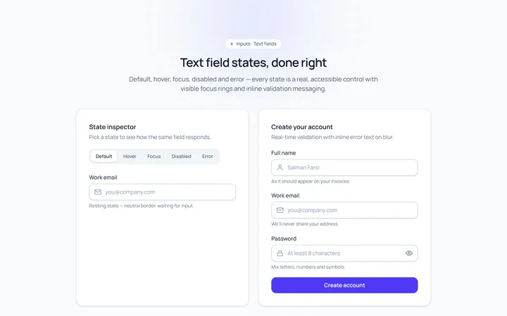
Basic Set Input
Originaldefault, hover, focus, disabled, error text inputs
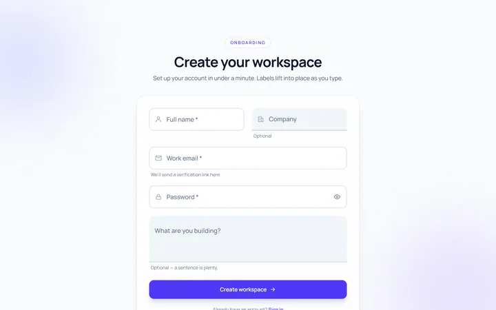
Floating Label Input
Originallabel that floats up on focus/fill
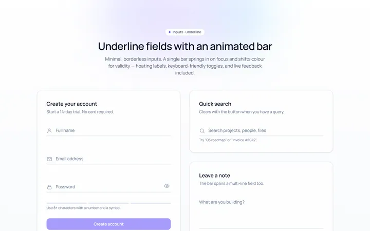
Underline Input
Originalminimal underline inputs with animated bar
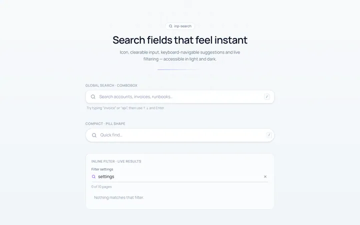
Search Input
Originalsearch box with icon and clear
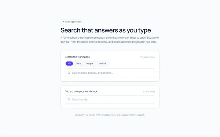
Search Suggest Input
Originalsearch with a live suggestions dropdown
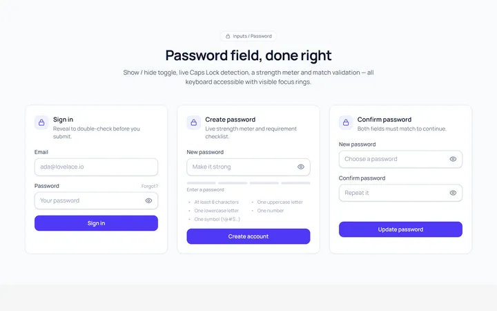
Password Toggle Input
Originalpassword field with show/hide toggle
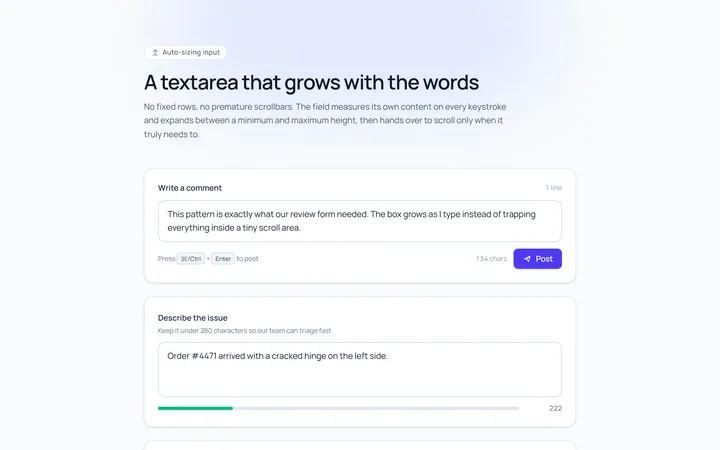
Textarea Autosize Input
Originaltextarea that grows with content
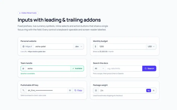
Addon Group Input
Originalinput group with leading/trailing addons
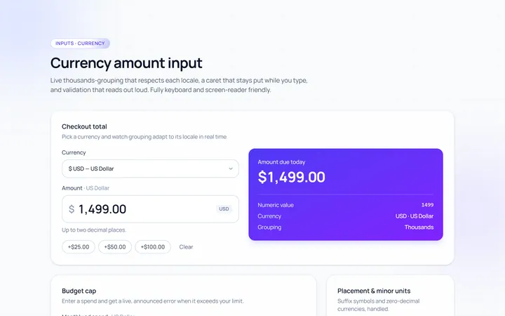
Currency Input
Originalcurrency input with formatting
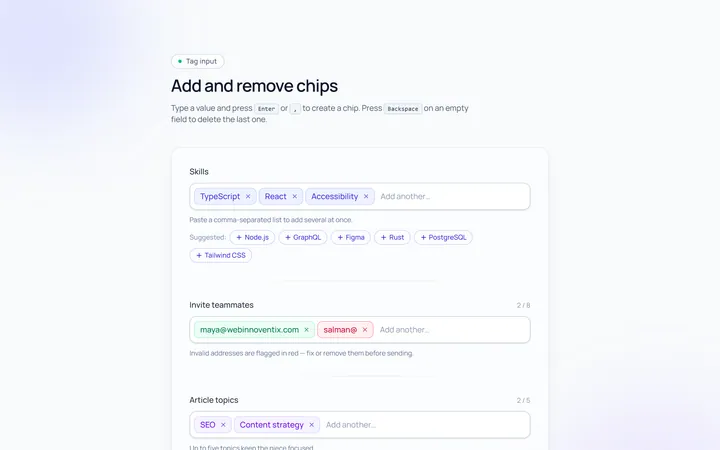
Tags Input
Originaltag input, add and remove chips
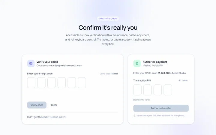
OTP Input
Original6-box one-time-code input with paste
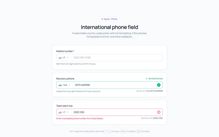
Phone Input
Originalphone input with country prefix select