

Cards Marquee
Original · freecard marquee
Copy prompt gives Claude Code, Cursor or v0 a ready-to-paste prompt that recreates this exact component.
npx shadcn@latest add https://webinnoventix.com/r/mqx-cards.json"use client";
import { useId, useState } from "react";
import type { CSSProperties } from "react";
import { motion, useReducedMotion } from "motion/react";
type Accent = "indigo" | "violet" | "emerald" | "rose" | "amber" | "sky";
type Speed = "slow" | "normal" | "fast";
interface Testimonial {
id: number;
name: string;
role: string;
quote: string;
rating: number;
accent: Accent;
}
const ACCENT: Record<Accent, string> = {
indigo: "bg-indigo-500",
violet: "bg-violet-500",
emerald: "bg-emerald-500",
rose: "bg-rose-500",
amber: "bg-amber-500",
sky: "bg-sky-500",
};
const DURATION: Record<Speed, string> = {
slow: "72s",
normal: "46s",
fast: "28s",
};
const SPEEDS: { value: Speed; label: string }[] = [
{ value: "slow", label: "Slow" },
{ value: "normal", label: "Normal" },
{ value: "fast", label: "Fast" },
];
const TESTIMONIALS: Testimonial[] = [
{
id: 0,
name: "Priya Nadkarni",
role: "Head of Growth, Meridian Labs",
quote:
"We cut weekly reporting from three hours to about ten minutes. The saved views alone paid for the whole plan.",
rating: 5,
accent: "indigo",
},
{
id: 1,
name: "Daniel Okafor",
role: "Data Lead, Fernweh",
quote:
"I was skeptical about yet another dashboard, but the query builder respects how analysts actually think. No SQL gymnastics.",
rating: 4,
accent: "emerald",
},
{
id: 2,
name: "Sofia Reyes",
role: "VP Product, Northwind",
quote:
"Onboarding my team took one afternoon. By Friday everyone was building their own funnels without pinging me.",
rating: 5,
accent: "violet",
},
{
id: 3,
name: "Marcus Feld",
role: "Engineering Manager, Palette",
quote:
"The alerting caught a 40% checkout drop at 2am. We shipped a fix before a single support ticket landed.",
rating: 5,
accent: "sky",
},
{
id: 4,
name: "Aisha Karim",
role: "Founder, Tidepool",
quote:
"Support replied in nine minutes with an actual fix, not a canned help-center link. That basically never happens.",
rating: 5,
accent: "rose",
},
{
id: 5,
name: "Tomás Herrera",
role: "CFO, Brightloom",
quote:
"Our board deck used to be a copy-paste nightmare. Now it's one shared link that updates itself before every meeting.",
rating: 5,
accent: "amber",
},
{
id: 6,
name: "Lena Vogt",
role: "Growth Marketer, Cadence",
quote:
"Cohort retention that used to need a data scientist now takes me — a marketer — about four clicks.",
rating: 5,
accent: "emerald",
},
{
id: 7,
name: "Ravi Menon",
role: "Staff Engineer, Kestrel",
quote:
"Migrated two years of events over a weekend with zero data loss. The import tooling is genuinely well built.",
rating: 4,
accent: "indigo",
},
{
id: 8,
name: "Grace Lin",
role: "Co-founder, Almanac",
quote:
"It's the first analytics tool my non-technical cofounder opens on her own, without me sitting next to her.",
rating: 5,
accent: "violet",
},
{
id: 9,
name: "Jonas Björk",
role: "COO, Vantage",
quote:
"We replaced three separate tools with this one and cut our monthly stack cost almost in half.",
rating: 5,
accent: "sky",
},
{
id: 10,
name: "Nadia Haddad",
role: "Backend Engineer, Loomwork",
quote:
"The API docs are clear enough that I shipped our custom integration in a single sprint, with time to spare.",
rating: 5,
accent: "amber",
},
{
id: 11,
name: "Chen Wei",
role: "Platform Lead, Summit",
quote:
"Finally, product analytics that loads instantly even on our 50-million-event dataset. No spinners, no waiting.",
rating: 5,
accent: "rose",
},
];
const ROW_A = TESTIMONIALS.slice(0, 6);
const ROW_B = TESTIMONIALS.slice(6);
const KEYFRAMES = `
@keyframes mqxcards-scroll {
from { transform: translateX(0); }
to { transform: translateX(-50%); }
}
.mqxcards-track { transform: translateX(0); }
@media (prefers-reduced-motion: reduce) {
.mqxcards-track {
animation: none !important;
transform: none !important;
}
}
`;
function getInitials(name: string): string {
return name
.split(" ")
.map((part) => part.charAt(0))
.slice(0, 2)
.join("")
.toUpperCase();
}
function Heart({ filled }: { filled: boolean }) {
return (
<svg
viewBox="0 0 24 24"
width="16"
height="16"
fill={filled ? "currentColor" : "none"}
stroke="currentColor"
strokeWidth={1.8}
strokeLinecap="round"
strokeLinejoin="round"
aria-hidden="true"
>
<path d="M12 20.3l-1.45-1.32C5.4 14.24 2 11.16 2 7.5 2 5 3.98 3 6.5 3c1.54 0 3.04.72 4 1.86A5.3 5.3 0 0 1 14.5 3 6.5 6.5 0 0 1 22 7.5c0 3.66-3.4 6.74-8.55 11.49L12 20.3z" />
</svg>
);
}
function Stars({ rating }: { rating: number }) {
return (
<div
className="flex items-center gap-0.5"
role="img"
aria-label={`Rated ${rating} out of 5`}
>
{[1, 2, 3, 4, 5].map((i) => (
<svg
key={i}
viewBox="0 0 20 20"
width="14"
height="14"
fill="currentColor"
aria-hidden="true"
className={
i <= rating
? "text-amber-400"
: "text-slate-300 dark:text-slate-600"
}
>
<path d="M10 1.5l2.6 5.27 5.82.85-4.21 4.1.99 5.79L10 14.77l-5.2 2.74.99-5.79L1.58 7.62l5.82-.85L10 1.5z" />
</svg>
))}
</div>
);
}
interface CardProps {
t: Testimonial;
saved: boolean;
onToggle: (id: number) => void;
clone?: boolean;
}
function Card({ t, saved, onToggle, clone = false }: CardProps) {
const savedControl =
"inline-flex h-8 w-8 items-center justify-center rounded-full border transition-colors focus-visible:outline-none focus-visible:ring-2 focus-visible:ring-indigo-500 focus-visible:ring-offset-2 focus-visible:ring-offset-white dark:focus-visible:ring-offset-slate-900";
const savedState = saved
? "border-rose-200 bg-rose-50 text-rose-500 dark:border-rose-500/30 dark:bg-rose-500/10"
: "border-slate-200 text-slate-400 hover:border-slate-300 hover:text-slate-600 dark:border-slate-700 dark:text-slate-500 dark:hover:text-slate-300";
return (
<li
className="flex w-[300px] shrink-0 snap-start sm:w-[350px]"
aria-hidden={clone ? true : undefined}
>
<figure className="flex h-full w-full flex-col justify-between gap-5 rounded-2xl border border-slate-200 bg-white p-6 shadow-sm transition-colors dark:border-slate-800 dark:bg-slate-900">
<div className="flex items-start justify-between gap-4">
<Stars rating={t.rating} />
{clone ? (
<span className={`${savedControl} ${savedState}`} aria-hidden="true">
<Heart filled={saved} />
</span>
) : (
<button
type="button"
onClick={() => onToggle(t.id)}
aria-pressed={saved}
aria-label={
saved
? `Remove saved quote from ${t.name}`
: `Save quote from ${t.name}`
}
className={`${savedControl} ${savedState}`}
>
<Heart filled={saved} />
</button>
)}
</div>
<blockquote className="text-[15px] leading-relaxed text-slate-700 dark:text-slate-300">
“{t.quote}”
</blockquote>
<figcaption className="flex items-center gap-3">
<span
className={`flex h-11 w-11 shrink-0 items-center justify-center rounded-full text-sm font-semibold text-white ${ACCENT[t.accent]}`}
aria-hidden="true"
>
{getInitials(t.name)}
</span>
<span className="min-w-0">
<span className="block truncate font-semibold text-slate-900 dark:text-slate-100">
{t.name}
</span>
<span className="block truncate text-sm text-slate-500 dark:text-slate-400">
{t.role}
</span>
</span>
</figcaption>
</figure>
</li>
);
}
interface RowProps {
items: Testimonial[];
reverse: boolean;
duration: string;
isPlaying: boolean;
pauseOnHover: boolean;
saved: Set<number>;
onToggle: (id: number) => void;
prefersReduced: boolean;
label: string;
}
function MarqueeRow({
items,
reverse,
duration,
isPlaying,
pauseOnHover,
saved,
onToggle,
prefersReduced,
label,
}: RowProps) {
const [hovered, setHovered] = useState(false);
const [focused, setFocused] = useState(false);
if (prefersReduced) {
return (
<div
role="group"
aria-label={`${label} (scrollable)`}
tabIndex={0}
className="relative snap-x snap-mandatory overflow-x-auto px-6 pb-4 focus-visible:outline-none focus-visible:ring-2 focus-visible:ring-inset focus-visible:ring-indigo-500"
>
<ul role="list" className="flex w-max gap-5 sm:gap-6">
{items.map((t) => (
<Card
key={t.id}
t={t}
saved={saved.has(t.id)}
onToggle={onToggle}
/>
))}
</ul>
</div>
);
}
const effectivePlay =
isPlaying && !(pauseOnHover && hovered) && !focused;
const trackStyle: CSSProperties = {
animationName: "mqxcards-scroll",
animationDuration: duration,
animationTimingFunction: "linear",
animationIterationCount: "infinite",
animationDirection: reverse ? "reverse" : "normal",
animationPlayState: effectivePlay ? "running" : "paused",
willChange: "transform",
};
return (
<div
role="group"
aria-label={`${label} (auto-scrolling)`}
className="relative overflow-hidden"
onMouseEnter={() => setHovered(true)}
onMouseLeave={() => setHovered(false)}
onFocus={() => setFocused(true)}
onBlur={(e) => {
if (!e.currentTarget.contains(e.relatedTarget as Node | null)) {
setFocused(false);
}
}}
>
<div className="pointer-events-none absolute inset-y-0 left-0 z-10 w-16 bg-gradient-to-r from-slate-50 to-transparent dark:from-slate-950 sm:w-28" />
<div className="pointer-events-none absolute inset-y-0 right-0 z-10 w-16 bg-gradient-to-l from-slate-50 to-transparent dark:from-slate-950 sm:w-28" />
<ul
role="list"
className="mqxcards-track flex w-max gap-5 py-2 sm:gap-6"
style={trackStyle}
>
{items.map((t) => (
<Card
key={`a-${t.id}`}
t={t}
saved={saved.has(t.id)}
onToggle={onToggle}
/>
))}
{items.map((t) => (
<Card
key={`b-${t.id}`}
t={t}
saved={saved.has(t.id)}
onToggle={onToggle}
clone
/>
))}
</ul>
</div>
);
}
export default function MqxCards() {
const uid = useId();
const titleId = `${uid}-title`;
const shouldReduce = useReducedMotion();
const prefersReduced = shouldReduce ?? false;
const [isPlaying, setIsPlaying] = useState(true);
const [speed, setSpeed] = useState<Speed>("normal");
const [pauseOnHover, setPauseOnHover] = useState(true);
const [saved, setSaved] = useState<Set<number>>(() => new Set<number>());
const toggleSave = (id: number) => {
setSaved((prev) => {
const next = new Set(prev);
if (next.has(id)) {
next.delete(id);
} else {
next.add(id);
}
return next;
});
};
const savedCount = saved.size;
return (
<section
aria-labelledby={titleId}
className="relative w-full overflow-hidden bg-slate-50 py-20 sm:py-28 dark:bg-slate-950"
>
<style dangerouslySetInnerHTML={{ __html: KEYFRAMES }} />
<div className="mx-auto max-w-6xl px-6">
<motion.div
initial={prefersReduced ? false : { opacity: 0, y: 14 }}
whileInView={{ opacity: 1, y: 0 }}
viewport={{ once: true, margin: "-80px" }}
transition={{ duration: 0.5, ease: "easeOut" }}
>
<span className="inline-flex items-center gap-2 text-sm font-semibold uppercase tracking-[0.2em] text-indigo-600 dark:text-indigo-400">
<span className="h-px w-8 bg-indigo-500/60" aria-hidden="true" />
Wall of love
</span>
<h2
id={titleId}
className="mt-4 max-w-2xl text-3xl font-bold tracking-tight text-slate-900 sm:text-4xl dark:text-slate-50"
>
The teams who ship on it, in their own words
</h2>
<p className="mt-4 max-w-xl text-base leading-relaxed text-slate-600 dark:text-slate-400">
Unedited notes from product, data, and engineering leads who
replaced their old analytics stack. Hover, pause, and save the ones
that resonate.
</p>
</motion.div>
</div>
{!prefersReduced && (
<div className="mx-auto mt-8 max-w-6xl px-6">
<div className="flex flex-col gap-4 sm:flex-row sm:items-center sm:justify-between">
<div className="flex flex-wrap items-center gap-3">
<motion.button
type="button"
onClick={() => setIsPlaying((p) => !p)}
whileTap={prefersReduced ? undefined : { scale: 0.96 }}
aria-label={
isPlaying ? "Pause testimonials" : "Play testimonials"
}
className="inline-flex items-center gap-2 rounded-full bg-slate-900 px-4 py-2 text-sm font-medium text-white shadow-sm transition-colors hover:bg-slate-800 focus-visible:outline-none focus-visible:ring-2 focus-visible:ring-slate-500 focus-visible:ring-offset-2 focus-visible:ring-offset-slate-50 dark:bg-white dark:text-slate-900 dark:hover:bg-slate-200 dark:focus-visible:ring-offset-slate-950"
>
{isPlaying ? (
<svg
viewBox="0 0 24 24"
width="16"
height="16"
fill="currentColor"
aria-hidden="true"
>
<rect x="6" y="5" width="4" height="14" rx="1" />
<rect x="14" y="5" width="4" height="14" rx="1" />
</svg>
) : (
<svg
viewBox="0 0 24 24"
width="16"
height="16"
fill="currentColor"
aria-hidden="true"
>
<path d="M8 5v14l11-7z" />
</svg>
)}
{isPlaying ? "Pause" : "Play"}
</motion.button>
<div
role="radiogroup"
aria-label="Marquee speed"
className="inline-flex rounded-full border border-slate-200 bg-white p-1 dark:border-slate-800 dark:bg-slate-900"
>
{SPEEDS.map((s) => {
const checked = speed === s.value;
return (
<label
key={s.value}
className="cursor-pointer"
>
<input
type="radio"
name={`${uid}-speed`}
value={s.value}
checked={checked}
onChange={() => setSpeed(s.value)}
className="peer sr-only"
/>
<span
className={`block rounded-full px-3 py-1.5 text-sm font-medium transition-colors peer-focus-visible:outline-none peer-focus-visible:ring-2 peer-focus-visible:ring-indigo-500 peer-focus-visible:ring-offset-2 peer-focus-visible:ring-offset-slate-50 dark:peer-focus-visible:ring-offset-slate-950 ${
checked
? "bg-indigo-600 text-white"
: "text-slate-600 hover:text-slate-900 dark:text-slate-300 dark:hover:text-white"
}`}
>
{s.label}
</span>
</label>
);
})}
</div>
<label className="inline-flex cursor-pointer items-center gap-2.5 text-sm text-slate-600 dark:text-slate-300">
<input
type="checkbox"
role="switch"
checked={pauseOnHover}
onChange={(e) => setPauseOnHover(e.target.checked)}
className="peer sr-only"
/>
<span className="relative h-6 w-11 shrink-0 rounded-full bg-slate-300 transition-colors after:absolute after:left-0.5 after:top-0.5 after:h-5 after:w-5 after:rounded-full after:bg-white after:shadow after:transition-transform peer-checked:bg-indigo-600 peer-checked:after:translate-x-5 peer-focus-visible:outline-none peer-focus-visible:ring-2 peer-focus-visible:ring-indigo-500 peer-focus-visible:ring-offset-2 peer-focus-visible:ring-offset-slate-50 dark:bg-slate-700 dark:peer-focus-visible:ring-offset-slate-950" />
Pause on hover
</label>
</div>
<div className="flex items-center gap-3">
<p
aria-live="polite"
className="text-sm text-slate-500 dark:text-slate-400"
>
{savedCount === 0
? "No quotes saved yet"
: `${savedCount} quote${savedCount === 1 ? "" : "s"} saved`}
</p>
{savedCount > 0 && (
<button
type="button"
onClick={() => setSaved(new Set<number>())}
className="rounded-full border border-slate-200 px-3 py-1.5 text-sm font-medium text-slate-600 transition-colors hover:bg-white hover:text-slate-900 focus-visible:outline-none focus-visible:ring-2 focus-visible:ring-indigo-500 focus-visible:ring-offset-2 focus-visible:ring-offset-slate-50 dark:border-slate-700 dark:text-slate-300 dark:hover:bg-slate-900 dark:hover:text-white dark:focus-visible:ring-offset-slate-950"
>
Clear
</button>
)}
</div>
</div>
</div>
)}
{prefersReduced && (
<div className="mx-auto mt-6 max-w-6xl px-6">
<p className="text-sm text-slate-500 dark:text-slate-400">
Motion is reduced based on your system settings — scroll each row
sideways to browse.
</p>
</div>
)}
<div className="mt-10 flex flex-col gap-6">
<MarqueeRow
items={ROW_A}
reverse={false}
duration={DURATION[speed]}
isPlaying={isPlaying}
pauseOnHover={pauseOnHover}
saved={saved}
onToggle={toggleSave}
prefersReduced={prefersReduced}
label="Customer testimonials, row 1"
/>
<MarqueeRow
items={ROW_B}
reverse
duration={DURATION[speed]}
isPlaying={isPlaying}
pauseOnHover={pauseOnHover}
saved={saved}
onToggle={toggleSave}
prefersReduced={prefersReduced}
label="Customer testimonials, row 2"
/>
</div>
</section>
);
}Dependencies
Licence
Built by Web Innoventix. Free for personal and commercial use, no attribution required.
Built by Web Innoventix
Need a custom interface, a full website, or SEO that gets you cited by AI? We design, build and rank it end to end.
Get a free quoteSimilar components
Browse all →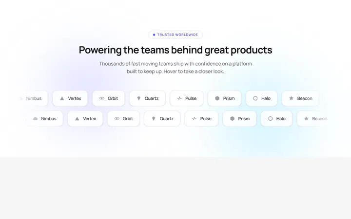
Glowing Logo Marquee
OriginalA dual-row infinite logo marquee whose rows scroll in opposite directions, pause on hover and lift each logo with a shimmer sweep over an animated gradient glow.
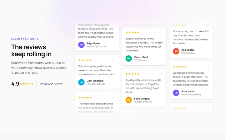
Vertical Testimonial Marquee
OriginalThree vertical testimonial columns scroll at different speeds and opposite directions, pausing on hover with a shine sweep so reviews loop endlessly beside a sticky heading.
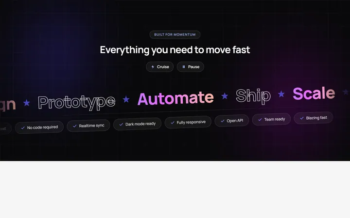
Velocity Band Marquee
OriginalA skewed dual-direction headline marquee of big gradient and outlined words plus a pill ticker, with speed and pause controls and pause on hover over an animated mesh background.
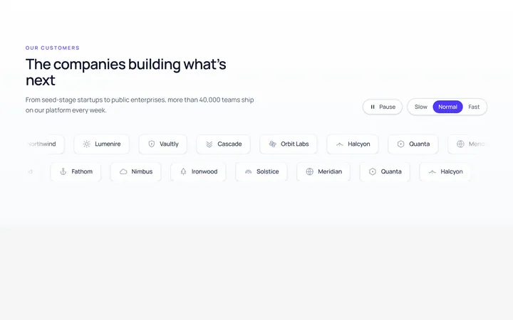
Logos Marquee
Originallogo marquee (generic marks)
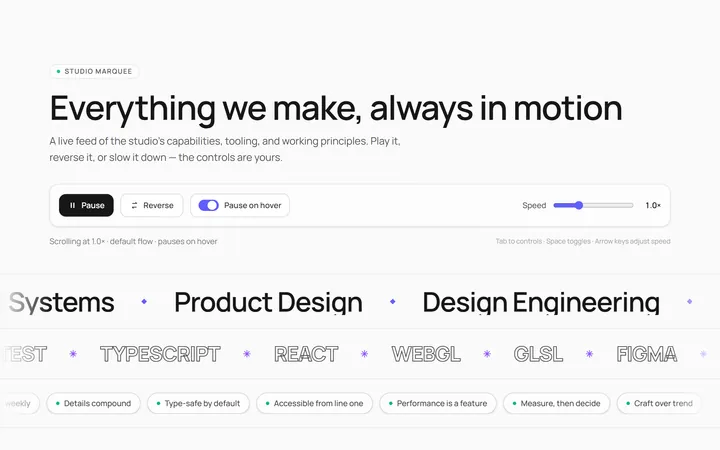
Text Marquee
Originalscrolling text marquee
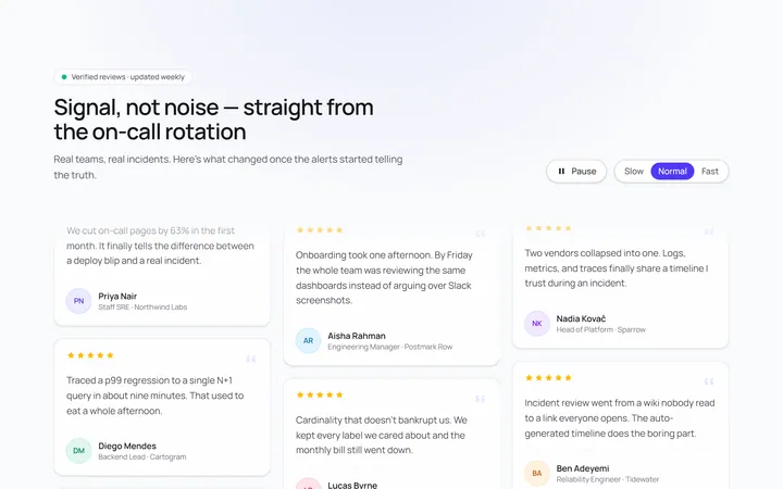
Vertical Marquee
Originalvertical marquee columns
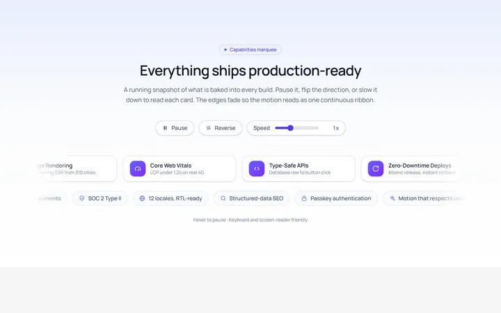
Gradient Fade Marquee
Originalmarquee with edge fade
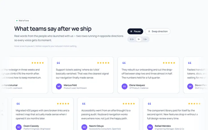
Reverse Rows Marquee
Originaltwo rows scrolling opposite
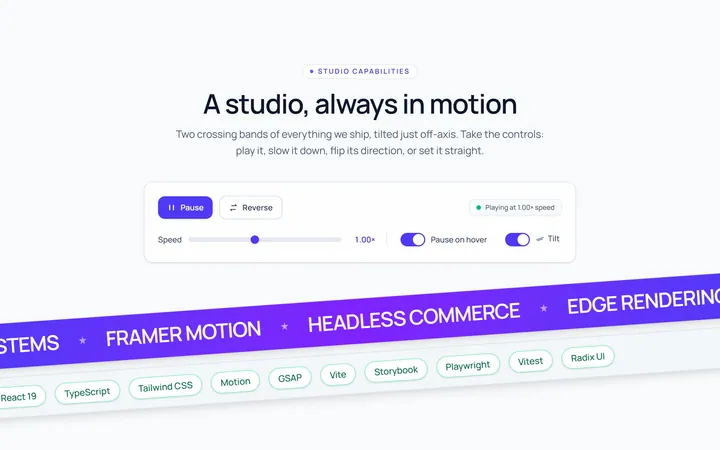
Tilted Marquee
Originaltilted marquee band
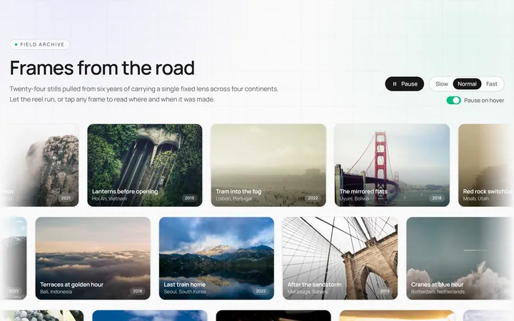
Image Marquee
Originalimage marquee

Spotlight Hero
OriginalA centred hero with a soft radial spotlight, badge and dual call-to-action.

Split Hero
OriginalA two-column hero pairing a headline and CTAs with a product mock and social proof.