

Tilted Marquee
Original · freetilted marquee band
Copy prompt gives Claude Code, Cursor or v0 a ready-to-paste prompt that recreates this exact component.
npx shadcn@latest add https://webinnoventix.com/r/mqx-tilted.json"use client";
import { useId, useState, type ReactNode } from "react";
import { motion, useReducedMotion } from "motion/react";
const BAND_A = [
"Design Systems",
"Framer Motion",
"Headless Commerce",
"Edge Rendering",
"Type & Color",
"Accessibility First",
"Rapid Prototyping",
"Design Tokens",
"Interaction Design",
] as const;
const BAND_B = [
"React 19",
"TypeScript",
"Tailwind CSS",
"Motion",
"GSAP",
"Vite",
"Storybook",
"Playwright",
"Vitest",
"Radix UI",
] as const;
const FOCUS_RING =
"focus-visible:outline-none focus-visible:ring-2 focus-visible:ring-indigo-500 focus-visible:ring-offset-2 focus-visible:ring-offset-white dark:focus-visible:ring-offset-neutral-950";
function StarIcon({ className }: { className?: string }) {
return (
<svg
viewBox="0 0 24 24"
fill="currentColor"
aria-hidden="true"
className={className}
>
<path d="M12 2.6l1.9 5.9a1 1 0 0 0 .95.69h6.2l-5.02 3.65a1 1 0 0 0-.36 1.12l1.9 5.9-5.02-3.64a1 1 0 0 0-1.18 0L7.25 19.86l1.9-5.9a1 1 0 0 0-.36-1.12L3.77 9.19h6.2a1 1 0 0 0 .95-.69L12 2.6z" />
</svg>
);
}
function PlayIcon({ className }: { className?: string }) {
return (
<svg viewBox="0 0 24 24" fill="currentColor" aria-hidden="true" className={className}>
<path d="M8 5.14v13.72a1 1 0 0 0 1.53.85l10.5-6.86a1 1 0 0 0 0-1.7L9.53 4.29A1 1 0 0 0 8 5.14z" />
</svg>
);
}
function PauseIcon({ className }: { className?: string }) {
return (
<svg viewBox="0 0 24 24" fill="currentColor" aria-hidden="true" className={className}>
<path d="M7 4.5A1.5 1.5 0 0 1 8.5 6v12A1.5 1.5 0 0 1 5.5 18V6A1.5 1.5 0 0 1 7 4.5zM17 4.5A1.5 1.5 0 0 1 18.5 6v12A1.5 1.5 0 0 1 15.5 18V6A1.5 1.5 0 0 1 17 4.5z" />
</svg>
);
}
function SwapIcon({ className }: { className?: string }) {
return (
<svg
viewBox="0 0 24 24"
fill="none"
stroke="currentColor"
strokeWidth="2"
strokeLinecap="round"
strokeLinejoin="round"
aria-hidden="true"
className={className}
>
<path d="M7 7h13l-3.5-3.5M17 17H4l3.5 3.5" />
</svg>
);
}
function TiltIcon({ className }: { className?: string }) {
return (
<svg
viewBox="0 0 24 24"
fill="none"
stroke="currentColor"
strokeWidth="2"
strokeLinecap="round"
strokeLinejoin="round"
aria-hidden="true"
className={className}
>
<path d="M3 15l18-6M5 18l14-4.7" />
</svg>
);
}
function Switch({
checked,
onChange,
children,
}: {
checked: boolean;
onChange: (next: boolean) => void;
children: ReactNode;
}) {
return (
<button
type="button"
role="switch"
aria-checked={checked}
onClick={() => onChange(!checked)}
className={
"group inline-flex items-center gap-2.5 rounded-full px-1 py-1 text-sm font-medium text-slate-700 transition-colors dark:text-neutral-200 " +
FOCUS_RING
}
>
<span
className={
"relative h-6 w-11 shrink-0 rounded-full transition-colors duration-200 " +
(checked
? "bg-indigo-600 dark:bg-indigo-500"
: "bg-slate-300 dark:bg-neutral-700")
}
>
<span
className={
"absolute top-0.5 left-0.5 h-5 w-5 rounded-full bg-white shadow-sm transition-transform duration-200 " +
(checked ? "translate-x-5" : "translate-x-0")
}
/>
</span>
<span>{children}</span>
</button>
);
}
interface BandProps {
items: readonly string[];
variant: "solid" | "outline";
reverse: boolean;
durationSec: number;
playing: boolean;
pauseOnHover: boolean;
reduced: boolean;
label: string;
}
function Group({
items,
variant,
hidden,
}: {
items: readonly string[];
variant: "solid" | "outline";
hidden?: boolean;
}) {
return (
<ul
aria-hidden={hidden || undefined}
className="mqxtilted-group flex shrink-0 items-center"
>
{items.map((label, i) => (
<li key={`${label}-${i}`} className="shrink-0">
{variant === "solid" ? (
<span className="flex items-center">
<span className="px-5 text-2xl font-semibold uppercase tracking-tight text-white md:px-8 md:text-4xl">
{label}
</span>
<StarIcon className="h-4 w-4 shrink-0 text-white/55 md:h-5 md:w-5" />
</span>
) : (
<span className="flex items-center pr-3 md:pr-4">
<span className="rounded-full border border-emerald-300/80 bg-white/80 px-4 py-1.5 text-sm font-medium text-emerald-800 shadow-sm dark:border-emerald-400/30 dark:bg-emerald-500/10 dark:text-emerald-200 md:text-base">
{label}
</span>
</span>
)}
</li>
))}
</ul>
);
}
function Band({
items,
variant,
reverse,
durationSec,
playing,
pauseOnHover,
reduced,
label,
}: BandProps) {
const [hovered, setHovered] = useState(false);
const paused = reduced || !playing || (pauseOnHover && hovered);
const shell =
variant === "solid"
? "bg-gradient-to-r from-indigo-600 via-violet-600 to-indigo-600 py-4 ring-1 ring-black/10 dark:from-indigo-600 dark:via-violet-600 dark:to-indigo-700 md:py-5"
: "border-y border-slate-200 bg-slate-100/80 py-3 ring-1 ring-slate-200 backdrop-blur-sm dark:border-neutral-800 dark:bg-neutral-900/70 dark:ring-neutral-800 md:py-4";
return (
<div
className={"mqxtilted-viewport overflow-hidden shadow-lg " + shell}
role="group"
aria-label={label}
onMouseEnter={() => setHovered(true)}
onMouseLeave={() => setHovered(false)}
>
<div
className="mqxtilted-track flex w-max items-center"
style={{
animationDuration: `${durationSec}s`,
animationDirection: reverse ? "reverse" : "normal",
animationPlayState: paused ? "paused" : "running",
}}
>
<Group items={items} variant={variant} />
<Group items={items} variant={variant} hidden />
</div>
</div>
);
}
export default function MqxTilted() {
const prefersReduced = useReducedMotion();
const reduced = prefersReduced === true;
const [playing, setPlaying] = useState(true);
const [reversed, setReversed] = useState(false);
const [pauseOnHover, setPauseOnHover] = useState(true);
const [tilted, setTilted] = useState(true);
const [speed, setSpeed] = useState(1);
const speedId = useId();
const headingId = useId();
const durA = Math.round((42 / speed) * 100) / 100;
const durB = Math.round((32 / speed) * 100) / 100;
const statusText = reduced
? "Motion reduced by system preference"
: `${playing ? "Playing" : "Paused"} at ${speed.toFixed(2)}× speed`;
return (
<section
aria-labelledby={headingId}
className="relative w-full overflow-hidden bg-slate-50 px-5 py-20 text-slate-900 sm:px-8 md:py-28 dark:bg-neutral-950 dark:text-neutral-100"
>
<style>{`
@keyframes mqxtilted-marquee {
from { transform: translateX(0); }
to { transform: translateX(-50%); }
}
.mqxtilted-track {
animation-name: mqxtilted-marquee;
animation-timing-function: linear;
animation-iteration-count: infinite;
will-change: transform;
}
@media (prefers-reduced-motion: reduce) {
.mqxtilted-track {
animation: none !important;
transform: none !important;
}
}
.mqxtilted-range::-webkit-slider-thumb {
-webkit-appearance: none;
appearance: none;
height: 1.1rem;
width: 1.1rem;
border-radius: 9999px;
background: #6366f1;
border: 2px solid #ffffff;
box-shadow: 0 1px 3px rgba(0, 0, 0, 0.25);
cursor: pointer;
}
.mqxtilted-range::-moz-range-thumb {
height: 1.1rem;
width: 1.1rem;
border-radius: 9999px;
background: #6366f1;
border: 2px solid #ffffff;
box-shadow: 0 1px 3px rgba(0, 0, 0, 0.25);
cursor: pointer;
}
`}</style>
{/* decorative backdrop */}
<div
aria-hidden="true"
className="pointer-events-none absolute inset-0 -z-10 bg-[radial-gradient(60%_50%_at_50%_0%,rgba(99,102,241,0.12),transparent_70%)] dark:bg-[radial-gradient(60%_50%_at_50%_0%,rgba(99,102,241,0.16),transparent_70%)]"
/>
<div className="relative z-10 mx-auto max-w-5xl">
<header className="mx-auto max-w-2xl text-center">
<motion.p
initial={reduced ? false : { opacity: 0, y: 12 }}
whileInView={reduced ? undefined : { opacity: 1, y: 0 }}
viewport={{ once: true, margin: "-80px" }}
transition={{ duration: 0.5 }}
className="inline-flex items-center gap-2 rounded-full border border-slate-200 bg-white px-3 py-1 text-xs font-semibold uppercase tracking-[0.18em] text-indigo-700 dark:border-neutral-800 dark:bg-neutral-900 dark:text-indigo-300"
>
<span className="h-1.5 w-1.5 rounded-full bg-indigo-500" />
Studio Capabilities
</motion.p>
<motion.h2
id={headingId}
initial={reduced ? false : { opacity: 0, y: 16 }}
whileInView={reduced ? undefined : { opacity: 1, y: 0 }}
viewport={{ once: true, margin: "-80px" }}
transition={{ duration: 0.55, delay: 0.05 }}
className="mt-5 text-3xl font-semibold tracking-tight text-slate-900 sm:text-4xl md:text-5xl dark:text-white"
>
A studio, always in motion
</motion.h2>
<motion.p
initial={reduced ? false : { opacity: 0, y: 16 }}
whileInView={reduced ? undefined : { opacity: 1, y: 0 }}
viewport={{ once: true, margin: "-80px" }}
transition={{ duration: 0.55, delay: 0.1 }}
className="mt-4 text-base leading-relaxed text-slate-600 md:text-lg dark:text-neutral-400"
>
Two crossing bands of everything we ship, tilted just off-axis. Take
the controls: play it, slow it down, flip its direction, or set it
straight.
</motion.p>
</header>
{/* Controls */}
<div className="mx-auto mt-10 flex max-w-3xl flex-col gap-5 rounded-2xl border border-slate-200 bg-white/80 p-5 shadow-sm backdrop-blur-sm dark:border-neutral-800 dark:bg-neutral-900/70 sm:p-6">
<div className="flex flex-wrap items-center gap-3">
<button
type="button"
aria-pressed={playing}
onClick={() => setPlaying((p) => !p)}
className={
"inline-flex items-center gap-2 rounded-xl bg-indigo-600 px-4 py-2.5 text-sm font-semibold text-white shadow-sm transition-colors hover:bg-indigo-700 active:bg-indigo-800 dark:bg-indigo-500 dark:hover:bg-indigo-400 " +
FOCUS_RING
}
>
{playing ? (
<PauseIcon className="h-4 w-4" />
) : (
<PlayIcon className="h-4 w-4" />
)}
{playing ? "Pause" : "Play"}
</button>
<button
type="button"
aria-pressed={reversed}
onClick={() => setReversed((r) => !r)}
className={
"inline-flex items-center gap-2 rounded-xl border border-slate-300 bg-white px-4 py-2.5 text-sm font-semibold text-slate-700 transition-colors hover:bg-slate-50 dark:border-neutral-700 dark:bg-neutral-800 dark:text-neutral-100 dark:hover:bg-neutral-700 " +
FOCUS_RING
}
>
<SwapIcon className="h-4 w-4" />
{reversed ? "Reversed" : "Reverse"}
</button>
<div className="ml-auto">
<span
aria-live="polite"
className="inline-flex items-center gap-2 rounded-lg border border-slate-200 bg-slate-50 px-3 py-1.5 text-xs font-medium text-slate-600 dark:border-neutral-800 dark:bg-neutral-800/60 dark:text-neutral-300"
>
<span
className={
"h-2 w-2 rounded-full " +
(reduced
? "bg-amber-500"
: playing
? "bg-emerald-500"
: "bg-slate-400 dark:bg-neutral-500")
}
/>
{statusText}
</span>
</div>
</div>
<div className="grid gap-5 sm:grid-cols-[1fr_auto_auto] sm:items-center">
<div className="flex items-center gap-3">
<label
htmlFor={speedId}
className="shrink-0 text-sm font-medium text-slate-700 dark:text-neutral-200"
>
Speed
</label>
<input
id={speedId}
type="range"
min={0.25}
max={2}
step={0.25}
value={speed}
onChange={(e) => setSpeed(Number(e.target.value))}
aria-valuetext={`${speed.toFixed(2)} times`}
className={
"mqxtilted-range h-2 w-full cursor-pointer appearance-none rounded-full bg-slate-200 accent-indigo-600 dark:bg-neutral-700 dark:accent-indigo-400 " +
FOCUS_RING
}
/>
<span className="w-12 shrink-0 text-right text-sm font-semibold tabular-nums text-indigo-700 dark:text-indigo-300">
{speed.toFixed(2)}
{"×"}
</span>
</div>
<div className="hidden h-6 w-px bg-slate-200 dark:bg-neutral-800 sm:block" />
<div className="flex flex-wrap items-center gap-x-6 gap-y-3">
<Switch checked={pauseOnHover} onChange={setPauseOnHover}>
Pause on hover
</Switch>
<Switch checked={tilted} onChange={setTilted}>
<span className="inline-flex items-center gap-1.5">
<TiltIcon className="h-4 w-4 text-slate-500 dark:text-neutral-400" />
Tilt
</span>
</Switch>
</div>
</div>
</div>
</div>
{/* Tilted marquee band */}
<div className="relative mt-14 md:mt-16">
<motion.div
initial={false}
animate={{ rotate: tilted ? -4 : 0 }}
transition={
reduced
? { duration: 0 }
: { type: "spring", stiffness: 120, damping: 18 }
}
style={{ width: "118%", marginLeft: "-9%" }}
className="origin-center"
>
<div className="flex flex-col gap-3 md:gap-4">
<Band
items={BAND_A}
variant="solid"
reverse={reversed}
durationSec={durA}
playing={playing}
pauseOnHover={pauseOnHover}
reduced={reduced}
label="Design and product capabilities"
/>
<Band
items={BAND_B}
variant="outline"
reverse={!reversed}
durationSec={durB}
playing={playing}
pauseOnHover={pauseOnHover}
reduced={reduced}
label="Engineering stack"
/>
</div>
</motion.div>
</div>
</section>
);
}Dependencies
Licence
Built by Web Innoventix. Free for personal and commercial use, no attribution required.
Built by Web Innoventix
Need a custom interface, a full website, or SEO that gets you cited by AI? We design, build and rank it end to end.
Get a free quoteSimilar components
Browse all →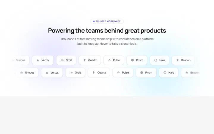
Glowing Logo Marquee
OriginalA dual-row infinite logo marquee whose rows scroll in opposite directions, pause on hover and lift each logo with a shimmer sweep over an animated gradient glow.
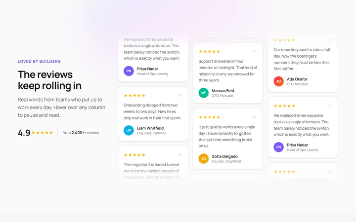
Vertical Testimonial Marquee
OriginalThree vertical testimonial columns scroll at different speeds and opposite directions, pausing on hover with a shine sweep so reviews loop endlessly beside a sticky heading.
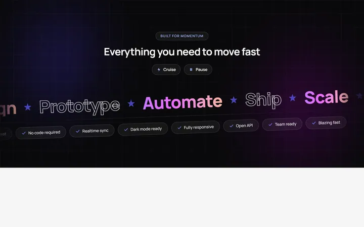
Velocity Band Marquee
OriginalA skewed dual-direction headline marquee of big gradient and outlined words plus a pill ticker, with speed and pause controls and pause on hover over an animated mesh background.
Logos Marquee
Originallogo marquee (generic marks)
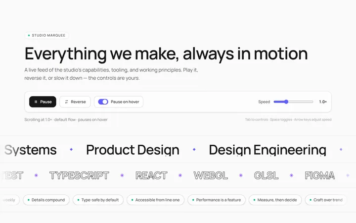
Text Marquee
Originalscrolling text marquee
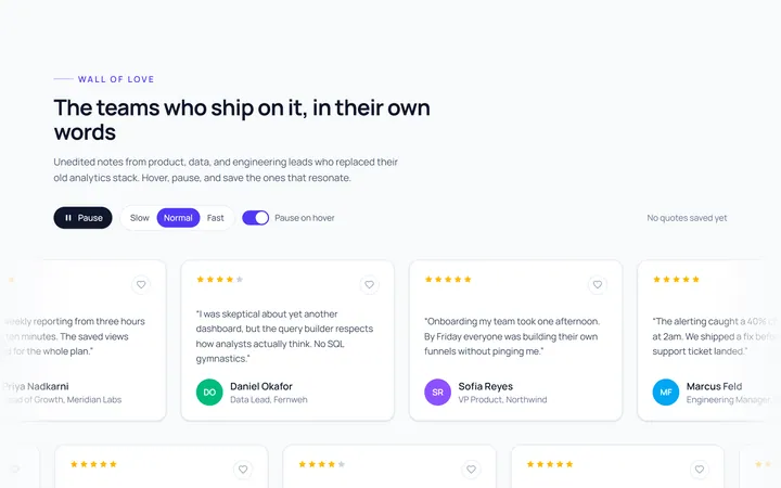
Cards Marquee
Originalcard marquee
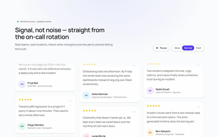
Vertical Marquee
Originalvertical marquee columns
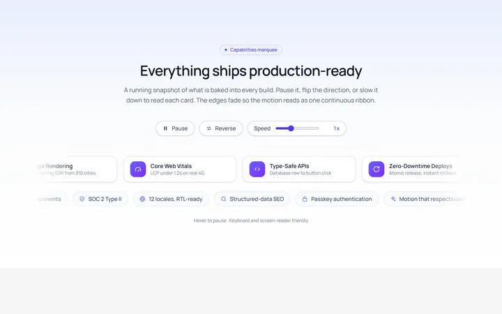
Gradient Fade Marquee
Originalmarquee with edge fade
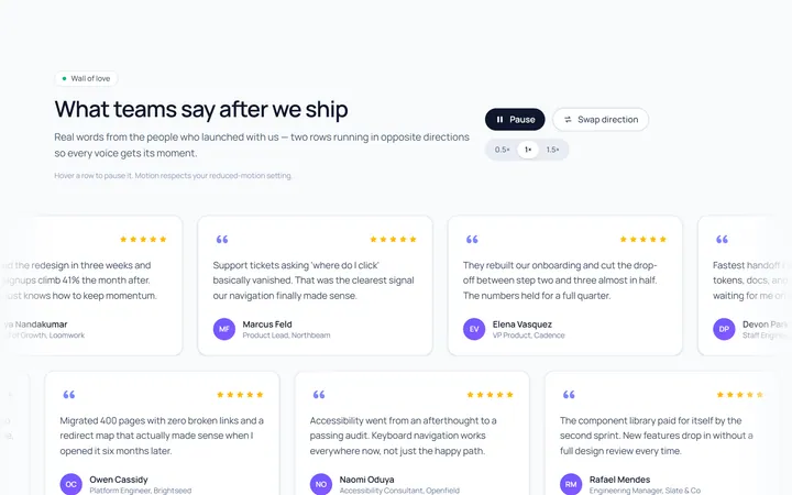
Reverse Rows Marquee
Originaltwo rows scrolling opposite
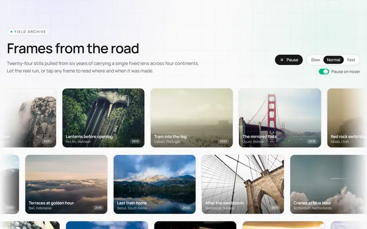
Image Marquee
Originalimage marquee

Spotlight Hero
OriginalA centred hero with a soft radial spotlight, badge and dual call-to-action.

Split Hero
OriginalA two-column hero pairing a headline and CTAs with a product mock and social proof.