

Gradient Fade Marquee
Original · freemarquee with edge fade
Copy prompt gives Claude Code, Cursor or v0 a ready-to-paste prompt that recreates this exact component.
npx shadcn@latest add https://webinnoventix.com/r/mqx-gradient-fade.json"use client";
import { useState, type CSSProperties, type ReactNode, type SVGProps } from "react";
import { useReducedMotion } from "motion/react";
type IconName =
| "bolt"
| "gauge"
| "code"
| "refresh"
| "eye"
| "layers"
| "shield"
| "globe"
| "search"
| "lock"
| "sparkles"
| "cog";
interface Capability {
icon: IconName;
title: string;
desc: string;
}
interface Tag {
icon: IconName;
label: string;
}
const CAPABILITIES: Capability[] = [
{ icon: "bolt", title: "Edge Rendering", desc: "Streaming SSR from 310 cities" },
{ icon: "gauge", title: "Core Web Vitals", desc: "LCP under 1.2s on real 4G" },
{ icon: "code", title: "Type-Safe APIs", desc: "Database row to button click" },
{ icon: "refresh", title: "Zero-Downtime Deploys", desc: "Atomic release, instant rollback" },
{ icon: "eye", title: "Accessible by Default", desc: "WCAG 2.2 AA every component" },
{ icon: "layers", title: "Design Tokens", desc: "One source of truth, both themes" },
];
const TAGS: Tag[] = [
{ icon: "shield", label: "SOC 2 Type II" },
{ icon: "globe", label: "12 locales, RTL-ready" },
{ icon: "search", label: "Structured-data SEO" },
{ icon: "lock", label: "Passkey authentication" },
{ icon: "sparkles", label: "Motion that respects users" },
{ icon: "cog", label: "CI/CD on every push" },
{ icon: "gauge", label: "99.98% uptime SLA" },
{ icon: "code", label: "Open-source components" },
];
const FADE =
"linear-gradient(to right, transparent 0, #000 9%, #000 91%, transparent 100%)";
const MASK_STYLE: CSSProperties = {
WebkitMaskImage: FADE,
maskImage: FADE,
};
function Icon({ name, className }: { name: IconName; className?: string }) {
const common: SVGProps<SVGSVGElement> = {
className,
viewBox: "0 0 24 24",
fill: "none",
stroke: "currentColor",
strokeWidth: 1.75,
strokeLinecap: "round",
strokeLinejoin: "round",
"aria-hidden": true,
};
switch (name) {
case "bolt":
return (
<svg {...common}>
<path d="M13 2 5 13h5l-1 9 8-12h-5l1-8Z" />
</svg>
);
case "gauge":
return (
<svg {...common}>
<path d="M5 18a8 8 0 1 1 14 0" />
<path d="M12 18l4-5" />
<circle cx="12" cy="18" r="1.2" fill="currentColor" stroke="none" />
</svg>
);
case "code":
return (
<svg {...common}>
<path d="m9 8-4 4 4 4" />
<path d="m15 8 4 4-4 4" />
</svg>
);
case "refresh":
return (
<svg {...common}>
<path d="M20 12a8 8 0 1 1-2.3-5.6" />
<path d="M20 4v4h-4" />
</svg>
);
case "eye":
return (
<svg {...common}>
<path d="M2.5 12S6 5.5 12 5.5 21.5 12 21.5 12 18 18.5 12 18.5 2.5 12 2.5 12Z" />
<circle cx="12" cy="12" r="3" />
</svg>
);
case "layers":
return (
<svg {...common}>
<path d="m12 3 9 5-9 5-9-5 9-5Z" />
<path d="m3 13 9 5 9-5" />
</svg>
);
case "shield":
return (
<svg {...common}>
<path d="M12 3l7 3v5c0 4.4-3 7.6-7 9-4-1.4-7-4.6-7-9V6l7-3Z" />
<path d="m9 12 2 2 4-4" />
</svg>
);
case "globe":
return (
<svg {...common}>
<circle cx="12" cy="12" r="9" />
<path d="M3 12h18" />
<path d="M12 3c2.7 2.4 4 5.6 4 9s-1.3 6.6-4 9c-2.7-2.4-4-5.6-4-9s1.3-6.6 4-9Z" />
</svg>
);
case "search":
return (
<svg {...common}>
<circle cx="11" cy="11" r="7" />
<path d="m20 20-3.6-3.6" />
</svg>
);
case "lock":
return (
<svg {...common}>
<rect x="4.5" y="10" width="15" height="10.5" rx="2" />
<path d="M8 10V7a4 4 0 0 1 8 0v3" />
</svg>
);
case "sparkles":
return (
<svg {...common}>
<path d="M12 3l1.7 4.6L18.5 9.4l-4.8 1.8L12 16l-1.7-4.8L5.5 9.4l4.8-1.8L12 3Z" />
<path d="M18.6 15.4l.6 1.8 1.8.6-1.8.6-.6 1.8-.6-1.8-1.8-.6 1.8-.6.6-1.8Z" />
</svg>
);
case "cog":
return (
<svg {...common}>
<circle cx="12" cy="12" r="3.2" />
<path d="M12 2.5v2.5M12 19v2.5M4.2 4.2l1.8 1.8M18 18l1.8 1.8M2.5 12H5M19 12h2.5M4.2 19.8 6 18M18 6l1.8-1.8" />
</svg>
);
default:
return null;
}
}
function CapabilityCard({ item }: { item: Capability }) {
return (
<li className="mr-4 flex w-72 shrink-0 items-center gap-3 rounded-2xl border border-slate-200 bg-white/90 px-4 py-3 shadow-sm backdrop-blur dark:border-slate-800 dark:bg-slate-900/80">
<span className="grid h-10 w-10 shrink-0 place-items-center rounded-xl bg-gradient-to-br from-indigo-500 to-violet-600 text-white shadow-sm">
<Icon name={item.icon} className="h-5 w-5" />
</span>
<div className="min-w-0">
<p className="truncate text-sm font-semibold text-slate-900 dark:text-slate-100">
{item.title}
</p>
<p className="truncate text-xs text-slate-500 dark:text-slate-400">{item.desc}</p>
</div>
</li>
);
}
function TagPill({ item }: { item: Tag }) {
return (
<li className="mr-3 flex shrink-0 items-center gap-2 rounded-full border border-slate-200 bg-slate-50 px-4 py-2 text-sm font-medium text-slate-700 dark:border-slate-800 dark:bg-slate-800/70 dark:text-slate-200">
<Icon name={item.icon} className="h-4 w-4 text-indigo-500 dark:text-indigo-400" />
<span className="whitespace-nowrap">{item.label}</span>
</li>
);
}
function Row({
ariaLabel,
content,
trackStyle,
reduced,
}: {
ariaLabel: string;
content: ReactNode;
trackStyle: CSSProperties;
reduced: boolean;
}) {
return (
<div
role="group"
aria-label={ariaLabel}
tabIndex={reduced ? 0 : -1}
className={`relative rounded-2xl focus-visible:outline-none focus-visible:ring-2 focus-visible:ring-indigo-500 focus-visible:ring-offset-2 focus-visible:ring-offset-white dark:focus-visible:ring-offset-slate-950 ${
reduced ? "overflow-x-auto overflow-y-hidden" : "overflow-hidden"
}`}
style={MASK_STYLE}
>
<div className="mqxGF-track flex w-max" style={trackStyle}>
<ul className="flex w-max shrink-0 items-stretch py-1">{content}</ul>
{!reduced && (
<ul className="flex w-max shrink-0 items-stretch py-1" aria-hidden="true">
{content}
</ul>
)}
</div>
</div>
);
}
export default function MqxGradientFade() {
const prefersReduced = useReducedMotion() ?? false;
const [playing, setPlaying] = useState(true);
const [reversed, setReversed] = useState(false);
const [speed, setSpeed] = useState(1);
const [hovered, setHovered] = useState(false);
const running = playing && !hovered && !prefersReduced;
const dirA: "normal" | "reverse" = reversed ? "reverse" : "normal";
const dirB: "normal" | "reverse" = reversed ? "normal" : "reverse";
const trackStyle = (base: number, dir: "normal" | "reverse"): CSSProperties =>
prefersReduced
? {}
: {
animationName: "mqxGF-scroll",
animationDuration: `${(base / speed).toFixed(2)}s`,
animationTimingFunction: "linear",
animationIterationCount: "infinite",
animationDirection: dir,
animationPlayState: running ? "running" : "paused",
willChange: "transform",
};
const buttonBase =
"inline-flex items-center gap-2 rounded-full border border-slate-300 bg-white px-4 py-2 text-sm font-medium text-slate-700 shadow-sm transition hover:bg-slate-50 disabled:cursor-not-allowed disabled:opacity-50 focus-visible:outline-none focus-visible:ring-2 focus-visible:ring-indigo-500 focus-visible:ring-offset-2 focus-visible:ring-offset-white dark:border-slate-700 dark:bg-slate-800 dark:text-slate-200 dark:hover:bg-slate-700 dark:focus-visible:ring-offset-slate-950";
const capabilityItems = CAPABILITIES.map((c) => (
<CapabilityCard key={c.title} item={c} />
));
const tagItems = TAGS.map((t) => <TagPill key={t.label} item={t} />);
return (
<section className="relative w-full overflow-hidden bg-gradient-to-b from-slate-50 to-white py-20 sm:py-28 dark:from-slate-950 dark:to-slate-900">
<style>{`
@keyframes mqxGF-scroll {
from { transform: translate3d(0, 0, 0); }
to { transform: translate3d(-50%, 0, 0); }
}
@media (prefers-reduced-motion: reduce) {
.mqxGF-track { animation: none !important; transform: none !important; }
}
`}</style>
<div
aria-hidden="true"
className="pointer-events-none absolute inset-x-0 top-0 h-72 bg-gradient-to-b from-indigo-100/60 to-transparent dark:from-indigo-500/10"
/>
<div className="relative z-10 mx-auto max-w-6xl px-6">
<div className="mx-auto max-w-2xl text-center">
<span className="inline-flex items-center gap-2 rounded-full border border-indigo-200 bg-indigo-50 px-3 py-1 text-xs font-medium text-indigo-700 dark:border-indigo-500/30 dark:bg-indigo-500/10 dark:text-indigo-300">
<span className="h-1.5 w-1.5 rounded-full bg-indigo-500" />
Capabilities marquee
</span>
<h2 className="mt-5 text-balance text-3xl font-semibold tracking-tight text-slate-900 sm:text-4xl dark:text-slate-50">
Everything ships production-ready
</h2>
<p className="mt-4 text-pretty text-base leading-relaxed text-slate-600 dark:text-slate-300">
A running snapshot of what is baked into every build. Pause it, flip the
direction, or slow it down to read each card. The edges fade so the motion
reads as one continuous ribbon.
</p>
</div>
<div className="mx-auto mt-10 flex max-w-3xl flex-wrap items-center justify-center gap-3">
<button
type="button"
onClick={() => setPlaying((v) => !v)}
aria-pressed={playing}
aria-label={playing ? "Pause marquee" : "Play marquee"}
disabled={prefersReduced}
className={buttonBase}
>
{playing ? (
<svg viewBox="0 0 24 24" className="h-4 w-4" fill="currentColor" aria-hidden="true">
<path d="M7 5h3.5v14H7zM13.5 5H17v14h-3.5z" />
</svg>
) : (
<svg viewBox="0 0 24 24" className="h-4 w-4" fill="currentColor" aria-hidden="true">
<path d="M7 5v14l11-7L7 5Z" />
</svg>
)}
{playing ? "Pause" : "Play"}
</button>
<button
type="button"
onClick={() => setReversed((v) => !v)}
aria-pressed={reversed}
disabled={prefersReduced}
className={buttonBase}
>
<svg
viewBox="0 0 24 24"
className="h-4 w-4"
fill="none"
stroke="currentColor"
strokeWidth={1.75}
strokeLinecap="round"
strokeLinejoin="round"
aria-hidden="true"
>
<path d="M4 9h13l-3-3M20 15H7l3 3" />
</svg>
Reverse
</button>
<div className="inline-flex items-center gap-3 rounded-full border border-slate-300 bg-white px-4 py-2 text-sm text-slate-700 shadow-sm dark:border-slate-700 dark:bg-slate-800 dark:text-slate-200">
<label htmlFor="mqxGF-speed" className="font-medium">
Speed
</label>
<input
id="mqxGF-speed"
type="range"
min={0.5}
max={2}
step={0.25}
value={speed}
onChange={(e) => setSpeed(Number(e.target.value))}
disabled={prefersReduced}
aria-valuetext={`${speed} times`}
className="h-1.5 w-28 cursor-pointer accent-indigo-600 disabled:cursor-not-allowed disabled:opacity-50 focus-visible:outline-none focus-visible:ring-2 focus-visible:ring-indigo-500 focus-visible:ring-offset-2 focus-visible:ring-offset-white dark:accent-indigo-400 dark:focus-visible:ring-offset-slate-950"
/>
<output
htmlFor="mqxGF-speed"
className="w-10 text-right font-medium tabular-nums text-indigo-600 dark:text-indigo-300"
>
{speed}x
</output>
</div>
</div>
<div
className="mt-12 space-y-4"
onMouseEnter={() => setHovered(true)}
onMouseLeave={() => setHovered(false)}
>
<Row
ariaLabel="Core platform capabilities"
content={capabilityItems}
trackStyle={trackStyle(38, dirA)}
reduced={prefersReduced}
/>
<Row
ariaLabel="Additional guarantees"
content={tagItems}
trackStyle={trackStyle(28, dirB)}
reduced={prefersReduced}
/>
</div>
<p className="mt-6 text-center text-xs text-slate-500 dark:text-slate-400">
Hover to pause ·{" "}
{prefersReduced
? "Reduced-motion mode: scroll the rows manually"
: "Keyboard and screen-reader friendly"}
</p>
</div>
</section>
);
}Dependencies
Licence
Built by Web Innoventix. Free for personal and commercial use, no attribution required.
Built by Web Innoventix
Need a custom interface, a full website, or SEO that gets you cited by AI? We design, build and rank it end to end.
Get a free quoteSimilar components
Browse all →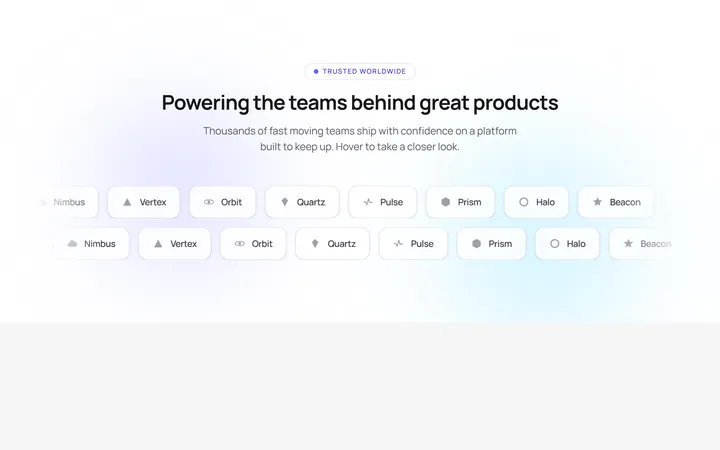
Glowing Logo Marquee
OriginalA dual-row infinite logo marquee whose rows scroll in opposite directions, pause on hover and lift each logo with a shimmer sweep over an animated gradient glow.
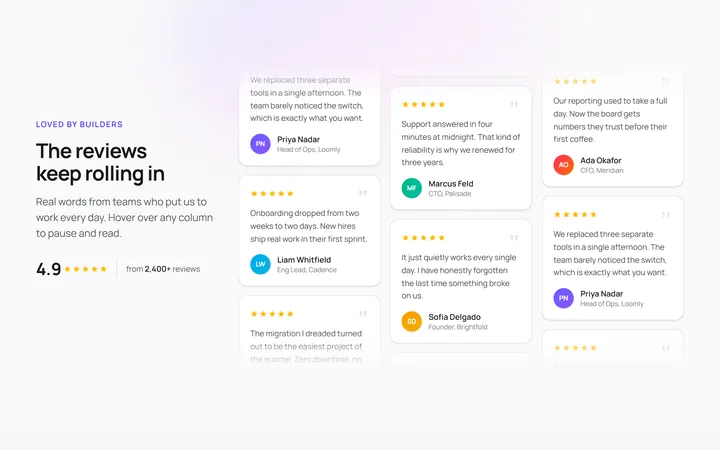
Vertical Testimonial Marquee
OriginalThree vertical testimonial columns scroll at different speeds and opposite directions, pausing on hover with a shine sweep so reviews loop endlessly beside a sticky heading.
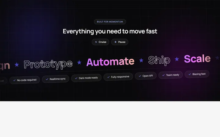
Velocity Band Marquee
OriginalA skewed dual-direction headline marquee of big gradient and outlined words plus a pill ticker, with speed and pause controls and pause on hover over an animated mesh background.
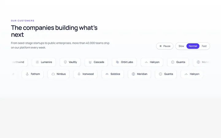
Logos Marquee
Originallogo marquee (generic marks)
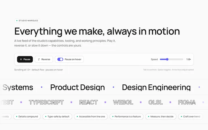
Text Marquee
Originalscrolling text marquee
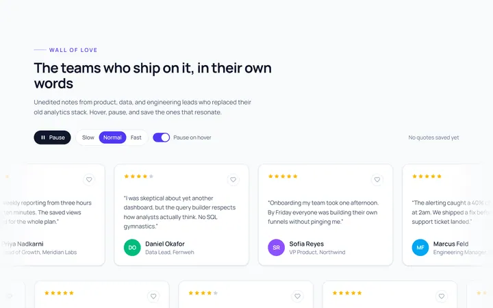
Cards Marquee
Originalcard marquee
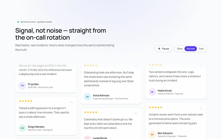
Vertical Marquee
Originalvertical marquee columns
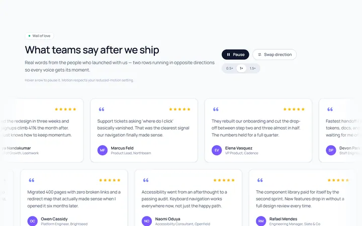
Reverse Rows Marquee
Originaltwo rows scrolling opposite
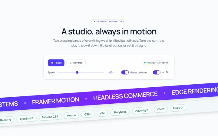
Tilted Marquee
Originaltilted marquee band
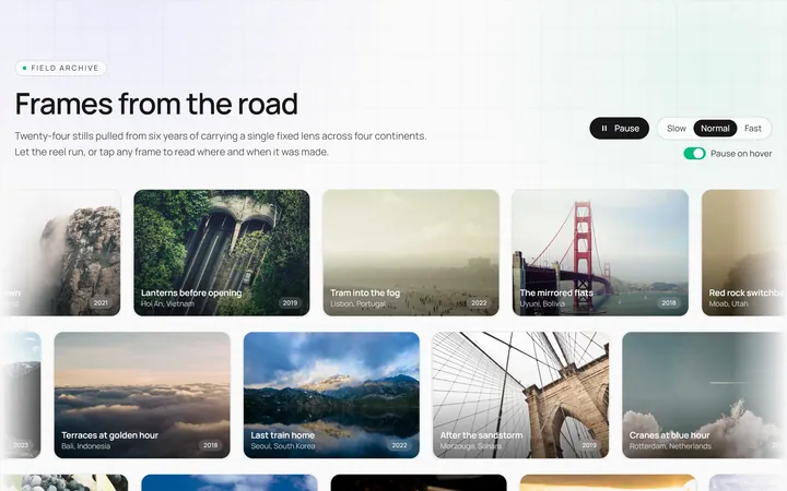
Image Marquee
Originalimage marquee

Spotlight Hero
OriginalA centred hero with a soft radial spotlight, badge and dual call-to-action.

Split Hero
OriginalA two-column hero pairing a headline and CTAs with a product mock and social proof.