

Dropdown Icons Menu
Original · freedropdown with icons and shortcuts
byWeb InnoventixReact + Tailwind
menudropdowniconsmenus
Copy prompt gives Claude Code, Cursor or v0 a ready-to-paste prompt that recreates this exact component.
npx shadcn@latest add https://webinnoventix.com/r/menu-dropdown-icons.jsonmenu-dropdown-icons.tsx
"use client";
import {
useEffect,
useId,
useMemo,
useRef,
useState,
type KeyboardEvent,
type ReactNode,
} from "react";
import { AnimatePresence, motion, useReducedMotion } from "motion/react";
type BaseItem = {
id: string;
label: string;
shortcut?: string[];
icon: ReactNode;
danger?: boolean;
};
type FlatItem = BaseItem & { index: number };
type Group = {
id: string;
label: string;
items: BaseItem[];
};
function Icon({ children }: { children: ReactNode }) {
return (
<svg
viewBox="0 0 24 24"
width="16"
height="16"
fill="none"
stroke="currentColor"
strokeWidth={1.7}
strokeLinecap="round"
strokeLinejoin="round"
aria-hidden="true"
>
{children}
</svg>
);
}
const GROUPS: Group[] = [
{
id: "create",
label: "Create",
items: [
{
id: "new-doc",
label: "New document",
shortcut: ["⌘", "N"],
icon: (
<Icon>
<path d="M14 3v5h5" />
<path d="M6 3h8l5 5v11a1 1 0 0 1-1 1H6a1 1 0 0 1-1-1V4a1 1 0 0 1 1-1Z" />
<path d="M9 13h6" />
<path d="M9 16.5h4" />
</Icon>
),
},
{
id: "new-folder",
label: "New folder",
shortcut: ["⌘", "⇧", "N"],
icon: (
<Icon>
<path d="M4 7a1 1 0 0 1 1-1h3.6l1.7 1.7H19a1 1 0 0 1 1 1V18a1 1 0 0 1-1 1H5a1 1 0 0 1-1-1V7Z" />
<path d="M12 11v4" />
<path d="M10 13h4" />
</Icon>
),
},
{
id: "import",
label: "Import files",
shortcut: ["⌘", "I"],
icon: (
<Icon>
<path d="M12 4v9" />
<path d="M8 9l4 4 4-4" />
<path d="M4 17v1a1 1 0 0 0 1 1h14a1 1 0 0 0 1-1v-1" />
</Icon>
),
},
],
},
{
id: "edit",
label: "Edit",
items: [
{
id: "copy-link",
label: "Copy link",
shortcut: ["⌘", "C"],
icon: (
<Icon>
<path d="M9.5 14.5l5-5" />
<path d="M10.8 6.6l1.6-1.6a3.4 3.4 0 0 1 4.8 4.8L15.6 11.4" />
<path d="M13.2 17.4l-1.6 1.6a3.4 3.4 0 0 1-4.8-4.8L8.4 12.6" />
</Icon>
),
},
{
id: "duplicate",
label: "Duplicate",
shortcut: ["⌘", "D"],
icon: (
<Icon>
<rect x="9" y="9" width="10" height="10" rx="2" />
<path d="M6.5 14.5H6a2 2 0 0 1-2-2V6a2 2 0 0 1 2-2h6.5a2 2 0 0 1 2 2v.5" />
</Icon>
),
},
{
id: "rename",
label: "Rename",
shortcut: ["F2"],
icon: (
<Icon>
<path d="M4 16.2V20h3.8L18.4 9.4 14.6 5.6 4 16.2Z" />
<path d="M13 7.2l3.8 3.8" />
</Icon>
),
},
],
},
{
id: "organize",
label: "Organize",
items: [
{
id: "move",
label: "Move to…",
shortcut: ["⌘", "M"],
icon: (
<Icon>
<path d="M12 4v16" />
<path d="M4 12h16" />
<path d="M9 7l3-3 3 3" />
<path d="M9 17l3 3 3-3" />
<path d="M7 9l-3 3 3 3" />
<path d="M17 9l3 3-3 3" />
</Icon>
),
},
{
id: "favorite",
label: "Add to favorites",
shortcut: ["⌘", "⇧", "F"],
icon: (
<Icon>
<path d="m12 4 2.35 4.76 5.25.77-3.8 3.7.9 5.22L12 16.9l-4.7 2.47.9-5.22-3.8-3.7 5.25-.77L12 4Z" />
</Icon>
),
},
{
id: "archive",
label: "Archive",
shortcut: ["⌘", "E"],
icon: (
<Icon>
<rect x="4" y="5" width="16" height="4" rx="1" />
<path d="M5.5 9v9a1 1 0 0 0 1 1h11a1 1 0 0 0 1-1V9" />
<path d="M10 13h4" />
</Icon>
),
},
],
},
{
id: "danger",
label: "Danger zone",
items: [
{
id: "delete",
label: "Delete forever",
shortcut: ["⌘", "⌫"],
danger: true,
icon: (
<Icon>
<path d="M5 7h14" />
<path d="M9 7V5a1 1 0 0 1 1-1h4a1 1 0 0 1 1 1v2" />
<path d="M6.5 7l.9 12a1 1 0 0 0 1 1h7.2a1 1 0 0 0 1-1l.9-12" />
<path d="M10 11v6" />
<path d="M14 11v6" />
</Icon>
),
},
],
},
];
const KBD_CLASS =
"flex h-5 min-w-[1.25rem] items-center justify-center rounded-md border border-slate-200 bg-slate-50 px-1 text-[11px] font-medium leading-none text-slate-500 dark:border-slate-700 dark:bg-slate-800 dark:text-slate-400";
function Shortcut({ keys }: { keys: string[] }) {
return (
<span className="ml-auto flex items-center gap-1" aria-hidden="true">
{keys.map((key, i) => (
<kbd key={`${key}-${i}`} className={KBD_CLASS}>
{key}
</kbd>
))}
</span>
);
}
export default function MenuDropdownIcons() {
const reduce = useReducedMotion();
const [open, setOpen] = useState(false);
const [activeIndex, setActiveIndex] = useState(0);
const [lastAction, setLastAction] = useState<string | null>(null);
const containerRef = useRef<HTMLDivElement>(null);
const triggerRef = useRef<HTMLButtonElement>(null);
const itemRefs = useRef<(HTMLButtonElement | null)[]>([]);
const typeahead = useRef<{ buffer: string; timer: number }>({
buffer: "",
timer: 0,
});
const uid = useId();
const menuId = `${uid}-menu`;
const labelId = `${uid}-label`;
const { groups, flatItems, itemCount } = useMemo(() => {
let index = 0;
const built = GROUPS.map((group) => ({
...group,
items: group.items.map((item) => ({ ...item, index: index++ })),
}));
const flat = built.flatMap((group) => group.items);
return { groups: built, flatItems: flat, itemCount: index };
}, []);
useEffect(() => {
if (open) {
itemRefs.current[activeIndex]?.focus();
}
}, [open, activeIndex]);
useEffect(() => {
if (!open) return;
function onPointerDown(event: MouseEvent) {
if (
containerRef.current &&
!containerRef.current.contains(event.target as Node)
) {
setOpen(false);
}
}
document.addEventListener("mousedown", onPointerDown);
return () => document.removeEventListener("mousedown", onPointerDown);
}, [open]);
useEffect(() => {
if (!lastAction) return;
const timer = window.setTimeout(() => setLastAction(null), 2800);
return () => window.clearTimeout(timer);
}, [lastAction]);
function openMenu(index: number) {
setActiveIndex(index);
setOpen(true);
}
function closeMenu() {
setOpen(false);
triggerRef.current?.focus();
}
function activate(item: FlatItem) {
setLastAction(item.label);
closeMenu();
}
function handleTypeahead(event: KeyboardEvent<HTMLDivElement>) {
if (
event.key.length !== 1 ||
event.metaKey ||
event.ctrlKey ||
event.altKey
) {
return;
}
window.clearTimeout(typeahead.current.timer);
typeahead.current.buffer += event.key.toLowerCase();
const buffer = typeahead.current.buffer;
const match = flatItems.findIndex((item) =>
item.label.toLowerCase().startsWith(buffer),
);
if (match >= 0) setActiveIndex(match);
typeahead.current.timer = window.setTimeout(() => {
typeahead.current.buffer = "";
}, 600);
}
function handleMenuKeyDown(event: KeyboardEvent<HTMLDivElement>) {
switch (event.key) {
case "ArrowDown":
event.preventDefault();
setActiveIndex((i) => (i + 1) % itemCount);
break;
case "ArrowUp":
event.preventDefault();
setActiveIndex((i) => (i - 1 + itemCount) % itemCount);
break;
case "Home":
event.preventDefault();
setActiveIndex(0);
break;
case "End":
event.preventDefault();
setActiveIndex(itemCount - 1);
break;
case "Escape":
event.preventDefault();
closeMenu();
break;
case "Tab":
event.preventDefault();
closeMenu();
break;
case "Enter":
case " ":
event.preventDefault();
activate(flatItems[activeIndex]);
break;
default:
handleTypeahead(event);
}
}
function handleTriggerKeyDown(event: KeyboardEvent<HTMLButtonElement>) {
if (event.key === "ArrowDown" || event.key === "Enter" || event.key === " ") {
event.preventDefault();
openMenu(0);
} else if (event.key === "ArrowUp") {
event.preventDefault();
openMenu(itemCount - 1);
}
}
const panelInitial = reduce
? { opacity: 0 }
: { opacity: 0, y: -6, scale: 0.97 };
const panelAnimate = reduce
? { opacity: 1 }
: { opacity: 1, y: 0, scale: 1 };
return (
<section className="relative w-full overflow-hidden bg-gradient-to-b from-slate-50 to-white text-slate-900 dark:from-slate-950 dark:to-slate-900 dark:text-slate-100">
<style>{`
@keyframes mdi-pulse {
0% { box-shadow: 0 0 0 0 rgba(16,185,129,0.55); }
70% { box-shadow: 0 0 0 6px rgba(16,185,129,0); }
100% { box-shadow: 0 0 0 0 rgba(16,185,129,0); }
}
.mdi-dot { animation: mdi-pulse 2.4s ease-out infinite; }
@media (prefers-reduced-motion: reduce) {
.mdi-dot { animation: none; }
}
`}</style>
<div
className="pointer-events-none absolute inset-0 opacity-[0.4] [background-image:radial-gradient(circle_at_1px_1px,theme(colors.slate.300)_1px,transparent_0)] [background-size:26px_26px] dark:opacity-[0.25] dark:[background-image:radial-gradient(circle_at_1px_1px,theme(colors.slate.700)_1px,transparent_0)]"
aria-hidden="true"
/>
<div className="relative mx-auto max-w-2xl px-6 py-24 sm:py-32">
<div className="text-center">
<span className="inline-flex items-center gap-1.5 rounded-full border border-slate-200 bg-white/70 px-3 py-1 text-xs font-medium uppercase tracking-wide text-indigo-600 backdrop-blur dark:border-slate-800 dark:bg-slate-900/70 dark:text-indigo-400">
<span className="h-1.5 w-1.5 rounded-full bg-indigo-500" />
Menus
</span>
<h2 className="mt-5 text-balance text-3xl font-semibold tracking-tight sm:text-4xl">
An action menu you can drive from the keyboard
</h2>
<p className="mx-auto mt-4 max-w-md text-pretty text-sm leading-relaxed text-slate-500 dark:text-slate-400">
Icons for scanability, shortcuts for speed. Open it, then use the
arrow keys, Home / End, type-ahead, or Escape.
</p>
</div>
<div className="mt-14 flex flex-col items-center gap-4">
<div ref={containerRef} className="relative inline-block">
<button
ref={triggerRef}
type="button"
id={`${uid}-trigger`}
aria-haspopup="menu"
aria-expanded={open}
aria-controls={open ? menuId : undefined}
onClick={() => (open ? closeMenu() : openMenu(0))}
onKeyDown={handleTriggerKeyDown}
className="inline-flex items-center gap-2.5 rounded-xl border border-slate-200 bg-white px-4 py-2.5 text-sm font-medium text-slate-700 shadow-sm transition-colors hover:bg-slate-50 focus:outline-none focus-visible:ring-2 focus-visible:ring-indigo-500 focus-visible:ring-offset-2 focus-visible:ring-offset-white dark:border-slate-700 dark:bg-slate-900 dark:text-slate-200 dark:hover:bg-slate-800 dark:focus-visible:ring-offset-slate-950"
>
<span className="text-indigo-500 dark:text-indigo-400">
<Icon>
<path d="M13 3 4 14h6l-1 7 9-11h-6l1-7Z" />
</Icon>
</span>
Actions
<motion.span
aria-hidden="true"
className="text-slate-400 dark:text-slate-500"
animate={{ rotate: open ? 180 : 0 }}
transition={reduce ? { duration: 0 } : { duration: 0.2 }}
>
<Icon>
<path d="m6 9 6 6 6-6" />
</Icon>
</motion.span>
</button>
<AnimatePresence>
{open && (
<motion.div
key="menu"
id={menuId}
role="menu"
aria-labelledby={labelId}
aria-orientation="vertical"
onKeyDown={handleMenuKeyDown}
initial={panelInitial}
animate={panelAnimate}
exit={panelInitial}
transition={
reduce
? { duration: 0 }
: { type: "spring", stiffness: 440, damping: 32, mass: 0.7 }
}
style={{ transformOrigin: "top left" }}
className="absolute left-0 z-20 mt-2 w-72 rounded-2xl border border-slate-200 bg-white p-1.5 shadow-xl shadow-slate-900/10 dark:border-slate-800 dark:bg-slate-900 dark:shadow-black/50"
>
<div className="flex items-center gap-2.5 px-2.5 py-2">
<span className="grid h-8 w-8 shrink-0 place-items-center rounded-lg bg-indigo-500/10 text-indigo-600 dark:text-indigo-400">
<Icon>
<rect x="4" y="4" width="16" height="16" rx="3" />
<path d="M9 12h6" />
<path d="M12 9v6" />
</Icon>
</span>
<div className="min-w-0">
<p
id={labelId}
className="truncate text-sm font-semibold text-slate-900 dark:text-slate-100"
>
Quick actions
</p>
<p className="truncate text-xs text-slate-400 dark:text-slate-500">
project-atlas / assets
</p>
</div>
</div>
{groups.map((group, groupIndex) => (
<div key={group.id}>
<div
role="separator"
className="mx-2 my-1 h-px bg-slate-100 dark:bg-slate-800"
/>
<p
className={`px-2.5 pb-1 pt-1.5 text-[11px] font-semibold uppercase tracking-wide ${
group.id === "danger"
? "text-rose-500/80 dark:text-rose-400/80"
: "text-slate-400 dark:text-slate-500"
}`}
>
{group.label}
</p>
{group.items.map((item) => {
const tone = item.danger
? "text-rose-600 hover:bg-rose-50 focus:bg-rose-50 dark:text-rose-400 dark:hover:bg-rose-950/50 dark:focus:bg-rose-950/50"
: "text-slate-700 hover:bg-slate-100 focus:bg-slate-100 dark:text-slate-200 dark:hover:bg-slate-800 dark:focus:bg-slate-800";
const iconTone = item.danger
? "text-rose-500 dark:text-rose-400"
: "text-slate-400 dark:text-slate-500";
return (
<button
key={item.id}
ref={(el) => {
itemRefs.current[item.index] = el;
}}
type="button"
role="menuitem"
tabIndex={item.index === activeIndex ? 0 : -1}
aria-keyshortcuts={item.shortcut?.join("+")}
onClick={() => activate(item)}
onMouseEnter={() => setActiveIndex(item.index)}
className={`group flex w-full items-center gap-3 rounded-lg px-2.5 py-2 text-sm transition-colors focus:outline-none focus-visible:ring-2 focus-visible:ring-inset focus-visible:ring-indigo-500 ${tone}`}
>
<span className={`shrink-0 ${iconTone}`}>
{item.icon}
</span>
<span className="truncate text-left font-medium">
{item.label}
</span>
{item.shortcut && <Shortcut keys={item.shortcut} />}
</button>
);
})}
{groupIndex === groups.length - 1 && (
<>
<div
role="separator"
className="mx-2 my-1 h-px bg-slate-100 dark:bg-slate-800"
/>
<div className="flex items-center gap-2 px-2.5 py-1.5 text-xs text-slate-400 dark:text-slate-500">
<span className="mdi-dot h-2 w-2 shrink-0 rounded-full bg-emerald-500" />
All changes synced
<span className="ml-auto">2s ago</span>
</div>
</>
)}
</div>
))}
</motion.div>
)}
</AnimatePresence>
</div>
<div className="h-9" role="status" aria-live="polite">
<AnimatePresence mode="wait">
{lastAction && (
<motion.div
key={lastAction}
initial={reduce ? { opacity: 0 } : { opacity: 0, y: 6 }}
animate={{ opacity: 1, y: 0 }}
exit={reduce ? { opacity: 0 } : { opacity: 0, y: -6 }}
transition={{ duration: reduce ? 0 : 0.18 }}
className="inline-flex items-center gap-2 rounded-full border border-emerald-200 bg-emerald-50 px-3.5 py-1.5 text-sm font-medium text-emerald-700 dark:border-emerald-900/60 dark:bg-emerald-950/40 dark:text-emerald-300"
>
<span className="text-emerald-500 dark:text-emerald-400">
<Icon>
<path d="M20 6 9 17l-5-5" />
</Icon>
</span>
{lastAction}
</motion.div>
)}
</AnimatePresence>
</div>
</div>
</div>
</section>
);
}Dependencies
motion
Licence
Built by Web Innoventix. Free for personal and commercial use, no attribution required.
Built by Web Innoventix
Need a custom interface, a full website, or SEO that gets you cited by AI? We design, build and rank it end to end.
Get a free quoteSimilar components
Browse all →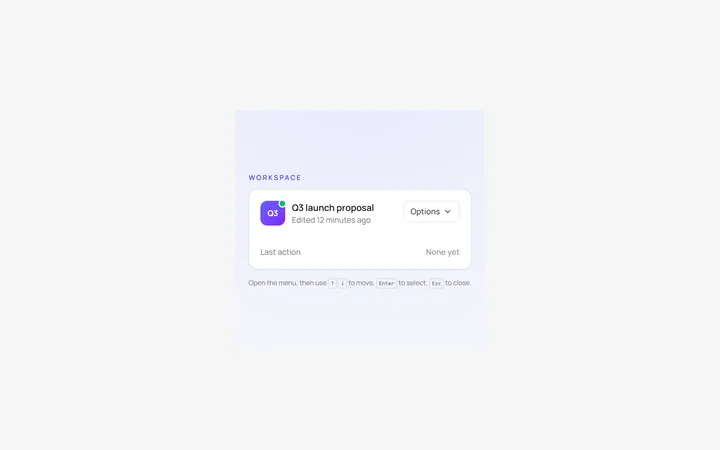
Dropdown Menu
Originalbasic dropdown menu with items
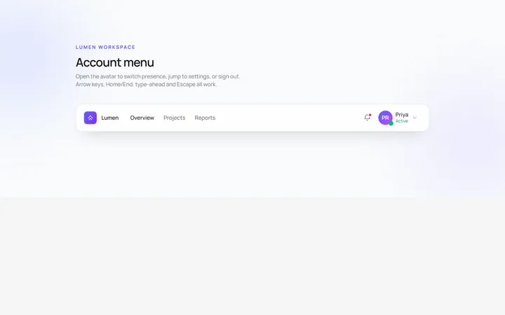
User Menu
Originaluser account dropdown with avatar
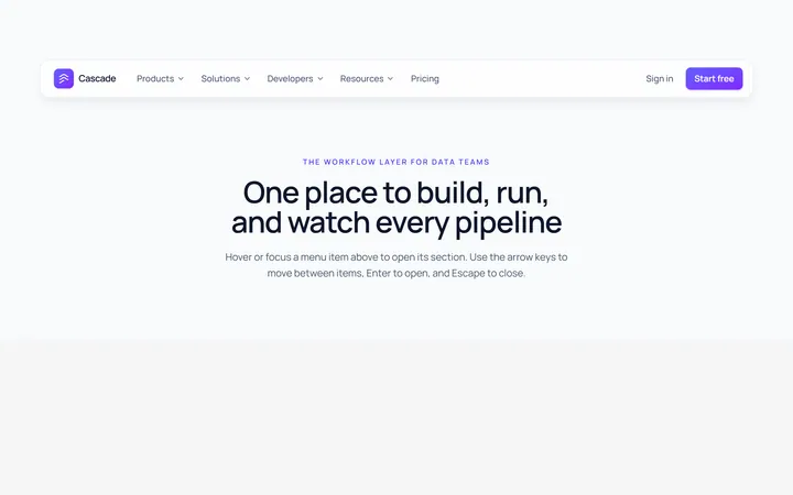
Mega Menu
Originalmega menu with grouped links
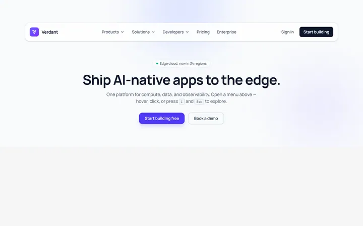
Mega Cols Menu
Originalmulti-column mega menu with featured
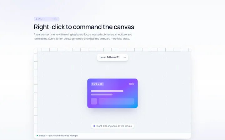
Context Menu
Originalright-click context menu
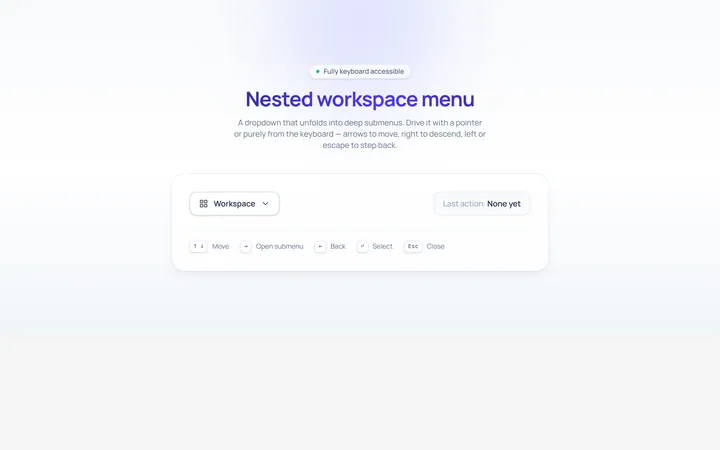
Nested Menu
Originaldropdown with nested submenus
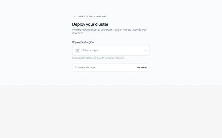
Select Menu
Originalcustom single select dropdown
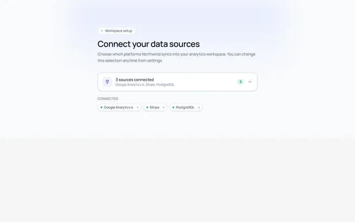
Multiselect Menu
Originalmulti-select with checkable items
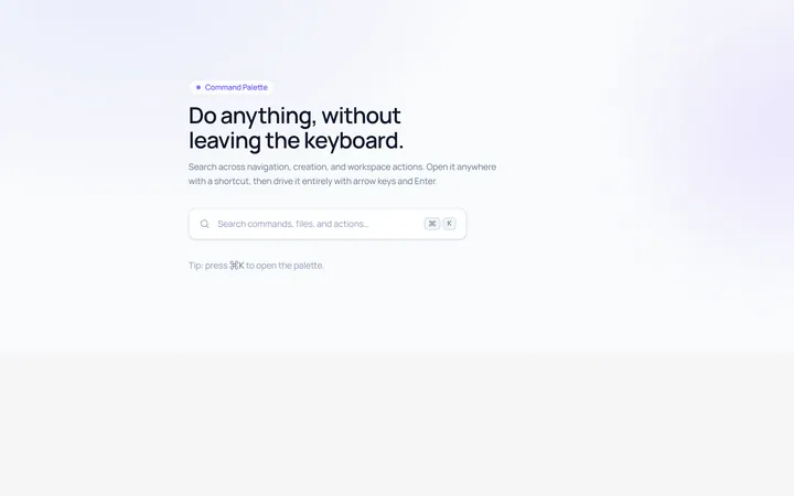
Command Menu
Originalcommand palette style menu with search
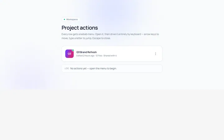
Actions Menu
Originalactions/kebab menu
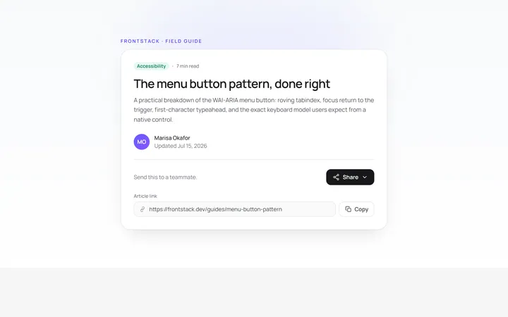
Share Menu
Originalshare menu with options
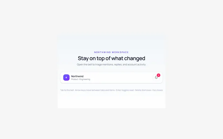
Notifications Menu
Originalnotifications dropdown list