

Nested Menu
Original · freedropdown with nested submenus
byWeb InnoventixReact + Tailwind
menunestedmenus
Copy prompt gives Claude Code, Cursor or v0 a ready-to-paste prompt that recreates this exact component.
npx shadcn@latest add https://webinnoventix.com/r/menu-nested.jsonmenu-nested.tsx
"use client"
import { useCallback, useEffect, useId, useRef, useState } from "react"
import type { KeyboardEvent as ReactKeyboardEvent, ReactNode } from "react"
import { motion, useReducedMotion } from "motion/react"
/* ----------------------------- data model ----------------------------- */
interface MenuAction {
id: string
label: string
hint?: string
icon?: ReactNode
shortcut?: string
danger?: boolean
disabled?: boolean
dividerBefore?: boolean
children?: MenuAction[]
}
interface PanelHandle {
focusFirst: () => void
}
interface MenuPanelProps {
items: MenuAction[]
id?: string
labelledBy?: string
isSubmenu: boolean
autoFocusOnMount: boolean
reduce: boolean
onSelect: (item: MenuAction) => void
onCloseAll: () => void
onCloseSelf: () => void
registerHandle?: (handle: PanelHandle | null) => void
}
/* ------------------------------- icons -------------------------------- */
function Svg({ children, className }: { children: ReactNode; className?: string }) {
return (
<svg
viewBox="0 0 24 24"
fill="none"
stroke="currentColor"
strokeWidth={1.7}
strokeLinecap="round"
strokeLinejoin="round"
aria-hidden="true"
className={className ?? "h-4 w-4"}
>
{children}
</svg>
)
}
const IconChevronRight = ({ className }: { className?: string }) => (
<Svg className={className}><path d="m9 6 6 6-6 6" /></Svg>
)
const IconChevronDown = ({ className }: { className?: string }) => (
<Svg className={className}><path d="m6 9 6 6 6-6" /></Svg>
)
const IconGrid = ({ className }: { className?: string }) => (
<Svg className={className}><rect x="3" y="3" width="7" height="7" rx="1.5" /><rect x="14" y="3" width="7" height="7" rx="1.5" /><rect x="3" y="14" width="7" height="7" rx="1.5" /><rect x="14" y="14" width="7" height="7" rx="1.5" /></Svg>
)
const IconPlus = ({ className }: { className?: string }) => (
<Svg className={className}><path d="M12 5v14M5 12h14" /></Svg>
)
const IconDoc = ({ className }: { className?: string }) => (
<Svg className={className}><path d="M14 3v5h5" /><path d="M8 3h6l5 5v11a2 2 0 0 1-2 2H8a2 2 0 0 1-2-2V5a2 2 0 0 1 2-2Z" /><path d="M9 13h6M9 17h4" /></Svg>
)
const IconTemplate = ({ className }: { className?: string }) => (
<Svg className={className}><rect x="3" y="4" width="18" height="16" rx="2" /><path d="M3 9h18M9 9v11" /></Svg>
)
const IconShare = ({ className }: { className?: string }) => (
<Svg className={className}><circle cx="18" cy="5" r="3" /><circle cx="6" cy="12" r="3" /><circle cx="18" cy="19" r="3" /><path d="m8.6 13.5 6.8 4M15.4 6.5 8.6 10.5" /></Svg>
)
const IconLink = ({ className }: { className?: string }) => (
<Svg className={className}><path d="M10 13a5 5 0 0 0 7 0l3-3a5 5 0 0 0-7-7l-1.5 1.5" /><path d="M14 11a5 5 0 0 0-7 0l-3 3a5 5 0 0 0 7 7l1.5-1.5" /></Svg>
)
const IconUsers = ({ className }: { className?: string }) => (
<Svg className={className}><path d="M16 21v-2a4 4 0 0 0-4-4H6a4 4 0 0 0-4 4v2" /><circle cx="9" cy="7" r="4" /><path d="M22 21v-2a4 4 0 0 0-3-3.87M16 3.13A4 4 0 0 1 16 11" /></Svg>
)
const IconDownload = ({ className }: { className?: string }) => (
<Svg className={className}><path d="M12 3v12m0 0 4-4m-4 4-4-4" /><path d="M4 17v2a2 2 0 0 0 2 2h12a2 2 0 0 0 2-2v-2" /></Svg>
)
const IconEye = ({ className }: { className?: string }) => (
<Svg className={className}><path d="M2.5 12S6 5 12 5s9.5 7 9.5 7-3.5 7-9.5 7-9.5-7-9.5-7Z" /><circle cx="12" cy="12" r="3" /></Svg>
)
const IconGear = ({ className }: { className?: string }) => (
<Svg className={className}><circle cx="12" cy="12" r="3" /><path d="M19.4 15a1.65 1.65 0 0 0 .33 1.82l.06.06a2 2 0 1 1-2.83 2.83l-.06-.06a1.65 1.65 0 0 0-2.82 1.17V21a2 2 0 1 1-4 0v-.09A1.65 1.65 0 0 0 6.5 19.4l-.06.06a2 2 0 1 1-2.83-2.83l.06-.06A1.65 1.65 0 0 0 4.6 13.8H4.5a2 2 0 1 1 0-4h.09A1.65 1.65 0 0 0 6.3 8.5l-.06-.06A2 2 0 1 1 9.07 5.6l.06.06a1.65 1.65 0 0 0 1.82.33H11a1.65 1.65 0 0 0 1-1.51V4a2 2 0 1 1 4 0v.09a1.65 1.65 0 0 0 1 1.51 1.65 1.65 0 0 0 1.82-.33l.06-.06a2 2 0 1 1 2.83 2.83l-.06.06a1.65 1.65 0 0 0-.33 1.82V11a1.65 1.65 0 0 0 1.51 1H21a2 2 0 1 1 0 4h-.09a1.65 1.65 0 0 0-1.51 1Z" /></Svg>
)
const IconTrash = ({ className }: { className?: string }) => (
<Svg className={className}><path d="M3 6h18M8 6V4a2 2 0 0 1 2-2h4a2 2 0 0 1 2 2v2m2 0v14a2 2 0 0 1-2 2H8a2 2 0 0 1-2-2V6" /><path d="M10 11v6M14 11v6" /></Svg>
)
/* ------------------------------- content ------------------------------ */
const MENU: MenuAction[] = [
{
id: "new",
label: "New file",
icon: <IconPlus />,
children: [
{ id: "doc", label: "Document", icon: <IconDoc />, shortcut: "⌘N" },
{ id: "sheet", label: "Spreadsheet", icon: <IconGrid />, shortcut: "⌘⇧N" },
{
id: "template",
label: "From template",
icon: <IconTemplate />,
children: [
{ id: "brief", label: "Project brief" },
{ id: "notes", label: "Meeting notes" },
{ id: "roadmap", label: "Product roadmap" },
{ id: "retro", label: "Sprint retrospective" },
],
},
],
},
{
id: "share",
label: "Share",
icon: <IconShare />,
children: [
{ id: "copy", label: "Copy link", icon: <IconLink />, shortcut: "⌘C" },
{
id: "invite",
label: "Invite people",
icon: <IconUsers />,
children: [
{ id: "editor", label: "Can edit", hint: "Full write access" },
{ id: "commenter", label: "Can comment" },
{ id: "viewer", label: "Can view" },
],
},
{
id: "export",
label: "Export as",
icon: <IconDownload />,
children: [
{ id: "pdf", label: "PDF document" },
{ id: "md", label: "Markdown (.md)" },
{ id: "html", label: "Web page (.html)" },
{ id: "csv", label: "CSV data", disabled: true },
],
},
],
},
{
id: "view",
label: "View options",
icon: <IconEye />,
children: [
{ id: "zoom-in", label: "Zoom in", shortcut: "⌘+" },
{ id: "zoom-out", label: "Zoom out", shortcut: "⌘−" },
{ id: "fullscreen", label: "Full screen", shortcut: "F11" },
],
},
{ id: "prefs", label: "Preferences", icon: <IconGear />, shortcut: "⌘,", dividerBefore: true },
{ id: "trash", label: "Move to trash", icon: <IconTrash />, danger: true },
]
/* ------------------------------- panel -------------------------------- */
function MenuPanel({
items,
id,
labelledBy,
isSubmenu,
autoFocusOnMount,
reduce,
onSelect,
onCloseAll,
onCloseSelf,
registerHandle,
}: MenuPanelProps) {
const firstEnabled = Math.max(0, items.findIndex((it) => !it.disabled))
const [activeIndex, setActiveIndex] = useState(firstEnabled)
const [openIndex, setOpenIndex] = useState<number | null>(null)
const itemRefs = useRef<Array<HTMLButtonElement | null>>([])
const submenuHandle = useRef<PanelHandle | null>(null)
const pendingSubFocus = useRef(false)
const focusItem = useCallback((i: number) => {
setActiveIndex(i)
itemRefs.current[i]?.focus()
}, [])
const focusFirst = useCallback(() => {
focusItem(Math.max(0, items.findIndex((it) => !it.disabled)))
}, [items, focusItem])
// Let a keyboard-opened parent push focus into this panel.
useEffect(() => {
registerHandle?.({ focusFirst })
return () => registerHandle?.(null)
}, [registerHandle, focusFirst])
// The root panel grabs focus when it opens; submenus wait to be asked.
useEffect(() => {
if (autoFocusOnMount) focusFirst()
// eslint-disable-next-line react-hooks/exhaustive-deps
}, [])
// When a submenu was opened via keyboard, move focus into it once mounted.
useEffect(() => {
if (openIndex !== null && pendingSubFocus.current) {
pendingSubFocus.current = false
submenuHandle.current?.focusFirst()
}
}, [openIndex])
const step = (dir: 1 | -1) => {
const n = items.length
let i = activeIndex
for (let s = 0; s < n; s++) {
i = (i + dir + n) % n
if (!items[i]?.disabled) break
}
setOpenIndex(null)
focusItem(i)
}
const jumpTo = (edge: "first" | "last") => {
setOpenIndex(null)
if (edge === "first") {
focusItem(Math.max(0, items.findIndex((it) => !it.disabled)))
} else {
let i = items.length - 1
while (i > 0 && items[i]?.disabled) i -= 1
focusItem(i)
}
}
const openSubmenu = (i: number, withFocus: boolean) => {
setActiveIndex(i)
pendingSubFocus.current = withFocus
setOpenIndex(i)
}
const activate = (i: number) => {
const item = items[i]
if (!item || item.disabled) return
if (item.children?.length) {
if (openIndex === i) submenuHandle.current?.focusFirst()
else openSubmenu(i, true)
} else {
onSelect(item)
onCloseAll()
}
}
const onKeyDown = (e: ReactKeyboardEvent<HTMLUListElement>) => {
const item = items[activeIndex]
switch (e.key) {
case "ArrowDown":
e.preventDefault(); e.stopPropagation(); step(1); break
case "ArrowUp":
e.preventDefault(); e.stopPropagation(); step(-1); break
case "Home":
e.preventDefault(); e.stopPropagation(); jumpTo("first"); break
case "End":
e.preventDefault(); e.stopPropagation(); jumpTo("last"); break
case "ArrowRight":
if (item?.children?.length) {
e.preventDefault(); e.stopPropagation()
if (openIndex === activeIndex) submenuHandle.current?.focusFirst()
else openSubmenu(activeIndex, true)
}
break
case "ArrowLeft":
if (isSubmenu) { e.preventDefault(); e.stopPropagation(); onCloseSelf() }
break
case "Escape":
e.preventDefault(); e.stopPropagation()
if (isSubmenu) onCloseSelf(); else onCloseAll()
break
case "Enter":
case " ":
e.preventDefault(); e.stopPropagation(); activate(activeIndex); break
case "Tab":
onCloseAll(); break
default:
break
}
}
return (
<motion.ul
id={id}
role="menu"
aria-labelledby={labelledBy}
aria-orientation="vertical"
onKeyDown={onKeyDown}
initial={reduce ? false : { opacity: 0, scale: 0.97, y: isSubmenu ? 0 : -6, x: isSubmenu ? -6 : 0 }}
animate={reduce ? undefined : { opacity: 1, scale: 1, y: 0, x: 0 }}
transition={reduce ? undefined : { duration: 0.15, ease: "easeOut" }}
style={{ transformOrigin: isSubmenu ? "left top" : "top left" }}
className={[
"absolute z-30 min-w-[15rem] rounded-2xl border p-1.5",
"border-slate-200/80 bg-white/95 shadow-xl shadow-slate-900/10 backdrop-blur-md",
"dark:border-slate-700/70 dark:bg-slate-900/95 dark:shadow-black/50",
isSubmenu ? "left-full top-[-0.4rem] ml-1.5" : "left-0 top-full mt-2",
].join(" ")}
>
{items.map((item, i) => {
const hasChildren = !!item.children?.length
const isActive = i === activeIndex
return (
<li key={item.id} role="none">
{item.dividerBefore && (
<div role="separator" className="mx-2 my-1 border-t border-slate-200/80 dark:border-slate-700/70" />
)}
<button
ref={(el) => { itemRefs.current[i] = el }}
type="button"
role="menuitem"
tabIndex={isActive ? 0 : -1}
disabled={item.disabled}
aria-haspopup={hasChildren ? "menu" : undefined}
aria-expanded={hasChildren ? openIndex === i : undefined}
aria-disabled={item.disabled || undefined}
onClick={() => activate(i)}
onMouseEnter={() => {
if (item.disabled) return
setActiveIndex(i)
if (hasChildren) openSubmenu(i, false)
else setOpenIndex(null)
}}
className={[
"group flex w-full items-center gap-3 rounded-xl px-3 py-2 text-left text-sm outline-none transition-colors",
"focus-visible:ring-2 focus-visible:ring-indigo-500 focus-visible:ring-offset-1 focus-visible:ring-offset-white dark:focus-visible:ring-offset-slate-900",
item.disabled
? "cursor-not-allowed text-slate-400 dark:text-slate-600"
: item.danger
? isActive
? "bg-rose-50 text-rose-700 dark:bg-rose-500/15 dark:text-rose-300"
: "text-rose-600 dark:text-rose-400"
: isActive
? "bg-indigo-50 text-indigo-700 dark:bg-indigo-500/15 dark:text-indigo-200"
: "text-slate-700 dark:text-slate-200",
].join(" ")}
>
{item.icon && (
<span className="flex h-5 w-5 shrink-0 items-center justify-center text-slate-400 group-hover:text-current dark:text-slate-500">
{item.icon}
</span>
)}
<span className="min-w-0 flex-1">
<span className="block truncate font-medium">{item.label}</span>
{item.hint && (
<span className="block truncate text-xs text-slate-400 dark:text-slate-500">{item.hint}</span>
)}
</span>
{item.shortcut && !hasChildren && (
<kbd className="ml-auto shrink-0 rounded-md border border-slate-200 bg-slate-50 px-1.5 py-0.5 font-mono text-[0.65rem] text-slate-500 dark:border-slate-700 dark:bg-slate-800 dark:text-slate-400">
{item.shortcut}
</kbd>
)}
{hasChildren && (
<IconChevronRight
className={[
"ml-auto h-4 w-4 shrink-0 text-slate-400 transition-transform dark:text-slate-500",
openIndex === i ? "translate-x-0.5 text-indigo-500 dark:text-indigo-300" : "",
].join(" ")}
/>
)}
</button>
{hasChildren && openIndex === i && (
<MenuPanel
items={item.children ?? []}
isSubmenu
autoFocusOnMount={false}
reduce={reduce}
onSelect={onSelect}
onCloseAll={onCloseAll}
onCloseSelf={() => { setOpenIndex(null); focusItem(i) }}
registerHandle={(h) => { submenuHandle.current = h }}
/>
)}
</li>
)
})}
</motion.ul>
)
}
/* ----------------------------- component ------------------------------ */
export default function MenuNested() {
const prefersReduced = useReducedMotion()
const reduce = !!prefersReduced
const [open, setOpen] = useState(false)
const [lastAction, setLastAction] = useState<string | null>(null)
const rootRef = useRef<HTMLDivElement>(null)
const buttonRef = useRef<HTMLButtonElement>(null)
const menuId = useId()
const buttonId = useId()
const closeAll = useCallback((returnFocus: boolean) => {
setOpen(false)
if (returnFocus) buttonRef.current?.focus()
}, [])
useEffect(() => {
if (!open) return
const onDown = (e: MouseEvent) => {
if (rootRef.current && !rootRef.current.contains(e.target as Node)) setOpen(false)
}
document.addEventListener("mousedown", onDown)
return () => document.removeEventListener("mousedown", onDown)
}, [open])
const onButtonKeyDown = (e: ReactKeyboardEvent<HTMLButtonElement>) => {
if (!open && (e.key === "ArrowDown" || e.key === "ArrowUp")) {
e.preventDefault()
setOpen(true)
}
}
const legend: Array<{ keys: string; label: string }> = [
{ keys: "↑ ↓", label: "Move" },
{ keys: "→", label: "Open submenu" },
{ keys: "←", label: "Back" },
{ keys: "↵", label: "Select" },
{ keys: "Esc", label: "Close" },
]
return (
<section className="relative w-full overflow-hidden bg-gradient-to-b from-slate-50 via-white to-slate-100 px-6 py-20 sm:py-28 dark:from-slate-950 dark:via-slate-950 dark:to-slate-900">
<style>{`
@keyframes mnst-dot-pulse { 0%, 100% { opacity: 1; transform: scale(1); } 50% { opacity: .3; transform: scale(.62); } }
@keyframes mnst-sheen { 0% { background-position: 0% 50%; } 100% { background-position: 200% 50%; } }
.mnst-dot { animation: mnst-dot-pulse 1.8s ease-in-out infinite; }
.mnst-title { background-size: 200% auto; animation: mnst-sheen 7s linear infinite; }
@media (prefers-reduced-motion: reduce) {
.mnst-dot, .mnst-title { animation: none !important; }
}
`}</style>
{/* soft ambient glow */}
<div
aria-hidden="true"
className="pointer-events-none absolute -top-24 left-1/2 h-72 w-72 -translate-x-1/2 rounded-full bg-indigo-400/20 blur-3xl dark:bg-indigo-500/15"
/>
<div className="relative mx-auto max-w-2xl">
<header className="mb-10 text-center">
<span className="inline-flex items-center gap-2 rounded-full border border-slate-200 bg-white/70 px-3 py-1 text-xs font-medium text-slate-600 shadow-sm backdrop-blur dark:border-slate-700 dark:bg-slate-900/70 dark:text-slate-300">
<span className="mnst-dot h-1.5 w-1.5 rounded-full bg-emerald-500" />
Fully keyboard accessible
</span>
<h2 className="mnst-title mt-4 bg-gradient-to-r from-slate-900 via-indigo-600 to-slate-900 bg-clip-text text-3xl font-bold tracking-tight text-transparent sm:text-4xl dark:from-white dark:via-indigo-300 dark:to-white">
Nested workspace menu
</h2>
<p className="mx-auto mt-3 max-w-md text-sm text-slate-500 dark:text-slate-400">
A dropdown that unfolds into deep submenus. Drive it with a pointer or purely from the keyboard — arrows to move, right to descend, left or escape to step back.
</p>
</header>
<div className="rounded-3xl border border-slate-200/80 bg-white/70 p-6 shadow-lg shadow-slate-900/5 backdrop-blur-sm sm:p-8 dark:border-slate-800 dark:bg-slate-900/50 dark:shadow-black/30">
<div className="flex flex-wrap items-center justify-between gap-4">
<div ref={rootRef} className="relative inline-block">
<button
ref={buttonRef}
id={buttonId}
type="button"
aria-haspopup="menu"
aria-expanded={open}
aria-controls={open ? menuId : undefined}
onClick={() => setOpen((o) => !o)}
onKeyDown={onButtonKeyDown}
className={[
"inline-flex items-center gap-2.5 rounded-xl border px-4 py-2.5 text-sm font-semibold shadow-sm transition-colors",
"focus-visible:outline-none focus-visible:ring-2 focus-visible:ring-indigo-500 focus-visible:ring-offset-2 focus-visible:ring-offset-white dark:focus-visible:ring-offset-slate-900",
open
? "border-indigo-400 bg-indigo-50 text-indigo-700 dark:border-indigo-500/60 dark:bg-indigo-500/15 dark:text-indigo-200"
: "border-slate-300 bg-white text-slate-800 hover:border-indigo-300 hover:bg-indigo-50 dark:border-slate-700 dark:bg-slate-800 dark:text-slate-100 dark:hover:border-indigo-500/50 dark:hover:bg-indigo-500/10",
].join(" ")}
>
<IconGrid className="h-4 w-4" />
Workspace
<IconChevronDown className={["h-4 w-4 transition-transform duration-200", open ? "rotate-180" : ""].join(" ")} />
</button>
{open && (
<MenuPanel
items={MENU}
id={menuId}
labelledBy={buttonId}
isSubmenu={false}
autoFocusOnMount
reduce={reduce}
onSelect={(item) => setLastAction(item.label)}
onCloseAll={() => closeAll(true)}
onCloseSelf={() => closeAll(true)}
/>
)}
</div>
<div className="rounded-xl border border-slate-200 bg-slate-50/80 px-4 py-2.5 text-sm dark:border-slate-700 dark:bg-slate-800/50">
<span className="text-slate-400 dark:text-slate-500">Last action: </span>
<span className="font-semibold text-slate-800 dark:text-slate-100">
{lastAction ?? "None yet"}
</span>
</div>
</div>
<ul className="mt-6 flex flex-wrap gap-x-5 gap-y-2 border-t border-slate-200/70 pt-5 text-xs text-slate-500 dark:border-slate-700/70 dark:text-slate-400">
{legend.map((row) => (
<li key={row.label} className="flex items-center gap-2">
<kbd className="rounded-md border border-slate-200 bg-white px-1.5 py-0.5 font-mono text-[0.7rem] text-slate-600 shadow-sm dark:border-slate-700 dark:bg-slate-800 dark:text-slate-300">
{row.keys}
</kbd>
{row.label}
</li>
))}
</ul>
</div>
</div>
</section>
)
}Dependencies
motion
Licence
Built by Web Innoventix. Free for personal and commercial use, no attribution required.
Built by Web Innoventix
Need a custom interface, a full website, or SEO that gets you cited by AI? We design, build and rank it end to end.
Get a free quoteSimilar components
Browse all →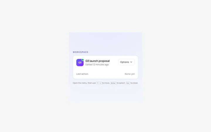
Dropdown Menu
Originalbasic dropdown menu with items
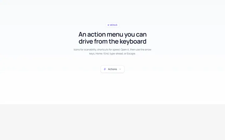
Dropdown Icons Menu
Originaldropdown with icons and shortcuts
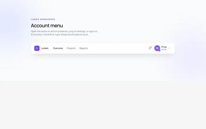
User Menu
Originaluser account dropdown with avatar
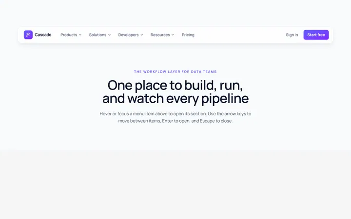
Mega Menu
Originalmega menu with grouped links
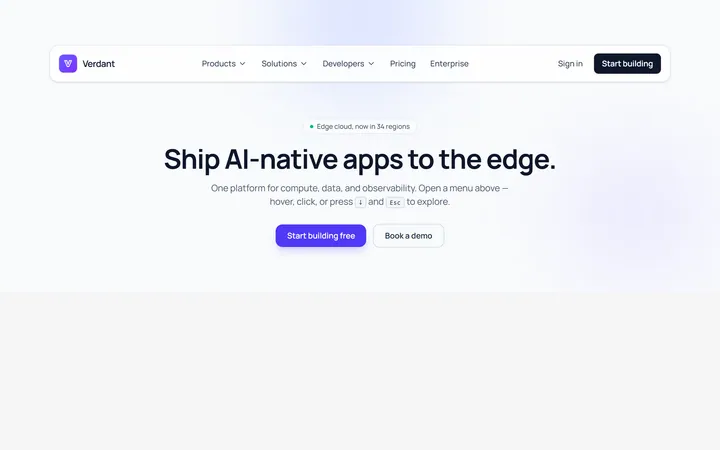
Mega Cols Menu
Originalmulti-column mega menu with featured
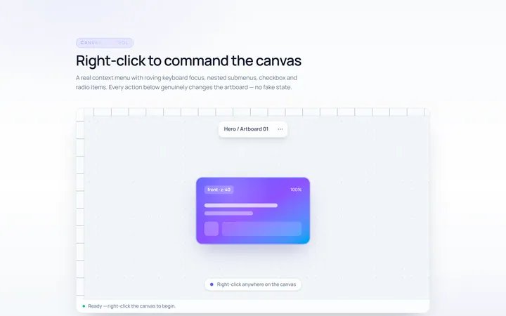
Context Menu
Originalright-click context menu
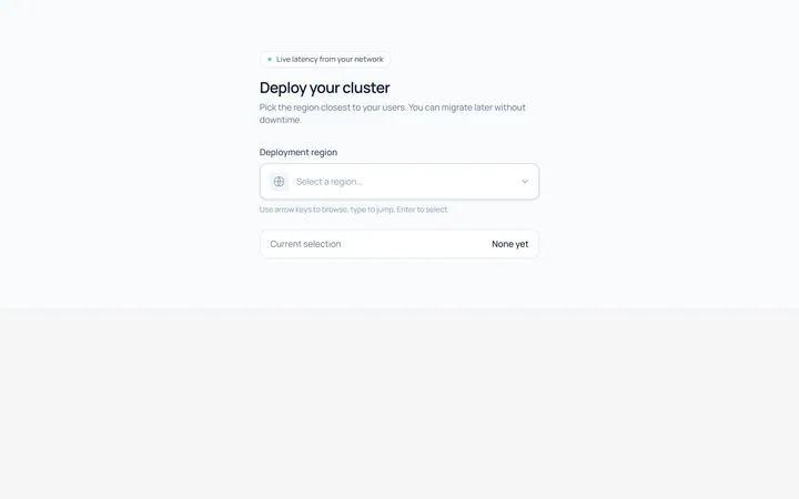
Select Menu
Originalcustom single select dropdown
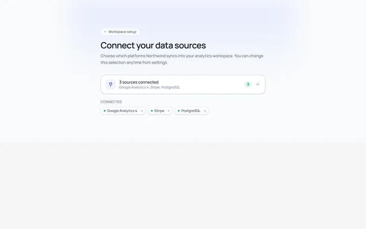
Multiselect Menu
Originalmulti-select with checkable items
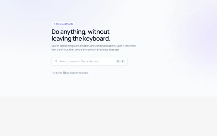
Command Menu
Originalcommand palette style menu with search
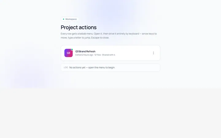
Actions Menu
Originalactions/kebab menu
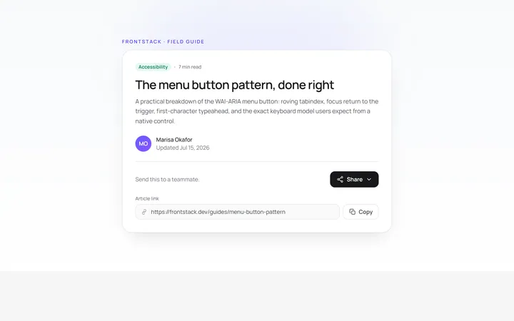
Share Menu
Originalshare menu with options
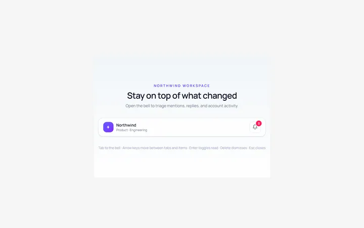
Notifications Menu
Originalnotifications dropdown list