

Notifications Menu
Original · freenotifications dropdown list
byWeb InnoventixReact + Tailwind
menunotificationsmenus
Copy prompt gives Claude Code, Cursor or v0 a ready-to-paste prompt that recreates this exact component.
npx shadcn@latest add https://webinnoventix.com/r/menu-notifications.jsonmenu-notifications.tsx
"use client";
import { useEffect, useId, useMemo, useRef, useState } from "react";
import { AnimatePresence, motion, useReducedMotion } from "motion/react";
/* ---------------------------------- types --------------------------------- */
type NotifType =
| "mention"
| "comment"
| "security"
| "billing"
| "follow"
| "system";
interface Notification {
id: string;
type: NotifType;
actor: string;
isPerson: boolean;
title: string;
body: string;
time: string;
unread: boolean;
}
type FilterId = "all" | "unread" | "mentions";
interface FilterTab {
id: FilterId;
label: string;
}
/* ---------------------------------- icons --------------------------------- */
function BellIcon({ className }: { className?: string }) {
return (
<svg
viewBox="0 0 24 24"
fill="none"
stroke="currentColor"
strokeWidth={1.7}
strokeLinecap="round"
strokeLinejoin="round"
className={className}
aria-hidden="true"
>
<path d="M6 8a6 6 0 0 1 12 0c0 5 1.5 7 2 8H4c.5-1 2-3 2-8Z" />
<path d="M10.3 20a2 2 0 0 0 3.4 0" />
</svg>
);
}
function CheckCheckIcon({ className }: { className?: string }) {
return (
<svg
viewBox="0 0 24 24"
fill="none"
stroke="currentColor"
strokeWidth={1.8}
strokeLinecap="round"
strokeLinejoin="round"
className={className}
aria-hidden="true"
>
<path d="m2 12 4.5 4.5L12 11" />
<path d="m10 16 1.5 1.5L22 7" />
</svg>
);
}
function XIcon({ className }: { className?: string }) {
return (
<svg
viewBox="0 0 24 24"
fill="none"
stroke="currentColor"
strokeWidth={1.9}
strokeLinecap="round"
strokeLinejoin="round"
className={className}
aria-hidden="true"
>
<path d="M18 6 6 18M6 6l12 12" />
</svg>
);
}
function AtIcon({ className }: { className?: string }) {
return (
<svg
viewBox="0 0 24 24"
fill="none"
stroke="currentColor"
strokeWidth={1.8}
strokeLinecap="round"
strokeLinejoin="round"
className={className}
aria-hidden="true"
>
<circle cx="12" cy="12" r="4" />
<path d="M16 8v5a3 3 0 0 0 6 0v-1a10 10 0 1 0-4 8" />
</svg>
);
}
function ChatIcon({ className }: { className?: string }) {
return (
<svg
viewBox="0 0 24 24"
fill="none"
stroke="currentColor"
strokeWidth={1.8}
strokeLinecap="round"
strokeLinejoin="round"
className={className}
aria-hidden="true"
>
<path d="M21 15a2 2 0 0 1-2 2H8l-4 4V5a2 2 0 0 1 2-2h13a2 2 0 0 1 2 2Z" />
</svg>
);
}
function ShieldIcon({ className }: { className?: string }) {
return (
<svg
viewBox="0 0 24 24"
fill="none"
stroke="currentColor"
strokeWidth={1.8}
strokeLinecap="round"
strokeLinejoin="round"
className={className}
aria-hidden="true"
>
<path d="M12 3 5 6v5c0 4.5 3 7.5 7 9 4-1.5 7-4.5 7-9V6Z" />
<path d="m9 12 2 2 4-4" />
</svg>
);
}
function CardIcon({ className }: { className?: string }) {
return (
<svg
viewBox="0 0 24 24"
fill="none"
stroke="currentColor"
strokeWidth={1.8}
strokeLinecap="round"
strokeLinejoin="round"
className={className}
aria-hidden="true"
>
<rect x="2.5" y="5" width="19" height="14" rx="2.5" />
<path d="M2.5 10h19M6 15h4" />
</svg>
);
}
function UserPlusIcon({ className }: { className?: string }) {
return (
<svg
viewBox="0 0 24 24"
fill="none"
stroke="currentColor"
strokeWidth={1.8}
strokeLinecap="round"
strokeLinejoin="round"
className={className}
aria-hidden="true"
>
<circle cx="9" cy="8" r="3.5" />
<path d="M3 20a6 6 0 0 1 12 0" />
<path d="M18 8v6M15 11h6" />
</svg>
);
}
function SparkIcon({ className }: { className?: string }) {
return (
<svg
viewBox="0 0 24 24"
fill="none"
stroke="currentColor"
strokeWidth={1.8}
strokeLinecap="round"
strokeLinejoin="round"
className={className}
aria-hidden="true"
>
<path d="M12 3v4M12 17v4M3 12h4M17 12h4M6 6l2.5 2.5M15.5 15.5 18 18M18 6l-2.5 2.5M8.5 15.5 6 18" />
</svg>
);
}
function InboxIcon({ className }: { className?: string }) {
return (
<svg
viewBox="0 0 24 24"
fill="none"
stroke="currentColor"
strokeWidth={1.6}
strokeLinecap="round"
strokeLinejoin="round"
className={className}
aria-hidden="true"
>
<path d="M4 13h4l1.5 2.5h5L16 13h4" />
<path d="M4 13 6 5h12l2 8v4a2 2 0 0 1-2 2H6a2 2 0 0 1-2-2Z" />
</svg>
);
}
function GearIcon({ className }: { className?: string }) {
return (
<svg
viewBox="0 0 24 24"
fill="none"
stroke="currentColor"
strokeWidth={1.7}
strokeLinecap="round"
strokeLinejoin="round"
className={className}
aria-hidden="true"
>
<circle cx="12" cy="12" r="3" />
<path d="M12 2v3M12 19v3M4.2 4.2l2.1 2.1M17.7 17.7l2.1 2.1M2 12h3M19 12h3M4.2 19.8l2.1-2.1M17.7 6.3l2.1-2.1" />
</svg>
);
}
function BoltIcon({ className }: { className?: string }) {
return (
<svg viewBox="0 0 24 24" fill="currentColor" className={className} aria-hidden="true">
<path d="M13 2 4 14h6l-1 8 9-12h-6Z" />
</svg>
);
}
/* --------------------------------- content -------------------------------- */
const INITIAL_NOTIFICATIONS: Notification[] = [
{
id: "n1",
type: "mention",
actor: "Amara Osei",
isPerson: true,
title: "mentioned you in Q3 launch checklist",
body: "@you can you confirm the analytics events are wired before we ship Thursday?",
time: "4m",
unread: true,
},
{
id: "n2",
type: "comment",
actor: "Devin Park",
isPerson: true,
title: "replied to your comment on PR #482",
body: "Good catch. I refactored the retry logic to use exponential backoff with jitter.",
time: "22m",
unread: true,
},
{
id: "n3",
type: "security",
actor: "Security",
isPerson: false,
title: "New sign-in from Chrome on macOS",
body: "Palo Alto, US · 10:12 AM. If this wasn't you, secure your account now.",
time: "1h",
unread: true,
},
{
id: "n4",
type: "billing",
actor: "Billing",
isPerson: false,
title: "Invoice INV-2043 for June is ready",
body: "$248.00 charged to Visa ending 4471. Receipt available in your workspace.",
time: "3h",
unread: false,
},
{
id: "n5",
type: "follow",
actor: "Lena Fischer",
isPerson: true,
title: "started following your project Northwind",
body: "You now share 3 boards and the release calendar.",
time: "5h",
unread: false,
},
{
id: "n6",
type: "mention",
actor: "Kwame Mensah",
isPerson: true,
title: "mentioned you in #design-review",
body: "The empty state you designed for the inbox is genuinely great work.",
time: "8h",
unread: false,
},
{
id: "n7",
type: "system",
actor: "Northwind CI",
isPerson: false,
title: "Deployment to production succeeded",
body: "Build 1.9.4 is live · 312 checks passing, 0 failed. Rollback available for 24h.",
time: "Yesterday",
unread: false,
},
];
const FILTERS: FilterTab[] = [
{ id: "all", label: "All" },
{ id: "unread", label: "Unread" },
{ id: "mentions", label: "Mentions" },
];
const AVATAR_PALETTE = [
"bg-indigo-100 text-indigo-700 dark:bg-indigo-500/15 dark:text-indigo-300",
"bg-emerald-100 text-emerald-700 dark:bg-emerald-500/15 dark:text-emerald-300",
"bg-rose-100 text-rose-700 dark:bg-rose-500/15 dark:text-rose-300",
"bg-amber-100 text-amber-800 dark:bg-amber-500/15 dark:text-amber-300",
"bg-sky-100 text-sky-700 dark:bg-sky-500/15 dark:text-sky-300",
"bg-violet-100 text-violet-700 dark:bg-violet-500/15 dark:text-violet-300",
];
const TYPE_TILE: Record<NotifType, string> = {
mention: "bg-indigo-100 text-indigo-700 dark:bg-indigo-500/15 dark:text-indigo-300",
comment: "bg-sky-100 text-sky-700 dark:bg-sky-500/15 dark:text-sky-300",
security: "bg-rose-100 text-rose-700 dark:bg-rose-500/15 dark:text-rose-300",
billing: "bg-amber-100 text-amber-800 dark:bg-amber-500/15 dark:text-amber-300",
follow: "bg-emerald-100 text-emerald-700 dark:bg-emerald-500/15 dark:text-emerald-300",
system: "bg-violet-100 text-violet-700 dark:bg-violet-500/15 dark:text-violet-300",
};
const TYPE_BADGE: Record<NotifType, string> = {
mention: "bg-indigo-500 text-white",
comment: "bg-sky-500 text-white",
security: "bg-rose-500 text-white",
billing: "bg-amber-500 text-white",
follow: "bg-emerald-500 text-white",
system: "bg-violet-500 text-white",
};
function typeIcon(type: NotifType, className: string) {
switch (type) {
case "mention":
return <AtIcon className={className} />;
case "comment":
return <ChatIcon className={className} />;
case "security":
return <ShieldIcon className={className} />;
case "billing":
return <CardIcon className={className} />;
case "follow":
return <UserPlusIcon className={className} />;
case "system":
return <SparkIcon className={className} />;
}
}
function initials(name: string): string {
const parts = name.trim().split(/\s+/);
const a = parts[0]?.[0] ?? "";
const b = parts.length > 1 ? parts[parts.length - 1]?.[0] ?? "" : "";
return (a + b).toUpperCase();
}
function paletteFor(name: string): string {
let hash = 0;
for (let i = 0; i < name.length; i += 1) {
hash = (hash * 31 + name.charCodeAt(i)) >>> 0;
}
return AVATAR_PALETTE[hash % AVATAR_PALETTE.length];
}
const EASE: [number, number, number, number] = [0.22, 1, 0.36, 1];
/* -------------------------------- component ------------------------------- */
export default function MenuNotifications() {
const reduce = useReducedMotion();
const uid = useId();
const panelId = `${uid}-panel`;
const headingId = `${uid}-heading`;
const listId = `${uid}-list`;
const [open, setOpen] = useState(false);
const [filter, setFilter] = useState<FilterId>("all");
const [notifications, setNotifications] =
useState<Notification[]>(INITIAL_NOTIFICATIONS);
const [focusedRow, setFocusedRow] = useState(0);
const triggerRef = useRef<HTMLButtonElement | null>(null);
const panelRef = useRef<HTMLDivElement | null>(null);
const tabRefs = useRef<Array<HTMLButtonElement | null>>([]);
const rowRefs = useRef<Array<HTMLButtonElement | null>>([]);
const pendingFocus = useRef<number | null>(null);
const unreadCount = useMemo(
() => notifications.filter((n) => n.unread).length,
[notifications],
);
const mentionsCount = useMemo(
() => notifications.filter((n) => n.type === "mention").length,
[notifications],
);
const visible = useMemo(() => {
if (filter === "unread") return notifications.filter((n) => n.unread);
if (filter === "mentions")
return notifications.filter((n) => n.type === "mention");
return notifications;
}, [notifications, filter]);
const selectedTabIndex = FILTERS.findIndex((f) => f.id === filter);
/* focus first control when opening */
useEffect(() => {
if (!open) return;
setFocusedRow(0);
const raf = requestAnimationFrame(() => {
tabRefs.current[selectedTabIndex]?.focus();
});
return () => cancelAnimationFrame(raf);
}, [open, selectedTabIndex]);
/* reset roving row focus when the filter changes */
useEffect(() => {
setFocusedRow(0);
}, [filter]);
/* restore focus to a sensible row after a dismissal */
useEffect(() => {
if (pendingFocus.current === null) return;
const target = Math.max(0, Math.min(pendingFocus.current, visible.length - 1));
pendingFocus.current = null;
if (visible.length > 0) {
setFocusedRow(target);
rowRefs.current[target]?.focus();
} else {
panelRef.current?.focus();
}
}, [visible.length]);
/* close on outside pointer */
useEffect(() => {
if (!open) return;
function onPointerDown(event: PointerEvent) {
const target = event.target as Node;
if (panelRef.current?.contains(target)) return;
if (triggerRef.current?.contains(target)) return;
setOpen(false);
}
document.addEventListener("pointerdown", onPointerDown);
return () => document.removeEventListener("pointerdown", onPointerDown);
}, [open]);
function closeAndRestore() {
setOpen(false);
triggerRef.current?.focus();
}
function onPanelKeyDown(event: React.KeyboardEvent<HTMLDivElement>) {
if (event.key === "Escape") {
event.preventDefault();
closeAndRestore();
}
}
function onTabKeyDown(
event: React.KeyboardEvent<HTMLButtonElement>,
index: number,
) {
const count = FILTERS.length;
let next = index;
if (event.key === "ArrowRight") next = (index + 1) % count;
else if (event.key === "ArrowLeft") next = (index - 1 + count) % count;
else if (event.key === "Home") next = 0;
else if (event.key === "End") next = count - 1;
else return;
event.preventDefault();
setFilter(FILTERS[next].id);
tabRefs.current[next]?.focus();
}
function focusRow(index: number) {
setFocusedRow(index);
rowRefs.current[index]?.focus();
}
function onRowKeyDown(
event: React.KeyboardEvent<HTMLButtonElement>,
index: number,
id: string,
) {
const count = visible.length;
if (count === 0) return;
if (event.key === "ArrowDown") {
event.preventDefault();
focusRow((index + 1) % count);
} else if (event.key === "ArrowUp") {
event.preventDefault();
focusRow((index - 1 + count) % count);
} else if (event.key === "Home") {
event.preventDefault();
focusRow(0);
} else if (event.key === "End") {
event.preventDefault();
focusRow(count - 1);
} else if (event.key === "Delete" || event.key === "Backspace") {
event.preventDefault();
dismiss(id, index);
}
}
function toggleRead(id: string) {
setNotifications((prev) =>
prev.map((n) => (n.id === id ? { ...n, unread: !n.unread } : n)),
);
}
function dismiss(id: string, index: number) {
pendingFocus.current = index;
setNotifications((prev) => prev.filter((n) => n.id !== id));
}
function markAllRead() {
setNotifications((prev) => prev.map((n) => ({ ...n, unread: false })));
}
const panelMotion = {
initial: reduce
? { opacity: 0 }
: { opacity: 0, y: -8, scale: 0.97 },
animate: reduce ? { opacity: 1 } : { opacity: 1, y: 0, scale: 1 },
exit: reduce ? { opacity: 0 } : { opacity: 0, y: -8, scale: 0.97 },
transition: { duration: reduce ? 0.12 : 0.2, ease: EASE },
};
return (
<section className="relative w-full overflow-hidden bg-gradient-to-b from-slate-100 to-white px-4 py-16 text-slate-900 dark:from-slate-950 dark:to-zinc-900 dark:text-slate-100 sm:py-24">
<style>{`
@keyframes mnfPulse { 0%,100%{opacity:1;transform:scale(1)} 50%{opacity:.5;transform:scale(.78)} }
@keyframes mnfPop { 0%{transform:scale(0);opacity:0} 60%{transform:scale(1.2)} 100%{transform:scale(1);opacity:1} }
.mnf-pulse{ animation: mnfPulse 2.2s ease-in-out infinite; }
.mnf-pop{ animation: mnfPop .32s cubic-bezier(.22,1,.36,1); }
@media (prefers-reduced-motion: reduce){
.mnf-pulse,.mnf-pop{ animation: none !important; }
}
`}</style>
<div className="mx-auto flex w-full max-w-2xl flex-col items-center gap-8">
<header className="text-center">
<p className="text-xs font-semibold uppercase tracking-[0.22em] text-indigo-600 dark:text-indigo-400">
Northwind Workspace
</p>
<h2 className="mt-2 text-2xl font-semibold tracking-tight sm:text-3xl">
Stay on top of what changed
</h2>
<p className="mt-2 text-sm text-slate-500 dark:text-slate-400">
Open the bell to triage mentions, replies, and account activity.
</p>
</header>
{/* App toolbar that anchors the dropdown */}
<div className="relative w-full rounded-2xl border border-slate-200 bg-white/80 px-4 py-3 shadow-sm backdrop-blur dark:border-slate-800 dark:bg-slate-900/70">
<div className="flex items-center justify-between gap-3">
<div className="flex items-center gap-2.5">
<span className="grid h-9 w-9 place-items-center rounded-xl bg-gradient-to-br from-indigo-500 to-violet-600 text-white shadow-sm">
<BoltIcon className="h-4 w-4" />
</span>
<div className="leading-tight">
<p className="text-sm font-semibold">Northwind</p>
<p className="text-[11px] text-slate-500 dark:text-slate-400">
Product · Engineering
</p>
</div>
</div>
<div className="relative">
<button
ref={triggerRef}
type="button"
onClick={() => setOpen((v) => !v)}
aria-haspopup="dialog"
aria-expanded={open}
aria-controls={panelId}
aria-label={
unreadCount > 0
? `Notifications, ${unreadCount} unread`
: "Notifications"
}
className="relative grid h-10 w-10 place-items-center rounded-xl border border-slate-200 bg-white text-slate-600 outline-none transition hover:bg-slate-50 hover:text-slate-900 focus-visible:ring-2 focus-visible:ring-indigo-500 focus-visible:ring-offset-2 focus-visible:ring-offset-white dark:border-slate-700 dark:bg-slate-800 dark:text-slate-300 dark:hover:bg-slate-700 dark:hover:text-white dark:focus-visible:ring-offset-slate-900"
>
<BellIcon className="h-5 w-5" />
{unreadCount > 0 && (
<span
key={unreadCount}
className="mnf-pop absolute -right-1 -top-1 grid h-5 min-w-5 place-items-center rounded-full bg-rose-500 px-1 text-[10px] font-bold leading-none text-white ring-2 ring-white dark:ring-slate-900"
>
{unreadCount > 9 ? "9+" : unreadCount}
</span>
)}
</button>
<AnimatePresence>
{open && (
<motion.div
key="panel"
ref={panelRef}
id={panelId}
role="dialog"
aria-labelledby={headingId}
tabIndex={-1}
onKeyDown={onPanelKeyDown}
initial={panelMotion.initial}
animate={panelMotion.animate}
exit={panelMotion.exit}
transition={panelMotion.transition}
style={{ transformOrigin: "top right" }}
className="absolute right-0 top-[calc(100%+0.6rem)] z-20 flex max-h-[30rem] w-[22rem] flex-col overflow-hidden rounded-2xl border border-slate-200 bg-white text-left shadow-2xl shadow-slate-900/10 outline-none dark:border-slate-700 dark:bg-slate-900 dark:shadow-black/40 sm:w-[24rem]"
>
{/* header */}
<div className="flex items-center justify-between gap-2 border-b border-slate-100 px-4 pb-3 pt-3.5 dark:border-slate-800">
<div className="flex items-center gap-2">
<h3
id={headingId}
className="text-sm font-semibold text-slate-900 dark:text-white"
>
Notifications
</h3>
{unreadCount > 0 && (
<span className="rounded-full bg-indigo-100 px-2 py-0.5 text-[11px] font-semibold text-indigo-700 dark:bg-indigo-500/15 dark:text-indigo-300">
{unreadCount} new
</span>
)}
</div>
<button
type="button"
onClick={markAllRead}
disabled={unreadCount === 0}
className="inline-flex items-center gap-1.5 rounded-lg px-2 py-1 text-xs font-medium text-indigo-600 outline-none transition hover:bg-indigo-50 focus-visible:ring-2 focus-visible:ring-indigo-500 disabled:cursor-not-allowed disabled:text-slate-400 disabled:hover:bg-transparent dark:text-indigo-300 dark:hover:bg-indigo-500/10 dark:disabled:text-slate-600"
>
<CheckCheckIcon className="h-3.5 w-3.5" />
Mark all read
</button>
</div>
{/* filter tabs */}
<div
role="tablist"
aria-label="Filter notifications"
className="flex gap-1 border-b border-slate-100 px-3 py-2 dark:border-slate-800"
>
{FILTERS.map((tab, index) => {
const active = tab.id === filter;
const count =
tab.id === "unread"
? unreadCount
: tab.id === "mentions"
? mentionsCount
: notifications.length;
return (
<button
key={tab.id}
ref={(el) => {
tabRefs.current[index] = el;
}}
role="tab"
id={`${uid}-tab-${tab.id}`}
aria-selected={active}
aria-controls={listId}
tabIndex={active ? 0 : -1}
onClick={() => setFilter(tab.id)}
onKeyDown={(e) => onTabKeyDown(e, index)}
className={`inline-flex items-center gap-1.5 rounded-lg px-3 py-1.5 text-xs font-medium outline-none transition focus-visible:ring-2 focus-visible:ring-indigo-500 ${
active
? "bg-slate-900 text-white dark:bg-white dark:text-slate-900"
: "text-slate-500 hover:bg-slate-100 hover:text-slate-800 dark:text-slate-400 dark:hover:bg-slate-800 dark:hover:text-slate-200"
}`}
>
{tab.label}
<span
className={`rounded-full px-1.5 text-[10px] font-semibold leading-tight ${
active
? "bg-white/20 text-white dark:bg-slate-900/15 dark:text-slate-900"
: "bg-slate-200 text-slate-600 dark:bg-slate-700 dark:text-slate-300"
}`}
>
{count}
</span>
</button>
);
})}
</div>
{/* list */}
<div
id={listId}
role="tabpanel"
aria-labelledby={`${uid}-tab-${filter}`}
className="min-h-0 flex-1 overflow-y-auto overscroll-contain"
>
{visible.length === 0 ? (
<div className="flex flex-col items-center gap-2 px-6 py-12 text-center">
<span className="grid h-12 w-12 place-items-center rounded-full bg-emerald-100 text-emerald-600 dark:bg-emerald-500/15 dark:text-emerald-300">
<InboxIcon className="h-6 w-6" />
</span>
<p className="text-sm font-semibold text-slate-800 dark:text-slate-200">
You're all caught up
</p>
<p className="text-xs text-slate-500 dark:text-slate-400">
No {filter === "all" ? "" : `${filter} `}notifications
to show right now.
</p>
</div>
) : (
<ul className="divide-y divide-slate-100 dark:divide-slate-800">
<AnimatePresence initial={false}>
{visible.map((n, index) => (
<motion.li
key={n.id}
layout={!reduce}
initial={false}
exit={
reduce
? { opacity: 0 }
: { opacity: 0, x: 24, height: 0 }
}
transition={{ duration: reduce ? 0.1 : 0.22, ease: EASE }}
className="relative"
>
<button
ref={(el) => {
rowRefs.current[index] = el;
}}
type="button"
tabIndex={index === focusedRow ? 0 : -1}
onFocus={() => setFocusedRow(index)}
onClick={() => toggleRead(n.id)}
onKeyDown={(e) => onRowKeyDown(e, index, n.id)}
aria-label={`${n.actor} ${n.title}. ${n.time} ago. ${
n.unread ? "Unread." : "Read."
} Enter to mark ${
n.unread ? "read" : "unread"
}, Delete to dismiss.`}
className={`group flex w-full items-start gap-3 px-4 py-3 pr-10 text-left outline-none transition focus-visible:bg-indigo-50 focus-visible:ring-2 focus-visible:ring-inset focus-visible:ring-indigo-500 dark:focus-visible:bg-indigo-500/10 ${
n.unread
? "bg-indigo-50/50 hover:bg-indigo-50 dark:bg-indigo-500/[0.06] dark:hover:bg-indigo-500/10"
: "hover:bg-slate-50 dark:hover:bg-slate-800/60"
}`}
>
{/* avatar / tile with type badge */}
<span className="relative shrink-0">
<span
className={`grid h-10 w-10 place-items-center rounded-xl text-sm font-semibold ${
n.isPerson
? paletteFor(n.actor)
: TYPE_TILE[n.type]
}`}
>
{n.isPerson
? initials(n.actor)
: typeIcon(n.type, "h-5 w-5")}
</span>
{n.isPerson && (
<span
className={`absolute -bottom-1 -right-1 grid h-4 w-4 place-items-center rounded-full ring-2 ring-white dark:ring-slate-900 ${TYPE_BADGE[n.type]}`}
>
{typeIcon(n.type, "h-2.5 w-2.5")}
</span>
)}
</span>
{/* text */}
<span className="min-w-0 flex-1">
<span className="block text-sm leading-snug text-slate-700 dark:text-slate-300">
<span className="font-semibold text-slate-900 dark:text-white">
{n.actor}
</span>{" "}
{n.title}
</span>
<span className="mt-0.5 block truncate text-xs text-slate-500 dark:text-slate-400">
{n.body}
</span>
<span className="mt-1 block text-[11px] font-medium text-slate-400 dark:text-slate-500">
{n.time} ago
</span>
</span>
{/* unread dot */}
{n.unread && (
<span
aria-hidden="true"
className="mnf-pulse mt-1.5 h-2 w-2 shrink-0 rounded-full bg-indigo-500 dark:bg-indigo-400"
/>
)}
</button>
{/* dismiss (pointer affordance; keyboard uses Delete) */}
<button
type="button"
tabIndex={-1}
onClick={() => dismiss(n.id, index)}
aria-label={`Dismiss notification from ${n.actor}`}
className="absolute right-2 top-2.5 grid h-7 w-7 place-items-center rounded-lg text-slate-400 opacity-0 outline-none transition hover:bg-slate-200 hover:text-slate-700 focus-visible:opacity-100 focus-visible:ring-2 focus-visible:ring-indigo-500 group-hover:opacity-100 dark:hover:bg-slate-700 dark:hover:text-slate-200"
>
<XIcon className="h-4 w-4" />
</button>
</motion.li>
))}
</AnimatePresence>
</ul>
)}
</div>
{/* footer */}
<div className="flex items-center justify-between gap-2 border-t border-slate-100 px-3 py-2.5 dark:border-slate-800">
<button
type="button"
className="inline-flex items-center gap-1.5 rounded-lg px-2 py-1 text-xs font-medium text-slate-500 outline-none transition hover:bg-slate-100 hover:text-slate-800 focus-visible:ring-2 focus-visible:ring-indigo-500 dark:text-slate-400 dark:hover:bg-slate-800 dark:hover:text-slate-200"
>
<GearIcon className="h-3.5 w-3.5" />
Settings
</button>
<button
type="button"
onClick={closeAndRestore}
className="rounded-lg px-2.5 py-1 text-xs font-semibold text-indigo-600 outline-none transition hover:bg-indigo-50 focus-visible:ring-2 focus-visible:ring-indigo-500 dark:text-indigo-300 dark:hover:bg-indigo-500/10"
>
View all notifications
</button>
</div>
</motion.div>
)}
</AnimatePresence>
</div>
</div>
</div>
<p className="text-center text-xs text-slate-400 dark:text-slate-500">
Tab to the bell · Arrow keys move between tabs and items · Enter toggles
read · Delete dismisses · Esc closes
</p>
</div>
</section>
);
}Dependencies
motion
Licence
Built by Web Innoventix. Free for personal and commercial use, no attribution required.
Built by Web Innoventix
Need a custom interface, a full website, or SEO that gets you cited by AI? We design, build and rank it end to end.
Get a free quoteSimilar components
Browse all →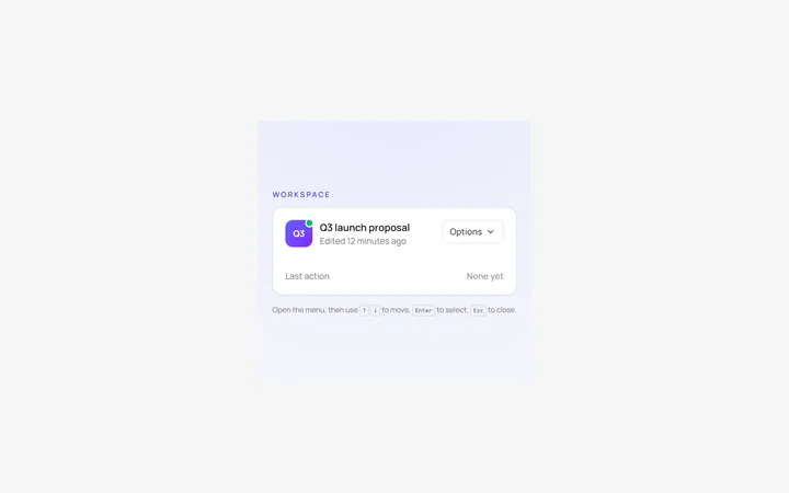
Dropdown Menu
Originalbasic dropdown menu with items
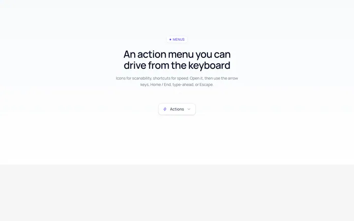
Dropdown Icons Menu
Originaldropdown with icons and shortcuts
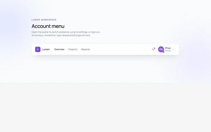
User Menu
Originaluser account dropdown with avatar
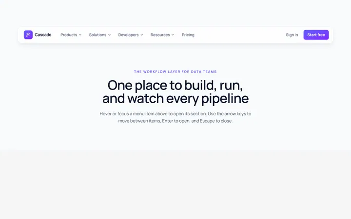
Mega Menu
Originalmega menu with grouped links
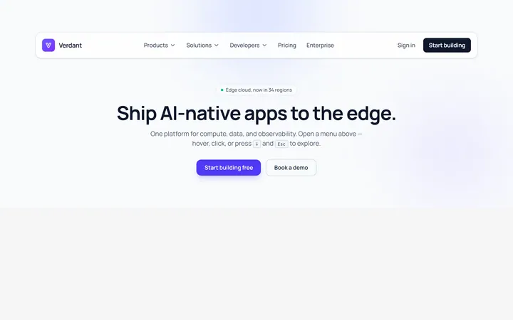
Mega Cols Menu
Originalmulti-column mega menu with featured
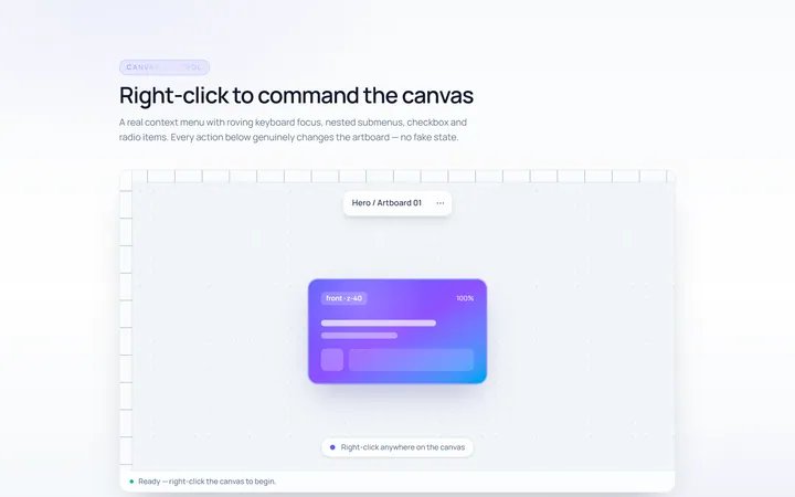
Context Menu
Originalright-click context menu
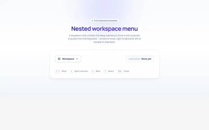
Nested Menu
Originaldropdown with nested submenus
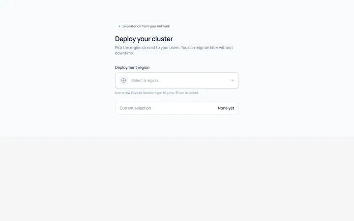
Select Menu
Originalcustom single select dropdown
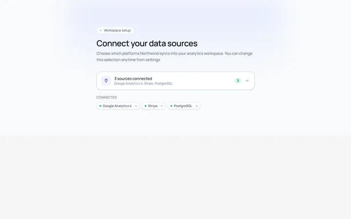
Multiselect Menu
Originalmulti-select with checkable items
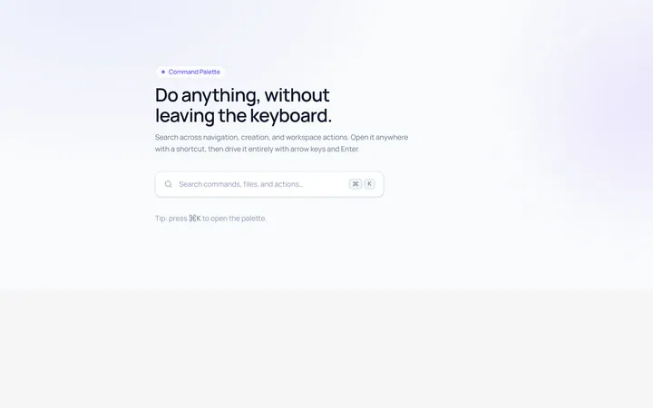
Command Menu
Originalcommand palette style menu with search
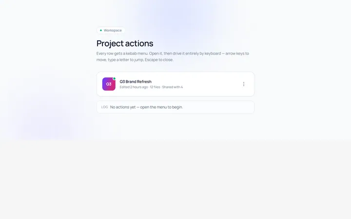
Actions Menu
Originalactions/kebab menu
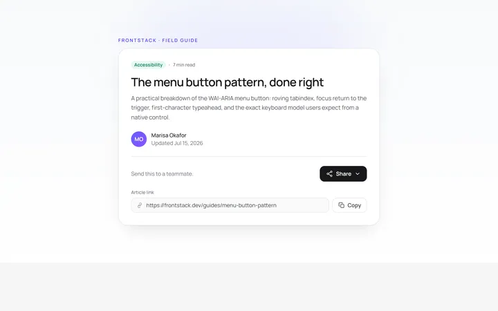
Share Menu
Originalshare menu with options