

Profile Card Menu
Original · freeprofile card dropdown with actions
byWeb InnoventixReact + Tailwind
menuprofilecardmenus
Copy prompt gives Claude Code, Cursor or v0 a ready-to-paste prompt that recreates this exact component.
npx shadcn@latest add https://webinnoventix.com/r/menu-profile-card.jsonmenu-profile-card.tsx
"use client";
import {
useState,
useRef,
useEffect,
useCallback,
useId,
type ReactNode,
type KeyboardEvent as ReactKeyboardEvent,
} from "react";
import { motion, AnimatePresence, useReducedMotion } from "motion/react";
type IconProps = { className?: string };
type StatusId = "active" | "away" | "dnd";
type StatusOption = {
id: StatusId;
label: string;
hint: string;
dotClass: string;
};
type ActionItem = {
id: string;
label: string;
description?: string;
shortcut?: string;
badge?: string;
badgeClass?: string;
icon: (p: IconProps) => ReactNode;
};
const USER = {
name: "Jordan Avery",
email: "jordan@northwind.studio",
initials: "JA",
role: "Product Designer",
plan: "Pro",
storageUsed: "6.2 GB",
storageTotal: "10 GB",
storagePct: 62,
};
const STATUS_OPTIONS: StatusOption[] = [
{ id: "active", label: "Active", hint: "Open to messages", dotClass: "bg-emerald-500" },
{ id: "away", label: "Away", hint: "Back in a little while", dotClass: "bg-amber-500" },
{ id: "dnd", label: "Do not disturb", hint: "Notifications muted", dotClass: "bg-rose-500" },
];
const STATUS_DOT: Record<StatusId, string> = {
active: "bg-emerald-500",
away: "bg-amber-500",
dnd: "bg-rose-500",
};
function UserIcon({ className }: IconProps) {
return (
<svg viewBox="0 0 24 24" fill="none" stroke="currentColor" strokeWidth={1.7} strokeLinecap="round" strokeLinejoin="round" className={className} aria-hidden="true">
<path d="M20 21v-2a4 4 0 0 0-4-4H8a4 4 0 0 0-4 4v2" />
<circle cx="12" cy="7" r="4" />
</svg>
);
}
function SettingsIcon({ className }: IconProps) {
return (
<svg viewBox="0 0 24 24" fill="none" stroke="currentColor" strokeWidth={1.7} strokeLinecap="round" strokeLinejoin="round" className={className} aria-hidden="true">
<circle cx="12" cy="12" r="3" />
<path d="M12 2v3M12 19v3M2 12h3M19 12h3M4.9 4.9l2.1 2.1M17 17l2.1 2.1M19.1 4.9 17 7M7 17l-2.1 2.1" />
</svg>
);
}
function CreditCardIcon({ className }: IconProps) {
return (
<svg viewBox="0 0 24 24" fill="none" stroke="currentColor" strokeWidth={1.7} strokeLinecap="round" strokeLinejoin="round" className={className} aria-hidden="true">
<rect x="2" y="5" width="20" height="14" rx="2.5" />
<path d="M2 10h20M6 15h4" />
</svg>
);
}
function BellIcon({ className }: IconProps) {
return (
<svg viewBox="0 0 24 24" fill="none" stroke="currentColor" strokeWidth={1.7} strokeLinecap="round" strokeLinejoin="round" className={className} aria-hidden="true">
<path d="M18 8a6 6 0 0 0-12 0c0 7-3 9-3 9h18s-3-2-3-9" />
<path d="M13.7 21a2 2 0 0 1-3.4 0" />
</svg>
);
}
function CommandIcon({ className }: IconProps) {
return (
<svg viewBox="0 0 24 24" fill="none" stroke="currentColor" strokeWidth={1.7} strokeLinecap="round" strokeLinejoin="round" className={className} aria-hidden="true">
<path d="M18 3a3 3 0 0 0-3 3v12a3 3 0 0 0 3 3 3 3 0 0 0 3-3 3 3 0 0 0-3-3H6a3 3 0 0 0-3 3 3 3 0 0 0 3 3 3 3 0 0 0 3-3V6a3 3 0 0 0-3-3 3 3 0 0 0-3 3 3 3 0 0 0 3 3h12a3 3 0 0 0 3-3 3 3 0 0 0-3-3Z" />
</svg>
);
}
function LifeBuoyIcon({ className }: IconProps) {
return (
<svg viewBox="0 0 24 24" fill="none" stroke="currentColor" strokeWidth={1.7} strokeLinecap="round" strokeLinejoin="round" className={className} aria-hidden="true">
<circle cx="12" cy="12" r="9" />
<circle cx="12" cy="12" r="3.5" />
<path d="M4.9 4.9 9.5 9.5M14.5 14.5l4.6 4.6M14.5 9.5l4.6-4.6M4.9 19.1 9.5 14.5" />
</svg>
);
}
function LogOutIcon({ className }: IconProps) {
return (
<svg viewBox="0 0 24 24" fill="none" stroke="currentColor" strokeWidth={1.7} strokeLinecap="round" strokeLinejoin="round" className={className} aria-hidden="true">
<path d="M9 21H5a2 2 0 0 1-2-2V5a2 2 0 0 1 2-2h4" />
<path d="m16 17 5-5-5-5M21 12H9" />
</svg>
);
}
function ChevronIcon({ className }: IconProps) {
return (
<svg viewBox="0 0 24 24" fill="none" stroke="currentColor" strokeWidth={2} strokeLinecap="round" strokeLinejoin="round" className={className} aria-hidden="true">
<path d="m6 9 6 6 6-6" />
</svg>
);
}
function CheckIcon({ className }: IconProps) {
return (
<svg viewBox="0 0 24 24" fill="none" stroke="currentColor" strokeWidth={2.2} strokeLinecap="round" strokeLinejoin="round" className={className} aria-hidden="true">
<path d="M20 6 9 17l-5-5" />
</svg>
);
}
const ACTIONS: ActionItem[] = [
{ id: "profile", label: "View profile", description: "Your public page", icon: UserIcon },
{ id: "settings", label: "Account settings", shortcut: "⌘,", icon: SettingsIcon },
{
id: "billing",
label: "Billing & plans",
badge: "Pro",
badgeClass:
"bg-indigo-100 text-indigo-700 dark:bg-indigo-500/15 dark:text-indigo-300",
icon: CreditCardIcon,
},
{
id: "notifications",
label: "Notifications",
badge: "3",
badgeClass: "bg-rose-100 text-rose-700 dark:bg-rose-500/15 dark:text-rose-300",
icon: BellIcon,
},
{ id: "command", label: "Command menu", shortcut: "⌘K", icon: CommandIcon },
{ id: "help", label: "Help & support", icon: LifeBuoyIcon },
];
const STATUS_COUNT = STATUS_OPTIONS.length;
const ACTIONS_OFFSET = STATUS_COUNT;
const SIGN_OUT_INDEX = STATUS_COUNT + ACTIONS.length;
const FOCUSABLE_COUNT = SIGN_OUT_INDEX + 1;
function itemClass(active: boolean): string {
return [
"group/item flex w-full items-center gap-3 rounded-xl px-2.5 py-2 text-left text-sm outline-none transition-colors duration-150",
"focus-visible:ring-2 focus-visible:ring-inset focus-visible:ring-indigo-500",
active
? "bg-slate-100 text-slate-900 dark:bg-slate-800 dark:text-white"
: "text-slate-700 hover:bg-slate-100 dark:text-slate-300 dark:hover:bg-slate-800/70",
].join(" ");
}
export default function MenuProfileCard() {
const reduce = useReducedMotion();
const uid = useId();
const triggerId = `${uid}-trigger`;
const menuId = `${uid}-menu`;
const statusLabelId = `${uid}-status-label`;
const [isOpen, setIsOpen] = useState(false);
const [status, setStatus] = useState<StatusId>("active");
const [activeIndex, setActiveIndex] = useState(0);
const [liveMessage, setLiveMessage] = useState("");
const triggerRef = useRef<HTMLButtonElement | null>(null);
const menuRef = useRef<HTMLDivElement | null>(null);
const itemRefs = useRef<(HTMLButtonElement | null)[]>([]);
const setItemRef = (i: number) => (el: HTMLButtonElement | null) => {
itemRefs.current[i] = el;
};
const closeMenu = useCallback((returnFocus: boolean) => {
setIsOpen(false);
if (returnFocus) triggerRef.current?.focus();
}, []);
const openMenu = useCallback(() => {
const idx = STATUS_OPTIONS.findIndex((s) => s.id === status);
setActiveIndex(idx < 0 ? 0 : idx);
setIsOpen(true);
}, [status]);
const toggle = () => {
if (isOpen) closeMenu(false);
else openMenu();
};
// Roving focus: move focus to the active item while the menu is open.
useEffect(() => {
if (!isOpen) return;
itemRefs.current[activeIndex]?.focus();
}, [isOpen, activeIndex]);
// Close on outside pointer interaction.
useEffect(() => {
if (!isOpen) return;
const onPointerDown = (e: PointerEvent) => {
const target = e.target as Node;
if (menuRef.current?.contains(target)) return;
if (triggerRef.current?.contains(target)) return;
setIsOpen(false);
};
document.addEventListener("pointerdown", onPointerDown);
return () => document.removeEventListener("pointerdown", onPointerDown);
}, [isOpen]);
const onMenuKeyDown = (e: ReactKeyboardEvent<HTMLDivElement>) => {
switch (e.key) {
case "ArrowDown":
e.preventDefault();
setActiveIndex((i) => (i + 1) % FOCUSABLE_COUNT);
break;
case "ArrowUp":
e.preventDefault();
setActiveIndex((i) => (i - 1 + FOCUSABLE_COUNT) % FOCUSABLE_COUNT);
break;
case "Home":
e.preventDefault();
setActiveIndex(0);
break;
case "End":
e.preventDefault();
setActiveIndex(FOCUSABLE_COUNT - 1);
break;
case "Escape":
e.preventDefault();
closeMenu(true);
break;
case "Tab":
closeMenu(false);
break;
default:
break;
}
};
const selectStatus = (option: StatusOption, index: number) => {
setStatus(option.id);
setActiveIndex(index);
setLiveMessage(`Status set to ${option.label}`);
// Menu stays open so multiple adjustments feel natural.
};
const selectAction = (label: string) => {
setLiveMessage(`${label} selected`);
closeMenu(true);
};
return (
<section className="relative w-full overflow-hidden bg-slate-50 px-4 py-16 dark:bg-slate-950 sm:py-24">
<style>{`
@keyframes mpc-pulse-ring {
0% { transform: scale(1); opacity: 0.55; }
70% { transform: scale(2.4); opacity: 0; }
100% { transform: scale(2.4); opacity: 0; }
}
@keyframes mpc-shimmer {
0% { transform: translateX(-140%); }
100% { transform: translateX(260%); }
}
.mpc-pulse-ring { animation: mpc-pulse-ring 2.6s ease-out infinite; }
.mpc-shimmer { animation: mpc-shimmer 2.4s ease-in-out infinite; }
@media (prefers-reduced-motion: reduce) {
.mpc-pulse-ring, .mpc-shimmer { animation: none !important; }
}
`}</style>
{/* Ambient decoration */}
<div aria-hidden="true" className="pointer-events-none absolute inset-0 overflow-hidden">
<div className="absolute -left-24 -top-24 h-72 w-72 rounded-full bg-indigo-400/20 blur-3xl dark:bg-indigo-500/10" />
<div className="absolute -right-16 top-1/3 h-72 w-72 rounded-full bg-violet-400/20 blur-3xl dark:bg-violet-500/10" />
</div>
<div className="relative mx-auto max-w-3xl">
<p className="text-xs font-semibold uppercase tracking-[0.22em] text-indigo-600 dark:text-indigo-400">
Account menu
</p>
<h2 className="mt-2 text-2xl font-semibold tracking-tight text-slate-900 dark:text-white sm:text-3xl">
Your workspace, one tap away
</h2>
<p className="mt-2 max-w-xl text-sm leading-relaxed text-slate-600 dark:text-slate-400">
Open the profile card to set your status and jump to any account action. Fully
keyboard-driven — try{" "}
<kbd className="rounded border border-slate-300 bg-white px-1.5 py-0.5 text-[11px] font-medium text-slate-600 dark:border-slate-600 dark:bg-slate-800 dark:text-slate-300">
↑ ↓
</kbd>
,{" "}
<kbd className="rounded border border-slate-300 bg-white px-1.5 py-0.5 text-[11px] font-medium text-slate-600 dark:border-slate-600 dark:bg-slate-800 dark:text-slate-300">
Home
</kbd>
, and{" "}
<kbd className="rounded border border-slate-300 bg-white px-1.5 py-0.5 text-[11px] font-medium text-slate-600 dark:border-slate-600 dark:bg-slate-800 dark:text-slate-300">
Esc
</kbd>
.
</p>
{/* App-bar mock that anchors the menu */}
<div className="mt-8 flex items-center justify-between rounded-2xl border border-slate-200 bg-white/80 px-4 py-3 backdrop-blur-sm dark:border-slate-800 dark:bg-slate-900/70">
<div className="flex items-center gap-2.5">
<span className="flex h-8 w-8 items-center justify-center rounded-lg bg-gradient-to-br from-indigo-500 via-violet-500 to-sky-500 text-sm font-bold text-white shadow-sm">
N
</span>
<span className="text-sm font-semibold tracking-tight text-slate-900 dark:text-white">
Northwind
</span>
</div>
{/* Trigger + dropdown wrapper */}
<div className="relative">
<button
ref={triggerRef}
type="button"
id={triggerId}
aria-haspopup="menu"
aria-expanded={isOpen}
aria-controls={isOpen ? menuId : undefined}
aria-label={`Account menu for ${USER.name}`}
onClick={toggle}
className="flex items-center gap-2 rounded-full border border-slate-200 bg-white py-1 pl-1 pr-2.5 transition-colors hover:bg-slate-50 focus-visible:outline-none focus-visible:ring-2 focus-visible:ring-indigo-500 focus-visible:ring-offset-2 focus-visible:ring-offset-white dark:border-slate-700 dark:bg-slate-800 dark:hover:bg-slate-700/70 dark:focus-visible:ring-offset-slate-900"
>
<span className="relative">
<span className="flex h-8 w-8 items-center justify-center rounded-full bg-gradient-to-br from-indigo-500 via-violet-500 to-sky-500 text-xs font-bold text-white">
{USER.initials}
</span>
<span className="absolute -bottom-0.5 -right-0.5 flex h-3 w-3 items-center justify-center">
{status === "active" && !reduce && (
<span className="mpc-pulse-ring absolute h-2.5 w-2.5 rounded-full bg-emerald-500" />
)}
<span
className={`relative h-3 w-3 rounded-full ring-2 ring-white dark:ring-slate-800 ${STATUS_DOT[status]}`}
/>
</span>
</span>
<span className="hidden text-left sm:block">
<span className="block text-xs font-semibold leading-tight text-slate-900 dark:text-white">
{USER.name}
</span>
<span className="block text-[11px] leading-tight text-slate-500 dark:text-slate-400">
{USER.plan} plan
</span>
</span>
<ChevronIcon
className={`h-4 w-4 text-slate-400 transition-transform duration-200 ${
isOpen ? "rotate-180" : ""
}`}
/>
</button>
<AnimatePresence>
{isOpen && (
<motion.div
ref={menuRef}
id={menuId}
role="menu"
aria-labelledby={triggerId}
aria-orientation="vertical"
onKeyDown={onMenuKeyDown}
initial={{ opacity: 0, scale: reduce ? 1 : 0.96, y: reduce ? 0 : -6 }}
animate={{ opacity: 1, scale: 1, y: 0 }}
exit={{ opacity: 0, scale: reduce ? 1 : 0.97, y: reduce ? 0 : -6 }}
transition={{ duration: reduce ? 0.12 : 0.18, ease: [0.16, 1, 0.3, 1] }}
className="absolute right-0 top-full z-50 mt-2 w-72 max-w-[calc(100vw-2rem)] origin-top-right overflow-hidden rounded-2xl border border-slate-200 bg-white shadow-xl shadow-slate-900/10 dark:border-slate-700/80 dark:bg-slate-900 dark:shadow-black/50 sm:w-80"
>
{/* Profile header */}
<div className="flex items-center gap-3 px-4 pb-3 pt-4">
<span className="relative shrink-0">
<span className="flex h-12 w-12 items-center justify-center rounded-full bg-gradient-to-br from-indigo-500 via-violet-500 to-sky-500 text-base font-bold text-white shadow-inner">
{USER.initials}
</span>
<span
className={`absolute -bottom-0.5 -right-0.5 h-3.5 w-3.5 rounded-full ring-2 ring-white dark:ring-slate-900 ${STATUS_DOT[status]}`}
/>
</span>
<div className="min-w-0 flex-1">
<div className="flex items-center gap-1.5">
<p className="truncate text-sm font-semibold text-slate-900 dark:text-white">
{USER.name}
</p>
<span className="shrink-0 rounded-full bg-indigo-100 px-1.5 py-0.5 text-[10px] font-semibold uppercase tracking-wide text-indigo-700 dark:bg-indigo-500/15 dark:text-indigo-300">
{USER.plan}
</span>
</div>
<p className="truncate text-xs text-slate-500 dark:text-slate-400">
{USER.email}
</p>
</div>
</div>
{/* Storage meter */}
<div className="px-4 pb-3">
<div className="mb-1.5 flex items-center justify-between text-[11px] font-medium">
<span className="text-slate-500 dark:text-slate-400">Storage</span>
<span className="tabular-nums text-slate-600 dark:text-slate-300">
{USER.storageUsed} <span className="text-slate-400">/ {USER.storageTotal}</span>
</span>
</div>
<div className="relative h-1.5 w-full overflow-hidden rounded-full bg-slate-200 dark:bg-slate-800">
<motion.div
className="relative h-full rounded-full bg-gradient-to-r from-indigo-500 to-violet-500"
initial={{ width: reduce ? `${USER.storagePct}%` : 0 }}
animate={{ width: `${USER.storagePct}%` }}
transition={{ duration: reduce ? 0 : 0.6, ease: "easeOut", delay: reduce ? 0 : 0.08 }}
>
<span className="mpc-shimmer absolute inset-y-0 -left-1/2 w-1/2 bg-gradient-to-r from-transparent via-white/50 to-transparent" />
</motion.div>
</div>
</div>
<div role="separator" className="mx-2 h-px bg-slate-200 dark:bg-slate-700/70" />
{/* Status radios */}
<div role="group" aria-labelledby={statusLabelId} className="p-1.5">
<p
id={statusLabelId}
className="px-2.5 pb-1 pt-1 text-[11px] font-semibold uppercase tracking-[0.14em] text-slate-400 dark:text-slate-500"
>
Set your status
</p>
{STATUS_OPTIONS.map((option, i) => {
const checked = status === option.id;
return (
<button
key={option.id}
ref={setItemRef(i)}
type="button"
role="menuitemradio"
aria-checked={checked}
tabIndex={activeIndex === i ? 0 : -1}
onClick={() => selectStatus(option, i)}
onMouseEnter={() => setActiveIndex(i)}
className={itemClass(activeIndex === i)}
>
<span className="relative flex h-4 w-4 items-center justify-center">
<span className={`h-2.5 w-2.5 rounded-full ${option.dotClass}`} />
</span>
<span className="min-w-0 flex-1">
<span className="block truncate font-medium">{option.label}</span>
<span className="block truncate text-[11px] text-slate-400 dark:text-slate-500">
{option.hint}
</span>
</span>
{checked && (
<CheckIcon className="h-4 w-4 shrink-0 text-indigo-600 dark:text-indigo-400" />
)}
</button>
);
})}
</div>
<div role="separator" className="mx-2 h-px bg-slate-200 dark:bg-slate-700/70" />
{/* Actions */}
<div role="none" className="p-1.5">
{ACTIONS.map((action, idx) => {
const i = ACTIONS_OFFSET + idx;
const Icon = action.icon;
return (
<button
key={action.id}
ref={setItemRef(i)}
type="button"
role="menuitem"
tabIndex={activeIndex === i ? 0 : -1}
onClick={() => selectAction(action.label)}
onMouseEnter={() => setActiveIndex(i)}
className={itemClass(activeIndex === i)}
>
<Icon className="h-4 w-4 shrink-0 text-slate-400 transition-colors group-hover/item:text-slate-600 dark:text-slate-500 dark:group-hover/item:text-slate-300" />
<span className="min-w-0 flex-1">
<span className="block truncate font-medium">{action.label}</span>
{action.description && (
<span className="block truncate text-[11px] text-slate-400 dark:text-slate-500">
{action.description}
</span>
)}
</span>
{action.shortcut && (
<kbd className="shrink-0 rounded border border-slate-200 bg-slate-50 px-1.5 py-0.5 font-sans text-[10px] font-medium text-slate-500 dark:border-slate-700 dark:bg-slate-800 dark:text-slate-400">
{action.shortcut}
</kbd>
)}
{action.badge && (
<span
className={`shrink-0 rounded-full px-1.5 py-0.5 text-[10px] font-semibold ${action.badgeClass ?? ""}`}
>
{action.badge}
</span>
)}
</button>
);
})}
</div>
<div role="separator" className="mx-2 h-px bg-slate-200 dark:bg-slate-700/70" />
{/* Sign out */}
<div role="none" className="p-1.5">
<button
ref={setItemRef(SIGN_OUT_INDEX)}
type="button"
role="menuitem"
tabIndex={activeIndex === SIGN_OUT_INDEX ? 0 : -1}
onClick={() => selectAction("Sign out")}
onMouseEnter={() => setActiveIndex(SIGN_OUT_INDEX)}
className={[
"flex w-full items-center gap-3 rounded-xl px-2.5 py-2 text-left text-sm font-medium outline-none transition-colors duration-150",
"focus-visible:ring-2 focus-visible:ring-inset focus-visible:ring-rose-500",
activeIndex === SIGN_OUT_INDEX
? "bg-rose-50 text-rose-700 dark:bg-rose-500/10 dark:text-rose-300"
: "text-rose-600 hover:bg-rose-50 dark:text-rose-400 dark:hover:bg-rose-500/10",
].join(" ")}
>
<LogOutIcon className="h-4 w-4 shrink-0" />
<span className="flex-1">Sign out</span>
</button>
</div>
</motion.div>
)}
</AnimatePresence>
</div>
</div>
{/* Faux page content for context */}
<div aria-hidden="true" className="mt-6 grid grid-cols-1 gap-4 sm:grid-cols-3">
{[0, 1, 2].map((n) => (
<div
key={n}
className="rounded-2xl border border-slate-200 bg-white/60 p-4 dark:border-slate-800 dark:bg-slate-900/40"
>
<div className="h-2.5 w-16 rounded-full bg-slate-200 dark:bg-slate-800" />
<div className="mt-3 h-6 w-24 rounded-md bg-slate-200/80 dark:bg-slate-800/80" />
<div className="mt-4 h-2 w-full rounded-full bg-slate-100 dark:bg-slate-800/60" />
<div className="mt-2 h-2 w-3/4 rounded-full bg-slate-100 dark:bg-slate-800/60" />
</div>
))}
</div>
<p aria-live="polite" className="sr-only">
{liveMessage}
</p>
</div>
</section>
);
}Dependencies
motion
Licence
Built by Web Innoventix. Free for personal and commercial use, no attribution required.
Built by Web Innoventix
Need a custom interface, a full website, or SEO that gets you cited by AI? We design, build and rank it end to end.
Get a free quoteSimilar components
Browse all →
Dropdown Menu
Originalbasic dropdown menu with items
Dropdown Icons Menu
Originaldropdown with icons and shortcuts
User Menu
Originaluser account dropdown with avatar
Mega Menu
Originalmega menu with grouped links
Mega Cols Menu
Originalmulti-column mega menu with featured
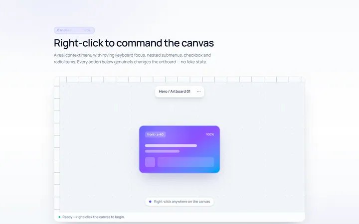
Context Menu
Originalright-click context menu
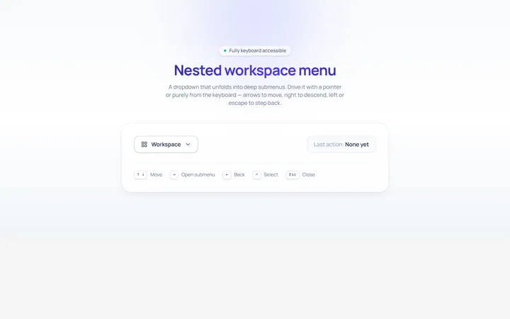
Nested Menu
Originaldropdown with nested submenus
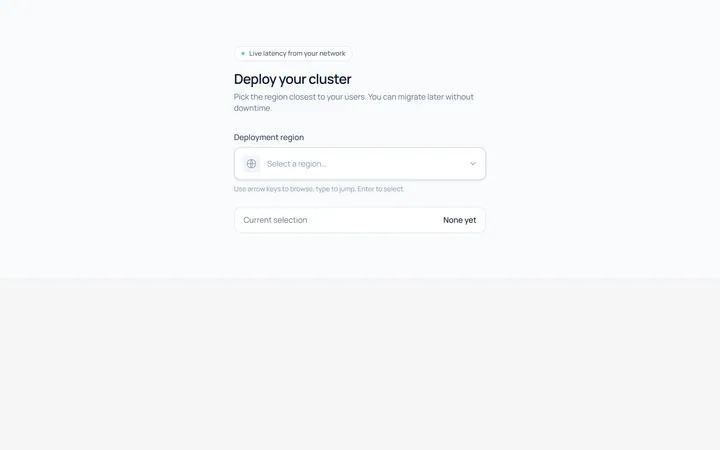
Select Menu
Originalcustom single select dropdown
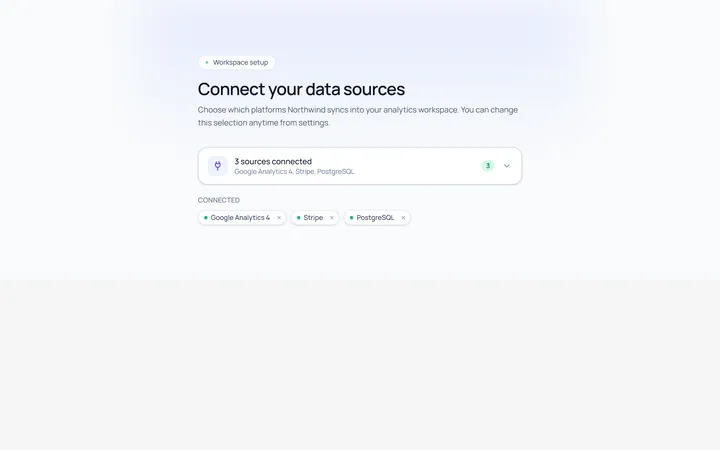
Multiselect Menu
Originalmulti-select with checkable items
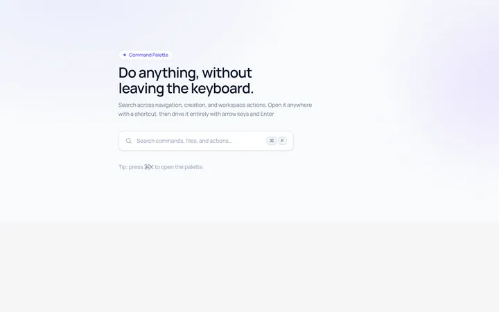
Command Menu
Originalcommand palette style menu with search
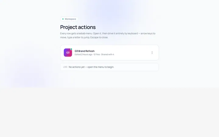
Actions Menu
Originalactions/kebab menu
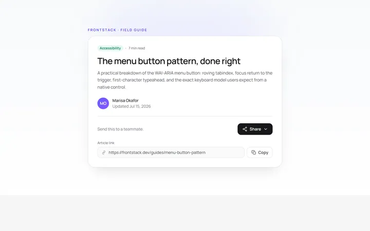
Share Menu
Originalshare menu with options