

Footer Bar Newsletter
Original · freesticky footer newsletter bar
Copy prompt gives Claude Code, Cursor or v0 a ready-to-paste prompt that recreates this exact component.
npx shadcn@latest add https://webinnoventix.com/r/newsx-footer-bar.json"use client";
import {
useEffect,
useRef,
useState,
type ChangeEvent,
type FormEvent,
type KeyboardEvent,
} from "react";
import { AnimatePresence, motion, useReducedMotion } from "motion/react";
type Status = "idle" | "invalid" | "submitting" | "success";
type Cadence = "weekly" | "biweekly";
const EMAIL_RE = /^[^\s@]+@[^\s@]+\.[^\s@]+$/;
const CADENCES: ReadonlyArray<{ value: Cadence; label: string; hint: string }> = [
{ value: "weekly", label: "Weekly", hint: "Every Thursday" },
{ value: "biweekly", label: "Biweekly", hint: "Every other Thursday" },
];
export default function NewsxFooterBar() {
const reduce = useReducedMotion();
const [email, setEmail] = useState("");
const [status, setStatus] = useState<Status>("idle");
const [cadence, setCadence] = useState<Cadence>("weekly");
const [dismissed, setDismissed] = useState(false);
const inputRef = useRef<HTMLInputElement>(null);
const pillRef = useRef<HTMLButtonElement>(null);
const timeoutRef = useRef<number | null>(null);
useEffect(() => {
return () => {
if (timeoutRef.current) window.clearTimeout(timeoutRef.current);
};
}, []);
function handleChange(e: ChangeEvent<HTMLInputElement>) {
setEmail(e.target.value);
if (status === "invalid") setStatus("idle");
}
function handleSubmit(e: FormEvent<HTMLFormElement>) {
e.preventDefault();
if (status === "submitting") return;
const value = email.trim();
if (!EMAIL_RE.test(value)) {
setStatus("invalid");
inputRef.current?.focus();
return;
}
setStatus("submitting");
timeoutRef.current = window.setTimeout(() => {
setStatus("success");
}, 1100);
}
function resetForm() {
if (timeoutRef.current) window.clearTimeout(timeoutRef.current);
setStatus("idle");
setEmail("");
inputRef.current?.focus();
}
function handleBarKeyDown(e: KeyboardEvent<HTMLDivElement>) {
if (e.key === "Escape" && !dismissed) {
e.stopPropagation();
setDismissed(true);
}
}
const helpText =
status === "invalid"
? "Enter a valid email address to continue."
: `No spam. ${
cadence === "weekly" ? "One issue every Thursday." : "One issue every other Thursday."
} Unsubscribe in a click.`;
return (
<section className="relative w-full overflow-hidden bg-gradient-to-b from-zinc-50 to-zinc-100 px-4 py-16 sm:py-20 dark:from-zinc-950 dark:to-black">
<div className="mx-auto max-w-5xl">
<div className="mb-6 flex flex-col items-start gap-1 sm:mb-8">
<span className="inline-flex items-center gap-2 rounded-full border border-zinc-200 bg-white/70 px-3 py-1 text-[11px] font-medium uppercase tracking-[0.18em] text-zinc-500 dark:border-zinc-800 dark:bg-zinc-900/70 dark:text-zinc-400">
<span className="h-1.5 w-1.5 rounded-full bg-indigo-500" />
Live demo
</span>
<h2 className="text-lg font-semibold text-zinc-900 dark:text-zinc-50">
Scroll the panel — the newsletter bar stays put
</h2>
<p className="text-sm text-zinc-500 dark:text-zinc-400">
Type an address, choose a cadence, dismiss it, bring it back. It keeps state and
announces every change.
</p>
</div>
{/* Reader frame with its own scroll context so the bar can stick to the bottom edge. */}
<div className="relative overflow-hidden rounded-3xl border border-zinc-200 bg-white shadow-[0_24px_60px_-30px_rgba(24,24,27,0.5)] dark:border-zinc-800 dark:bg-zinc-950 dark:shadow-[0_24px_60px_-30px_rgba(0,0,0,0.9)]">
<div className="relative max-h-[34rem] overflow-y-auto">
<article className="px-6 py-9 sm:px-10 sm:py-11">
<p className="text-xs font-semibold uppercase tracking-[0.2em] text-indigo-600 dark:text-indigo-400">
Field notes · Issue #211
</p>
<h3 className="mt-3 text-2xl font-semibold tracking-tight text-zinc-900 sm:text-3xl dark:text-zinc-50">
The sticky footer, revisited
</h3>
<p className="mt-2 text-sm text-zinc-500 dark:text-zinc-500">
By the Render Loop team · 6 min read
</p>
<div className="mt-6 space-y-5 text-[15px] leading-relaxed text-zinc-600 dark:text-zinc-400">
<p>
For years the newsletter pop-up was the default growth tactic. It also became the
most resented pattern on the web — a full-screen interruption that arrives before a
reader has decided whether they care. We stopped shipping them in 2023, and our
confirmed-subscriber rate went up, not down.
</p>
<h4 className="pt-1 text-base font-semibold text-zinc-900 dark:text-zinc-100">
Persistent beats interruptive
</h4>
<p>
A footer bar stays out of the way. It rides along the bottom of the viewport,
visible but ignorable, and it converts precisely because it waits. Readers opt in
after they have read something worth their inbox — so the addresses you collect are
warmer, and the unsubscribe rate that follows is measurably lower.
</p>
<h4 className="pt-1 text-base font-semibold text-zinc-900 dark:text-zinc-100">
Three rules we follow
</h4>
<ul className="space-y-2">
{[
"Never cover the content. The bar owns the bottom edge and nothing else.",
"One field, one decision. Ask for an email; ask for everything else later.",
"Always dismissible. A close button that truly closes earns more trust than any incentive.",
].map((rule) => (
<li key={rule} className="flex gap-3">
<span
aria-hidden
className="mt-2 h-1.5 w-1.5 shrink-0 rounded-full bg-indigo-500"
/>
<span>{rule}</span>
</li>
))}
</ul>
<p>
The trap most teams fall into is treating dismissal as failure. It is not. A reader
who closes the bar and keeps reading is telling you they are still deciding — the
worst thing you can do is spring the same modal on them three paragraphs later.
</p>
<p>
Everything below the fold of this panel is scrollable, and the bar pinned to the
bottom is the real component. Try it. It keeps its state, announces each change to
assistive technology, and never traps your keyboard.
</p>
</div>
</article>
{/* Sticky footer bar — pinned to the bottom of the scroll viewport. */}
<div className="pointer-events-none sticky bottom-0 z-10 px-3 pb-3 sm:px-4 sm:pb-4">
<AnimatePresence
mode="wait"
onExitComplete={() => {
// With mode="wait" the incoming element mounts only after the
// outgoing one has exited, so move focus once it is in the DOM.
requestAnimationFrame(() => {
(pillRef.current ?? inputRef.current)?.focus();
});
}}
>
{dismissed ? (
<motion.div
key="pill"
className="flex justify-end"
initial={reduce ? false : { opacity: 0, scale: 0.9, y: 8 }}
animate={reduce ? { opacity: 1 } : { opacity: 1, scale: 1, y: 0 }}
exit={reduce ? { opacity: 0 } : { opacity: 0, scale: 0.9, y: 8 }}
transition={{ duration: reduce ? 0 : 0.25, ease: [0.16, 1, 0.3, 1] }}
>
<button
ref={pillRef}
type="button"
onClick={() => setDismissed(false)}
className="pointer-events-auto inline-flex items-center gap-2 rounded-full bg-indigo-600 px-4 py-2.5 text-sm font-semibold text-white shadow-lg shadow-indigo-600/25 transition-colors hover:bg-indigo-500 focus-visible:outline-none focus-visible:ring-2 focus-visible:ring-indigo-500 focus-visible:ring-offset-2 focus-visible:ring-offset-white dark:focus-visible:ring-offset-zinc-950"
>
<MailIcon className="h-4 w-4" />
Subscribe to The Render Loop
</button>
</motion.div>
) : (
<motion.div
key="bar"
role="region"
aria-label="The Render Loop newsletter signup"
onKeyDown={handleBarKeyDown}
className="pointer-events-auto relative w-full overflow-hidden rounded-2xl border border-zinc-200 bg-white/90 shadow-2xl shadow-zinc-900/10 backdrop-blur-xl dark:border-zinc-800 dark:bg-zinc-900/85 dark:shadow-black/40"
initial={reduce ? false : { opacity: 0, y: 28 }}
animate={reduce ? { opacity: 1 } : { opacity: 1, y: 0 }}
exit={reduce ? { opacity: 0 } : { opacity: 0, y: 28 }}
transition={{ duration: reduce ? 0 : 0.4, ease: [0.16, 1, 0.3, 1] }}
>
<span
aria-hidden
className="newsxfb-anim absolute inset-x-0 top-0 h-px animate-[newsxfb-shimmer_3.2s_linear_infinite] bg-[linear-gradient(90deg,transparent,rgba(129,140,248,0.9),transparent)] bg-[length:200%_100%]"
/>
<button
type="button"
onClick={() => setDismissed(true)}
aria-label="Dismiss newsletter bar"
className="absolute right-2.5 top-2.5 z-10 flex h-7 w-7 items-center justify-center rounded-lg text-zinc-400 transition-colors hover:bg-zinc-100 hover:text-zinc-700 focus-visible:outline-none focus-visible:ring-2 focus-visible:ring-indigo-500 dark:hover:bg-zinc-800 dark:hover:text-zinc-200"
>
<svg
viewBox="0 0 24 24"
fill="none"
stroke="currentColor"
strokeWidth={2}
strokeLinecap="round"
className="h-4 w-4"
aria-hidden
>
<path d="M18 6 6 18M6 6l12 12" />
</svg>
</button>
<div className="flex flex-col gap-4 p-4 pr-10 sm:p-5 sm:pr-12 md:flex-row md:items-center md:gap-6">
{/* Brand block */}
<div className="flex items-start gap-3 md:w-[42%] md:shrink-0">
<span className="relative flex h-10 w-10 shrink-0 items-center justify-center rounded-xl bg-gradient-to-br from-indigo-500 to-violet-600 text-white shadow-inner shadow-white/20">
<svg
viewBox="0 0 24 24"
fill="none"
stroke="currentColor"
strokeWidth={2}
strokeLinecap="round"
strokeLinejoin="round"
className="h-5 w-5"
aria-hidden
>
<path d="M21 12a9 9 0 1 1-2.64-6.36" />
<path d="M21 3v6h-6" />
</svg>
</span>
<div className="min-w-0">
<div className="flex flex-wrap items-center gap-x-2 gap-y-1">
<span className="font-semibold text-zinc-900 dark:text-zinc-50">
The Render Loop
</span>
<span className="inline-flex items-center gap-1.5 rounded-full bg-emerald-50 px-2 py-0.5 text-[11px] font-medium text-emerald-700 dark:bg-emerald-500/10 dark:text-emerald-400">
<span className="relative flex h-1.5 w-1.5">
<span
aria-hidden
className="newsxfb-anim absolute inline-flex h-full w-full animate-[newsxfb-ring_1.8s_ease-out_infinite] rounded-full bg-emerald-500 opacity-75"
/>
<span className="relative inline-flex h-1.5 w-1.5 rounded-full bg-emerald-500" />
</span>
41,200 readers
</span>
</div>
<p className="mt-0.5 text-sm text-zinc-600 dark:text-zinc-400">
A weekly field guide to fast, accessible web interfaces.
</p>
</div>
</div>
{/* Form / success */}
<div className="md:flex-1">
{status === "success" ? (
<div
role="status"
aria-live="polite"
className="flex items-center gap-3"
>
<span className="flex h-9 w-9 shrink-0 items-center justify-center rounded-full bg-emerald-100 text-emerald-600 dark:bg-emerald-500/15 dark:text-emerald-400">
<svg
viewBox="0 0 24 24"
fill="none"
stroke="currentColor"
strokeWidth={2.5}
strokeLinecap="round"
strokeLinejoin="round"
className="h-5 w-5"
aria-hidden
>
<path
d="M20 6 9 17l-5-5"
className="newsxfb-anim [stroke-dasharray:24] [stroke-dashoffset:24] [animation:newsxfb-draw_0.5s_ease-out_forwards]"
/>
</svg>
</span>
<div className="min-w-0">
<p className="font-medium text-zinc-900 dark:text-zinc-50">
You are in — welcome aboard.
</p>
<p className="truncate text-sm text-zinc-600 dark:text-zinc-400">
Confirm {email.trim()} and issue #212 lands Thursday.
</p>
</div>
<button
type="button"
onClick={resetForm}
className="ml-auto shrink-0 rounded-md px-1 text-sm font-medium text-indigo-600 underline decoration-indigo-300 underline-offset-4 transition-colors hover:text-indigo-500 focus-visible:outline-none focus-visible:ring-2 focus-visible:ring-indigo-500 dark:text-indigo-400 dark:decoration-indigo-500/50"
>
Use another email
</button>
</div>
) : (
<form onSubmit={handleSubmit} noValidate className="flex flex-col gap-2.5">
<div className="flex flex-col gap-2 sm:flex-row">
<label htmlFor="newsxfb-email" className="sr-only">
Email address
</label>
<input
id="newsxfb-email"
ref={inputRef}
type="email"
name="email"
inputMode="email"
autoComplete="email"
placeholder="you@company.com"
value={email}
onChange={handleChange}
aria-invalid={status === "invalid"}
aria-describedby="newsxfb-help"
className={
"w-full flex-1 rounded-lg border bg-zinc-50 px-3 py-2.5 text-sm text-zinc-900 outline-none transition-colors placeholder:text-zinc-400 focus-visible:ring-2 focus-visible:ring-indigo-500 dark:bg-zinc-800/60 dark:text-zinc-100 dark:placeholder:text-zinc-500 " +
(status === "invalid"
? "border-rose-400 focus-visible:ring-rose-500 dark:border-rose-500/60"
: "border-zinc-300 dark:border-zinc-700")
}
/>
<button
type="submit"
disabled={status === "submitting"}
className="inline-flex shrink-0 items-center justify-center gap-2 rounded-lg bg-indigo-600 px-4 py-2.5 text-sm font-semibold text-white shadow-sm transition-colors hover:bg-indigo-500 focus-visible:outline-none focus-visible:ring-2 focus-visible:ring-indigo-500 focus-visible:ring-offset-2 focus-visible:ring-offset-white disabled:cursor-not-allowed disabled:opacity-70 dark:focus-visible:ring-offset-zinc-900"
>
{status === "submitting" ? (
<>
<svg
viewBox="0 0 24 24"
fill="none"
className="newsxfb-anim h-4 w-4 animate-spin"
aria-hidden
>
<circle
cx="12"
cy="12"
r="9"
stroke="currentColor"
strokeWidth={3}
className="opacity-25"
/>
<path
d="M21 12a9 9 0 0 0-9-9"
stroke="currentColor"
strokeWidth={3}
strokeLinecap="round"
/>
</svg>
Joining…
</>
) : (
<>
Subscribe
<svg
viewBox="0 0 24 24"
fill="none"
stroke="currentColor"
strokeWidth={2}
strokeLinecap="round"
strokeLinejoin="round"
className="h-4 w-4"
aria-hidden
>
<path d="M5 12h14M13 6l6 6-6 6" />
</svg>
</>
)}
</button>
</div>
<div className="flex flex-wrap items-center justify-between gap-x-3 gap-y-1.5">
<div
role="radiogroup"
aria-label="Newsletter delivery cadence"
className="inline-flex rounded-full bg-zinc-100 p-0.5 dark:bg-zinc-800"
>
{CADENCES.map((c) => (
<label
key={c.value}
className="relative cursor-pointer"
title={c.hint}
>
<input
type="radio"
name="newsxfb-cadence"
value={c.value}
checked={cadence === c.value}
onChange={() => setCadence(c.value)}
className="peer sr-only"
/>
<span className="block rounded-full px-3 py-1 text-xs font-medium text-zinc-500 transition-colors peer-checked:bg-white peer-checked:text-indigo-600 peer-checked:shadow-sm peer-focus-visible:outline peer-focus-visible:outline-2 peer-focus-visible:outline-offset-2 peer-focus-visible:outline-indigo-500 dark:text-zinc-400 dark:peer-checked:bg-zinc-950 dark:peer-checked:text-indigo-400">
{c.label}
</span>
</label>
))}
</div>
<p
id="newsxfb-help"
role="status"
aria-live="polite"
className={
"text-xs " +
(status === "invalid"
? "font-medium text-rose-600 dark:text-rose-400"
: "text-zinc-500 dark:text-zinc-500")
}
>
{helpText}
</p>
</div>
</form>
)}
</div>
</div>
</motion.div>
)}
</AnimatePresence>
</div>
</div>
</div>
</div>
<style>{`
@keyframes newsxfb-shimmer {
0% { background-position: 200% 0; }
100% { background-position: -200% 0; }
}
@keyframes newsxfb-ring {
0% { transform: scale(1); opacity: 0.7; }
100% { transform: scale(2.6); opacity: 0; }
}
@keyframes newsxfb-draw {
to { stroke-dashoffset: 0; }
}
@media (prefers-reduced-motion: reduce) {
.newsxfb-anim { animation: none !important; }
}
`}</style>
</section>
);
}
function MailIcon({ className }: { className?: string }) {
return (
<svg
viewBox="0 0 24 24"
fill="none"
stroke="currentColor"
strokeWidth={2}
strokeLinecap="round"
strokeLinejoin="round"
className={className}
aria-hidden
>
<rect x="3" y="5" width="18" height="14" rx="2" />
<path d="m3 7 9 6 9-6" />
</svg>
);
}Dependencies
Licence
Built by Web Innoventix. Free for personal and commercial use, no attribution required.
Built by Web Innoventix
Need a custom interface, a full website, or SEO that gets you cited by AI? We design, build and rank it end to end.
Get a free quoteSimilar components
Browse all →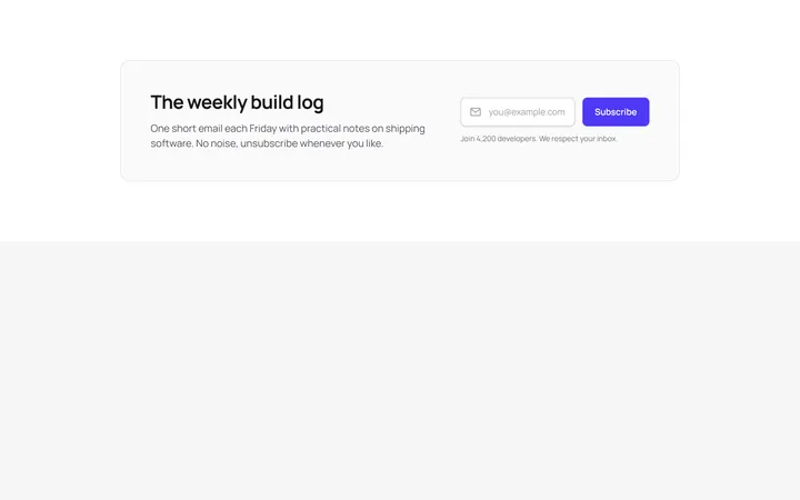
Inline Email Signup Bar
OriginalA wide banner that pairs a short heading with a single-line email field and subscribe button laid out side by side on desktop.
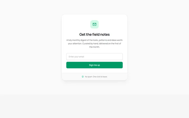
Boxed Newsletter Card
OriginalA centred, self-contained signup card with an icon badge, stacked email field and reassurance footer for dropping into a sidebar or narrow column.
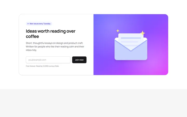
Split Newsletter With Illustration
OriginalA two-column section combining copy and an inline email form with a gradient panel and hand-drawn SVG envelope illustration.
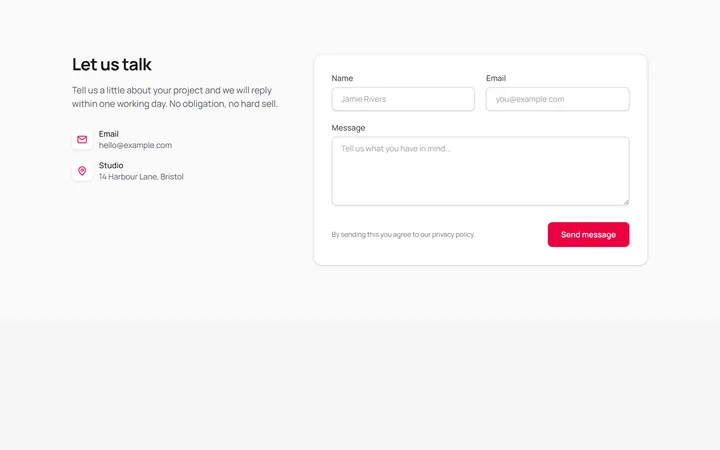
Contact Form With Details
OriginalA full contact section pairing email and location details with a name, email and message form on a bordered card.
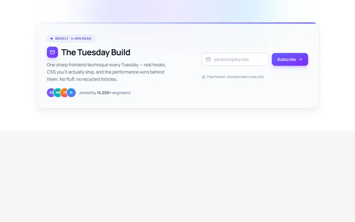
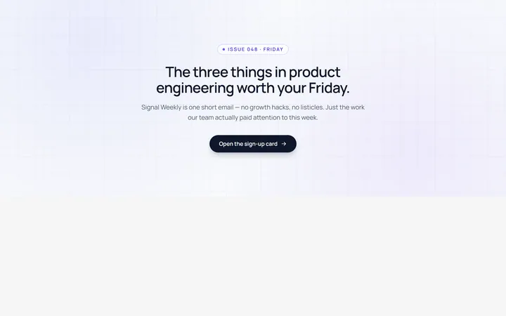
Inline Newsletter
Originalinline newsletter bar
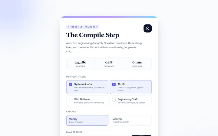
Card Newsletter
Originalnewsletter card
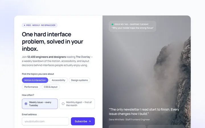
Split Image Newsletter
Originalnewsletter with image side
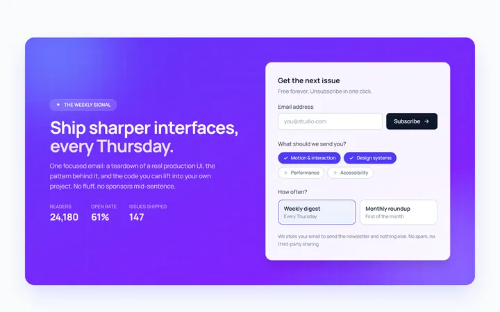
Gradient Newsletter
Originalgradient newsletter band
Modal Newsletter
Originalnewsletter popup card
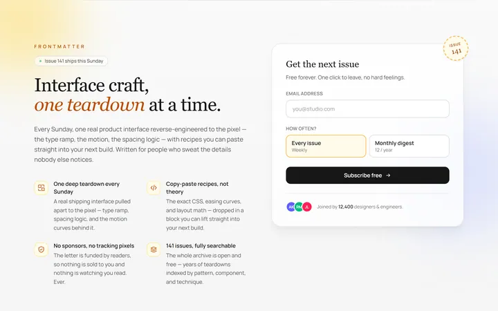
Benefits Newsletter
Originalnewsletter with benefit bullets
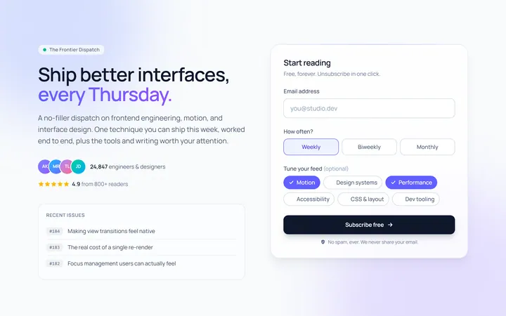
Dark Newsletter
Originaldark newsletter section
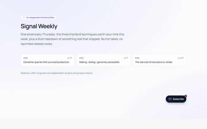
Floating Newsletter
Originalfloating newsletter widget