

Split Image Newsletter
Original · freenewsletter with image side
Copy prompt gives Claude Code, Cursor or v0 a ready-to-paste prompt that recreates this exact component.
npx shadcn@latest add https://webinnoventix.com/r/newsx-split-image.json"use client";
import { useId, useRef, useState, type FormEvent } from "react";
import { motion, useReducedMotion } from "motion/react";
type Topic = { id: string; label: string };
const TOPICS: readonly Topic[] = [
{ id: "motion", label: "Motion & interaction" },
{ id: "a11y", label: "Accessibility" },
{ id: "systems", label: "Design systems" },
{ id: "perf", label: "Performance" },
{ id: "layout", label: "CSS & layout" },
] as const;
const CADENCE: readonly Topic[] = [
{ id: "weekly", label: "Weekly issue — every Tuesday" },
{ id: "digest", label: "Monthly digest — first of the month" },
] as const;
const READERS: readonly { initials: string; tint: string }[] = [
{ initials: "DW", tint: "bg-indigo-500" },
{ initials: "AR", tint: "bg-violet-500" },
{ initials: "KL", tint: "bg-emerald-500" },
{ initials: "MP", tint: "bg-sky-500" },
];
const EMAIL_RE = /^[^\s@]+@[^\s@]+\.[^\s@]+$/;
export default function NewsxSplitImage() {
const reduce = useReducedMotion();
const uid = useId();
const emailId = `${uid}-email`;
const errorId = `${uid}-error`;
const statusId = `${uid}-status`;
const topicsLegendId = `${uid}-topics`;
const emailRef = useRef<HTMLInputElement>(null);
const [email, setEmail] = useState("");
const [topics, setTopics] = useState<string[]>(["motion"]);
const [cadence, setCadence] = useState<string>("weekly");
const [error, setError] = useState<string | null>(null);
const [done, setDone] = useState(false);
const toggleTopic = (id: string) => {
setTopics((prev) =>
prev.includes(id) ? prev.filter((t) => t !== id) : [...prev, id],
);
};
const handleSubmit = (e: FormEvent<HTMLFormElement>) => {
e.preventDefault();
const value = email.trim();
if (!EMAIL_RE.test(value)) {
setError("Enter a valid email address so we can send your first issue.");
emailRef.current?.focus();
return;
}
setError(null);
setDone(true);
};
return (
<section className="relative w-full overflow-hidden bg-slate-50 py-16 text-slate-900 sm:py-24 dark:bg-slate-950 dark:text-slate-100">
<style>{`
@keyframes nxsi-float {
0%, 100% { transform: translateY(0); }
50% { transform: translateY(-10px); }
}
@keyframes nxsi-shimmer {
0% { background-position: -160% 0; }
100% { background-position: 260% 0; }
}
@keyframes nxsi-draw {
from { stroke-dashoffset: 26; }
to { stroke-dashoffset: 0; }
}
@keyframes nxsi-pulse-ring {
0% { transform: scale(0.9); opacity: 0.7; }
70% { transform: scale(1.6); opacity: 0; }
100% { transform: scale(1.6); opacity: 0; }
}
.nxsi-float { animation: nxsi-float 6s ease-in-out infinite; }
.nxsi-shimmer {
background-image: linear-gradient(110deg, transparent 30%, rgba(255,255,255,0.55) 50%, transparent 70%);
background-size: 220% 100%;
animation: nxsi-shimmer 3.2s linear infinite;
}
.nxsi-draw { stroke-dasharray: 26; stroke-dashoffset: 26; animation: nxsi-draw 0.6s ease-out 0.1s forwards; }
.nxsi-ping { animation: nxsi-pulse-ring 2.4s ease-out infinite; }
@media (prefers-reduced-motion: reduce) {
.nxsi-float, .nxsi-shimmer, .nxsi-draw, .nxsi-ping { animation: none !important; }
.nxsi-draw { stroke-dashoffset: 0; }
}
`}</style>
<div className="pointer-events-none absolute -left-24 top-0 h-72 w-72 rounded-full bg-indigo-300/30 blur-3xl dark:bg-indigo-600/20" />
<div className="pointer-events-none absolute -right-16 bottom-0 h-72 w-72 rounded-full bg-violet-300/30 blur-3xl dark:bg-violet-700/20" />
<div className="relative mx-auto max-w-6xl px-4 sm:px-6">
<motion.div
initial={reduce ? false : { opacity: 0, y: 24 }}
whileInView={reduce ? undefined : { opacity: 1, y: 0 }}
viewport={{ once: true, amount: 0.3 }}
transition={{ duration: 0.55, ease: [0.22, 1, 0.36, 1] }}
className="grid overflow-hidden rounded-3xl border border-slate-200 bg-white shadow-xl shadow-slate-900/5 lg:grid-cols-2 dark:border-slate-800 dark:bg-slate-900 dark:shadow-black/40"
>
{/* Content / form side */}
<div className="order-2 flex flex-col justify-center p-7 sm:p-10 lg:order-1 lg:p-12">
<span className="relative inline-flex w-fit items-center gap-2 overflow-hidden rounded-full border border-indigo-200 bg-indigo-50 px-3 py-1 text-xs font-semibold uppercase tracking-wide text-indigo-700 dark:border-indigo-500/30 dark:bg-indigo-500/10 dark:text-indigo-300">
<span className="nxsi-shimmer absolute inset-0" aria-hidden="true" />
<span className="relative inline-block h-1.5 w-1.5 rounded-full bg-indigo-500" />
<span className="relative">Free · Weekly · No spam ever</span>
</span>
<h2 className="mt-5 text-3xl font-bold leading-tight tracking-tight sm:text-4xl">
One hard interface problem, solved in your inbox.
</h2>
<p className="mt-4 max-w-md text-base leading-relaxed text-slate-600 dark:text-slate-400">
Join{" "}
<span className="font-semibold text-slate-900 dark:text-slate-100">
12,400 engineers and designers
</span>{" "}
reading <em className="not-italic font-semibold">The Overlay</em> —
a weekly teardown of the motion, accessibility, and layout
decisions behind interfaces people actually enjoy using.
</p>
{done ? (
<div
id={statusId}
role="status"
aria-live="polite"
className="mt-8 flex items-start gap-4 rounded-2xl border border-emerald-200 bg-emerald-50 p-5 dark:border-emerald-500/30 dark:bg-emerald-500/10"
>
<span className="mt-0.5 inline-flex h-9 w-9 shrink-0 items-center justify-center rounded-full bg-emerald-500 text-white">
<svg viewBox="0 0 24 24" className="h-5 w-5" aria-hidden="true">
<path
className="nxsi-draw"
d="M5 12.5l4 4 10-10"
fill="none"
stroke="currentColor"
strokeWidth="2.5"
strokeLinecap="round"
strokeLinejoin="round"
/>
</svg>
</span>
<div>
<p className="font-semibold text-emerald-800 dark:text-emerald-200">
You’re on the list.
</p>
<p className="mt-1 text-sm text-emerald-700/90 dark:text-emerald-300/80">
Confirm at{" "}
<span className="font-medium">{email.trim()}</span> and your
first issue lands next Tuesday.
</p>
<button
type="button"
onClick={() => {
setDone(false);
setEmail("");
}}
className="mt-3 rounded-md text-sm font-semibold text-emerald-700 underline underline-offset-4 hover:text-emerald-900 focus-visible:outline-none focus-visible:ring-2 focus-visible:ring-emerald-500 focus-visible:ring-offset-2 focus-visible:ring-offset-emerald-50 dark:text-emerald-300 dark:focus-visible:ring-offset-slate-900"
>
Use a different email
</button>
</div>
</div>
) : (
<form onSubmit={handleSubmit} noValidate className="mt-8">
<fieldset className="border-0 p-0">
<legend
id={topicsLegendId}
className="text-sm font-semibold text-slate-700 dark:text-slate-300"
>
Pick the topics you care about
</legend>
<div
className="mt-3 flex flex-wrap gap-2"
role="group"
aria-labelledby={topicsLegendId}
>
{TOPICS.map((t) => {
const active = topics.includes(t.id);
return (
<label
key={t.id}
className={`cursor-pointer select-none rounded-full border px-3.5 py-1.5 text-sm font-medium transition-colors focus-within:ring-2 focus-within:ring-indigo-500 focus-within:ring-offset-2 focus-within:ring-offset-white dark:focus-within:ring-offset-slate-900 ${
active
? "border-indigo-500 bg-indigo-500 text-white"
: "border-slate-300 bg-white text-slate-700 hover:border-slate-400 dark:border-slate-700 dark:bg-slate-800 dark:text-slate-300 dark:hover:border-slate-600"
}`}
>
<input
type="checkbox"
className="sr-only"
checked={active}
onChange={() => toggleTopic(t.id)}
/>
{t.label}
</label>
);
})}
</div>
</fieldset>
<fieldset className="mt-6 border-0 p-0">
<legend className="text-sm font-semibold text-slate-700 dark:text-slate-300">
How often?
</legend>
<div className="mt-3 grid gap-2 sm:grid-cols-2">
{CADENCE.map((c) => {
const active = cadence === c.id;
return (
<label
key={c.id}
className={`flex cursor-pointer items-center gap-3 rounded-xl border px-4 py-3 text-sm transition-colors focus-within:ring-2 focus-within:ring-indigo-500 focus-within:ring-offset-2 focus-within:ring-offset-white dark:focus-within:ring-offset-slate-900 ${
active
? "border-indigo-500 bg-indigo-50 text-slate-900 dark:border-indigo-500/60 dark:bg-indigo-500/10 dark:text-slate-100"
: "border-slate-300 bg-white text-slate-600 hover:border-slate-400 dark:border-slate-700 dark:bg-slate-800 dark:text-slate-400 dark:hover:border-slate-600"
}`}
>
<input
type="radio"
name={`${uid}-cadence`}
value={c.id}
checked={active}
onChange={() => setCadence(c.id)}
className="sr-only"
/>
<span
aria-hidden="true"
className={`grid h-4 w-4 shrink-0 place-items-center rounded-full border-2 ${
active
? "border-indigo-500"
: "border-slate-400 dark:border-slate-500"
}`}
>
<span
className={`h-2 w-2 rounded-full bg-indigo-500 transition-transform ${
active ? "scale-100" : "scale-0"
}`}
/>
</span>
<span className="font-medium leading-snug">
{c.label}
</span>
</label>
);
})}
</div>
</fieldset>
<div className="mt-6">
<label
htmlFor={emailId}
className="block text-sm font-semibold text-slate-700 dark:text-slate-300"
>
Email address
</label>
<div className="mt-2 flex flex-col gap-3 sm:flex-row">
<input
ref={emailRef}
id={emailId}
type="email"
inputMode="email"
autoComplete="email"
placeholder="you@studio.com"
value={email}
onChange={(ev) => {
setEmail(ev.target.value);
if (error) setError(null);
}}
aria-invalid={error ? true : undefined}
aria-describedby={error ? errorId : undefined}
className={`w-full rounded-xl border bg-white px-4 py-3 text-base text-slate-900 shadow-sm placeholder:text-slate-400 focus-visible:outline-none focus-visible:ring-2 focus-visible:ring-offset-2 focus-visible:ring-offset-white dark:bg-slate-800 dark:text-slate-100 dark:placeholder:text-slate-500 dark:focus-visible:ring-offset-slate-900 ${
error
? "border-rose-400 focus-visible:ring-rose-500 dark:border-rose-500/60"
: "border-slate-300 focus-visible:ring-indigo-500 dark:border-slate-700"
}`}
/>
<button
type="submit"
className="inline-flex shrink-0 items-center justify-center gap-2 rounded-xl bg-indigo-600 px-6 py-3 text-base font-semibold text-white shadow-sm transition-colors hover:bg-indigo-500 focus-visible:outline-none focus-visible:ring-2 focus-visible:ring-indigo-500 focus-visible:ring-offset-2 focus-visible:ring-offset-white active:bg-indigo-700 dark:focus-visible:ring-offset-slate-900"
>
Subscribe
<svg
viewBox="0 0 20 20"
className="h-4 w-4"
aria-hidden="true"
fill="none"
stroke="currentColor"
strokeWidth="2"
strokeLinecap="round"
strokeLinejoin="round"
>
<path d="M4 10h11M11 5l5 5-5 5" />
</svg>
</button>
</div>
<p
id={errorId}
role={error ? "alert" : undefined}
aria-live="assertive"
className={`mt-2 text-sm text-rose-600 dark:text-rose-400 ${
error ? "" : "sr-only"
}`}
>
{error}
</p>
</div>
<div className="mt-6 flex items-center gap-3">
<div className="flex -space-x-2" aria-hidden="true">
{READERS.map((r) => (
<span
key={r.initials}
className={`grid h-7 w-7 place-items-center rounded-full text-[10px] font-bold text-white ring-2 ring-white dark:ring-slate-900 ${r.tint}`}
>
{r.initials}
</span>
))}
</div>
<p className="text-sm text-slate-500 dark:text-slate-400">
Trusted by builders at studios and product teams worldwide.
</p>
</div>
</form>
)}
</div>
{/* Image side */}
<div className="relative order-1 min-h-[280px] overflow-hidden bg-slate-200 lg:order-2 lg:min-h-full dark:bg-slate-800">
{/* eslint-disable-next-line @next/next/no-img-element */}
<img
src="/img/gallery/g01.webp"
alt="A designer's desk with an open laptop showing an interface prototype, a notebook of layout sketches, and a coffee cup in warm morning light."
loading="lazy"
draggable={false}
className="absolute inset-0 h-full w-full object-cover"
/>
<div
className="absolute inset-0 bg-gradient-to-t from-slate-950/80 via-slate-950/25 to-slate-950/40 lg:bg-gradient-to-tr"
aria-hidden="true"
/>
<div className="relative flex h-full flex-col justify-between p-7 sm:p-10">
<div className="nxsi-float w-fit rounded-2xl border border-white/20 bg-white/10 px-4 py-3 backdrop-blur-md">
<div className="flex items-center gap-2">
<span className="relative flex h-2.5 w-2.5">
<span className="nxsi-ping absolute inline-flex h-full w-full rounded-full bg-emerald-400" />
<span className="relative inline-flex h-2.5 w-2.5 rounded-full bg-emerald-400" />
</span>
<p className="text-xs font-semibold uppercase tracking-wide text-white/90">
Issue No. 148 — shipping Tuesday
</p>
</div>
<p className="mt-1 text-sm font-medium text-white">
“Why your modal traps the wrong focus”
</p>
</div>
<figure className="mt-8">
<blockquote className="text-lg font-medium leading-snug text-white sm:text-xl">
“The only newsletter I read start to finish. Every issue
changes how I build.”
</blockquote>
<figcaption className="mt-3 text-sm text-white/80">
Dana Whitfield · Staff Frontend Engineer
</figcaption>
<div className="mt-6 grid grid-cols-2 gap-3">
<div className="rounded-xl border border-white/15 bg-white/10 px-4 py-3 backdrop-blur-sm">
<p className="text-2xl font-bold text-white">94%</p>
<p className="text-xs text-white/75">avg. open rate</p>
</div>
<div className="rounded-xl border border-white/15 bg-white/10 px-4 py-3 backdrop-blur-sm">
<p className="text-2xl font-bold text-white">12.4k</p>
<p className="text-xs text-white/75">subscribers</p>
</div>
</div>
</figure>
</div>
</div>
</motion.div>
<p className="mt-4 text-center text-xs text-slate-500 dark:text-slate-500">
We send one email a week. Unsubscribe in a single click, any time.
</p>
</div>
</section>
);
}Dependencies
Licence
Built by Web Innoventix. Free for personal and commercial use, no attribution required.
Built by Web Innoventix
Need a custom interface, a full website, or SEO that gets you cited by AI? We design, build and rank it end to end.
Get a free quoteSimilar components
Browse all →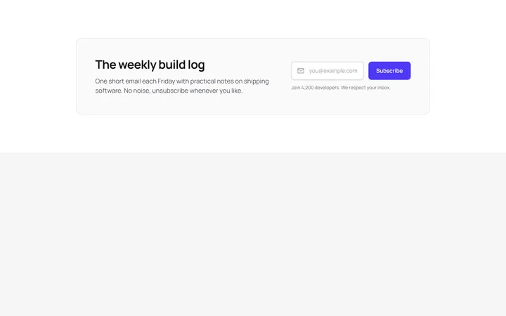
Inline Email Signup Bar
OriginalA wide banner that pairs a short heading with a single-line email field and subscribe button laid out side by side on desktop.
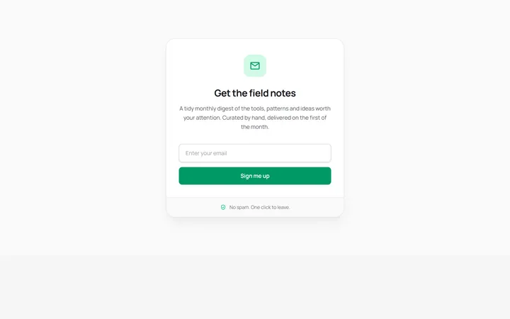
Boxed Newsletter Card
OriginalA centred, self-contained signup card with an icon badge, stacked email field and reassurance footer for dropping into a sidebar or narrow column.
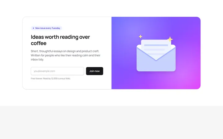
Split Newsletter With Illustration
OriginalA two-column section combining copy and an inline email form with a gradient panel and hand-drawn SVG envelope illustration.
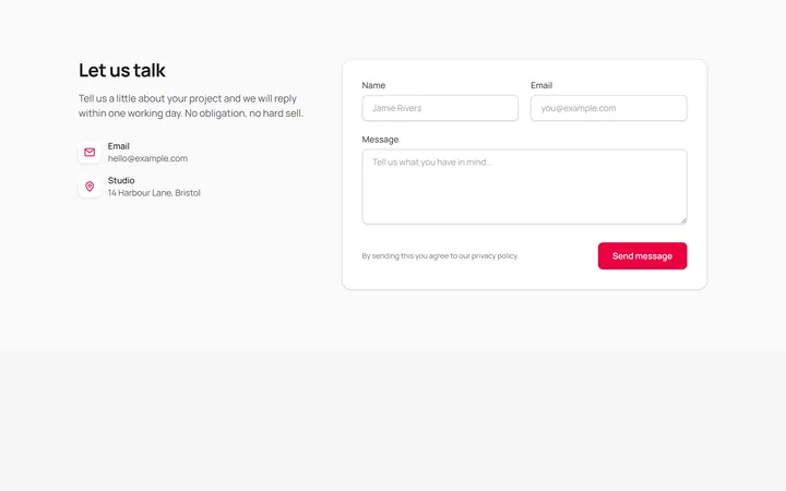
Contact Form With Details
OriginalA full contact section pairing email and location details with a name, email and message form on a bordered card.
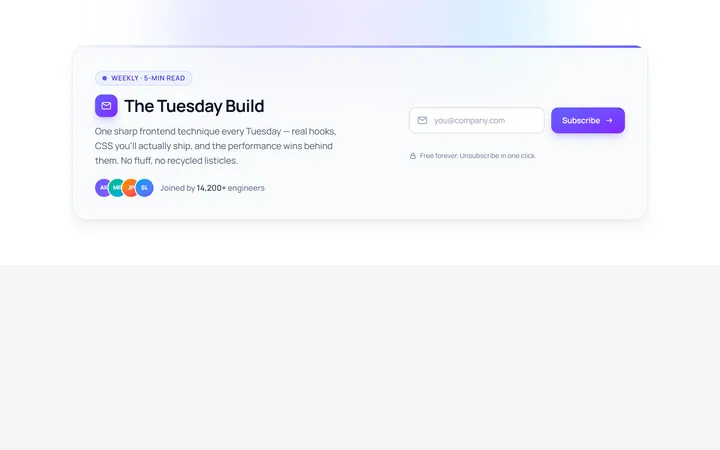
Inline Newsletter
Originalinline newsletter bar
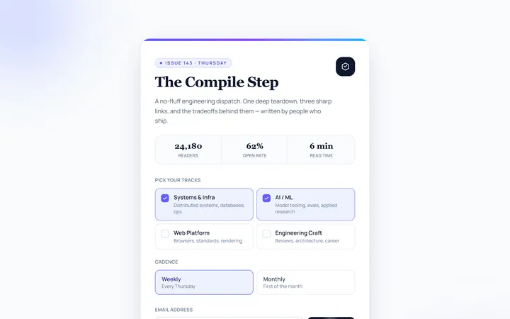
Card Newsletter
Originalnewsletter card
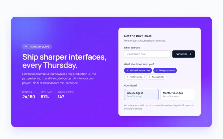
Gradient Newsletter
Originalgradient newsletter band
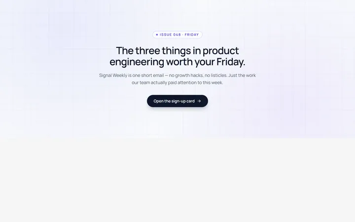
Modal Newsletter
Originalnewsletter popup card
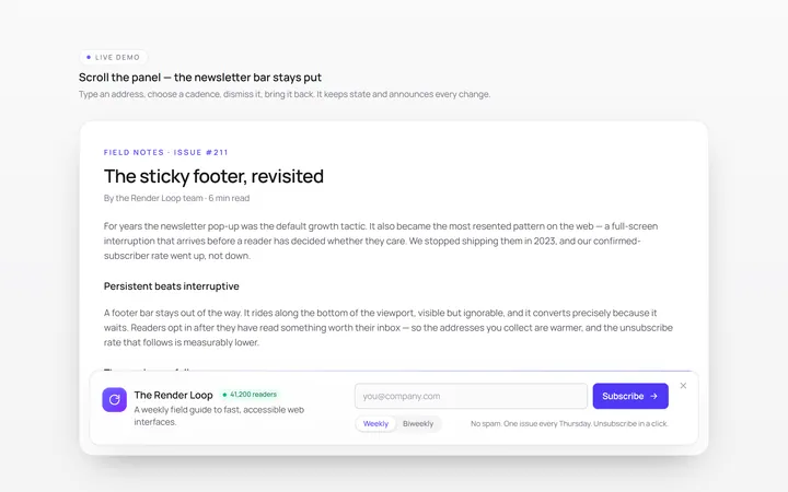
Footer Bar Newsletter
Originalsticky footer newsletter bar
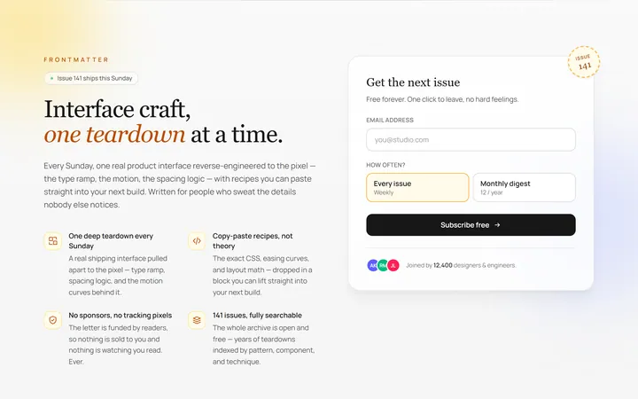
Benefits Newsletter
Originalnewsletter with benefit bullets
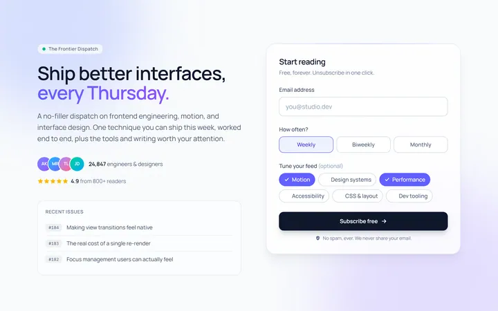
Dark Newsletter
Originaldark newsletter section
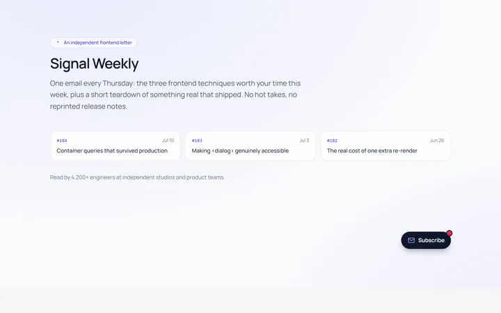
Floating Newsletter
Originalfloating newsletter widget