

Gradient Newsletter
Original · freegradient newsletter band
Copy prompt gives Claude Code, Cursor or v0 a ready-to-paste prompt that recreates this exact component.
npx shadcn@latest add https://webinnoventix.com/r/newsx-gradient.json"use client"
import { useId, useRef, useState, type FormEvent } from "react"
import { AnimatePresence, motion, useReducedMotion } from "motion/react"
type SubmitStatus = "idle" | "loading" | "success"
type Cadence = "weekly" | "monthly"
const TOPICS = [
{ id: "motion", label: "Motion & interaction" },
{ id: "systems", label: "Design systems" },
{ id: "performance", label: "Performance" },
{ id: "a11y", label: "Accessibility" },
] as const
const CADENCES: ReadonlyArray<{ id: Cadence; label: string; hint: string }> = [
{ id: "weekly", label: "Weekly digest", hint: "Every Thursday" },
{ id: "monthly", label: "Monthly roundup", hint: "First of the month" },
]
const EMAIL_RE = /^[^\s@]+@[^\s@]+\.[^\s@]+$/
export default function NewsxGradient() {
const reduce = useReducedMotion()
const uid = useId()
const emailId = `${uid}-email`
const errorId = `${uid}-error`
const topicsLabelId = `${uid}-topics`
const inputRef = useRef<HTMLInputElement>(null)
const [email, setEmail] = useState("")
const [cadence, setCadence] = useState<Cadence>("weekly")
const [topics, setTopics] = useState<string[]>(["motion", "systems"])
const [status, setStatus] = useState<SubmitStatus>("idle")
const [error, setError] = useState<string | null>(null)
const toggleTopic = (id: string) => {
setTopics((prev) =>
prev.includes(id) ? prev.filter((t) => t !== id) : [...prev, id],
)
}
const handleSubmit = (e: FormEvent<HTMLFormElement>) => {
e.preventDefault()
if (status === "loading") return
if (!EMAIL_RE.test(email.trim())) {
setError("Enter a valid email address so we know where to send it.")
inputRef.current?.focus()
return
}
setError(null)
setStatus("loading")
window.setTimeout(() => setStatus("success"), 1100)
}
const reset = () => {
setStatus("idle")
setEmail("")
setError(null)
}
const anim = (name: string) => (reduce ? "" : name)
return (
<section className="relative w-full bg-slate-50 px-4 py-20 sm:px-6 sm:py-24 lg:px-8 dark:bg-slate-950">
<style>{`
@keyframes nxg-drift {
0% { background-position: 0% 50%; }
50% { background-position: 100% 50%; }
100% { background-position: 0% 50%; }
}
@keyframes nxg-float {
0%, 100% { transform: translate3d(0, 0, 0) scale(1); }
50% { transform: translate3d(0, -22px, 0) scale(1.05); }
}
@keyframes nxg-float-slow {
0%, 100% { transform: translate3d(0, 0, 0) scale(1); }
50% { transform: translate3d(-18px, 16px, 0) scale(1.08); }
}
@keyframes nxg-pop {
0% { transform: scale(0.5); opacity: 0; }
60% { transform: scale(1.12); }
100% { transform: scale(1); opacity: 1; }
}
@keyframes nxg-tick {
from { stroke-dashoffset: 26; }
to { stroke-dashoffset: 0; }
}
.nxg-drift { background-size: 220% 220%; animation: nxg-drift 16s ease-in-out infinite; }
.nxg-float { animation: nxg-float 11s ease-in-out infinite; }
.nxg-float-slow { animation: nxg-float-slow 14s ease-in-out infinite; }
.nxg-pop { animation: nxg-pop 0.55s cubic-bezier(0.22, 1, 0.36, 1) both; }
.nxg-tick { stroke-dasharray: 26; animation: nxg-tick 0.5s ease-out 0.2s both; }
@media (prefers-reduced-motion: reduce) {
.nxg-drift, .nxg-float, .nxg-float-slow, .nxg-pop, .nxg-tick {
animation: none !important;
background-position: 0% 50% !important;
stroke-dashoffset: 0 !important;
}
}
`}</style>
<motion.div
initial={reduce ? false : { opacity: 0, y: 30 }}
whileInView={reduce ? undefined : { opacity: 1, y: 0 }}
viewport={{ once: true, amount: 0.3 }}
transition={{ duration: 0.65, ease: [0.22, 1, 0.36, 1] }}
className={`relative mx-auto max-w-6xl overflow-hidden rounded-3xl bg-gradient-to-br from-indigo-600 via-violet-600 to-sky-500 shadow-2xl shadow-indigo-500/25 ring-1 ring-white/20 dark:from-indigo-700 dark:via-violet-800 dark:to-sky-700 dark:shadow-black/40 ${anim(
"nxg-drift",
)}`}
>
{/* Decorative atmosphere */}
<div
aria-hidden="true"
className={`pointer-events-none absolute -top-24 -left-16 h-72 w-72 rounded-full bg-sky-300/40 blur-3xl ${anim(
"nxg-float",
)}`}
/>
<div
aria-hidden="true"
className={`pointer-events-none absolute -right-20 -bottom-24 h-80 w-80 rounded-full bg-violet-400/40 blur-3xl ${anim(
"nxg-float-slow",
)}`}
/>
<div
aria-hidden="true"
className="pointer-events-none absolute inset-0 opacity-[0.15] mix-blend-soft-light [background-image:linear-gradient(to_right,white_1px,transparent_1px),linear-gradient(to_bottom,white_1px,transparent_1px)] [background-size:32px_32px]"
/>
<div className="relative grid gap-10 p-8 sm:p-12 lg:grid-cols-[1.05fr_1fr] lg:items-center lg:gap-14 lg:p-16">
{/* Left: pitch */}
<div>
<span className="inline-flex items-center gap-2 rounded-full bg-white/15 px-3.5 py-1.5 text-xs font-semibold tracking-wide text-white uppercase ring-1 ring-white/25 backdrop-blur-sm">
<svg
aria-hidden="true"
viewBox="0 0 24 24"
className="h-3.5 w-3.5"
fill="currentColor"
>
<path d="M12 2l1.9 5.8H20l-4.9 3.6 1.9 5.8L12 13.6 7 17.2l1.9-5.8L4 7.8h6.1L12 2z" />
</svg>
The Weekly Signal
</span>
<h2 className="mt-5 text-3xl font-bold tracking-tight text-white sm:text-4xl lg:text-[2.75rem] lg:leading-[1.05]">
Ship sharper interfaces,
<span className="block text-white/85">every Thursday.</span>
</h2>
<p className="mt-4 max-w-md text-base leading-relaxed text-white/80">
One focused email: a teardown of a real production UI, the pattern
behind it, and the code you can lift into your own project. No
fluff, no sponsors mid-sentence.
</p>
<dl className="mt-8 flex flex-wrap gap-x-8 gap-y-4">
<div>
<dt className="text-xs font-medium tracking-wide text-white/60 uppercase">
Readers
</dt>
<dd className="mt-0.5 text-2xl font-bold text-white">24,180</dd>
</div>
<div>
<dt className="text-xs font-medium tracking-wide text-white/60 uppercase">
Open rate
</dt>
<dd className="mt-0.5 text-2xl font-bold text-white">61%</dd>
</div>
<div>
<dt className="text-xs font-medium tracking-wide text-white/60 uppercase">
Issues shipped
</dt>
<dd className="mt-0.5 text-2xl font-bold text-white">147</dd>
</div>
</dl>
</div>
{/* Right: form / success */}
<div className="rounded-2xl bg-white/95 p-6 shadow-xl ring-1 ring-white/40 backdrop-blur-md sm:p-8 dark:bg-slate-900/90 dark:ring-white/10">
<AnimatePresence mode="wait" initial={false}>
{status === "success" ? (
<motion.div
key="success"
initial={reduce ? false : { opacity: 0, scale: 0.96 }}
animate={{ opacity: 1, scale: 1 }}
exit={reduce ? undefined : { opacity: 0, scale: 0.96 }}
transition={{ duration: 0.35, ease: "easeOut" }}
className="flex flex-col items-center text-center"
role="status"
aria-live="polite"
>
<span
className={`flex h-14 w-14 items-center justify-center rounded-full bg-emerald-500 text-white shadow-lg shadow-emerald-500/30 ${anim(
"nxg-pop",
)}`}
>
<svg
viewBox="0 0 24 24"
className="h-7 w-7"
fill="none"
stroke="currentColor"
strokeWidth="2.5"
strokeLinecap="round"
strokeLinejoin="round"
aria-hidden="true"
>
<path className={anim("nxg-tick")} d="M5 13l4 4L19 7" />
</svg>
</span>
<h3 className="mt-5 text-xl font-bold text-slate-900 dark:text-white">
You’re on the list.
</h3>
<p className="mt-2 text-sm leading-relaxed text-slate-600 dark:text-slate-300">
Check <span className="font-semibold">{email}</span> for a
confirmation link. Your first{" "}
{cadence === "weekly" ? "weekly digest" : "monthly roundup"}{" "}
lands soon.
</p>
<button
type="button"
onClick={reset}
className="mt-6 rounded-lg px-4 py-2 text-sm font-semibold text-indigo-600 underline-offset-4 transition hover:underline focus-visible:ring-2 focus-visible:ring-indigo-500 focus-visible:ring-offset-2 focus-visible:outline-none dark:text-indigo-300 dark:focus-visible:ring-offset-slate-900"
>
Use a different email
</button>
</motion.div>
) : (
<motion.form
key="form"
initial={reduce ? false : { opacity: 0 }}
animate={{ opacity: 1 }}
exit={reduce ? undefined : { opacity: 0 }}
transition={{ duration: 0.3 }}
onSubmit={handleSubmit}
noValidate
>
<h3 className="text-lg font-bold text-slate-900 dark:text-white">
Get the next issue
</h3>
<p className="mt-1 text-sm text-slate-500 dark:text-slate-400">
Free forever. Unsubscribe in one click.
</p>
<label
htmlFor={emailId}
className="mt-5 block text-sm font-medium text-slate-700 dark:text-slate-200"
>
Email address
</label>
<div className="mt-1.5 flex flex-col gap-2.5 sm:flex-row">
<input
ref={inputRef}
id={emailId}
type="email"
inputMode="email"
autoComplete="email"
placeholder="you@studio.com"
value={email}
onChange={(e) => {
setEmail(e.target.value)
if (error) setError(null)
}}
aria-invalid={error ? true : undefined}
aria-describedby={error ? errorId : undefined}
className="min-w-0 flex-1 rounded-lg border border-slate-300 bg-white px-3.5 py-2.5 text-sm text-slate-900 placeholder-slate-400 transition focus-visible:border-indigo-500 focus-visible:ring-2 focus-visible:ring-indigo-500/50 focus-visible:outline-none aria-[invalid=true]:border-rose-400 aria-[invalid=true]:ring-2 aria-[invalid=true]:ring-rose-400/40 dark:border-slate-700 dark:bg-slate-950 dark:text-white dark:placeholder-slate-500"
/>
<button
type="submit"
disabled={status === "loading"}
className="inline-flex shrink-0 items-center justify-center gap-2 rounded-lg bg-slate-900 px-5 py-2.5 text-sm font-semibold text-white shadow-sm transition hover:bg-slate-800 focus-visible:ring-2 focus-visible:ring-slate-900 focus-visible:ring-offset-2 focus-visible:outline-none disabled:cursor-not-allowed disabled:opacity-70 dark:bg-white dark:text-slate-900 dark:hover:bg-slate-100 dark:focus-visible:ring-white dark:focus-visible:ring-offset-slate-900"
>
{status === "loading" ? (
<>
<svg
className="h-4 w-4 animate-spin motion-reduce:animate-none"
viewBox="0 0 24 24"
fill="none"
aria-hidden="true"
>
<circle
cx="12"
cy="12"
r="10"
stroke="currentColor"
strokeWidth="4"
className="opacity-25"
/>
<path
d="M12 2a10 10 0 0 1 10 10"
stroke="currentColor"
strokeWidth="4"
strokeLinecap="round"
/>
</svg>
Subscribing…
</>
) : (
<>
Subscribe
<svg
viewBox="0 0 24 24"
className="h-4 w-4"
fill="none"
stroke="currentColor"
strokeWidth="2"
strokeLinecap="round"
strokeLinejoin="round"
aria-hidden="true"
>
<path d="M5 12h14M13 6l6 6-6 6" />
</svg>
</>
)}
</button>
</div>
{error ? (
<p
id={errorId}
role="alert"
className="mt-2 flex items-center gap-1.5 text-sm font-medium text-rose-600 dark:text-rose-400"
>
<svg
viewBox="0 0 24 24"
className="h-4 w-4 shrink-0"
fill="currentColor"
aria-hidden="true"
>
<path d="M12 2a10 10 0 100 20 10 10 0 000-20zm-1 5h2v7h-2V7zm0 9h2v2h-2v-2z" />
</svg>
{error}
</p>
) : null}
{/* Topic interests */}
<div className="mt-6" role="group" aria-labelledby={topicsLabelId}>
<span
id={topicsLabelId}
className="text-sm font-medium text-slate-700 dark:text-slate-200"
>
What should we send you?
</span>
<div className="mt-2.5 flex flex-wrap gap-2">
{TOPICS.map((topic) => {
const active = topics.includes(topic.id)
return (
<button
key={topic.id}
type="button"
aria-pressed={active}
onClick={() => toggleTopic(topic.id)}
className={`inline-flex items-center gap-1.5 rounded-full border px-3 py-1.5 text-xs font-medium transition focus-visible:ring-2 focus-visible:ring-indigo-500 focus-visible:ring-offset-2 focus-visible:outline-none dark:focus-visible:ring-offset-slate-900 ${
active
? "border-indigo-600 bg-indigo-600 text-white shadow-sm"
: "border-slate-300 bg-white text-slate-600 hover:border-slate-400 hover:bg-slate-50 dark:border-slate-700 dark:bg-slate-950 dark:text-slate-300 dark:hover:bg-slate-800"
}`}
>
<svg
viewBox="0 0 24 24"
className={`h-3.5 w-3.5 transition ${
active ? "opacity-100" : "opacity-40"
}`}
fill="none"
stroke="currentColor"
strokeWidth="2.5"
strokeLinecap="round"
strokeLinejoin="round"
aria-hidden="true"
>
{active ? (
<path d="M5 13l4 4L19 7" />
) : (
<path d="M12 5v14M5 12h14" />
)}
</svg>
{topic.label}
</button>
)
})}
</div>
</div>
{/* Cadence radios */}
<fieldset className="mt-6">
<legend className="text-sm font-medium text-slate-700 dark:text-slate-200">
How often?
</legend>
<div className="mt-2.5 grid grid-cols-2 gap-2.5">
{CADENCES.map((opt) => (
<label
key={opt.id}
className="group cursor-pointer"
>
<input
type="radio"
name={`${uid}-cadence`}
value={opt.id}
checked={cadence === opt.id}
onChange={() => setCadence(opt.id)}
className="peer sr-only"
/>
<span className="block rounded-xl border border-slate-300 bg-white px-3.5 py-3 text-left transition peer-checked:border-indigo-600 peer-checked:bg-indigo-50 peer-focus-visible:ring-2 peer-focus-visible:ring-indigo-500 peer-focus-visible:ring-offset-2 group-hover:border-slate-400 dark:border-slate-700 dark:bg-slate-950 dark:peer-checked:border-indigo-400 dark:peer-checked:bg-indigo-500/10 dark:peer-focus-visible:ring-offset-slate-900">
<span className="block text-sm font-semibold text-slate-900 dark:text-white">
{opt.label}
</span>
<span className="mt-0.5 block text-xs text-slate-500 dark:text-slate-400">
{opt.hint}
</span>
</span>
</label>
))}
</div>
</fieldset>
<p className="mt-5 text-xs leading-relaxed text-slate-500 dark:text-slate-400">
We store your email to send the newsletter and nothing else.
No spam, no third-party sharing.
</p>
</motion.form>
)}
</AnimatePresence>
</div>
</div>
</motion.div>
</section>
)
}Dependencies
Licence
Built by Web Innoventix. Free for personal and commercial use, no attribution required.
Built by Web Innoventix
Need a custom interface, a full website, or SEO that gets you cited by AI? We design, build and rank it end to end.
Get a free quoteSimilar components
Browse all →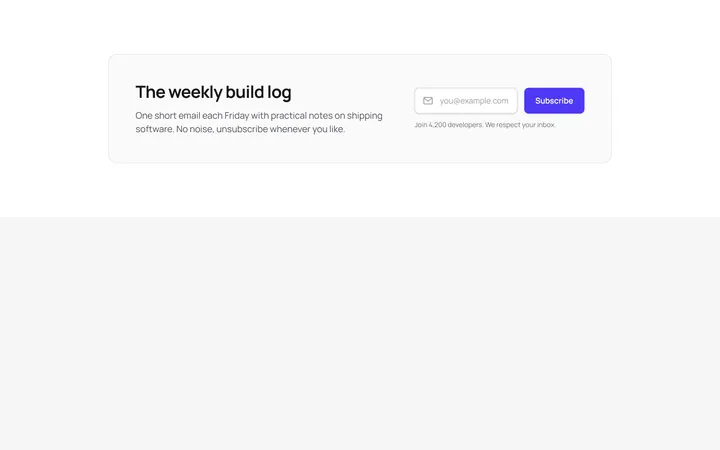
Inline Email Signup Bar
OriginalA wide banner that pairs a short heading with a single-line email field and subscribe button laid out side by side on desktop.
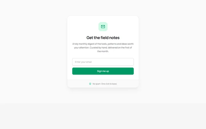
Boxed Newsletter Card
OriginalA centred, self-contained signup card with an icon badge, stacked email field and reassurance footer for dropping into a sidebar or narrow column.
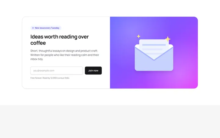
Split Newsletter With Illustration
OriginalA two-column section combining copy and an inline email form with a gradient panel and hand-drawn SVG envelope illustration.
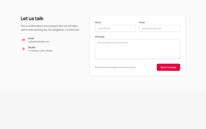
Contact Form With Details
OriginalA full contact section pairing email and location details with a name, email and message form on a bordered card.
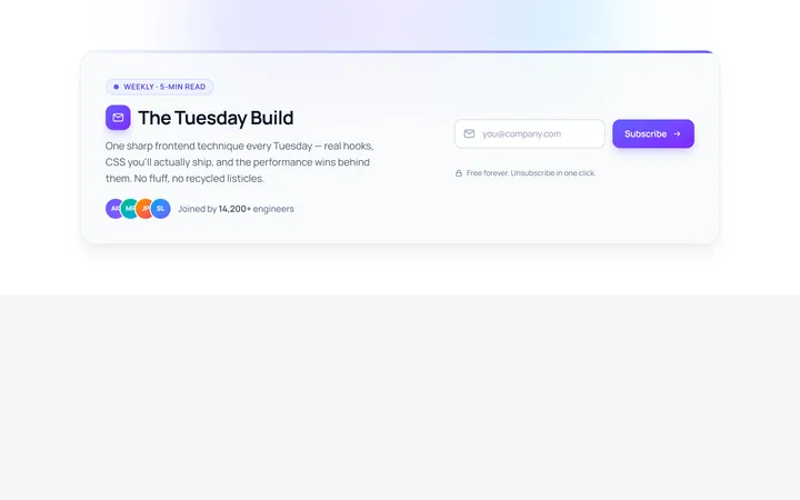
Inline Newsletter
Originalinline newsletter bar
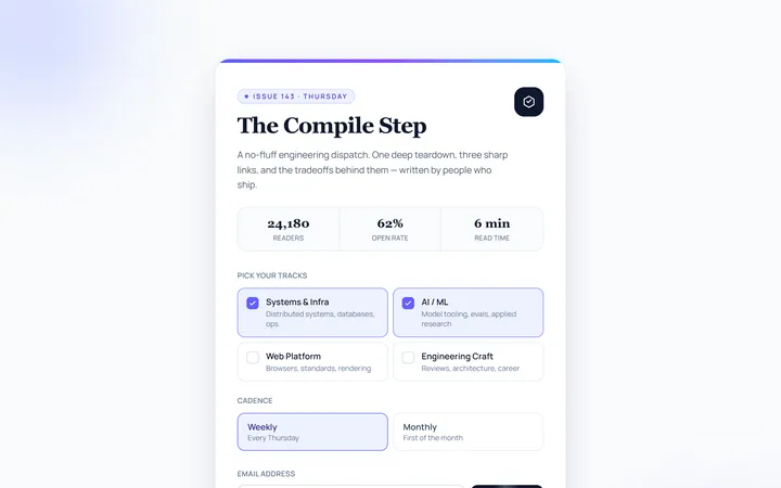
Card Newsletter
Originalnewsletter card
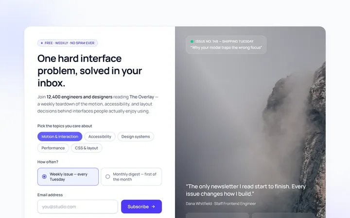
Split Image Newsletter
Originalnewsletter with image side
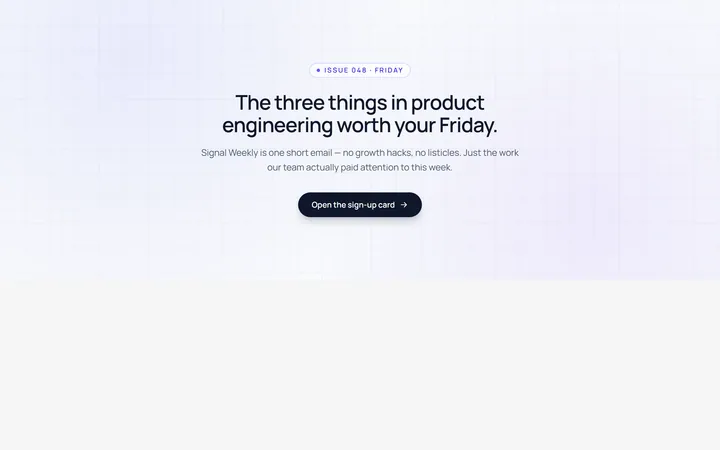
Modal Newsletter
Originalnewsletter popup card
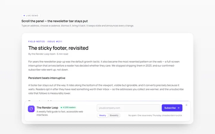
Footer Bar Newsletter
Originalsticky footer newsletter bar
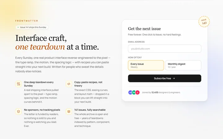
Benefits Newsletter
Originalnewsletter with benefit bullets
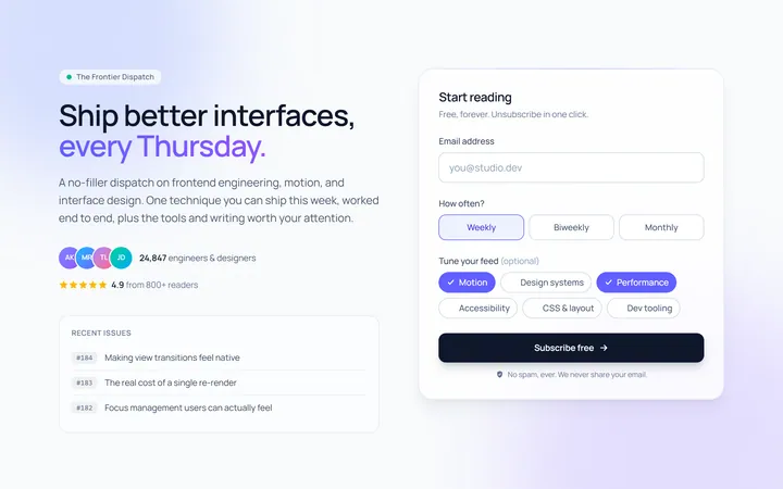
Dark Newsletter
Originaldark newsletter section
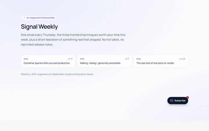
Floating Newsletter
Originalfloating newsletter widget