

Bar Gradient Progress
Original · freegradient progress bar with label
byWeb InnoventixReact + Tailwind
progbargradientprogress
Copy prompt gives Claude Code, Cursor or v0 a ready-to-paste prompt that recreates this exact component.
npx shadcn@latest add https://webinnoventix.com/r/prog-bar-gradient.jsonprog-bar-gradient.tsx
"use client";
import { useId, useState, type ChangeEvent } from "react";
import { motion, useReducedMotion } from "motion/react";
type Metric = {
label: string;
value: number;
gradient: string;
hint: string;
};
const METRICS: Metric[] = [
{
label: "Test coverage",
value: 94,
gradient: "from-emerald-500 to-sky-400",
hint: "1,204 of 1,280 lines",
},
{
label: "Bundle budget used",
value: 68,
gradient: "from-amber-400 to-rose-500",
hint: "170 KB of 250 KB",
},
{
label: "Docs completeness",
value: 47,
gradient: "from-violet-500 to-indigo-500",
hint: "9 of 19 pages written",
},
];
const PRESETS = [0, 25, 50, 75, 100] as const;
const cx = (...parts: Array<string | false | undefined>): string =>
parts.filter(Boolean).join(" ");
const clamp = (n: number): number => Math.min(100, Math.max(0, n));
const statusFor = (value: number): string => {
if (value === 0) return "Not started";
if (value < 40) return "Getting started";
if (value < 75) return "In progress";
if (value < 100) return "Almost there";
return "Ready to ship";
};
export default function ProgBarGradient() {
const reduce = useReducedMotion();
const [value, setValue] = useState<number>(62);
const baseId = useId();
const heroLabelId = `${baseId}-hero-label`;
const sliderId = `${baseId}-slider`;
const liveId = `${baseId}-live`;
const status = statusFor(value);
const done = value === 100;
const checks = Math.round((value / 100) * 8);
const onSlider = (e: ChangeEvent<HTMLInputElement>): void => {
setValue(clamp(Number(e.target.value)));
};
const step = (delta: number): void => {
setValue((v) => clamp(v + delta));
};
return (
<section className="relative w-full bg-slate-50 px-4 py-16 sm:py-24 dark:bg-slate-950">
<style>{`
@keyframes pbg-shimmer {
0% { transform: translateX(-130%); }
100% { transform: translateX(340%); }
}
@keyframes pbg-pulse-dot {
0%, 100% { opacity: 0.55; transform: scale(0.8); }
50% { opacity: 1; transform: scale(1.5); }
}
@media (prefers-reduced-motion: reduce) {
.pbg-shimmer, .pbg-pulse-dot { animation: none !important; }
}
`}</style>
<div className="mx-auto w-full max-w-2xl">
<div className="rounded-3xl border border-slate-200 bg-white p-6 shadow-sm sm:p-8 dark:border-slate-800 dark:bg-slate-900">
{/* Header */}
<div className="flex items-start justify-between gap-4">
<div>
<p className="text-xs font-semibold uppercase tracking-[0.18em] text-indigo-600 dark:text-indigo-400">
Release pipeline
</p>
<h2
id={heroLabelId}
className="mt-1 text-lg font-semibold text-slate-900 sm:text-xl dark:text-white"
>
Deploy readiness · v2.4
</h2>
</div>
<span
className={cx(
"inline-flex select-none items-center gap-1.5 rounded-full px-2.5 py-1 text-xs font-medium",
done
? "bg-emerald-50 text-emerald-700 dark:bg-emerald-500/15 dark:text-emerald-300"
: "bg-slate-100 text-slate-600 dark:bg-slate-800 dark:text-slate-300",
)}
>
<span className="relative flex h-2 w-2">
{!reduce && !done && (
<span className="pbg-pulse-dot absolute inset-0 rounded-full bg-indigo-400" />
)}
<span
className={cx(
"relative inline-flex h-2 w-2 rounded-full",
done ? "bg-emerald-500" : "bg-indigo-500",
)}
/>
</span>
{status}
</span>
</div>
{/* Value + hint */}
<div className="mt-6 flex items-end justify-between gap-4">
<p
id={liveId}
aria-live="polite"
className="text-4xl font-semibold tabular-nums text-slate-900 dark:text-white"
>
{value}
<span className="ml-0.5 text-xl font-medium text-slate-400 dark:text-slate-500">
%
</span>
</p>
<p className="pb-1 text-right text-sm text-slate-500 dark:text-slate-400">
{checks} of 8 pre-flight checks passed
</p>
</div>
{/* Hero gradient bar */}
<div className="relative mt-3">
<div
role="progressbar"
aria-labelledby={heroLabelId}
aria-valuenow={value}
aria-valuemin={0}
aria-valuemax={100}
aria-valuetext={`${value} percent, ${status}`}
className="h-3.5 w-full overflow-hidden rounded-full bg-slate-200 dark:bg-slate-800"
>
<motion.div
animate={{ width: `${value}%` }}
transition={
reduce
? { duration: 0 }
: { type: "spring", stiffness: 140, damping: 24 }
}
className="relative h-full overflow-hidden rounded-full bg-gradient-to-r from-indigo-500 via-violet-500 to-sky-400"
>
{!reduce && value > 0 && (
<span className="pbg-shimmer absolute inset-y-0 left-0 w-1/3 bg-gradient-to-r from-transparent via-white/55 to-transparent" />
)}
</motion.div>
</div>
{value > 0 && value < 100 && (
<span
aria-hidden="true"
style={{ left: `${value}%` }}
className="pointer-events-none absolute top-1/2 h-4 w-4 -translate-x-1/2 -translate-y-1/2"
>
{!reduce && (
<span className="pbg-pulse-dot absolute inset-0 rounded-full bg-indigo-400/70" />
)}
<span className="absolute inset-0 rounded-full border-2 border-white bg-indigo-500 shadow-sm dark:border-slate-900" />
</span>
)}
</div>
{/* Slider control */}
<div className="mt-8">
<div className="flex items-center justify-between">
<label
htmlFor={sliderId}
className="text-sm font-medium text-slate-700 dark:text-slate-200"
>
Adjust readiness
</label>
<div className="flex items-center gap-2">
<button
type="button"
onClick={() => step(-5)}
disabled={value === 0}
aria-label="Decrease readiness by 5 percent"
className="inline-flex h-9 w-9 items-center justify-center rounded-xl border border-slate-200 bg-white text-slate-700 transition hover:bg-slate-100 focus-visible:outline-none focus-visible:ring-2 focus-visible:ring-indigo-500 focus-visible:ring-offset-2 focus-visible:ring-offset-white disabled:cursor-not-allowed disabled:opacity-40 dark:border-slate-700 dark:bg-slate-800 dark:text-slate-200 dark:hover:bg-slate-700 dark:focus-visible:ring-offset-slate-900"
>
<svg
viewBox="0 0 24 24"
className="h-4 w-4"
fill="none"
stroke="currentColor"
strokeWidth="2.2"
strokeLinecap="round"
aria-hidden="true"
>
<path d="M5 12h14" />
</svg>
</button>
<button
type="button"
onClick={() => step(5)}
disabled={value === 100}
aria-label="Increase readiness by 5 percent"
className="inline-flex h-9 w-9 items-center justify-center rounded-xl border border-slate-200 bg-white text-slate-700 transition hover:bg-slate-100 focus-visible:outline-none focus-visible:ring-2 focus-visible:ring-indigo-500 focus-visible:ring-offset-2 focus-visible:ring-offset-white disabled:cursor-not-allowed disabled:opacity-40 dark:border-slate-700 dark:bg-slate-800 dark:text-slate-200 dark:hover:bg-slate-700 dark:focus-visible:ring-offset-slate-900"
>
<svg
viewBox="0 0 24 24"
className="h-4 w-4"
fill="none"
stroke="currentColor"
strokeWidth="2.2"
strokeLinecap="round"
aria-hidden="true"
>
<path d="M12 5v14M5 12h14" />
</svg>
</button>
</div>
</div>
<input
id={sliderId}
type="range"
min={0}
max={100}
step={1}
value={value}
onChange={onSlider}
aria-describedby={liveId}
className="mt-3 w-full cursor-pointer accent-indigo-500 focus-visible:outline-none focus-visible:ring-2 focus-visible:ring-indigo-500 focus-visible:ring-offset-4 focus-visible:ring-offset-white dark:accent-indigo-400 dark:focus-visible:ring-offset-slate-900"
/>
{/* Presets */}
<div className="mt-5 flex flex-wrap gap-2">
{PRESETS.map((preset) => {
const active = value === preset;
return (
<button
key={preset}
type="button"
onClick={() => setValue(preset)}
aria-pressed={active}
className={cx(
"rounded-lg border px-3 py-1.5 text-sm font-medium tabular-nums transition focus-visible:outline-none focus-visible:ring-2 focus-visible:ring-indigo-500 focus-visible:ring-offset-2 focus-visible:ring-offset-white dark:focus-visible:ring-offset-slate-900",
active
? "border-indigo-500 bg-indigo-50 text-indigo-700 dark:border-indigo-400 dark:bg-indigo-500/15 dark:text-indigo-300"
: "border-slate-200 bg-white text-slate-600 hover:bg-slate-100 dark:border-slate-700 dark:bg-slate-800 dark:text-slate-300 dark:hover:bg-slate-700",
)}
>
{preset}%
</button>
);
})}
</div>
</div>
{/* Divider */}
<div className="my-8 h-px w-full bg-slate-200 dark:bg-slate-800" />
{/* Secondary metrics */}
<div>
<h3 className="text-sm font-semibold text-slate-700 dark:text-slate-200">
Quality metrics
</h3>
<ul className="mt-5 space-y-5">
{METRICS.map((m, i) => (
<li key={m.label}>
<div className="flex items-baseline justify-between gap-4">
<span className="text-sm font-medium text-slate-700 dark:text-slate-200">
{m.label}
</span>
<span className="text-sm font-semibold tabular-nums text-slate-900 dark:text-white">
{m.value}%
</span>
</div>
<div
role="progressbar"
aria-label={m.label}
aria-valuenow={m.value}
aria-valuemin={0}
aria-valuemax={100}
className="mt-2 h-2 w-full overflow-hidden rounded-full bg-slate-200 dark:bg-slate-800"
>
<motion.div
initial={{ width: reduce ? `${m.value}%` : 0 }}
whileInView={{ width: `${m.value}%` }}
viewport={{ once: true, amount: 0.6 }}
transition={
reduce
? { duration: 0 }
: { duration: 0.9, delay: 0.08 * i, ease: "easeOut" }
}
className={cx(
"h-full rounded-full bg-gradient-to-r",
m.gradient,
)}
/>
</div>
<p className="mt-1.5 text-xs text-slate-500 dark:text-slate-400">
{m.hint}
</p>
</li>
))}
</ul>
</div>
</div>
</div>
</section>
);
}Dependencies
motion
Licence
Built by Web Innoventix. Free for personal and commercial use, no attribution required.
Built by Web Innoventix
Need a custom interface, a full website, or SEO that gets you cited by AI? We design, build and rank it end to end.
Get a free quoteSimilar components
Browse all →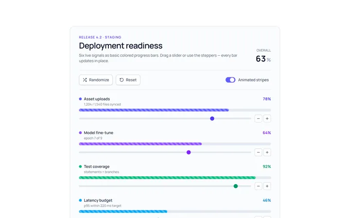
Bar Basic Progress
Originalbasic progress bars in colours
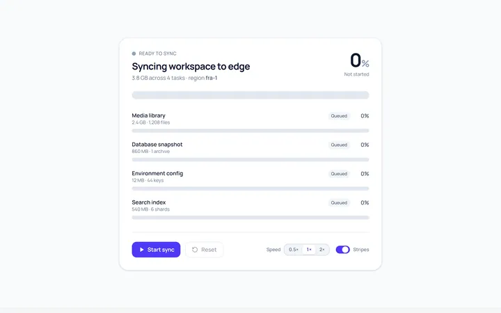
Bar Striped Progress
Originalanimated striped progress bar
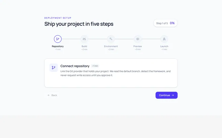
Bar Steps Progress
Originalstepped progress bar

Ring Progress
Originalcircular progress ring with percent

Ring Gradient Progress
Originalgradient circular progress

Semicircle Progress
Originalsemicircle gauge progress
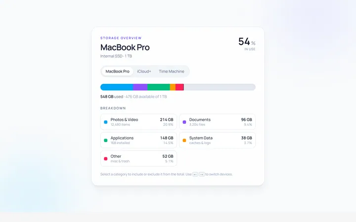
Multi Progress
Originalmulti-segment stacked progress
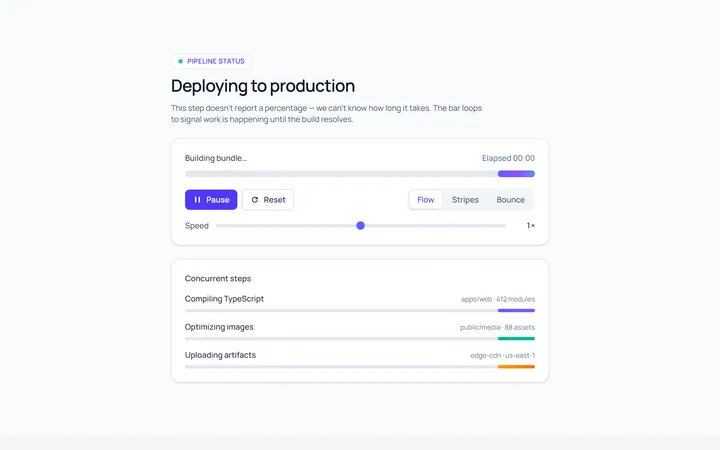
Indeterminate Progress
Originalindeterminate progress bar
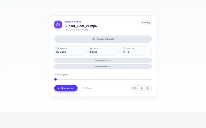
Label Inside Progress
Originalprogress bar with inner label
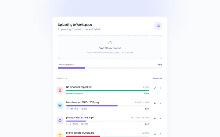
Upload Progress
Originalfile upload progress rows
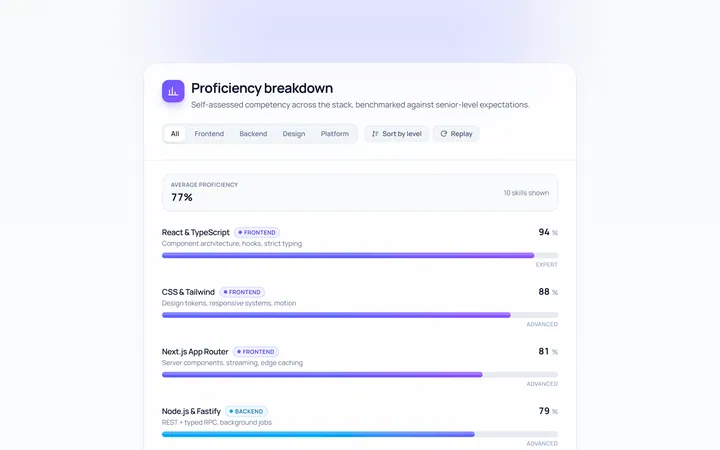
Skill Bars Progress
Originalanimated skill/percent bars

Spotlight Hero
OriginalA centred hero with a soft radial spotlight, badge and dual call-to-action.