

Bar Steps Progress
Original · freestepped progress bar
byWeb InnoventixReact + Tailwind
progbarstepsprogress
Copy prompt gives Claude Code, Cursor or v0 a ready-to-paste prompt that recreates this exact component.
npx shadcn@latest add https://webinnoventix.com/r/prog-bar-steps.jsonprog-bar-steps.tsx
"use client";
import { useId, useRef, useState } from "react";
import type { KeyboardEvent, ReactNode } from "react";
import { AnimatePresence, motion, useReducedMotion } from "motion/react";
type IconProps = { className?: string };
function IconBranch({ className }: IconProps) {
return (
<svg viewBox="0 0 24 24" fill="none" stroke="currentColor" strokeWidth={1.8} strokeLinecap="round" strokeLinejoin="round" className={className} aria-hidden="true">
<circle cx="6" cy="6" r="2.4" />
<circle cx="6" cy="18" r="2.4" />
<circle cx="18" cy="8" r="2.4" />
<path d="M6 8.4v7.2" />
<path d="M18 10.4c0 3.4-2.7 4.6-5.6 5.1-2 .4-3.4 1-3.4 2.5" />
</svg>
);
}
function IconSliders({ className }: IconProps) {
return (
<svg viewBox="0 0 24 24" fill="none" stroke="currentColor" strokeWidth={1.8} strokeLinecap="round" strokeLinejoin="round" className={className} aria-hidden="true">
<path d="M5 5v6M5 15v4M12 5v2M12 11v8M19 5v10M19 19v0" />
<circle cx="5" cy="13" r="2" />
<circle cx="12" cy="9" r="2" />
<circle cx="19" cy="17" r="2" />
</svg>
);
}
function IconKey({ className }: IconProps) {
return (
<svg viewBox="0 0 24 24" fill="none" stroke="currentColor" strokeWidth={1.8} strokeLinecap="round" strokeLinejoin="round" className={className} aria-hidden="true">
<circle cx="8" cy="8" r="4" />
<path d="M11 11l7 7" />
<path d="M16 16l2-2M18.5 18.5l1.5-1.5" />
</svg>
);
}
function IconEye({ className }: IconProps) {
return (
<svg viewBox="0 0 24 24" fill="none" stroke="currentColor" strokeWidth={1.8} strokeLinecap="round" strokeLinejoin="round" className={className} aria-hidden="true">
<path d="M2.5 12S6 5.5 12 5.5 21.5 12 21.5 12 18 18.5 12 18.5 2.5 12 2.5 12Z" />
<circle cx="12" cy="12" r="2.6" />
</svg>
);
}
function IconRocket({ className }: IconProps) {
return (
<svg viewBox="0 0 24 24" fill="none" stroke="currentColor" strokeWidth={1.8} strokeLinecap="round" strokeLinejoin="round" className={className} aria-hidden="true">
<path d="M12 3c3 1.5 5 4.6 5 8.4 0 1.7-.4 3-1 4H8c-.6-1-1-2.3-1-4C7 7.6 9 4.5 12 3Z" />
<circle cx="12" cy="9.5" r="1.6" />
<path d="M7.4 15.4C5.6 16 4.8 18 5 20c2-.2 3.7-1.1 4.4-2.6M16.6 15.4c1.8.6 2.6 2.6 2.4 4.6-2-.2-3.7-1.1-4.4-2.6" />
</svg>
);
}
function IconCheck({ className }: IconProps) {
return (
<svg viewBox="0 0 24 24" fill="none" stroke="currentColor" strokeWidth={2.4} strokeLinecap="round" strokeLinejoin="round" className={className} aria-hidden="true">
<path d="M5 12.5l4.2 4.2L19 7" />
</svg>
);
}
function IconArrow({ className }: IconProps) {
return (
<svg viewBox="0 0 24 24" fill="none" stroke="currentColor" strokeWidth={2} strokeLinecap="round" strokeLinejoin="round" className={className} aria-hidden="true">
<path d="M5 12h14M13 6l6 6-6 6" />
</svg>
);
}
type Step = {
id: string;
title: string;
short: string;
description: string;
meta: string;
icon: (p: IconProps) => ReactNode;
};
const STEPS: Step[] = [
{
id: "connect",
title: "Connect repository",
short: "Repository",
meta: "~1 min",
description:
"Link the Git provider that holds your project. We read the default branch, detect the framework, and never request write access until you approve it.",
icon: IconBranch,
},
{
id: "build",
title: "Configure the build",
short: "Build",
meta: "~2 min",
description:
"Confirm the install command, build command, and output directory. Auto-detected values are pre-filled for Next.js, Vite, and Astro — override any of them inline.",
icon: IconSliders,
},
{
id: "env",
title: "Add environment variables",
short: "Environment",
meta: "~2 min",
description:
"Paste your .env or add keys one at a time. Secrets are encrypted at rest and scoped per environment, so preview builds never touch production credentials.",
icon: IconKey,
},
{
id: "preview",
title: "Review a preview",
short: "Preview",
meta: "~3 min",
description:
"We ship an isolated staging deployment with a shareable URL. Click through the running app and check the build logs before anything reaches your domain.",
icon: IconEye,
},
{
id: "launch",
title: "Go live",
short: "Launch",
meta: "~1 min",
description:
"Promote the verified build to production behind your custom domain. Rollback stays one click away — every previous deployment is kept and instantly restorable.",
icon: IconRocket,
},
];
export default function ProgBarSteps() {
const reduce = useReducedMotion();
const [current, setCurrent] = useState<number>(0);
const [maxReached, setMaxReached] = useState<number>(0);
const [done, setDone] = useState<boolean>(false);
const [focusIndex, setFocusIndex] = useState<number>(0);
const stepRefs = useRef<Array<HTMLButtonElement | null>>([]);
const liveId = useId();
const last = STEPS.length - 1;
const fillPct = done ? 100 : (current / last) * 100;
const percent = Math.round(fillPct);
const edgeInset = `${50 / STEPS.length}%`;
const getStatus = (i: number): "complete" | "current" | "upcoming" => {
if (done || i < current) return "complete";
if (i === current) return "current";
return "upcoming";
};
const focusStep = (i: number) => {
const clamped = Math.max(0, Math.min(last, i));
setFocusIndex(clamped);
stepRefs.current[clamped]?.focus();
};
const goTo = (i: number) => {
if (i > maxReached) return;
setDone(false);
setCurrent(i);
setFocusIndex(i);
};
const handleNext = () => {
if (current < last) {
const next = current + 1;
setCurrent(next);
setMaxReached((m) => Math.max(m, next));
setFocusIndex(next);
return;
}
setDone(true);
};
const handleBack = () => {
if (done) {
setDone(false);
return;
}
if (current > 0) {
const prev = current - 1;
setCurrent(prev);
setFocusIndex(prev);
}
};
const handleReset = () => {
setDone(false);
setCurrent(0);
setMaxReached(0);
setFocusIndex(0);
};
const handleKey = (e: KeyboardEvent<HTMLOListElement>) => {
switch (e.key) {
case "ArrowRight":
case "ArrowDown":
e.preventDefault();
focusStep(focusIndex + 1);
break;
case "ArrowLeft":
case "ArrowUp":
e.preventDefault();
focusStep(focusIndex - 1);
break;
case "Home":
e.preventDefault();
focusStep(0);
break;
case "End":
e.preventDefault();
focusStep(last);
break;
default:
break;
}
};
const active = STEPS[current];
const panelKey = done ? "done" : active.id;
const rise = reduce ? 0 : 14;
return (
<section className="relative w-full bg-slate-50 px-4 py-16 text-slate-900 sm:px-6 sm:py-24 dark:bg-slate-950 dark:text-slate-100">
<style>{`
@keyframes pbsteps-pulse {
0% { transform: scale(1); opacity: 0.5; }
70% { transform: scale(2); opacity: 0; }
100% { transform: scale(2); opacity: 0; }
}
@keyframes pbsteps-shimmer {
0% { transform: translateX(-120%); }
100% { transform: translateX(320%); }
}
@keyframes pbsteps-pop {
0% { transform: scale(0.5); opacity: 0; }
60% { transform: scale(1.12); }
100% { transform: scale(1); opacity: 1; }
}
.pbsteps-pulse-ring { animation: pbsteps-pulse 2.1s cubic-bezier(0.4, 0, 0.2, 1) infinite; }
.pbsteps-shimmer { animation: pbsteps-shimmer 2.4s ease-in-out infinite; }
.pbsteps-pop { animation: pbsteps-pop 0.34s cubic-bezier(0.34, 1.56, 0.64, 1); }
@media (prefers-reduced-motion: reduce) {
.pbsteps-pulse-ring, .pbsteps-shimmer, .pbsteps-pop { animation: none !important; }
}
`}</style>
<div className="mx-auto max-w-3xl">
<header className="mb-10 flex flex-col gap-3 sm:mb-12 sm:flex-row sm:items-end sm:justify-between">
<div>
<p className="mb-2 text-xs font-semibold uppercase tracking-[0.2em] text-indigo-600 dark:text-indigo-400">
Deployment setup
</p>
<h2 className="text-2xl font-semibold tracking-tight sm:text-3xl">
Ship your project in five steps
</h2>
</div>
<div className="flex items-baseline gap-3 rounded-full border border-slate-200 bg-white px-4 py-2 text-sm shadow-sm dark:border-slate-800 dark:bg-slate-900">
<span className="font-medium text-slate-500 dark:text-slate-400">
{done ? "Complete" : `Step ${current + 1} of ${STEPS.length}`}
</span>
<span className="tabular-nums text-lg font-semibold text-indigo-600 dark:text-indigo-400">
{percent}%
</span>
</div>
</header>
<nav aria-label="Deployment setup progress">
<ol
className="relative flex items-start"
onKeyDown={handleKey}
>
<div
className="pointer-events-none absolute top-[20px] h-1 rounded-full bg-slate-200 dark:bg-slate-800"
style={{ left: edgeInset, right: edgeInset }}
aria-hidden="true"
>
<motion.div
className="relative h-full overflow-hidden rounded-full bg-gradient-to-r from-indigo-500 to-violet-500"
initial={false}
animate={{ width: `${fillPct}%` }}
transition={{ duration: reduce ? 0 : 0.6, ease: [0.22, 1, 0.36, 1] }}
>
{!reduce && fillPct > 0 && (
<span className="pbsteps-shimmer absolute inset-y-0 left-0 w-1/3 bg-gradient-to-r from-transparent via-white/70 to-transparent" />
)}
</motion.div>
</div>
{STEPS.map((step, i) => {
const status = getStatus(i);
const reachable = i <= maxReached;
const Icon = step.icon;
return (
<li key={step.id} className="relative flex min-w-0 flex-1 flex-col items-center">
<button
type="button"
ref={(el) => {
stepRefs.current[i] = el;
}}
tabIndex={i === focusIndex ? 0 : -1}
aria-current={status === "current" ? "step" : undefined}
aria-disabled={reachable ? undefined : true}
aria-label={`Step ${i + 1}: ${step.title}${
status === "complete" ? " (completed)" : status === "current" ? " (current)" : " (not yet available)"
}`}
onClick={() => goTo(i)}
onFocus={() => setFocusIndex(i)}
className={`group flex w-full flex-col items-center rounded-2xl px-1 pb-1 pt-0 outline-none focus-visible:ring-2 focus-visible:ring-indigo-500 focus-visible:ring-offset-2 dark:focus-visible:ring-offset-slate-950 ${
reachable ? "cursor-pointer" : "cursor-not-allowed"
}`}
>
<span className="relative flex h-11 w-11 items-center justify-center">
{status === "current" && !reduce && (
<span className="pbsteps-pulse-ring absolute inset-0 rounded-full bg-indigo-500/50" aria-hidden="true" />
)}
<span
className={`relative z-10 flex h-11 w-11 items-center justify-center rounded-full transition-colors duration-300 ${
status === "complete"
? "bg-gradient-to-br from-indigo-500 to-violet-600 text-white shadow-lg shadow-indigo-500/25"
: status === "current"
? "border-2 border-indigo-500 bg-white text-indigo-600 dark:bg-slate-900 dark:text-indigo-300"
: "border border-slate-200 bg-slate-100 text-slate-400 dark:border-slate-700 dark:bg-slate-800 dark:text-slate-500"
}`}
>
{status === "complete" ? (
<IconCheck className={`h-5 w-5 ${reduce ? "" : "pbsteps-pop"}`} />
) : (
<Icon className="h-5 w-5" />
)}
</span>
</span>
<span
className={`mt-3 text-center text-[13px] font-semibold leading-tight transition-colors ${
status === "upcoming"
? "text-slate-400 dark:text-slate-500"
: "text-slate-900 dark:text-slate-100"
}`}
>
{step.short}
</span>
<span className="mt-0.5 hidden text-[11px] text-slate-400 sm:block dark:text-slate-500">
{status === "complete" ? "Done" : step.meta}
</span>
</button>
</li>
);
})}
</ol>
</nav>
<div className="mt-10 min-h-[168px] rounded-2xl border border-slate-200 bg-white p-6 shadow-sm sm:p-7 dark:border-slate-800 dark:bg-slate-900">
<AnimatePresence mode="wait" initial={false}>
{done ? (
<motion.div
key={panelKey}
initial={{ opacity: 0, y: rise }}
animate={{ opacity: 1, y: 0 }}
exit={{ opacity: 0, y: -rise }}
transition={{ duration: reduce ? 0 : 0.32, ease: "easeOut" }}
className="flex flex-col items-start gap-4 sm:flex-row sm:items-center"
>
<span className="flex h-12 w-12 shrink-0 items-center justify-center rounded-full bg-gradient-to-br from-emerald-500 to-emerald-600 text-white shadow-lg shadow-emerald-500/25">
<IconCheck className="h-6 w-6" />
</span>
<div>
<h3 className="text-lg font-semibold text-slate-900 dark:text-slate-100">
You’re live in production
</h3>
<p className="mt-1 text-sm leading-relaxed text-slate-600 dark:text-slate-300">
All five steps are complete and your build is serving traffic on your custom domain. Rollbacks and preview deploys stay available from the dashboard.
</p>
</div>
</motion.div>
) : (
<motion.div
key={panelKey}
initial={{ opacity: 0, y: rise }}
animate={{ opacity: 1, y: 0 }}
exit={{ opacity: 0, y: -rise }}
transition={{ duration: reduce ? 0 : 0.32, ease: "easeOut" }}
className="flex flex-col items-start gap-4 sm:flex-row"
>
<span className="flex h-12 w-12 shrink-0 items-center justify-center rounded-xl bg-indigo-50 text-indigo-600 dark:bg-indigo-500/10 dark:text-indigo-300">
<active.icon className="h-6 w-6" />
</span>
<div>
<div className="flex items-center gap-2">
<h3 className="text-lg font-semibold text-slate-900 dark:text-slate-100">
{active.title}
</h3>
<span className="rounded-full bg-slate-100 px-2 py-0.5 text-[11px] font-medium text-slate-500 dark:bg-slate-800 dark:text-slate-400">
{active.meta}
</span>
</div>
<p className="mt-1.5 text-sm leading-relaxed text-slate-600 dark:text-slate-300">
{active.description}
</p>
</div>
</motion.div>
)}
</AnimatePresence>
</div>
<div className="mt-6 flex items-center justify-between gap-4">
<button
type="button"
onClick={handleBack}
disabled={current === 0 && !done}
className="inline-flex items-center gap-2 rounded-xl border border-slate-200 bg-white px-4 py-2.5 text-sm font-semibold text-slate-700 transition-colors hover:bg-slate-50 focus-visible:outline-none focus-visible:ring-2 focus-visible:ring-indigo-500 focus-visible:ring-offset-2 disabled:cursor-not-allowed disabled:opacity-40 dark:border-slate-700 dark:bg-slate-900 dark:text-slate-200 dark:hover:bg-slate-800 dark:focus-visible:ring-offset-slate-950"
>
<IconArrow className="h-4 w-4 rotate-180" />
Back
</button>
{done ? (
<button
type="button"
onClick={handleReset}
className="inline-flex items-center gap-2 rounded-xl bg-slate-900 px-5 py-2.5 text-sm font-semibold text-white transition-colors hover:bg-slate-700 focus-visible:outline-none focus-visible:ring-2 focus-visible:ring-slate-500 focus-visible:ring-offset-2 dark:bg-white dark:text-slate-900 dark:hover:bg-slate-200 dark:focus-visible:ring-offset-slate-950"
>
Start over
</button>
) : (
<button
type="button"
onClick={handleNext}
className={`inline-flex items-center gap-2 rounded-xl px-5 py-2.5 text-sm font-semibold text-white shadow-sm transition-colors focus-visible:outline-none focus-visible:ring-2 focus-visible:ring-offset-2 dark:focus-visible:ring-offset-slate-950 ${
current === last
? "bg-emerald-600 hover:bg-emerald-500 focus-visible:ring-emerald-500"
: "bg-indigo-600 hover:bg-indigo-500 focus-visible:ring-indigo-500"
}`}
>
{current === last ? "Finish setup" : "Continue"}
{current === last ? (
<IconCheck className="h-4 w-4" />
) : (
<IconArrow className="h-4 w-4" />
)}
</button>
)}
</div>
<p id={liveId} aria-live="polite" className="sr-only">
{done
? "Setup complete. Your project is live in production."
: `Step ${current + 1} of ${STEPS.length}: ${active.title}. ${percent} percent complete.`}
</p>
</div>
</section>
);
}Dependencies
motion
Licence
Built by Web Innoventix. Free for personal and commercial use, no attribution required.
Built by Web Innoventix
Need a custom interface, a full website, or SEO that gets you cited by AI? We design, build and rank it end to end.
Get a free quoteSimilar components
Browse all →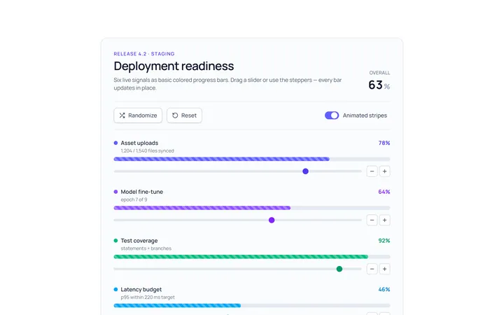
Bar Basic Progress
Originalbasic progress bars in colours
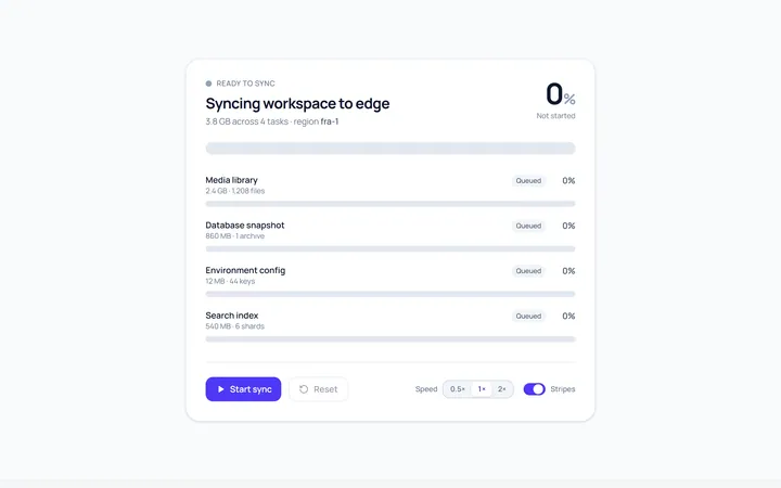
Bar Striped Progress
Originalanimated striped progress bar
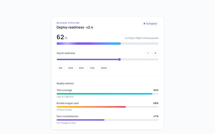
Bar Gradient Progress
Originalgradient progress bar with label
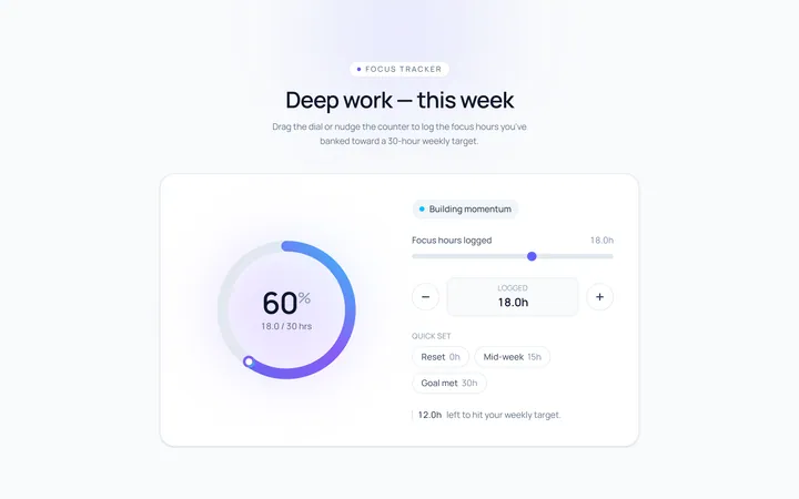
Ring Progress
Originalcircular progress ring with percent
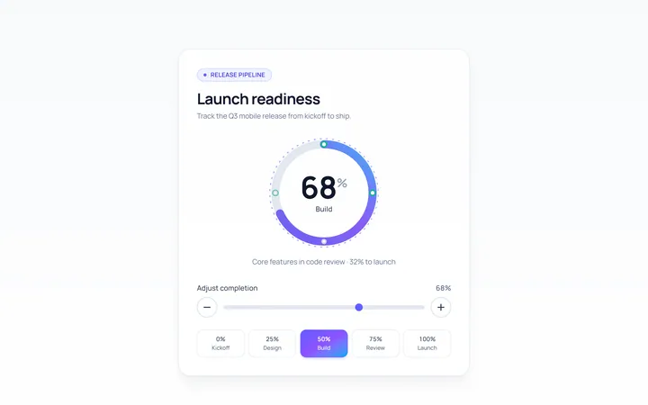
Ring Gradient Progress
Originalgradient circular progress
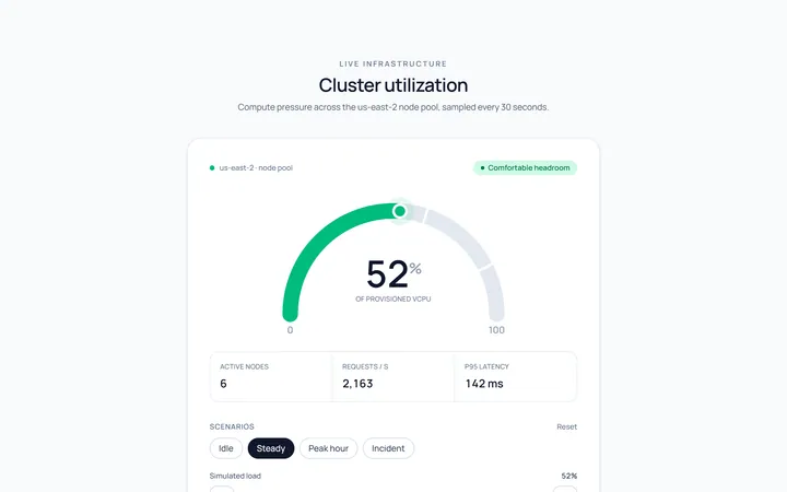
Semicircle Progress
Originalsemicircle gauge progress
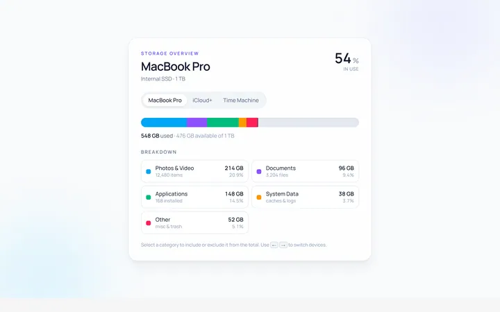
Multi Progress
Originalmulti-segment stacked progress
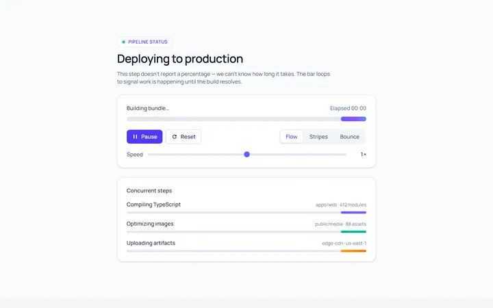
Indeterminate Progress
Originalindeterminate progress bar
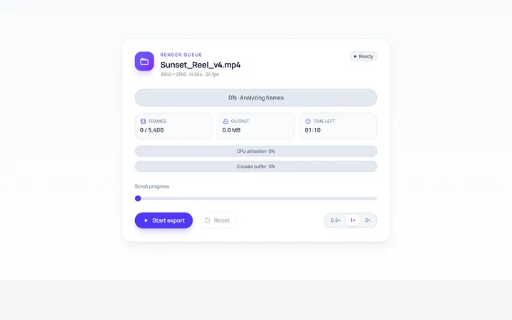
Label Inside Progress
Originalprogress bar with inner label
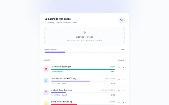
Upload Progress
Originalfile upload progress rows
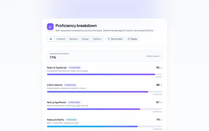
Skill Bars Progress
Originalanimated skill/percent bars

Spotlight Hero
OriginalA centred hero with a soft radial spotlight, badge and dual call-to-action.