

Multi Progress
Original · freemulti-segment stacked progress
byWeb InnoventixReact + Tailwind
progmultiprogress
Copy prompt gives Claude Code, Cursor or v0 a ready-to-paste prompt that recreates this exact component.
npx shadcn@latest add https://webinnoventix.com/r/prog-multi.jsonprog-multi.tsx
"use client";

import { useId, useRef, useState, type KeyboardEvent } from "react";
import { motion, useReducedMotion } from "motion/react";

type CategoryId = "media" | "docs" | "apps" | "system" | "other";

type Category = {
  id: CategoryId;
  label: string;
  hint: string;
  bar: string;
  dot: string;
  focus: string;
};

type Device = {
  name: string;
  sub: string;
  capacity: number; // in GB
  values: Record<CategoryId, number>;
};

const CATEGORIES: Category[] = [
  {
    id: "media",
    label: "Photos & Video",
    hint: "12,480 items",
    bar: "bg-sky-500 dark:bg-sky-400",
    dot: "bg-sky-500 dark:bg-sky-400",
    focus: "focus-visible:ring-sky-500 dark:focus-visible:ring-sky-400",
  },
  {
    id: "docs",
    label: "Documents",
    hint: "3,204 files",
    bar: "bg-violet-500 dark:bg-violet-400",
    dot: "bg-violet-500 dark:bg-violet-400",
    focus: "focus-visible:ring-violet-500 dark:focus-visible:ring-violet-400",
  },
  {
    id: "apps",
    label: "Applications",
    hint: "168 installed",
    bar: "bg-emerald-500 dark:bg-emerald-400",
    dot: "bg-emerald-500 dark:bg-emerald-400",
    focus: "focus-visible:ring-emerald-500 dark:focus-visible:ring-emerald-400",
  },
  {
    id: "system",
    label: "System Data",
    hint: "caches & logs",
    bar: "bg-amber-500 dark:bg-amber-400",
    dot: "bg-amber-500 dark:bg-amber-400",
    focus: "focus-visible:ring-amber-500 dark:focus-visible:ring-amber-400",
  },
  {
    id: "other",
    label: "Other",
    hint: "misc & trash",
    bar: "bg-rose-500 dark:bg-rose-400",
    dot: "bg-rose-500 dark:bg-rose-400",
    focus: "focus-visible:ring-rose-500 dark:focus-visible:ring-rose-400",
  },
];

const DEVICES: Device[] = [
  {
    name: "MacBook Pro",
    sub: "Internal SSD · 1 TB",
    capacity: 1024,
    values: { media: 214, docs: 96, apps: 148, system: 38, other: 52 },
  },
  {
    name: "iCloud+",
    sub: "2 TB plan",
    capacity: 2048,
    values: { media: 742, docs: 205, apps: 44, system: 12, other: 96 },
  },
  {
    name: "Time Machine",
    sub: "External · 4 TB",
    capacity: 4096,
    values: { media: 1180, docs: 320, apps: 210, system: 64, other: 148 },
  },
];

function formatSize(gb: number): string {
  if (gb >= 1024) {
    const tb = gb / 1024;
    return `${Number.isInteger(tb) ? tb.toFixed(0) : tb.toFixed(2)} TB`;
  }
  return `${gb.toFixed(0)} GB`;
}

export default function ProgMulti() {
  const uid = useId();
  const reduce = useReducedMotion();

  const [activeIndex, setActiveIndex] = useState(0);
  const [hidden, setHidden] = useState<Set<CategoryId>>(new Set());
  const [hovered, setHovered] = useState<CategoryId | null>(null);

  const tabRefs = useRef<Array<HTMLButtonElement | null>>([]);

  const device = DEVICES[activeIndex];

  const usedVisible = CATEGORIES.reduce(
    (sum, c) => (hidden.has(c.id) ? sum : sum + device.values[c.id]),
    0,
  );
  const free = Math.max(device.capacity - usedVisible, 0);
  const usedPct = (usedVisible / device.capacity) * 100;

  const hoveredCat = hovered ? CATEGORIES.find((c) => c.id === hovered) ?? null : null;

  function toggle(id: CategoryId) {
    setHidden((prev) => {
      const next = new Set(prev);
      if (next.has(id)) next.delete(id);
      else next.add(id);
      return next;
    });
  }

  function onTabKeyDown(e: KeyboardEvent<HTMLButtonElement>, i: number) {
    const last = DEVICES.length - 1;
    let next = i;
    if (e.key === "ArrowRight" || e.key === "ArrowDown") next = i === last ? 0 : i + 1;
    else if (e.key === "ArrowLeft" || e.key === "ArrowUp") next = i === 0 ? last : i - 1;
    else if (e.key === "Home") next = 0;
    else if (e.key === "End") next = last;
    else return;
    e.preventDefault();
    setActiveIndex(next);
    tabRefs.current[next]?.focus();
  }

  const keyframes = `
@keyframes progmulti-pulse {
  0%, 100% { opacity: 0.35; transform: scaleY(0.82); }
  50% { opacity: 0.95; transform: scaleY(1); }
}
@keyframes progmulti-rise {
  from { opacity: 0; transform: translateY(6px); }
  to { opacity: 1; transform: translateY(0); }
}
@media (prefers-reduced-motion: reduce) {
  .progmulti-anim { animation: none !important; }
}
`;

  const panelId = `${uid}-panel`;

  return (
    <section
      aria-labelledby={`${uid}-title`}
      className="relative w-full overflow-hidden bg-slate-50 text-slate-900 dark:bg-slate-950 dark:text-slate-100"
    >
      <style>{keyframes}</style>

      {/* atmosphere */}
      <div
        aria-hidden
        className="pointer-events-none absolute -top-24 right-0 h-72 w-72 rounded-full bg-indigo-400/10 blur-3xl dark:bg-indigo-500/10"
      />
      <div
        aria-hidden
        className="pointer-events-none absolute -bottom-24 -left-10 h-72 w-72 rounded-full bg-sky-400/10 blur-3xl dark:bg-sky-500/10"
      />

      <div className="relative mx-auto max-w-2xl px-6 py-16 sm:py-24">
        <div className="rounded-3xl border border-slate-200 bg-white/80 p-6 shadow-xl shadow-slate-900/5 backdrop-blur-sm sm:p-8 dark:border-slate-800 dark:bg-slate-900/70 dark:shadow-black/30">
          {/* header */}
          <div className="flex flex-wrap items-start justify-between gap-4">
            <div>
              <p className="text-[0.7rem] font-semibold uppercase tracking-[0.22em] text-indigo-600 dark:text-indigo-400">
                Storage overview
              </p>
              <h2
                id={`${uid}-title`}
                className="mt-1.5 text-2xl font-semibold tracking-tight text-slate-900 sm:text-3xl dark:text-white"
              >
                {device.name}
              </h2>
              <p className="mt-1 text-sm text-slate-500 dark:text-slate-400">{device.sub}</p>
            </div>

            <div className="text-right">
              <div className="flex items-baseline justify-end gap-1">
                <span className="text-3xl font-semibold tabular-nums tracking-tight text-slate-900 sm:text-4xl dark:text-white">
                  {Math.round(usedPct)}
                </span>
                <span className="text-lg font-medium text-slate-400 dark:text-slate-500">%</span>
              </div>
              <p className="text-xs font-medium uppercase tracking-wider text-slate-400 dark:text-slate-500">
                in use
              </p>
            </div>
          </div>

          {/* device tabs */}
          <div
            role="tablist"
            aria-label="Choose a device"
            className="mt-6 inline-flex rounded-full border border-slate-200 bg-slate-100 p-1 dark:border-slate-800 dark:bg-slate-800/60"
          >
            {DEVICES.map((d, i) => {
              const selected = i === activeIndex;
              return (
                <button
                  key={d.name}
                  ref={(el) => {
                    tabRefs.current[i] = el;
                  }}
                  role="tab"
                  type="button"
                  id={`${uid}-tab-${i}`}
                  aria-selected={selected}
                  aria-controls={panelId}
                  tabIndex={selected ? 0 : -1}
                  onClick={() => setActiveIndex(i)}
                  onKeyDown={(e) => onTabKeyDown(e, i)}
                  className={`rounded-full px-3.5 py-1.5 text-sm font-medium transition-colors focus-visible:outline-none focus-visible:ring-2 focus-visible:ring-indigo-500 focus-visible:ring-offset-2 focus-visible:ring-offset-slate-100 dark:focus-visible:ring-offset-slate-900 ${
                    selected
                      ? "bg-white text-slate-900 shadow-sm dark:bg-slate-700 dark:text-white"
                      : "text-slate-500 hover:text-slate-800 dark:text-slate-400 dark:hover:text-slate-200"
                  }`}
                >
                  {d.name}
                </button>
              );
            })}
          </div>

          {/* panel */}
          <div id={panelId} role="tabpanel" aria-labelledby={`${uid}-tab-${activeIndex}`} tabIndex={0} className="mt-6 focus-visible:outline-none">
            {/* stacked bar */}
            <div
              role="progressbar"
              aria-valuenow={Math.round(usedPct)}
              aria-valuemin={0}
              aria-valuemax={100}
              aria-valuetext={`${formatSize(usedVisible)} used of ${formatSize(device.capacity)}`}
              aria-label={`${device.name} storage in use`}
              className="relative flex h-6 w-full overflow-hidden rounded-full bg-slate-200 shadow-inner dark:bg-slate-800"
            >
              {CATEGORIES.map((c) => {
                const isHidden = hidden.has(c.id);
                const widthPct = isHidden ? 0 : (device.values[c.id] / device.capacity) * 100;
                const dimmed = hovered !== null && hovered !== c.id;
                return (
                  <motion.div
                    key={c.id}
                    aria-hidden
                    title={`${c.label} — ${formatSize(device.values[c.id])}`}
                    className={`h-full ${c.bar} transition-opacity duration-200`}
                    style={{ opacity: dimmed ? 0.32 : 1 }}
                    initial={reduce ? false : { width: 0 }}
                    animate={{ width: `${widthPct}%` }}
                    transition={
                      reduce ? { duration: 0 } : { type: "spring", stiffness: 140, damping: 22 }
                    }
                  />
                );
              })}

              {/* boundary marker */}
              {usedPct > 1 && usedPct < 99 && (
                <motion.div
                  aria-hidden
                  className="progmulti-anim absolute top-0 h-full w-[2px] rounded bg-slate-900/70 dark:bg-white/80 [animation:progmulti-pulse_2.4s_ease-in-out_infinite]"
                  initial={reduce ? false : { left: 0 }}
                  animate={{ left: `calc(${usedPct}% - 1px)` }}
                  transition={
                    reduce ? { duration: 0 } : { type: "spring", stiffness: 140, damping: 22 }
                  }
                />
              )}
            </div>

            {/* under-bar summary (live) */}
            <p
              aria-live="polite"
              className="mt-3 min-h-[1.25rem] text-sm text-slate-600 dark:text-slate-300"
            >
              {hoveredCat ? (
                <span className="progmulti-anim [animation:progmulti-rise_240ms_ease-out]">
                  <span className="font-semibold text-slate-900 dark:text-white">
                    {hoveredCat.label}
                  </span>
                  {" — "}
                  {formatSize(device.values[hoveredCat.id])}
                  <span className="text-slate-400 dark:text-slate-500">
                    {" · "}
                    {((device.values[hoveredCat.id] / device.capacity) * 100).toFixed(1)}% of drive
                  </span>
                </span>
              ) : (
                <>
                  <span className="font-semibold text-slate-900 dark:text-white">
                    {formatSize(usedVisible)}
                  </span>{" "}
                  used
                  <span className="text-slate-400 dark:text-slate-500">
                    {" · "}
                    {formatSize(free)} available of {formatSize(device.capacity)}
                  </span>
                </>
              )}
            </p>

            {/* legend header */}
            <div className="mt-6 flex items-center justify-between">
              <h3 className="text-xs font-semibold uppercase tracking-[0.16em] text-slate-500 dark:text-slate-400">
                Breakdown
              </h3>
              {hidden.size > 0 && (
                <button
                  type="button"
                  onClick={() => setHidden(new Set())}
                  className="rounded-md text-xs font-medium text-indigo-600 underline-offset-2 hover:underline focus-visible:outline-none focus-visible:ring-2 focus-visible:ring-indigo-500 focus-visible:ring-offset-2 focus-visible:ring-offset-white dark:text-indigo-400 dark:focus-visible:ring-offset-slate-900"
                >
                  Show all
                </button>
              )}
            </div>

            {/* legend / toggles */}
            <ul className="mt-3 grid grid-cols-1 gap-2 sm:grid-cols-2">
              {CATEGORIES.map((c) => {
                const isHidden = hidden.has(c.id);
                const value = device.values[c.id];
                const pct = (value / device.capacity) * 100;
                return (
                  <li key={c.id}>
                    <button
                      type="button"
                      aria-pressed={!isHidden}
                      onClick={() => toggle(c.id)}
                      onMouseEnter={() => setHovered(c.id)}
                      onMouseLeave={() => setHovered((h) => (h === c.id ? null : h))}
                      onFocus={() => setHovered(c.id)}
                      onBlur={() => setHovered((h) => (h === c.id ? null : h))}
                      className={`flex w-full items-center gap-3 rounded-xl border px-3 py-2.5 text-left transition-colors focus-visible:outline-none focus-visible:ring-2 focus-visible:ring-offset-2 focus-visible:ring-offset-white dark:focus-visible:ring-offset-slate-900 ${c.focus} ${
                        isHidden
                          ? "border-slate-200 bg-slate-50 dark:border-slate-800 dark:bg-slate-900/40"
                          : "border-slate-200 bg-white hover:border-slate-300 dark:border-slate-700 dark:bg-slate-800/50 dark:hover:border-slate-600"
                      }`}
                    >
                      <span
                        aria-hidden
                        className={`mt-0.5 h-3 w-3 flex-shrink-0 rounded-sm transition-all ${
                          isHidden
                            ? "bg-transparent ring-1 ring-inset ring-slate-300 dark:ring-slate-600"
                            : c.dot
                        }`}
                      />
                      <span className="min-w-0 flex-1">
                        <span
                          className={`block truncate text-sm font-medium ${
                            isHidden
                              ? "text-slate-400 line-through dark:text-slate-500"
                              : "text-slate-800 dark:text-slate-100"
                          }`}
                        >
                          {c.label}
                        </span>
                        <span className="block truncate text-xs text-slate-400 dark:text-slate-500">
                          {c.hint}
                        </span>
                      </span>
                      <span className="flex-shrink-0 text-right">
                        <span
                          className={`block text-sm font-semibold tabular-nums ${
                            isHidden
                              ? "text-slate-400 dark:text-slate-500"
                              : "text-slate-900 dark:text-white"
                          }`}
                        >
                          {formatSize(value)}
                        </span>
                        <span className="block text-xs tabular-nums text-slate-400 dark:text-slate-500">
                          {pct.toFixed(1)}%
                        </span>
                      </span>
                    </button>
                  </li>
                );
              })}
            </ul>

            <p className="mt-5 text-xs text-slate-400 dark:text-slate-500">
              Select a category to include or exclude it from the total. Use{" "}
              <kbd className="rounded border border-slate-300 bg-slate-100 px-1 font-sans text-[0.65rem] text-slate-600 dark:border-slate-700 dark:bg-slate-800 dark:text-slate-300">
                ←
              </kbd>{" "}
              <kbd className="rounded border border-slate-300 bg-slate-100 px-1 font-sans text-[0.65rem] text-slate-600 dark:border-slate-700 dark:bg-slate-800 dark:text-slate-300">
                →
              </kbd>{" "}
              to switch devices.
            </p>
          </div>
        </div>
      </div>
    </section>
  );
}
Dependencies
motion
Licence
Built by Web Innoventix. Free for personal and commercial use, no attribution required.
Built by Web Innoventix
Need a custom interface, a full website, or SEO that gets you cited by AI? We design, build and rank it end to end.
Get a free quoteSimilar components
Browse all →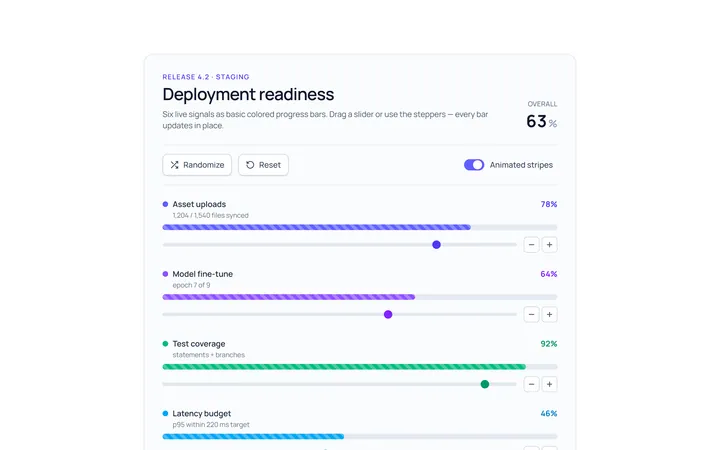
Bar Basic Progress
Originalbasic progress bars in colours
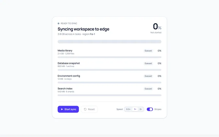
Bar Striped Progress
Originalanimated striped progress bar
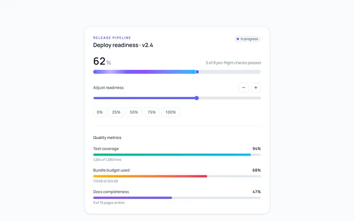
Bar Gradient Progress
Originalgradient progress bar with label
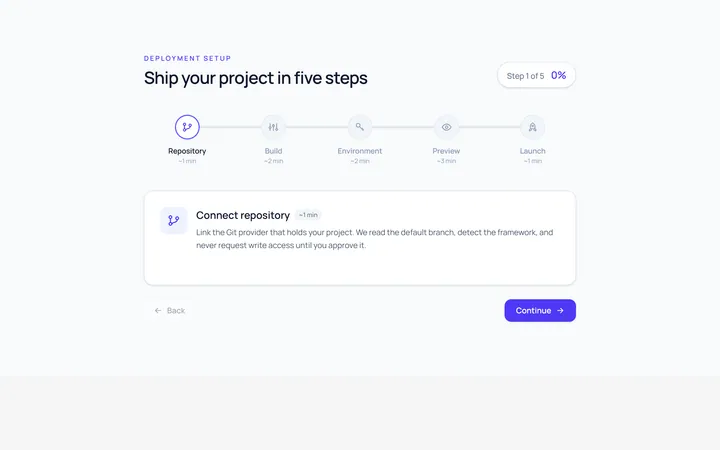
Bar Steps Progress
Originalstepped progress bar
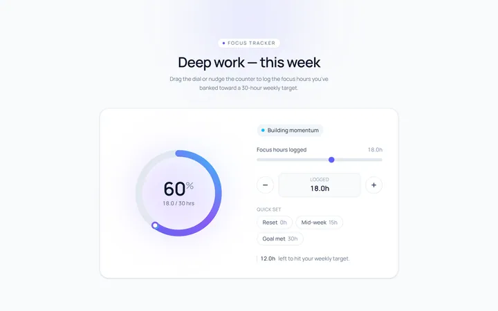
Ring Progress
Originalcircular progress ring with percent
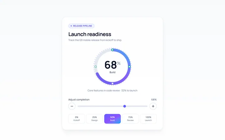
Ring Gradient Progress
Originalgradient circular progress
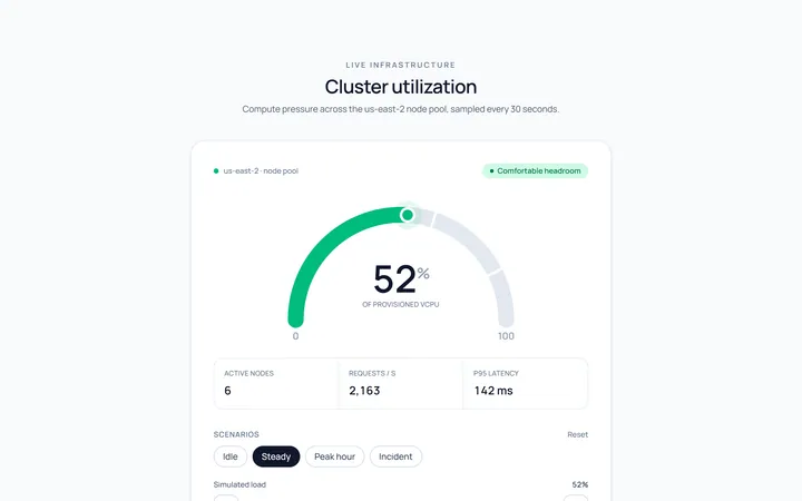
Semicircle Progress
Originalsemicircle gauge progress
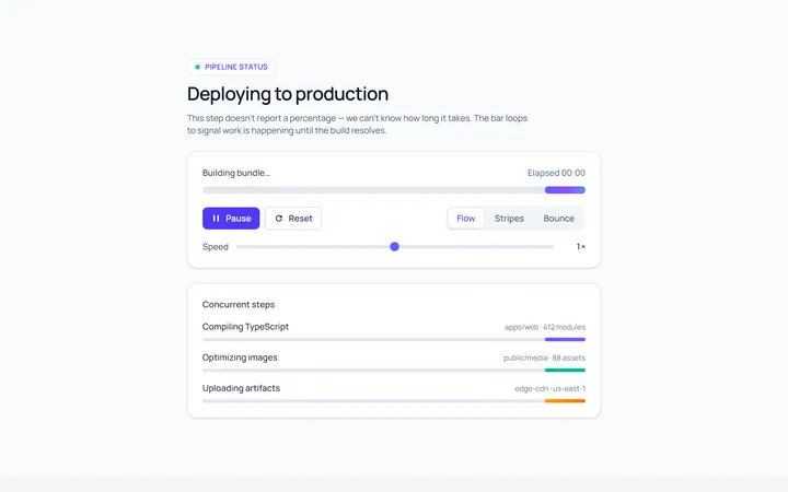
Indeterminate Progress
Originalindeterminate progress bar
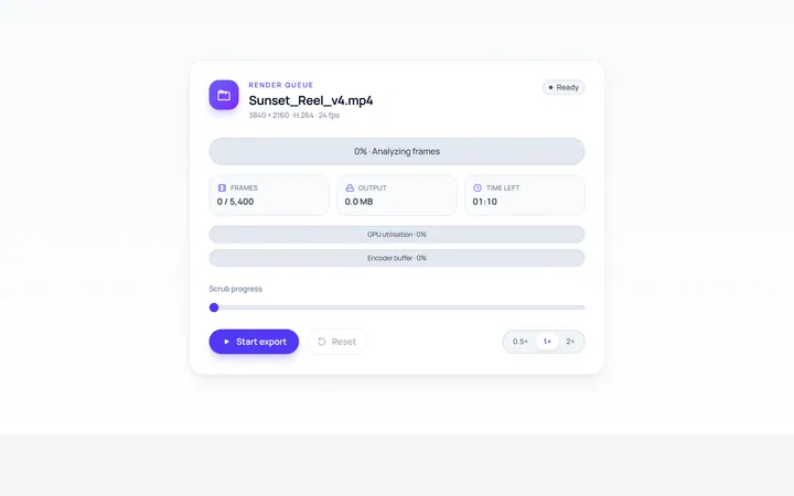
Label Inside Progress
Originalprogress bar with inner label
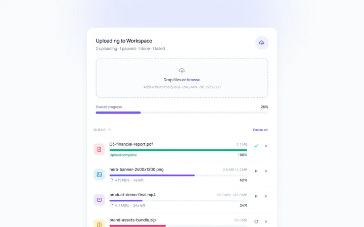
Upload Progress
Originalfile upload progress rows
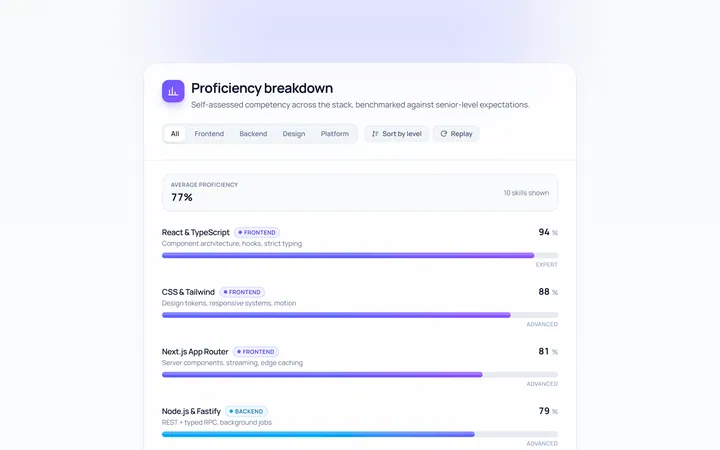
Skill Bars Progress
Originalanimated skill/percent bars

Spotlight Hero
OriginalA centred hero with a soft radial spotlight, badge and dual call-to-action.