

Card Skeleton
Original · freecard skeleton placeholder with shimmer
Copy prompt gives Claude Code, Cursor or v0 a ready-to-paste prompt that recreates this exact component.
npx shadcn@latest add https://webinnoventix.com/r/skel-card.json"use client";
import { useEffect, useRef, useState } from "react";
import type { KeyboardEvent as ReactKeyboardEvent } from "react";
import { motion, useReducedMotion } from "motion/react";
type SkelStyle = "shimmer" | "pulse" | "wave";
type Item = {
id: number;
tag: string;
title: string;
excerpt: string;
author: string;
initials: string;
read: string;
cover: string;
avatar: string;
};
const ITEMS: Item[] = [
{
id: 1,
tag: "Design systems",
title: "Tokens that survive a full rebrand",
excerpt:
"We renamed every color twice and shipped zero visual regressions. Here is the naming layer that made the migration boring on purpose.",
author: "Priya Nair",
initials: "PN",
read: "8 min read",
cover: "from-indigo-500 to-violet-600",
avatar: "from-indigo-400 to-violet-500",
},
{
id: 2,
tag: "Motion",
title: "Easing curves people can actually feel",
excerpt:
"Linear is a lie your users notice. A short tour of the four curves we reach for and exactly when each one earns its place.",
author: "Diego Ruiz",
initials: "DR",
read: "6 min read",
cover: "from-emerald-500 to-sky-600",
avatar: "from-emerald-400 to-sky-500",
},
{
id: 3,
tag: "Research",
title: "Usability tests without a lab or a budget",
excerpt:
"Five unmoderated sessions beat one perfect study. How we run them in an afternoon using tools the team already pays for.",
author: "Amara Okafor",
initials: "AO",
read: "5 min read",
cover: "from-rose-500 to-amber-500",
avatar: "from-rose-400 to-amber-400",
},
{
id: 4,
tag: "Accessibility",
title: "Focus rings are a feature, not a bug",
excerpt:
"The outline you keep deleting is the map keyboard users navigate by. Here is how to make it look intentional instead of accidental.",
author: "Lena Fischer",
initials: "LF",
read: "7 min read",
cover: "from-sky-500 to-indigo-600",
avatar: "from-sky-400 to-indigo-500",
},
{
id: 5,
tag: "Front-end",
title: "Skeletons that lower bounce, not just spinners",
excerpt:
"Perceived performance is still performance. What changed for us when we swapped generic loaders for content-shaped placeholders.",
author: "Sam Whitfield",
initials: "SW",
read: "9 min read",
cover: "from-violet-500 to-rose-500",
avatar: "from-violet-400 to-rose-400",
},
{
id: 6,
tag: "Process",
title: "Design reviews that end in decisions",
excerpt:
"Meetings drift when nobody owns the call. The one-page agenda that keeps critique honest, kind, and genuinely short.",
author: "Yuki Tanaka",
initials: "YT",
read: "4 min read",
cover: "from-amber-500 to-emerald-500",
avatar: "from-amber-400 to-emerald-400",
},
];
const STYLES: { id: SkelStyle; label: string }[] = [
{ id: "shimmer", label: "Shimmer" },
{ id: "pulse", label: "Pulse" },
{ id: "wave", label: "Wave" },
];
const MIN_CARDS = 2;
const MAX_CARDS = 6;
const LOAD_MS = 2200;
const RING =
"focus-visible:outline-none focus-visible:ring-2 focus-visible:ring-indigo-500 focus-visible:ring-offset-2 focus-visible:ring-offset-slate-50 dark:focus-visible:ring-offset-slate-950";
function Skel({
className,
skelStyle,
reduced,
}: {
className?: string;
skelStyle: SkelStyle;
reduced: boolean;
}) {
const anim = reduced
? ""
: skelStyle === "pulse"
? " skelcard-pulse"
: skelStyle === "wave"
? " skelcard-wave"
: "";
return (
<span
aria-hidden="true"
className={`relative block overflow-hidden bg-slate-200 dark:bg-slate-800${anim}${
className ? " " + className : ""
}`}
>
{!reduced && skelStyle === "shimmer" ? (
<span className="skelcard-sweep pointer-events-none absolute inset-0 -translate-x-full bg-gradient-to-r from-transparent via-white/70 to-transparent dark:via-white/10" />
) : null}
</span>
);
}
export default function SkelCard() {
const reduced = useReducedMotion() ?? false;
const [cycle, setCycle] = useState(0);
const [loading, setLoading] = useState(true);
const [hold, setHold] = useState(false);
const [skelStyle, setSkelStyle] = useState<SkelStyle>("shimmer");
const [count, setCount] = useState(3);
const [saved, setSaved] = useState<Record<number, boolean>>({});
const styleRefs = useRef<Array<HTMLButtonElement | null>>([]);
useEffect(() => {
setLoading(true);
const t = window.setTimeout(() => setLoading(false), LOAD_MS);
return () => window.clearTimeout(t);
}, [cycle]);
const showSkeleton = hold || loading;
const visible = ITEMS.slice(0, count);
const onStyleKey = (
e: ReactKeyboardEvent<HTMLButtonElement>,
idx: number,
) => {
let next = idx;
if (e.key === "ArrowRight" || e.key === "ArrowDown") next = (idx + 1) % STYLES.length;
else if (e.key === "ArrowLeft" || e.key === "ArrowUp")
next = (idx - 1 + STYLES.length) % STYLES.length;
else if (e.key === "Home") next = 0;
else if (e.key === "End") next = STYLES.length - 1;
else return;
e.preventDefault();
setSkelStyle(STYLES[next].id);
styleRefs.current[next]?.focus();
};
return (
<section className="relative w-full overflow-hidden bg-slate-50 px-4 py-16 text-slate-900 dark:bg-slate-950 dark:text-slate-100 sm:px-6 sm:py-20 lg:py-24">
<style>{`
@keyframes skelcard-shimmer {
0% { transform: translateX(-100%); }
100% { transform: translateX(100%); }
}
@keyframes skelcard-pulse {
0%, 100% { opacity: 1; }
50% { opacity: 0.42; }
}
@keyframes skelcard-wave {
0% { background-position: 200% 0; }
100% { background-position: -200% 0; }
}
@keyframes skelcard-spin {
to { transform: rotate(360deg); }
}
.skelcard-sweep { animation: skelcard-shimmer 1.6s ease-in-out infinite; }
.skelcard-pulse { animation: skelcard-pulse 1.5s ease-in-out infinite; }
.skelcard-wave {
background-image: linear-gradient(90deg, rgba(148,163,184,0) 0%, rgba(148,163,184,0.45) 50%, rgba(148,163,184,0) 100%);
background-size: 200% 100%;
animation: skelcard-wave 1.9s linear infinite;
}
.skelcard-spin { animation: skelcard-spin 0.9s linear infinite; }
@media (prefers-reduced-motion: reduce) {
.skelcard-sweep { display: none; }
.skelcard-pulse, .skelcard-wave, .skelcard-spin { animation: none !important; }
}
`}</style>
{/* soft ambient wash */}
<div
aria-hidden="true"
className="pointer-events-none absolute inset-x-0 -top-24 mx-auto h-64 max-w-4xl rounded-full bg-gradient-to-r from-indigo-300/30 via-violet-300/20 to-sky-300/30 blur-3xl dark:from-indigo-500/10 dark:via-violet-500/10 dark:to-sky-500/10"
/>
<div className="relative mx-auto max-w-6xl">
<header className="max-w-2xl">
<span className="inline-flex items-center gap-2 rounded-full border border-slate-200 bg-white px-3 py-1 text-xs font-medium uppercase tracking-wider text-indigo-600 shadow-sm dark:border-slate-800 dark:bg-slate-900 dark:text-indigo-300">
<svg viewBox="0 0 24 24" className="h-3.5 w-3.5" fill="none" aria-hidden="true">
<rect x="3" y="4" width="18" height="6" rx="1.5" fill="currentColor" opacity="0.35" />
<rect x="3" y="13" width="12" height="4" rx="1.5" fill="currentColor" />
</svg>
Loading states
</span>
<h2 className="mt-5 text-3xl font-semibold tracking-tight text-slate-900 dark:text-white sm:text-4xl">
Card skeletons that hold their shape
</h2>
<p className="mt-3 text-base leading-relaxed text-slate-600 dark:text-slate-400">
Content-shaped placeholders keep the layout stable while data
loads, so nothing jumps when it arrives. Switch the shimmer style,
hold the skeleton to inspect it, or simulate a fresh fetch.
</p>
</header>
{/* control panel */}
<div className="mt-8 flex flex-col gap-5 rounded-2xl border border-slate-200 bg-white/80 p-4 shadow-sm backdrop-blur dark:border-slate-800 dark:bg-slate-900/70 sm:flex-row sm:flex-wrap sm:items-end sm:gap-6 sm:p-5">
{/* reload */}
<div className="flex flex-col gap-1.5">
<span className="text-xs font-semibold uppercase tracking-wider text-slate-500 dark:text-slate-400">
Fetch
</span>
<button
type="button"
onClick={() => setCycle((c) => c + 1)}
className={`inline-flex items-center justify-center gap-2 rounded-xl bg-indigo-600 px-4 py-2.5 text-sm font-semibold text-white shadow-sm transition-colors hover:bg-indigo-500 active:bg-indigo-700 ${RING}`}
>
<svg
viewBox="0 0 24 24"
fill="none"
className={`h-4 w-4${showSkeleton && !reduced ? " skelcard-spin" : ""}`}
aria-hidden="true"
>
<path
d="M20 11a8 8 0 1 0-.6 3"
stroke="currentColor"
strokeWidth="2"
strokeLinecap="round"
/>
<path
d="M20 4v5h-5"
stroke="currentColor"
strokeWidth="2"
strokeLinecap="round"
strokeLinejoin="round"
/>
</svg>
{showSkeleton ? "Loading…" : "Simulate reload"}
</button>
</div>
{/* hold switch */}
<div className="flex flex-col gap-1.5">
<span className="text-xs font-semibold uppercase tracking-wider text-slate-500 dark:text-slate-400">
Inspect
</span>
<div className="flex items-center gap-3">
<button
type="button"
role="switch"
aria-checked={hold}
aria-label="Hold skeleton in view"
onClick={() => setHold((h) => !h)}
className={`relative inline-flex h-6 w-11 shrink-0 items-center rounded-full transition-colors ${RING} ${
hold ? "bg-indigo-600" : "bg-slate-300 dark:bg-slate-700"
}`}
>
<span
className={`inline-block h-5 w-5 transform rounded-full bg-white shadow transition-transform ${
hold ? "translate-x-5" : "translate-x-0.5"
}`}
/>
</button>
<span className="text-sm font-medium text-slate-700 dark:text-slate-300">
Hold skeleton
</span>
</div>
</div>
{/* style radiogroup */}
<div className="flex flex-col gap-1.5">
<span
id="skelcard-style-label"
className="text-xs font-semibold uppercase tracking-wider text-slate-500 dark:text-slate-400"
>
Animation
</span>
<div
role="radiogroup"
aria-labelledby="skelcard-style-label"
className="inline-flex rounded-xl border border-slate-200 bg-slate-100 p-1 dark:border-slate-800 dark:bg-slate-800/60"
>
{STYLES.map((s, i) => {
const active = skelStyle === s.id;
return (
<button
key={s.id}
ref={(el) => {
styleRefs.current[i] = el;
}}
type="button"
role="radio"
aria-checked={active}
tabIndex={active ? 0 : -1}
onClick={() => setSkelStyle(s.id)}
onKeyDown={(e) => onStyleKey(e, i)}
className={`rounded-lg px-3 py-1.5 text-sm font-medium transition-colors ${RING} ${
active
? "bg-white text-slate-900 shadow-sm dark:bg-slate-950 dark:text-white"
: "text-slate-600 hover:text-slate-900 dark:text-slate-400 dark:hover:text-slate-200"
}`}
>
{s.label}
</button>
);
})}
</div>
</div>
{/* count stepper */}
<div className="flex flex-col gap-1.5">
<span
id="skelcard-count-label"
className="text-xs font-semibold uppercase tracking-wider text-slate-500 dark:text-slate-400"
>
Cards
</span>
<div
role="group"
aria-labelledby="skelcard-count-label"
className="inline-flex items-center gap-1 rounded-xl border border-slate-200 bg-white p-1 dark:border-slate-800 dark:bg-slate-950"
>
<button
type="button"
aria-label="Show fewer cards"
disabled={count <= MIN_CARDS}
onClick={() => setCount((c) => Math.max(MIN_CARDS, c - 1))}
className={`inline-flex h-8 w-8 items-center justify-center rounded-lg text-slate-700 transition-colors hover:bg-slate-100 disabled:cursor-not-allowed disabled:opacity-40 dark:text-slate-300 dark:hover:bg-slate-800 ${RING}`}
>
<svg viewBox="0 0 24 24" className="h-4 w-4" aria-hidden="true">
<path
d="M5 12h14"
stroke="currentColor"
strokeWidth="2"
strokeLinecap="round"
/>
</svg>
</button>
<span
aria-live="polite"
className="w-7 text-center text-sm font-semibold tabular-nums text-slate-900 dark:text-white"
>
{count}
</span>
<button
type="button"
aria-label="Show more cards"
disabled={count >= MAX_CARDS}
onClick={() => setCount((c) => Math.min(MAX_CARDS, c + 1))}
className={`inline-flex h-8 w-8 items-center justify-center rounded-lg text-slate-700 transition-colors hover:bg-slate-100 disabled:cursor-not-allowed disabled:opacity-40 dark:text-slate-300 dark:hover:bg-slate-800 ${RING}`}
>
<svg viewBox="0 0 24 24" className="h-4 w-4" aria-hidden="true">
<path
d="M12 5v14M5 12h14"
stroke="currentColor"
strokeWidth="2"
strokeLinecap="round"
/>
</svg>
</button>
</div>
</div>
</div>
{/* live status */}
<p className="sr-only" role="status" aria-live="polite">
{showSkeleton
? "Loading cards"
: `${visible.length} cards loaded`}
</p>
{/* grid */}
<div
aria-busy={showSkeleton}
className="mt-8 grid grid-cols-1 gap-5 sm:grid-cols-2 lg:grid-cols-3"
>
{showSkeleton
? Array.from({ length: count }).map((_, i) => (
<div
key={`skel-${i}`}
aria-hidden="true"
className="overflow-hidden rounded-2xl border border-slate-200 bg-white p-4 dark:border-slate-800 dark:bg-slate-900"
>
<Skel
skelStyle={skelStyle}
reduced={reduced}
className="mb-4 h-40 w-full rounded-xl"
/>
<Skel
skelStyle={skelStyle}
reduced={reduced}
className="mb-4 h-5 w-24 rounded-full"
/>
<Skel
skelStyle={skelStyle}
reduced={reduced}
className="mb-2.5 h-4 w-11/12 rounded"
/>
<Skel
skelStyle={skelStyle}
reduced={reduced}
className="mb-5 h-4 w-3/4 rounded"
/>
<Skel
skelStyle={skelStyle}
reduced={reduced}
className="mb-2 h-3 w-full rounded"
/>
<Skel
skelStyle={skelStyle}
reduced={reduced}
className="mb-2 h-3 w-full rounded"
/>
<Skel
skelStyle={skelStyle}
reduced={reduced}
className="mb-6 h-3 w-2/3 rounded"
/>
<div className="flex items-center gap-3">
<Skel
skelStyle={skelStyle}
reduced={reduced}
className="h-9 w-9 shrink-0 rounded-full"
/>
<div className="flex-1">
<Skel
skelStyle={skelStyle}
reduced={reduced}
className="mb-2 h-3 w-28 rounded"
/>
<Skel
skelStyle={skelStyle}
reduced={reduced}
className="h-3 w-16 rounded"
/>
</div>
</div>
</div>
))
: visible.map((item, i) => {
const isSaved = !!saved[item.id];
return (
<motion.article
key={item.id}
initial={reduced ? false : { opacity: 0, y: 10 }}
animate={{ opacity: 1, y: 0 }}
transition={{
duration: 0.35,
ease: "easeOut",
delay: reduced ? 0 : i * 0.06,
}}
className="group flex flex-col overflow-hidden rounded-2xl border border-slate-200 bg-white shadow-sm transition-shadow hover:shadow-md dark:border-slate-800 dark:bg-slate-900"
>
<div
className={`relative h-40 w-full overflow-hidden bg-gradient-to-br ${item.cover}`}
>
<span
aria-hidden="true"
className="pointer-events-none absolute -right-3 -top-6 select-none text-[7rem] font-black leading-none text-white/15"
>
{item.tag.charAt(0)}
</span>
<span className="absolute bottom-3 left-3 inline-flex items-center rounded-full bg-black/25 px-2.5 py-1 text-xs font-semibold text-white backdrop-blur-sm">
{item.tag}
</span>
<button
type="button"
aria-pressed={isSaved}
aria-label={
isSaved
? `Remove ${item.title} from saved`
: `Save ${item.title}`
}
onClick={() =>
setSaved((s) => ({ ...s, [item.id]: !s[item.id] }))
}
className={`absolute right-3 top-3 inline-flex h-9 w-9 items-center justify-center rounded-full bg-white/90 text-slate-700 shadow-sm transition-colors hover:bg-white dark:bg-slate-950/70 dark:text-slate-200 dark:hover:bg-slate-950 ${RING} focus-visible:ring-offset-transparent`}
>
<svg
viewBox="0 0 24 24"
className="h-4 w-4"
fill={isSaved ? "currentColor" : "none"}
aria-hidden="true"
>
<path
d="M6 4h12a1 1 0 0 1 1 1v15l-7-4-7 4V5a1 1 0 0 1 1-1Z"
stroke="currentColor"
strokeWidth="2"
strokeLinejoin="round"
/>
</svg>
</button>
</div>
<div className="flex flex-1 flex-col p-5">
<h3 className="text-lg font-semibold leading-snug tracking-tight text-slate-900 line-clamp-2 dark:text-white">
{item.title}
</h3>
<p className="mt-2 text-sm leading-relaxed text-slate-600 line-clamp-3 dark:text-slate-400">
{item.excerpt}
</p>
<div className="mt-auto flex items-center gap-3 pt-5">
<span
aria-hidden="true"
className={`inline-flex h-9 w-9 shrink-0 items-center justify-center rounded-full bg-gradient-to-br text-xs font-bold text-white ${item.avatar}`}
>
{item.initials}
</span>
<div className="min-w-0">
<p className="truncate text-sm font-medium text-slate-800 dark:text-slate-200">
{item.author}
</p>
<p className="text-xs text-slate-500 dark:text-slate-500">
{item.read}
</p>
</div>
</div>
</div>
</motion.article>
);
})}
</div>
</div>
</section>
);
}Dependencies
Licence
Built by Web Innoventix. Free for personal and commercial use, no attribution required.
Built by Web Innoventix
Need a custom interface, a full website, or SEO that gets you cited by AI? We design, build and rank it end to end.
Get a free quoteSimilar components
Browse all →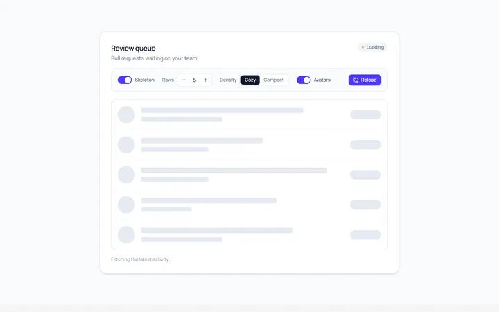
List Skeleton
Originallist rows skeleton
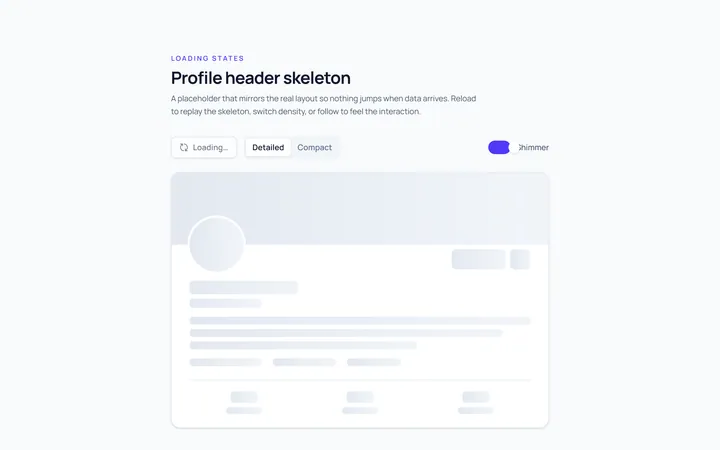
Profile Skeleton
Originalprofile header skeleton
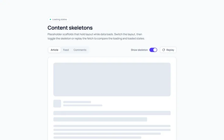
Article Skeleton
Originalarticle/text skeleton
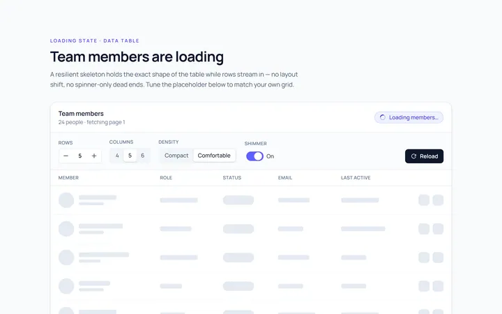
Table Skeleton
Originaltable skeleton
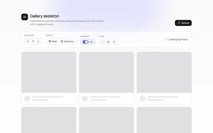
Gallery Skeleton
Originalimage grid skeleton
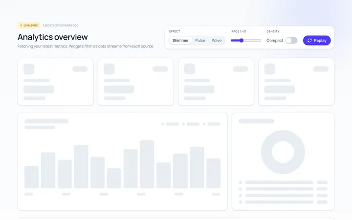
Dashboard Skeleton
Originaldashboard widgets skeleton
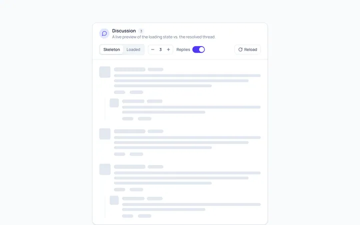
Comment Skeleton
Originalcomment thread skeleton

Spotlight Hero
OriginalA centred hero with a soft radial spotlight, badge and dual call-to-action.

Split Hero
OriginalA two-column hero pairing a headline and CTAs with a product mock and social proof.

Gradient Spotlight Hero
OriginalA minimal centred hero with a soft gradient-mesh backdrop, announcement pill and dual call-to-action buttons.

App Preview Hero
OriginalA centred hero that pairs headline copy with a realistic product dashboard mock built entirely from markup, complete with browser chrome and a floating notification card.

Waitlist Capture Hero
OriginalA dark, focused hero with an inline email capture form and avatar social proof, ready for pre-launch waitlists.