

Table Skeleton
Original · freetable skeleton
Copy prompt gives Claude Code, Cursor or v0 a ready-to-paste prompt that recreates this exact component.
npx shadcn@latest add https://webinnoventix.com/r/skel-table.json"use client";
import { useState } from "react";
import { motion, useReducedMotion } from "motion/react";
type Column = { key: string; label: string; kind: "member" | "status" | "text" };
const ALL_COLUMNS: Column[] = [
{ key: "member", label: "Member", kind: "member" },
{ key: "role", label: "Role", kind: "text" },
{ key: "status", label: "Status", kind: "status" },
{ key: "email", label: "Email", kind: "text" },
{ key: "active", label: "Last active", kind: "text" },
{ key: "plan", label: "Plan", kind: "text" },
];
const BAR_WIDTHS = ["w-16", "w-20", "w-24", "w-14", "w-28"] as const;
const NAME_WIDTHS = ["w-24", "w-28", "w-32", "w-20"] as const;
const SUB_WIDTHS = ["w-16", "w-20", "w-14"] as const;
const MIN_ROWS = 3;
const MAX_ROWS = 8;
function pick<T>(arr: readonly T[], seed: number): T {
return arr[Math.abs(seed) % arr.length] as T;
}
function seedFor(a: number, b: number, k: number): number {
return (a * 73856093) ^ ((b + 1) * 19349663) ^ ((k + 1) * 83492791);
}
const ring =
"focus:outline-none focus-visible:ring-2 focus-visible:ring-indigo-500 focus-visible:ring-offset-2 focus-visible:ring-offset-white dark:focus-visible:ring-offset-slate-900";
function Bar({ className = "", shine }: { className?: string; shine: boolean }) {
return (
<span
aria-hidden="true"
className={`relative block overflow-hidden bg-slate-200/90 dark:bg-slate-700/70 ${className}`}
>
{shine ? (
<span className="skeltable-sweep pointer-events-none absolute inset-0 -translate-x-full bg-gradient-to-r from-transparent via-white/70 to-transparent dark:via-white/10" />
) : null}
</span>
);
}
type SegOption = { label: string; value: string };
function Segmented({
legend,
name,
value,
options,
onChange,
}: {
legend: string;
name: string;
value: string;
options: SegOption[];
onChange: (v: string) => void;
}) {
return (
<fieldset className="min-w-0">
<legend className="mb-1.5 text-xs font-semibold uppercase tracking-wide text-slate-500 dark:text-slate-400">
{legend}
</legend>
<div className="inline-flex rounded-lg bg-slate-100 p-1 dark:bg-slate-800">
{options.map((o) => (
<label key={o.value} className="cursor-pointer">
<input
type="radio"
name={name}
value={o.value}
checked={value === o.value}
onChange={() => onChange(o.value)}
className="peer sr-only"
/>
<span
className={`block rounded-md px-3 py-1.5 text-sm font-medium text-slate-600 transition-colors peer-checked:bg-white peer-checked:text-slate-900 peer-checked:shadow-sm peer-focus-visible:ring-2 peer-focus-visible:ring-indigo-500 motion-reduce:transition-none dark:text-slate-300 dark:peer-checked:bg-slate-700 dark:peer-checked:text-white`}
>
{o.label}
</span>
</label>
))}
</div>
</fieldset>
);
}
export default function SkelTable() {
const reduced = useReducedMotion();
const [rows, setRows] = useState<number>(5);
const [cols, setCols] = useState<number>(5);
const [density, setDensity] = useState<"compact" | "comfortable">("comfortable");
const [shimmer, setShimmer] = useState<boolean>(true);
const [reloadKey, setReloadKey] = useState<number>(0);
const shine = shimmer && !reduced;
const compact = density === "compact";
const rowPad = compact ? "py-2.5" : "py-4";
const barH = compact ? "h-2.5" : "h-3";
const avatar = compact ? "h-8 w-8" : "h-10 w-10";
const dot = compact ? "h-6 w-6" : "h-7 w-7";
const visibleColumns = ALL_COLUMNS.slice(0, cols);
const rowList = Array.from({ length: rows }, (_, i) => i);
const renderCell = (col: Column, r: number, c: number) => {
if (col.kind === "member") {
return (
<div className="flex items-center gap-3">
<Bar className={`${avatar} shrink-0 rounded-full`} shine={shine} />
<div className="min-w-0 space-y-1.5">
<Bar
className={`${barH} ${pick(NAME_WIDTHS, seedFor(r, c, reloadKey))} rounded`}
shine={shine}
/>
<Bar
className={`h-2 ${pick(SUB_WIDTHS, seedFor(r, c + 11, reloadKey))} rounded`}
shine={shine}
/>
</div>
</div>
);
}
if (col.kind === "status") {
return <Bar className="h-6 w-20 rounded-full" shine={shine} />;
}
return (
<Bar
className={`${barH} ${pick(BAR_WIDTHS, seedFor(r, c, reloadKey))} rounded`}
shine={shine}
/>
);
};
return (
<section className="relative w-full bg-slate-50 px-4 py-16 text-slate-900 sm:px-6 sm:py-24 dark:bg-slate-950 dark:text-slate-100">
<style>{`
@keyframes skeltable-sweep {
0% { transform: translateX(-100%); }
100% { transform: translateX(150%); }
}
@keyframes skeltable-spin {
to { transform: rotate(360deg); }
}
.skeltable-sweep { animation: skeltable-sweep 1.6s ease-in-out infinite; }
.skeltable-spin { animation: skeltable-spin 0.9s linear infinite; }
@media (prefers-reduced-motion: reduce) {
.skeltable-sweep, .skeltable-spin { animation: none !important; }
}
`}</style>
<div className="mx-auto max-w-5xl">
<div className="mb-8 max-w-2xl">
<p className="text-xs font-semibold uppercase tracking-[0.2em] text-indigo-600 dark:text-indigo-400">
Loading state · Data table
</p>
<h2 className="mt-3 text-3xl font-bold tracking-tight sm:text-4xl">
Team members are loading
</h2>
<p className="mt-3 text-base leading-relaxed text-slate-600 dark:text-slate-400">
A resilient skeleton holds the exact shape of the table while rows stream in — no
layout shift, no spinner-only dead ends. Tune the placeholder below to match your own
grid.
</p>
</div>
<div className="overflow-hidden rounded-2xl border border-slate-200 bg-white shadow-sm dark:border-slate-800 dark:bg-slate-900">
{/* Card header */}
<div className="flex flex-wrap items-center justify-between gap-3 border-b border-slate-200 px-5 py-4 dark:border-slate-800">
<div>
<h3 className="text-base font-semibold text-slate-900 dark:text-white">
Team members
</h3>
<p className="text-sm text-slate-500 dark:text-slate-400">24 people · fetching page 1</p>
</div>
<span
role="status"
aria-live="polite"
className="inline-flex items-center gap-2 rounded-full border border-indigo-200 bg-indigo-50 px-3 py-1 text-sm font-medium text-indigo-700 dark:border-indigo-500/30 dark:bg-indigo-500/10 dark:text-indigo-300"
>
<svg
aria-hidden="true"
viewBox="0 0 24 24"
fill="none"
className="skeltable-spin h-4 w-4"
>
<circle cx="12" cy="12" r="9" stroke="currentColor" strokeOpacity="0.25" strokeWidth="3" />
<path d="M21 12a9 9 0 0 0-9-9" stroke="currentColor" strokeWidth="3" strokeLinecap="round" />
</svg>
Loading members…
</span>
</div>
{/* Controls */}
<div className="flex flex-wrap items-end gap-5 border-b border-slate-200 bg-slate-50/60 px-5 py-4 dark:border-slate-800 dark:bg-slate-800/30">
{/* Rows stepper */}
<div role="group" aria-labelledby="skeltable-rows-label" className="min-w-0">
<span
id="skeltable-rows-label"
className="mb-1.5 block text-xs font-semibold uppercase tracking-wide text-slate-500 dark:text-slate-400"
>
Rows
</span>
<div className="inline-flex items-center rounded-lg border border-slate-200 bg-white dark:border-slate-700 dark:bg-slate-900">
<button
type="button"
aria-label="Decrease row count"
disabled={rows <= MIN_ROWS}
onClick={() => setRows((r) => Math.max(MIN_ROWS, r - 1))}
className={`flex h-9 w-9 items-center justify-center rounded-l-lg text-slate-600 transition-colors hover:bg-slate-100 disabled:cursor-not-allowed disabled:opacity-40 motion-reduce:transition-none dark:text-slate-300 dark:hover:bg-slate-800 ${ring}`}
>
<svg aria-hidden="true" viewBox="0 0 16 16" className="h-4 w-4">
<path d="M3 8h10" stroke="currentColor" strokeWidth="1.6" strokeLinecap="round" />
</svg>
</button>
<span
aria-live="polite"
className="w-9 select-none text-center text-sm font-semibold tabular-nums text-slate-900 dark:text-white"
>
{rows}
</span>
<button
type="button"
aria-label="Increase row count"
disabled={rows >= MAX_ROWS}
onClick={() => setRows((r) => Math.min(MAX_ROWS, r + 1))}
className={`flex h-9 w-9 items-center justify-center rounded-r-lg text-slate-600 transition-colors hover:bg-slate-100 disabled:cursor-not-allowed disabled:opacity-40 motion-reduce:transition-none dark:text-slate-300 dark:hover:bg-slate-800 ${ring}`}
>
<svg aria-hidden="true" viewBox="0 0 16 16" className="h-4 w-4">
<path d="M8 3v10M3 8h10" stroke="currentColor" strokeWidth="1.6" strokeLinecap="round" />
</svg>
</button>
</div>
</div>
<Segmented
legend="Columns"
name="skeltable-cols"
value={String(cols)}
options={[
{ label: "4", value: "4" },
{ label: "5", value: "5" },
{ label: "6", value: "6" },
]}
onChange={(v) => setCols(Number(v))}
/>
<Segmented
legend="Density"
name="skeltable-density"
value={density}
options={[
{ label: "Compact", value: "compact" },
{ label: "Comfortable", value: "comfortable" },
]}
onChange={(v) => setDensity(v === "compact" ? "compact" : "comfortable")}
/>
{/* Shimmer switch */}
<div className="min-w-0">
<span className="mb-1.5 block text-xs font-semibold uppercase tracking-wide text-slate-500 dark:text-slate-400">
Shimmer
</span>
<button
type="button"
role="switch"
aria-checked={shimmer}
aria-label="Toggle shimmer animation"
onClick={() => setShimmer((s) => !s)}
className={`inline-flex h-9 items-center gap-2 rounded-lg px-1 ${ring}`}
>
<span
className={`relative inline-flex h-6 w-11 items-center rounded-full transition-colors motion-reduce:transition-none ${
shimmer ? "bg-indigo-500" : "bg-slate-300 dark:bg-slate-600"
}`}
>
<span
className={`inline-block h-5 w-5 transform rounded-full bg-white shadow transition-transform motion-reduce:transition-none ${
shimmer ? "translate-x-5" : "translate-x-0.5"
}`}
/>
</span>
<span className="text-sm font-medium text-slate-700 dark:text-slate-200">
{shimmer ? "On" : "Off"}
</span>
</button>
</div>
{/* Reload */}
<div className="ml-auto self-end">
<button
type="button"
onClick={() => setReloadKey((k) => k + 1)}
className={`inline-flex h-9 items-center gap-2 rounded-lg bg-slate-900 px-3.5 text-sm font-semibold text-white transition-colors hover:bg-slate-700 motion-reduce:transition-none dark:bg-white dark:text-slate-900 dark:hover:bg-slate-200 ${ring}`}
>
<svg aria-hidden="true" viewBox="0 0 24 24" fill="none" className="h-4 w-4">
<path
d="M20 11a8 8 0 1 0-.6 4M20 5v6h-6"
stroke="currentColor"
strokeWidth="1.8"
strokeLinecap="round"
strokeLinejoin="round"
/>
</svg>
Reload
</button>
</div>
</div>
{/* Skeleton table */}
<div className="overflow-x-auto">
<motion.div
key={reloadKey}
initial={reduced ? false : { opacity: 0, y: 6 }}
animate={{ opacity: 1, y: 0 }}
transition={{ duration: reduced ? 0 : 0.4, ease: "easeOut" }}
>
<table aria-busy="true" className="w-full min-w-[640px] border-collapse text-left">
<caption className="sr-only">Team members table, loading data</caption>
<thead>
<tr className="border-b border-slate-200 dark:border-slate-800">
{visibleColumns.map((col) => (
<th
key={col.key}
scope="col"
className="px-5 py-3 text-xs font-semibold uppercase tracking-wide text-slate-500 dark:text-slate-400"
>
{col.label}
</th>
))}
<th scope="col" className="px-5 py-3 text-right">
<span className="sr-only">Actions</span>
</th>
</tr>
</thead>
<tbody aria-hidden="true">
{rowList.map((r) => (
<tr
key={r}
className="border-b border-slate-100 last:border-0 dark:border-slate-800/60"
>
{visibleColumns.map((col, c) => (
<td key={col.key} className={`px-5 ${rowPad} align-middle`}>
{renderCell(col, r, c)}
</td>
))}
<td className={`px-5 ${rowPad} align-middle`}>
<div className="flex items-center justify-end gap-2">
<Bar className={`${dot} rounded-lg`} shine={shine} />
<Bar className={`${dot} rounded-lg`} shine={shine} />
</div>
</td>
</tr>
))}
</tbody>
</table>
</motion.div>
</div>
{/* Card footer */}
<div className="flex flex-wrap items-center justify-between gap-3 border-t border-slate-200 px-5 py-4 dark:border-slate-800">
<Bar className="h-3 w-40 rounded" shine={shine} />
<div className="flex items-center gap-2">
<Bar className="h-8 w-20 rounded-lg" shine={shine} />
<Bar className="h-8 w-20 rounded-lg" shine={shine} />
</div>
</div>
</div>
<p className="mt-4 text-sm text-slate-500 dark:text-slate-400">
The skeleton mirrors the real grid’s columns and row height, so content swaps in without a
single pixel of layout shift.
</p>
</div>
</section>
);
}Dependencies
Licence
Built by Web Innoventix. Free for personal and commercial use, no attribution required.
Built by Web Innoventix
Need a custom interface, a full website, or SEO that gets you cited by AI? We design, build and rank it end to end.
Get a free quoteSimilar components
Browse all →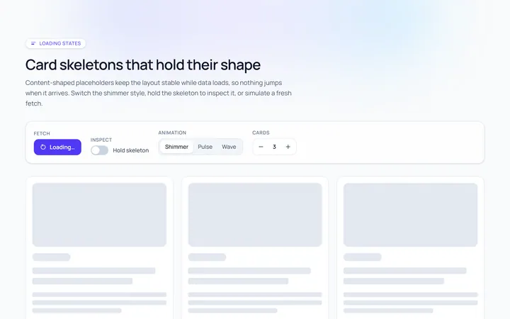
Card Skeleton
Originalcard skeleton placeholder with shimmer
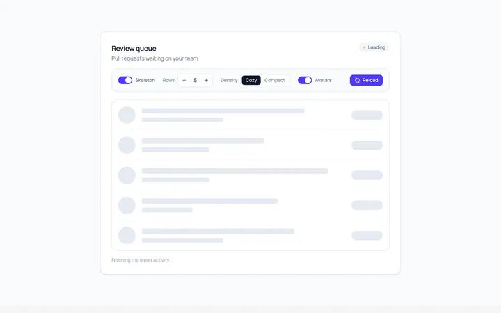
List Skeleton
Originallist rows skeleton
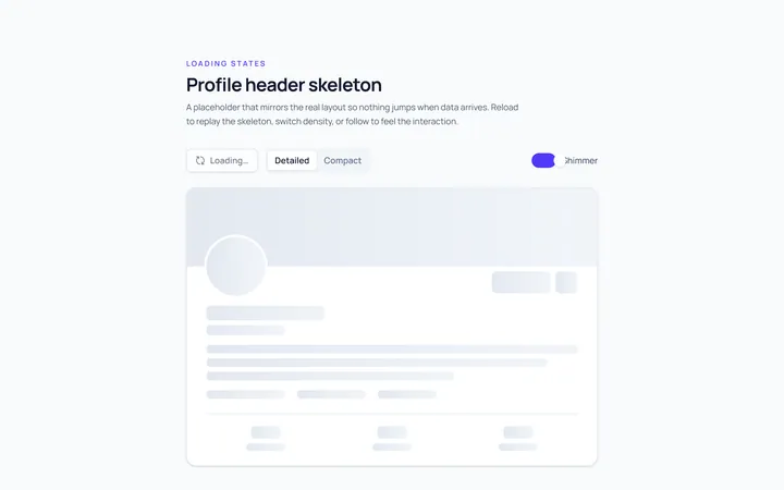
Profile Skeleton
Originalprofile header skeleton
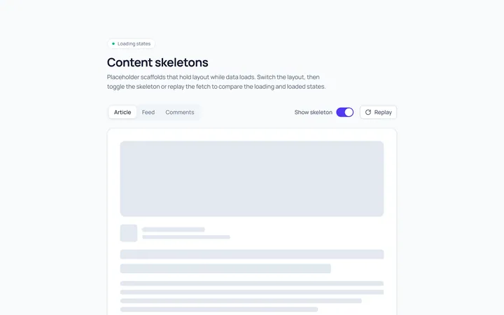
Article Skeleton
Originalarticle/text skeleton
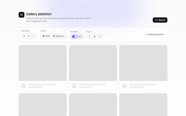
Gallery Skeleton
Originalimage grid skeleton
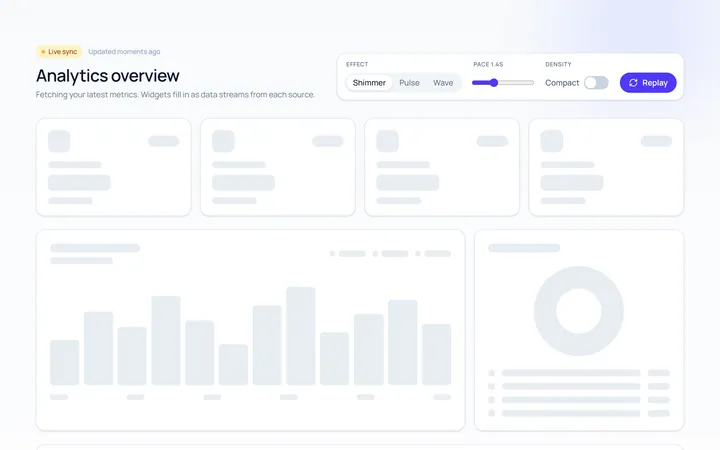
Dashboard Skeleton
Originaldashboard widgets skeleton
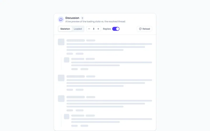
Comment Skeleton
Originalcomment thread skeleton

Spotlight Hero
OriginalA centred hero with a soft radial spotlight, badge and dual call-to-action.

Split Hero
OriginalA two-column hero pairing a headline and CTAs with a product mock and social proof.

Gradient Spotlight Hero
OriginalA minimal centred hero with a soft gradient-mesh backdrop, announcement pill and dual call-to-action buttons.

App Preview Hero
OriginalA centred hero that pairs headline copy with a realistic product dashboard mock built entirely from markup, complete with browser chrome and a floating notification card.

Waitlist Capture Hero
OriginalA dark, focused hero with an inline email capture form and avatar social proof, ready for pre-launch waitlists.