

Gallery Skeleton
Original · freeimage grid skeleton
Copy prompt gives Claude Code, Cursor or v0 a ready-to-paste prompt that recreates this exact component.
npx shadcn@latest add https://webinnoventix.com/r/skel-gallery.json"use client";
import {
useState,
useRef,
useEffect,
useCallback,
useId,
type KeyboardEvent as ReactKeyboardEvent,
type ReactNode,
} from "react";
import { motion, useReducedMotion } from "motion/react";
type Cols = 2 | 3 | 4;
type Layout = "grid" | "masonry";
const MIN = 3;
const MAX = 18;
const STEP = 3;
const RING =
"focus-visible:outline-none focus-visible:ring-2 focus-visible:ring-indigo-500 focus-visible:ring-offset-2 focus-visible:ring-offset-white dark:focus-visible:ring-offset-zinc-950";
const LABEL =
"text-[0.7rem] font-medium uppercase tracking-wider text-zinc-500 dark:text-zinc-400";
const GRID_COLS: Record<Cols, string> = {
2: "grid-cols-1 sm:grid-cols-2",
3: "grid-cols-2 sm:grid-cols-3",
4: "grid-cols-2 sm:grid-cols-4",
};
const MASONRY_COLS: Record<Cols, string> = {
2: "columns-1 sm:columns-2",
3: "columns-2 sm:columns-3",
4: "columns-2 sm:columns-4",
};
const MASONRY_H = ["h-44", "h-64", "h-52", "h-72", "h-48", "h-60"];
const GRADIENTS = [
"from-indigo-400 to-violet-500",
"from-sky-400 to-indigo-500",
"from-emerald-400 to-sky-500",
"from-rose-400 to-amber-400",
"from-amber-400 to-rose-400",
"from-violet-400 to-sky-500",
];
const PHOTOS: { title: string; meta: string }[] = [
{ title: "Harbor fog at first light", meta: "Kodak Portra 400" },
{ title: "Concrete stairwell, floor 7", meta: "35mm · f/2.8" },
{ title: "Studio still life No. 3", meta: "Medium format" },
{ title: "Neon crosswalk after rain", meta: "Night series" },
{ title: "Dune ridge, golden hour", meta: "Aerial · drone" },
{ title: "Analog portrait, window light", meta: "Ilford HP5" },
{ title: "Glasshouse ferns", meta: "Botanic archive" },
{ title: "Salt flats reflection", meta: "Wide · 16mm" },
{ title: "Rooftop antenna cluster", meta: "Urban grain" },
{ title: "Cold brew, marble counter", meta: "Product set" },
{ title: "Mountain pass switchbacks", meta: "Long lens" },
{ title: "Empty theater, red seats", meta: "Available light" },
{ title: "Frost across the window", meta: "Macro · 90mm" },
{ title: "Ferry wake at dusk", meta: "Long exposure" },
{ title: "Paper textures, overhead", meta: "Flat lay" },
{ title: "Chrome diner at midnight", meta: "Neon series" },
{ title: "Cliff path, low tide", meta: "Coastal" },
{ title: "Loft with north windows", meta: "Interiors" },
];
function ImagesIcon() {
return (
<svg
viewBox="0 0 24 24"
width={18}
height={18}
fill="none"
stroke="currentColor"
strokeWidth={1.7}
strokeLinecap="round"
strokeLinejoin="round"
aria-hidden="true"
>
<rect x="3" y="4" width="18" height="14" rx="2" />
<circle cx="8.5" cy="9" r="1.5" />
<path d="m21 15-5-5L5 20" />
</svg>
);
}
function ReloadIcon() {
return (
<svg
viewBox="0 0 24 24"
width={16}
height={16}
fill="none"
stroke="currentColor"
strokeWidth={1.8}
strokeLinecap="round"
strokeLinejoin="round"
aria-hidden="true"
>
<path d="M21 12a9 9 0 1 1-2.64-6.36" />
<path d="M21 4v5h-5" />
</svg>
);
}
function GridIcon() {
return (
<svg
viewBox="0 0 24 24"
width={15}
height={15}
fill="none"
stroke="currentColor"
strokeWidth={1.8}
strokeLinecap="round"
strokeLinejoin="round"
aria-hidden="true"
>
<rect x="3" y="3" width="7" height="7" rx="1.5" />
<rect x="14" y="3" width="7" height="7" rx="1.5" />
<rect x="3" y="14" width="7" height="7" rx="1.5" />
<rect x="14" y="14" width="7" height="7" rx="1.5" />
</svg>
);
}
function MasonryIcon() {
return (
<svg
viewBox="0 0 24 24"
width={15}
height={15}
fill="none"
stroke="currentColor"
strokeWidth={1.8}
strokeLinecap="round"
strokeLinejoin="round"
aria-hidden="true"
>
<rect x="3" y="3" width="7" height="10" rx="1.5" />
<rect x="3" y="15" width="7" height="6" rx="1.5" />
<rect x="14" y="3" width="7" height="6" rx="1.5" />
<rect x="14" y="11" width="7" height="10" rx="1.5" />
</svg>
);
}
function PlusIcon() {
return (
<svg
viewBox="0 0 24 24"
width={16}
height={16}
fill="none"
stroke="currentColor"
strokeWidth={2}
strokeLinecap="round"
strokeLinejoin="round"
aria-hidden="true"
>
<path d="M12 5v14M5 12h14" />
</svg>
);
}
function MinusIcon() {
return (
<svg
viewBox="0 0 24 24"
width={16}
height={16}
fill="none"
stroke="currentColor"
strokeWidth={2}
strokeLinecap="round"
strokeLinejoin="round"
aria-hidden="true"
>
<path d="M5 12h14" />
</svg>
);
}
function Segmented({
label,
options,
value,
onChange,
}: {
label: string;
options: readonly { value: string; label: string; icon?: ReactNode }[];
value: string;
onChange: (value: string) => void;
}) {
const refs = useRef<(HTMLButtonElement | null)[]>([]);
const groupId = useId();
const current = Math.max(
0,
options.findIndex((o) => o.value === value),
);
const focusIndex = (i: number) => {
const n = options.length;
const wrapped = (i + n) % n;
onChange(options[wrapped].value);
refs.current[wrapped]?.focus();
};
const onKeyDown = (e: ReactKeyboardEvent<HTMLDivElement>) => {
switch (e.key) {
case "ArrowRight":
case "ArrowDown":
e.preventDefault();
focusIndex(current + 1);
break;
case "ArrowLeft":
case "ArrowUp":
e.preventDefault();
focusIndex(current - 1);
break;
case "Home":
e.preventDefault();
focusIndex(0);
break;
case "End":
e.preventDefault();
focusIndex(options.length - 1);
break;
default:
break;
}
};
return (
<div className="flex flex-col gap-1.5">
<span id={groupId} className={LABEL}>
{label}
</span>
<div
role="radiogroup"
aria-labelledby={groupId}
onKeyDown={onKeyDown}
className="inline-flex rounded-xl border border-zinc-200 bg-zinc-100/70 p-1 dark:border-zinc-800 dark:bg-zinc-900"
>
{options.map((o, i) => {
const selected = o.value === value;
return (
<button
key={o.value}
ref={(el) => {
refs.current[i] = el;
}}
type="button"
role="radio"
aria-checked={selected}
tabIndex={selected ? 0 : -1}
onClick={() => onChange(o.value)}
className={[
"inline-flex items-center gap-1.5 rounded-lg px-3 py-1.5 text-sm font-medium transition-colors",
RING,
selected
? "bg-white text-zinc-900 shadow-sm dark:bg-zinc-700 dark:text-white"
: "text-zinc-600 hover:text-zinc-900 dark:text-zinc-400 dark:hover:text-zinc-100",
].join(" ")}
>
{o.icon}
{o.label}
</button>
);
})}
</div>
</div>
);
}
export default function SkelGallery() {
const reduce = useReducedMotion();
const [loading, setLoading] = useState(true);
const [cols, setCols] = useState<Cols>(3);
const [layout, setLayout] = useState<Layout>("grid");
const [shimmer, setShimmer] = useState(true);
const [count, setCount] = useState(9);
const timer = useRef<number | null>(null);
const reload = useCallback(() => {
if (timer.current !== null) window.clearTimeout(timer.current);
setLoading(true);
timer.current = window.setTimeout(() => setLoading(false), 1500);
}, []);
useEffect(() => {
reload();
return () => {
if (timer.current !== null) window.clearTimeout(timer.current);
};
}, [reload]);
const photos = PHOTOS.slice(0, count);
const containerClass =
layout === "grid"
? `grid gap-4 ${GRID_COLS[cols]}`
: `${MASONRY_COLS[cols]} gap-4`;
const itemBase =
"group relative overflow-hidden rounded-2xl border border-zinc-200 bg-white dark:border-zinc-800 dark:bg-zinc-900";
const itemExtra = layout === "masonry" ? "mb-4 w-full break-inside-avoid" : "";
return (
<section className="relative w-full overflow-hidden bg-gradient-to-b from-zinc-50 to-white px-5 py-16 sm:px-8 sm:py-20 dark:from-zinc-950 dark:to-zinc-900">
<div
aria-hidden="true"
className="pointer-events-none absolute -top-24 left-1/2 h-72 w-[42rem] max-w-[90%] -translate-x-1/2 rounded-full bg-indigo-400/20 blur-3xl dark:bg-indigo-500/10"
/>
<div className="relative mx-auto max-w-5xl">
{/* Header */}
<div className="mb-8 flex flex-col gap-5 sm:flex-row sm:items-end sm:justify-between">
<div className="flex items-start gap-3">
<span className="mt-0.5 grid h-10 w-10 shrink-0 place-items-center rounded-xl bg-zinc-900 text-white dark:bg-white dark:text-zinc-900">
<ImagesIcon />
</span>
<div>
<h2 className="text-xl font-semibold tracking-tight text-zinc-900 sm:text-2xl dark:text-white">
Gallery skeleton
</h2>
<p className="mt-1 max-w-md text-sm text-zinc-500 dark:text-zinc-400">
A placeholder grid that shimmers while photos load, then fills
in with a soft, staggered reveal.
</p>
</div>
</div>
<button
type="button"
onClick={reload}
className={`inline-flex shrink-0 items-center gap-2 rounded-xl bg-zinc-900 px-4 py-2 text-sm font-medium text-white transition-colors hover:bg-zinc-700 dark:bg-white dark:text-zinc-900 dark:hover:bg-zinc-200 ${RING}`}
>
<ReloadIcon />
Reload
</button>
</div>
{/* Toolbar */}
<div className="mb-6 flex flex-wrap items-end gap-x-6 gap-y-4 rounded-2xl border border-zinc-200 bg-white/60 p-4 backdrop-blur dark:border-zinc-800 dark:bg-zinc-900/40">
<Segmented
label="Columns"
value={String(cols)}
onChange={(v) => setCols(Number(v) as Cols)}
options={[
{ value: "2", label: "2" },
{ value: "3", label: "3" },
{ value: "4", label: "4" },
]}
/>
<Segmented
label="Layout"
value={layout}
onChange={(v) => setLayout(v as Layout)}
options={[
{ value: "grid", label: "Grid", icon: <GridIcon /> },
{ value: "masonry", label: "Masonry", icon: <MasonryIcon /> },
]}
/>
{/* Shimmer switch */}
<div className="flex flex-col gap-1.5">
<span className={LABEL}>Shimmer</span>
<button
type="button"
role="switch"
aria-checked={shimmer}
aria-label="Shimmer animation"
onClick={() => setShimmer((s) => !s)}
className={[
"inline-flex h-9 items-center gap-2 rounded-xl border px-3 transition-colors",
RING,
shimmer
? "border-indigo-300 bg-indigo-50 dark:border-indigo-500/40 dark:bg-indigo-500/10"
: "border-zinc-200 bg-zinc-100/70 dark:border-zinc-800 dark:bg-zinc-900",
].join(" ")}
>
<span
aria-hidden="true"
className={`relative h-5 w-9 rounded-full transition-colors ${
shimmer ? "bg-indigo-500" : "bg-zinc-300 dark:bg-zinc-700"
}`}
>
<span
className={`absolute top-0.5 h-4 w-4 rounded-full bg-white shadow transition-all ${
shimmer ? "left-4" : "left-0.5"
}`}
/>
</span>
<span className="text-sm font-medium text-zinc-700 dark:text-zinc-300">
{shimmer ? "On" : "Off"}
</span>
</button>
</div>
{/* Tiles stepper */}
<div className="flex flex-col gap-1.5">
<span className={LABEL}>Tiles</span>
<div
role="group"
aria-label="Number of tiles"
className="inline-flex h-9 items-center rounded-xl border border-zinc-200 bg-zinc-100/70 dark:border-zinc-800 dark:bg-zinc-900"
>
<button
type="button"
aria-label="Fewer tiles"
disabled={count <= MIN}
onClick={() => setCount((c) => Math.max(MIN, c - STEP))}
className={`grid h-9 w-9 place-items-center rounded-l-xl text-zinc-600 transition-colors hover:text-zinc-900 disabled:cursor-not-allowed disabled:opacity-40 dark:text-zinc-400 dark:hover:text-zinc-100 ${RING}`}
>
<MinusIcon />
</button>
<span
aria-hidden="true"
className="w-9 text-center text-sm font-semibold tabular-nums text-zinc-900 dark:text-zinc-100"
>
{count}
</span>
<button
type="button"
aria-label="More tiles"
disabled={count >= MAX}
onClick={() => setCount((c) => Math.min(MAX, c + STEP))}
className={`grid h-9 w-9 place-items-center rounded-r-xl text-zinc-600 transition-colors hover:text-zinc-900 disabled:cursor-not-allowed disabled:opacity-40 dark:text-zinc-400 dark:hover:text-zinc-100 ${RING}`}
>
<PlusIcon />
</button>
</div>
</div>
{/* Status */}
<div className="ml-auto flex items-center gap-2 self-center">
<span
aria-hidden="true"
className={`h-2 w-2 rounded-full ${
loading ? "skelgal-pulse bg-amber-400" : "bg-emerald-500"
}`}
/>
<p
role="status"
aria-live="polite"
className="text-sm font-medium text-zinc-600 dark:text-zinc-300"
>
{loading
? `Loading ${count} photos…`
: `${count} photos ready`}
</p>
</div>
</div>
{/* Gallery */}
<div
role="list"
aria-label="Photo gallery"
aria-busy={loading}
className={containerClass}
>
{photos.map((photo, i) => {
const imgClass =
layout === "grid"
? "aspect-[4/3]"
: MASONRY_H[i % MASONRY_H.length];
const gradient = GRADIENTS[i % GRADIENTS.length];
return (
<div
key={photo.title}
role="listitem"
className={`${itemBase} ${itemExtra}`}
>
{loading ? (
<>
<div
className={`relative overflow-hidden bg-zinc-200 dark:bg-zinc-800 ${imgClass}`}
>
<span
aria-hidden="true"
className="skelgal-pulse absolute inset-0 bg-zinc-300/40 dark:bg-zinc-700/40"
/>
<span
aria-hidden="true"
className="pointer-events-none absolute inset-0 overflow-hidden"
>
<span
className={`skelgal-band absolute inset-0 bg-gradient-to-r from-transparent via-white/70 to-transparent dark:via-white/10 ${
shimmer ? "skelgal-shimmer" : ""
}`}
/>
</span>
</div>
<div className="flex items-center gap-3 p-4">
<span
aria-hidden="true"
className="skelgal-pulse h-9 w-9 shrink-0 rounded-full bg-zinc-200 dark:bg-zinc-800"
/>
<div className="flex w-full flex-col gap-2">
<span
aria-hidden="true"
className="skelgal-pulse h-2.5 w-3/4 rounded-full bg-zinc-200 dark:bg-zinc-800"
/>
<span
aria-hidden="true"
className="skelgal-pulse h-2.5 w-2/5 rounded-full bg-zinc-200 dark:bg-zinc-800"
/>
</div>
</div>
</>
) : (
<motion.div
initial={reduce ? false : { opacity: 0, y: 10 }}
animate={{ opacity: 1, y: 0 }}
transition={{
duration: 0.45,
delay: reduce ? 0 : i * 0.05,
ease: [0.22, 1, 0.36, 1],
}}
>
<div
className={`relative overflow-hidden bg-gradient-to-br ${gradient} ${imgClass}`}
>
<span className="absolute inset-0 transition-transform duration-500 ease-out group-hover:scale-[1.04]">
<span className="absolute inset-0 bg-gradient-to-t from-black/35 to-transparent" />
</span>
<span className="absolute left-3 top-3 rounded-full bg-white/85 px-2 py-0.5 text-[0.65rem] font-semibold tabular-nums text-zinc-800 backdrop-blur">
{String(i + 1).padStart(2, "0")}
</span>
</div>
<div className="flex items-center gap-3 p-4">
<span
className={`grid h-9 w-9 shrink-0 place-items-center rounded-full bg-gradient-to-br ${gradient} text-xs font-bold text-white`}
>
{photo.title.slice(0, 1)}
</span>
<div className="min-w-0">
<p className="truncate text-sm font-medium text-zinc-900 dark:text-zinc-100">
{photo.title}
</p>
<p className="truncate text-xs text-zinc-500 dark:text-zinc-400">
{photo.meta}
</p>
</div>
</div>
</motion.div>
)}
</div>
);
})}
</div>
</div>
<style>{`
@keyframes skelgal-sweep {
0% { transform: translateX(-120%); }
100% { transform: translateX(120%); }
}
@keyframes skelgal-breathe {
0%, 100% { opacity: 0.45; }
50% { opacity: 0.85; }
}
.skelgal-band { transform: translateX(-120%); }
.skelgal-shimmer { animation: skelgal-sweep 1.8s ease-in-out infinite; }
.skelgal-pulse { animation: skelgal-breathe 2.6s ease-in-out infinite; }
@media (prefers-reduced-motion: reduce) {
.skelgal-shimmer, .skelgal-pulse { animation: none !important; }
}
`}</style>
</section>
);
}Dependencies
Licence
Built by Web Innoventix. Free for personal and commercial use, no attribution required.
Built by Web Innoventix
Need a custom interface, a full website, or SEO that gets you cited by AI? We design, build and rank it end to end.
Get a free quoteSimilar components
Browse all →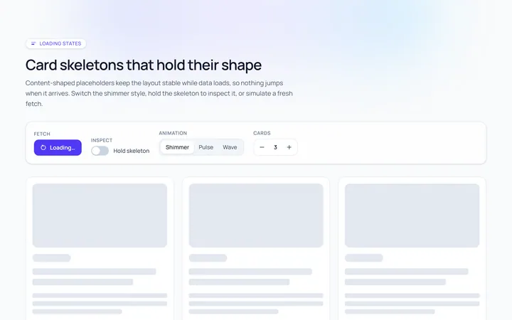
Card Skeleton
Originalcard skeleton placeholder with shimmer

List Skeleton
Originallist rows skeleton

Profile Skeleton
Originalprofile header skeleton
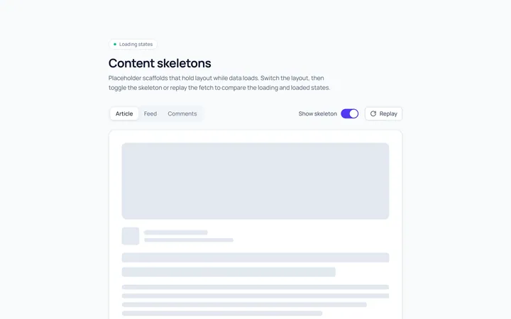
Article Skeleton
Originalarticle/text skeleton
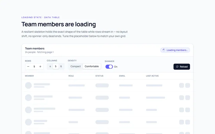
Table Skeleton
Originaltable skeleton

Dashboard Skeleton
Originaldashboard widgets skeleton
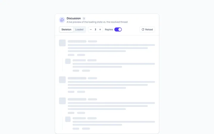
Comment Skeleton
Originalcomment thread skeleton

Spotlight Hero
OriginalA centred hero with a soft radial spotlight, badge and dual call-to-action.

Split Hero
OriginalA two-column hero pairing a headline and CTAs with a product mock and social proof.

Gradient Spotlight Hero
OriginalA minimal centred hero with a soft gradient-mesh backdrop, announcement pill and dual call-to-action buttons.

App Preview Hero
OriginalA centred hero that pairs headline copy with a realistic product dashboard mock built entirely from markup, complete with browser chrome and a floating notification card.

Waitlist Capture Hero
OriginalA dark, focused hero with an inline email capture form and avatar social proof, ready for pre-launch waitlists.