

Basic Slider
Original · freebasic range slider with value bubble
byWeb InnoventixReact + Tailwind
sldbasicsliders
Copy prompt gives Claude Code, Cursor or v0 a ready-to-paste prompt that recreates this exact component.
npx shadcn@latest add https://webinnoventix.com/r/sld-basic.jsonsld-basic.tsx
"use client";
import { ChangeEvent, useState } from "react";
import { motion, useReducedMotion } from "motion/react";
type AccentKey = "indigo" | "violet" | "emerald" | "amber" | "sky";
type Accent = {
fill: string;
thumbBorder: string;
bubble: string;
tail: string;
ring: string;
};
const ACCENTS: Record<AccentKey, Accent> = {
indigo: {
fill: "from-indigo-500 to-violet-500 dark:from-indigo-400 dark:to-violet-400",
thumbBorder: "border-indigo-500 dark:border-indigo-400",
bubble: "bg-indigo-600 dark:bg-indigo-500",
tail: "bg-indigo-600 dark:bg-indigo-500",
ring: "peer-focus-visible:ring-indigo-400/70 dark:peer-focus-visible:ring-indigo-300/50",
},
violet: {
fill: "from-violet-500 to-indigo-500 dark:from-violet-400 dark:to-indigo-400",
thumbBorder: "border-violet-500 dark:border-violet-400",
bubble: "bg-violet-600 dark:bg-violet-500",
tail: "bg-violet-600 dark:bg-violet-500",
ring: "peer-focus-visible:ring-violet-400/70 dark:peer-focus-visible:ring-violet-300/50",
},
emerald: {
fill: "from-emerald-500 to-emerald-400 dark:from-emerald-400 dark:to-emerald-300",
thumbBorder: "border-emerald-500 dark:border-emerald-400",
bubble: "bg-emerald-600 dark:bg-emerald-500",
tail: "bg-emerald-600 dark:bg-emerald-500",
ring: "peer-focus-visible:ring-emerald-400/70 dark:peer-focus-visible:ring-emerald-300/50",
},
amber: {
fill: "from-amber-500 to-amber-400 dark:from-amber-400 dark:to-amber-300",
thumbBorder: "border-amber-500 dark:border-amber-400",
bubble: "bg-amber-600 dark:bg-amber-500",
tail: "bg-amber-600 dark:bg-amber-500",
ring: "peer-focus-visible:ring-amber-400/70 dark:peer-focus-visible:ring-amber-300/50",
},
sky: {
fill: "from-sky-500 to-indigo-500 dark:from-sky-400 dark:to-indigo-400",
thumbBorder: "border-sky-500 dark:border-sky-400",
bubble: "bg-sky-600 dark:bg-sky-500",
tail: "bg-sky-600 dark:bg-sky-500",
ring: "peer-focus-visible:ring-sky-400/70 dark:peer-focus-visible:ring-sky-300/50",
},
};
type SliderDef = {
id: string;
label: string;
hint: string;
min: number;
max: number;
step: number;
accent: AccentKey;
minLabel: string;
maxLabel: string;
format: (v: number) => string;
};
const SLIDERS: SliderDef[] = [
{
id: "budget",
label: "Monthly budget",
hint: "What you're comfortable spending each month",
min: 0,
max: 5000,
step: 50,
accent: "indigo",
minLabel: "$0",
maxLabel: "$5,000",
format: (v) => `$${v.toLocaleString("en-US")}/mo`,
},
{
id: "storage",
label: "Storage allocation",
hint: "Reserved SSD capacity for your workspace",
min: 32,
max: 2048,
step: 32,
accent: "violet",
minLabel: "32 GB",
maxLabel: "2 TB",
format: (v) => (v >= 1024 ? `${(v / 1024).toFixed(1)} TB` : `${v} GB`),
},
{
id: "volume",
label: "Output volume",
hint: "Master level for notification sounds",
min: 0,
max: 100,
step: 1,
accent: "emerald",
minLabel: "Mute",
maxLabel: "Max",
format: (v) => `${v}%`,
},
{
id: "brightness",
label: "Display brightness",
hint: "Panel luminance in the editor",
min: 10,
max: 100,
step: 5,
accent: "amber",
minLabel: "Dim",
maxLabel: "Bright",
format: (v) => `${v}%`,
},
{
id: "temperature",
label: "Thermostat target",
hint: "Preferred room temperature while working",
min: 16,
max: 28,
step: 0.5,
accent: "sky",
minLabel: "16°C",
maxLabel: "28°C",
format: (v) => `${v.toFixed(1)}°C`,
},
];
const DEFAULTS: Record<string, number> = {
budget: 2400,
storage: 512,
volume: 65,
brightness: 80,
temperature: 21,
};
type SliderRowProps = SliderDef & {
value: number;
onChange: (v: number) => void;
};
function SliderRow({
id,
label,
hint,
min,
max,
step,
accent,
minLabel,
maxLabel,
format,
value,
onChange,
}: SliderRowProps) {
const reduce = useReducedMotion();
const [focused, setFocused] = useState(false);
const [dragging, setDragging] = useState(false);
const active = focused || dragging;
const a = ACCENTS[accent];
const range = max - min;
const pct = range === 0 ? 0 : Math.min(1, Math.max(0, (value - min) / range));
const thumbSize = 20;
const pos = `calc(${(pct * 100).toFixed(3)}% + ${((0.5 - pct) * thumbSize).toFixed(2)}px)`;
const thumbScale = !reduce && active ? 1.14 : 1;
return (
<div className="py-5">
<div className="mb-3 flex items-baseline justify-between gap-4">
<div className="min-w-0">
<label
htmlFor={`sldbasic-${id}`}
className="block text-sm font-semibold text-slate-800 dark:text-slate-100"
>
{label}
</label>
<p className="mt-0.5 truncate text-xs text-slate-500 dark:text-slate-400">
{hint}
</p>
</div>
<span
aria-hidden="true"
className="shrink-0 font-mono text-sm font-semibold tabular-nums text-slate-900 dark:text-white"
>
{format(value)}
</span>
</div>
<div className="relative flex h-11 items-center">
{/* Track */}
<div className="pointer-events-none absolute inset-x-0 h-2 rounded-full bg-slate-200/90 ring-1 ring-inset ring-slate-300/60 dark:bg-slate-700/80 dark:ring-slate-600/50" />
{/* Fill */}
<div
className={`pointer-events-none absolute left-0 h-2 overflow-hidden rounded-full bg-gradient-to-r ${a.fill}`}
style={{ width: `${(pct * 100).toFixed(3)}%` }}
>
<span
aria-hidden="true"
className="sldbasic-sheen absolute inset-y-0 -left-1/3 w-1/3 skew-x-[-20deg] bg-white/40 dark:bg-white/25"
/>
</div>
{/* Native control (source of truth: keyboard, ARIA, focus) */}
<input
id={`sldbasic-${id}`}
type="range"
className={`peer absolute inset-0 z-20 h-full w-full cursor-pointer appearance-none bg-transparent opacity-0 focus:outline-none`}
min={min}
max={max}
step={step}
value={value}
onChange={(e: ChangeEvent<HTMLInputElement>) => onChange(Number(e.target.value))}
onFocus={() => setFocused(true)}
onBlur={() => setFocused(false)}
onPointerDown={() => setDragging(true)}
onPointerUp={() => setDragging(false)}
onPointerCancel={() => setDragging(false)}
aria-valuetext={format(value)}
/>
{/* Thumb (visual only) */}
<div
aria-hidden="true"
className={`pointer-events-none absolute z-10 h-5 w-5 rounded-full border-[3px] bg-white shadow-md shadow-slate-900/20 transition-transform duration-150 ease-out dark:bg-slate-900 dark:shadow-black/40 ${a.thumbBorder} peer-focus-visible:ring-4 ${a.ring}`}
style={{
left: pos,
top: "50%",
transform: `translate(-50%, -50%) scale(${thumbScale})`,
}}
/>
{/* Value bubble */}
<div
aria-hidden="true"
className="pointer-events-none absolute z-30"
style={{
left: pos,
top: "50%",
transform: "translate(-50%, calc(-100% - 15px))",
}}
>
<motion.div
initial={false}
animate={
reduce
? undefined
: { scale: active ? 1.06 : 1, y: active ? -2 : 0 }
}
transition={{ type: "spring", stiffness: 520, damping: 30 }}
className="relative"
style={{ transformOrigin: "bottom center" }}
>
<span
className={`block rounded-lg px-2.5 py-1 text-center font-mono text-xs font-bold tabular-nums text-white shadow-lg shadow-slate-900/25 ${a.bubble}`}
>
{format(value)}
</span>
<span
className={`absolute left-1/2 top-full h-2.5 w-2.5 -translate-x-1/2 -translate-y-1/2 rotate-45 rounded-[2px] ${a.tail}`}
/>
</motion.div>
</div>
</div>
<div className="mt-2 flex justify-between text-[11px] font-medium uppercase tracking-wide text-slate-400 dark:text-slate-500">
<span>{minLabel}</span>
<span>{maxLabel}</span>
</div>
</div>
);
}
export default function SldBasic() {
const [values, setValues] = useState<Record<string, number>>({ ...DEFAULTS });
const setValue = (id: string, v: number) =>
setValues((prev) => ({ ...prev, [id]: v }));
const isDefault = SLIDERS.every((s) => values[s.id] === DEFAULTS[s.id]);
const reset = () => setValues({ ...DEFAULTS });
return (
<section className="relative w-full overflow-hidden bg-slate-50 px-4 py-16 text-slate-900 sm:px-6 md:py-24 dark:bg-slate-950 dark:text-slate-100">
{/* Ambient background */}
<div
aria-hidden="true"
className="pointer-events-none absolute inset-0 [background-image:radial-gradient(circle_at_18%_0%,rgba(99,102,241,0.10),transparent_45%),radial-gradient(circle_at_88%_100%,rgba(16,185,129,0.10),transparent_45%)]"
/>
<style>{`
@keyframes sldbasic-sheen {
0% { transform: translateX(-140%) skewX(-20deg); opacity: 0; }
18% { opacity: 1; }
70% { opacity: 1; }
100% { transform: translateX(360%) skewX(-20deg); opacity: 0; }
}
.sldbasic-sheen {
animation: sldbasic-sheen 3.2s cubic-bezier(0.4, 0, 0.2, 1) infinite;
animation-delay: 1.2s;
}
@media (prefers-reduced-motion: reduce) {
.sldbasic-sheen { animation: none; opacity: 0; }
}
`}</style>
<div className="relative mx-auto max-w-2xl">
<header className="mb-8">
<span className="inline-flex items-center gap-1.5 rounded-full border border-slate-300/70 bg-white/70 px-3 py-1 text-[11px] font-semibold uppercase tracking-wider text-slate-600 backdrop-blur dark:border-slate-700 dark:bg-slate-900/60 dark:text-slate-300">
<svg
viewBox="0 0 24 24"
className="h-3.5 w-3.5"
fill="none"
stroke="currentColor"
strokeWidth={2}
strokeLinecap="round"
aria-hidden="true"
>
<line x1="4" y1="8" x2="20" y2="8" />
<circle cx="9" cy="8" r="2.5" fill="currentColor" stroke="none" />
<line x1="4" y1="16" x2="20" y2="16" />
<circle cx="15" cy="16" r="2.5" fill="currentColor" stroke="none" />
</svg>
Range controls
</span>
<h2 className="mt-4 text-2xl font-bold tracking-tight text-slate-900 sm:text-3xl dark:text-white">
Tune your workspace
</h2>
<p className="mt-2 text-sm text-slate-600 dark:text-slate-400">
Drag a handle or focus it and use the arrow keys. The value bubble
tracks each thumb as it moves.
</p>
</header>
<div className="rounded-2xl border border-slate-200 bg-white/80 p-5 shadow-xl shadow-slate-900/5 backdrop-blur sm:p-7 dark:border-slate-800 dark:bg-slate-900/70 dark:shadow-black/30">
<div className="divide-y divide-slate-200/80 dark:divide-slate-800">
{SLIDERS.map((s) => (
<SliderRow
key={s.id}
{...s}
value={values[s.id]}
onChange={(v) => setValue(s.id, v)}
/>
))}
</div>
<div className="mt-6 flex flex-col gap-3 border-t border-slate-200/80 pt-5 sm:flex-row sm:items-center sm:justify-between dark:border-slate-800">
<p className="text-xs text-slate-500 dark:text-slate-400">
Estimated plan:{" "}
<span className="font-mono font-semibold text-slate-800 dark:text-slate-100">
${values.budget.toLocaleString("en-US")}/mo
</span>{" "}
·{" "}
{values.storage >= 1024
? `${(values.storage / 1024).toFixed(1)} TB`
: `${values.storage} GB`}{" "}
storage
</p>
<button
type="button"
onClick={reset}
disabled={isDefault}
className="inline-flex items-center justify-center gap-1.5 rounded-lg border border-slate-300 bg-white px-3.5 py-2 text-sm font-semibold text-slate-700 transition-colors hover:bg-slate-100 focus-visible:outline-none focus-visible:ring-2 focus-visible:ring-indigo-500 focus-visible:ring-offset-2 focus-visible:ring-offset-white disabled:cursor-not-allowed disabled:opacity-45 dark:border-slate-700 dark:bg-slate-800 dark:text-slate-200 dark:hover:bg-slate-700 dark:focus-visible:ring-offset-slate-900"
>
<svg
viewBox="0 0 24 24"
className="h-4 w-4"
fill="none"
stroke="currentColor"
strokeWidth={2}
strokeLinecap="round"
strokeLinejoin="round"
aria-hidden="true"
>
<path d="M3 12a9 9 0 1 0 3-6.7" />
<path d="M3 4v4h4" />
</svg>
Reset defaults
</button>
</div>
</div>
</div>
</section>
);
}Dependencies
motion
Licence
Built by Web Innoventix. Free for personal and commercial use, no attribution required.
Built by Web Innoventix
Need a custom interface, a full website, or SEO that gets you cited by AI? We design, build and rank it end to end.
Get a free quoteSimilar components
Browse all →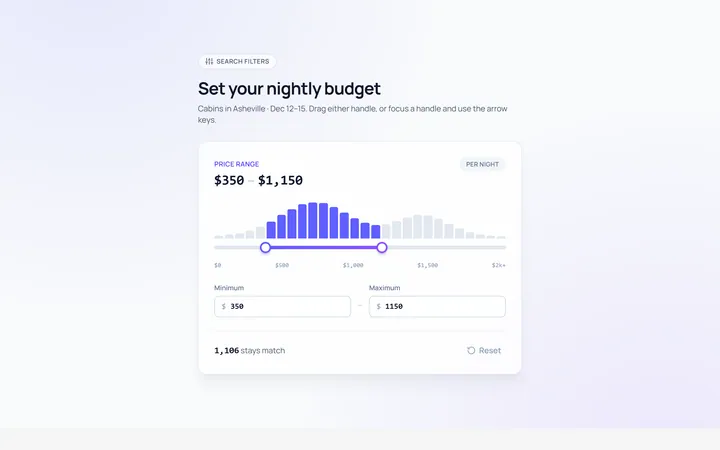
Range Dual Slider
Originaldual-handle min/max range
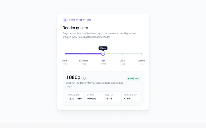
Steps Slider
Originalstepped slider with tick marks
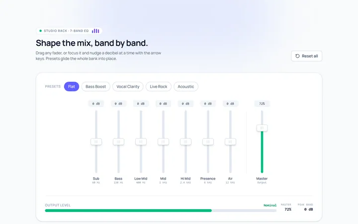
Vertical Slider
Originalvertical sliders
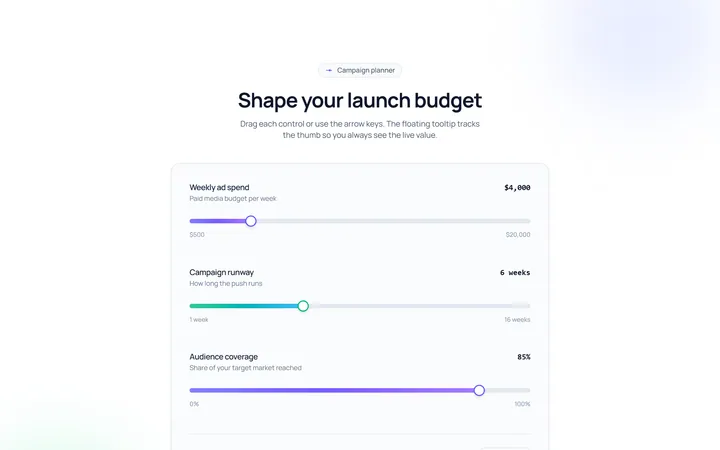
Tooltip Slider
Originalslider with a floating value tooltip
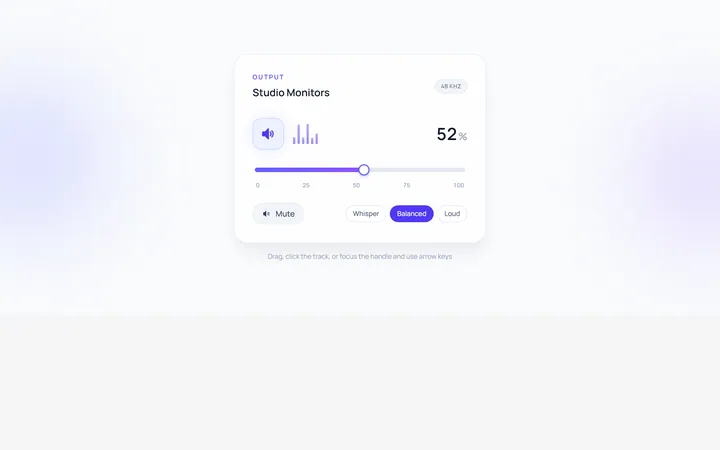
Volume Slider
Originalvolume slider with icon
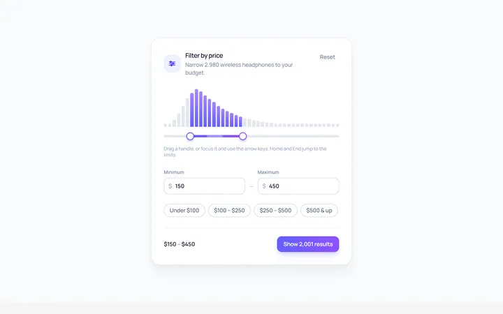
Price Range Slider
Originalprice range filter slider
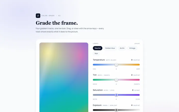
Gradient Track Slider
Originalslider with a gradient track

Rating Slider
Originalsatisfaction rating slider
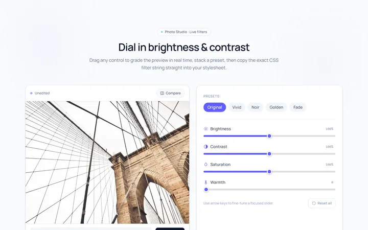
Brightness Slider
Originalbrightness/contrast control sliders
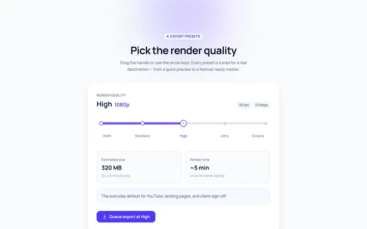
Marks Slider
Originalslider with labelled marks
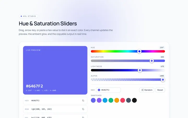
Color Hue Slider
Originalhue/saturation color sliders

Progress Drag Slider
Originalmedia scrubber slider