

Tooltip Slider
Original · freeslider with a floating value tooltip
byWeb InnoventixReact + Tailwind
sldtooltipsliders
Copy prompt gives Claude Code, Cursor or v0 a ready-to-paste prompt that recreates this exact component.
npx shadcn@latest add https://webinnoventix.com/r/sld-tooltip.jsonsld-tooltip.tsx
"use client";

import {
  useCallback,
  useRef,
  useState,
  type CSSProperties,
  type KeyboardEvent as ReactKeyboardEvent,
  type PointerEvent as ReactPointerEvent,
} from "react";
import { AnimatePresence, motion, useReducedMotion } from "motion/react";

type Accent = "indigo" | "emerald";

type AccentTokens = {
  fill: string;
  tip: string;
  thumbBorder: string;
  focusRing: string;
  glow: string;
};

const ACCENTS: Record<Accent, AccentTokens> = {
  indigo: {
    fill: "from-indigo-500 to-violet-500",
    tip: "bg-indigo-600 text-white",
    thumbBorder: "border-indigo-500 dark:border-indigo-400",
    focusRing: "focus-visible:ring-indigo-500",
    glow: "rgba(99, 102, 241, 0.55)",
  },
  emerald: {
    fill: "from-emerald-500 to-sky-500",
    tip: "bg-emerald-600 text-white",
    thumbBorder: "border-emerald-500 dark:border-emerald-400",
    focusRing: "focus-visible:ring-emerald-500",
    glow: "rgba(16, 185, 129, 0.55)",
  },
};

function clamp(value: number, min: number, max: number): number {
  return Math.min(max, Math.max(min, value));
}

function decimalsOf(step: number): number {
  const parts = String(step).split(".");
  return parts.length > 1 ? parts[1].length : 0;
}

type TooltipSliderProps = {
  id: string;
  label: string;
  caption: string;
  min: number;
  max: number;
  step: number;
  value: number;
  onChange: (next: number) => void;
  format: (value: number) => string;
  accent: Accent;
};

function TooltipSlider({
  id,
  label,
  caption,
  min,
  max,
  step,
  value,
  onChange,
  format,
  accent,
}: TooltipSliderProps) {
  const reduce = useReducedMotion();
  const railRef = useRef<HTMLDivElement | null>(null);
  const thumbRef = useRef<HTMLDivElement | null>(null);
  const [dragging, setDragging] = useState(false);
  const [focused, setFocused] = useState(false);
  const [hovered, setHovered] = useState(false);

  const tokens = ACCENTS[accent];
  const percent = ((value - min) / (max - min)) * 100;
  const active = dragging || focused || hovered;
  const labelId = `${id}-label`;

  const commit = useCallback(
    (raw: number) => {
      const stepped = Math.round((raw - min) / step) * step + min;
      const bounded = clamp(stepped, min, max);
      const clean = Number(bounded.toFixed(decimalsOf(step)));
      if (clean !== value) onChange(clean);
    },
    [min, max, step, value, onChange],
  );

  const commitFromClientX = useCallback(
    (clientX: number) => {
      const rail = railRef.current;
      if (!rail) return;
      const rect = rail.getBoundingClientRect();
      if (rect.width === 0) return;
      const ratio = clamp((clientX - rect.left) / rect.width, 0, 1);
      commit(min + ratio * (max - min));
    },
    [commit, min, max],
  );

  const handlePointerDown = (event: ReactPointerEvent<HTMLDivElement>) => {
    if (event.button !== 0) return;
    event.preventDefault();
    setDragging(true);
    commitFromClientX(event.clientX);
    thumbRef.current?.focus();

    const move = (moveEvent: PointerEvent) => commitFromClientX(moveEvent.clientX);
    const up = () => {
      setDragging(false);
      window.removeEventListener("pointermove", move);
      window.removeEventListener("pointerup", up);
    };
    window.addEventListener("pointermove", move);
    window.addEventListener("pointerup", up);
  };

  const handleKeyDown = (event: ReactKeyboardEvent<HTMLDivElement>) => {
    let next: number | null = null;
    switch (event.key) {
      case "ArrowRight":
      case "ArrowUp":
        next = value + step;
        break;
      case "ArrowLeft":
      case "ArrowDown":
        next = value - step;
        break;
      case "PageUp":
        next = value + step * 10;
        break;
      case "PageDown":
        next = value - step * 10;
        break;
      case "Home":
        next = min;
        break;
      case "End":
        next = max;
        break;
      default:
        return;
    }
    event.preventDefault();
    commit(next);
  };

  const tipMotion = reduce
    ? {
        initial: { opacity: 0 },
        animate: { opacity: 1 },
        exit: { opacity: 0 },
        transition: { duration: 0.12 },
      }
    : {
        initial: { opacity: 0, y: 6, scale: 0.9 },
        animate: { opacity: 1, y: 0, scale: 1 },
        exit: { opacity: 0, y: 6, scale: 0.9 },
        transition: { type: "spring" as const, stiffness: 520, damping: 30 },
      };

  return (
    <div className="w-full">
      <div className="mb-4 flex items-baseline justify-between gap-4">
        <div>
          <span
            id={labelId}
            className="block text-sm font-semibold tracking-tight text-slate-800 dark:text-slate-100"
          >
            {label}
          </span>
          <span className="mt-0.5 block text-xs text-slate-500 dark:text-slate-400">
            {caption}
          </span>
        </div>
        <span className="shrink-0 font-mono text-sm font-semibold tabular-nums text-slate-900 dark:text-white">
          {format(value)}
        </span>
      </div>

      <div
        className="relative cursor-pointer touch-none select-none py-3"
        onPointerDown={handlePointerDown}
        onMouseEnter={() => setHovered(true)}
        onMouseLeave={() => setHovered(false)}
      >
        <div
          ref={railRef}
          className="relative h-2 w-full rounded-full bg-slate-200 dark:bg-slate-700"
        >
          <div
            className={`absolute inset-y-0 left-0 overflow-hidden rounded-full bg-gradient-to-r ${tokens.fill}`}
            style={{ width: `${percent}%` }}
          >
            <span
              aria-hidden="true"
              className="sldtt-shimmer pointer-events-none absolute inset-0"
              style={{
                backgroundImage:
                  "linear-gradient(90deg, transparent, rgba(255,255,255,0.5), transparent)",
                backgroundSize: "220% 100%",
              }}
            />
          </div>

          <div
            className="absolute top-1/2 -translate-x-1/2 -translate-y-1/2"
            style={{ left: `${percent}%` }}
          >
            <div className="pointer-events-none absolute bottom-full left-1/2 mb-3 -translate-x-1/2">
              <AnimatePresence>
                {active ? (
                  <motion.div
                    key="tip"
                    initial={tipMotion.initial}
                    animate={tipMotion.animate}
                    exit={tipMotion.exit}
                    transition={tipMotion.transition}
                    className={`relative whitespace-nowrap rounded-lg px-2.5 py-1 text-xs font-semibold tabular-nums shadow-lg ${tokens.tip}`}
                  >
                    {format(value)}
                    <span
                      aria-hidden="true"
                      className={`absolute left-1/2 top-full -mt-1 h-2 w-2 -translate-x-1/2 rotate-45 rounded-[2px] ${tokens.tip}`}
                    />
                  </motion.div>
                ) : null}
              </AnimatePresence>
            </div>

            <div
              ref={thumbRef}
              role="slider"
              tabIndex={0}
              aria-labelledby={labelId}
              aria-valuemin={min}
              aria-valuemax={max}
              aria-valuenow={value}
              aria-valuetext={format(value)}
              onKeyDown={handleKeyDown}
              onFocus={() => setFocused(true)}
              onBlur={() => setFocused(false)}
              className={`${dragging ? "sldtt-pulse " : ""}h-5 w-5 cursor-grab rounded-full border-2 bg-white shadow-md outline-none transition-transform duration-150 focus-visible:ring-2 focus-visible:ring-offset-2 focus-visible:ring-offset-white active:cursor-grabbing dark:bg-slate-900 dark:focus-visible:ring-offset-slate-950 ${tokens.thumbBorder} ${tokens.focusRing} ${active ? "scale-110" : "scale-100"}`}
              style={{ "--sldtt-glow": tokens.glow } as CSSProperties}
            />
          </div>
        </div>

        <div className="mt-3 flex justify-between text-[11px] font-medium text-slate-400 dark:text-slate-500">
          <span>{format(min)}</span>
          <span>{format(max)}</span>
        </div>
      </div>
    </div>
  );
}

export default function SldTooltip() {
  const [weeklyBudget, setWeeklyBudget] = useState(4000);
  const [weeks, setWeeks] = useState(6);
  const [coverage, setCoverage] = useState(85);

  const defaults = { weeklyBudget: 4000, weeks: 6, coverage: 85 };
  const isDefault =
    weeklyBudget === defaults.weeklyBudget &&
    weeks === defaults.weeks &&
    coverage === defaults.coverage;

  const reset = () => {
    setWeeklyBudget(defaults.weeklyBudget);
    setWeeks(defaults.weeks);
    setCoverage(defaults.coverage);
  };

  const total = weeklyBudget * weeks;
  const currency = (value: number) => `$${value.toLocaleString("en-US")}`;

  return (
    <section className="relative w-full overflow-hidden bg-white px-6 py-20 text-slate-900 dark:bg-slate-950 dark:text-slate-100 sm:py-28">
      <style>{`
        @keyframes sldtt-shimmer {
          0% { background-position: 200% 0; }
          100% { background-position: -200% 0; }
        }
        @keyframes sldtt-pulse {
          0% { box-shadow: 0 0 0 0 var(--sldtt-glow); }
          70% { box-shadow: 0 0 0 10px rgba(0, 0, 0, 0); }
          100% { box-shadow: 0 0 0 0 rgba(0, 0, 0, 0); }
        }
        .sldtt-shimmer { animation: sldtt-shimmer 2.6s linear infinite; }
        .sldtt-pulse { animation: sldtt-pulse 1.4s ease-out infinite; }
        @media (prefers-reduced-motion: reduce) {
          .sldtt-shimmer, .sldtt-pulse { animation: none !important; }
        }
      `}</style>

      <div className="pointer-events-none absolute -top-24 right-0 h-72 w-72 rounded-full bg-indigo-200/40 blur-3xl dark:bg-indigo-500/10" />
      <div className="pointer-events-none absolute -bottom-24 -left-10 h-72 w-72 rounded-full bg-emerald-200/40 blur-3xl dark:bg-emerald-500/10" />

      <div className="relative mx-auto max-w-2xl">
        <div className="mb-10 text-center">
          <span className="inline-flex items-center gap-2 rounded-full border border-slate-200 bg-slate-50 px-3 py-1 text-xs font-medium text-slate-600 dark:border-slate-800 dark:bg-slate-900 dark:text-slate-300">
            <svg
              viewBox="0 0 24 24"
              aria-hidden="true"
              className="h-3.5 w-3.5 text-indigo-500 dark:text-indigo-400"
              fill="none"
              stroke="currentColor"
              strokeWidth="2"
              strokeLinecap="round"
              strokeLinejoin="round"
            >
              <path d="M4 12h16" />
              <circle cx="14" cy="12" r="3" fill="currentColor" stroke="none" />
            </svg>
            Campaign planner
          </span>
          <h2 className="mt-5 text-3xl font-bold tracking-tight sm:text-4xl">
            Shape your launch budget
          </h2>
          <p className="mx-auto mt-3 max-w-md text-sm text-slate-600 dark:text-slate-400">
            Drag each control or use the arrow keys. The floating tooltip tracks
            the thumb so you always see the live value.
          </p>
        </div>

        <div className="rounded-2xl border border-slate-200 bg-slate-50/70 p-6 shadow-sm backdrop-blur-sm dark:border-slate-800 dark:bg-slate-900/60 sm:p-8">
          <div className="space-y-9">
            <TooltipSlider
              id="weekly-budget"
              label="Weekly ad spend"
              caption="Paid media budget per week"
              min={500}
              max={20000}
              step={250}
              value={weeklyBudget}
              onChange={setWeeklyBudget}
              format={currency}
              accent="indigo"
            />
            <TooltipSlider
              id="runway"
              label="Campaign runway"
              caption="How long the push runs"
              min={1}
              max={16}
              step={1}
              value={weeks}
              onChange={setWeeks}
              format={(value) => `${value} ${value === 1 ? "week" : "weeks"}`}
              accent="emerald"
            />
            <TooltipSlider
              id="coverage"
              label="Audience coverage"
              caption="Share of your target market reached"
              min={0}
              max={100}
              step={5}
              value={coverage}
              onChange={setCoverage}
              format={(value) => `${value}%`}
              accent="indigo"
            />
          </div>

          <div className="mt-8 flex flex-col gap-4 border-t border-slate-200 pt-6 dark:border-slate-800 sm:flex-row sm:items-center sm:justify-between">
            <p className="text-sm text-slate-600 dark:text-slate-400">
              Across{" "}
              <span className="font-semibold text-slate-900 dark:text-white">
                {weeks} {weeks === 1 ? "week" : "weeks"}
              </span>{" "}
              at{" "}
              <span className="font-semibold text-slate-900 dark:text-white">
                {currency(weeklyBudget)}/wk
              </span>
              , plan for about{" "}
              <span className="font-mono font-semibold tabular-nums text-indigo-600 dark:text-indigo-400">
                {currency(total)}
              </span>
              .
            </p>
            <button
              type="button"
              onClick={reset}
              disabled={isDefault}
              className="inline-flex shrink-0 items-center justify-center gap-1.5 rounded-lg border border-slate-300 bg-white px-3.5 py-2 text-sm font-medium text-slate-700 shadow-sm outline-none transition hover:bg-slate-100 focus-visible:ring-2 focus-visible:ring-slate-400 focus-visible:ring-offset-2 focus-visible:ring-offset-white disabled:cursor-not-allowed disabled:opacity-50 dark:border-slate-700 dark:bg-slate-800 dark:text-slate-200 dark:hover:bg-slate-700 dark:focus-visible:ring-offset-slate-900"
            >
              <svg
                viewBox="0 0 24 24"
                aria-hidden="true"
                className="h-4 w-4"
                fill="none"
                stroke="currentColor"
                strokeWidth="2"
                strokeLinecap="round"
                strokeLinejoin="round"
              >
                <path d="M3 12a9 9 0 1 0 3-6.7L3 8" />
                <path d="M3 3v5h5" />
              </svg>
              Reset
            </button>
          </div>
        </div>
      </div>
    </section>
  );
}
Dependencies
motion
Licence
Built by Web Innoventix. Free for personal and commercial use, no attribution required.
Built by Web Innoventix
Need a custom interface, a full website, or SEO that gets you cited by AI? We design, build and rank it end to end.
Get a free quoteSimilar components
Browse all →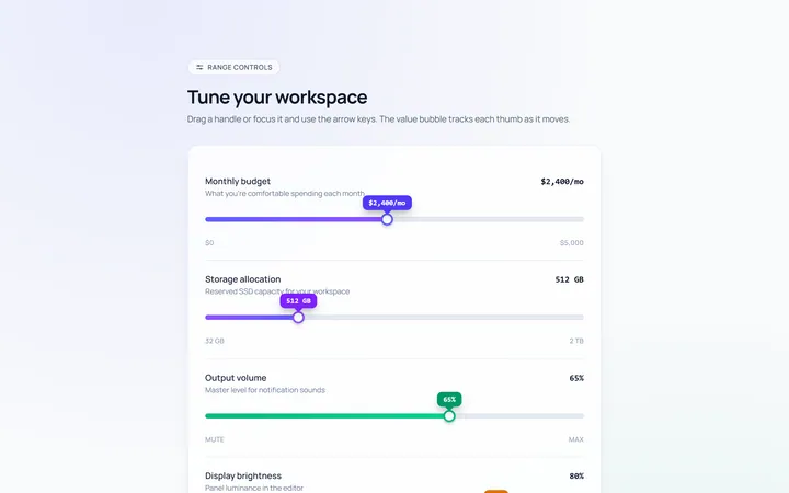
Basic Slider
Originalbasic range slider with value bubble
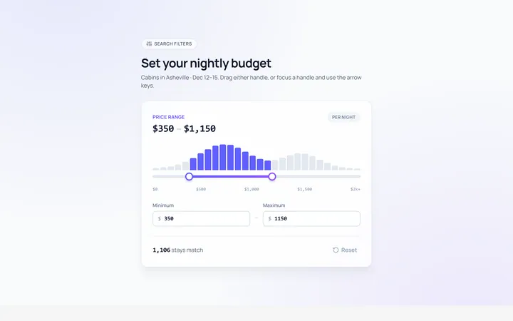
Range Dual Slider
Originaldual-handle min/max range
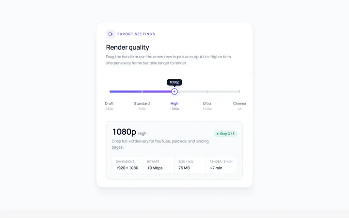
Steps Slider
Originalstepped slider with tick marks
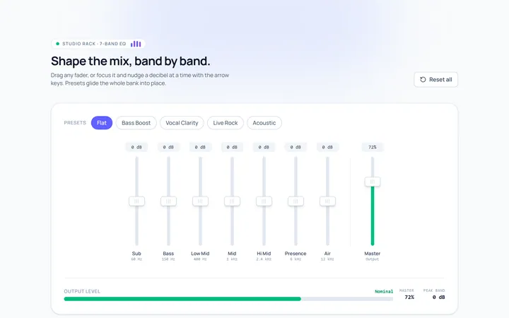
Vertical Slider
Originalvertical sliders
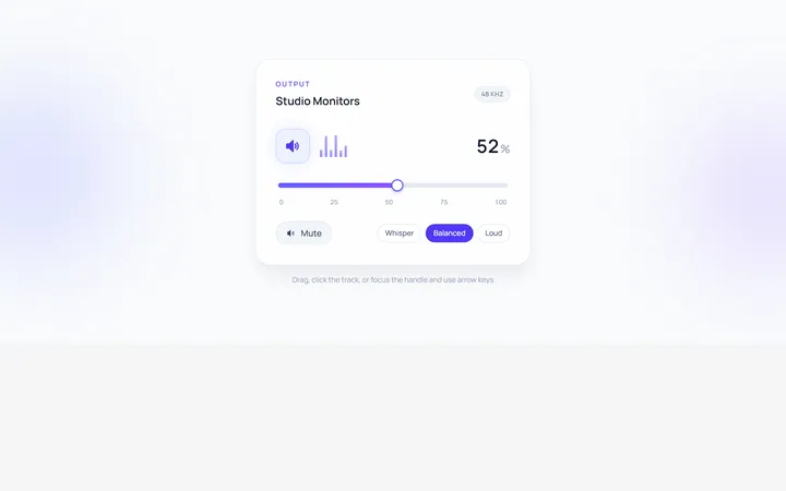
Volume Slider
Originalvolume slider with icon
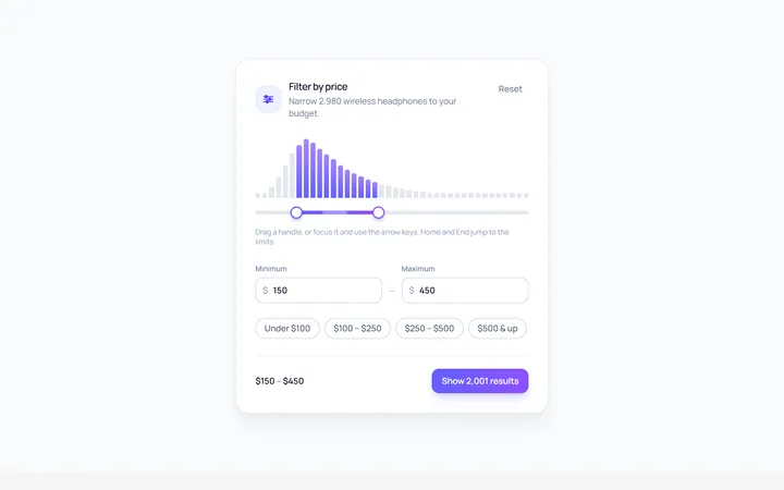
Price Range Slider
Originalprice range filter slider
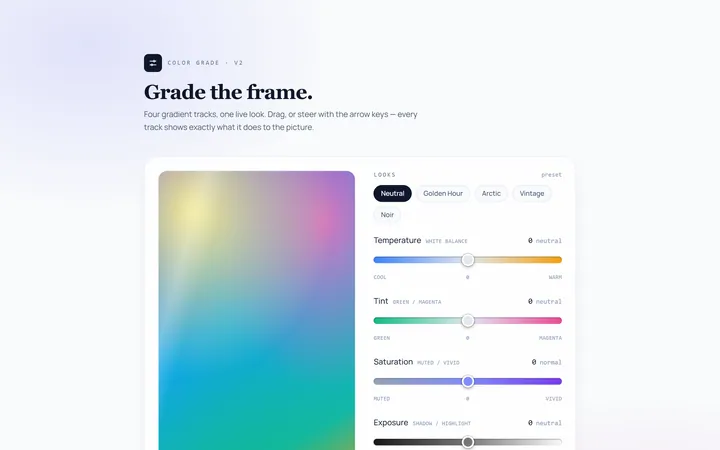
Gradient Track Slider
Originalslider with a gradient track

Rating Slider
Originalsatisfaction rating slider
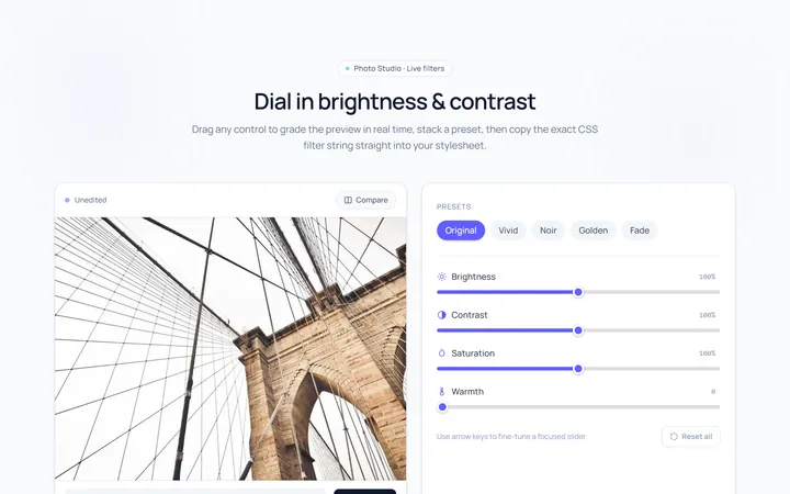
Brightness Slider
Originalbrightness/contrast control sliders
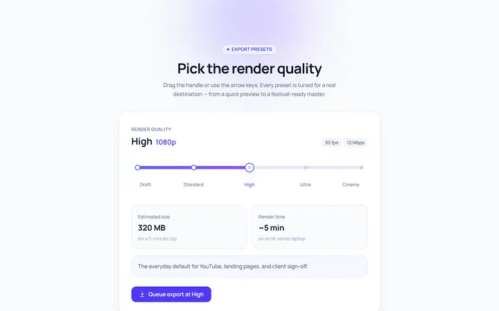
Marks Slider
Originalslider with labelled marks
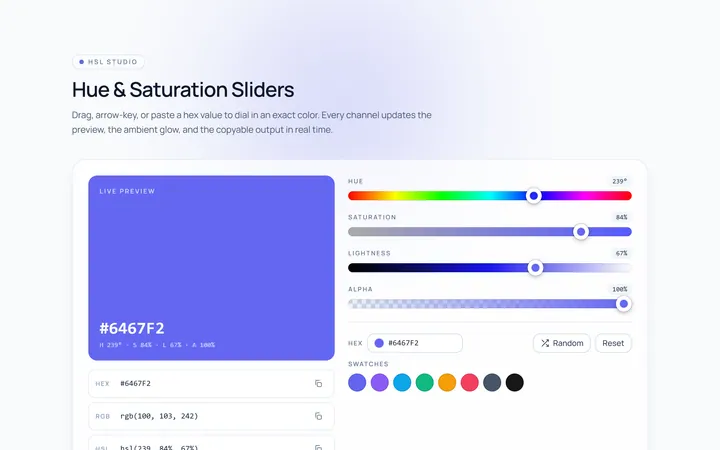
Color Hue Slider
Originalhue/saturation color sliders

Progress Drag Slider
Originalmedia scrubber slider