

Volume Slider
Original · freevolume slider with icon
byWeb InnoventixReact + Tailwind
sldvolumesliders
Copy prompt gives Claude Code, Cursor or v0 a ready-to-paste prompt that recreates this exact component.
npx shadcn@latest add https://webinnoventix.com/r/sld-volume.jsonsld-volume.tsx
"use client";

import {
  useRef,
  useState,
  type KeyboardEvent as ReactKeyboardEvent,
  type PointerEvent as ReactPointerEvent,
} from "react";
import { motion, useReducedMotion } from "motion/react";

const MIN = 0;
const MAX = 100;
const STEP = 1;

const PRESETS: { label: string; value: number }[] = [
  { label: "Whisper", value: 18 },
  { label: "Balanced", value: 52 },
  { label: "Loud", value: 84 },
];

function VolumeGlyph({ level }: { level: number }) {
  return (
    <svg
      viewBox="0 0 24 24"
      className="h-7 w-7 text-indigo-600 dark:text-indigo-300"
      aria-hidden="true"
      fill="none"
    >
      <path
        fill="currentColor"
        d="M13 4.6a1 1 0 0 0-1.7-.72L6.9 8.2H4A1.5 1.5 0 0 0 2.5 9.7v4.6A1.5 1.5 0 0 0 4 15.8h2.9l4.4 4.32A1 1 0 0 0 13 19.4V4.6Z"
      />
      {level === 0 ? (
        <g
          stroke="currentColor"
          strokeWidth={2}
          strokeLinecap="round"
          className="text-rose-500 dark:text-rose-400"
        >
          <path d="M16 9.5 21 15" />
          <path d="M21 9.5 16 15" />
        </g>
      ) : (
        <g stroke="currentColor" strokeWidth={1.9} strokeLinecap="round" fill="none">
          <path d="M15.2 9.3c1.35 1.5 1.35 3.9 0 5.4" />
          {level >= 34 && <path d="M17.3 7.3c2.7 2.6 2.7 6.8 0 9.4" opacity={0.9} />}
          {level >= 67 && <path d="M19.4 5.4c4 3.8 4 10.4 0 14.2" opacity={0.75} />}
        </g>
      )}
    </svg>
  );
}

export default function SldVolume() {
  const [value, setValue] = useState<number>(52);
  const trackRef = useRef<HTMLDivElement | null>(null);
  const thumbRef = useRef<HTMLDivElement | null>(null);
  const draggingRef = useRef<boolean>(false);
  const restoreRef = useRef<number>(52);
  const prefersReduced = useReducedMotion();

  const percent = ((value - MIN) / (MAX - MIN)) * 100;
  const muted = value === 0;

  const commit = (raw: number) => {
    const stepped = Math.round(raw / STEP) * STEP;
    setValue(Math.min(MAX, Math.max(MIN, stepped)));
  };

  const updateFromClientX = (clientX: number) => {
    const track = trackRef.current;
    if (!track) return;
    const rect = track.getBoundingClientRect();
    const ratio = (clientX - rect.left) / rect.width;
    const clamped = Math.min(1, Math.max(0, ratio));
    commit(MIN + clamped * (MAX - MIN));
  };

  const onPointerDown = (e: ReactPointerEvent<HTMLDivElement>) => {
    const track = trackRef.current;
    if (!track) return;
    draggingRef.current = true;
    track.setPointerCapture(e.pointerId);
    updateFromClientX(e.clientX);
    thumbRef.current?.focus();
  };

  const onPointerMove = (e: ReactPointerEvent<HTMLDivElement>) => {
    if (!draggingRef.current) return;
    updateFromClientX(e.clientX);
  };

  const endDrag = (e: ReactPointerEvent<HTMLDivElement>) => {
    draggingRef.current = false;
    const track = trackRef.current;
    if (track && track.hasPointerCapture(e.pointerId)) {
      track.releasePointerCapture(e.pointerId);
    }
  };

  const onKeyDown = (e: ReactKeyboardEvent<HTMLDivElement>) => {
    let next = value;
    switch (e.key) {
      case "ArrowRight":
      case "ArrowUp":
        next = value + STEP;
        break;
      case "ArrowLeft":
      case "ArrowDown":
        next = value - STEP;
        break;
      case "PageUp":
        next = value + 10;
        break;
      case "PageDown":
        next = value - 10;
        break;
      case "Home":
        next = MIN;
        break;
      case "End":
        next = MAX;
        break;
      default:
        return;
    }
    e.preventDefault();
    commit(next);
  };

  const toggleMute = () => {
    if (muted) {
      commit(restoreRef.current || 40);
    } else {
      restoreRef.current = value;
      commit(0);
    }
  };

  const barCount = 6;

  return (
    <section className="relative w-full overflow-hidden bg-slate-50 px-4 py-16 sm:py-24 dark:bg-slate-950">
      <style>{`
        @keyframes sldvol-eq {
          0%, 100% { transform: scaleY(0.28); }
          50% { transform: scaleY(1); }
        }
        @keyframes sldvol-halo {
          0%, 100% { opacity: 0.35; transform: scale(1); }
          50% { opacity: 0.6; transform: scale(1.08); }
        }
        .sldvol-bar { transform-origin: bottom; transform: scaleY(0.28); }
        .sldvol-bar--on { animation: sldvol-eq 900ms ease-in-out infinite; }
        .sldvol-halo--on { animation: sldvol-halo 3s ease-in-out infinite; }
        @media (prefers-reduced-motion: reduce) {
          .sldvol-bar--on { animation: none; }
          .sldvol-halo--on { animation: none; }
        }
      `}</style>

      <div
        aria-hidden="true"
        className="pointer-events-none absolute -left-24 top-1/2 h-72 w-72 -translate-y-1/2 rounded-full bg-indigo-400/20 blur-3xl dark:bg-indigo-500/10"
      />
      <div
        aria-hidden="true"
        className="pointer-events-none absolute -right-24 top-1/3 h-64 w-64 rounded-full bg-violet-400/20 blur-3xl dark:bg-violet-500/10"
      />

      <div className="relative mx-auto w-full max-w-md">
        <div className="rounded-3xl border border-slate-200/80 bg-white/90 p-6 shadow-xl shadow-slate-900/5 backdrop-blur-sm sm:p-8 dark:border-slate-800 dark:bg-slate-900/80 dark:shadow-black/40">
          {/* header */}
          <div className="mb-8 flex items-center justify-between">
            <div>
              <p className="text-[0.7rem] font-semibold uppercase tracking-[0.18em] text-indigo-600 dark:text-indigo-400">
                Output
              </p>
              <h2 className="mt-1 text-lg font-semibold text-slate-900 dark:text-slate-50">
                Studio Monitors
              </h2>
            </div>
            <span className="rounded-full border border-slate-200 bg-slate-100 px-2.5 py-1 text-[0.65rem] font-medium uppercase tracking-wide text-slate-500 dark:border-slate-700 dark:bg-slate-800 dark:text-slate-400">
              48 kHz
            </span>
          </div>

          {/* icon + eq + readout */}
          <div className="mb-6 flex items-center justify-between gap-4">
            <div className="flex items-center gap-4">
              <div className="relative flex h-14 w-14 shrink-0 items-center justify-center">
                <span
                  aria-hidden="true"
                  className={`absolute inset-0 rounded-2xl bg-indigo-500/20 blur-md ${
                    !prefersReduced && !muted ? "sldvol-halo--on" : ""
                  }`}
                  style={{ opacity: muted ? 0 : 0.3 + (percent / 100) * 0.4 }}
                />
                <div className="relative flex h-14 w-14 items-center justify-center rounded-2xl border border-indigo-200 bg-indigo-50 dark:border-indigo-500/30 dark:bg-indigo-500/10">
                  <VolumeGlyph level={value} />
                </div>
              </div>

              <div
                aria-hidden="true"
                className="flex h-9 items-end gap-1"
                style={{ opacity: muted ? 0.25 : 0.4 + (percent / 100) * 0.6 }}
              >
                {Array.from({ length: barCount }).map((_, i) => (
                  <span
                    key={i}
                    className={`sldvol-bar w-1 rounded-full bg-gradient-to-t from-indigo-500 to-violet-400 ${
                      !prefersReduced && !muted ? "sldvol-bar--on" : ""
                    }`}
                    style={{
                      height: "100%",
                      animationDelay: `${i * 110}ms`,
                      animationDuration: `${760 + (i % 3) * 180}ms`,
                    }}
                  />
                ))}
              </div>
            </div>

            <div className="text-right">
              <span className="text-3xl font-semibold tabular-nums text-slate-900 dark:text-slate-50">
                {muted ? "—" : value}
              </span>
              <span className="ml-0.5 text-lg font-medium text-slate-400 dark:text-slate-500">
                {muted ? "" : "%"}
              </span>
            </div>
          </div>

          {/* slider */}
          <div className="px-1">
            <div
              ref={trackRef}
              onPointerDown={onPointerDown}
              onPointerMove={onPointerMove}
              onPointerUp={endDrag}
              onPointerCancel={endDrag}
              className="relative flex h-6 w-full cursor-pointer touch-none select-none items-center"
            >
              <div className="relative h-2 w-full rounded-full bg-slate-200 dark:bg-slate-700">
                <div
                  className="absolute inset-y-0 left-0 rounded-full bg-gradient-to-r from-indigo-500 to-violet-500"
                  style={{ width: `${percent}%` }}
                />
                <motion.div
                  ref={thumbRef}
                  role="slider"
                  tabIndex={0}
                  aria-label="Volume"
                  aria-orientation="horizontal"
                  aria-valuemin={MIN}
                  aria-valuemax={MAX}
                  aria-valuenow={value}
                  aria-valuetext={muted ? "Muted" : `${value} percent`}
                  onKeyDown={onKeyDown}
                  whileTap={prefersReduced ? undefined : { scale: 1.12 }}
                  className="absolute top-1/2 h-5 w-5 -translate-x-1/2 -translate-y-1/2 rounded-full border-2 border-indigo-500 bg-white shadow-md shadow-indigo-500/30 outline-none focus-visible:ring-2 focus-visible:ring-indigo-500 focus-visible:ring-offset-2 focus-visible:ring-offset-white dark:border-indigo-400 dark:bg-slate-100 dark:focus-visible:ring-offset-slate-900"
                  style={{ left: `${percent}%` }}
                />
              </div>
            </div>

            <div
              aria-hidden="true"
              className="mt-2 flex justify-between px-0.5 text-[0.65rem] font-medium tabular-nums text-slate-400 dark:text-slate-600"
            >
              <span>0</span>
              <span>25</span>
              <span>50</span>
              <span>75</span>
              <span>100</span>
            </div>
          </div>

          {/* controls */}
          <div className="mt-6 flex items-center justify-between gap-3">
            <motion.button
              type="button"
              onClick={toggleMute}
              aria-pressed={muted}
              aria-label={muted ? "Unmute" : "Mute"}
              whileTap={prefersReduced ? undefined : { scale: 0.94 }}
              className={`inline-flex items-center gap-2 rounded-full border px-4 py-2 text-sm font-medium outline-none transition-colors focus-visible:ring-2 focus-visible:ring-indigo-500 focus-visible:ring-offset-2 focus-visible:ring-offset-white dark:focus-visible:ring-offset-slate-900 ${
                muted
                  ? "border-rose-300 bg-rose-50 text-rose-600 dark:border-rose-500/40 dark:bg-rose-500/10 dark:text-rose-300"
                  : "border-slate-200 bg-slate-100 text-slate-700 hover:bg-slate-200 dark:border-slate-700 dark:bg-slate-800 dark:text-slate-200 dark:hover:bg-slate-700"
              }`}
            >
              <svg viewBox="0 0 24 24" className="h-4 w-4" fill="none" aria-hidden="true">
                <path
                  fill="currentColor"
                  d="M11 5.4a.9.9 0 0 0-1.53-.64L6.4 7.8H4.2A1.2 1.2 0 0 0 3 9v6a1.2 1.2 0 0 0 1.2 1.2h2.2l3.07 3.04A.9.9 0 0 0 11 18.6V5.4Z"
                />
                {muted ? (
                  <g stroke="currentColor" strokeWidth={2} strokeLinecap="round">
                    <path d="M15.5 9.5 20.5 14.5" />
                    <path d="M20.5 9.5 15.5 14.5" />
                  </g>
                ) : (
                  <g stroke="currentColor" strokeWidth={1.8} strokeLinecap="round" fill="none">
                    <path d="M14.8 9.4c1.4 1.5 1.4 3.7 0 5.2" />
                    <path d="M17 7.3c2.7 2.6 2.7 6.8 0 9.4" opacity={0.7} />
                  </g>
                )}
              </svg>
              {muted ? "Muted" : "Mute"}
            </motion.button>

            <div className="flex items-center gap-1.5">
              {PRESETS.map((preset) => {
                const active = value === preset.value;
                return (
                  <motion.button
                    key={preset.label}
                    type="button"
                    onClick={() => commit(preset.value)}
                    aria-pressed={active}
                    whileTap={prefersReduced ? undefined : { scale: 0.94 }}
                    className={`rounded-full border px-3 py-1.5 text-xs font-medium outline-none transition-colors focus-visible:ring-2 focus-visible:ring-indigo-500 focus-visible:ring-offset-2 focus-visible:ring-offset-white dark:focus-visible:ring-offset-slate-900 ${
                      active
                        ? "border-transparent bg-indigo-600 text-white dark:bg-indigo-500"
                        : "border-slate-200 bg-white text-slate-600 hover:border-indigo-300 hover:text-indigo-600 dark:border-slate-700 dark:bg-slate-800 dark:text-slate-300 dark:hover:border-indigo-500/50 dark:hover:text-indigo-300"
                    }`}
                  >
                    {preset.label}
                  </motion.button>
                );
              })}
            </div>
          </div>
        </div>

        <p className="mt-4 text-center text-xs text-slate-400 dark:text-slate-600">
          Drag, click the track, or focus the handle and use arrow keys
        </p>
      </div>
    </section>
  );
}
Dependencies
motion
Licence
Built by Web Innoventix. Free for personal and commercial use, no attribution required.
Built by Web Innoventix
Need a custom interface, a full website, or SEO that gets you cited by AI? We design, build and rank it end to end.
Get a free quoteSimilar components
Browse all →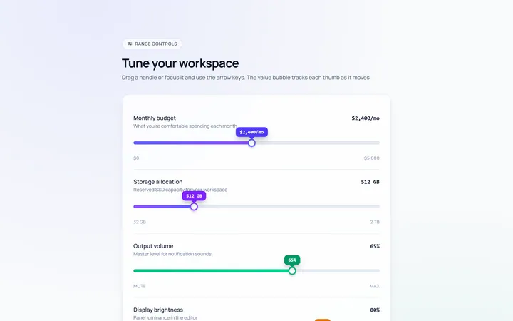
Basic Slider
Originalbasic range slider with value bubble
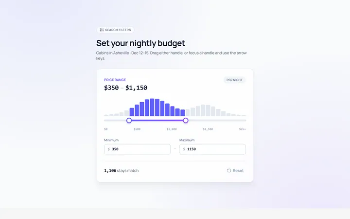
Range Dual Slider
Originaldual-handle min/max range
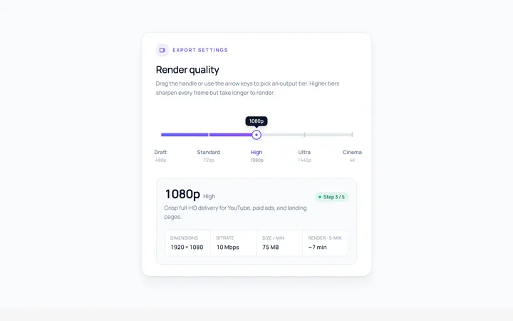
Steps Slider
Originalstepped slider with tick marks
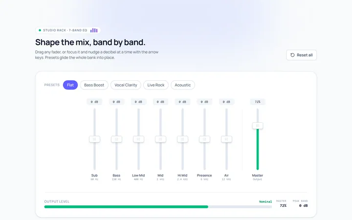
Vertical Slider
Originalvertical sliders
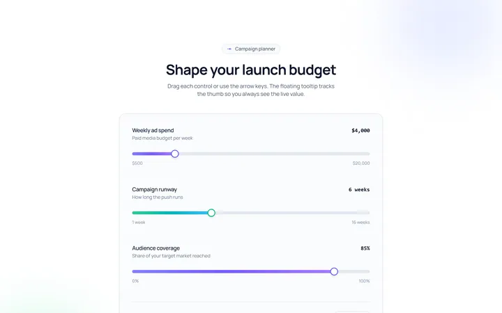
Tooltip Slider
Originalslider with a floating value tooltip
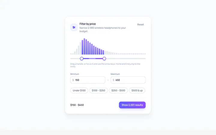
Price Range Slider
Originalprice range filter slider
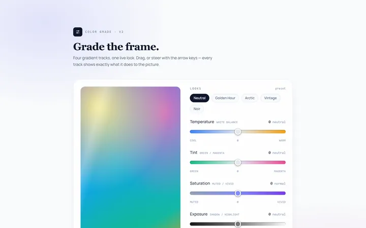
Gradient Track Slider
Originalslider with a gradient track

Rating Slider
Originalsatisfaction rating slider
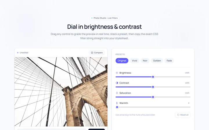
Brightness Slider
Originalbrightness/contrast control sliders
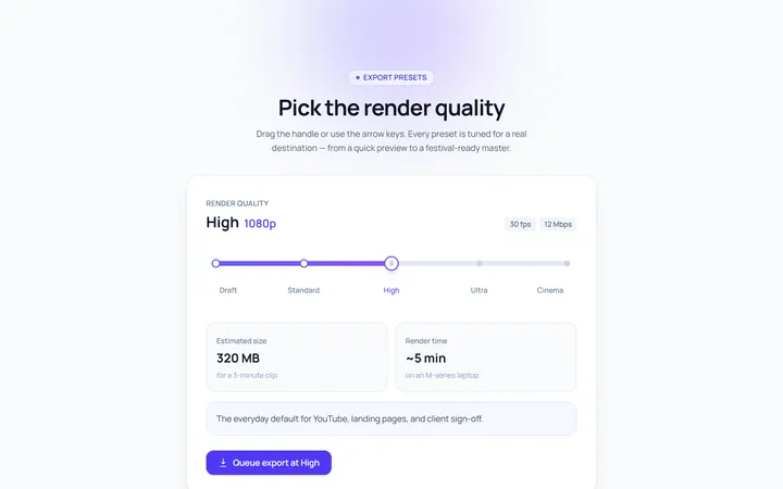
Marks Slider
Originalslider with labelled marks
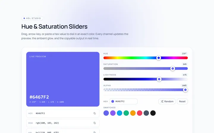
Color Hue Slider
Originalhue/saturation color sliders

Progress Drag Slider
Originalmedia scrubber slider