

Count-up stats reveal
Original · freeA four-card stat band whose gradient numbers count up from zero as the section scrolls into view, with staggered blur-in cards, a pulsing eyebrow, floating aurora blobs and a shimmering underline sweep.
Copy prompt gives Claude Code, Cursor or v0 a ready-to-paste prompt that recreates this exact component.
npx shadcn@latest add https://webinnoventix.com/r/astat-countup-reveal.json"use client";
import { useEffect, useRef, useState } from "react";
import { animate, motion, useInView, useReducedMotion, type Variants } from "motion/react";
type Stat = {
value: number;
prefix?: string;
suffix?: string;
decimals?: number;
label: string;
hint: string;
};
const stats: Stat[] = [
{ value: 128000, suffix: "+", label: "Active builders", hint: "shipping every single week" },
{ value: 99.98, suffix: "%", decimals: 2, label: "Platform uptime", hint: "measured across twelve months" },
{ value: 42, suffix: "ms", label: "Median latency", hint: "served from the global edge" },
{ value: 4.9, suffix: "/5", decimals: 1, label: "Average rating", hint: "from 6,200 verified reviews" },
];
function formatValue(v: number, s: Stat) {
const body = s.decimals ? v.toFixed(s.decimals) : Math.round(v).toLocaleString("en-GB");
return `${s.prefix ?? ""}${body}${s.suffix ?? ""}`;
}
function Counter({ stat }: { stat: Stat }) {
const ref = useRef<HTMLSpanElement>(null);
const inView = useInView(ref, { once: true, margin: "-60px" });
const reduce = useReducedMotion();
const [display, setDisplay] = useState(0);
useEffect(() => {
if (!inView) return;
if (reduce) {
setDisplay(stat.value);
return;
}
const controls = animate(0, stat.value, {
duration: 2,
ease: [0.16, 1, 0.3, 1],
onUpdate: (v) => setDisplay(v),
});
return () => controls.stop();
}, [inView, reduce, stat.value]);
return (
<span ref={ref} className="tabular-nums">
{formatValue(display, stat)}
</span>
);
}
export default function AstatCountupReveal() {
const reduce = useReducedMotion();
const container: Variants = {
hidden: {},
show: { transition: { staggerChildren: 0.12, delayChildren: 0.15 } },
};
const item: Variants = {
hidden: reduce ? { opacity: 0 } : { opacity: 0, y: 28, filter: "blur(6px)" },
show: {
opacity: 1,
y: 0,
filter: "blur(0px)",
transition: { type: "spring", stiffness: 130, damping: 20 },
},
};
return (
<section className="relative isolate overflow-hidden bg-white px-6 py-20 dark:bg-zinc-950 md:py-28">
<style>{`
@keyframes astat1-shimmer {
0% { background-position: -160% 0; }
100% { background-position: 260% 0; }
}
`}</style>
{/* animated aurora backdrop */}
<motion.div
aria-hidden
className="pointer-events-none absolute -top-24 left-1/4 h-72 w-72 rounded-full bg-indigo-400/30 blur-3xl dark:bg-indigo-500/20"
animate={reduce ? undefined : { x: [0, 40, 0], y: [0, -24, 0], scale: [1, 1.15, 1] }}
transition={{ duration: 16, repeat: Infinity, ease: "easeInOut" }}
/>
<motion.div
aria-hidden
className="pointer-events-none absolute -bottom-24 right-1/5 h-80 w-80 rounded-full bg-fuchsia-400/25 blur-3xl dark:bg-fuchsia-500/15"
animate={reduce ? undefined : { x: [0, -36, 0], y: [0, 20, 0], scale: [1.1, 1, 1.1] }}
transition={{ duration: 18, repeat: Infinity, ease: "easeInOut" }}
/>
<div className="relative mx-auto max-w-6xl">
<motion.div
initial={reduce ? { opacity: 0 } : { opacity: 0, y: 18 }}
whileInView={{ opacity: 1, y: 0 }}
viewport={{ once: true, margin: "-80px" }}
transition={{ duration: 0.6, ease: "easeOut" }}
className="mx-auto max-w-2xl text-center"
>
<span className="inline-flex items-center gap-2 rounded-full border border-zinc-200 bg-zinc-50 px-3 py-1 text-xs font-semibold uppercase tracking-widest text-indigo-600 dark:border-zinc-800 dark:bg-zinc-900 dark:text-indigo-400">
<motion.span
className="h-1.5 w-1.5 rounded-full bg-indigo-500"
animate={reduce ? undefined : { scale: [1, 1.6, 1], opacity: [1, 0.4, 1] }}
transition={{ duration: 1.8, repeat: Infinity, ease: "easeInOut" }}
/>
Live metrics
</span>
<h2 className="mt-4 text-balance text-3xl font-bold tracking-tight text-zinc-900 sm:text-4xl dark:text-white">
Numbers that climb the moment they appear
</h2>
<p className="mt-3 text-pretty text-zinc-600 dark:text-zinc-400">
Every figure counts up from zero as it scrolls into view, then settles into place.
</p>
</motion.div>
<motion.dl
variants={container}
initial="hidden"
whileInView="show"
viewport={{ once: true, margin: "-60px" }}
className="mt-14 grid grid-cols-1 gap-5 sm:grid-cols-2 lg:grid-cols-4"
>
{stats.map((stat) => (
<motion.div
key={stat.label}
variants={item}
whileHover={reduce ? undefined : { y: -6 }}
className="group relative overflow-hidden rounded-2xl border border-zinc-200 bg-white p-7 shadow-sm transition-shadow hover:shadow-xl hover:shadow-indigo-500/10 dark:border-zinc-800 dark:bg-zinc-900/60"
>
{/* hover glow */}
<div className="pointer-events-none absolute inset-0 -z-10 bg-gradient-to-br from-indigo-500/0 via-indigo-500/0 to-fuchsia-500/0 opacity-0 transition-opacity duration-500 group-hover:from-indigo-500/10 group-hover:to-fuchsia-500/10 group-hover:opacity-100" />
<dd className="bg-gradient-to-br from-indigo-600 via-violet-600 to-fuchsia-500 bg-clip-text text-4xl font-bold tracking-tight text-transparent sm:text-5xl dark:from-indigo-300 dark:via-violet-300 dark:to-fuchsia-300">
<Counter stat={stat} />
</dd>
{/* shimmer underline */}
<div className="relative mt-4 h-px w-full overflow-hidden rounded-full bg-zinc-200 dark:bg-zinc-800">
<span
aria-hidden
className="absolute inset-y-0 left-0 w-full bg-[linear-gradient(90deg,transparent,rgba(139,92,246,0.9),transparent)] bg-[length:40%_100%] bg-no-repeat [animation:astat1-shimmer_2.6s_linear_infinite] motion-reduce:animate-none"
/>
</div>
<dt className="mt-4 text-base font-semibold text-zinc-900 dark:text-white">{stat.label}</dt>
<p className="mt-1 text-sm text-zinc-500 dark:text-zinc-400">{stat.hint}</p>
</motion.div>
))}
</motion.dl>
</div>
</section>
);
}Dependencies
Licence
Built by Web Innoventix. Free for personal and commercial use, no attribution required.
Built by Web Innoventix
Need a custom interface, a full website, or SEO that gets you cited by AI? We design, build and rank it end to end.
Get a free quoteSimilar components
Browse all →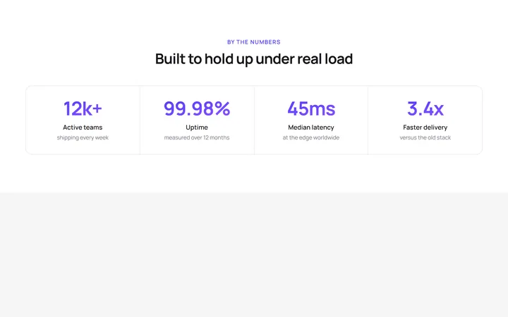
Four Stat Metric Band
OriginalA four-column metric band with gradient figures inside a hairline-divided card, ideal for headline numbers like uptime, latency and growth.
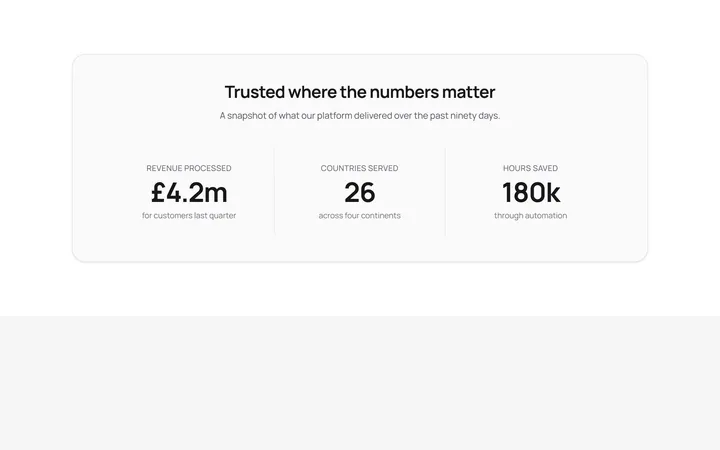
Labelled Stats With Dividers
OriginalThree centred stats separated by responsive dividers, each pairing a headline figure with an uppercase label and supporting detail.
Trusted By Logo Cloud
OriginalA responsive six-up logo strip using simple inline-SVG marks and wordmarks with a grayscale-to-colour hover, for a trusted-by section.
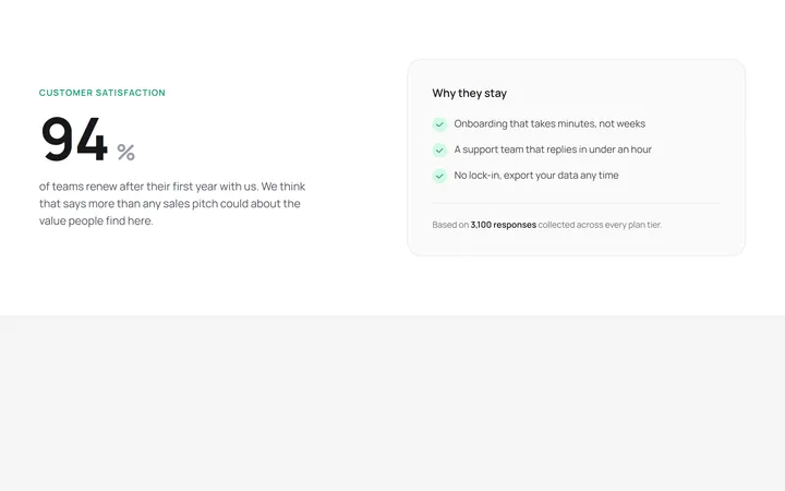
Hero Stat With Supporting Copy
OriginalA two-column layout pairing one oversized hero statistic with a supporting paragraph and a checklist card explaining the number.
Animated SVG progress rings
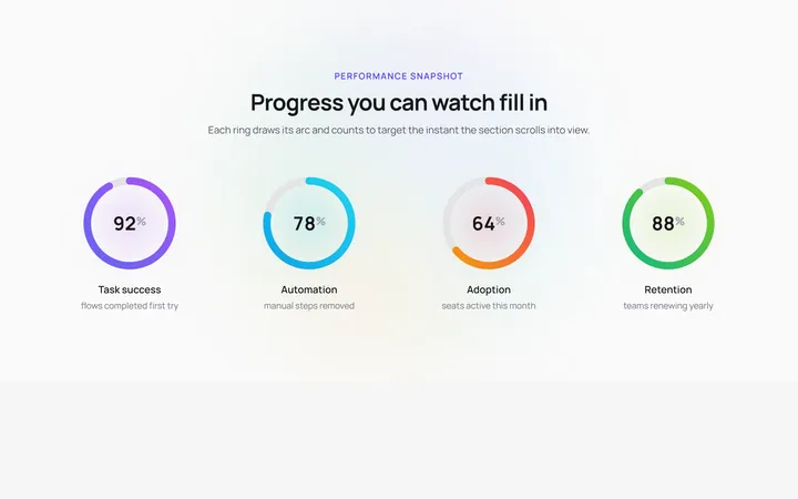
OriginalFour circular SVG progress rings that draw their gradient arcs and count up to their target percentage the moment they enter view, over a slowly rotating conic halo with a soft glow pulse behind each ring.
Staggered stat band with marquee ticker
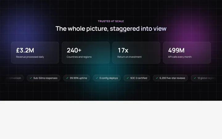
OriginalA dark stat band where 3D-tilt cards stagger into view with count-up figures over an animated gradient mesh, finished by an infinite marquee ticker of highlight chips that pauses on hover.

Spotlight Hero
OriginalA centred hero with a soft radial spotlight, badge and dual call-to-action.

Split Hero
OriginalA two-column hero pairing a headline and CTAs with a product mock and social proof.

Gradient Spotlight Hero
OriginalA minimal centred hero with a soft gradient-mesh backdrop, announcement pill and dual call-to-action buttons.

App Preview Hero
OriginalA centred hero that pairs headline copy with a realistic product dashboard mock built entirely from markup, complete with browser chrome and a floating notification card.

Waitlist Capture Hero
OriginalA dark, focused hero with an inline email capture form and avatar social proof, ready for pre-launch waitlists.

Image Backdrop Hero
OriginalA cinematic full-bleed hero with a layered image-style backdrop, overlaid left-aligned copy and a trusted-by logos strip.