

Labelled Stats With Dividers
Original · freeThree centred stats separated by responsive dividers, each pairing a headline figure with an uppercase label and supporting detail.
Copy prompt gives Claude Code, Cursor or v0 a ready-to-paste prompt that recreates this exact component.
npx shadcn@latest add https://webinnoventix.com/r/stats-labelled-dividers.jsonconst stats = [
{ value: "£4.2m", label: "Revenue processed", detail: "for customers last quarter" },
{ value: "26", label: "Countries served", detail: "across four continents" },
{ value: "180k", label: "Hours saved", detail: "through automation" },
];
export default function StatsLabelledDividers() {
return (
<section className="bg-white px-6 py-16 dark:bg-zinc-950 md:py-24">
<div className="mx-auto max-w-5xl rounded-3xl border border-zinc-200 bg-zinc-50 px-8 py-12 shadow-sm dark:border-zinc-800 dark:bg-zinc-900/50 md:px-14">
<div className="mx-auto max-w-xl text-center">
<h2 className="text-2xl font-bold tracking-tight text-zinc-900 sm:text-3xl dark:text-white">
Trusted where the numbers matter
</h2>
<p className="mt-3 text-zinc-600 dark:text-zinc-400">
A snapshot of what our platform delivered over the past ninety days.
</p>
</div>
<dl className="mt-12 grid grid-cols-1 divide-y divide-zinc-200 sm:grid-cols-3 sm:divide-x sm:divide-y-0 dark:divide-zinc-800">
{stats.map((stat) => (
<div key={stat.label} className="flex flex-col items-center px-6 py-6 text-center">
<dt className="text-sm font-medium uppercase tracking-wide text-zinc-500 dark:text-zinc-400">
{stat.label}
</dt>
<dd className="mt-2 text-5xl font-bold tracking-tight text-zinc-900 dark:text-white">
{stat.value}
</dd>
<p className="mt-2 text-sm text-zinc-500 dark:text-zinc-500">{stat.detail}</p>
</div>
))}
</dl>
</div>
</section>
);
}Dependencies
Licence
Built by Web Innoventix. Free for personal and commercial use, no attribution required.
Built by Web Innoventix
Need a custom interface, a full website, or SEO that gets you cited by AI? We design, build and rank it end to end.
Get a free quoteSimilar components
Browse all →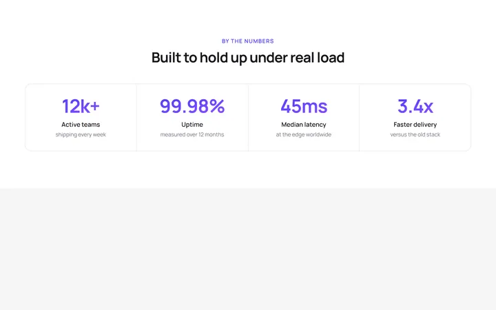
Four Stat Metric Band
OriginalA four-column metric band with gradient figures inside a hairline-divided card, ideal for headline numbers like uptime, latency and growth.
Trusted By Logo Cloud
OriginalA responsive six-up logo strip using simple inline-SVG marks and wordmarks with a grayscale-to-colour hover, for a trusted-by section.
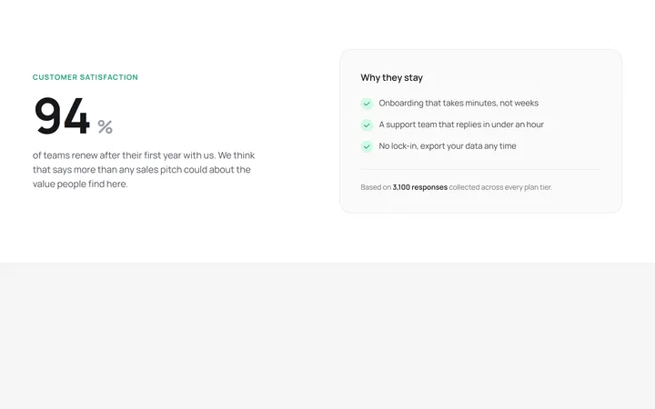
Hero Stat With Supporting Copy
OriginalA two-column layout pairing one oversized hero statistic with a supporting paragraph and a checklist card explaining the number.
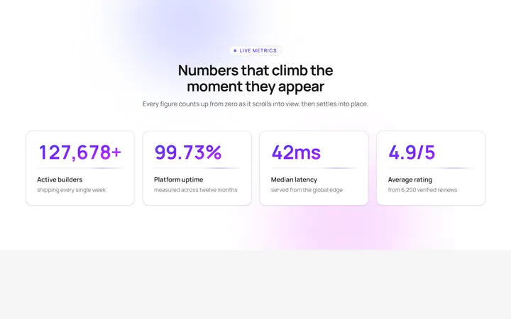
Count-up stats reveal
OriginalA four-card stat band whose gradient numbers count up from zero as the section scrolls into view, with staggered blur-in cards, a pulsing eyebrow, floating aurora blobs and a shimmering underline sweep.
Animated SVG progress rings
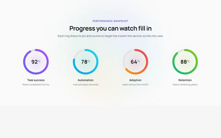
OriginalFour circular SVG progress rings that draw their gradient arcs and count up to their target percentage the moment they enter view, over a slowly rotating conic halo with a soft glow pulse behind each ring.
Staggered stat band with marquee ticker
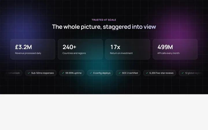
OriginalA dark stat band where 3D-tilt cards stagger into view with count-up figures over an animated gradient mesh, finished by an infinite marquee ticker of highlight chips that pauses on hover.

Spotlight Hero
OriginalA centred hero with a soft radial spotlight, badge and dual call-to-action.

Split Hero
OriginalA two-column hero pairing a headline and CTAs with a product mock and social proof.

Gradient Spotlight Hero
OriginalA minimal centred hero with a soft gradient-mesh backdrop, announcement pill and dual call-to-action buttons.

App Preview Hero
OriginalA centred hero that pairs headline copy with a realistic product dashboard mock built entirely from markup, complete with browser chrome and a floating notification card.

Waitlist Capture Hero
OriginalA dark, focused hero with an inline email capture form and avatar social proof, ready for pre-launch waitlists.

Image Backdrop Hero
OriginalA cinematic full-bleed hero with a layered image-style backdrop, overlaid left-aligned copy and a trusted-by logos strip.