

Staggered stat band with marquee ticker
Original · freeA dark stat band where 3D-tilt cards stagger into view with count-up figures over an animated gradient mesh, finished by an infinite marquee ticker of highlight chips that pauses on hover.
Copy prompt gives Claude Code, Cursor or v0 a ready-to-paste prompt that recreates this exact component.
npx shadcn@latest add https://webinnoventix.com/r/astat-stagger-marquee.json"use client";
import { useEffect, useRef, useState } from "react";
import { animate, motion, useInView, useReducedMotion, type Variants } from "motion/react";
type Stat = {
value: number;
prefix?: string;
suffix?: string;
decimals?: number;
label: string;
};
const stats: Stat[] = [
{ value: 3.2, prefix: "£", suffix: "M", decimals: 1, label: "Revenue processed daily" },
{ value: 240, suffix: "+", label: "Countries and regions" },
{ value: 17, suffix: "x", label: "Return on investment" },
{ value: 500, suffix: "M", label: "API calls every month" },
];
const ticker = [
"24% higher conversion",
"Sub-50ms responses",
"99.99% uptime",
"0 config deploys",
"SOC 2 certified",
"6,200 five-star reviews",
"12 global regions",
"Zero-downtime releases",
];
function formatValue(v: number, s: Stat) {
const body = s.decimals ? v.toFixed(s.decimals) : Math.round(v).toLocaleString("en-GB");
return `${s.prefix ?? ""}${body}${s.suffix ?? ""}`;
}
function Counter({ stat, start }: { stat: Stat; start: boolean }) {
const reduce = useReducedMotion();
const [display, setDisplay] = useState(0);
useEffect(() => {
if (!start) return;
if (reduce) {
setDisplay(stat.value);
return;
}
const controls = animate(0, stat.value, {
duration: 2,
ease: [0.16, 1, 0.3, 1],
onUpdate: (v) => setDisplay(v),
});
return () => controls.stop();
}, [start, reduce, stat.value]);
return <span className="tabular-nums">{formatValue(display, stat)}</span>;
}
export default function AstatStaggerMarquee() {
const reduce = useReducedMotion();
const ref = useRef<HTMLDivElement>(null);
const inView = useInView(ref, { once: true, margin: "-60px" });
const container: Variants = {
hidden: {},
show: { transition: { staggerChildren: 0.14, delayChildren: 0.1 } },
};
const item: Variants = {
hidden: reduce ? { opacity: 0 } : { opacity: 0, y: 30, rotateX: -25 },
show: {
opacity: 1,
y: 0,
rotateX: 0,
transition: { type: "spring", stiffness: 120, damping: 18 },
},
};
return (
<section className="relative isolate overflow-hidden bg-zinc-950 px-6 py-20 text-white md:py-28">
<style>{`
@keyframes astat3-marquee {
from { transform: translateX(0); }
to { transform: translateX(-50%); }
}
@keyframes astat3-drift {
0%, 100% { transform: translate3d(0,0,0) scale(1); }
50% { transform: translate3d(6%, -8%, 0) scale(1.15); }
}
@media (prefers-reduced-motion: reduce) {
.astat3-marquee-track, .astat3-mesh { animation: none !important; }
}
`}</style>
{/* animated gradient mesh */}
<div className="pointer-events-none absolute inset-0 -z-10 opacity-70">
<div
className="astat3-mesh absolute -left-20 top-0 h-[420px] w-[420px] rounded-full blur-3xl [animation:astat3-drift_18s_ease-in-out_infinite]"
style={{ background: "radial-gradient(circle, #6366f1, transparent 65%)" }}
/>
<div
className="astat3-mesh absolute right-0 top-10 h-[380px] w-[380px] rounded-full blur-3xl [animation:astat3-drift_22s_ease-in-out_infinite_reverse]"
style={{ background: "radial-gradient(circle, #d946ef, transparent 65%)" }}
/>
<div
className="astat3-mesh absolute bottom-0 left-1/3 h-[360px] w-[360px] rounded-full blur-3xl [animation:astat3-drift_26s_ease-in-out_infinite]"
style={{ background: "radial-gradient(circle, #06b6d4, transparent 65%)" }}
/>
</div>
{/* subtle grid overlay */}
<div
aria-hidden
className="pointer-events-none absolute inset-0 -z-10 opacity-[0.08]"
style={{
backgroundImage:
"linear-gradient(to right, #fff 1px, transparent 1px), linear-gradient(to bottom, #fff 1px, transparent 1px)",
backgroundSize: "48px 48px",
}}
/>
<div ref={ref} className="relative mx-auto max-w-6xl">
<motion.div
initial={reduce ? { opacity: 0 } : { opacity: 0, y: 18 }}
whileInView={{ opacity: 1, y: 0 }}
viewport={{ once: true, margin: "-80px" }}
transition={{ duration: 0.6, ease: "easeOut" }}
className="mx-auto max-w-2xl text-center"
>
<p className="text-sm font-semibold uppercase tracking-widest text-fuchsia-300">
Trusted at scale
</p>
<h2 className="mt-3 text-balance bg-gradient-to-r from-white via-fuchsia-100 to-indigo-200 bg-clip-text text-3xl font-bold tracking-tight text-transparent sm:text-4xl">
The whole picture, staggered into view
</h2>
</motion.div>
<motion.dl
variants={container}
initial="hidden"
whileInView="show"
viewport={{ once: true, margin: "-60px" }}
style={{ perspective: 1000 }}
className="mt-14 grid grid-cols-2 gap-4 lg:grid-cols-4"
>
{stats.map((stat) => (
<motion.div
key={stat.label}
variants={item}
whileHover={reduce ? undefined : { y: -6, scale: 1.03 }}
className="group relative overflow-hidden rounded-2xl border border-white/10 bg-white/5 p-7 backdrop-blur-sm transition-colors hover:border-white/25 hover:bg-white/10"
>
<div className="pointer-events-none absolute -inset-px -z-10 rounded-2xl bg-gradient-to-br from-fuchsia-500/0 to-indigo-500/0 opacity-0 blur transition-opacity duration-500 group-hover:from-fuchsia-500/30 group-hover:to-indigo-500/30 group-hover:opacity-100" />
<dd className="text-3xl font-bold tracking-tight sm:text-4xl">
<Counter stat={stat} start={inView} />
</dd>
<dt className="mt-2 text-sm text-zinc-300">{stat.label}</dt>
</motion.div>
))}
</motion.dl>
</div>
{/* marquee ticker */}
<div className="group relative mt-16 flex overflow-hidden [mask-image:linear-gradient(to_right,transparent,#000_12%,#000_88%,transparent)]">
<div className="astat3-marquee-track flex shrink-0 items-center gap-4 pr-4 [animation:astat3-marquee_28s_linear_infinite] group-hover:[animation-play-state:paused]">
{[...ticker, ...ticker].map((chip, i) => (
<span
key={i}
className="inline-flex shrink-0 items-center gap-2 rounded-full border border-white/10 bg-white/5 px-4 py-2 text-sm text-zinc-200"
>
<svg viewBox="0 0 20 20" className="h-3.5 w-3.5 text-emerald-400" fill="none" aria-hidden>
<path d="M4 11l3 3 9-9" stroke="currentColor" strokeWidth="2.4" strokeLinecap="round" strokeLinejoin="round" />
</svg>
{chip}
</span>
))}
</div>
</div>
</section>
);
}Dependencies
Licence
Built by Web Innoventix. Free for personal and commercial use, no attribution required.
Built by Web Innoventix
Need a custom interface, a full website, or SEO that gets you cited by AI? We design, build and rank it end to end.
Get a free quoteSimilar components
Browse all →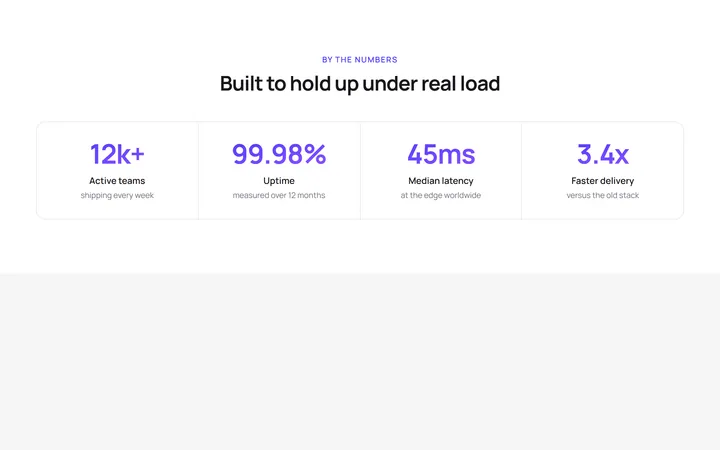
Four Stat Metric Band
OriginalA four-column metric band with gradient figures inside a hairline-divided card, ideal for headline numbers like uptime, latency and growth.
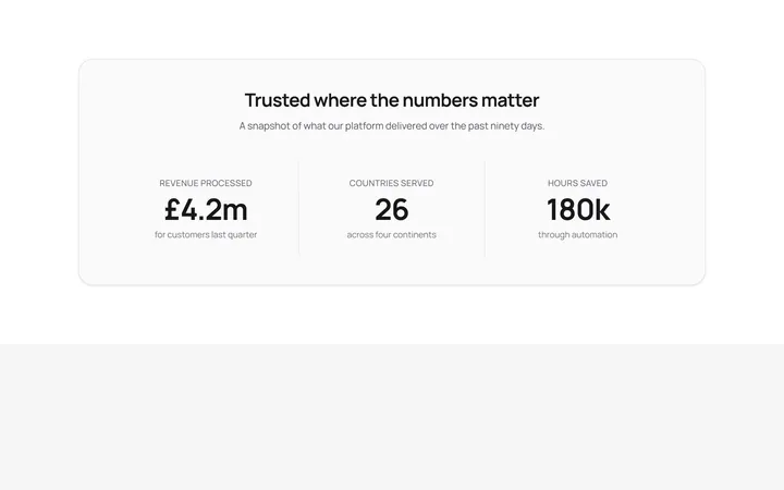
Labelled Stats With Dividers
OriginalThree centred stats separated by responsive dividers, each pairing a headline figure with an uppercase label and supporting detail.
Trusted By Logo Cloud
OriginalA responsive six-up logo strip using simple inline-SVG marks and wordmarks with a grayscale-to-colour hover, for a trusted-by section.
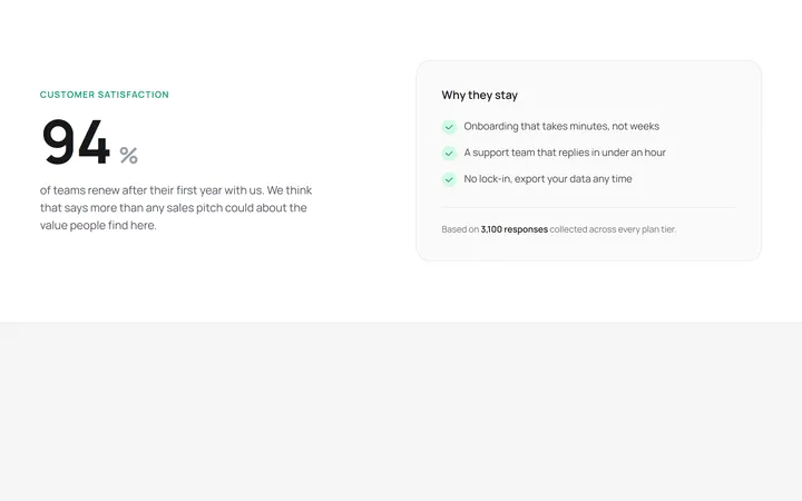
Hero Stat With Supporting Copy
OriginalA two-column layout pairing one oversized hero statistic with a supporting paragraph and a checklist card explaining the number.
Count-up stats reveal
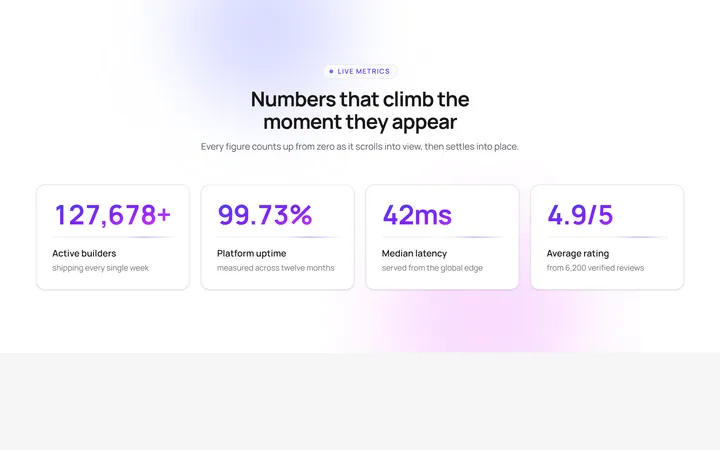
OriginalA four-card stat band whose gradient numbers count up from zero as the section scrolls into view, with staggered blur-in cards, a pulsing eyebrow, floating aurora blobs and a shimmering underline sweep.
Animated SVG progress rings
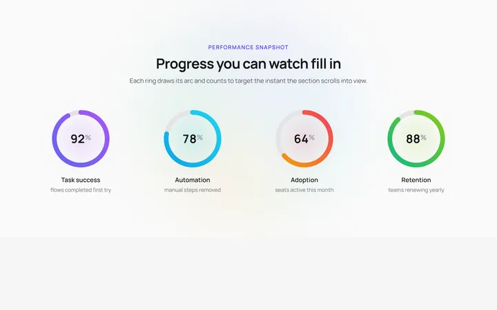
OriginalFour circular SVG progress rings that draw their gradient arcs and count up to their target percentage the moment they enter view, over a slowly rotating conic halo with a soft glow pulse behind each ring.

Spotlight Hero
OriginalA centred hero with a soft radial spotlight, badge and dual call-to-action.

Split Hero
OriginalA two-column hero pairing a headline and CTAs with a product mock and social proof.

Gradient Spotlight Hero
OriginalA minimal centred hero with a soft gradient-mesh backdrop, announcement pill and dual call-to-action buttons.

App Preview Hero
OriginalA centred hero that pairs headline copy with a realistic product dashboard mock built entirely from markup, complete with browser chrome and a floating notification card.

Waitlist Capture Hero
OriginalA dark, focused hero with an inline email capture form and avatar social proof, ready for pre-launch waitlists.

Image Backdrop Hero
OriginalA cinematic full-bleed hero with a layered image-style backdrop, overlaid left-aligned copy and a trusted-by logos strip.