

Highlight Testimonial
Original · freehighlighted featured testimonial
Copy prompt gives Claude Code, Cursor or v0 a ready-to-paste prompt that recreates this exact component.
npx shadcn@latest add https://webinnoventix.com/r/tstx-highlight.json"use client";
import { useRef, useState, type KeyboardEvent } from "react";
import { AnimatePresence, motion, useReducedMotion } from "motion/react";
type Testimonial = {
id: string;
quote: string;
author: string;
role: string;
company: string;
initials: string;
avatar: string;
metricValue: string;
metricLabel: string;
};
const TESTIMONIALS: Testimonial[] = [
{
id: "tstxhl-vega",
quote:
"We replaced four disconnected spreadsheets with Nimbus and cut our monthly close from nine days to two. The part I still can't get over is that finance and operations finally argue about the strategy instead of the numbers.",
author: "Priya Raman",
role: "VP of Finance",
company: "Larkfield Retail Group",
initials: "PR",
avatar: "from-indigo-400 to-violet-500",
metricValue: "78%",
metricLabel: "faster monthly close",
},
{
id: "tstxhl-orion",
quote:
"Onboarding thirty regional managers used to eat an entire quarter. With Nimbus the templates did the teaching for us. Most of the team shipped their first live report on day one, without a single training call.",
author: "Marcus Bell",
role: "Director of Operations",
company: "Continental Freightworks",
initials: "MB",
avatar: "from-emerald-400 to-teal-500",
metricValue: "1 day",
metricLabel: "to first live report",
},
{
id: "tstxhl-lyra",
quote:
"I evaluate a lot of tools and most of them look great in the demo and collapse in month three. Nimbus was the opposite. It got quietly indispensable, and our quarterly business reviews stopped being a scramble.",
author: "Sofia Almeida",
role: "Head of Customer Success",
company: "Brightpath Software",
initials: "SA",
avatar: "from-rose-400 to-pink-500",
metricValue: "3.2x",
metricLabel: "more QBRs on schedule",
},
{
id: "tstxhl-atlas",
quote:
"Our board asked for one dashboard everyone could agree on. We built it in Nimbus over a weekend, and it has survived two reorganisations since. That reliability is worth more to me than any single feature.",
author: "Daniel Okafor",
role: "Chief of Staff",
company: "Meridian Health Partners",
initials: "DO",
avatar: "from-sky-400 to-indigo-500",
metricValue: "12 hrs",
metricLabel: "saved every week",
},
];
function StarIcon({ className }: { className?: string }) {
return (
<svg
viewBox="0 0 20 20"
fill="currentColor"
aria-hidden="true"
className={className}
>
<path d="M9.05 2.93c.3-.92 1.6-.92 1.9 0l1.36 4.18a1 1 0 0 0 .95.69h4.4c.96 0 1.36 1.24.58 1.8l-3.56 2.59a1 1 0 0 0-.36 1.12l1.36 4.18c.3.92-.75 1.68-1.53 1.12l-3.56-2.59a1 1 0 0 0-1.18 0l-3.56 2.59c-.78.56-1.83-.2-1.53-1.12l1.36-4.18a1 1 0 0 0-.36-1.12L1.72 9.6c-.78-.56-.38-1.8.58-1.8h4.4a1 1 0 0 0 .95-.69L9.05 2.93Z" />
</svg>
);
}
function QuoteGlyph({ className }: { className?: string }) {
return (
<svg
viewBox="0 0 48 48"
fill="currentColor"
aria-hidden="true"
className={className}
>
<path d="M18 10c-6.6 0-12 5.4-12 12v16h16V22h-8c0-4.4 3.6-8 8-8V10Zm24 0c-6.6 0-12 5.4-12 12v16h16V22h-8c0-4.4 3.6-8 8-8V10Z" />
</svg>
);
}
function ArrowIcon({ className }: { className?: string }) {
return (
<svg
viewBox="0 0 20 20"
fill="none"
stroke="currentColor"
strokeWidth={1.8}
strokeLinecap="round"
strokeLinejoin="round"
aria-hidden="true"
className={className}
>
<path d="M4 10h12M11 5l5 5-5 5" />
</svg>
);
}
export default function TstxHighlight() {
const reduce = useReducedMotion();
const [active, setActive] = useState(0);
const tabRefs = useRef<Array<HTMLButtonElement | null>>([]);
const current = TESTIMONIALS[active];
const onKeyDown = (event: KeyboardEvent<HTMLButtonElement>, index: number) => {
const last = TESTIMONIALS.length - 1;
let next = index;
if (event.key === "ArrowRight" || event.key === "ArrowDown") {
next = index === last ? 0 : index + 1;
} else if (event.key === "ArrowLeft" || event.key === "ArrowUp") {
next = index === 0 ? last : index - 1;
} else if (event.key === "Home") {
next = 0;
} else if (event.key === "End") {
next = last;
} else {
return;
}
event.preventDefault();
setActive(next);
tabRefs.current[next]?.focus();
};
const panelVariants = reduce
? {
initial: { opacity: 0 },
animate: { opacity: 1 },
exit: { opacity: 0 },
}
: {
initial: { opacity: 0, y: 18 },
animate: { opacity: 1, y: 0 },
exit: { opacity: 0, y: -14 },
};
return (
<section className="relative w-full overflow-hidden bg-slate-50 py-24 sm:py-32 dark:bg-slate-950">
<style>{`
@keyframes tstxhl-glow {
0%, 100% { transform: translate3d(0,0,0) scale(1); opacity: 0.55; }
50% { transform: translate3d(0,-16px,0) scale(1.08); opacity: 0.85; }
}
@keyframes tstxhl-drift {
0%, 100% { transform: translate3d(0,0,0) scale(1); opacity: 0.4; }
50% { transform: translate3d(0,20px,0) scale(1.12); opacity: 0.65; }
}
.tstxhl-glow-a { animation: tstxhl-glow 11s ease-in-out infinite; }
.tstxhl-glow-b { animation: tstxhl-drift 14s ease-in-out infinite; }
@media (prefers-reduced-motion: reduce) {
.tstxhl-glow-a, .tstxhl-glow-b { animation: none !important; }
}
`}</style>
{/* decorative background */}
<div
aria-hidden="true"
className="tstxhl-glow-a pointer-events-none absolute -left-24 top-8 h-72 w-72 rounded-full bg-gradient-to-br from-indigo-300/50 to-violet-400/40 blur-3xl dark:from-indigo-600/25 dark:to-violet-700/20"
/>
<div
aria-hidden="true"
className="tstxhl-glow-b pointer-events-none absolute -right-20 bottom-0 h-80 w-80 rounded-full bg-gradient-to-br from-sky-300/40 to-emerald-300/40 blur-3xl dark:from-sky-700/20 dark:to-emerald-700/15"
/>
<div className="relative mx-auto max-w-6xl px-6 lg:px-8">
{/* header */}
<div className="mx-auto max-w-2xl text-center">
<span className="inline-flex items-center gap-2 rounded-full border border-indigo-200 bg-white/70 px-4 py-1.5 text-xs font-semibold uppercase tracking-wider text-indigo-600 shadow-sm backdrop-blur dark:border-indigo-500/30 dark:bg-white/5 dark:text-indigo-300">
<span className="h-1.5 w-1.5 rounded-full bg-indigo-500" />
Customer stories
</span>
<h2 className="mt-6 text-3xl font-bold tracking-tight text-slate-900 sm:text-4xl dark:text-white">
The teams behind the numbers
</h2>
<p className="mt-4 text-base leading-relaxed text-slate-600 dark:text-slate-400">
Operators who run on Nimbus every day, in their own words. Pick a
story to hear what changed once the reporting stopped fighting back.
</p>
</div>
{/* featured card */}
<div className="mx-auto mt-14 max-w-4xl">
<div className="relative overflow-hidden rounded-3xl border border-slate-200 bg-white/80 p-8 shadow-xl shadow-slate-900/5 backdrop-blur-sm sm:p-12 dark:border-white/10 dark:bg-slate-900/60 dark:shadow-black/30">
{/* accent bar */}
<div className="absolute inset-x-0 top-0 h-1 bg-gradient-to-r from-indigo-500 via-violet-500 to-sky-500" />
<QuoteGlyph className="pointer-events-none absolute -right-2 -top-2 h-28 w-28 text-slate-900/[0.04] dark:text-white/[0.05]" />
<AnimatePresence mode="wait" initial={false}>
<motion.div
key={current.id}
variants={panelVariants}
initial="initial"
animate="animate"
exit="exit"
transition={{
duration: reduce ? 0.2 : 0.45,
ease: "easeOut",
}}
role="tabpanel"
id={`${current.id}-panel`}
aria-labelledby={`${current.id}-tab`}
>
<div className="flex items-center gap-1 text-amber-400">
{[0, 1, 2, 3, 4].map((star) => (
<StarIcon key={star} className="h-5 w-5" />
))}
<span className="sr-only">Rated 5 out of 5</span>
</div>
<blockquote className="mt-6">
<p className="text-xl font-medium leading-relaxed text-slate-800 sm:text-2xl sm:leading-relaxed dark:text-slate-100">
“{current.quote}”
</p>
</blockquote>
<div className="mt-10 flex flex-col gap-8 border-t border-slate-200 pt-8 sm:flex-row sm:items-center sm:justify-between dark:border-white/10">
<div className="flex items-center gap-4">
<div
aria-hidden="true"
className={`flex h-14 w-14 shrink-0 items-center justify-center rounded-full bg-gradient-to-br ${current.avatar} text-base font-semibold text-white shadow-md`}
>
{current.initials}
</div>
<div>
<div className="text-base font-semibold text-slate-900 dark:text-white">
{current.author}
</div>
<div className="text-sm text-slate-500 dark:text-slate-400">
{current.role}, {current.company}
</div>
</div>
</div>
<div className="sm:text-right">
<div className="bg-gradient-to-r from-indigo-600 to-violet-600 bg-clip-text text-3xl font-bold text-transparent dark:from-indigo-400 dark:to-violet-400">
{current.metricValue}
</div>
<div className="text-sm font-medium text-slate-500 dark:text-slate-400">
{current.metricLabel}
</div>
</div>
</div>
</motion.div>
</AnimatePresence>
</div>
</div>
{/* selector tabs */}
<div
role="tablist"
aria-label="Featured customer testimonials"
className="mx-auto mt-10 flex max-w-4xl flex-wrap justify-center gap-3"
>
{TESTIMONIALS.map((item, index) => {
const selected = index === active;
return (
<button
key={item.id}
ref={(node) => {
tabRefs.current[index] = node;
}}
type="button"
role="tab"
id={`${item.id}-tab`}
aria-selected={selected}
aria-controls={`${item.id}-panel`}
tabIndex={selected ? 0 : -1}
onClick={() => setActive(index)}
onKeyDown={(event) => onKeyDown(event, index)}
className={`group flex items-center gap-3 rounded-full border px-4 py-2 text-left outline-none transition focus-visible:ring-2 focus-visible:ring-indigo-500 focus-visible:ring-offset-2 focus-visible:ring-offset-slate-50 dark:focus-visible:ring-offset-slate-950 ${
selected
? "border-indigo-300 bg-white shadow-md dark:border-indigo-500/40 dark:bg-slate-800"
: "border-slate-200 bg-white/50 hover:border-slate-300 hover:bg-white dark:border-white/10 dark:bg-white/5 dark:hover:border-white/20 dark:hover:bg-white/10"
}`}
>
<span
aria-hidden="true"
className={`flex h-9 w-9 shrink-0 items-center justify-center rounded-full bg-gradient-to-br ${item.avatar} text-xs font-semibold text-white transition group-hover:scale-105`}
>
{item.initials}
</span>
<span className="pr-1">
<span
className={`block text-sm font-semibold ${
selected
? "text-slate-900 dark:text-white"
: "text-slate-700 dark:text-slate-300"
}`}
>
{item.author}
</span>
<span className="block text-xs text-slate-500 dark:text-slate-400">
{item.company}
</span>
</span>
</button>
);
})}
</div>
{/* footer cta */}
<div className="mt-12 flex justify-center">
<a
href="#"
className="inline-flex items-center gap-2 text-sm font-semibold text-indigo-600 transition hover:gap-3 hover:text-indigo-500 dark:text-indigo-400 dark:hover:text-indigo-300"
>
Read every case study
<ArrowIcon className="h-4 w-4" />
</a>
</div>
</div>
</section>
);
}Dependencies
Licence
Built by Web Innoventix. Free for personal and commercial use, no attribution required.
Built by Web Innoventix
Need a custom interface, a full website, or SEO that gets you cited by AI? We design, build and rank it end to end.
Get a free quoteSimilar components
Browse all →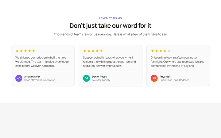
Three Card Testimonial Grid
OriginalA clean three-column grid of testimonial cards, each with a star rating, quote and an initial avatar with name and role.
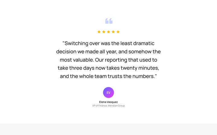
Single Featured Quote
OriginalA large centred pull quote with a decorative quotation mark, five-star rating and a prominent author avatar for a single standout testimonial.
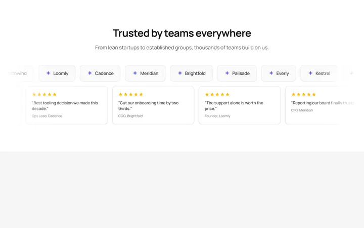
Logo Wall Marquee
OriginalA pair of infinitely scrolling, pause-on-hover marquees pairing a customer logo wall with compact quote cards, with reduced-motion support.
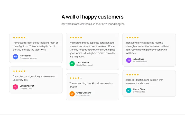
Masonry Testimonial Wall
OriginalA CSS-columns masonry wall of testimonial cards in varied lengths, each with a star rating and initial avatar for a natural, organic layout.
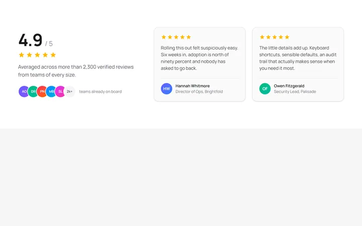
Aggregate Rating Spotlight
OriginalA split layout pairing a large aggregate rating score, star row and overlapping avatar stack with two featured review cards.
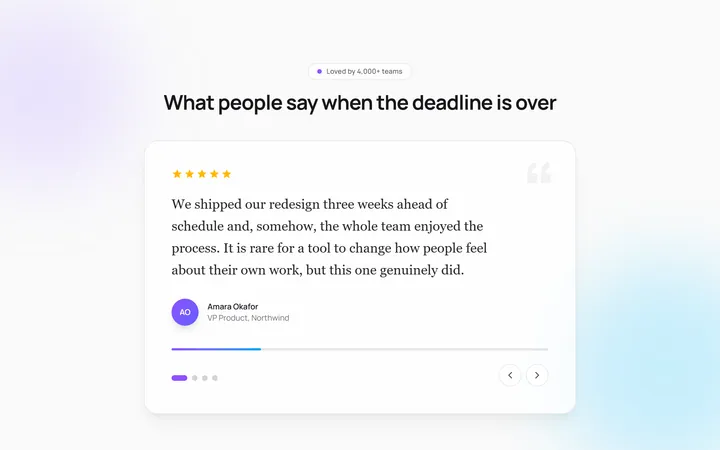
Auto-Rotating Quote Carousel
OriginalAn auto-advancing testimonial carousel that slides and crossfades between quotes with a live progress bar, pause-on-hover, and dot plus arrow navigation.
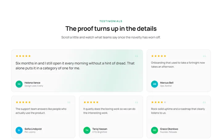
Staggered Reveal Testimonial Grid
OriginalA testimonial grid whose cards spring in with a staggered scroll reveal and light up with an animated gradient border on hover.
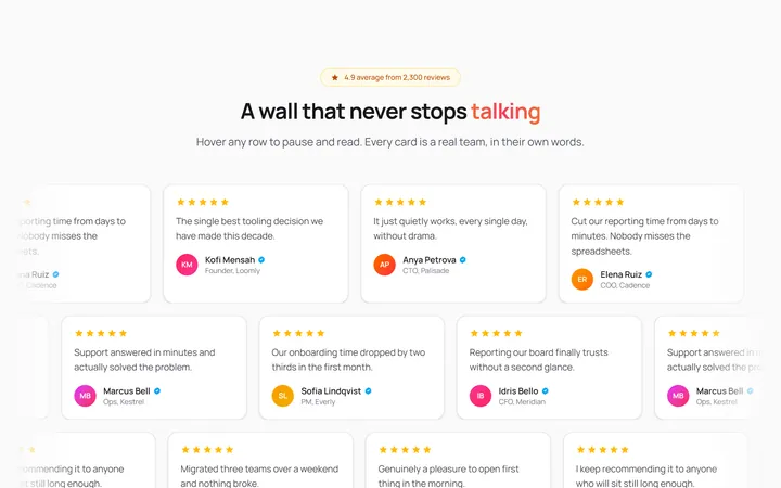
Infinite Marquee Testimonial Wall
OriginalA three-row marquee wall of review cards scrolling in alternating directions that pause on hover, with a shimmering gradient headline and faded edges.
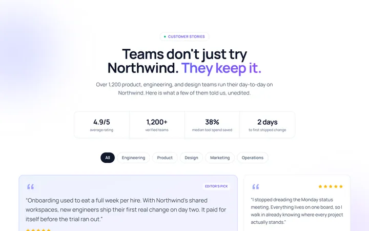
Grid Testimonial
Originaltestimonial grid
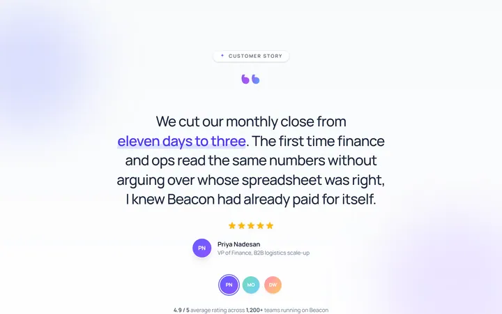
Single Large Testimonial
Originalsingle large quote
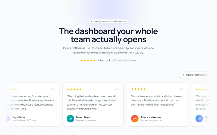
Marquee Testimonial
Originaltestimonial marquee rows
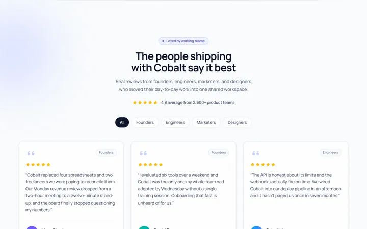
Cards Avatar Testimonial
Originaltestimonial cards with avatars