

Slider Testimonial
Original · freetestimonial slider
Copy prompt gives Claude Code, Cursor or v0 a ready-to-paste prompt that recreates this exact component.
npx shadcn@latest add https://webinnoventix.com/r/tstx-slider.json"use client";
import {
useCallback,
useEffect,
useRef,
useState,
type KeyboardEvent as ReactKeyboardEvent,
} from "react";
import { AnimatePresence, motion, useReducedMotion, type Variants } from "motion/react";
type Testimonial = {
quote: string;
name: string;
role: string;
company: string;
rating: number;
initials: string;
accent: string;
};
const TESTIMONIALS: readonly Testimonial[] = [
{
quote:
"We cut our monthly reporting cycle from nine days to under two. The dashboards Lumen ships out of the box replaced three brittle spreadsheets and one very tired analyst.",
name: "Priya Nadkarni",
role: "VP of Operations",
company: "Meridian Logistics",
rating: 5,
initials: "PN",
accent: "from-indigo-500 to-violet-500",
},
{
quote:
"Onboarding thirty field reps used to eat a full quarter. With the role-based templates we had the whole team live in eleven days, and nobody asked for the training deck.",
name: "Marcus Bell",
role: "Head of Enablement",
company: "Cartwright Field Services",
rating: 5,
initials: "MB",
accent: "from-emerald-500 to-sky-500",
},
{
quote:
"I was sure another tool would just add noise. Six months in, our support backlog is down forty percent and I have not opened a single ticket about the platform itself.",
name: "Elena Sorensen",
role: "Customer Success Lead",
company: "Northgate Software",
rating: 5,
initials: "ES",
accent: "from-rose-500 to-amber-500",
},
{
quote:
"The API is the cleanest I have integrated in a decade. My engineers shipped a custom billing sync in an afternoon instead of the two-week estimate they gave me.",
name: "David Okafor",
role: "Chief Technology Officer",
company: "Halden Payments",
rating: 5,
initials: "DO",
accent: "from-sky-500 to-indigo-500",
},
{
quote:
"Renewal was a five-minute conversation. Finance pulled up the utilization numbers, saw seventy percent adoption across every team, and signed before the call ended.",
name: "Hannah Weiss",
role: "RevOps Manager",
company: "Bramble & Co.",
rating: 4,
initials: "HW",
accent: "from-violet-500 to-rose-500",
},
] as const;
const AUTOPLAY_MS = 7000;
function StarIcon({ filled }: { filled: boolean }) {
return (
<svg
viewBox="0 0 20 20"
aria-hidden="true"
className={
filled
? "h-4 w-4 flex-none fill-amber-400"
: "h-4 w-4 flex-none fill-slate-300 dark:fill-slate-600"
}
>
<path d="M10 1.6l2.47 5.01 5.53.8-4 3.9.94 5.5L10 14.2l-4.94 2.6.94-5.5-4-3.9 5.53-.8z" />
</svg>
);
}
export default function TstxSlider() {
const prefersReduced = useReducedMotion();
const [index, setIndex] = useState<number>(0);
const [direction, setDirection] = useState<number>(1);
const [userPlaying, setUserPlaying] = useState<boolean>(true);
const [interacting, setInteracting] = useState<boolean>(false);
const regionRef = useRef<HTMLDivElement | null>(null);
const count = TESTIMONIALS.length;
const playing = userPlaying && !interacting && !prefersReduced;
const goTo = useCallback(
(next: number, dir: number) => {
setDirection(dir);
setIndex(((next % count) + count) % count);
},
[count],
);
const goNext = useCallback(() => goTo(index + 1, 1), [goTo, index]);
const goPrev = useCallback(() => goTo(index - 1, -1), [goTo, index]);
// Fallback advance timer (kept in sync with the progress bar, but also
// guarantees rotation if the animated bar is ever skipped by the browser).
useEffect(() => {
if (!playing) return;
const id = window.setTimeout(goNext, AUTOPLAY_MS);
return () => window.clearTimeout(id);
}, [playing, index, goNext]);
const onKeyDown = useCallback(
(event: ReactKeyboardEvent<HTMLDivElement>) => {
if (event.key === "ArrowRight") {
event.preventDefault();
goNext();
} else if (event.key === "ArrowLeft") {
event.preventDefault();
goPrev();
}
},
[goNext, goPrev],
);
const shift = prefersReduced ? 0 : 56;
const slideVariants: Variants = {
enter: (dir: number) => ({ opacity: 0, x: dir >= 0 ? shift : -shift }),
center: { opacity: 1, x: 0 },
exit: (dir: number) => ({ opacity: 0, x: dir >= 0 ? -shift : shift }),
};
const active = TESTIMONIALS[index];
return (
<section className="relative w-full overflow-hidden bg-slate-50 px-6 py-24 text-slate-900 dark:bg-slate-950 dark:text-slate-100 sm:py-28">
<style>{`
@keyframes tstxsl-drift {
0%, 100% { transform: translate3d(0, 0, 0) scale(1); }
50% { transform: translate3d(0, -24px, 0) scale(1.08); }
}
.tstxsl-blob { animation: tstxsl-drift 16s ease-in-out infinite; }
.tstxsl-blob-slow { animation: tstxsl-drift 22s ease-in-out infinite reverse; }
@media (prefers-reduced-motion: reduce) {
.tstxsl-blob, .tstxsl-blob-slow { animation: none !important; }
}
`}</style>
{/* Ambient background decoration */}
<div aria-hidden="true" className="pointer-events-none absolute inset-0 overflow-hidden">
<div className="tstxsl-blob absolute -left-24 top-8 h-72 w-72 rounded-full bg-indigo-300/40 blur-3xl dark:bg-indigo-600/20" />
<div className="tstxsl-blob-slow absolute -right-16 bottom-0 h-80 w-80 rounded-full bg-violet-300/40 blur-3xl dark:bg-violet-600/20" />
</div>
<div className="relative mx-auto max-w-5xl">
<header className="mx-auto max-w-2xl text-center">
<span className="inline-flex items-center gap-2 rounded-full border border-slate-200 bg-white/70 px-3 py-1 text-xs font-semibold uppercase tracking-widest text-indigo-600 backdrop-blur dark:border-slate-800 dark:bg-slate-900/70 dark:text-indigo-400">
<span className="h-1.5 w-1.5 rounded-full bg-emerald-500" />
Customer stories
</span>
<h2 className="mt-5 text-balance text-3xl font-bold tracking-tight sm:text-4xl">
Teams ship faster once Lumen does the busywork
</h2>
<p className="mt-4 text-pretty text-base text-slate-600 dark:text-slate-400">
Operators, engineers, and revenue leads on what changed after they switched. Real
numbers, no scripted praise.
</p>
</header>
<div
ref={regionRef}
role="group"
aria-roledescription="carousel"
aria-label="Customer testimonials"
tabIndex={0}
onKeyDown={onKeyDown}
onMouseEnter={() => setInteracting(true)}
onMouseLeave={() => setInteracting(false)}
onFocus={() => setInteracting(true)}
onBlur={(e) => {
if (!e.currentTarget.contains(e.relatedTarget as Node | null)) setInteracting(false);
}}
className="group relative mt-12 rounded-3xl outline-none focus-visible:ring-2 focus-visible:ring-indigo-500 focus-visible:ring-offset-2 focus-visible:ring-offset-slate-50 dark:focus-visible:ring-offset-slate-950"
>
<div className="relative min-h-[22rem] overflow-hidden rounded-3xl border border-slate-200 bg-white/80 p-8 shadow-xl shadow-slate-900/5 backdrop-blur-sm dark:border-slate-800 dark:bg-slate-900/70 dark:shadow-black/30 sm:min-h-[20rem] sm:p-12">
{/* Decorative quote mark */}
<svg
viewBox="0 0 48 48"
aria-hidden="true"
className="absolute right-8 top-8 h-14 w-14 fill-indigo-200 dark:fill-indigo-900/60"
>
<path d="M18 10C11 12 6 18 6 26v12h14V24h-8c0-5 3-8 8-9zm22 0c-7 2-12 8-12 16v12h14V24h-8c0-5 3-8 8-9z" />
</svg>
<AnimatePresence mode="wait" custom={direction} initial={false}>
<motion.article
key={index}
custom={direction}
variants={slideVariants}
initial="enter"
animate="center"
exit="exit"
transition={{
duration: prefersReduced ? 0 : 0.42,
ease: [0.22, 1, 0.36, 1],
}}
aria-roledescription="slide"
aria-label={`${index + 1} of ${count}`}
className="relative flex h-full flex-col"
>
<div className="flex items-center gap-1" aria-hidden="true">
{Array.from({ length: 5 }, (_, i) => (
<StarIcon key={i} filled={i < active.rating} />
))}
</div>
<span className="sr-only">{`Rated ${active.rating} out of 5`}</span>
<blockquote className="mt-6 flex-1">
<p className="text-balance text-xl font-medium leading-relaxed text-slate-800 dark:text-slate-100 sm:text-2xl">
“{active.quote}”
</p>
</blockquote>
<figcaption className="mt-8 flex items-center gap-4">
<span
aria-hidden="true"
className={`flex h-12 w-12 flex-none items-center justify-center rounded-full bg-gradient-to-br ${active.accent} text-sm font-bold text-white shadow-lg`}
>
{active.initials}
</span>
<span className="min-w-0">
<span className="block truncate font-semibold text-slate-900 dark:text-white">
{active.name}
</span>
<span className="block truncate text-sm text-slate-500 dark:text-slate-400">
{active.role}, {active.company}
</span>
</span>
</figcaption>
</motion.article>
</AnimatePresence>
</div>
{/* Autoplay progress bar */}
{!prefersReduced && (
<div className="mt-5 h-1 w-full overflow-hidden rounded-full bg-slate-200 dark:bg-slate-800">
<motion.div
key={`${index}-${playing ? "on" : "off"}`}
className="h-full origin-left rounded-full bg-gradient-to-r from-indigo-500 to-violet-500"
initial={{ scaleX: 0 }}
animate={{ scaleX: playing ? 1 : 0 }}
transition={{ duration: playing ? AUTOPLAY_MS / 1000 : 0, ease: "linear" }}
/>
</div>
)}
</div>
{/* Controls */}
<div className="mt-8 flex items-center justify-between gap-4">
<div className="flex items-center gap-2">
<button
type="button"
onClick={goPrev}
aria-label="Previous testimonial"
className="inline-flex h-11 w-11 items-center justify-center rounded-full border border-slate-200 bg-white text-slate-700 transition hover:border-indigo-400 hover:text-indigo-600 focus-visible:outline-none focus-visible:ring-2 focus-visible:ring-indigo-500 active:scale-95 dark:border-slate-700 dark:bg-slate-900 dark:text-slate-200 dark:hover:border-indigo-500 dark:hover:text-indigo-400"
>
<svg viewBox="0 0 24 24" aria-hidden="true" className="h-5 w-5 fill-none stroke-current stroke-2">
<path d="M15 18l-6-6 6-6" strokeLinecap="round" strokeLinejoin="round" />
</svg>
</button>
<button
type="button"
onClick={goNext}
aria-label="Next testimonial"
className="inline-flex h-11 w-11 items-center justify-center rounded-full border border-slate-200 bg-white text-slate-700 transition hover:border-indigo-400 hover:text-indigo-600 focus-visible:outline-none focus-visible:ring-2 focus-visible:ring-indigo-500 active:scale-95 dark:border-slate-700 dark:bg-slate-900 dark:text-slate-200 dark:hover:border-indigo-500 dark:hover:text-indigo-400"
>
<svg viewBox="0 0 24 24" aria-hidden="true" className="h-5 w-5 fill-none stroke-current stroke-2">
<path d="M9 6l6 6-6 6" strokeLinecap="round" strokeLinejoin="round" />
</svg>
</button>
</div>
<div className="flex items-center gap-2.5" role="tablist" aria-label="Choose a testimonial">
{TESTIMONIALS.map((t, i) => {
const current = i === index;
return (
<button
key={t.name}
type="button"
role="tab"
aria-selected={current}
aria-label={`Show testimonial from ${t.name}`}
onClick={() => goTo(i, i > index ? 1 : -1)}
className={
current
? "h-2.5 w-7 rounded-full bg-indigo-600 transition-all focus-visible:outline-none focus-visible:ring-2 focus-visible:ring-indigo-500 focus-visible:ring-offset-2 focus-visible:ring-offset-slate-50 dark:bg-indigo-400 dark:focus-visible:ring-offset-slate-950"
: "h-2.5 w-2.5 rounded-full bg-slate-300 transition-all hover:bg-slate-400 focus-visible:outline-none focus-visible:ring-2 focus-visible:ring-indigo-500 focus-visible:ring-offset-2 focus-visible:ring-offset-slate-50 dark:bg-slate-700 dark:hover:bg-slate-600 dark:focus-visible:ring-offset-slate-950"
}
/>
);
})}
</div>
<button
type="button"
onClick={() => setUserPlaying((p) => !p)}
aria-pressed={!userPlaying}
aria-label={userPlaying ? "Pause autoplay" : "Start autoplay"}
className="inline-flex h-11 w-11 items-center justify-center rounded-full border border-slate-200 bg-white text-slate-700 transition hover:border-indigo-400 hover:text-indigo-600 focus-visible:outline-none focus-visible:ring-2 focus-visible:ring-indigo-500 active:scale-95 dark:border-slate-700 dark:bg-slate-900 dark:text-slate-200 dark:hover:border-indigo-500 dark:hover:text-indigo-400"
>
{userPlaying ? (
<svg viewBox="0 0 24 24" aria-hidden="true" className="h-5 w-5 fill-current">
<rect x="6" y="5" width="4" height="14" rx="1" />
<rect x="14" y="5" width="4" height="14" rx="1" />
</svg>
) : (
<svg viewBox="0 0 24 24" aria-hidden="true" className="h-5 w-5 fill-current">
<path d="M8 5v14l11-7z" />
</svg>
)}
</button>
</div>
</div>
</section>
);
}Dependencies
Licence
Built by Web Innoventix. Free for personal and commercial use, no attribution required.
Built by Web Innoventix
Need a custom interface, a full website, or SEO that gets you cited by AI? We design, build and rank it end to end.
Get a free quoteSimilar components
Browse all →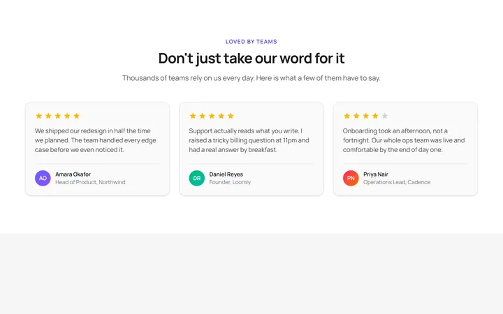
Three Card Testimonial Grid
OriginalA clean three-column grid of testimonial cards, each with a star rating, quote and an initial avatar with name and role.
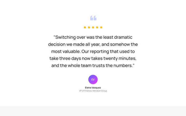
Single Featured Quote
OriginalA large centred pull quote with a decorative quotation mark, five-star rating and a prominent author avatar for a single standout testimonial.
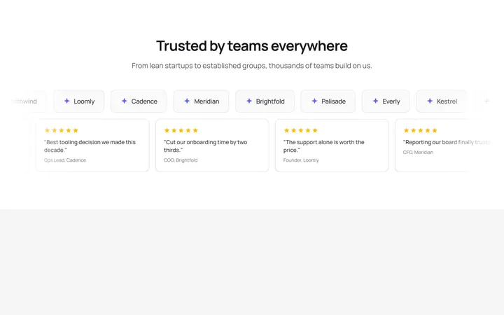
Logo Wall Marquee
OriginalA pair of infinitely scrolling, pause-on-hover marquees pairing a customer logo wall with compact quote cards, with reduced-motion support.
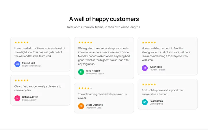
Masonry Testimonial Wall
OriginalA CSS-columns masonry wall of testimonial cards in varied lengths, each with a star rating and initial avatar for a natural, organic layout.
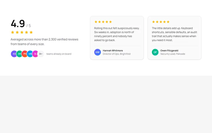
Aggregate Rating Spotlight
OriginalA split layout pairing a large aggregate rating score, star row and overlapping avatar stack with two featured review cards.
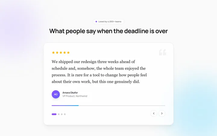
Auto-Rotating Quote Carousel
OriginalAn auto-advancing testimonial carousel that slides and crossfades between quotes with a live progress bar, pause-on-hover, and dot plus arrow navigation.
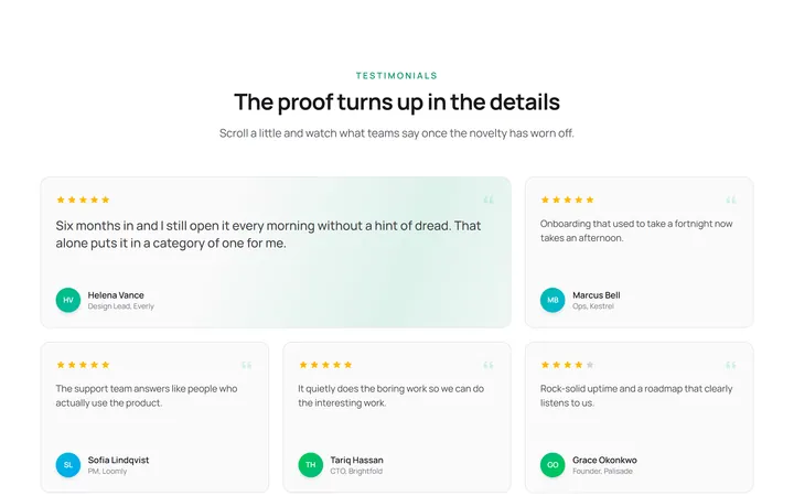
Staggered Reveal Testimonial Grid
OriginalA testimonial grid whose cards spring in with a staggered scroll reveal and light up with an animated gradient border on hover.
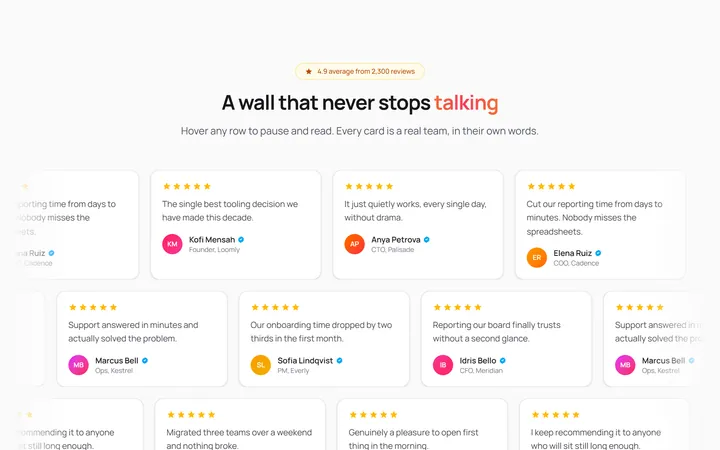
Infinite Marquee Testimonial Wall
OriginalA three-row marquee wall of review cards scrolling in alternating directions that pause on hover, with a shimmering gradient headline and faded edges.
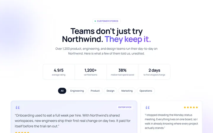
Grid Testimonial
Originaltestimonial grid
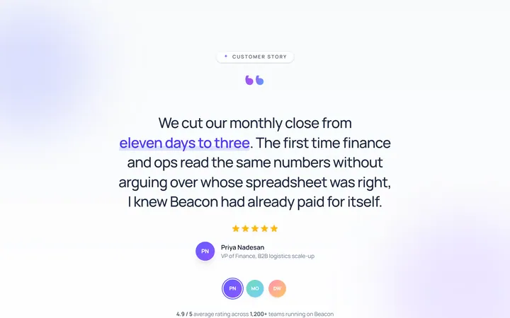
Single Large Testimonial
Originalsingle large quote
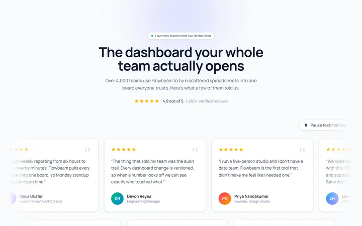
Marquee Testimonial
Originaltestimonial marquee rows
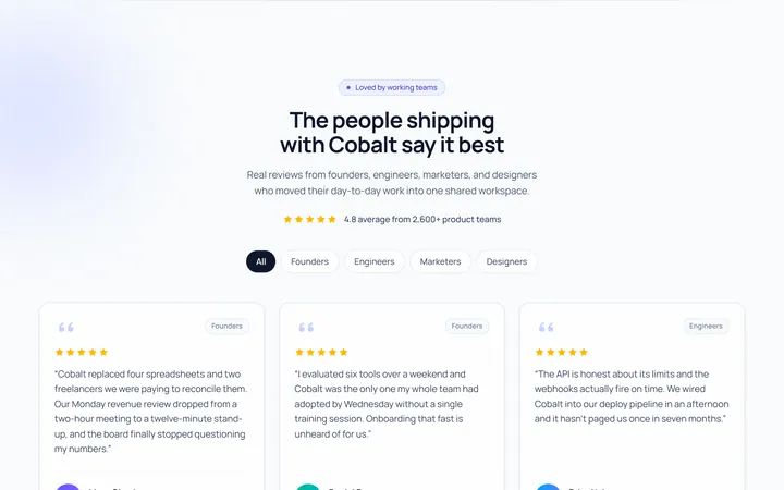
Cards Avatar Testimonial
Originaltestimonial cards with avatars