Overview
Creatiwise is a forward-thinking web development agency focused on delivering exceptional digital solutions while nurturing long-term client partnerships. They needed a visual identity that reflects their core values — communication, collaboration, and stability — while standing out in a competitive market. Our goal was to create a logo that conveys both innovation and trust, aligning with Creatiwise’s mission to offer reliable, balanced services.
Focus Areas : Logo Concept, Symbolic Design System, Visual Identity Foundation
Platform: Print & Digital Branding
Objective
To design a logo that embodies Creatiwise’s philosophy of long-lasting client relationships, seamless communication, and dependable digital solutions by:
Creating a symbol that reflects unity, balance, and collaboration
Merging abstract and monogram elements for modern appeal
Building a visual identity that translates across digital and offline touchpoints
Our Approach
To design a logo that embodies Creatiwise’s philosophy of long-term partnerships, communication, and reliability by:
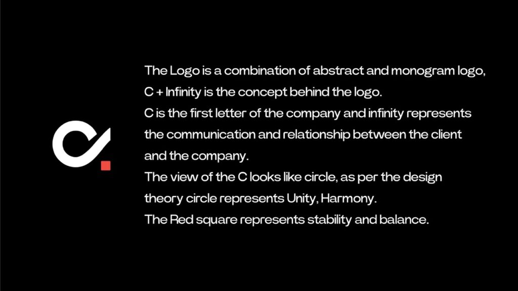
Combining the “C” monogram with the infinity symbol to represent continuous collaboration and enduring relationships
Incorporating geometric elements like a red square to convey stability, trust, and groundedness
Crafting a balanced circular form to emphasize unity and seamless workflow
Using a minimalist color palette (black, white, and red) for timeless visual appeal and digital clarity
Ensuring the logo adapts easily across all brand platforms — from websites and pitch decks to business cards and social media profiles
Our Process
Aligning Values with Visual Strategy
We began by immersing ourselves in Creatiwise’s vision — a digital agency that thrives on collaboration, communication, and long-term client success. This stage focused on extracting key attributes that would later guide the visual identity.
Conducted workshops to define the brand’s tone: reliable, clear, and growth-oriented
Identified competitor visuals to differentiate with symbolism and simplicity
Aligned on three brand pillars: trust, collaboration, and innovation
Created a moodboard to explore iconography, forms, and brand-relevant metaphors
This discovery phase helped us root the visual design in meaning, not just aesthetics.
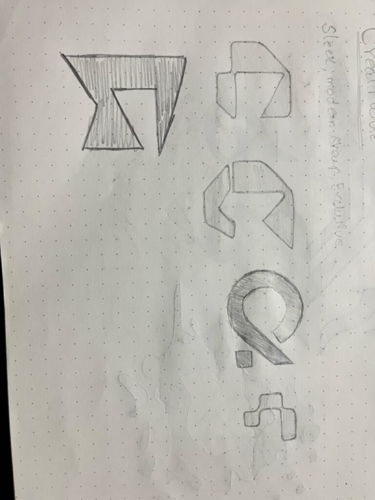
Designing a Visual Metaphor for Connection
Creatiwise’s logo needed to embody lasting relationships and seamless communication. We developed a smart, symbolic mark that visually represents those values.
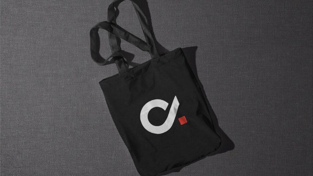
Merged the letter “C” with an infinity symbol, capturing continuity and trust
Embedded a geometric red square within the mark — a nod to stability, strength, and grounded solutions
Crafted a symmetrical, circular logo that feels unified and visually balanced
Explored minimalist forms to ensure recognizability across small and large scales
This symbolic fusion set Creatiwise apart with a logo that’s memorable and meaningful.
Balancing Professionalism with Boldness
We refined the brand identity with a timeless typeface and a minimal, confident color palette that enhances both digital and print visibility.
Selected a clean sans-serif typeface to maintain clarity and digital friendliness
Chose a black, white, and red color palette — black for professionalism, red for energy, white for space and balance
Established color use rules to ensure hierarchy, contrast, and accessibility
Applied consistent typography pairing for headers, body, and UI usage
This system reinforces brand recognition and elevates every touchpoint with simplicity and strength.
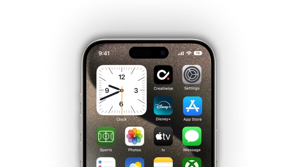
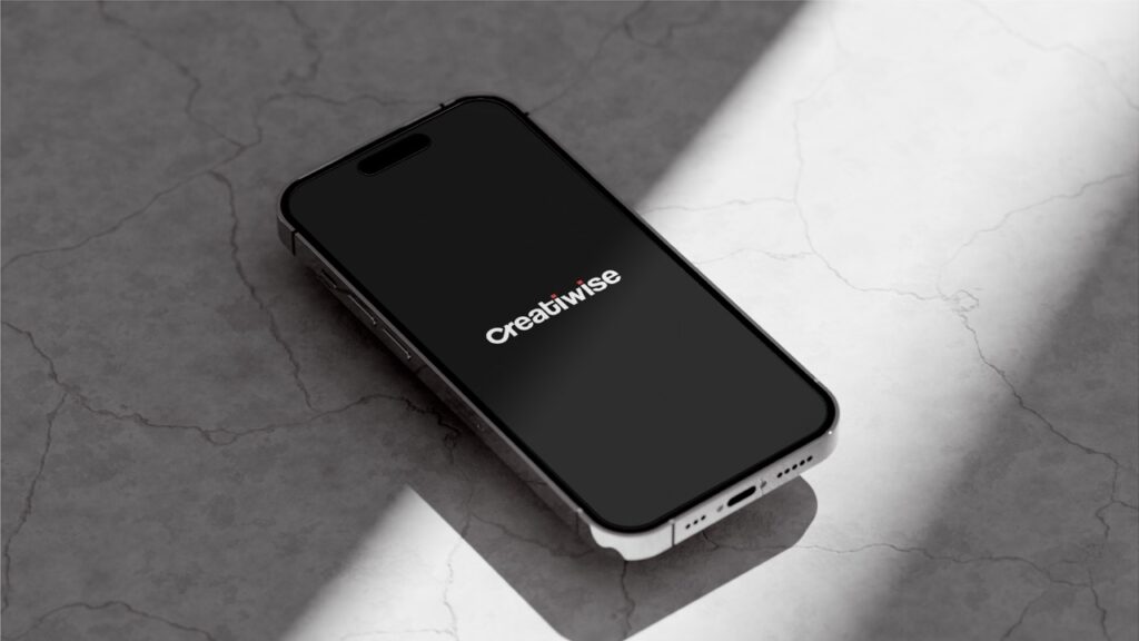
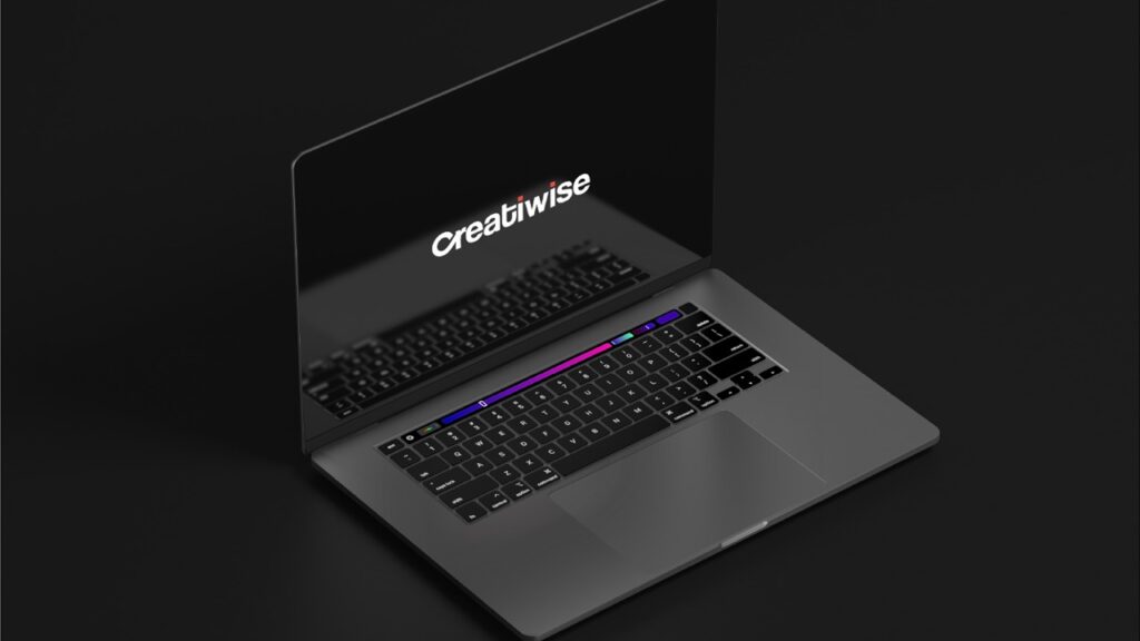
Testing Identity Across Touchpoints
To ensure flexibility and effectiveness, we tested the logo and branding across common use cases — from websites to business cards.
Placed the logo in mockups for desktop, mobile, business stationery, and social media
Checked contrast and sizing for high legibility on digital platforms
Verified alignment and balance on document headers and presentation slides
Explored both horizontal and stacked layouts for various display needs
Every variation retained clarity, scalability, and brand integrity.
Scalable Assets and Brand Guidelines
We wrapped the project with a comprehensive logo suite and brand asset pack, ensuring long-term usability and consistency for the Creatiwise team.
Deliverables included:
Logo in all standard formats (SVG, PNG, EPS, PDF)
Primary and secondary logo versions for different layouts
Color codes, typography specs, and logo usage rules
Brand guideline document for internal and external use
Mockups for key brand applications (web, stationery, social media)
The result is a future-ready brand identity that embodies Creatiwise’s purpose: strong partnerships, clean delivery, and digital excellence.
Key Outcomes
The new visual identity for Creatiwise delivers a symbol-rich, adaptable brand presence that aligns with their core mission of clarity, connection, and quality.
Bold Visual Identity with Depth
A powerful monogram logo combining the letter “C” with the infinity symbol and red square — communicating lasting relationships, trust, and strength in delivery.Professional, Timeless Look Across Platforms
The color system (black, white, red) ensures legibility and brand recognition across digital screens, business cards, and developer hand-offs.Memorable Brand Recognition
The symbolic logo sets Creatiwise apart in a crowded market while remaining meaningful and aligned with their values of collaboration and consistency.Versatile Design for Every Use Case
From websites to pitch decks and business stationery, the logo scales cleanly and remains visually effective in every size and context.
More Portfolios
Monday – Saturday : 9.00 am – 10:30 pm