Overview
Ekaiva is a premium furniture manufacturer focused on delivering modern, durable pieces that blend elegance with function. They approached us to craft a visual identity that reflects their core values — craftsmanship, quality, and timeless design. The goal was to create a sophisticated brand system that would position them as a trusted name in the premium furniture segment.
Focus Areas: Logo Design, Color Palette, Packaging, Visual Identity
Objective
To develop a premium brand identity system that reinforces Ekaiva’s core values by:
Creating a logo that symbolizes strength, craftsmanship, and design precision
Developing a timeless color palette rooted in nature and elegance
Ensuring branding elements work seamlessly across packaging, digital, and print
Laying the foundation for a recognizable and adaptable brand
Our Approach
We followed a strategy-led branding process that emphasized clarity, meaning, and consistency.
Discovery Sessions: Conducted stakeholder interviews to understand the brand story and target positioning
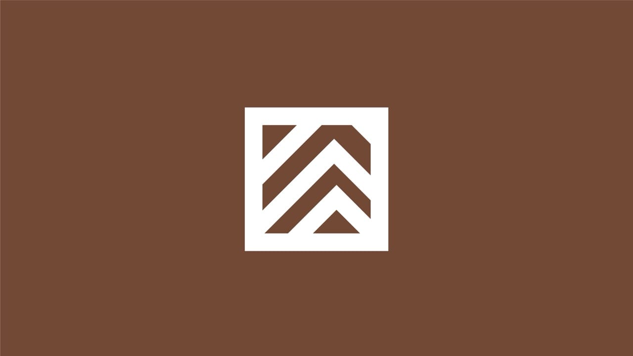
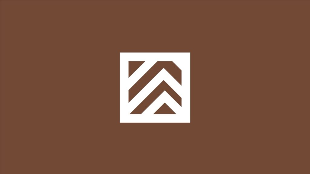
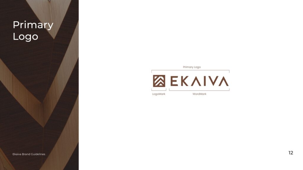
Logo Conceptualization: Created a modern mark inspired by plywood structure within a square — representing strength, craft, and stability
Color Strategy: Built a two-tone palette
- Brown to symbolize warmth, wood, and craftsmanship
- White to reflect purity, simplicity, and elegance
Typography Design: Used a sleek serif font to communicate durability and modern sophistication
Brand System Development: Applied the identity consistently across packaging, stationery, and marketing materials
Our Process
Aligning Values with Visual Direction
We began by understanding Ekaiva’s mission, audience, and design sensibilities through collaborative discovery sessions.
Conducted stakeholder interviews to capture brand tone and competitive edge
Identified key brand attributes: craftsmanship, timelessness, and reliability
Mapped market benchmarks to ensure differentiation in the premium furniture space
This set the foundation for a design system rooted in clarity and elegance.
Symbolizing Craft and Structure
The logo needed to reflect Ekaiva’s dedication to durability and modern craftsmanship.
Designed a modern geometric mark inspired by layered plywood within a square form
The structure reflects stability, craftsmanship, and architectural precision
Paired with a clean serif typeface to convey sophistication and brand maturity
Created variants to work across small labels, packaging, and print materials
This ensured the brand mark would stand out across applications while maintaining elegance.
Nature-Inspired Premium Tones
We developed a refined, earthy color palette to evoke natural elegance and warmth.
Deep brown to represent wood, quality, and trust
White to express simplicity, balance, and visual space
Created a balance that aligns with both physical materials and digital environments
The palette works effortlessly across packaging, signage, and web interfaces.
Refining the Visual Language
Typography was selected to elevate the brand while maintaining modern accessibility.
Chose a sleek, high-contrast serif font that evokes premium appeal
Defined typographic hierarchy for headlines, labels, and descriptions
Supported the identity with custom line-based icons for labeling and signage
This helped establish a versatile brand language for use across formats.
Bringing the Brand to Life
We extended the identity into real-world applications to ensure visual harmony and brand consistency at every customer interaction point.
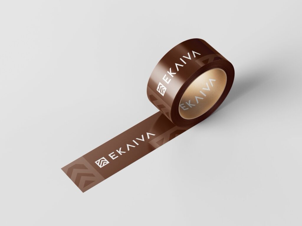
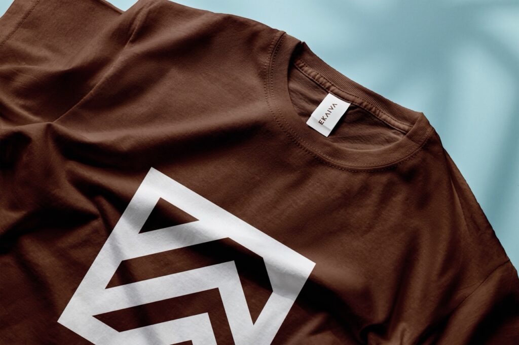
Applied the brand across product boxes, wrapping papers, labels, care cards, and tags
Designed embossed and foil-ready assets for elevated tactile finishes and shelf appeal
Developed in-store signage templates, banner designs, and showroom branding assets
Included scalable layout systems for product manuals and material inserts
Ensured packaging followed sustainability practices aligned with premium values
Each material was designed not just for utility, but to enhance the overall brand experience and evoke a sense of premium craftsmanship.
A Scalable Identity System Built for Growth
The project concluded with a future-ready visual identity toolkit to support expansion and brand integrity over time.
Delivered fully optimized logo versions for print, web, packaging, and social media
Provided an interactive brand style guide covering do’s/don’ts, spacing, scale, and usage
Included ready-to-use design templates for social media posts, catalogs, and business cards
Set up naming conventions and folder structures to streamline future creative production
Provided onboarding and walkthroughs to the client’s internal design/marketing team
Built a foundation for future campaigns, product lines, or category extensions without needing a full redesign
This ensured Ekaiva’s internal team and partners could implement the brand smoothly across any future marketing or product efforts.
Key Outcomes
The final brand identity positions Ekaiva as a premium, trustworthy player in the furniture market — while setting a clear visual tone for all customer touchpoints.
Stronger Brand Recall: Minimal, meaningful logo design works seamlessly across packaging and digital
Elevated Brand Perception: Clean, modern visual style establishes Ekaiva’s premium positioning
Consistency Across Assets: Cohesive color and type system ensures recognizability
Ready for Scale: Modular visual system allows future expansion into new categories or campaigns
More Portfolios
Monday – Saturday : 9.00 am – 10:30 pm