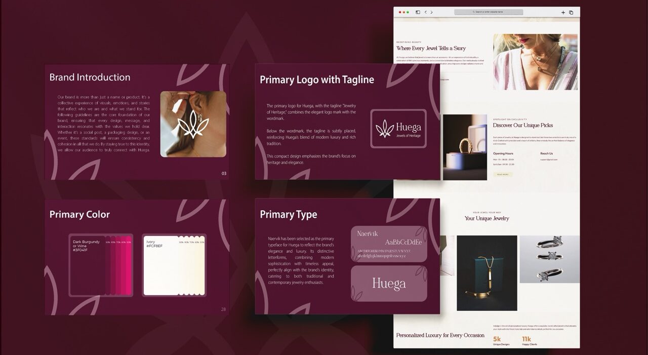
Overview
Journey with Strangers is a travel brand that curates adventurous group experiences like trekking, bonfire nights, and nature getaways — all designed for individuals to travel with new people and form unforgettable connections. With the goal of connecting like-minded explorers and promoting community-driven travel, the brand needed a logo that visually expresses the spirit of exploration, connection, and modern adventure.
Focus Areas: Logo Design.
Objective
To craft a visually iconic and modern brand identity for Journey with Strangers by:
Designing a logo that symbolizes travel, exploration, and collective experience
Combining recognizable travel symbols with a clean, bold style
Using a fresh, high-energy color palette to attract a youthful audience
Ensuring the visual identity adapts well across print, digital, and merchandise platforms
Our Approach
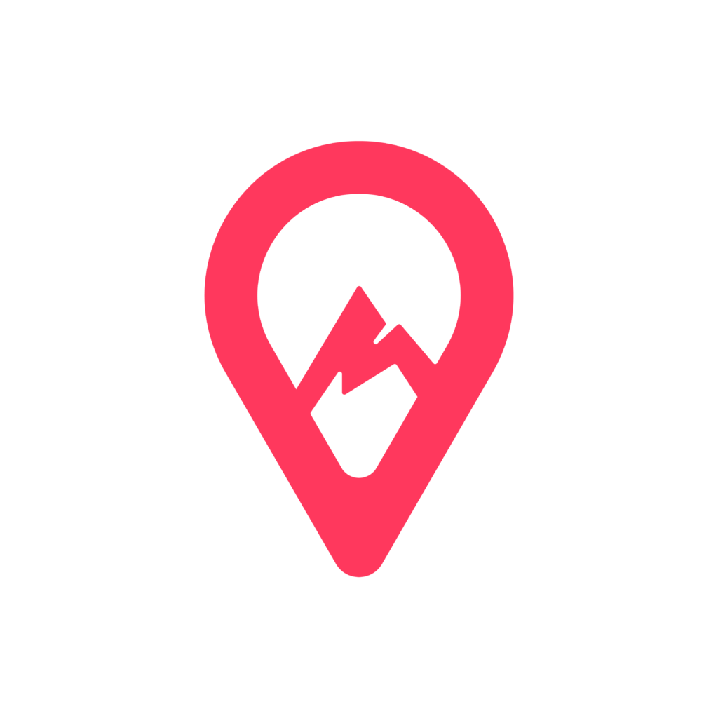
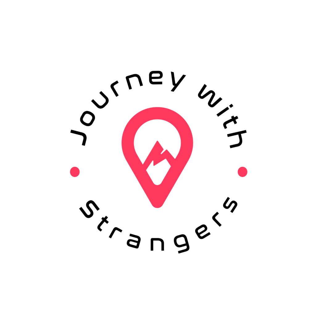
We developed a bold and symbolic logo concept that merges two strong visual metaphors the mountain and the location pin into a clean, modern identity.
Mountain in Negative Space: Placed within the location pin, the mountain signifies adventure, nature, and the brand’s focus on exploration
Location Pin Base Shape: Instantly recognizable, the location pin symbolizes journey, movement, and shared travel experiences
Color System:
Pink: Represents vibrancy, connection, and fun — appealing to a youthful, curious audience
Black: Adds structure and contrast, enhancing professionalism and clarity
White: Enhances the balance of the negative space, giving the mark a clean and adaptable appearance
Balanced Composition: The design is kept minimal yet meaningful, ensuring that it is scalable, memorable, and instantly identifiable
Our Process
Understanding the Brand Spirit
We began by diving deep into the brand’s mission: to create bold, community-driven adventures for strangers turned companions. Our aim was to translate this emotion of togetherness and exploration into a visual form.
Key Discussions Included:
How do we symbolize both travel and human connection in one design?
What visuals appeal to a young, curious, and social audience?
How can we ensure the logo stands out across t-shirts, apps, and travel gear?
These insights helped us establish a creative direction that blends modern adventure with emotional warmth.
Designing with Symbolism
Once the vision was set, we began exploring visual metaphors that could capture the dual identity of the brand — both adventure and togetherness.
Logo Concept Highlights:
Crafted a mountain silhouette within a location pin to represent exploration and movement
Chose a minimal, bold form for instant recognition
Explored different arrangements before finalizing a shape that balances symbolic depth and visual simplicity
The result was a logo concept that felt rooted in shared journeys, not just destinations.
Expressing Energy and Clarity
We curated a vibrant yet grounded color palette to reflect the brand’s fun, adventurous tone while ensuring visual legibility.
Key Style Elements:
Pink: Stands for fun, excitement, and connection
Black: Provides contrast, strength, and professionalism
White: Used as negative space for clarity and cleanliness
Font Choice: A bold, rounded sans-serif typeface that feels friendly and youthful, yet modern
Together, these elements built a cohesive and expressive brand identity.
Making It Work Everywhere
With the core concept approved, we refined the logo across sizes and use cases, ensuring consistency, balance, and versatility.
Adjustments Included:
Tweaked proportions for better visibility at smaller sizes
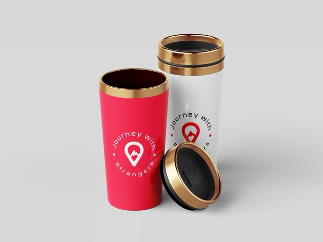
Created black & white and alternate-color versions for merchandise and print
Optimized spacing for icon applications and social media avatars
We ensured the identity stayed recognizable whether on a phone screen or a flag at a base camp.
Ensuring Visual Consistency
We tested the logo across digital and physical environments to guarantee practical performance and impact.
Mockups Included:
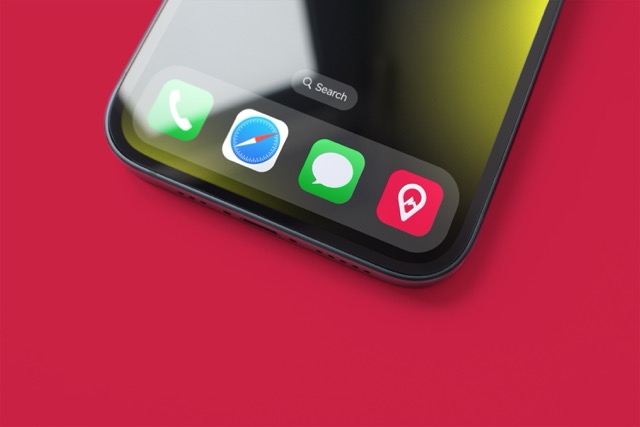
Social media headers and app icons
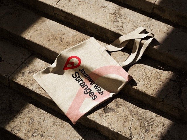
Branded t-shirts, caps, and tote bags
Event flyers and tour brochures
These tests helped us fine-tune color contrast, sizing rules, and positioning.
Making the identity feel alive and energetic in real-world settings.
Future-Ready for Growth
We designed the brand identity to grow with Journey with Strangers as it expands its offerings and community.
Scalability Highlights:
Modular identity system for future travel verticals (bike trips, nature retreats, etc.)
Brand guide provided with usage rules, color breakdowns, and logo dos/don’ts
Ready for rollout across merchandise, mobile apps, and event collateral
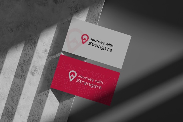
Clean vector assets ensure clarity from business cards to banners
Journey with Strangers now stands out as a youthful, adventurous, and emotionally resonant brand, ready to inspire connection through every journey.
Key Outcomes
The final logo for Journey with Strangers effectively encapsulates the brand’s adventurous and social spirit in a visually distinctive way.
Adventure-Driven Identity: A symbolic logo that reflects exploration and connection through the mountain-pin concept
Youthful and Energetic Appeal: The pink and black palette strikes a balance between boldness and friendliness
Versatile and Memorable: Designed for flexibility across mediums — from social media icons to t-shirt prints and brochures
Instant Recognition: Clean lines and clever use of space ensure strong brand recall and visual impact
More Portfolios
Monday – Saturday : 9.00 am – 10:30 pm