Overview
Bark and Bite is a pet food brand that brings fun, care, and premium quality into the daily lives of dogs, cats, and their owners. Known for its cheerful tone and quirky personality, the brand sought a visual identity that would capture hearts and shelf attention in a highly competitive market. The goal was to design a logo and packaging system that communicated playfulness, trust, and love for pets while standing out from traditional pet food brands.
Focus Areas: Brand Identity, Logo Design, Shelf-Ready Packaging
Objective
To craft a lively and emotionally resonant brand identity for Bark and Bite by:
Designing a bold, fun wordmark logo that reflects the brand’s playful character
Using a bright, pet-friendly color palette that sparks attention and warmth
Creating packaging that connects with pet parents emotionally and visually
Ensuring readability and differentiation on retail shelves
Our Approach
We focused on blending joy and clarity to capture the fun-loving spirit of Bark and Bite while maintaining professional shelf appeal.
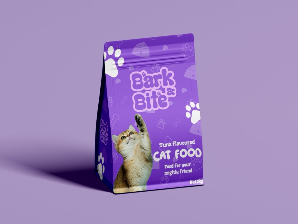
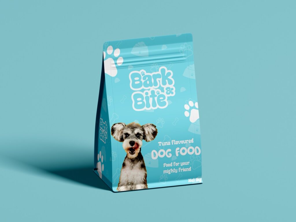
Logo Design: Developed a humorous, friendly wordmark using a rounded typeface that visually represents affection and playfulness
Color System: Combined pink, sky blue, purple, and white to symbolize joy, creativity, trust, and cleanliness — all key emotions for pet owners
Packaging Design: Featured bold illustrations and cute pet visuals to create an emotional bond, paired with legible typography for clear product communication
Mockups & Testing: Applied branding to retail mockups to ensure shelf visibility and consistency across packaging variants
Our Process
Uncovering the Heart of Bark and Bite
We began by exploring what makes Bark and Bite special — a blend of fun, care, and premium pet nutrition. This stage focused on defining the brand’s emotional tone, voice, and visual cues that resonate with pet parents.
Held discovery sessions with the client to identify values, audience insights, and tone of voice
Explored competitor packaging across retail and D2C brands to spot gaps and opportunities
Defined emotional triggers — joy, trust, companionship — to guide all visual decisions
Mapped core brand keywords: playful, caring, bold, friendly
This foundation ensured our creative direction would feel authentic and attention-grabbing in the pet food space.
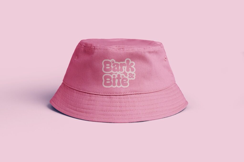
Expressing Personality Through Typography
The logo needed to reflect the charm and quirky soul of Bark and Bite. We created a friendly, custom wordmark that feels expressive and full of life.
Chose a rounded, bold typeface that evokes softness, friendliness, and fun
Incorporated subtle motion in letterforms to mimic the playful energy of pets
Explored various layouts — stacked, horizontal, badge-style — for versatile use
Paired the wordmark with brand-specific icons for future expansion (e.g., paw, bone, whiskers)
The final logo radiates happiness, trust, and personality — instantly connecting with both kids and adults.
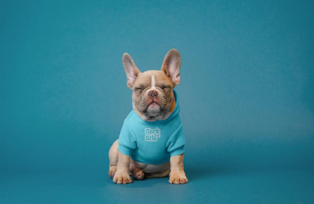
Building a Joyful Visual Language
To make Bark and Bite pop off the shelf and emotionally engage pet parents, we built a lively and expressive color and illustration system.
Created a vibrant color palette (pink, sky blue, purple, white) with emotional intent: joy, calm, creativity, purity
Designed custom pet illustrations to bring life and relatability to the packaging
Used soft gradients and layered tones to balance cheerfulness with clarity
Ensured color contrast meets accessibility and print-readiness standards
These visuals made the brand immediately recognizable and emotionally irresistible.
Making Every Bag Feel Like a Hug
The packaging design was crafted to create emotional engagement and quick recognition, especially in crowded retail environments.
Developed consistent layout templates for different product types (dry food, treats, puppy, senior, etc.)
Combined large pet visuals with bold product names and benefit icons for fast readability
Used back-of-pack space for brand storytelling, feeding info, and playful copy
Created dielines and mockups for multiple packaging sizes with strong visual unity
The result: packaging that communicates love, nutrition, and fun from shelf to shopping cart.
Ensuring Shelf Visibility and Brand Consistency
To validate our work, we tested packaging designs in mock retail scenarios and ensured branding stayed clear across mediums.
Placed mockup variants in shelf simulations with competitor products
Evaluated impact, contrast, and emotional reaction in physical and digital formats
Fine-tuned color use, spacing, and image placement for multiple packaging materials
Ensured logo scalability and readability across print, digital, and merchandising
This helped us ensure that Bark and Bite’s identity performs just as well in the real world as it does on the design board.
Ready to Launch with Confidence
We handed off a complete brand system designed to scale with Bark and Bite’s future growth — including packaging templates and marketing assets.
Deliverables included:
Logo files in multiple formats (AI, EPS, SVG, PNG) with usage guidelines
Color palette and type hierarchy with accessibility notes
Fully layered packaging design templates with editable content areas
Print-ready mockups and dielines for manufacturers
Brand style guide covering tone, icons, and visual rules
With this launch-ready toolkit, Bark and Bite is ready to bring joy, care, and bold flavor to the pet food aisle — one wag at a time.
Key Outcomes
Bark and Bite’s new identity delivers an irresistible combination of personality, function, and visual storytelling — turning every product into a joyful experience for pet owners.
Playful Visual Identity: A lovable wordmark and cheerful palette capture the brand’s warmth and energy
Striking Shelf Presence: Eye-catching packaging design stands out in crowded aisles and appeals to impulse buyers
Emotional Connection: Friendly visuals and soft tones connect directly with the love and care owners have for their pets
Brand Recognition: The consistent use of bright colors and pet-themed illustrations ensures Bark and Bite is both memorable and lovable
More Portfolios
Monday – Saturday : 9.00 am – 10:30 pm