Overview
Calm Hustle is a modern stress management company focused on helping working professionals balance productivity with inner peace. Their offerings include wellness programs, mindfulness sessions, and productivity coaching — all designed to help people stay calm while they hustle.
They approached us with a clear request: to create a logo that embodies both energy and calmness — capturing the unique duality of their brand name while standing out in the wellness space.

Objective
To design a logo that visually communicates the brand’s philosophy — calm on the inside, active on the outside. The goal was to strike a visual balance between stillness and momentum, appealing to both individuals and organizations.


Our Approach
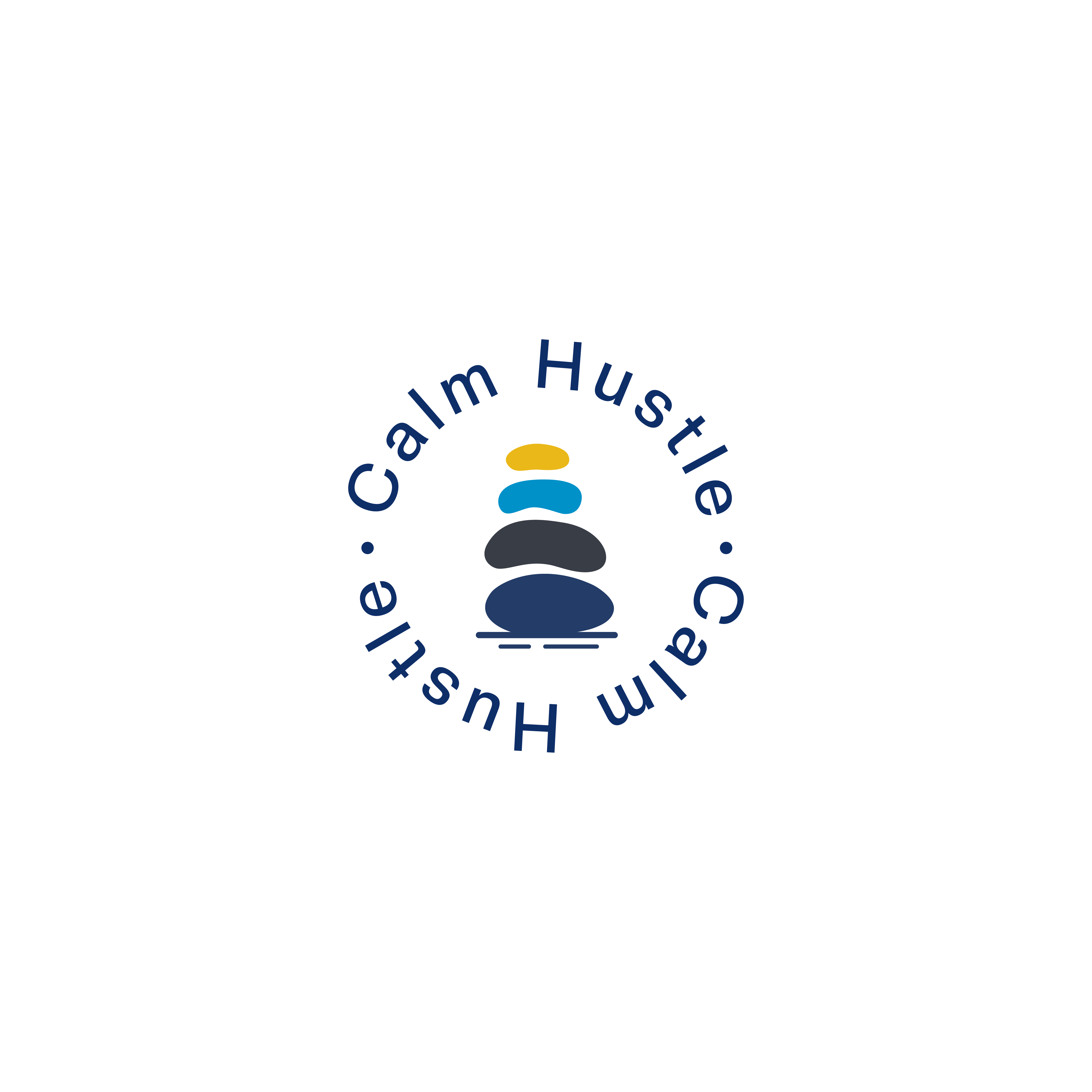
We created a logo that fuses minimalist calmness with dynamic structure — a symbol of centered motion.
Soothing but Strong Typography: A rounded sans-serif typeface reflects softness and calm, while its bold weight communicates confidence and structure.
Color Palette:
Soft Blue: Evokes tranquility, mental clarity, and calmness
Warm Orange: Brings in motivation, energy, and forward momentum — representing the “hustle”
Together, the palette creates emotional contrast while maintaining harmony


Our Process
Defining the Duality of Calm and Hustle
We began by understanding the philosophy behind Calm Hustle — the fusion of inner stillness with outer productivity. Through discovery sessions, we clarified how the brand wants to be perceived in the wellness and professional space.
Key Exploration Points:
What emotions should the logo immediately evoke?
How do we visually represent balance without cliché wellness symbols?
What brand tone appeals to both corporate clients and individual professionals?
This phase helped us align creative direction with brand values and audience expectations.
Framing Emotion Through Design Language
We mapped out the visual strategy that would guide the logo creation and identity system — from moodboards to tone-setting color theory.
Highlights:
Selected contrasting but harmonious emotional tones: calm vs. driven
Explored visual metaphors for balance, duality, and flow
Defined type personality — soft yet structured — to reflect trust and focus
The visual framework created a strong foundation for design execution.
Crafting the Symbol of Centered Momentum
We developed a minimalist logo that balances energy with serenity — designed to be clean, adaptable, and expressive.
Design Focus Areas:
Typography: Rounded sans-serif for calm; bold weight for strength
Layout: Horizontal structure for stability and clarity
Letter Balance: Carefully kerned for visual calm and rhythm
We avoided overused wellness motifs in favor of something more timeless and relatable to professionals.
Harmonizing Calmness and Energy
The color palette was designed to carry emotional weight — visually representing both mindfulness and drive.
Colors Chosen:
Soft Blue for tranquility, clarity, and relaxation
Warm Orange for action, motivation, and hustle
Used together, they create a calm-energy blend — powerful for branding across programs, apps, and campaigns.
Ensuring Real-World Versatility
We tested the logo in various real-life mockups to ensure it performs well in professional, personal, and digital contexts.
Mockup Use Cases Included:
App Interfaces: Verified clarity and scale across splash screens, login pages, and notification banners
Digital Documents: Applied the logo to onboarding guides, coaching worksheets, email templates, and wellness PDFs to ensure print and screen readability
Merchandise: Tested on yoga mats, ceramic mugs, tote bags, and notepads — confirming the logo’s warmth and recognizability in lifestyle products
Corporate Materials: Integrated into pitch decks, Zoom backgrounds, internal reports, and branded video thumbnails for organizational consistency
Social Media: Evaluated in profile images, story templates, and branded reels to maintain recognition and visual integrity on mobile screens
Built for Growth and Clarity
We delivered a ready-to-grow visual identity that can scale with Calm Hustle’s evolving offerings.
Deliverables & Future-Readiness:
Editable vector logo files (color, B/W, reversed)
Brand guide with spacing, color codes, and typography rules
Guidelines for future sub-brand extensions (e.g., Calm Hustle Kids or Calm Hustle Teams)
Consistent visual tone for social media, web banners, and digital content
Calm Hustle now owns a distinctive, meaningful brand identity that confidently bridges inner peace with outer productivity.
Key Outcomes
Balanced Identity: The logo successfully communicates the intersection of calm and hustle — a rare balance in the wellness industry
Versatility: The logo’s structure allows for easy adaptation across digital platforms, merchandise, and coaching materials
Memorable and Modern: A distinct visual system that speaks to millennials and professionals without using clichés like lotus or leaves
More Portfolios
"Web Innoventix truly understood what Calm Hustle stands for. They delivered a brand identity that captures the essence of what we help our clients achieve a balance, clarity, and control. The logo design has become a powerful part of our message, and our audience connects with it instantly."
Tom Hissey, Founder of Calm Hustle

Monday – Saturday : 9.00 am – 10:30 pm