Overview
Ipsa’s Talia is a premium hair oil brand focused on promoting hair growth and solving dandruff issues with a holistic, rejuvenating approach. The brand steers clear of conventional Ayurvedic visuals like herbs or pestles and instead seeks a modern interpretation that still feels rooted in traditional wisdom.

Objective
To create a logo that reflects tradition without being clichéd, and premium quality without being loud — combining elegance, balance, and holistic care. Our visual solution had to:
Avoid common Ayurvedic icons while still feeling rooted in wellness
Reflect rejuvenation, balance, and inner strength
Exude premium quality and timeless simplicity

Our Approach
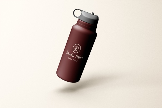
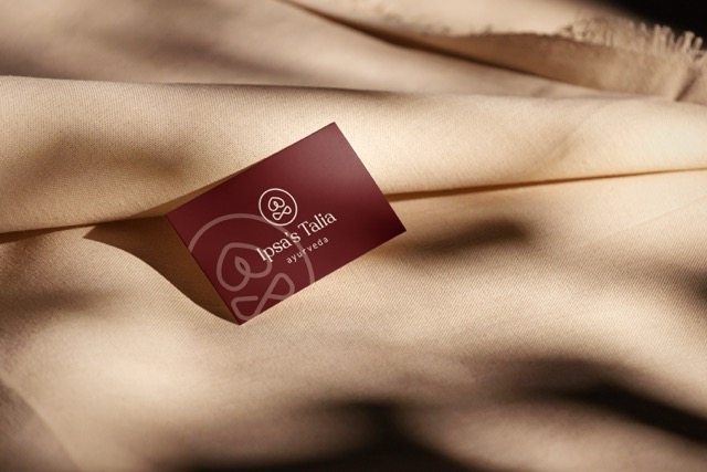
We crafted a design centered around a yoga pose with Namaskaram hands, symbolizing harmony and wellness — the essence of Ipsa’s Talia.
Yoga Pose with Namaskaram: A graceful figure sitting in a meditative posture, hands joined in a Namaskaram gesture — representing inner balance, calm, and rejuvenation. This subtly speaks of Ayurvedic benefits without literal symbols
Color Palette:
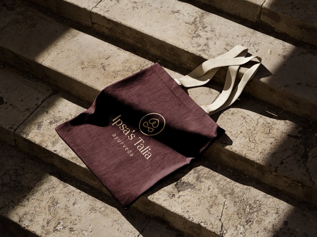
Brown-Maroon Mix: Evokes a sense of earthiness, warmth, and natural care
Cream: Adds elegance and premium quality while keeping the look soft and clean
Typography:
A Serif font was used to balance tradition with sophistication, giving the brand a refined and timeless feel
Our Process
Laying the Foundation for a Balanced Identity
We started by understanding Ipsa’s Talia’s vision — a premium hair oil rooted in tradition but free from Ayurvedic clichés. The goal was to create a refined, holistic identity that feels calm, confident, and elevated.
We explored key questions:
How can we reflect Ayurvedic roots without using literal visuals like herbs or leaves?
What emotional connection should the brand create — strength, rejuvenation, or calmness?
Who is the modern consumer, and what visual language appeals to them?
This phase helped us define the visual tone: thoughtful, natural, and modern.
Capturing Meaning Without Clichés
Once aligned on direction, we conceptualized a unique symbol. The result was a graceful figure in a seated yoga pose, with Namaskaram hands — evoking balance, peace, and inner healing.
Key decisions:
Chose symbolic human posture to convey wellness and centeredness
Avoided common icons to ensure uniqueness in a saturated market
Focused on elegance and cultural relevance, not ornamentation
This approach ensured the logo communicated depth without overused tropes.
Creating a Premium, Grounded Look
With the symbol finalized, we expanded into a full visual identity. The color palette and typography were carefully selected to convey purity, elegance, and care.
Highlights:
Used a brown-maroon blend for warmth, earthiness, and natural care
Paired with cream to maintain sophistication and balance
Selected a serif typeface that feels both refined and rooted in heritage
Every visual decision reinforced Ipsa’s Talia’s premium, calming essence.
Testing the Identity in Real Life
We applied the new brand identity across key use cases to ensure it worked well in every touchpoint.
We tested the logo on:
Bottle labels, box packaging, and dropper visuals
Social media thumbnails and influencer kit mockups
Printed tags, brochures, and shelf display signage
The logo retained clarity, grace, and recall across sizes and materials.
Setting the Brand Up for Success
After validation and refinements, we packaged all final assets with clear usage guidelines to support the brand team going forward.
Deliverables included:
Logo in all formats (AI, PNG, SVG, PDF)
Brand colors, font styles, and safe spacing zones
Style guide for consistent usage in future packaging and campaigns
Everything was documented for easy use across design, marketing, and manufacturing.
Designed for Growth and Longevity
Our process ensured that the identity would not only serve the brand at launch but also grow with it — accommodating product extensions, marketing expansions, and evolving audience needs.
Key highlights:
Modular identity adaptable to new product variants (like serums, tonics, or hair packs) under the same parent brand
Flexible brand system easily applied to campaigns, influencer kits, pop-up displays, and e-commerce banners
Color and font system built for scalability across different product lines while keeping a consistent brand feel
Documentation & support provided for future brand partners, designers, or packaging vendors to maintain consistency
Ready for regional or global expansion with a visual identity that translates across cultures while maintaining relevance
Ipsa’s Talia now has a holistic, scalable brand presence — rooted in tradition, ready for innovation, and built to grow gracefully.
Key Outcomes
The final logo achieved a strong, elegant presence that remains rooted in traditional wellness while breaking away from overused visual tropes.
Subtle Symbolism with Purpose: The yoga pose speaks to balance, healing, and self-care without using literal Ayurvedic visuals
Premium and Natural Appeal: The rich brown-maroon tones paired with a clean cream base create a luxurious, grounded brand identity
Unique Brand Recall: A fresh take in a saturated market, setting Ipsa’s Talia apart as thoughtful, refined, and rooted in care
More Portfolios
"We didn’t want to look like every other Ayurvedic brand — and Web Innoventix completely got that. They brought a fresh perspective that honored our roots while giving us a visual identity that’s truly one of a kind. The concept of using yoga as a symbol of healing perfectly captured what our brand stands for. It helped us communicate our values clearly and gain trust from conscious customers."
Preethika, Founder of Ipsa’s Talia


Monday – Saturday : 9.00 am – 10:30 pm